Built with Jitter
JetztJob • Full redesign of a German job platform
Daniel G Bright
Verified
Project Background
The project came to me through another client I’d worked with, Aramaz Digital, who connected me with the CEO of JetztJob. From the first call, it was clear this wasn’t going to be a light refresh. The old site was outdated, cluttered, and visually behind the times - especially compared to others in the space. They wanted to become a top-tier, modern presence in the industry - something that would instantly feel more current, more helpful, and more trustworthy.
The challenge was to redesign the entire website from the ground up, while staying true to the brand’s existing identity. Keep the logo and primary color - but reimagine everything else.
Users & Context
JetztJob serves two very different audiences:
Employers who need to hire efficiently
Job seekers looking for meaningful opportunities
The site had to work for both. That meant a structure that felt clear and welcoming, but also fast and practical. We didn’t have the luxury of doing full-on UX research - but I worked from client data and our early conversations to understand what wasn’t working in the current flow.
Strategy & Design Direction
After our kickoff, I spoke with the CEO about the core brand values. It became clear that they wanted the brand to feel reliable, human, and easy to trust - not overly corporate or robotic.
They were also very aware that the original design wasn’t holding up next to their competitors. So my goal was to make it feel:
More airy
Much easier to scan
Cleaner and more balanced visually
We kept the base brand colors, but introduced complementary shades, refined type, and a system of cards, layouts, and icons that gave the whole site a lot more structure and visual rhythm. Fonts were chosen to feel accessible but still modern - with good line height and spacing for the German language, which tends to run long.
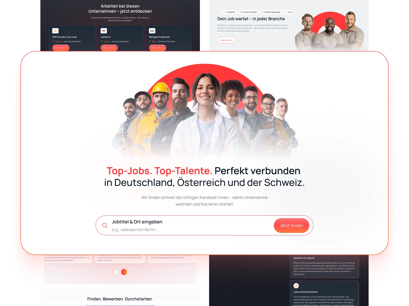
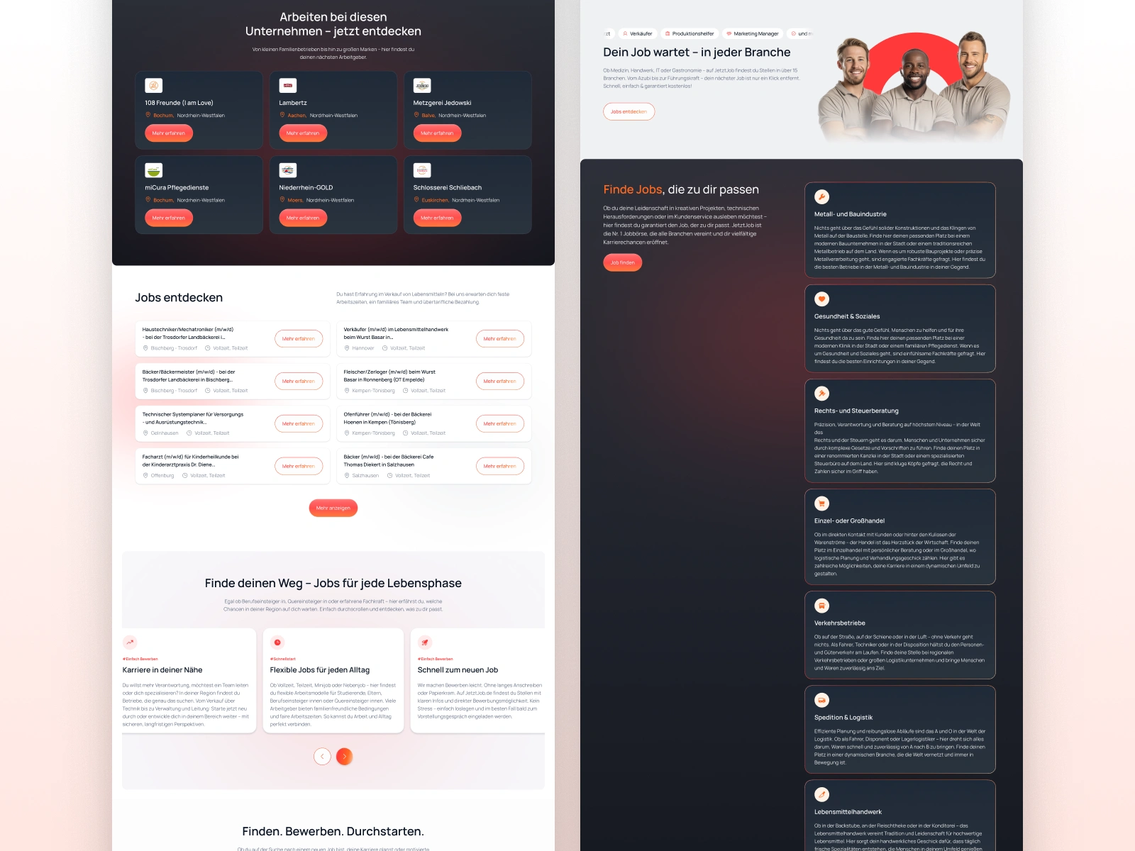
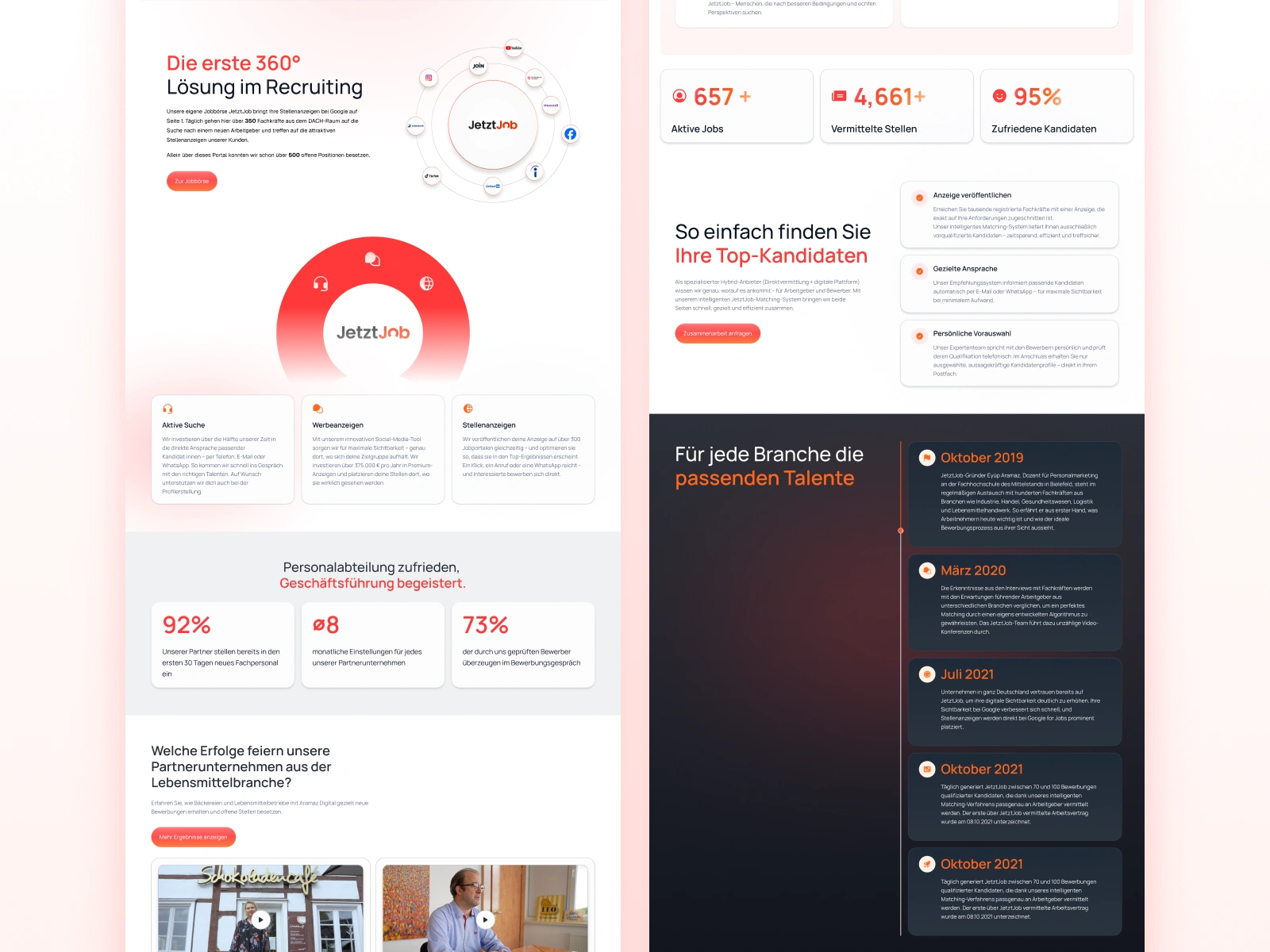
Rebuilding the Site
This wasn’t a surface-level UI refresh - I redesigned over 15 pages, including:
Homepage & hero system
Full job seeker and recruiter flows
CMS-driven blog and success story templates
Contact, team, and policy pages
Multiple layouts for desktop + mobile
Plus content restructuring and tone of voice work
The old site was dense. Lots of long copy blocks. I spent a good amount of time rewriting and reworking the tone to make it more natural and friendly - still professional, but easier to understand.
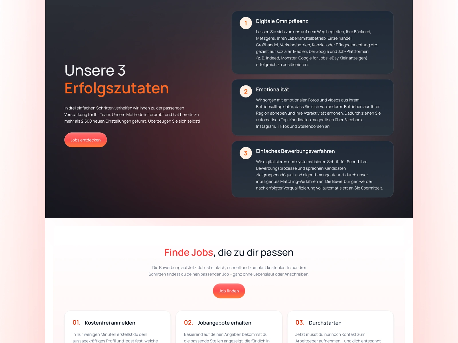
Dark Section
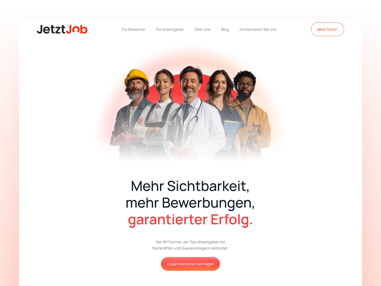
Hero Section
Content Pages
Features Sections
UX Decisions That Made a Difference
One of the biggest issues was how overwhelming the content was. There were pages that just felt like walls of text. I focused on building in natural scanning patterns, with clear hierarchy, visual grouping, and smart white space to make sure that anyone landing on a page could immediately see where they were and what to do next.
No flashy tricks - just good structure, clarity, and breathing room.
Collaboration & Handoff
I worked directly with the CEO throughout the project. We kept feedback loops fast and focused - and his input helped ground a lot of the decisions in actual use cases.
Once the design was done, I handed everything off to their WordPress development team - complete with layout guidance, animation notes, and responsive states.
Outcome
The new design holds its own. It feels fresh and modern, but it’s still clearly JetztJob. The client was super happy with the outcome and said it was exactly what he had in mind - just “more polished and easier to use.”
What I’m most proud of is how I was able to keep the brand foundation intact - the same logo, same base palette - while still rebuilding everything around it to feel better, clearer, and a lot more professional.
Let me know if you’d like help turning this into a visual case study for Contra, or want an abbreviated version for a LinkedIn post or carousel.
Like this project
What the client had to say
Great job again. Thank you!
Eyüp Aramaz, Aramaz Digital
May 7, 2025, Client
Posted May 18, 2025
Redesigned 15+ pages from the ground up: cleaner layout, better UX, reworked content - all while keeping the original brand intact.
Likes
3
Views
236
Timeline
May 1, 2025 - May 7, 2025
Clients
Aramaz Digital