Built with Jitter
Hypernative • Reinventing Web3 Security UX
Daniel G Bright

Overview
Hypernative is a cybersecurity platform specializing in proactive threat detection for blockchain and Web3 applications. Their system monitors blockchain transactions in real-time to identify and prevent threats before they materialize. The goal of this project was to design a user-friendly interface that would allow security teams and blockchain developers to efficiently detect, analyze, and respond to threats with minimal friction.
Problem Statement
Before the redesign, Hypernative lacked a cohesive UX strategy, making it difficult for users to navigate their security insights and act on real-time alerts efficiently. The existing interface was complex, lacked prioritization in data presentation, and required a steep learning curve for new users. Our goal was to improve usability, enhance real-time alerting, and create a scalable system that would cater to both technical and non-technical users.
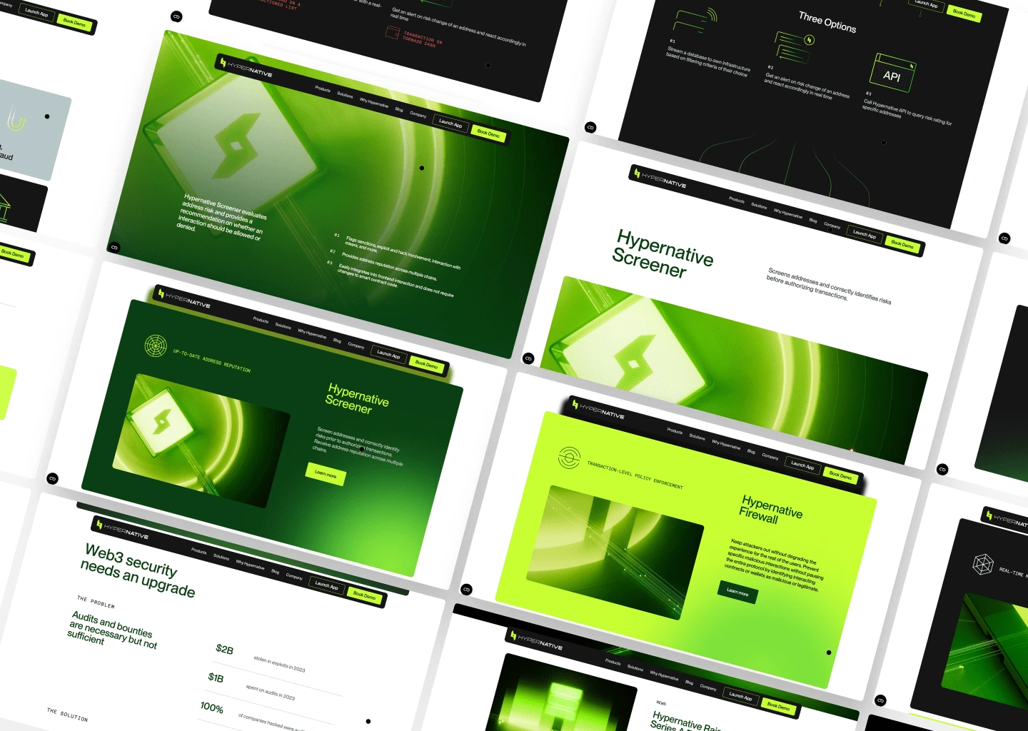
Thumbnail Image
Research & Discovery
To inform the design strategy, we conducted:
User Interviews: Spoke with security analysts, blockchain developers, and risk management professionals to understand their workflows and pain points.
Competitive Analysis: Reviewed similar platforms like Chainalysis and Forta to identify best practices and potential differentiators.
Usability Testing: Conducted sessions with existing users to pinpoint specific areas where they faced difficulties.
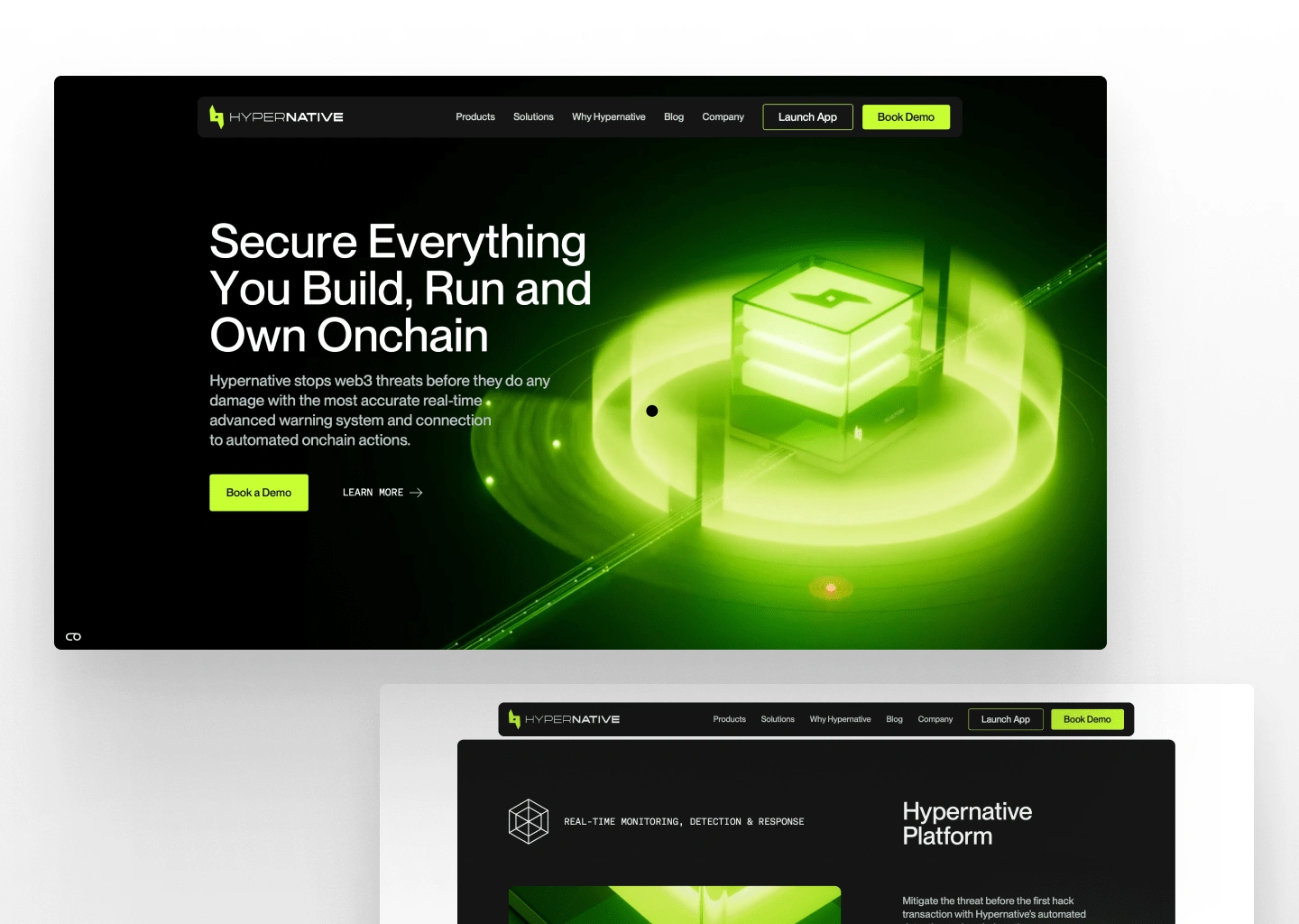
Homepage
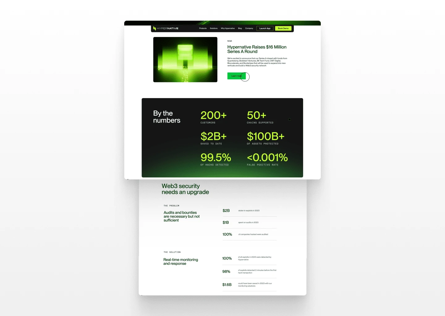
Some Numbers
Key Insights
Users needed clearer risk categorization to quickly assess the severity of a threat.
Real-time notifications had to be more actionable, reducing unnecessary noise while ensuring critical threats were never missed.
Many security teams required custom dashboards tailored to their unique risk profiles.
Blockchain developers needed more contextual explanations of alerts to speed up decision-making.
Design Approach
Our design strategy revolved around three pillars: Clarity, Actionability, and Scalability.
Clarity: We introduced a visual hierarchy that prioritized the most critical alerts and risk factors. A redesigned threat severity scale ensured that users could immediately gauge which alerts required urgent attention.
Actionability: Instead of static alerts, we created an interactive alerting system with actionable recommendations, historical context, and mitigation options directly integrated within the UI.
Scalability: We implemented a modular dashboard approach, allowing different teams to customize the interface based on their operational needs.
UI/UX Enhancements
Threat Intelligence Dashboard: Redesigned to display critical threats first, with color-coded severity indicators.
Event Timeline: Added a chronological view of security events for better context and investigation workflows.
Custom Alerts: Enabled users to define specific triggers and escalation protocols.
Dark Mode & Accessibility Improvements: Optimized contrast ratios and typography for readability.
Integration-Friendly Design: Ensured seamless integration with security tools like SIEMs and custom APIs.
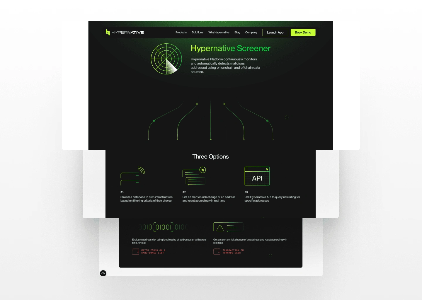
Screener
Challenges & Solutions
Reducing Alert Fatigue: Many security platforms overwhelm users with excessive alerts. We tackled this by implementing an intelligent filtering system that categorized threats based on impact and recurrence patterns.
Balancing Technical Depth with Usability: While security professionals needed deep insights, non-technical users required simplified explanations. We introduced adaptive UI layers, allowing users to toggle between high-level summaries and detailed blockchain forensics.
Ensuring Real-Time Responsiveness: Given the fast-moving nature of blockchain security, we optimized the system for low-latency updates, ensuring alerts were delivered within milliseconds of detection.
Results & Impact
Following the redesign:
Threat detection response time improved by 40%, as users could act on alerts more efficiently.
User retention increased by 30%, with improved onboarding and streamlined workflows.
Reduction in false positives by 25%, thanks to intelligent filtering and contextual recommendations.
Positive feedback from security teams, who reported a more intuitive experience with fewer unnecessary interruptions.
Conclusion
The Hypernative redesign successfully transformed the platform into a streamlined, intuitive, and actionable security solution for blockchain professionals. By focusing on clarity, actionability, and scalability, we ensured that users could proactively detect and mitigate risks with minimal friction. The platform is now positioned as a leading player in the blockchain security space, with a design that supports both rapid growth and evolving user needs.
Like this project
Posted Feb 4, 2025
Designing Hypernative’s platform to improve real-time threat detection, creating a more intuitive and friendly experience for security-conscious organizations.
Likes
15
Views
831
Timeline
Dec 1, 2024 - Ongoing
Clients
Hypernative