CRESTLEARN - Your Smart Personal Learning Companion

Kehinde Oyekanmi
1 collaborator


CrestLearn — Designing a Scalable Learning Experience Platform
Overview
CrestLearn is a digital learning experience platform created to empower agile professionals and training organizations with structured, practical learning journeys. As the Product Designer, I helped redesign the platform’s user experience to improve engagement, reduce admin friction, and position the product for B2B growth.
The Challenge
As CrestLearn began to grow, we recognized the need to introduce more features to solve real user pain points; from content accessibility to learner motivation and admin efficiency.
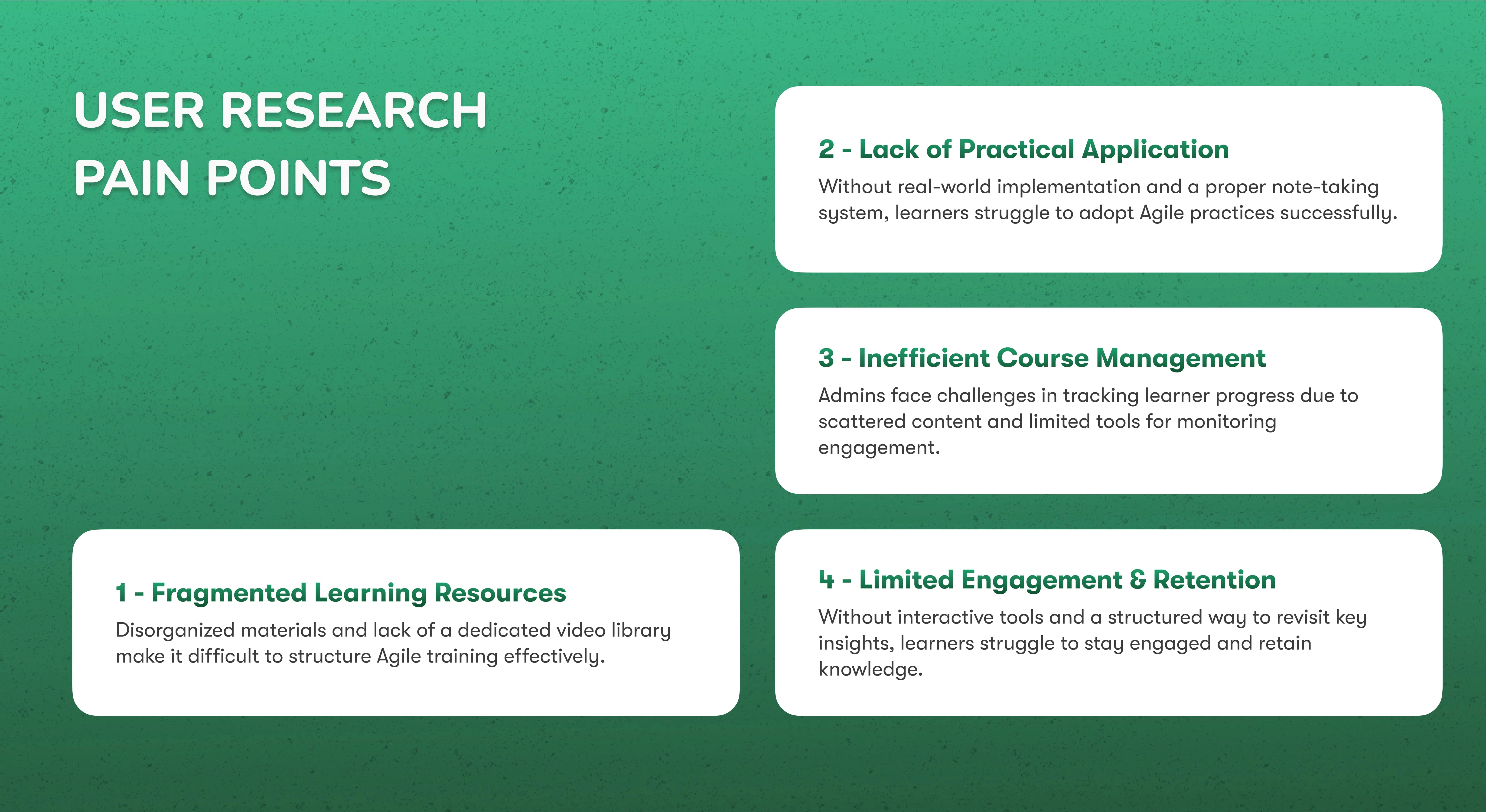
Summary of the Pain Points
Many of these features, like the video library, personal study notes, and gamified learning journeys, didn’t exist before. This presented a unique challenge: designing entirely new experiences from the ground up.
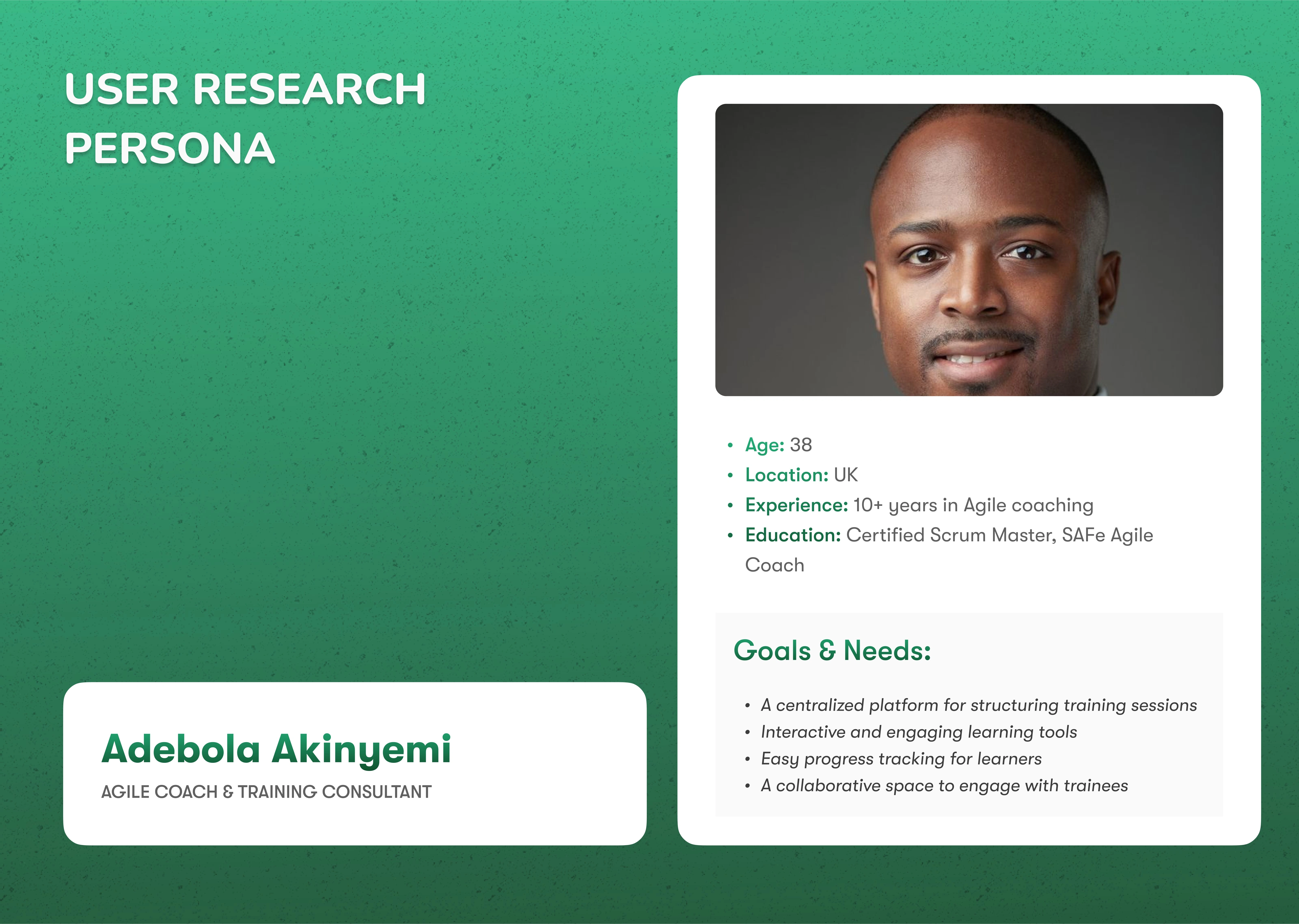
User Persona A
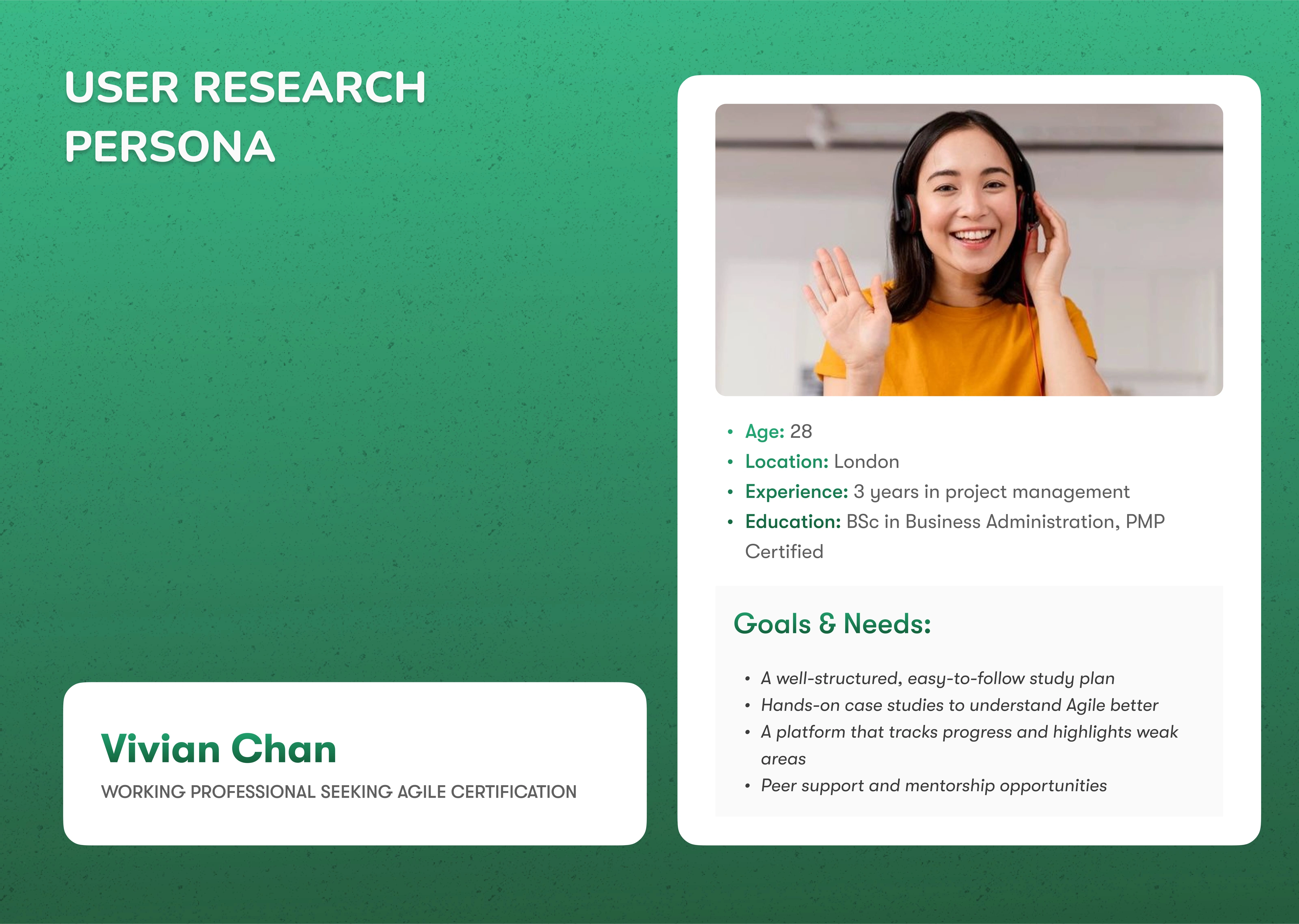
User Persona B
We had to ensure each feature was intuitive, aligned with user needs, and integrated seamlessly into the existing platform: all while maintaining a consistent, scalable design system. Balancing innovation with clarity became key to delivering features users could easily adopt and love.
Key Features & Why They Matter
As CrestLearn grew, we listened closely to users, analyzed their behavior, and introduced features that not only solved real problems but also shaped a richer, more engaging learning experience. Here’s how each one came to life:
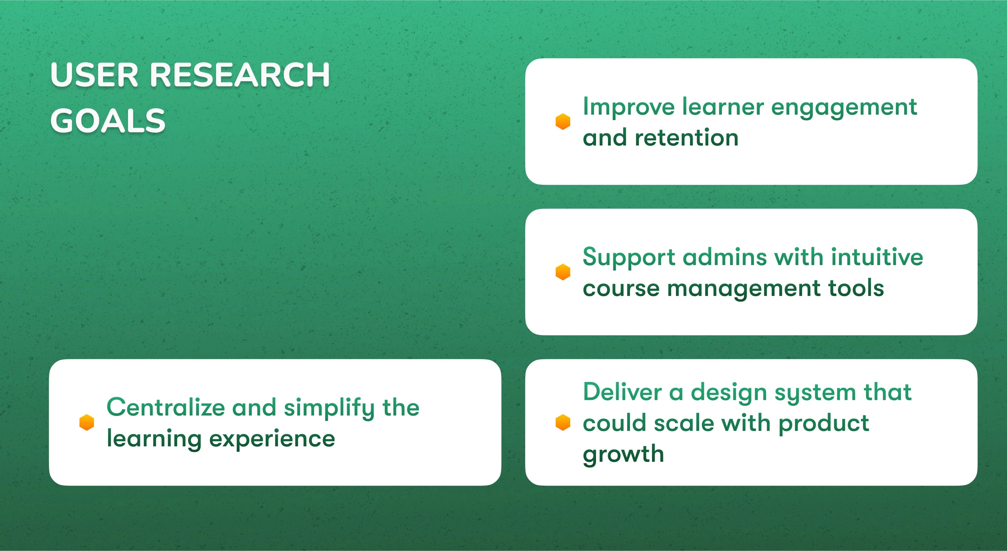
Summary of the Research Goals
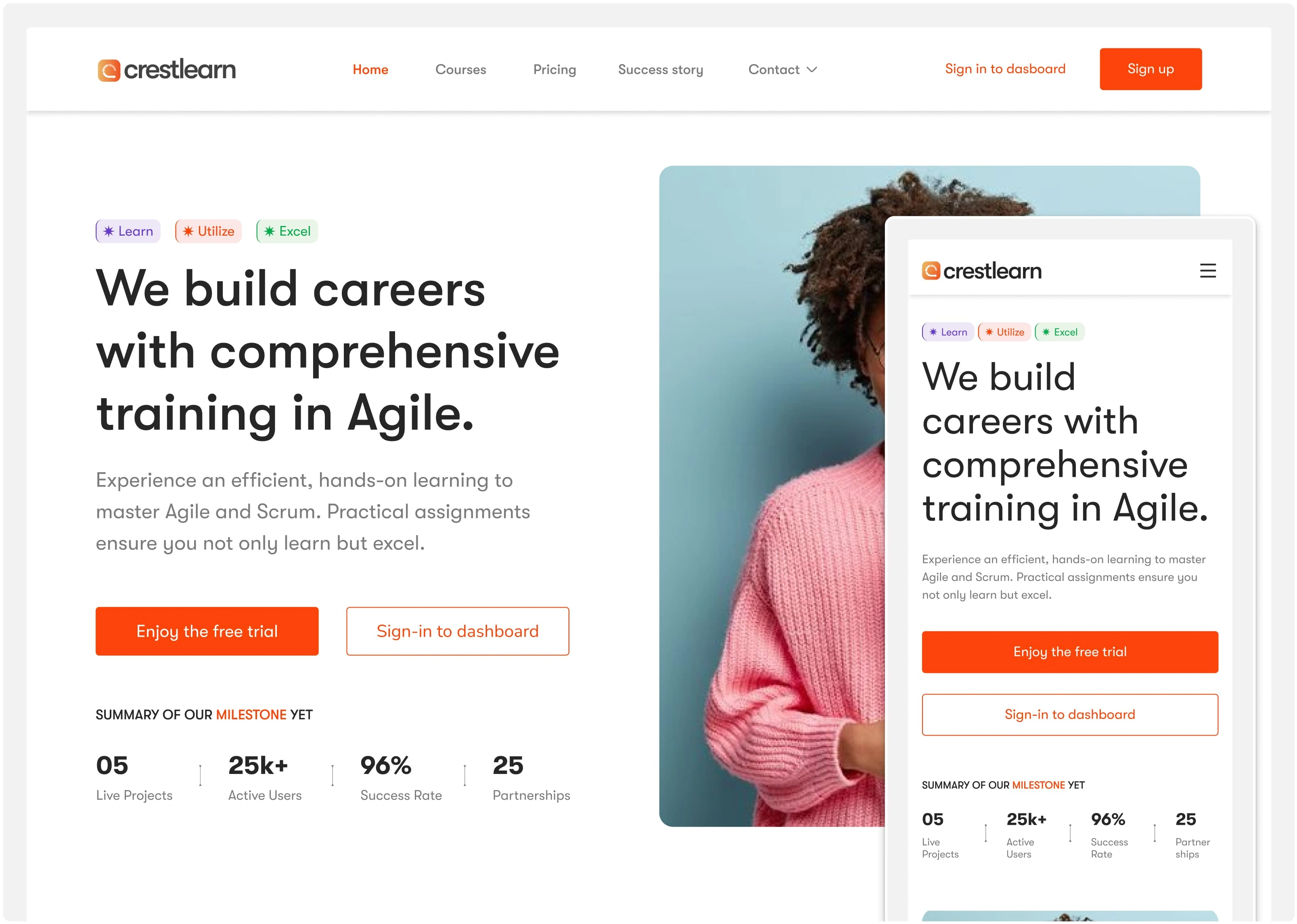
📊 Dashboard Updates
Why: Users needed a clearer overview of their learning progress and next actions.
How: Feedback showed confusion around what to do next. We redesigned the dashboard to surface key metrics, upcoming tasks, and personalized tips; reducing drop-off points.
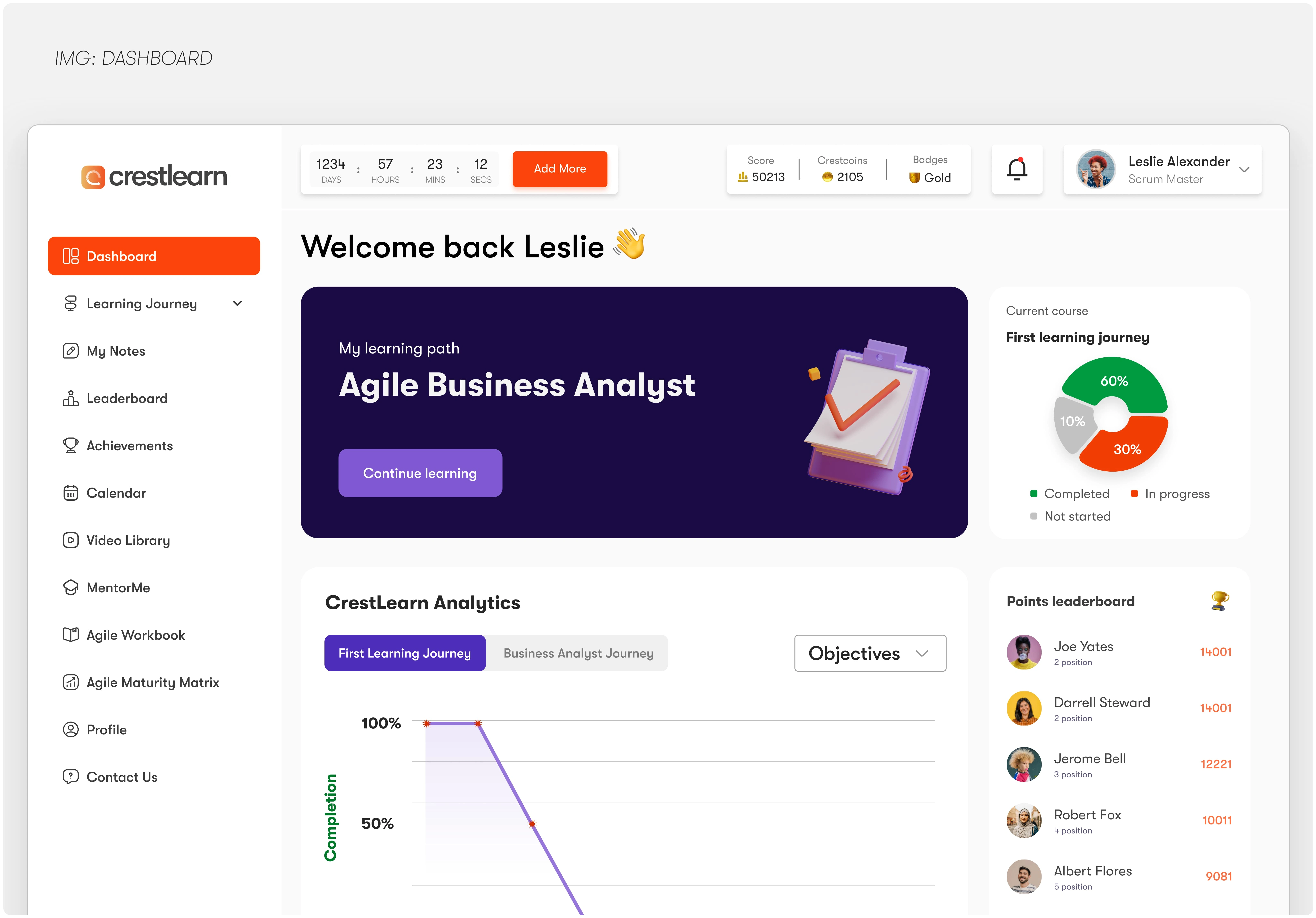
The Dashboard
📝 My Notes Updates
Why: Learners wanted to capture insights without leaving the platform.
How: After noticing learners were using external note tools, we upgraded the note-taking experience with autosave, tagging, and cross-device syncing; keeping everything in one place.
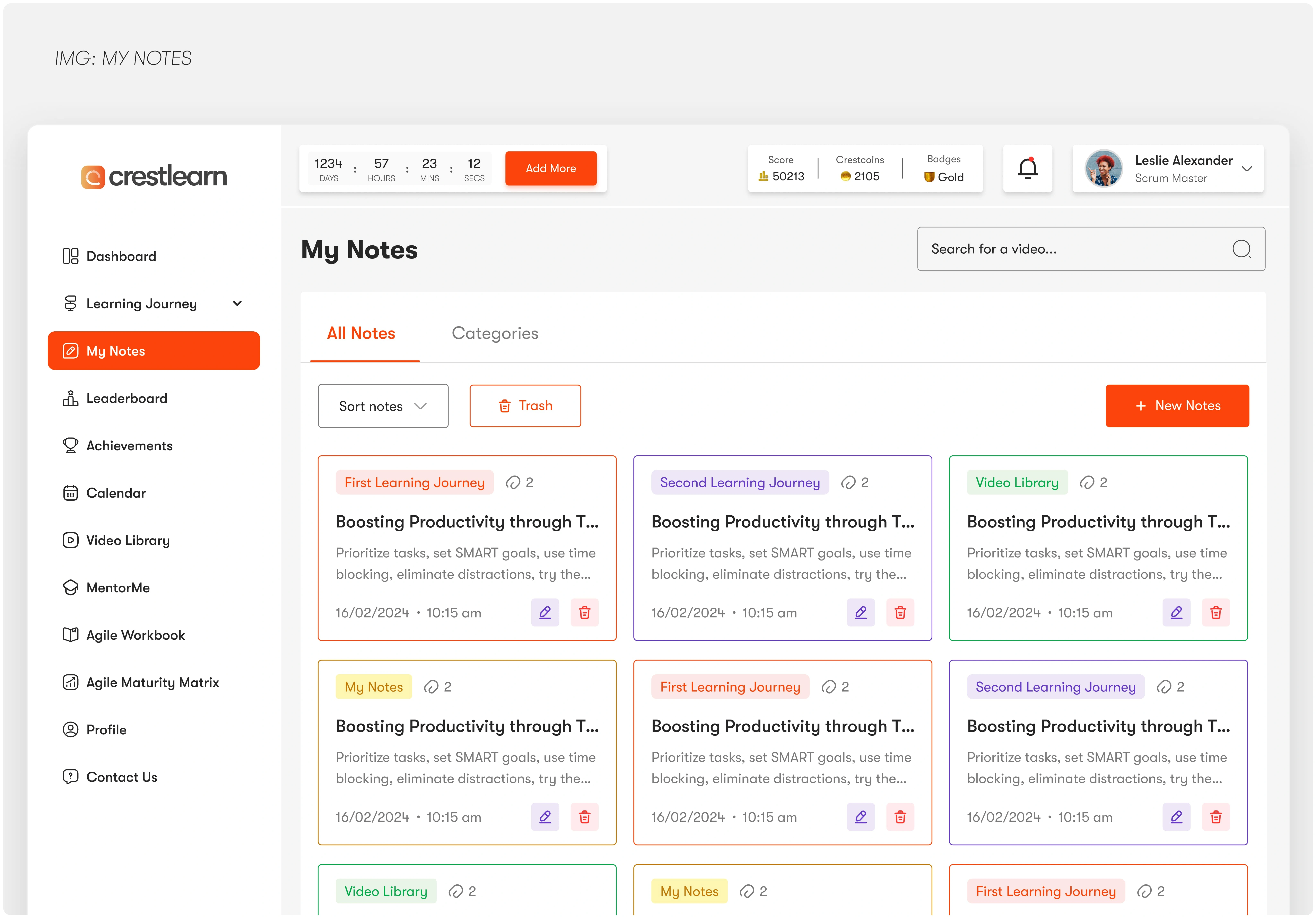
My Notes
🎯 Learning Journey
Why: There was no structured flow guiding users through a course.
How: We created a modular learning path feature that helped users see where they were, what’s next, and how far they’ve come; driving motivation and consistency.
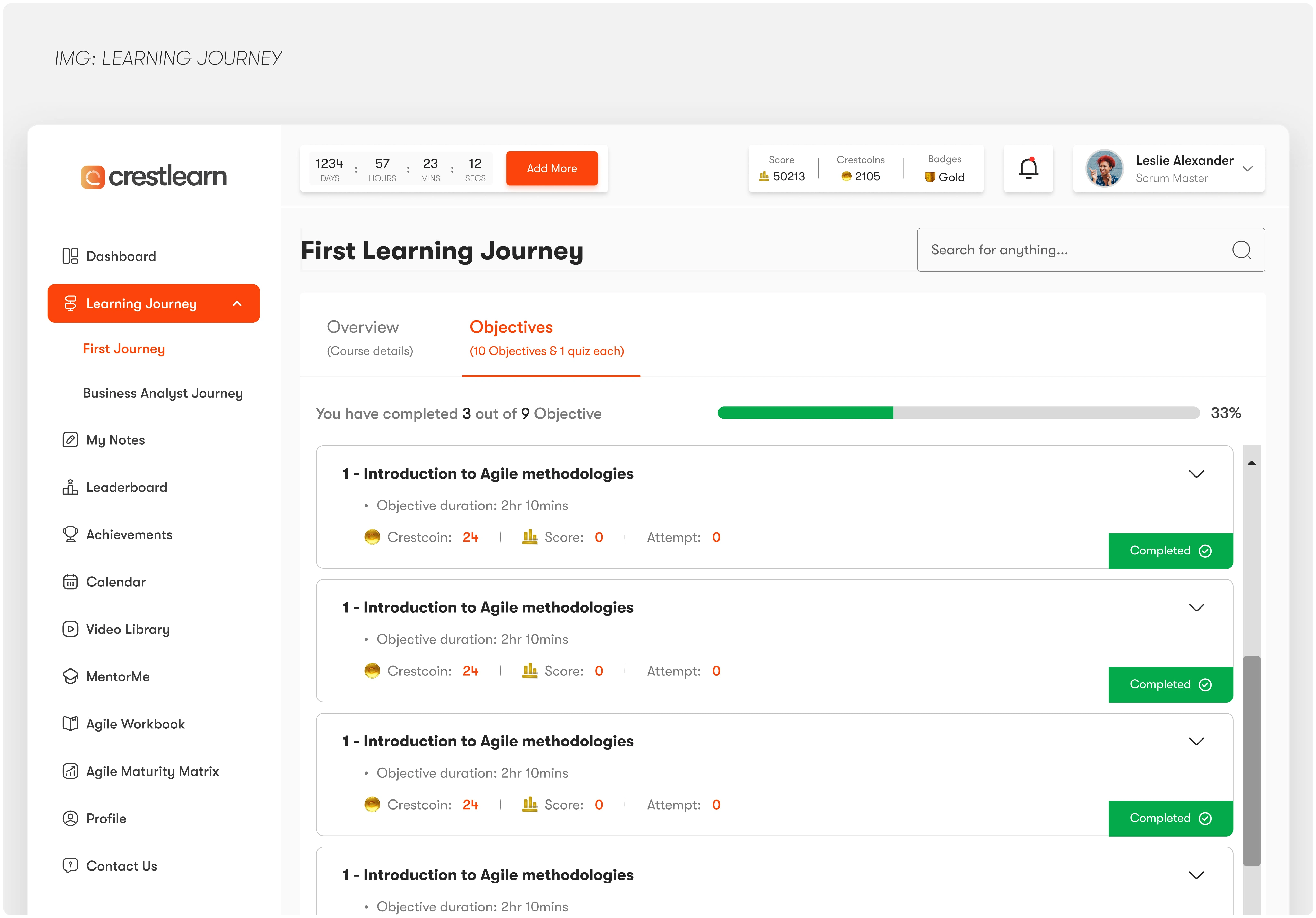
Learning Journey
🏆 Leaderboard Updates
Why: To spark friendly competition and boost engagement.
How: Engagement data revealed learners loved being recognized. We revamped the leaderboard with real-time updates, personalized ranks, and team-based challenges; driving a 30% spike in session time.
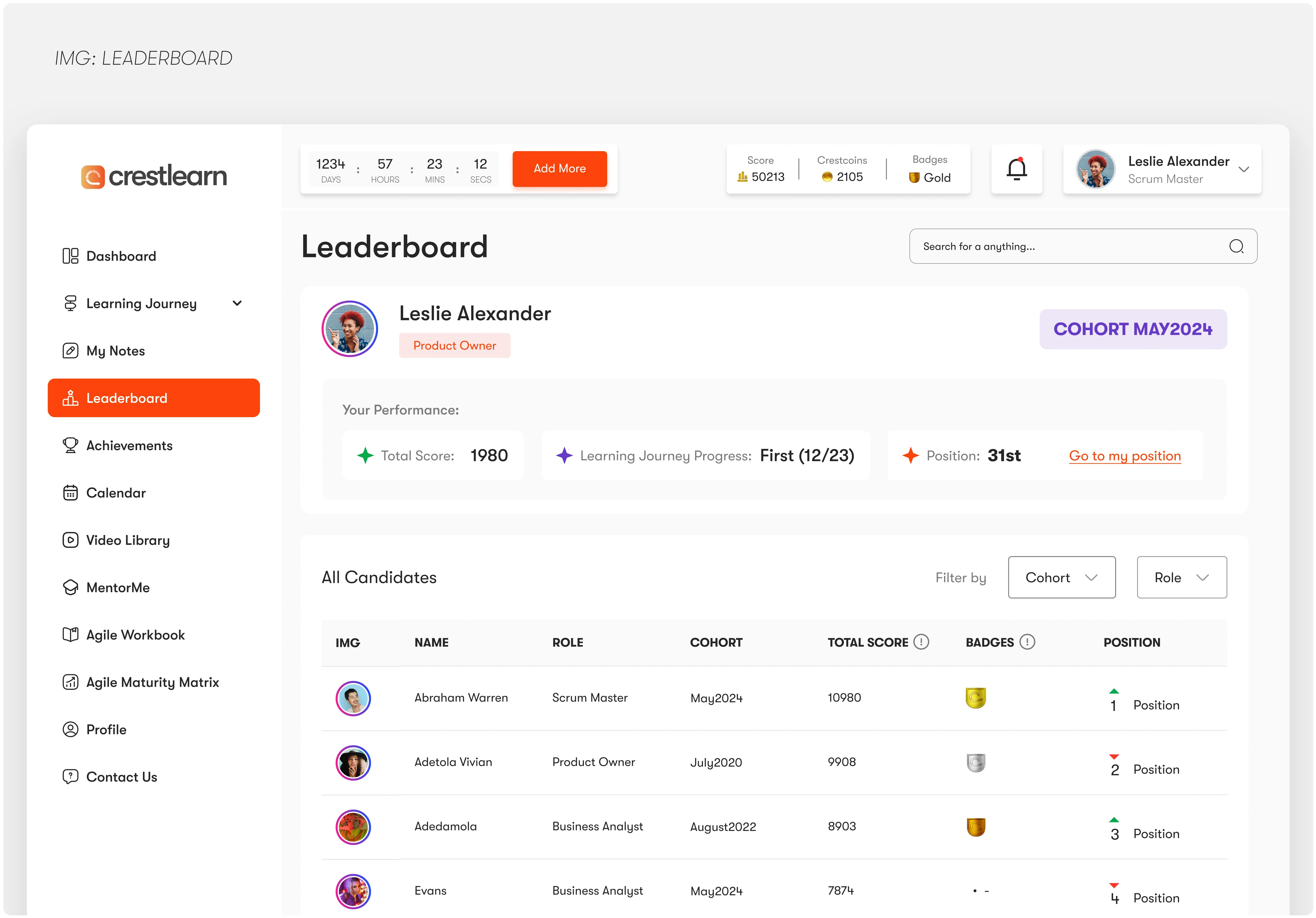
Leaderboard
🎓 Certification & Achievements
Why: Learners wanted proof of progress they could share or use professionally.
How: We added shareable certificates and achievement badges at key milestones, encouraging learners to stay committed and giving them something to be proud of all their learning path.
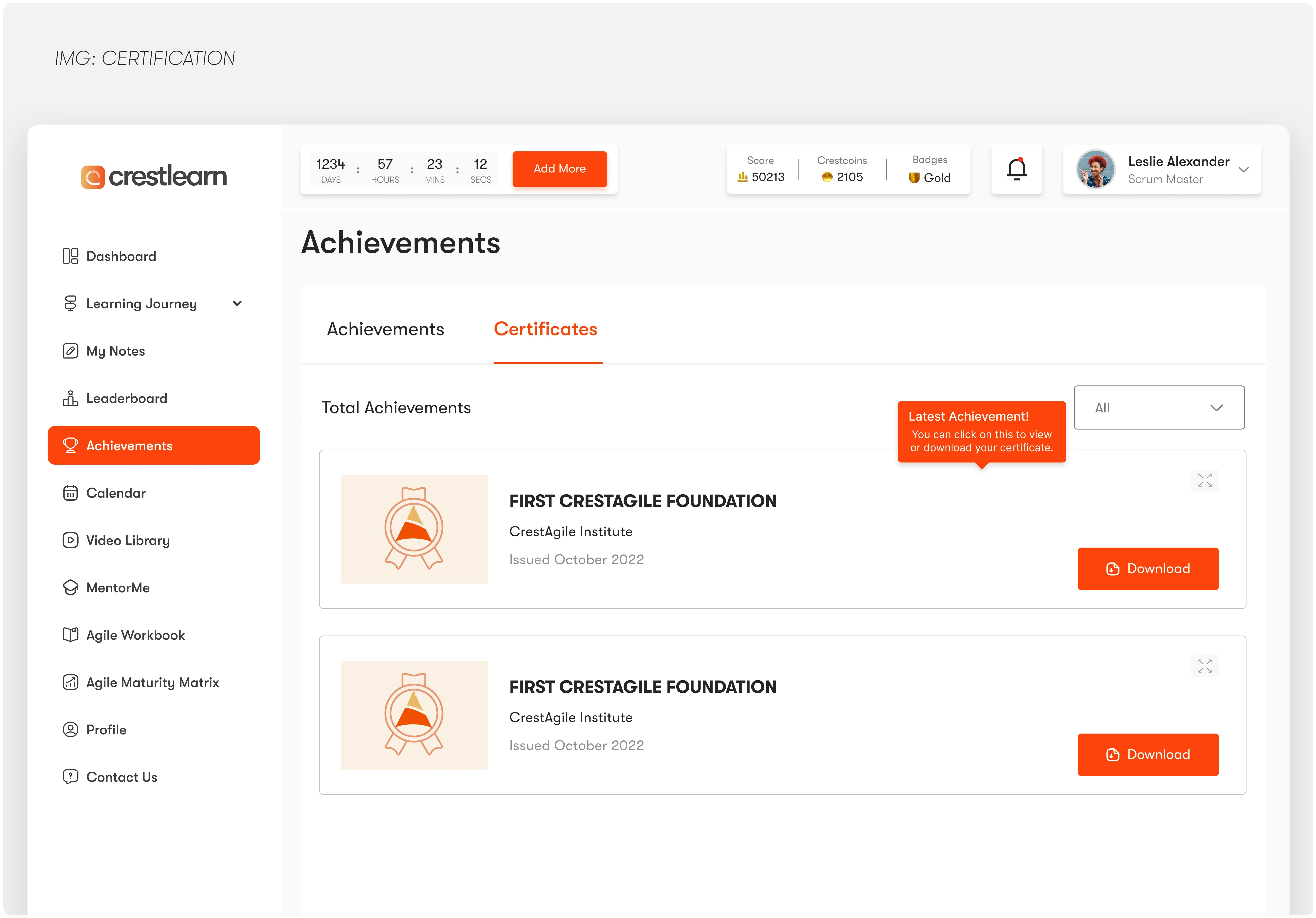
Learner Journey Certification
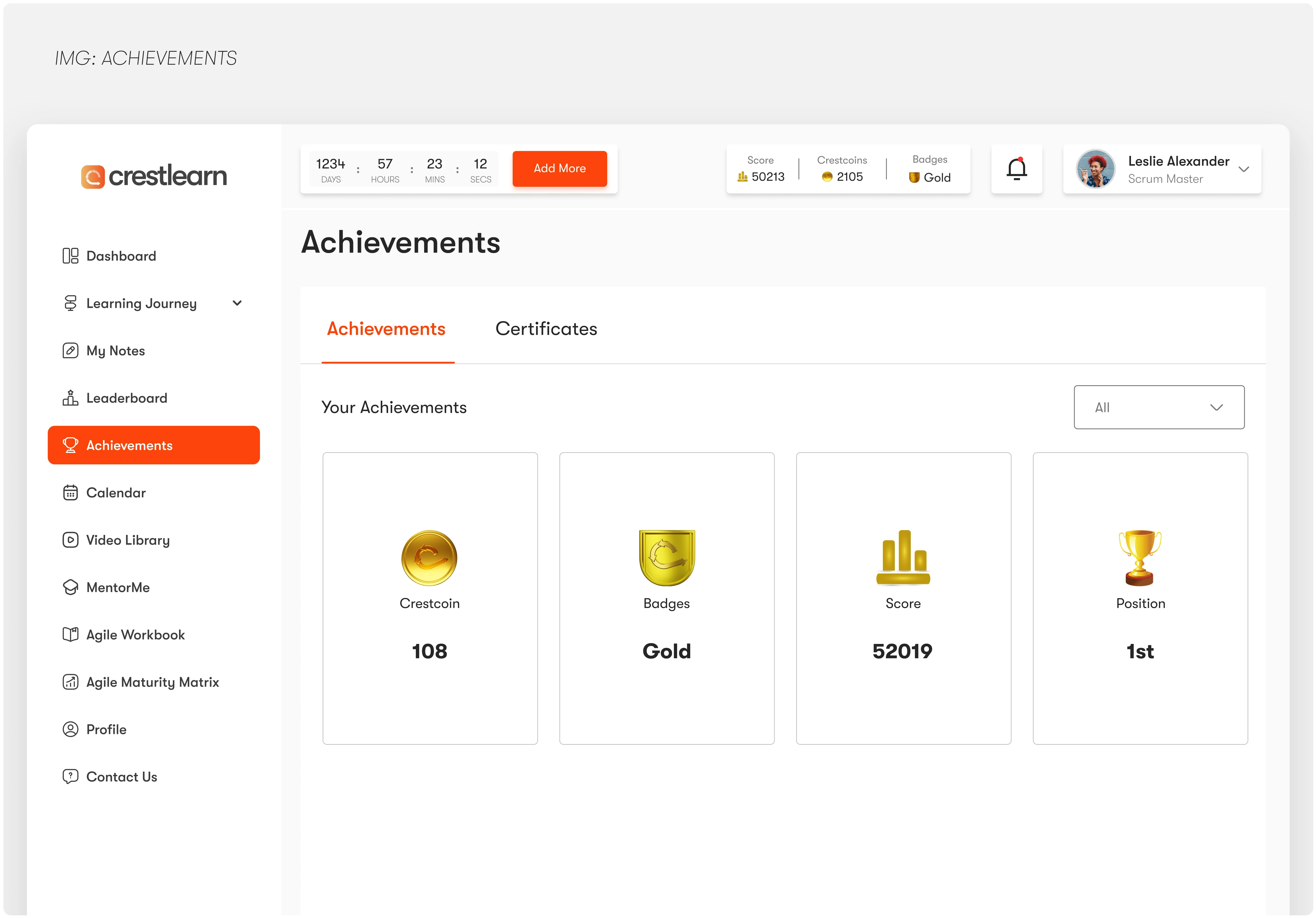
Students Learning Achievements
🎥 Video Library
Why: Learners needed an easy way to revisit core lessons, especially for self-paced learning and revision.
How: After noticing repeated requests for “lesson videos” and on-demand access, we introduced a dedicated Video Library; organized, searchable, and equipped with playback history and downloadable resources to support flexible learning.
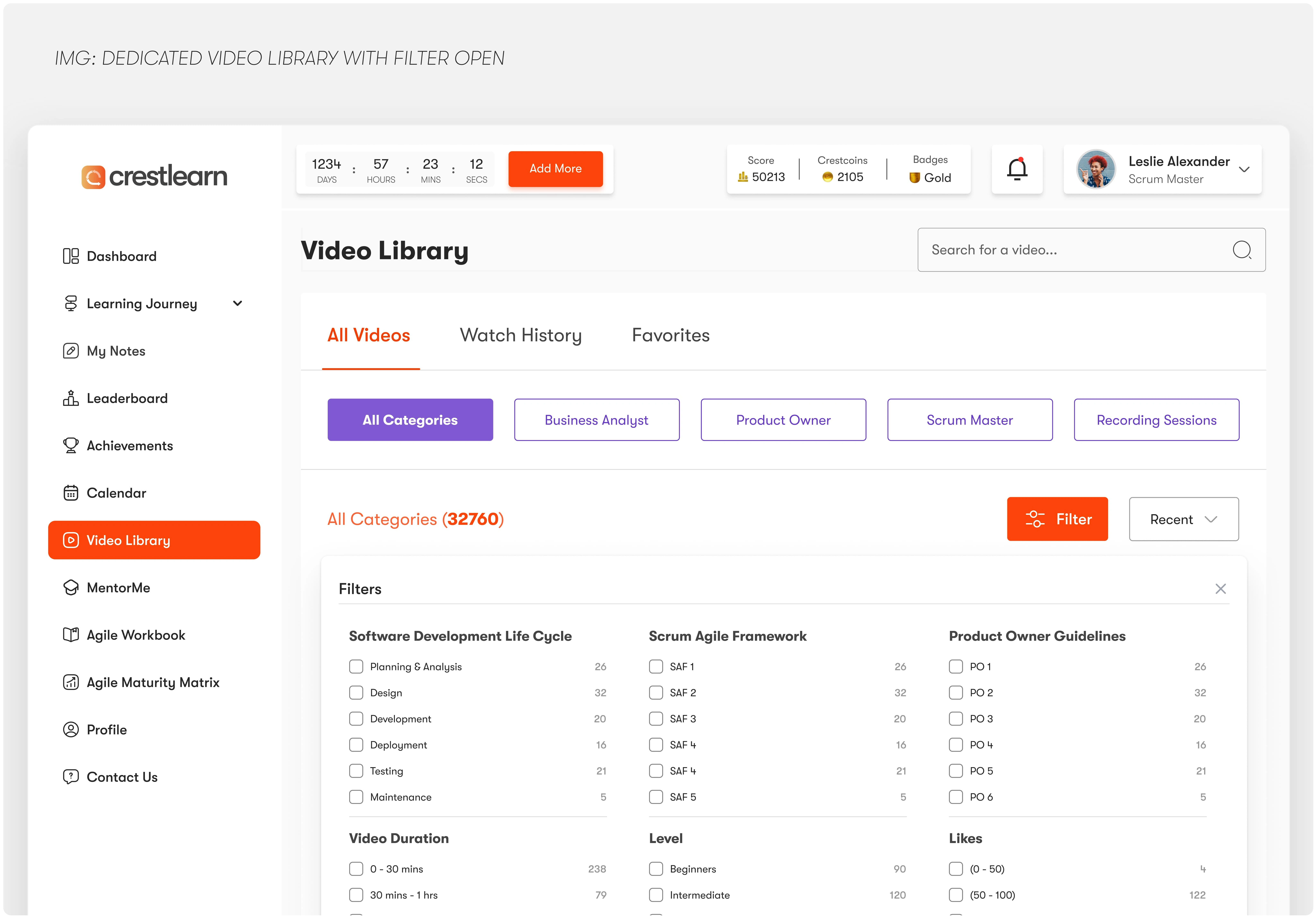
Video Library with Filter opened
🧠 CV Refinement with AI
Why: Learners needed practical, career-focused support beyond just courses.
How: After interviews with users exploring job options, we integrated an AI-powered CV assistant to offer tailored, actionable feedback — helping learners connect learning with real opportunities.
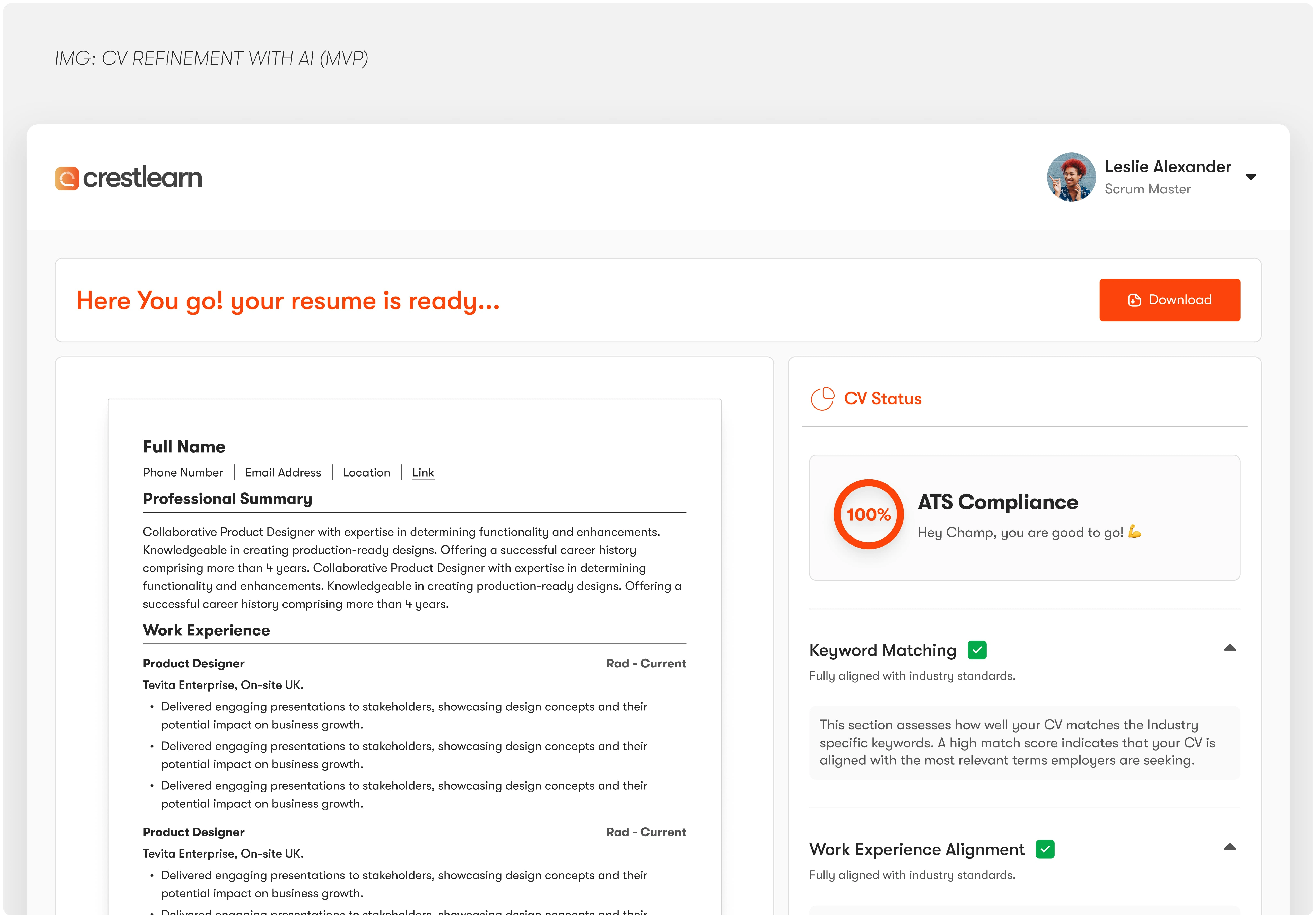
cv Refinement with AI (MVP)
💬 Chat Feature
Why: Learners wanted instant support and connection with peers and mentors.
How: We built a contextual chat system directly into learning screens, allowing for quick questions, support requests, and real-time interaction with facilitators.
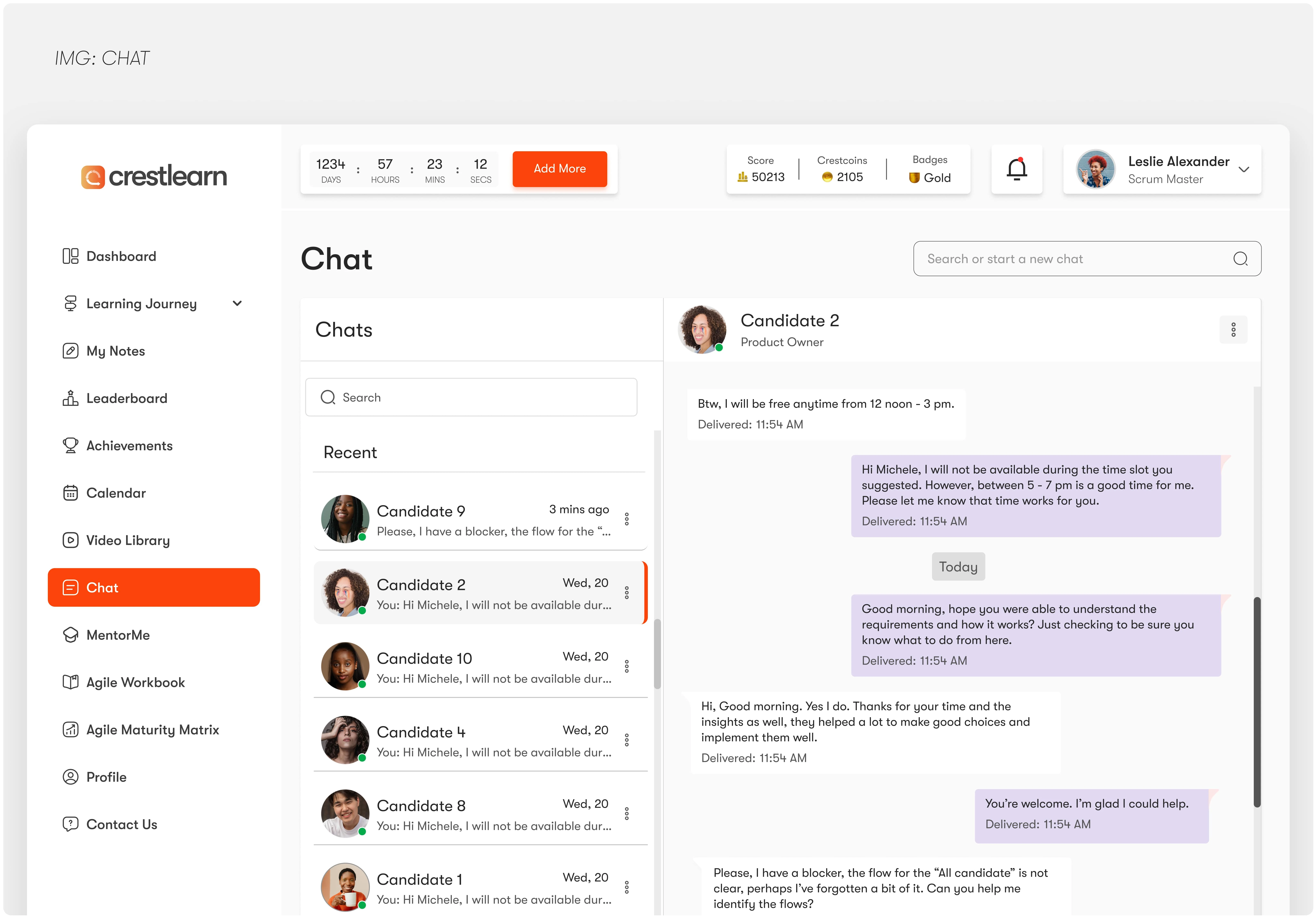
Chat Feature
✨ The Outcome
Our design efforts led to meaningful improvements across user engagement, admin efficiency, and product perception:
35% boost in learner engagement within the first 2 months of launching the new features.
Course completion rates increased by 40%, thanks to structured learning journeys, motivation-driven design (leaderboards, achievements), and intuitive navigation.
Admin task completion time was cut in 50%, following the streamlined dashboard updates and improved user flow.
User satisfaction scores rose by 50%, reflecting the impact of personalized experiences like My Notes, CV Refinement, and in-app chat.
Attracted new B2B clients, as the enhanced experience positioned CrestLearn as a modern, scalable learning solution.
Key Learnings
Designing for Scalability Matters Early
As new features rolled out, we saw how early design choices either helped or hindered scalability. Planning for growth from the start made future iterations smoother.
User Feedback is Gold
Some of our best features (like the Video Library and Notes) came directly from consistent user requests. Listening closely helped us design what people actually needed—not what we assumed.
Balance Between Functionality and Simplicity
With a growing list of features, keeping the experience intuitive was a challenge. It taught us the importance of information hierarchy, visual clarity, and prioritizing usability over flash.
Cross-Team Collaboration Fuels Better Solutions
Working closely with developers, content teams, and support made the product more cohesive. The earlier we collaborated, the fewer reworks needed later.
More screens from CrestLearn
Like this project
Posted Apr 12, 2025
Crestlearn empowers self-taught individuals to build new skills with structured learning paths, progress tracking, and motivation to stay consistent.
Likes
2
Views
9
Timeline
Jun 22, 2021 - May 22, 2025
Collaborators


Gumble UX Redesign – Guest-Facing Website for a Restaurant.
MyEdVault - Learning for Better Experiences
UX Audit & Redesign for Gumble Restaurant Admin Dashboard
Personal Study Coach; A System That Drives Student Study Focus