MyEdVault - Learning for Better Experiences

Kehinde Oyekanmi


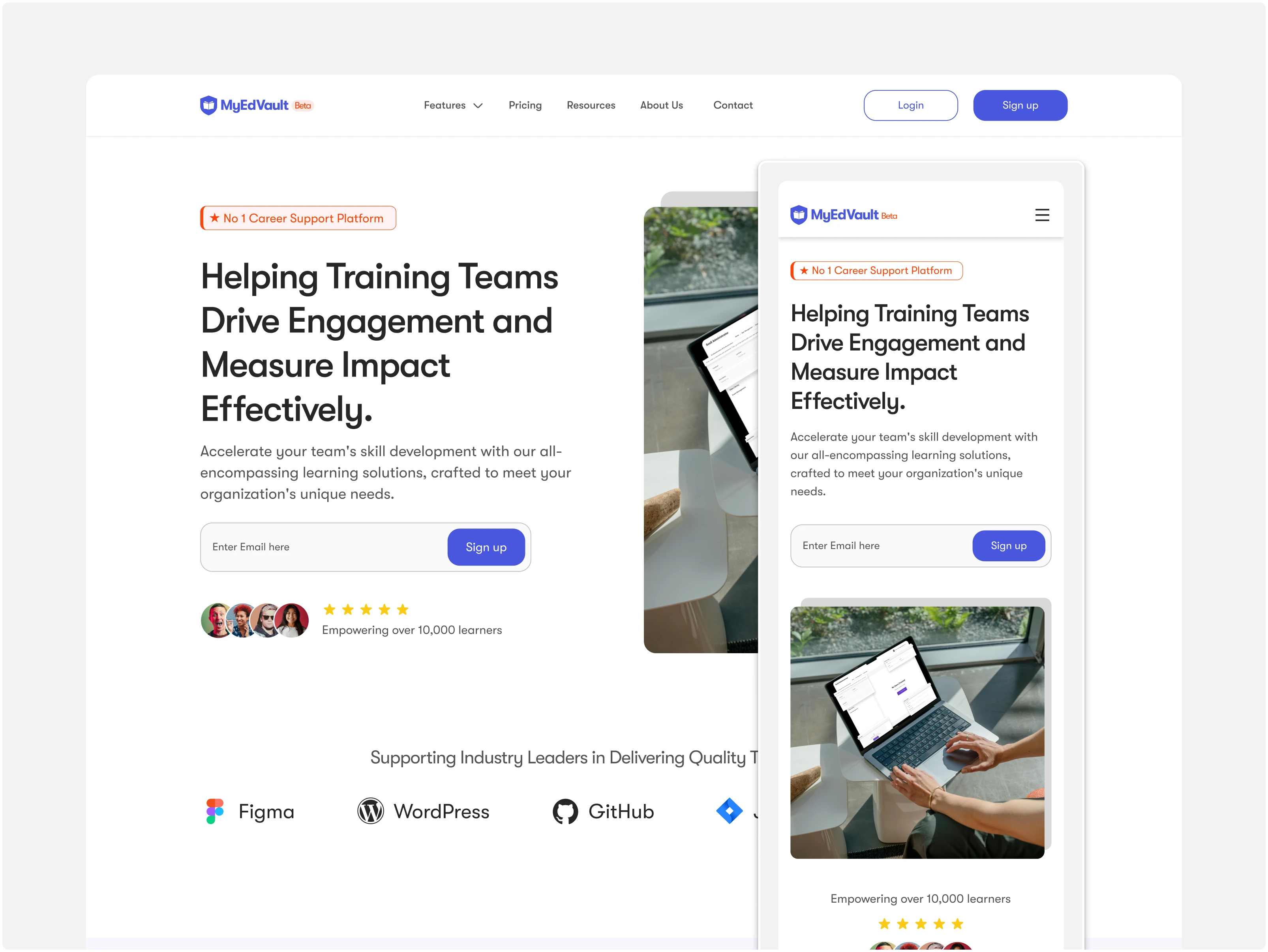
The Landing Page
Designing a Smarter Learning Experience
Overview
MyEdVault is a digital platform built to help training organizations streamline learning delivery while supporting learners through personalized, goal-driven study tools. From course libraries to notes and event tracking, it combines multiple learning resources into one cohesive experience.
Identifying the Core Problems
Through research and stakeholder interviews, we uncovered four key challenges affecting both training organizations and learners:
1. Fragmented Learning Experience
Learners and admins rely on multiple disconnected tools, causing confusion and inefficiency.
2. Low Learner Engagement
Motivation and course completion rates suffer due to lack of structure, feedback, and clear progress indicators.
3. Complex Admin Interfaces
Administrators struggle with cluttered dashboards and non-intuitive navigation, leading to wasted time and errors.
4. Limited Insight into Learner Progress
Both admins and facilitators lack clear visibility into learner activity, performance, and growth.
What We Set Out to Do
Our goal was to design a learning platform that simplifies complexity, motivates learners, and scales with the needs of training organizations. We focused on:
1. Creating a unified experience
Bringing all learning tools and resources into one intuitive, cohesive platform.
2. Empowering admins with simplicity
Making it easy to manage learners, track progress, and organize content without friction.
3. Encouraging learner consistency
Introducing thoughtful UX patterns and light gamification to build better study habits.
4. Designing for scalability
Building a flexible system architecture that could grow as the product and user base expanded.
Understanding the Users
We conducted interviews and reviewed competing platforms to identify what mattered most to our core user groups. The insights shaped our strategy:
1. Learners craved structure and motivation
They wanted a clearer learning path and tools to help them stay consistent and accountable.
2. Admins needed simplicity
Most were overwhelmed by complex systems. They wanted something intuitive — not another tool that required training to use.
3. Everyone valued speed and clarity
Both learners and admins expected fast access to content with minimal friction or clutter.
UX Challenges & How We Solved Them
1. Fragmented Learning Journey
Learners had to jump between tools and tabs to find what they needed.
Solution: We designed a unified learner dashboard that brings together notes, courses, events, and videos — all in one accessible place.
2. Admin Confusion
Admins struggled with cluttered interfaces and repetitive tasks.
Solution: We redesigned the admin panel with streamlined navigation, bulk actions, and visual tracking tools to simplify daily workflows.
3. Low Learner Motivation
Many users dropped off due to lack of progress feedback or incentives.
Solution: We introduced gamified elements like streaks, badges, and progress bars to encourage consistent engagement.
Design Process: Following the SDLC Framework
Requirement Gathering
I started by speaking with the platform’s founder and stakeholders to understand business goals. Then I interviewed potential users; both learners and admins to uncover their day-to-day frustrations and must-haves.
Key Insights:
Learners needed motivation, structure, and access to organized content
Admins wanted a clean, easy-to-use dashboard without technical overwhelm
Everyone wanted a platform that "just works" without a steep learning curve
System Analysis
I studied competitors (like LMS tools and study platforms) to spot opportunities. Combined with user insights, I defined the core user flows and functional requirements for both roles — learner and admin.
This phase helped validate:
Which features to prioritize
What the MVP should look like
The best way to segment the platform’s features for each user group
Design
I translated our findings into wireframes, user flows, and finally, high-fidelity UI designs — all supported by a consistent design system. Every screen was carefully considered to reduce friction and promote ease of use.
Highlights:
Modular course cards,
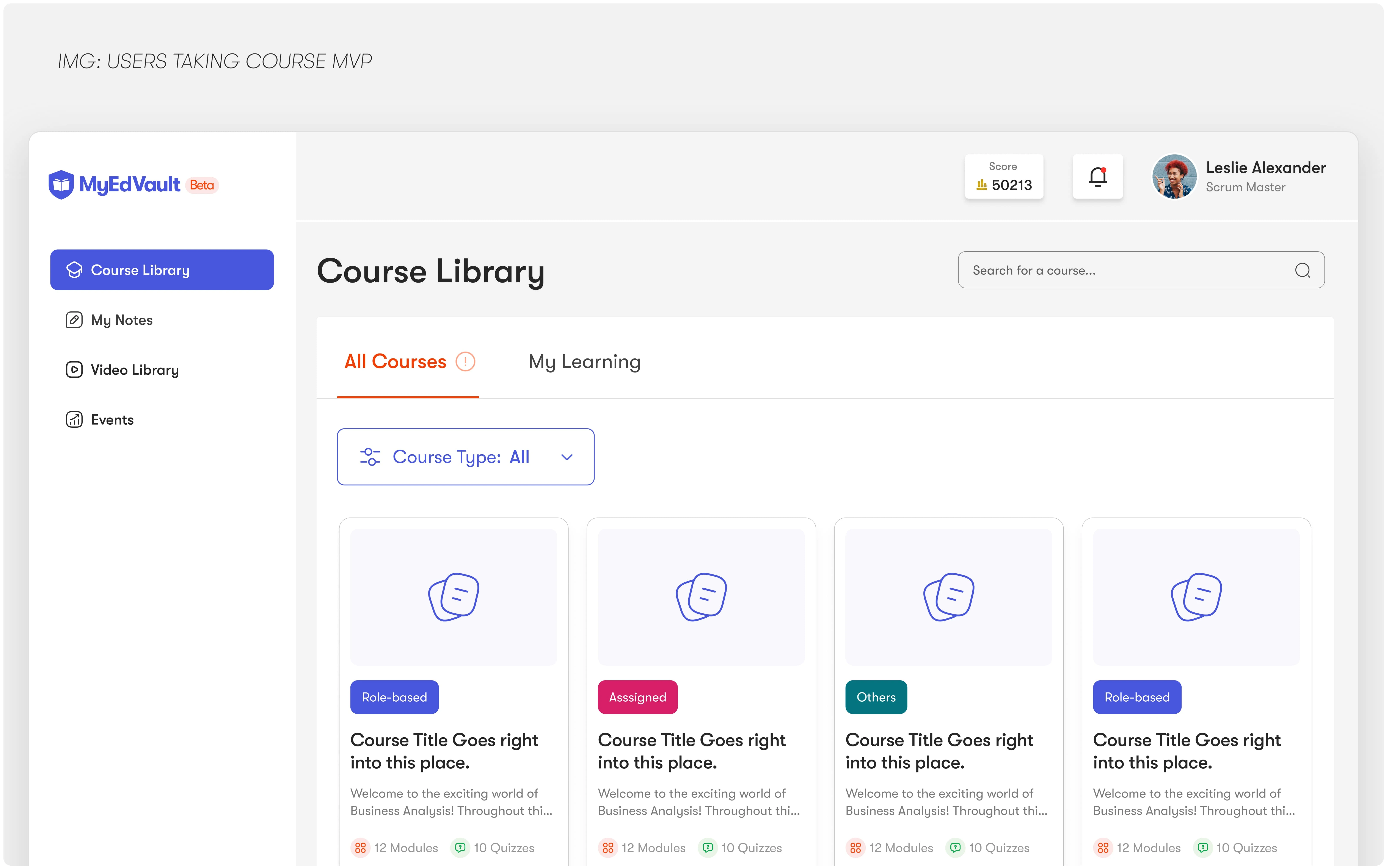
Customized Course Library
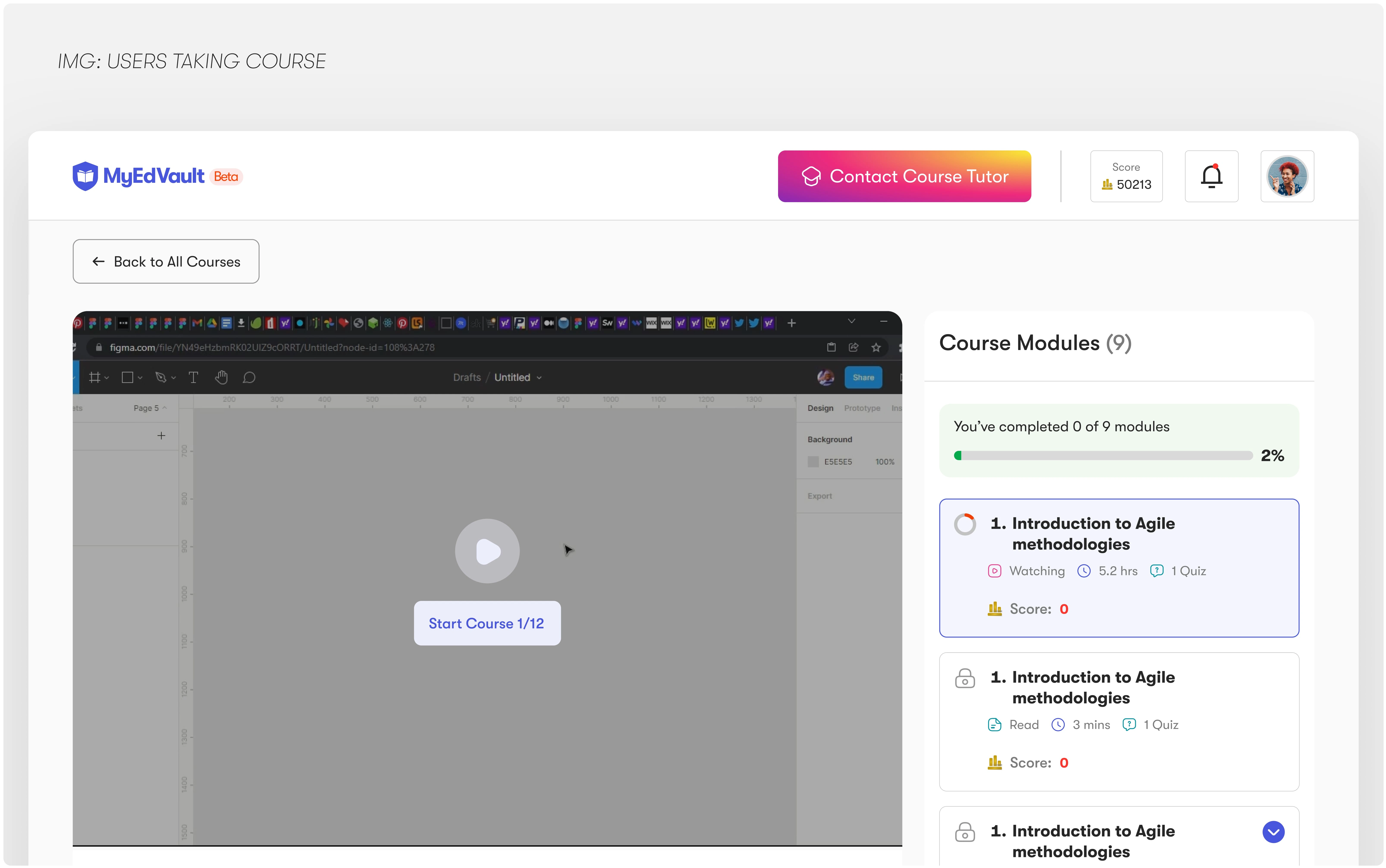
Learners Start Course
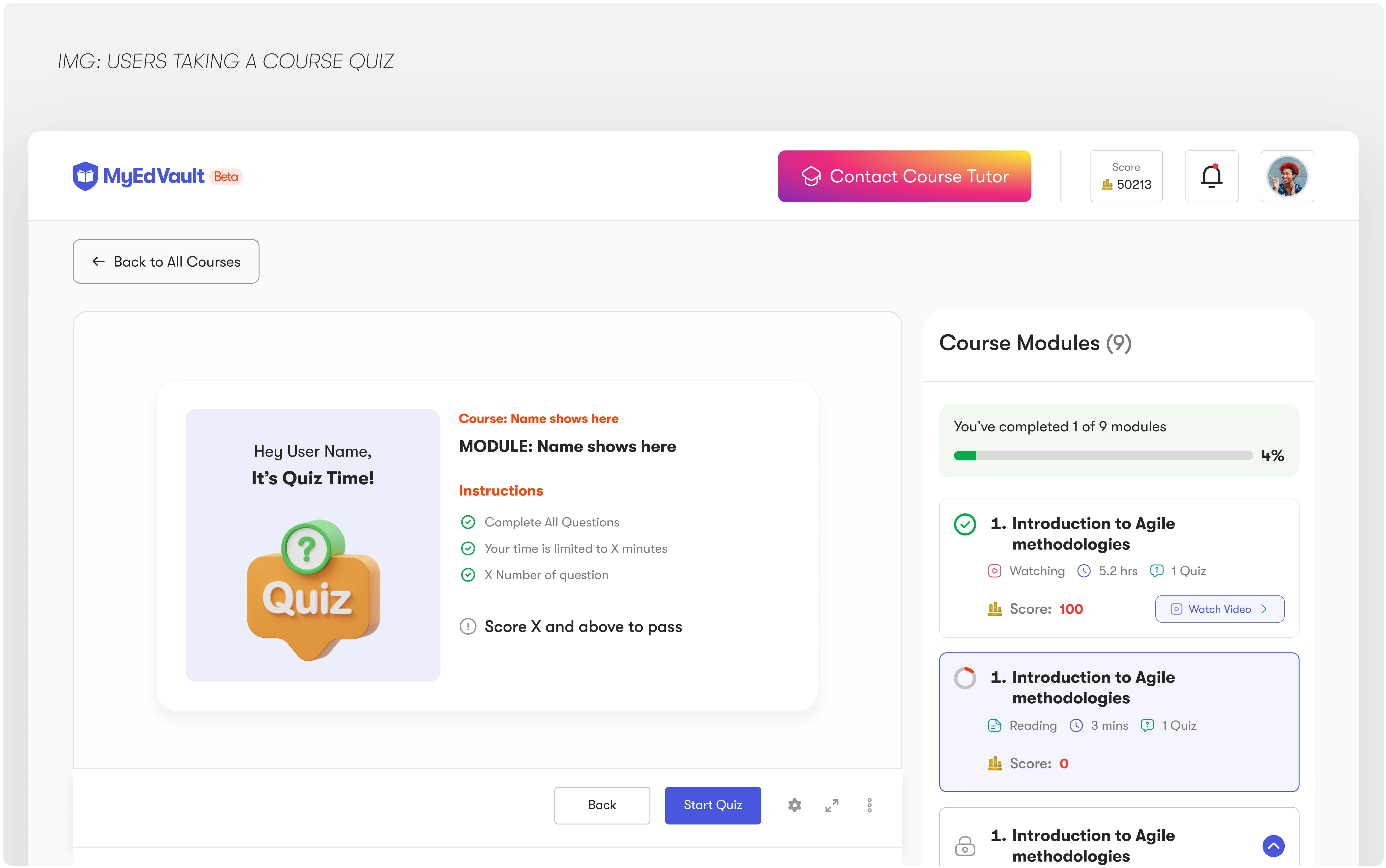
Learners Take Quiz
Video library,
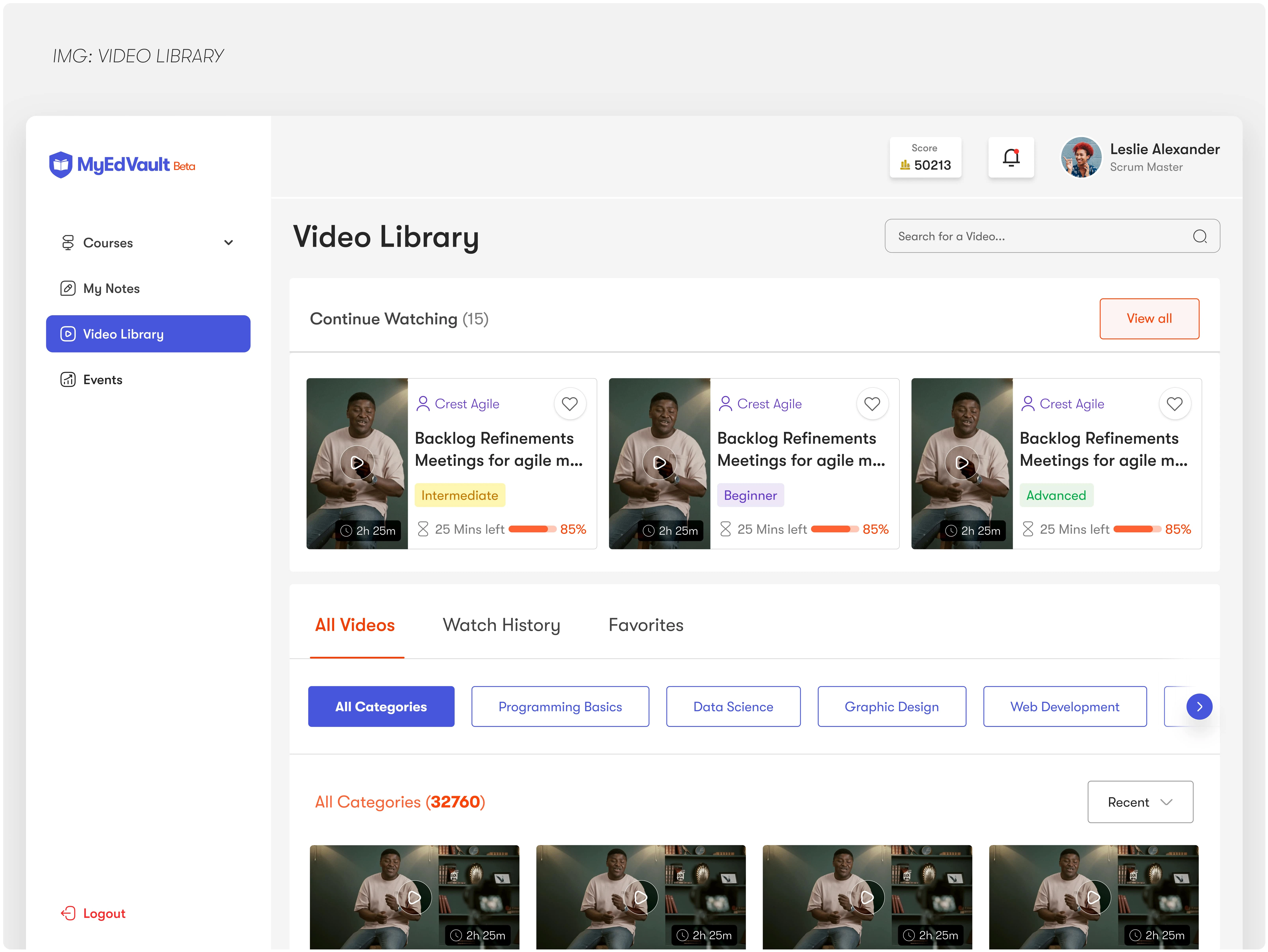
Video Library
Note-taking tools
A reimagined admin dashboard with clear status indicators and progress tracking
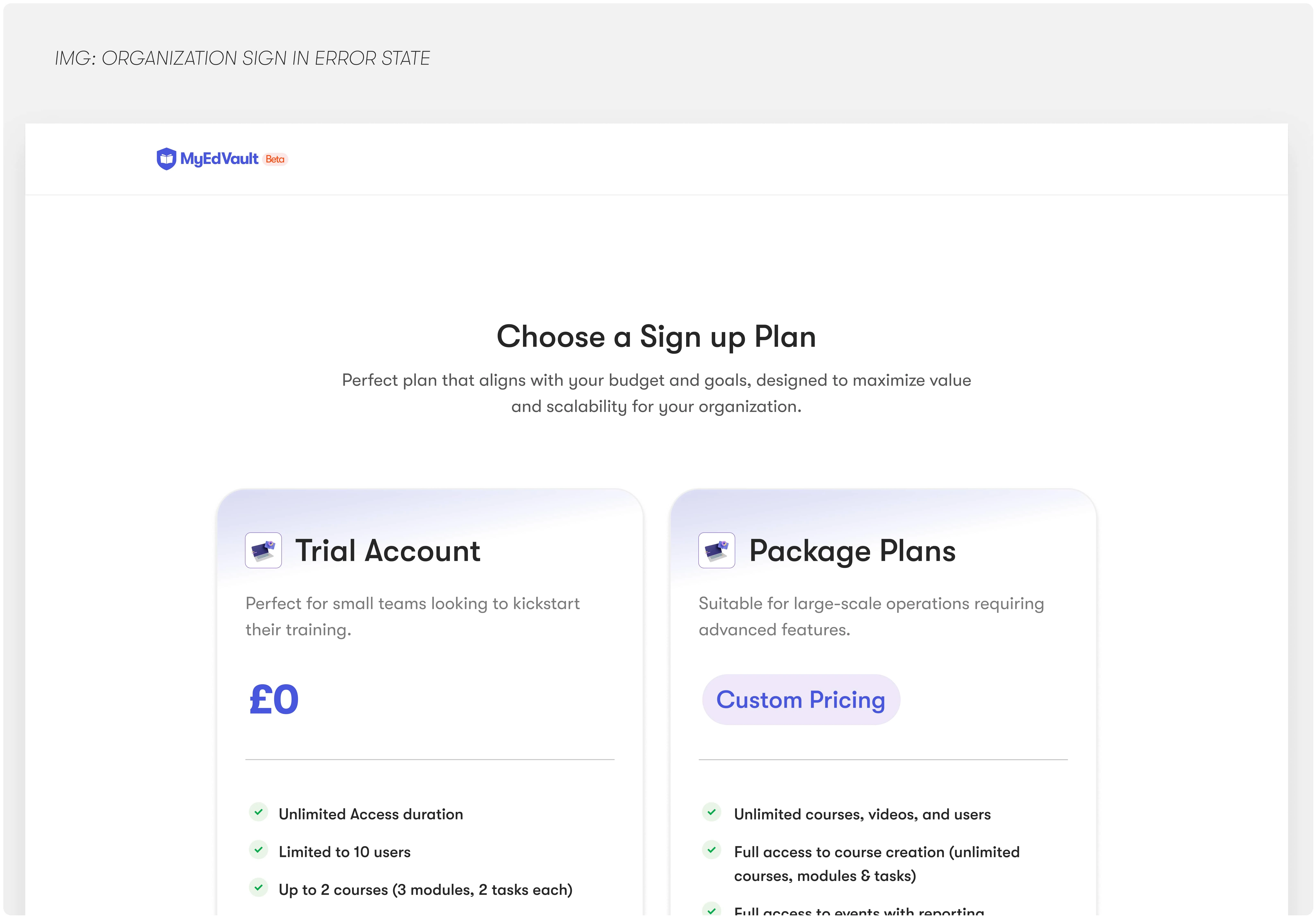
Organization choosing Plans MVP
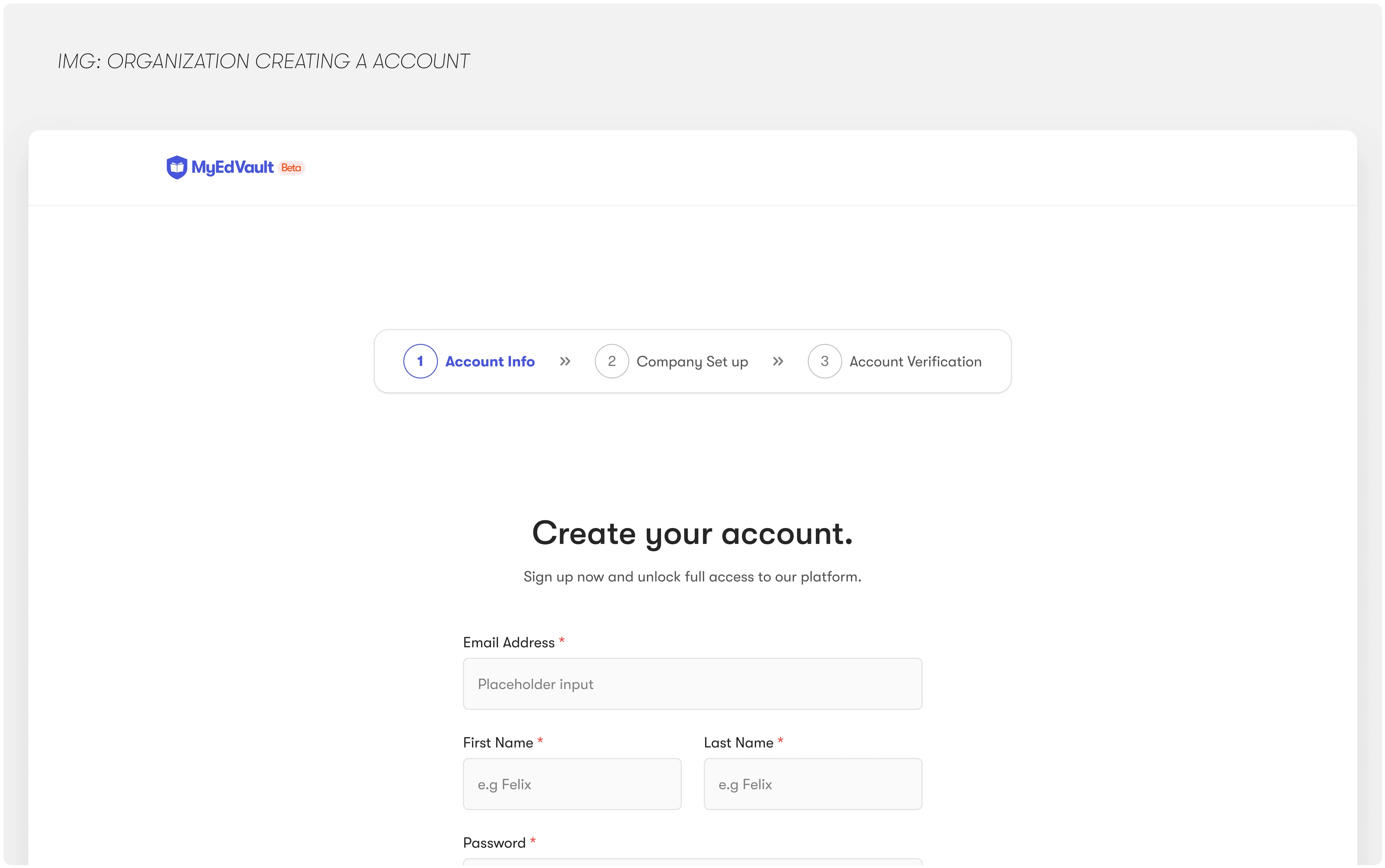
Create an Account With MyEdVault
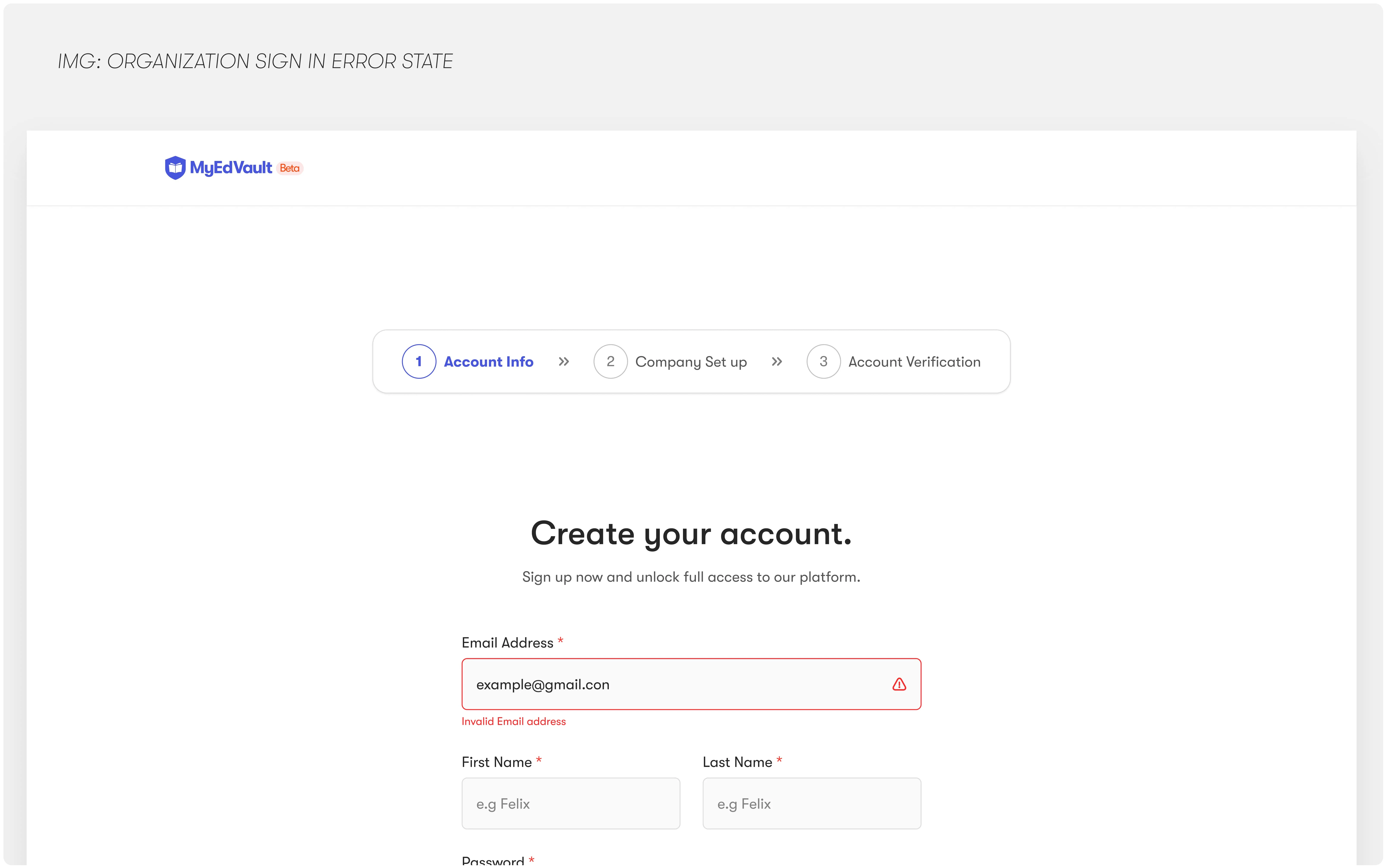
Invalid Image Address Error
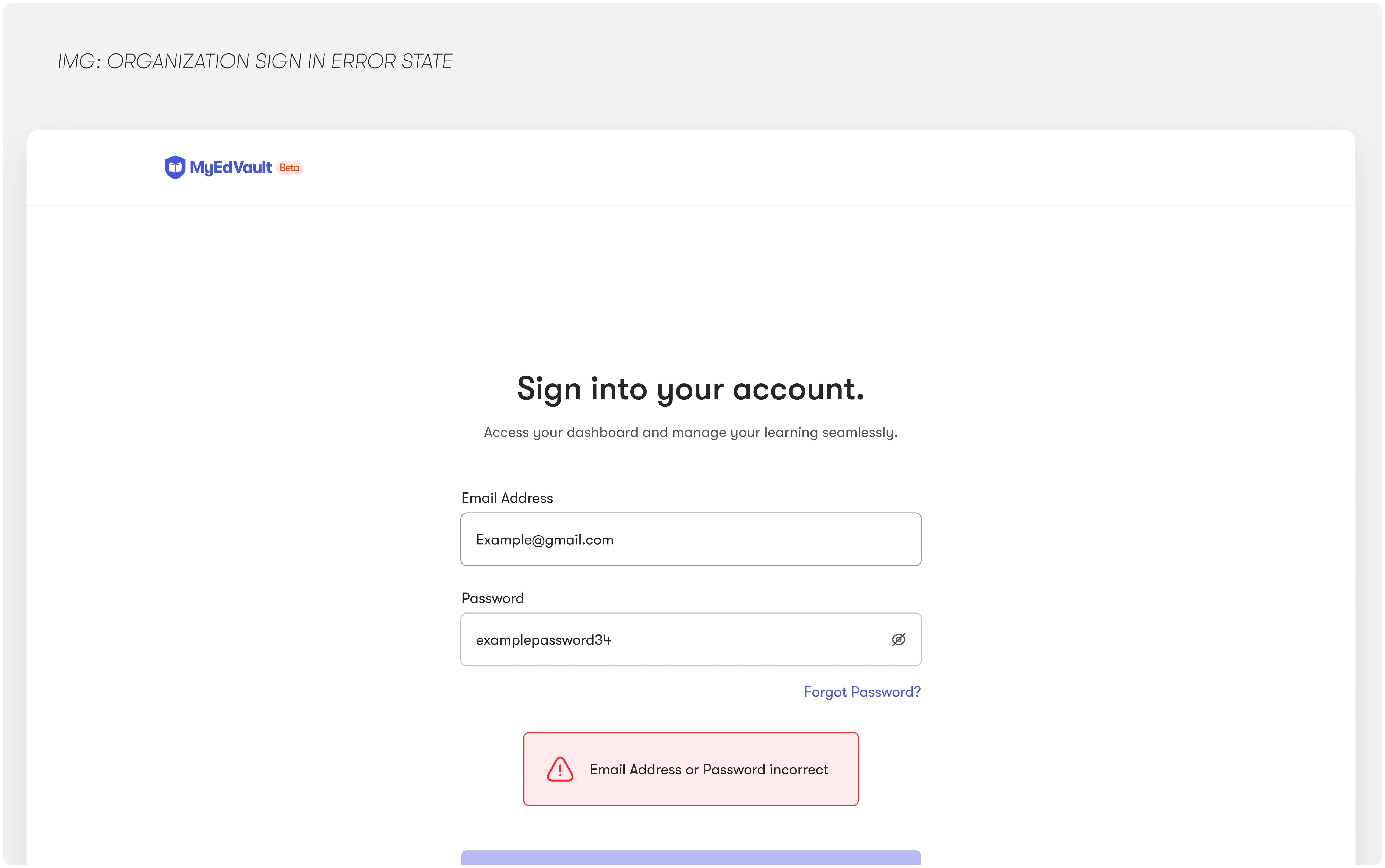
Generic Error Message for Data/Hacker Vulnerability.
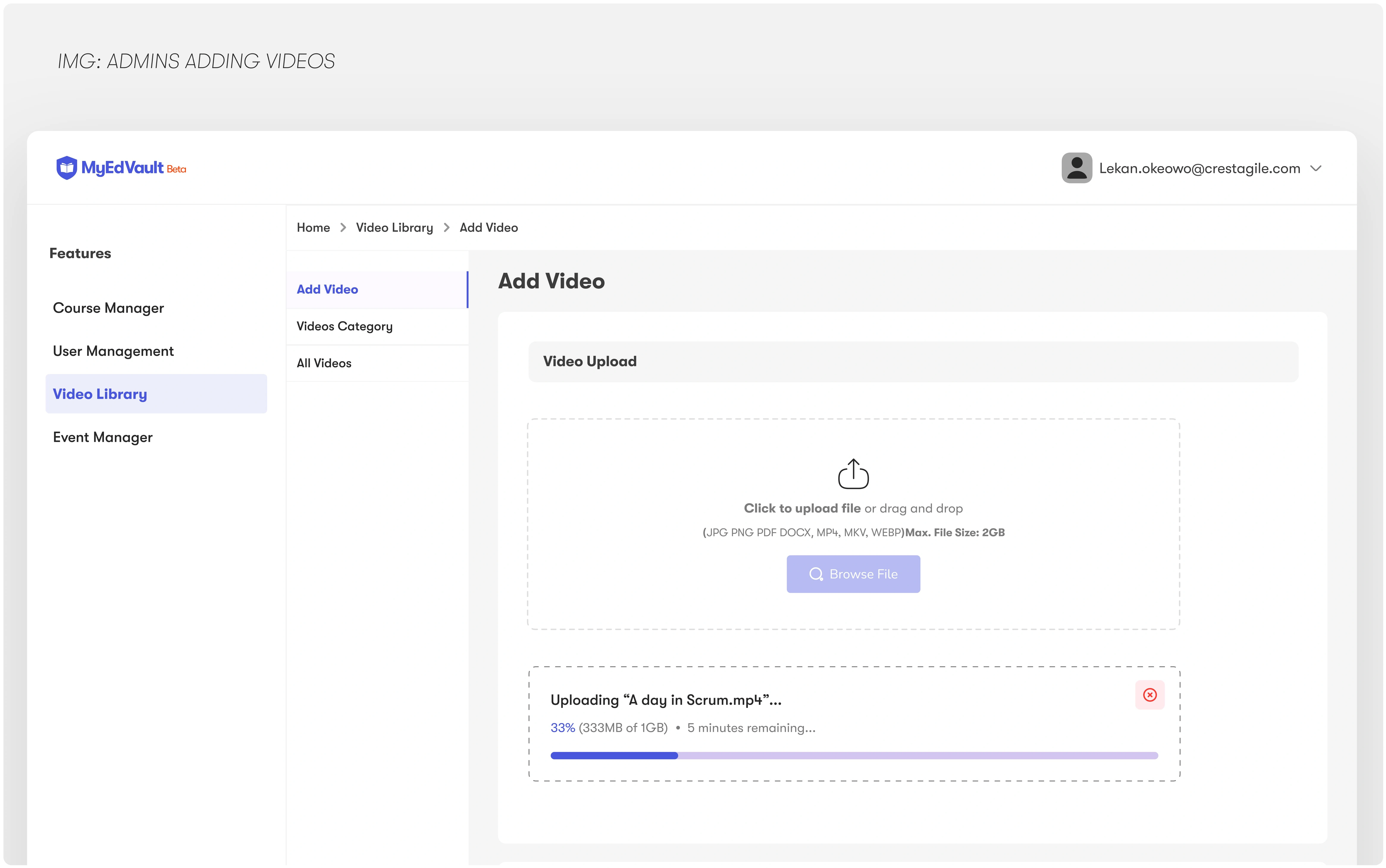
Admin Adding a Video Content
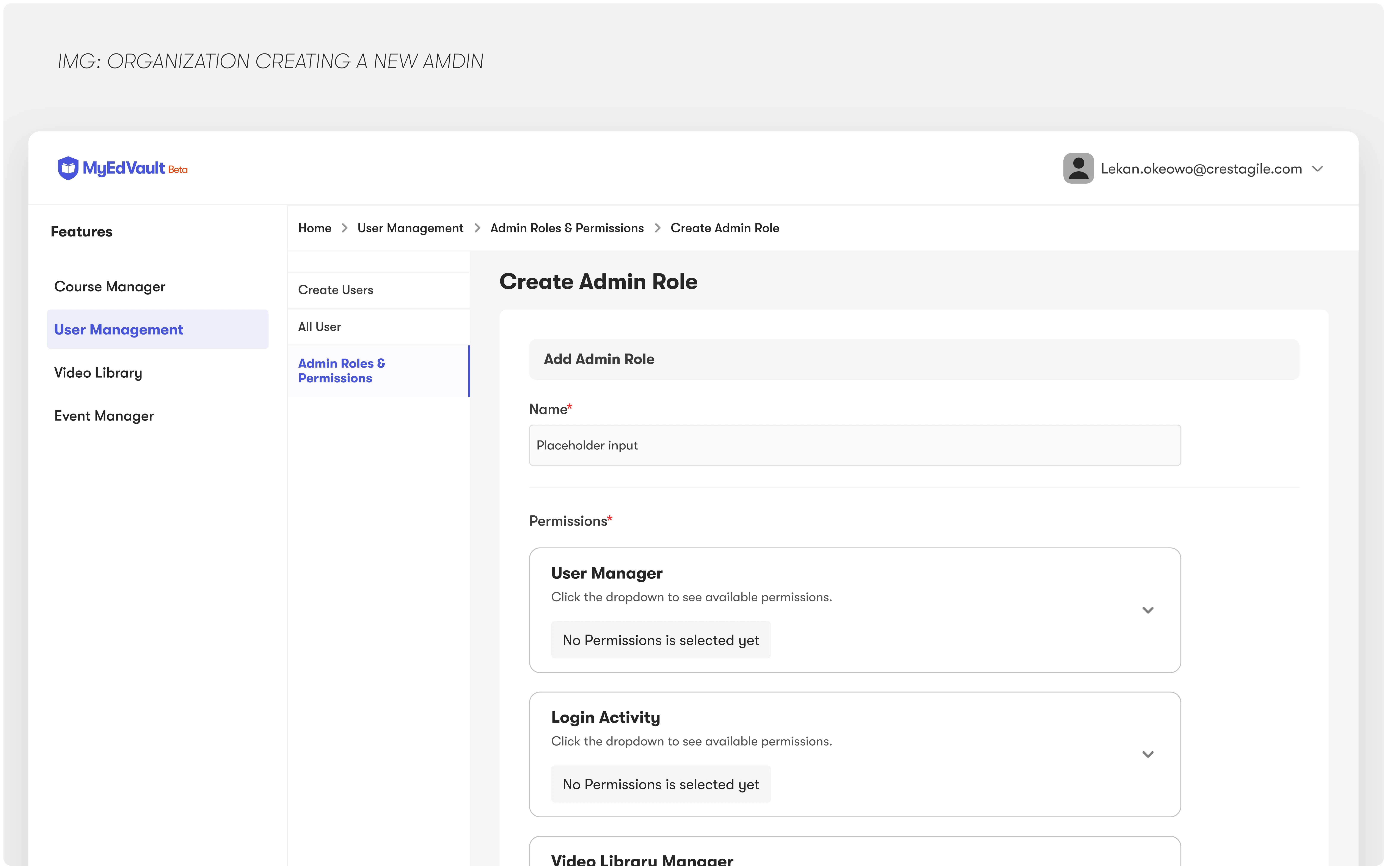
Root Admin Adding Regular Admin and Permissions.
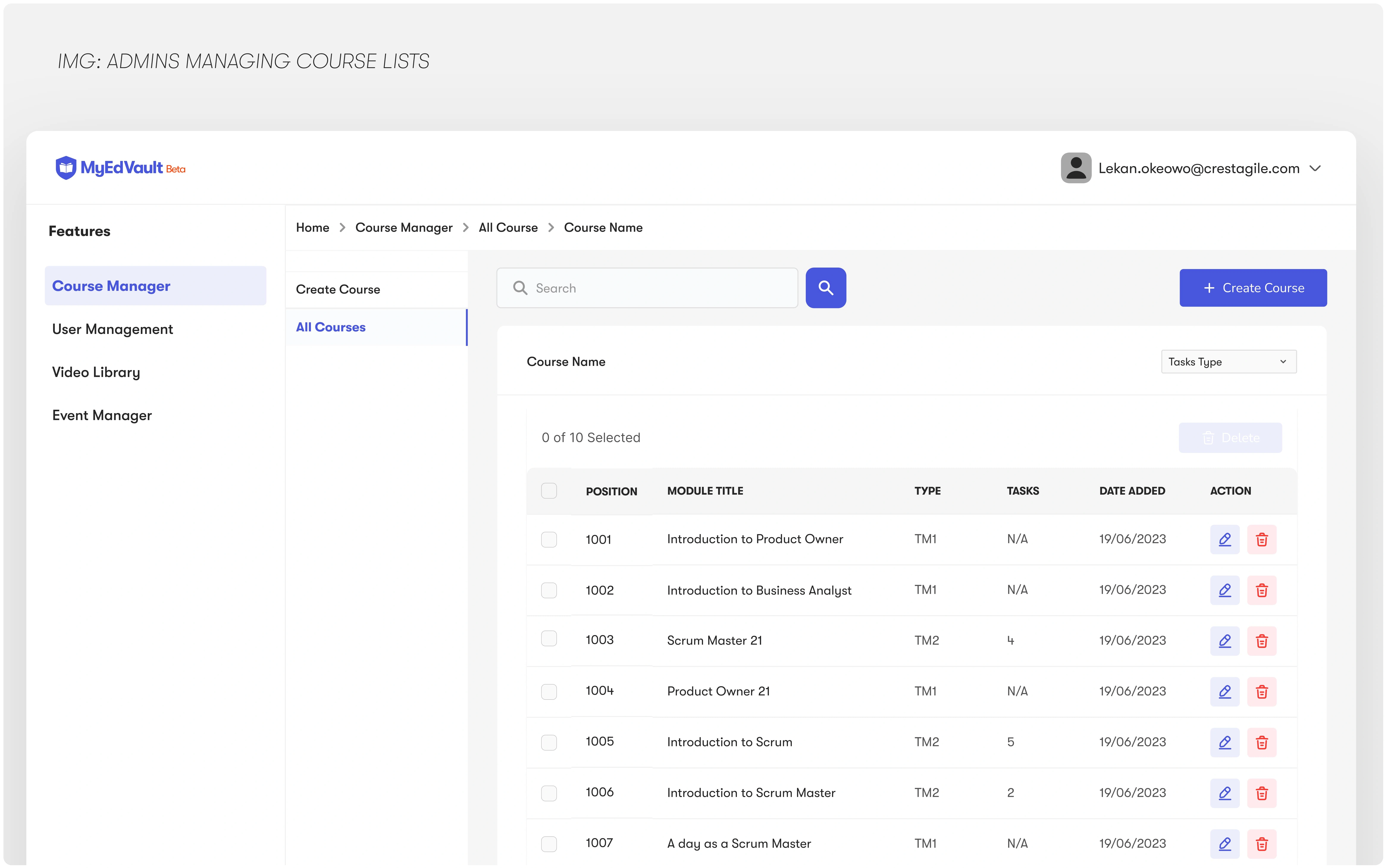
Course Added on the Admin View
Gamified learning: streaks, badges, and visual progress bars
Implementation (Design Handoff)
I prepared organized files, component specs, and written annotations for a smooth handoff to the development team. I also supported developers by clarifying edge cases, ensuring pixel-perfect implementation.
Handoff Included:
UI kits and component libraries
Mobile and web layout specs
Flows for both learners and admins
Testing from interactive prototype
Interactive prototypes were shared with test users. I observed how they navigated the platform, identifying friction points and making iterative improvements based on real-time feedback.
Results from Usability Testing:
Reduced confusion on the admin panel
Increased confidence in navigating the learner dashboard
Clearer understanding of task status and next steps
Deployment & Maintenance
While I wasn’t involved in platform development, I stayed in the loop post-launch, reviewing designs in staging, suggesting UX improvements, and proposing scalable enhancements for future updates.
I also laid the groundwork for future iterations by:
Building a flexible design system
Creating a feature roadmap from user feedback
Documenting design logic and decisions
Our Solution delivered measurable improvements for both learners and administrators, while setting a strong foundation for future growth:
• 35% increase in learner engagement
Achieved within the first two months after launch through structured UX and motivational features.
• 50% reduction in admin onboarding time
Simplified workflows and intuitive interfaces helped new admins get up to speed faster.
• Higher satisfaction among training organizations
Led to 4 new enterprise partnerships secured within Q2.
• A scalable design system
Built to support upcoming modules like AI Tutor, Events, and Certificate Management; without reinventing the UI.
Key Takeaways
Designing for both learner and admin personas helped us build a more well-rounded product
A modular, scalable approach was crucial for long-term feature rollouts
Early involvement of users in the feedback loop saved time during revisions
More Screens from MyEdVault
Like this project
Posted Apr 6, 2025
A learning platform solution to boost engagement, simplify admin tasks, and scale for future features like AI Tutor, Events, and Certification.
Likes
1
Views
5
Timeline
Sep 19, 2024 - Jan 20, 2025


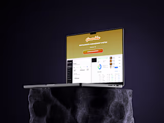
UX Audit & Redesign for Gumble Restaurant Admin Dashboard
Personal Study Coach; A System That Drives Student Study Focus

CRESTLEARN - Your Smart Personal Learning Companion
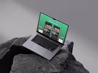
Gumble UX Redesign – Guest-Facing Website for a Restaurant.