Cadence - product analytics site, designed and built in Webflow

Taras Migulko


Home - hero and the dashboard mock, built as real Webflow elements rather than an image.
Cadence - a product analytics site, designed and built in Webflow
Cadence is a product analytics tool. The client needed a marketing site that could carry a technical story on its own - product, pricing, docs and API reference - without sending every visitor to a sales call. I designed the whole thing and built it in Webflow.
The design is 100% mine. Every product UI on the pages - dashboards, funnels, retention grids, code blocks - is drawn in Webflow with real elements, not screenshots. 13 pages on one component system, fully responsive, with changelog, blog and roles running on the CMS.
Live page: Home
The problem
Cadence had a product and a sales team and almost nothing in between. Every question about pricing, the data model or the API ended in a call, which filtered out exactly the people most likely to sign up on their own: developers who want to read the reference first, and product leads who want a number before they involve anyone else.
So I wrote the brief as three tests. A developer can evaluate the API without an account. A product lead can price 5M events a month without talking to sales. The client can publish a changelog entry on a Tuesday without opening the Designer. Every decision below comes back to one of those three.
Process
I started from questions, not pages. Two months of sales threads and support tickets gave me a list of everything people asked more than twice, and that list became the sitemap: 13 pages, each one owning a small group of questions instead of a marketing theme.
Greybox wireframes stayed in Figma for about a day. After that I designed in Webflow, in the browser, because these layouts only tell the truth at real widths with real strings in them. Roughly one week on structure and the system, two weeks on pages, one week on motion, states and QA.
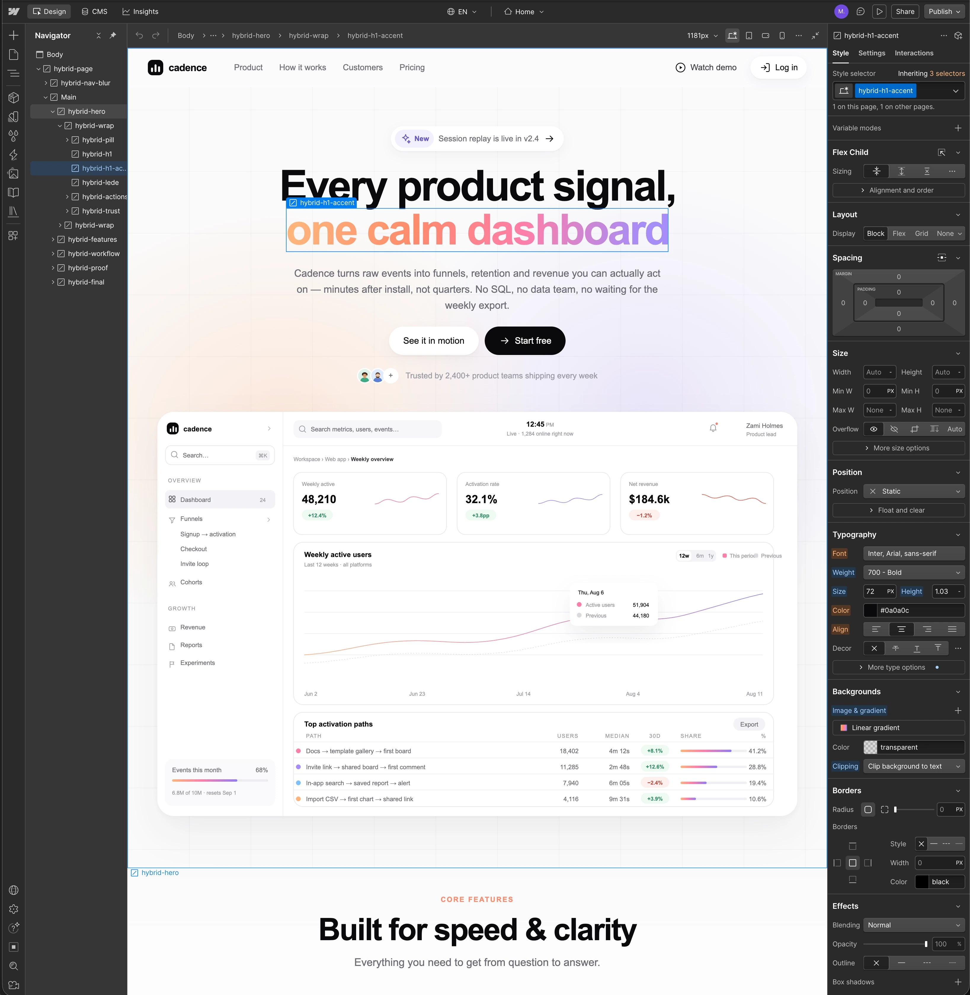
The Webflow canvas - every section is a component, spacing and colour come from variables.
One system, thirteen pages
Problem: 13 pages drawn by hand drift apart inside a week. Fonts creep, spacing stops matching, and every fix has to be made thirteen times.
Solution: nothing on this site is a one-off. Type scale, spacing steps, radii and colour are Webflow variables, and every section is a component with variants instead of a copy. Changing the base spacing step re-spaces the whole site. The Designer tree in this shot is components and classes, not divs nudged into position, which is the only reason 13 pages stayed consistent to the end.
Live page: Home
Pricing - four plan cards from one component, plus a bill estimator that reads the slider live.
Pricing you can answer yourself
Problem: Cadence charges on events, not seats. That is fairer and much harder to read off a card. People could not tell whether they were a $47 team or a $600 one, so they asked sales, and most of them never got round to asking.
Solution: an estimator above the plans. Drag the slider to your monthly volume and the plan and price update live, with the definition of an event written directly underneath so nobody has to guess what counts. Below it sits a full comparison table with no asterisks, and a billing FAQ that answers the six questions the sales team had been answering by hand.
Live page: Pricing
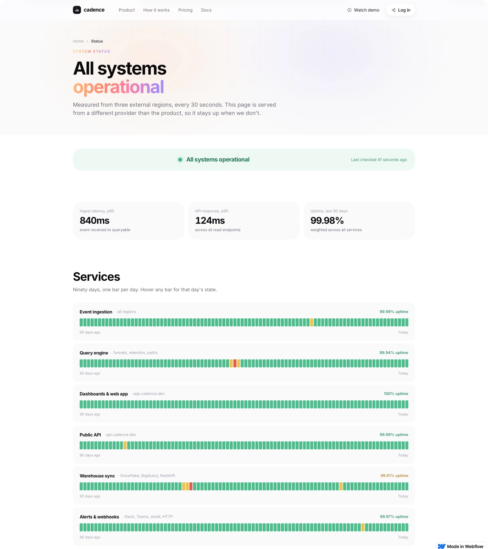
Status - ninety uptime bars per service, one small CMS collection behind the whole page.
A status page that means something
Problem: a status page hosted on the same infrastructure as the product is worthless in the only moment anyone opens it.
Solution: this one is measured from three external regions every 30 seconds and served from a different provider, and the page says so in its first sentence. Ninety days of history per service, one bar per day, so a bad week stays visible instead of being averaged into a comfortable number.
Live page: Status
How it works - four steps, a first-month timeline and an FAQ, all on the same section system.
The first month, not the feature list
Problem: "how it works" pages usually restate the features in a different order, so nobody learns anything new by reading one.
Solution: I built it as a timeline of the first month. Day one is the install, day two or three is naming events, week one is the argument the team stops having, week three or four is when alerts replace the Monday dashboard ritual. Each step carries the piece of product UI it refers to, and the page ends with the questions people actually ask on a first call rather than a second CTA.
Live page: How it works
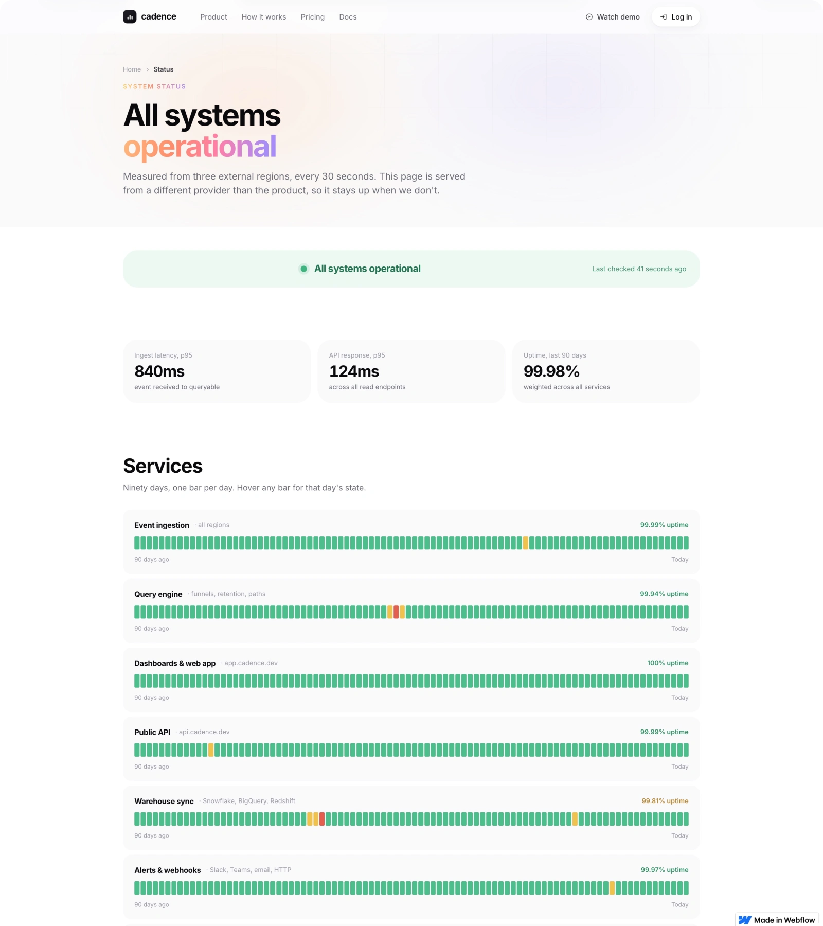
The same page in a wider viewport - the bar grid keeps its rhythm instead of stretching.
Responsive without a mobile version
Problem: dense product UI is where responsive design normally gives up, and someone quietly ships a cut-down mobile page with half the content missing.
Solution: four breakpoints, one set of components, and every layout tested with the longest string it will ever hold. Tables become stacked rows, the docs sidebar becomes a sticky select, the uptime grid keeps its rhythm instead of stretching. Nothing is hidden below 768, because the person on a phone is often the one forwarding the link.
Live page: Status
Product - nine feature cards on one grid, each with its own icon, metric line and hover state.
Product UI drawn, not screenshotted
Problem: marketing screenshots go stale the week after they are taken, look soft at 2x, cannot reflow and cannot animate.
Solution: every dashboard, funnel, retention grid and code block on this site is built from real Webflow elements. It costs more up front and pays for itself immediately: it stays sharp, it responds, and a number can be changed in the CMS instead of a designer re-exporting a PNG.
Motion follows the same rule. Scroll-linked reveals, the pricing toggle, the estimator, the changelog filters and the docs sidebar are all native Webflow interactions, so there is no custom script to break when the client edits a page.
Live page: Product
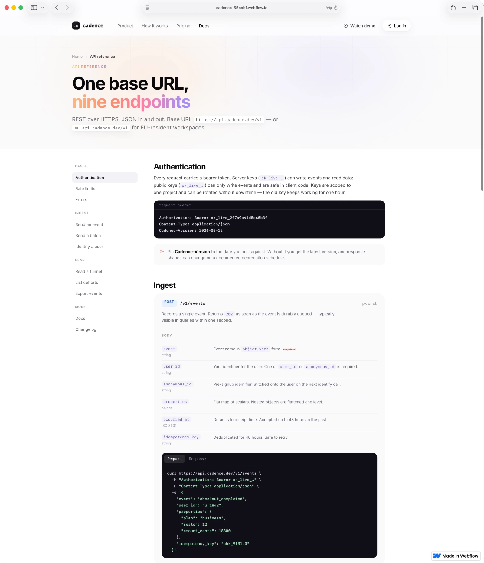
API reference - sticky sidebar, parameter tables and request/response tabs, all native Webflow.
Docs and API reference on the same system
Problem: most teams push docs to a separate tool, and within a month the marketing site and the reference no longer look like the same company.
Solution: the reference lives in Webflow with everything else. Sticky sidebar with scroll tracking, parameter tables, request and response tabs, copy buttons and syntax-highlighted samples. A developer can read the whole ingest flow, error model and rate limits without an account, which was the first of the three tests.
Live page: API reference
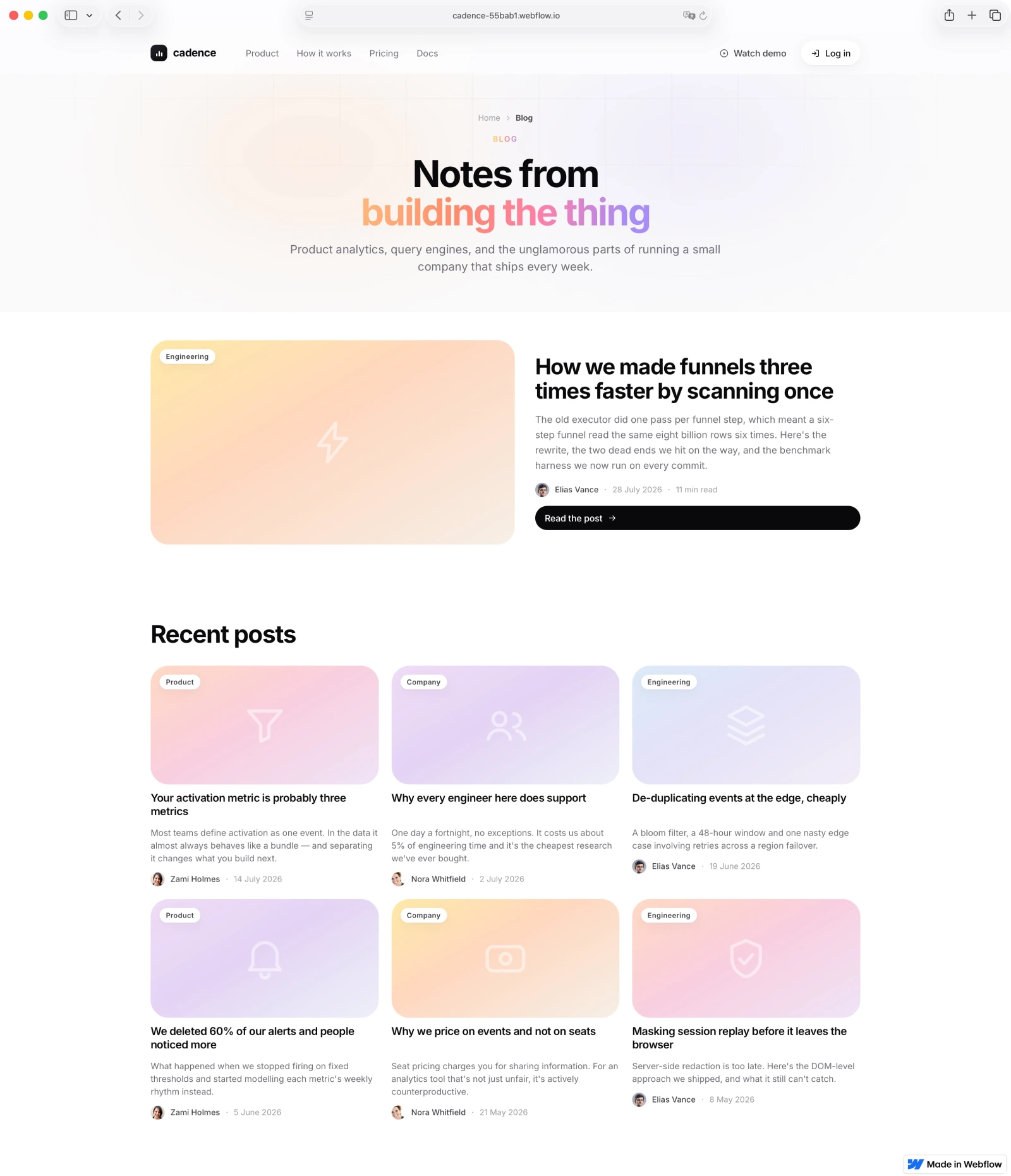
Blog - a featured post plus a CMS grid with categories, authors and generated cover art.
Content the client owns
Problem: a site the designer has to touch for every update goes quiet after three months, and the quiet reads as a dead product.
Solution: blog, changelog, roles, status entries and metric definitions all run on the CMS, with generated cover art so nobody has to make an image before they can publish. Handover was a short screen recording and a one-page doc; the client has been publishing without me since launch.
Live page: Blog
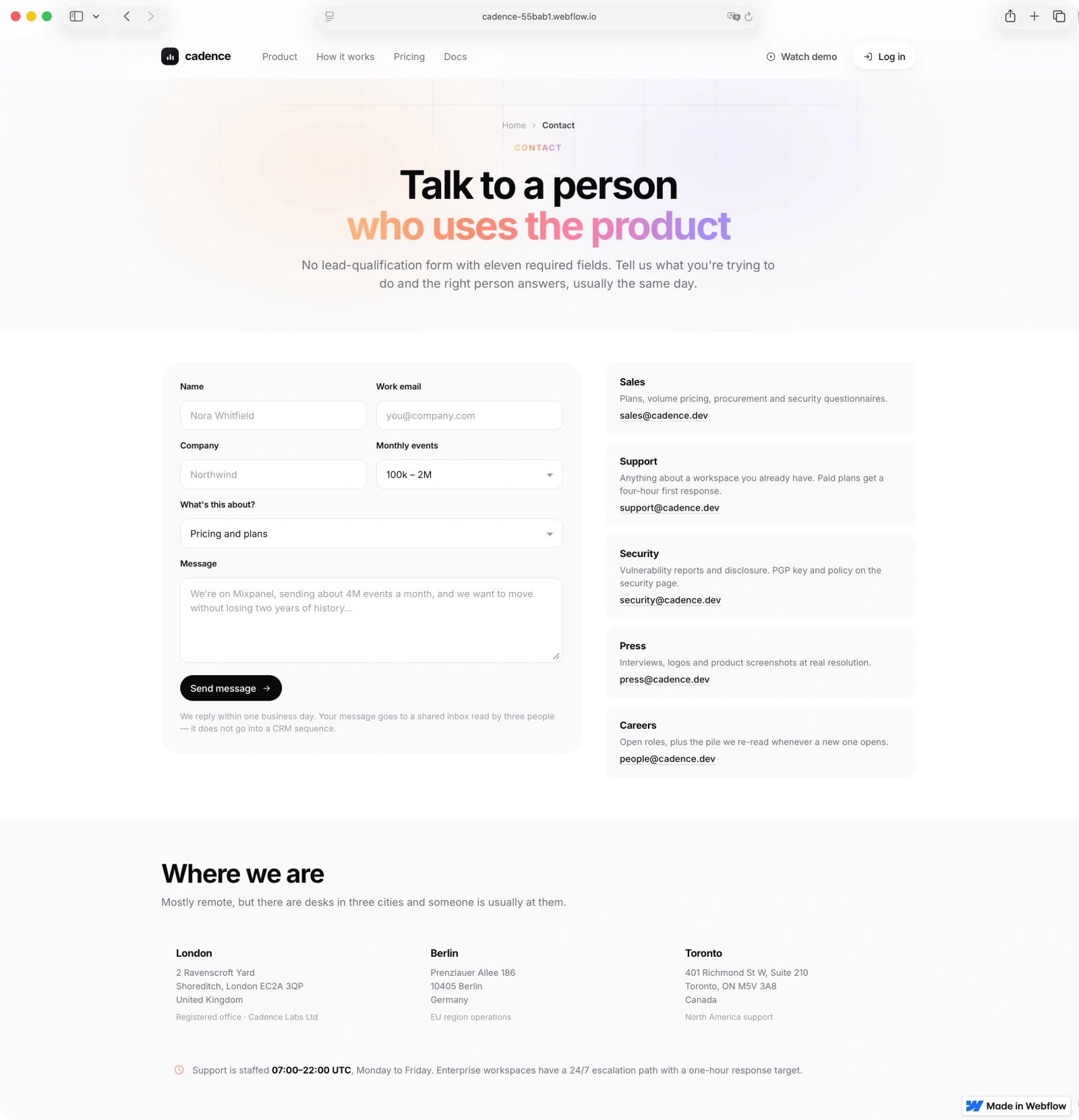
Contact - a short form with routing by team instead of an eleven-field qualification wall.
A contact page, not a lead form
Problem: an eleven-field qualification form is the fastest way to lose the person who was already going to buy.
Solution: five fields, a topic picker that routes to the right inbox, and every team address published in the open for people who would rather write an email. The page promises one business day and says exactly what happens to the message, which is the part most forms leave out.
Live page: Contact
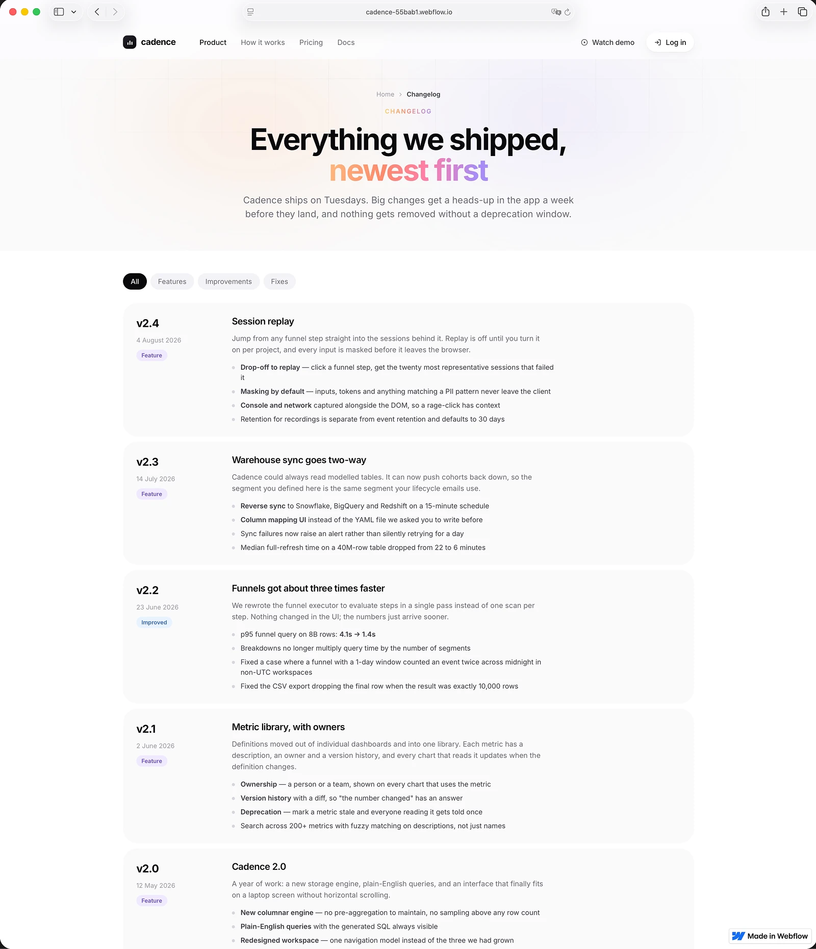
Changelog - CMS entries with version, date and type, filtered without a page reload.
Shipping in public
Problem: nothing tells a technical buyer more about a young product than whether it is visibly moving.
Solution: a filterable changelog with version, date and type. Entries are CMS items, the filters run without a page reload, and the deprecation policy sits in the header so it reads as a promise rather than a footnote.
Live page: Changelog
Result
13 pages, one component system, four breakpoints, five CMS collections, no custom JavaScript. The site now answers the pricing, data-model and API questions on its own, so sales calls start after those pages instead of in place of them, and the client ships updates without me.
Live page: Home
Like this project
Posted Aug 12, 2026
A 13-page marketing site for a product analytics tool: pricing calculator, API reference, status page and CMS-run changelog. Designed and built in Webflow.
Likes
1
Views
22
Timeline
Jul 1, 2026 - Aug 13, 2026
Clients
Cadence