Salesflare: CRM Workflow & Revenue Intelligence

Taras Migulko

Project overview
Product: Salesflare
Project type: CRM product redesign
My role: Product design, UX/UI, workflow architecture, data visualization and motion direction
Tools: Figma
The problem
A sales team does not use a CRM in one mode. The morning is reading: what moved, what stalled, what is going to close. Midday is coordination: who is being contacted, at what step, by whom. The afternoon is execution: move a deal, log what was said, decide the next action. Most CRMs ship these as three unrelated products - a chart page, a list page, a board page - each with its own vocabulary for status and its own rules for where detail hides. The cost is not visual. It is the reload the person performs in their own head every time they switch, several times a day.
So I wrote the brief as three tests. A rep can see what changed since yesterday without building a report. A manager can judge whether a campaign is working without opening the sequence. A deal can change stage, gain a note and get a next action without anyone leaving the board. Every decision below comes back to one of those three.
Process
I started from the working day, not the sitemap. The three modes above became the top level of the product, which settled the information architecture before a single screen existed and kept me from adding a fourth section every time a new requirement arrived. Greybox layouts stayed rough for about a week, long enough to argue about hierarchy and no longer. After that the work went into the system first: status colors, numeric typography, table and board density, and the behaviour of the detail panel all three workspaces share. Roughly one week on structure, two on screens and states, one on motion and QA. Everything was designed with the longest string and the worst number it would ever hold, because CRM data is never as tidy as a mockup.
Revenue insights that recommend, not just report
Problem: a sales dashboard states numbers and stops there. Pipeline value went up - against what, by how much, and what is anyone supposed to do on Monday because of it? The gap between the chart and the decision is where most CRM dashboards quietly become decoration, and the real answer moves into a spreadsheet somebody exports every week.
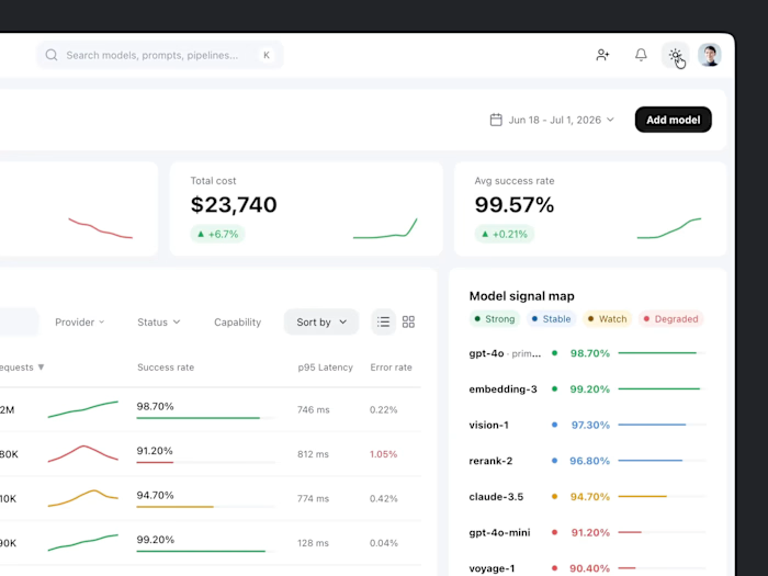
Solution: the four numbers a sales lead actually runs on - pipeline value, won revenue, active accounts, average cycle length - sit above the fold with their trend, not alone. Time ranges are flexible, charts can be inspected in place, and recommended actions are derived from the same data rather than written next to it. The second question after the first look gets answered on this screen instead of in an export.
Campaign management: audience, sequence, progress and status controls.
Campaigns as a workspace, not a list
Problem: a campaign list tells you campaigns exist. It rarely tells you whether one is working, who owns it, how far through the sequence the audience has moved, or what breaks if you pause it today. So people open every campaign in turn to find the single one that needs attention, which is the most expensive way possible to answer a yes-or-no question.
Solution: audience, owner, progress and status live in the table, so judgement happens while scanning. Intervention happens in the side panel: the full sequence, the step the audience is on right now, and the controls to pause or continue, opening beside the list instead of replacing it. Nobody opens five campaigns to find the stalled one, and nobody loses their place after fixing it.
Opportunity pipeline: stage movement, deal context and next actions.
A pipeline that survives a busy Friday
Problem: pipeline boards go stale for exactly one reason - updating them costs more than skipping them. If moving a deal means opening a record, changing a field and saving a form, it does not happen on the day the deal moved. It happens at month end, in bulk, from memory, and by then the board is a report about the past rather than a picture of the present.
Solution: stage changes are drag-and-drop, so the cheapest available action is also the correct one. Each card carries value, stage and category, which is enough to read a column without opening anything. The detail panel holds the rest - value, probability, contact context, actions, timeline and notes - in one place, so the follow-up after moving a card takes seconds and never becomes a second screen.
Result
A coherent CRM product system connecting revenue intelligence, outbound campaign management and opportunity tracking. Each workflow can operate independently, and each is recognisably part of the same product: same navigation, same status language, same rules for where detail lives. The dense parts stay readable, the frequent actions stay cheap, and the three tests from the brief are answered on the screens where the questions come up.
Deliverables
Information architecture, revenue dashboard, campaign management, campaign sequence panel, opportunity pipeline, deal details, interaction states, data visualization and motion direction.
Like this project
Posted Aug 12, 2026
CRM product redesign connecting revenue insights, campaign workflows and opportunity management in one dark, motion-led workspace.