Hiki App Redesign for Inclusivity and Growth
Craig Stapley
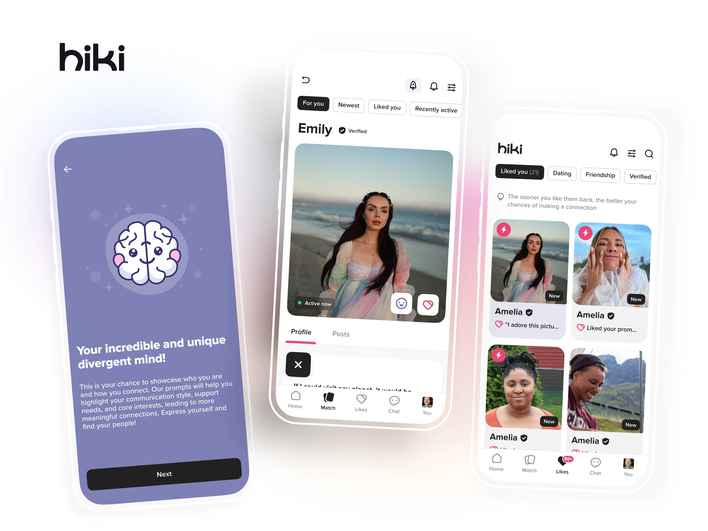
Hiki App Redesign
Role: Sole Designer (UX, UI, Brand, Strategy)
Client: Hiki – A social app for the neurodivergent community
Goal: Transform Hiki from a niche dating app into an inclusive, accessible platform for neurodivergent adults to connect, fostering friendship, love, and community.
Hiki’s mission centers on empowering neurodivergent connection through design clarity and emotional safety.
00. Context
As Hiki evolved to serve the broader neurodivergent community, the app required a full redesign to reflect inclusivity, accessibility, and sustainable growth.
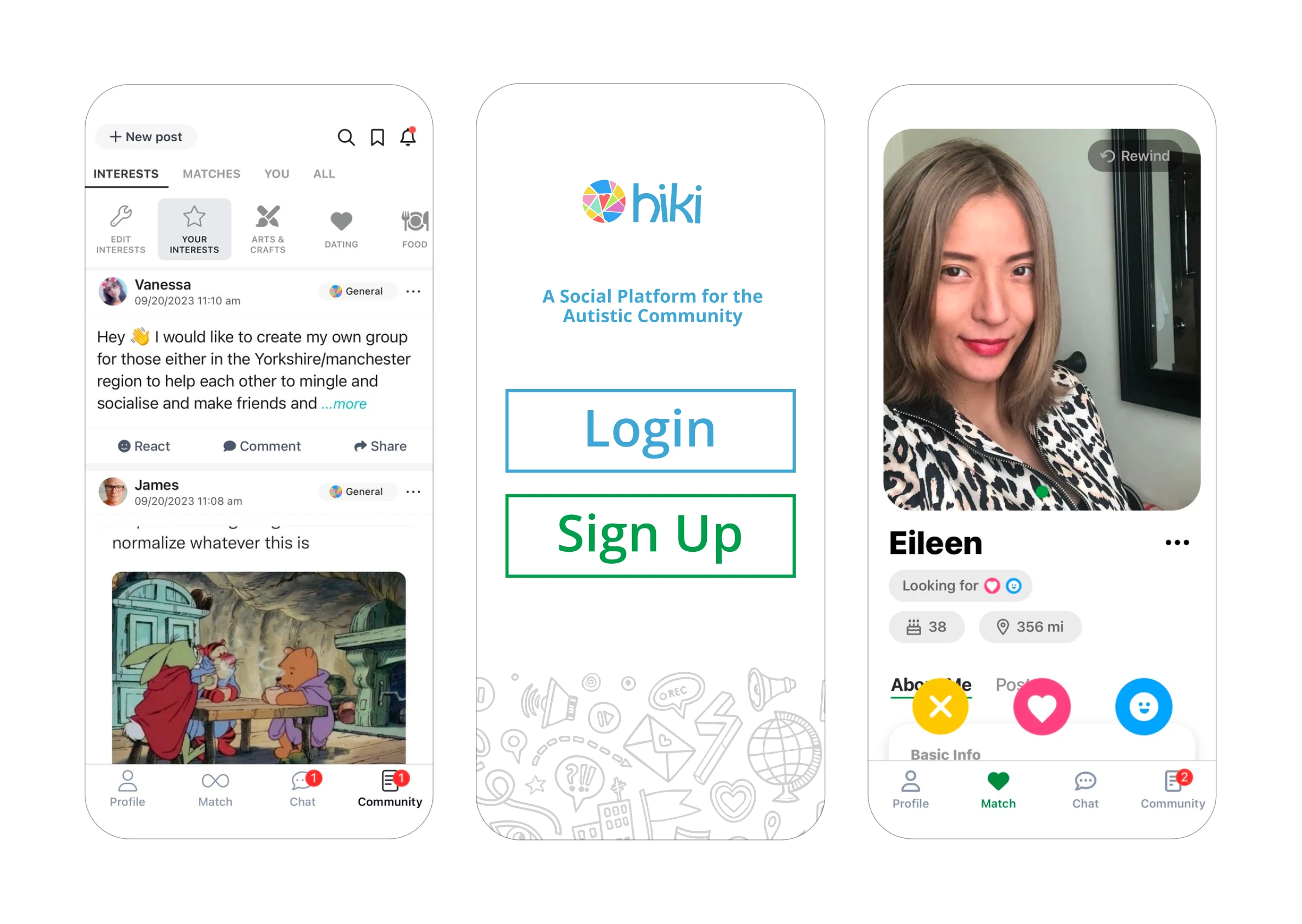
Old designs
01. Challenges
Outdated brand identity not resonating with the broader neurodivergent audience.
User interface lacked accessibility features.
No existing monetization strategy.
02. Solutions
Brand Overhaul: Redefined Hiki’s visual identity to be more inclusive and representative.
Animated logo, with the infinity symbol representing neurodivergence and the love & friendship being the core features of the app.
UX/UI Redesign: Implemented accessibility best practices, including adjustable text sizes and color contrasts.
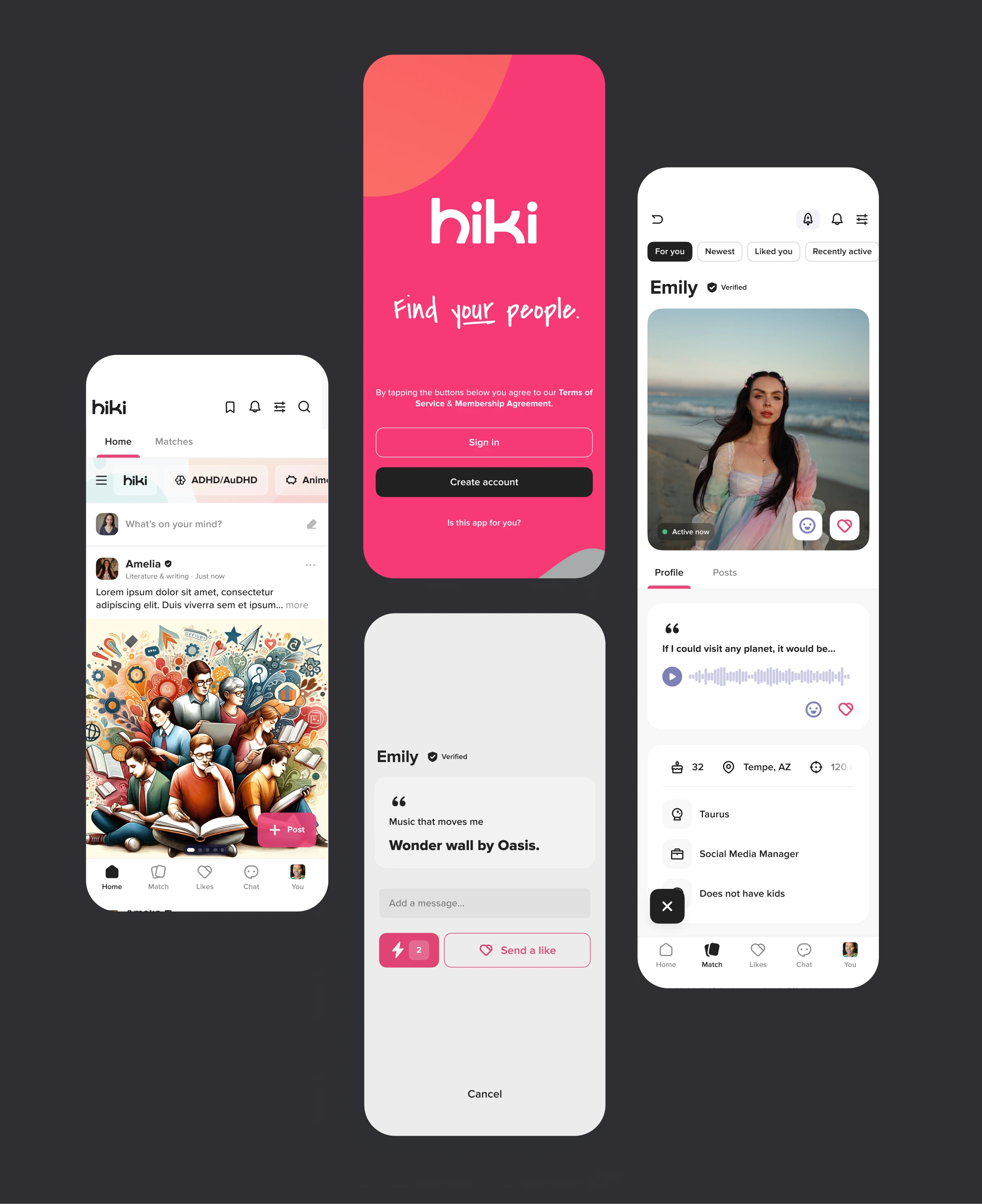
A full rebrand grounded in visual softness, accessibility, and neurodivergent comfort cues.
Monetization: Introduced premium features aligned with user needs, ensuring revenue growth without compromising user experience.
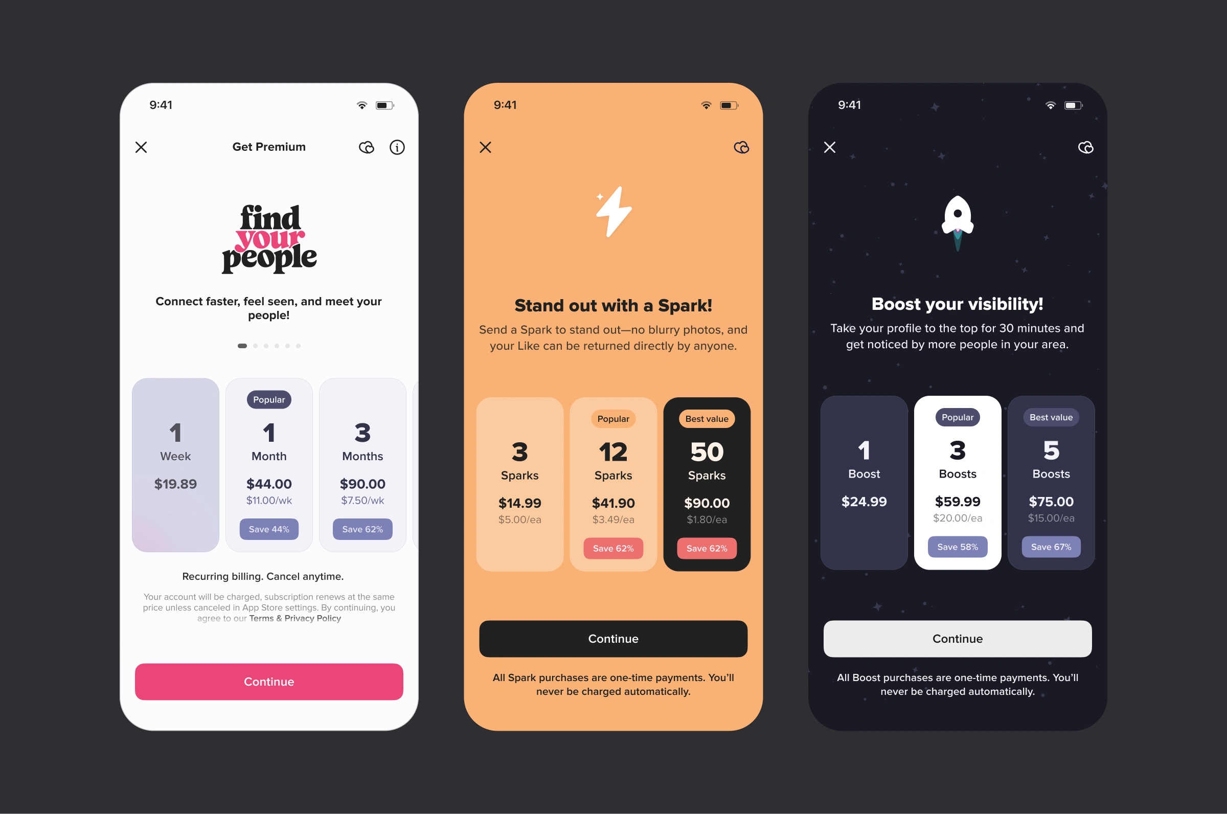
Premium features were carefully tiered to preserve community safety while supporting platform sustainability.
03. Results
User Growth: +3.9×
Revenue Growth: +2.6×
Efficiency: 10:1 LTV:CAC
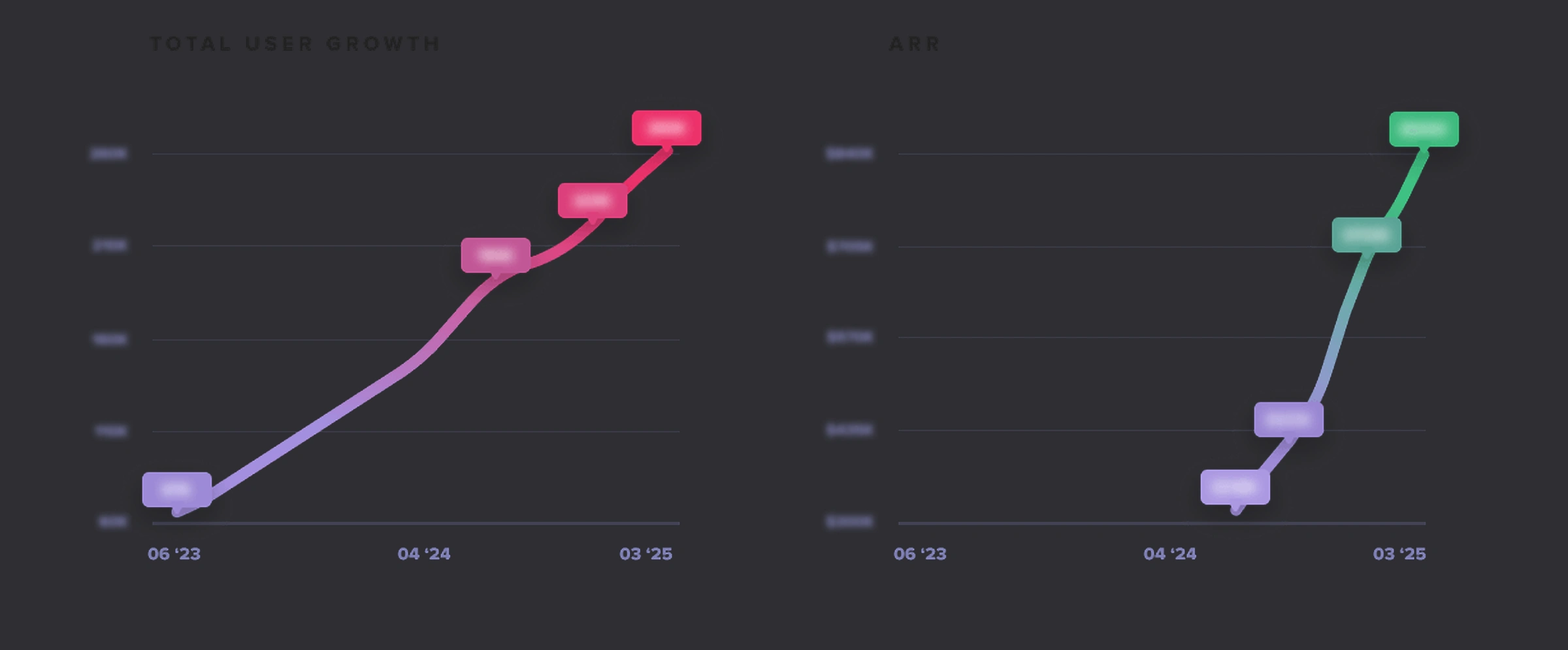
Revenue and retention growth after launch of new onboarding and monetization flow.
04. Reflections
While the redesign was successful, incorporating user feedback earlier in the process could have further enhanced the outcome. Future iterations should include more extensive user testing phases.
For a more detailed view, you can explore the full case study on my website: stapleycreative.com/hiki
Like this project
Posted May 23, 2025
Redesigned Hiki for neurodivergent connection — boosting user growth, improving accessibility, and launching monetization.
Likes
4
Views
40
Clients
Hiki