NordicTrack—PDP redesign
Craig Stapley
NordicTrack Product Pages — UX + Story Overhaul
Redesigned NordicTrack’s product pages to reduce friction, sharpen clarity, and guide users toward confident decisions—blending better narrative structure with refined visual hierarchy.
Role & tools
Role: UX/UI Designer, Copywriter, Art Direction, Photo Editing, Animator
Tools: Figma, Illustrator, Photoshop, After Effects, Pen & Paper
Project Overview
NordicTrack’s PDPs were visually bloated, hard to scan, and lacking narrative flow. I simplified the structure, rewrote the core story, and designed a more immersive page to improve product clarity and support confident buying decisions.
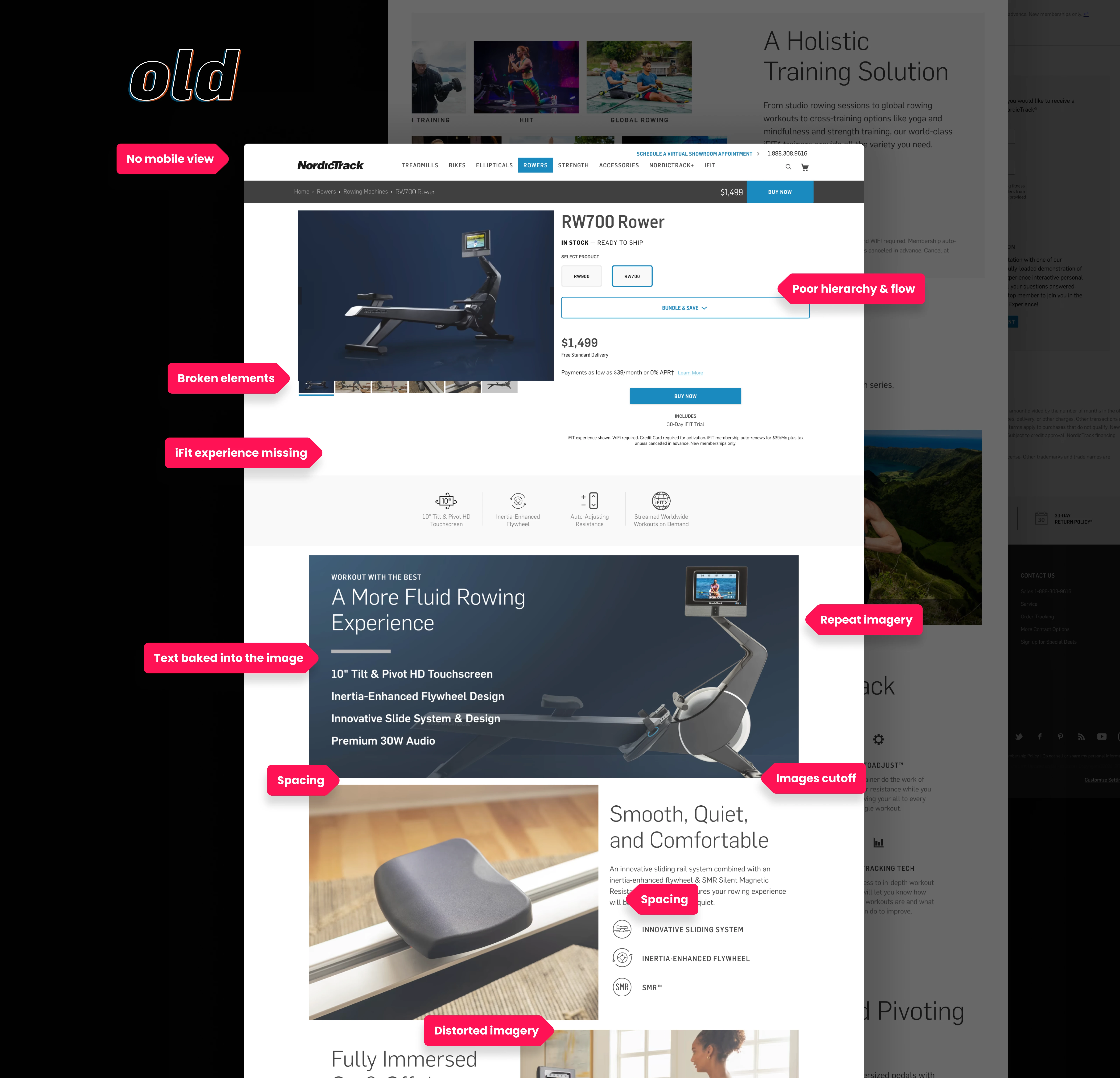
The old RW700 POP page
Process
Audited legacy PDPs for clutter, weak CTA focus, and confusing visual order
Mapped the user story to build a clean, story-driven prototype
Wireframed a new narrative to focus on decision-making cues
Reorganized components to support feature-first logic
Refined copy to be tighter, more dynamic, and CTA-focused
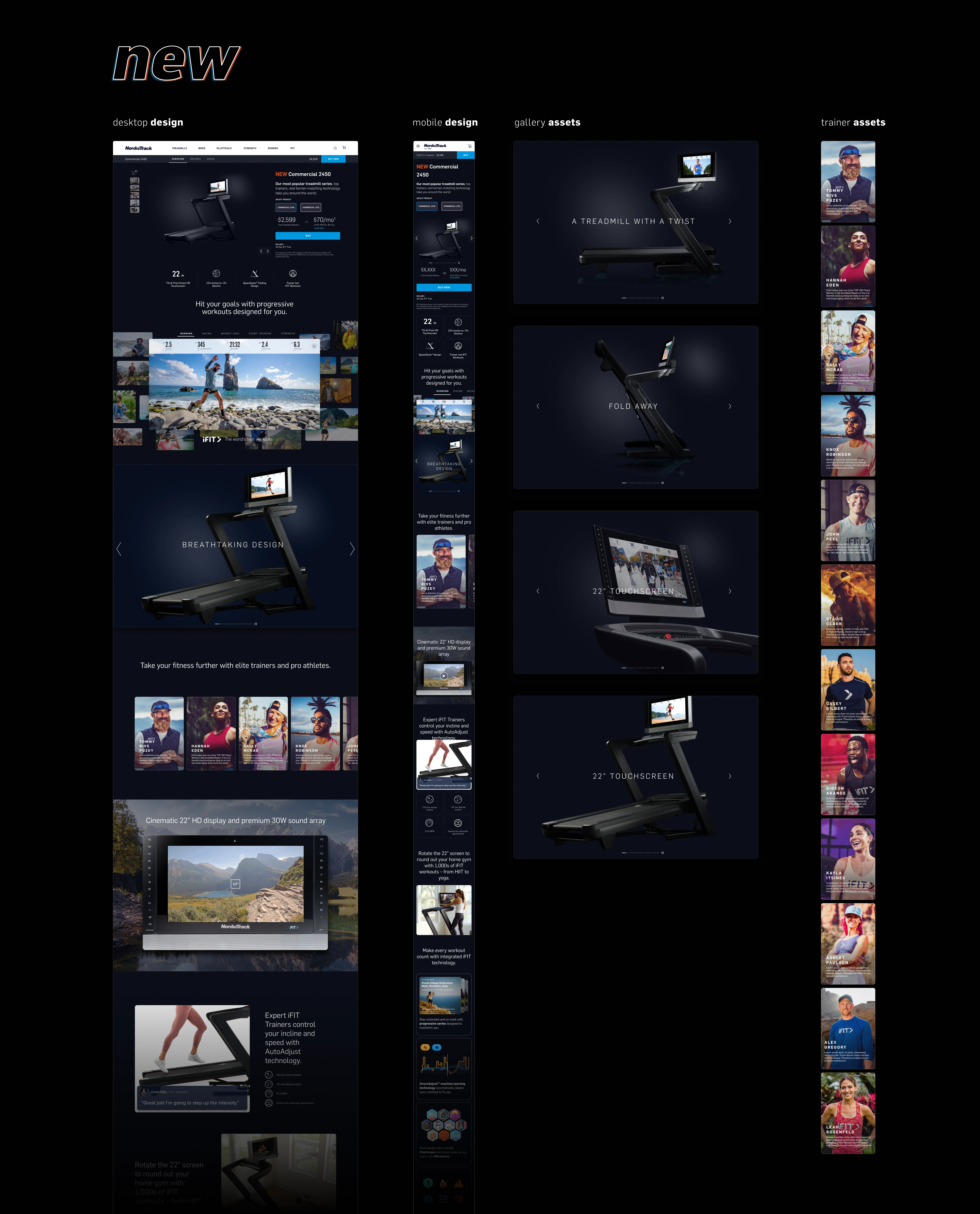
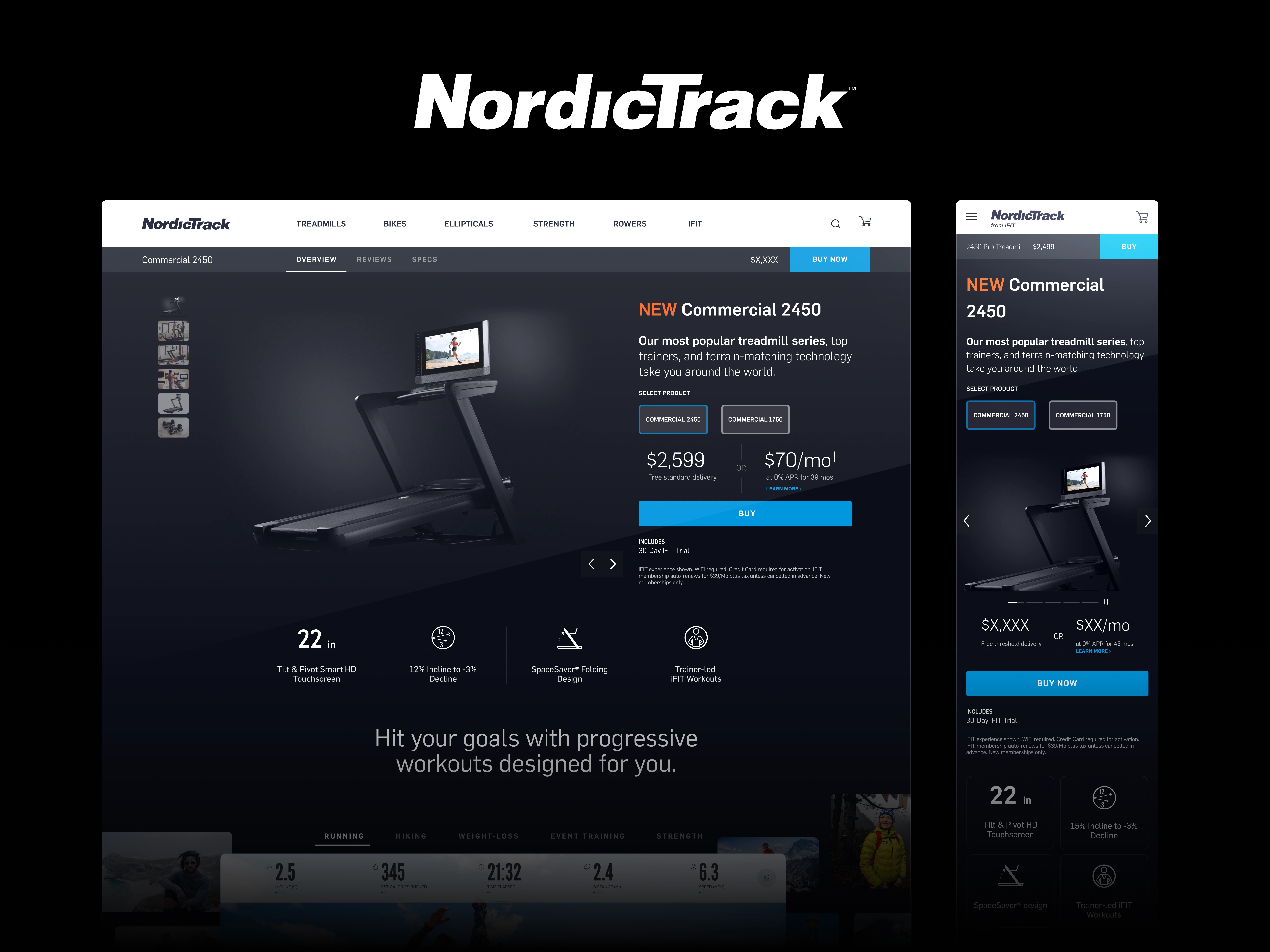
The new design coming together
Outcome
A/B testing against current designs showed an increase of conversion significant enough to roll the template out to the entire product line, resulting in hundreds of thousands of dollars in additional revenue. The “dark world” motif was also used universally for later sales campaigns and marketing material.
Streamlined product storytelling
Reduced buyer hesitation by cleaning up CTA flow and visual hierarchy
Improved PDP scannability and emotional resonance
Helped unify marketing and in-app product narratives
Gallery transition
in-situ experience demonstration
Team
It’s always a group effort.
Though I mainly tackled this project solo, I am grateful to the executive team for the trust and flexibility they gave. Also a shout-out to the NordicTrack web development team for their quick responses and feedback.
Overall it was a fun and challenging project.
Like this project
Posted May 1, 2025
Redesigned NordicTrack’s product pages to sharpen clarity, reduce friction, and drive confident user decisions through better UX and narrative.
Likes
0
Views
4
Clients
NordicTrack
iFIT