Insurely – Health Insurance Made For Human
Daniel Kozkin
1. Project Overview – Giving People Clarity in Chaos
"Health insurance is the one product people avoid using — even when they desperately need it. I wanted to change that."
Project Name: Insurely – Health Insurance Made For Human
Role: Lead Product Designer
Duration: 4 months
Tools: Figma, Maze, Notion, Google Forms, Play
Problem
What is the main problem, and why is this a problem? The main issue is that most health insurance companies and medical centers struggle to provide a comfortable user experience; they often have mobile applications only for their customers or don't lack mobile apps altogether.
This is a problem because 53.6% of users struggle with insurance complexity, and the current system creates fragmentation, inefficiency, and barriers to user care. The lack of a unified and user-friendly system leads to:
Health insurance apps are overwhelming and unclear.
Users struggle to understand their coverage, select plans, or access care — because most tools are disconnected, jargon-heavy, and poorly designed.
Time-Consuming Processes—Scheduling care requires searching across different apps, calling providers, and manually verifying insurance, which often takes hours.
Delayed or Missed Care – Users may postpone necessary appointments due to difficulty accessing information, leading to worsened health outcomes.
Unexpected Costs – Patients risk surprise medical bills and out-of-network charges without clear, real-time cost transparency.
Goal
Design a mobile app that simplifies:
Design a seamless, user-friendly Onboarding process that empowers users to gain a deeper understanding of insurance.
Compare plans and maximize health insurance coverage in one place.
Access to doctors and prescriptions in a few clicks.
2. Research – Listening First, Designing Second
"People aren't confused because they're careless — they're confused because the tools are terrible."
Approach
Conducted 5 user interviews
Sent a survey with 10+ responses
Audited major competitors: Aetna, Oscar, UnitedHealthcare, Kaiser Permanente, Molina Healthcare, Regence - BlueShield, and Community Health Plan of Washington(CHPW).
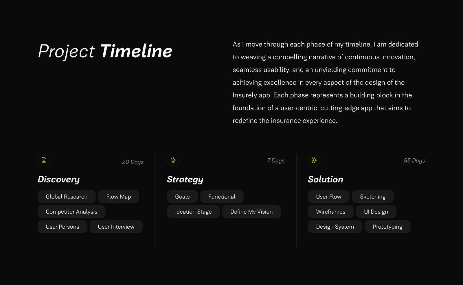
Project Timeline
Insights That Shaped the Design
80% didn't know what their plan covered
60% couldn't find in-network doctors easily
The most common feeling is: "I don't trust this app to give me accurate answers."
Key Opportunity
→ Simplify the overall experience. Remove jargon, show only what's relevant, and make the app more human.
→ Improve Plan Clarity to Boost Decision Confidence. Increased policy selection and satisfaction by Creating side-by-side plan comparisons with filtering and Highlighting key metrics (cost, deductible, network).
→ Integrate Doctor Access to Increase App Stickiness. Integrate provider access to boost daily and weekly engagement. Build an in-app "Find a Doctor" feature that includes reviews, filtering, availability, and video visit booking.
→ Add Prescription Tools to Boost Loyalty. Allow users to track refills, manage prescriptions, and receive alerts in one place. Create screens for tracking medications and add refill alerts and delivery status UI.
→ Build Visual Trust to Improve Brand Perception. Most users feel intimidated by insurance apps that are cold, clinical, or overly technical. Use a soft color palette, rounded cards, and clear icons. Design for accessibility and simplicity. Better UI/UX → Better App Store reviews → More organic growth.
3. Personas – Designing for Clarity and Confidence
Persona 1: Sarah (35)
Freelance designer frequently switches plans.
It needs simple onboarding and clear plan comparisons.
Feels overwhelmed by policy documents.
Persona 2: Linda (67)
Has a chronic condition and frequent appointments
Prioritizes provider access and medication tracking
Wants to avoid calling support
These personas informed decisions such as homepage shortcuts, side-by-side plan comparisons, and telehealth access.
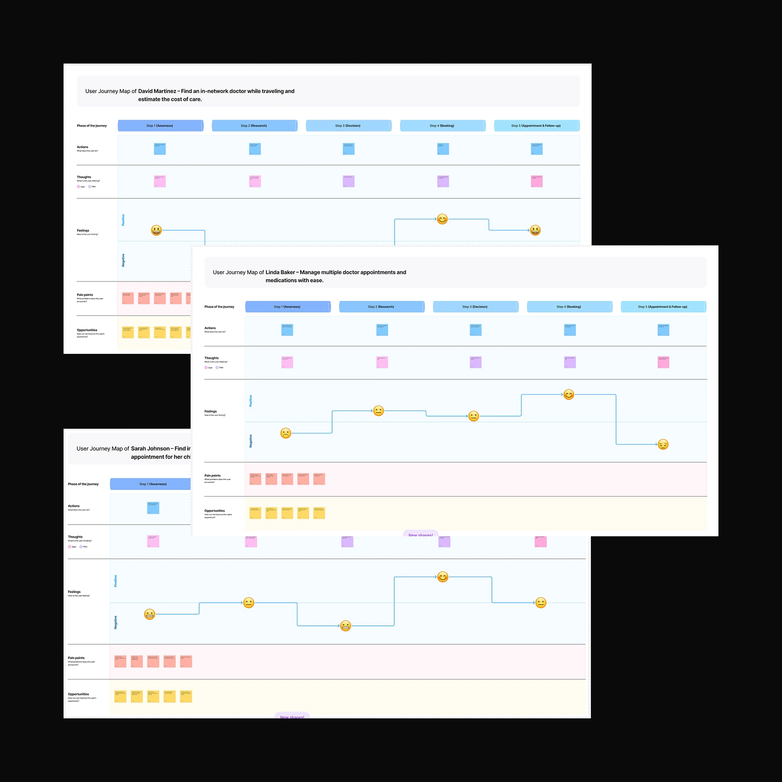
User Journey Maps
4. Key Flows – Building Around the User's Mental Model
"My goal was to reduce hesitation and increase action."
Core Flows Designed
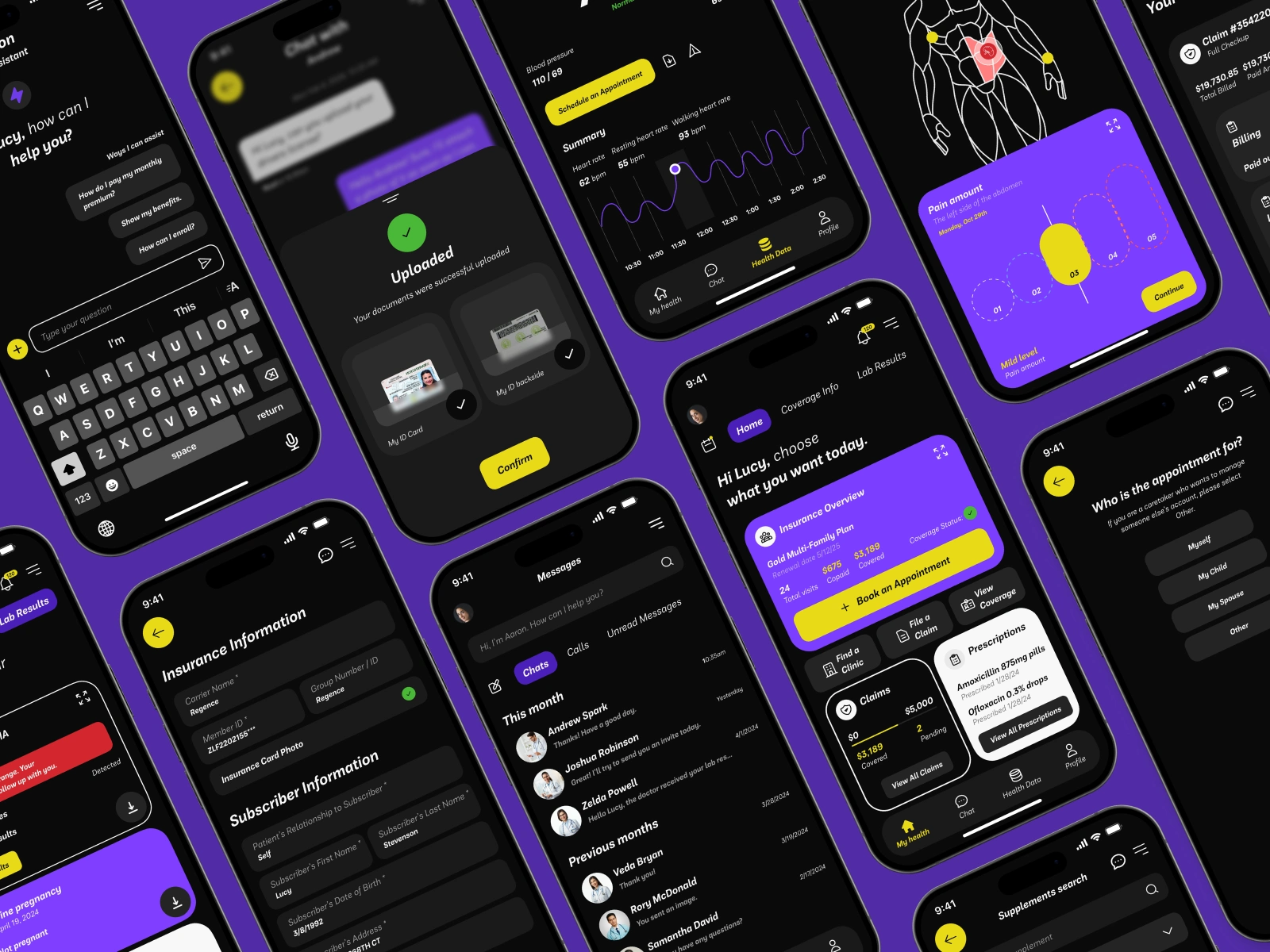
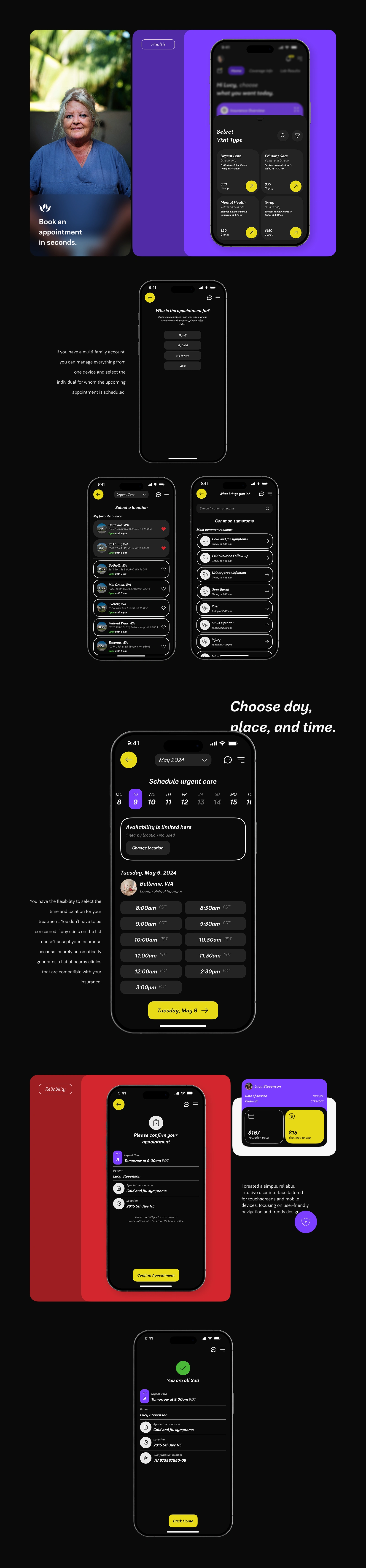
Onboarding: a 3-step process using insurance card scan + ID upload.
Coverage Summary: Visual breakdown of what's included/not included.
Plan Comparison: Filterable, side-by-side layout with deductible/costs.
Doctor Access: In-app booking with availability, reviews, and chat.
Prescription Tracking: Auto-reminders + refill scheduling.
Why It Works
Clean information hierarchy
Contextual guidance at each step
Removed cognitive load with icon + label combinations
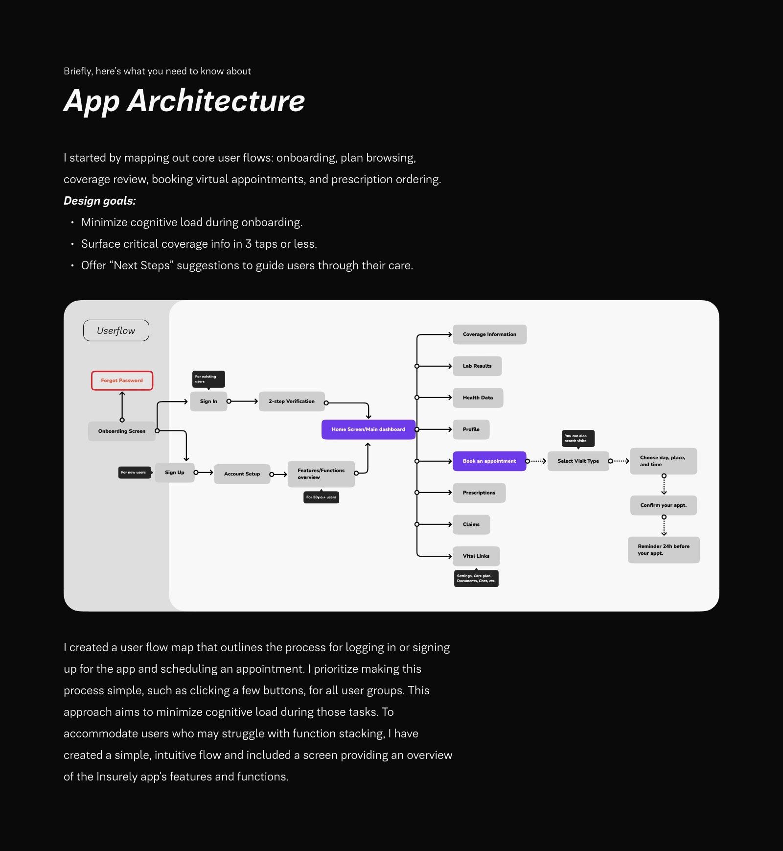
App Architecture
5. Visual Design – From Cold to Comforting
"I didn't want this to look like a corporate tool. I wanted it to feel like help."
Design Language
Calming color palette (purples, white space, rounded UI)
Minimalist icons + legible typography
Onboarding illustrations to reduce intimidation
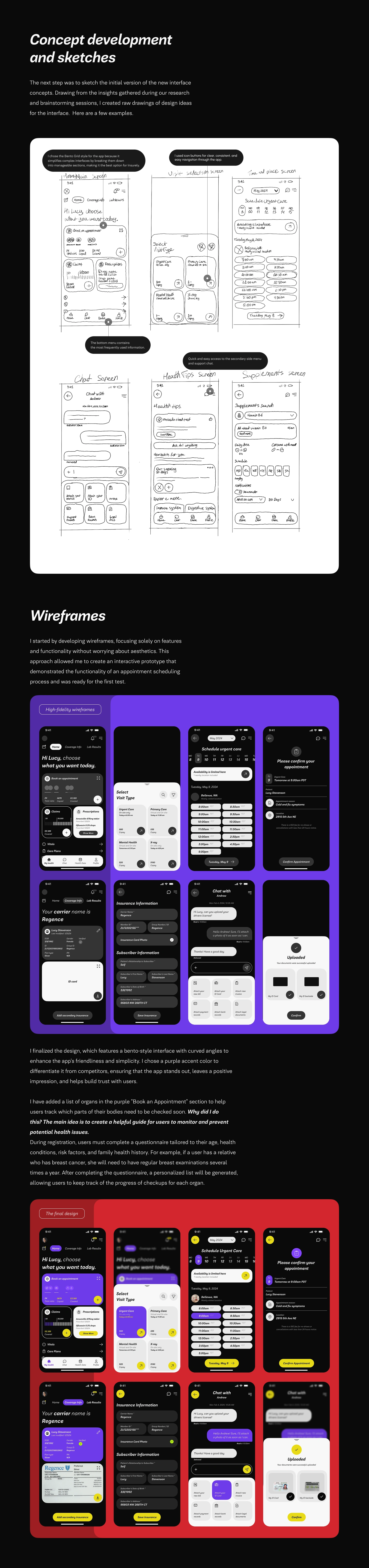
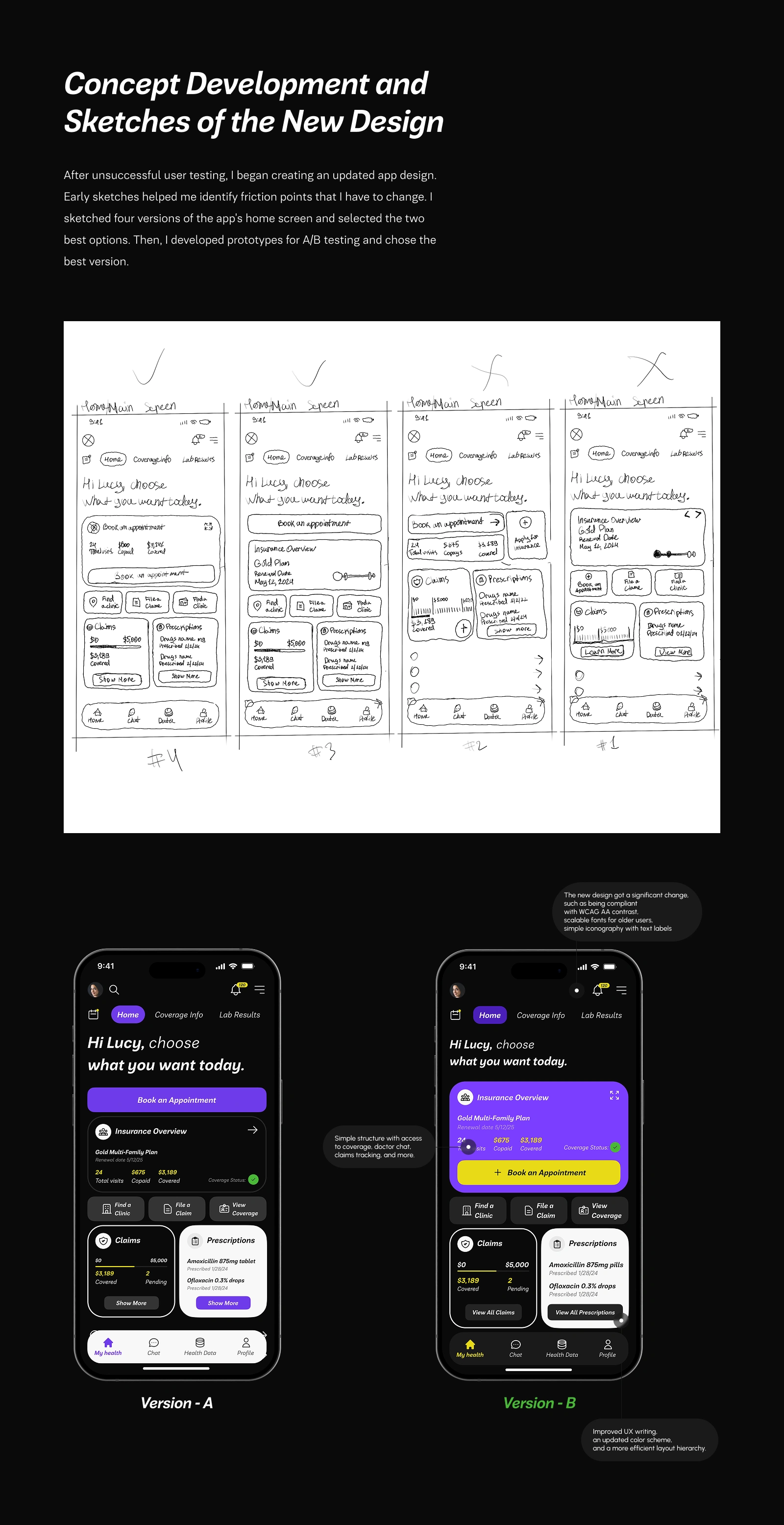
Concept Development
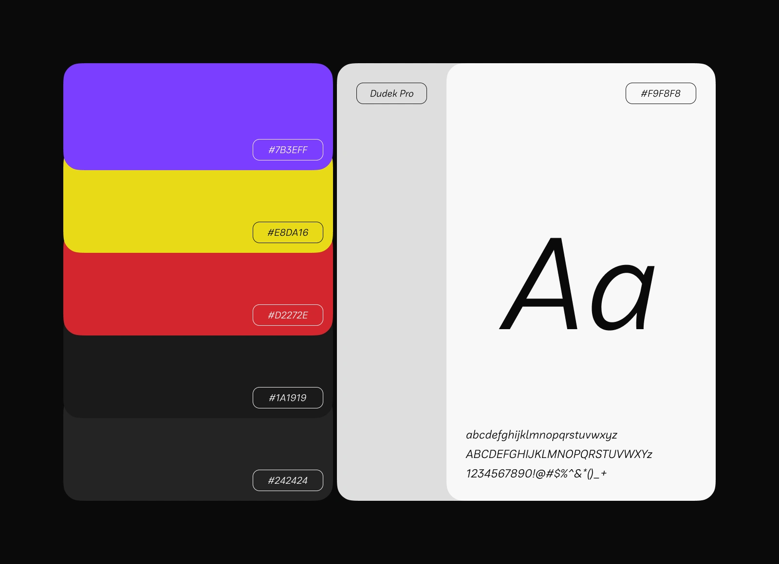
Color Palette & Font
Accessibility Built-In
Text contrast meets WCAG AA
Icons include text labels
Font resizable for visually impaired users
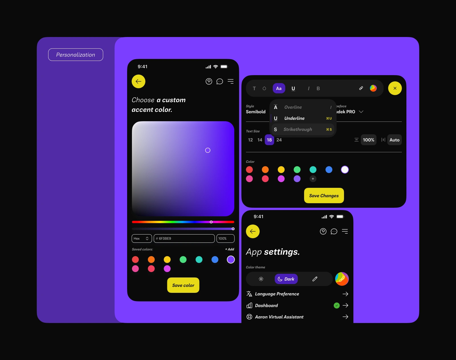
Interaction Highlights
Confetti on successful onboarding
Real-time doctor availability
In-app coverage explainer with micro-animations
6. Testing & Iteration – Listening, Adjusting, Winning
"No design survives contact with real users — and that's the point."
Usability Testing
5 moderated Maze tests
Tasks: onboarding, doctor booking, plan comparison
What I tested
Basic usability
How easily can users perform basic tasks?
How quickly and smoothly can users accomplish tasks?
Testing revealed many weaknesses in the Design and scheduling process; one of the most critical issues is the confusing buttons without context, the missed option to write a visit reason, the unclear organ icons in the "book an appointment" section without a clear sense of purpose, and too small text.
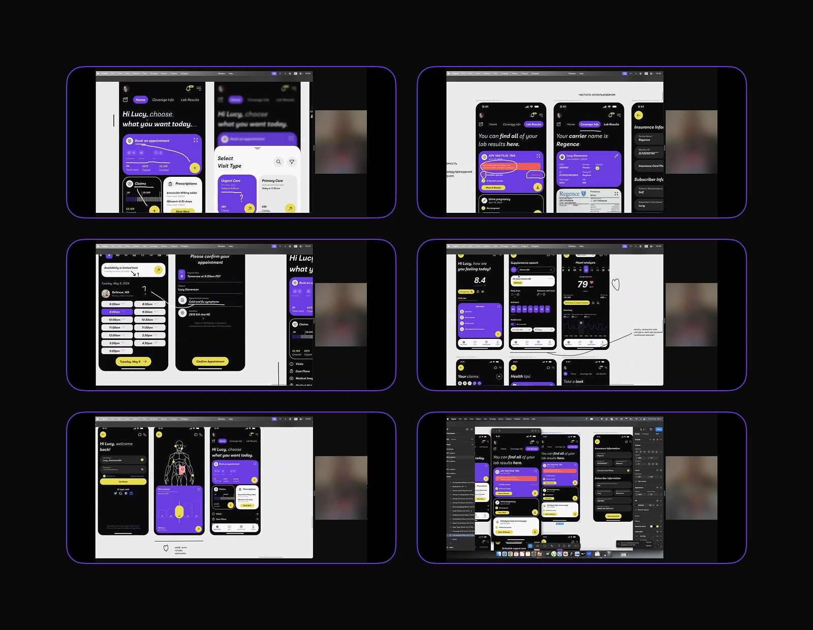
User Tests
What I Changed
Coverage Info, Visibility, and Dashboard Information: The home screen displays coverage status, upcoming appointments, and recent claims at a glance — providing essential daily information.
Plan Summary: Simplified to 3 key metrics: cost, deductible, network
Booking flow: Shortened to 2 taps from the homepage
Prescription Summary: Showing two current prescriptions with a "View All Prescriptions" button balances clarity with simplicity.
Real-Time Claims Tracker: A simplified claims overview helps users feel in control of their spending and coverage.
Clean, Familiar Style: Maintains the visual structure and aesthetic users preferred in previous versions. Clear icons, soft colors, and a readable layout support accessibility and ease of use structure.
New Concept
7. Results – Small Changes, Massive Confidence Boost
"After testing, users told me they finally understood what they were buying. That's impact."
UX Outcomes
90% onboarding completion (vs. ~60% industry avg.)
Plan decision time reduced by 50% (avg. 2 min vs. 4–5 min)
User satisfaction: 4.6/5 average across testing
Business Potential
Easier onboarding = more plan activations
Clearer plans = fewer support tickets
Confident users = better retention
8. Reflection – Designing with Empathy, Not Just Logic
"This project taught me that good UX is like a good teacher — it explains what matters and gives people confidence to act."
What I'd Improve
Work with legal advisors to ensure HIPAA and compliance coverage.
Add AI-powered plan recommendations.
Expand the testing pool to underserved users (e.g., seniors, immigrants)
9. Collaboration – No Echo Chambers Allowed
Even solo, I reached out for feedback:
Interviewed an insurance broker to validate plan comparison logic
I spoke with a developer about API structure for real-time coverage.
Ran early flows by a design mentor for feedback on hierarchy and tone.
"Even solo work should be collaborative — it's how real products grow."
Final Thought
"Health insurance is overwhelming by default. My job was to make it understandable by Design."
Like this project
Posted Jun 5, 2025
Designed a user-friendly health insurance app to simplify onboarding and plan comparison.
Likes
1
Views
13
Timeline
Apr 30, 2024 - Aug 31, 2024
Clients
Insurely