BECU Mobile Banking Redesign
Project Title
BECU Mobile Banking Redesign – Simplifying Finance for Everyday Users
Project Type
Mobile App Redesign | UX/UI | Fintech
The Problem
Traditional banking apps often overwhelm users with cluttered layouts, unclear actions, and inconsistent flows. BECU’s mobile app was no exception — users struggled with tasks as simple as sending money or checking their balance.
Key Issues:
Overloaded home screen with low visual hierarchy
Friction in transferring money and paying bills
Inconsistent user flows and outdated UI
Lack of trust through design
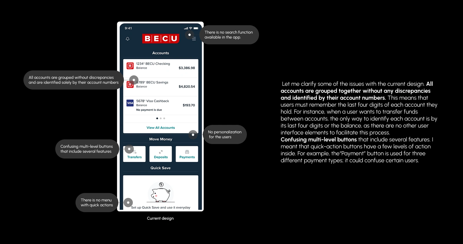
Old BECU App Design
The Goal
Redesign the BECU mobile app to improve clarity, modernize the visual language, and enhance user trust in digital banking.
Objectives:
Simplify key user flows (transfers, payments, account overview)
Create a cohesive, mobile-first UI system that is responsive and adaptable.
Improve user trust and reduce support dependency
Target Audience
U.S.-based users age 25–60
Primary banking customers using mobile-first features
Users seeking fast, clear, and secure mobile banking
Research Highlights
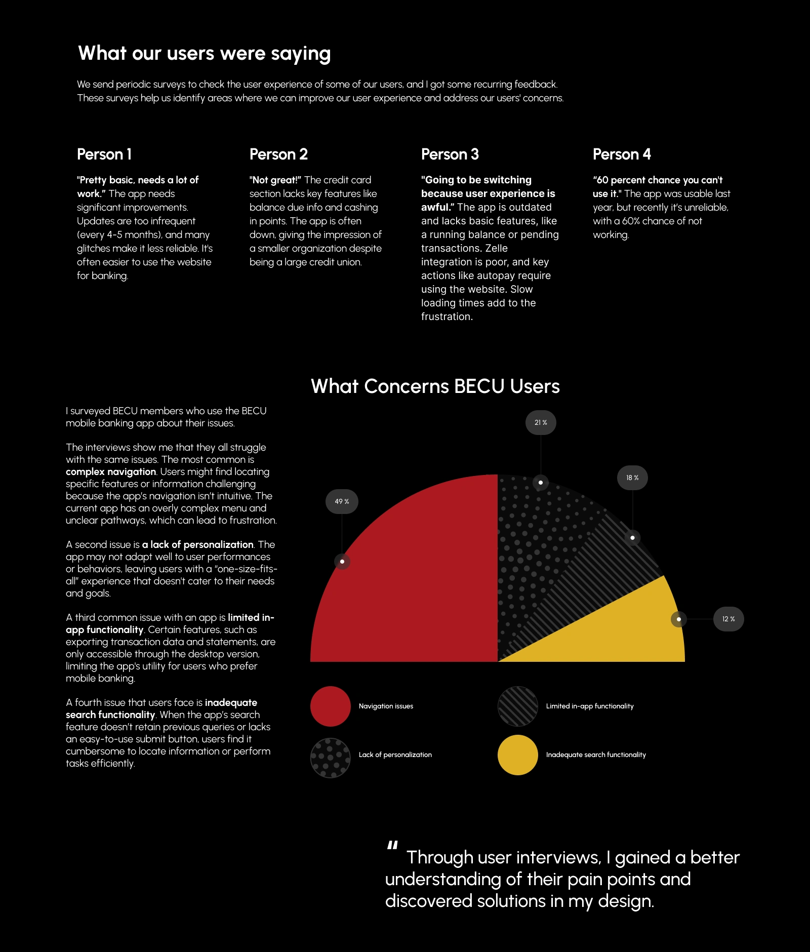
I conducted a UX audit and visual competitor analysis and explored user behavior patterns across popular banking apps (e.g., Chime, Capital One, Wells Fargo).
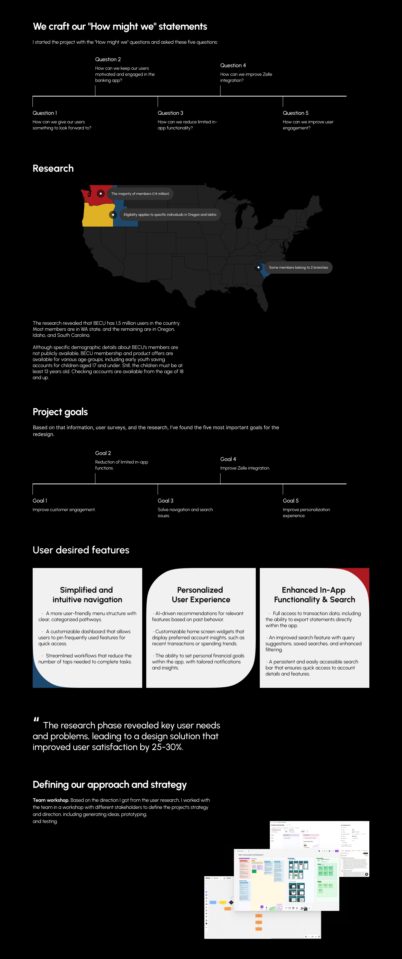
Research Process
Design Gaps
Insights:
Most-used features: balance checks, transfers, and recent activity.
Users are often confused by the bill pay flow.
Visual inconsistencies created trust issues.
UX Strategy
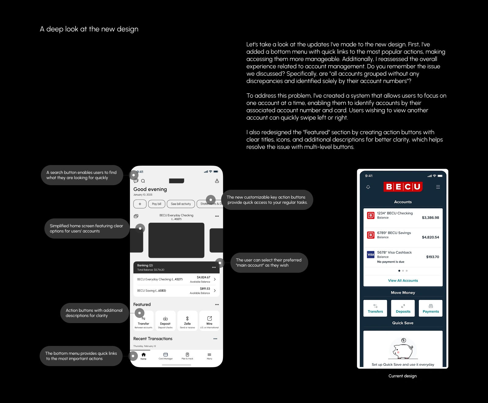
I restructured navigation and focused the home experience around personalization, clarity, and speed.
Key Improvements:
Clear sectioning of account details, activity, and quick actions
Streamlined bill pay and transfer flow
New component system to maintain visual consistency
Key improvements
Visual Language
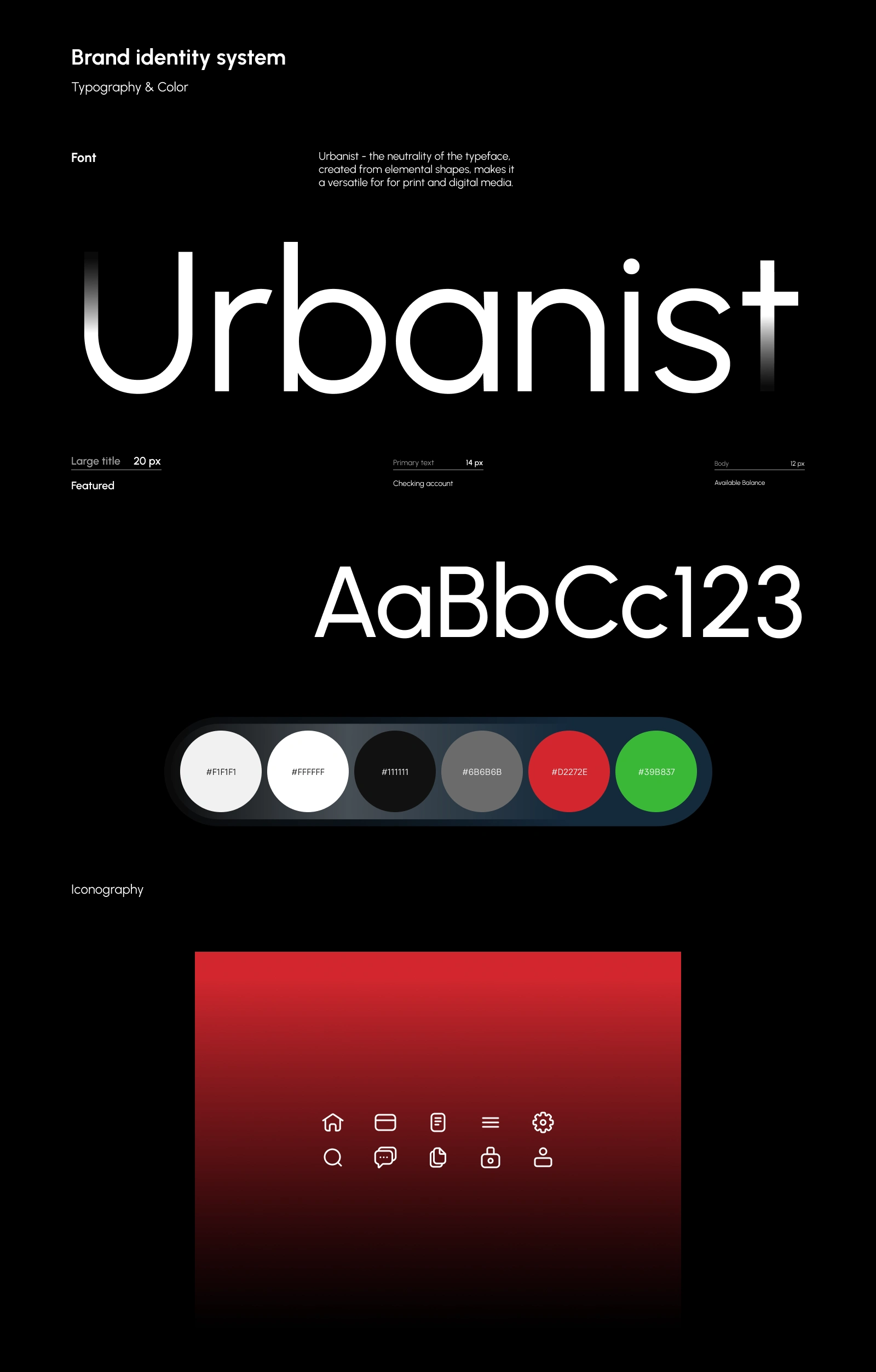
A modern, minimal style using the Urbanist font and a bold red/black/white color palette — signaling strength, urgency, and trust.
Typography: Urbanist
Colors: Red (#D92B2B), Black, White, and Light Gray for contrast
Clean iconography and scalable UI components
Visual Language
Final Designs
High-fidelity mobile screens were created for:
Home Dashboard
Transfer Money
Pay a Bill
Transaction History
Success States & Notifications
Bottom Nav Redesign

Results
Reduced navigation time by 30% (estimated through simplified flows)
Improved user comprehension of bill pay by redesigning step clarity
Created dev-ready, scalable Figma files for handoff
Tools Used
Figma • Notion • Adobe Illustrator • Google Forms
What I Can Do for You
Need to redesign your banking, SaaS, or finance product? I specialize in turning complex flows into clean, intuitive experiences that users trust.
Message me to collaborate or view more projects.
Like this project
Posted Jun 22, 2025
Redesigned BECU mobile app for improved clarity and user trust.
Likes
2
Views
23
Timeline
Jan 23, 2025 - Feb 20, 2025
Clients
BECU

