Built with Spline
Logo & Brand Identity Design for a Payment Comparison Service
Ugochukwu Osuagwu
Switch Smarter, Save Time

Brand Pattern cover
Project Description
eProPay is a comparison platform that helps businesses effortlessly find and switch to the ideal payment processor. With their core promise of saving time and simplifying decision-making, eProPay empowers businesses to discover the right payments provider instantly, ensuring smoother operations without the usual hassle.
My Contribution
I crafted a logo design and brand identity that seamlessly align with eProPay's vision, name, and origin. The design reflects the brand's core values: switch smarter, save time. The visual elements were carefully chosen to resonate with businesses seeking clarity in the complex world of payment processors, ensuring eProPay stands out as a reliable and modern solution.
Key Deliverables
Logo Design
Brand Identity Elements
Industry
Fintech

Tagline
The right design
In early 2024, I collaborated with Mr. David Luta to create a timeless and efficient logo identity for his brand, eProPay. The company, which he co-founded with a close friend, is designed to revolutionize how businesses find and switch to the ideal payment processor. Their mission is to simplify this process, ensuring a straightforward and efficient experience that delivers exceptional results.
Understanding the significance of the logo as the visual cornerstone of the brand, I began the project with a collaborative approach. I provided Mr. Lutta and his team with a detailed questionnaire to gain deeper insights into their vision, values, and the unique challenges their business addresses. Through our discussions, I discovered that eProPay prioritized simplicity, reliability, and clarity—qualities that needed to be reflected in the logo.
Based on these insights, I developed four distinct logo concepts, each carefully designed to resonate with the brand's mission and the emotions they wanted to evoke. These concepts incorporated clean, modern elements and versatile designs that could adapt across various platforms and applications. The final design captures the essence of eProPay, reflecting its commitment to simplicity and efficiency. It stands as a professional and enduring visual identity that aligns with their mission to transform the payment processor industry.
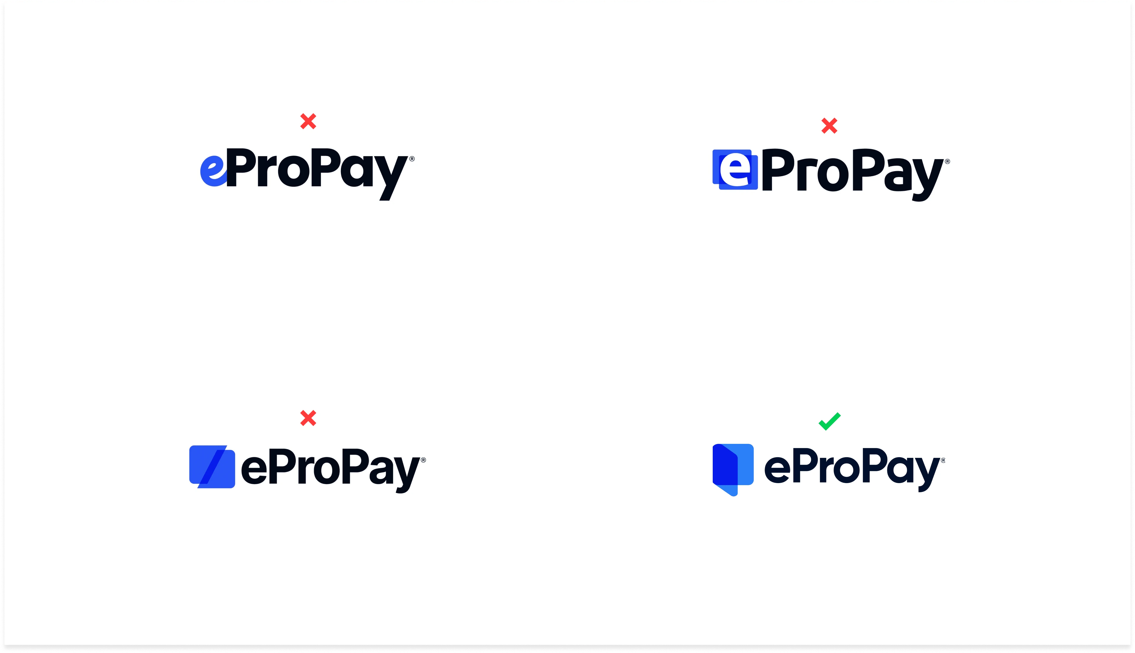
Logo concepts
The Logo
The eProPay logo reflects a simple yet highly effective visual identity for the brand. The design centers around an abstract icon that captures the essence of eProPay’s services. The icon subtly incorporates a “quote” motif, symbolizing the company’s role in offering comparison quotes to help businesses find their ideal payment processor.
Additionally, the design features two overlapping card shapes, representing the brand’s core service of comparing payment options. In a clever and understated manner, the icon also forms the letter “P,” tying it closely to the brand name while emphasizing its modern and professional identity.
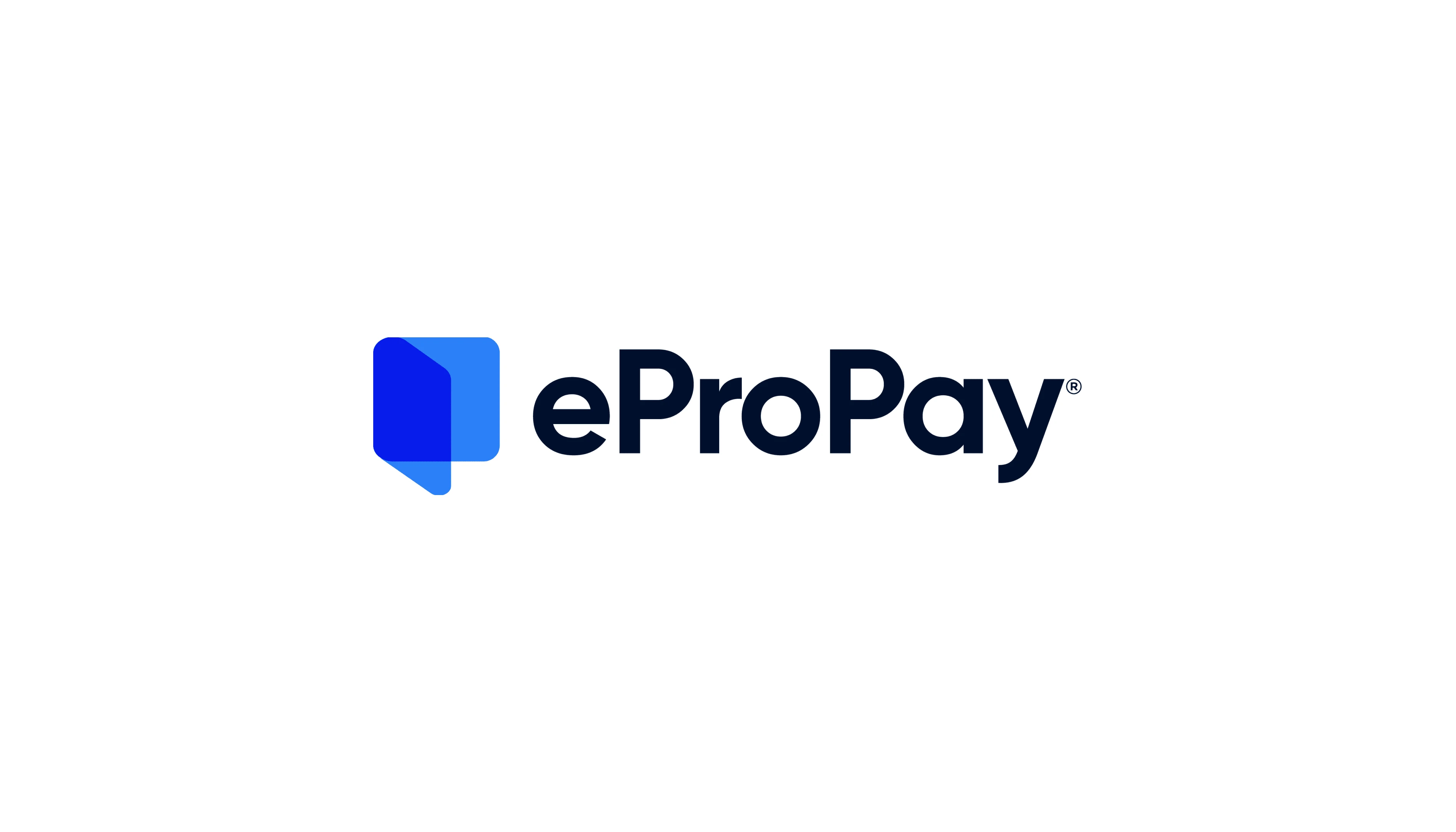
The approved logo design

3D icon
Background overlay
Branding Elements
We designed key branding elements needed at the point for the brand vision and mission establishment.

Business card & app Icon
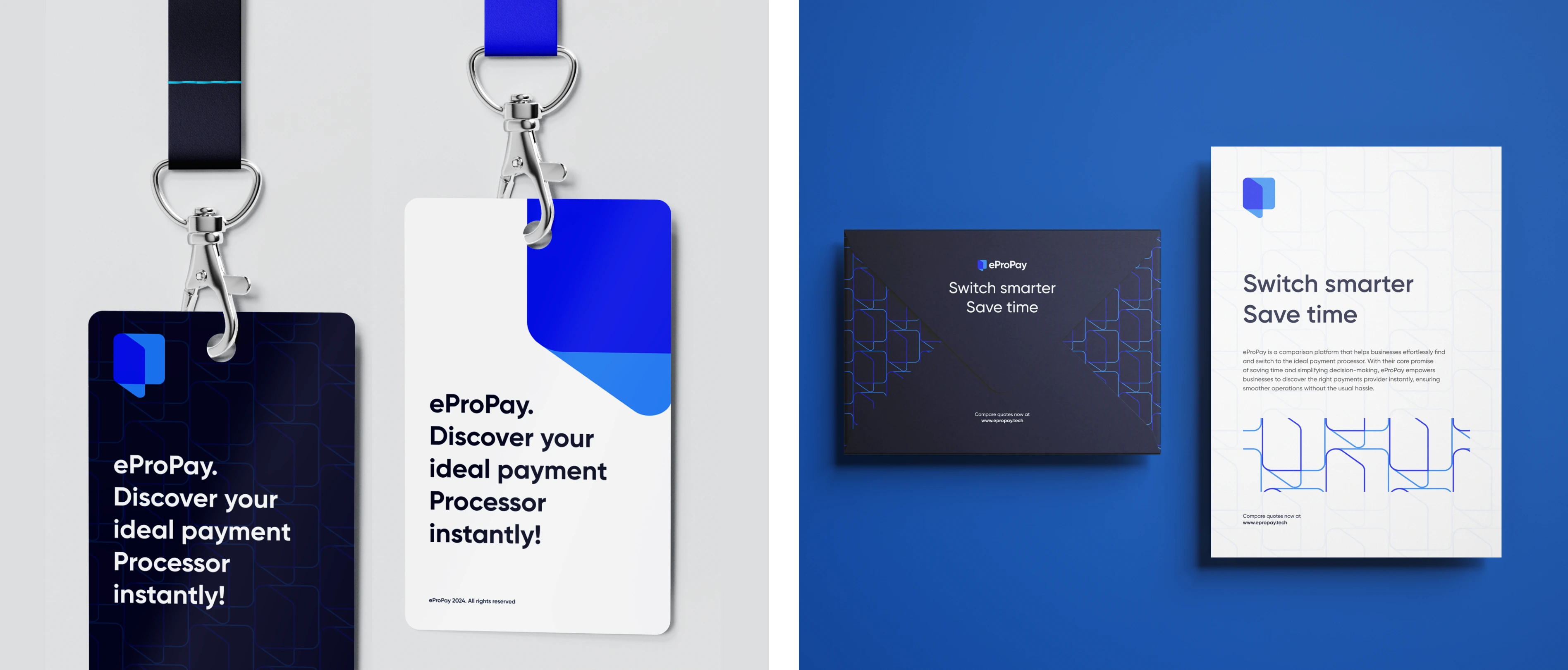
Switch smarter

The perfect payment partner

Pin & silicon band
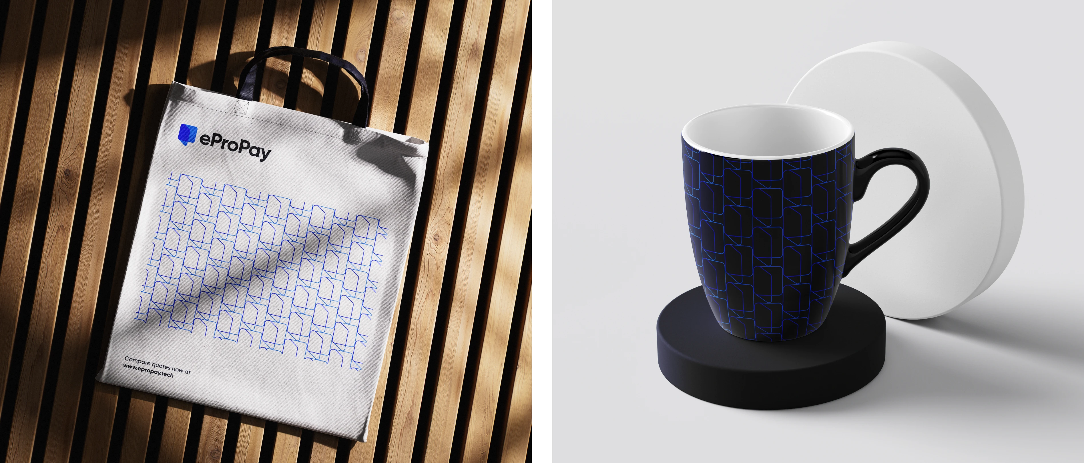
Tote bag & coffee cup

Ad banner
Results
A better visual direction for the brand and an increase in development - productivity.
Thank you
Like this project
Posted Feb 18, 2025
I crafted a logo design and brand identity that seamlessly align with eProPay's vision, name, and origin.
Likes
1
Views
8
Timeline
Apr 1, 2024 - May 2, 2024