RECx: Mobile App Concept & UX Design

Omar Alfageeh

Self-initiated concept project. Product, UX and brand designer · Figma. Deliverables: market and user research, an AI guardrail system prompt, brand identity, a design system and hi-fi mockups with a prototype.
Overview
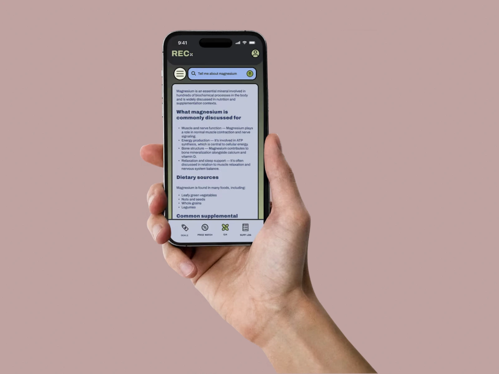
I take supplements, and the more I added, the more the same problems came up: which brands to trust, what's hype versus real benefit, how to dose, and how to keep costs down. RECx is a concept for one app that covers all four: an AI Q&A for research, price matching, a deals feed and a daily supplement log.
Research
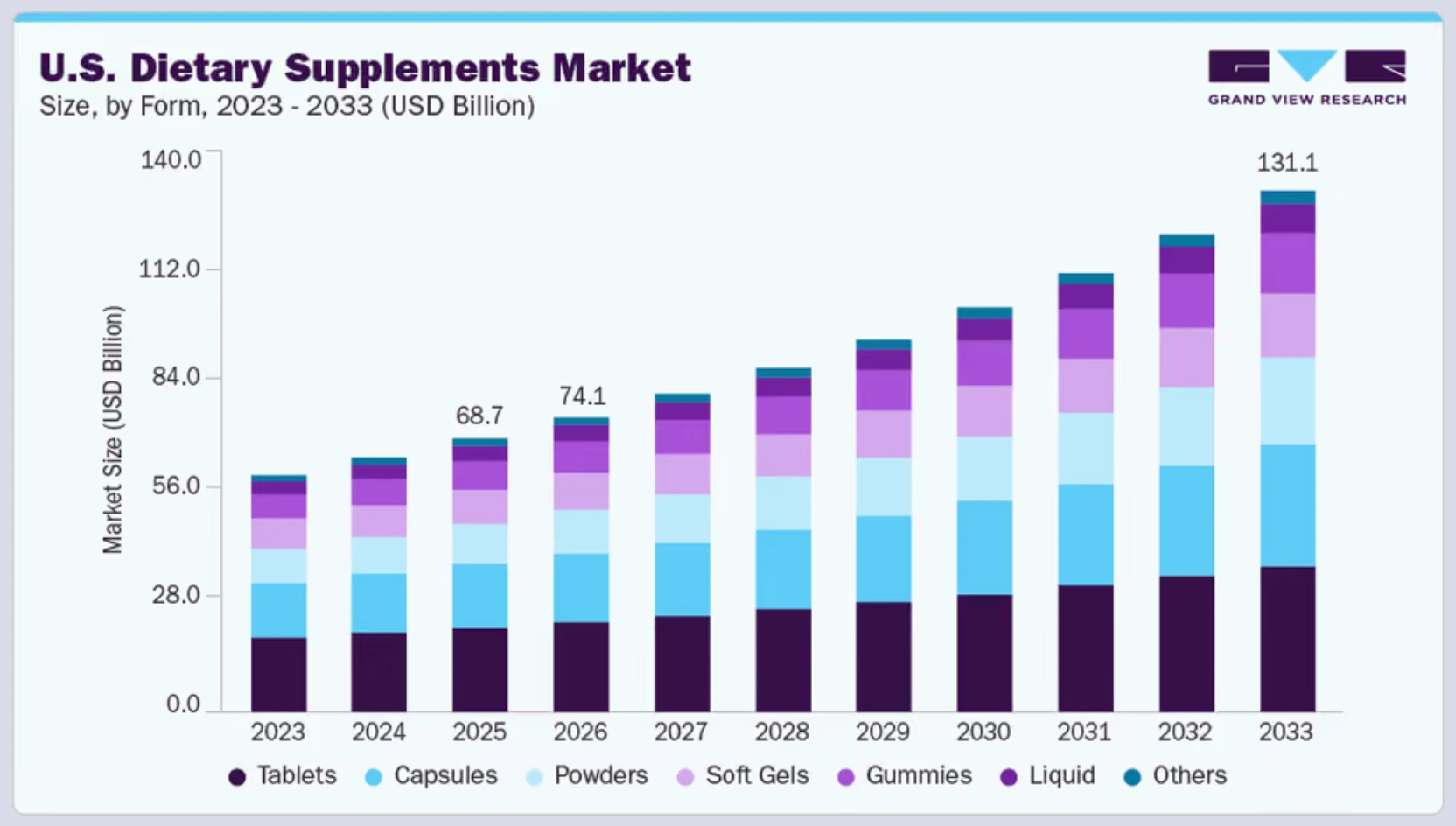
The market is large and loosely regulated. The U.S. dietary supplements market was estimated at $68.74B in 2025 and is projected to reach $131B by 2033 (Grand View Research). The FDA doesn't approve supplements before they're sold, a NEJM study estimated about 23,000 emergency department visits a year from supplement adverse events, and a 2022 study of immune-support products found quality control lacking in many of them.
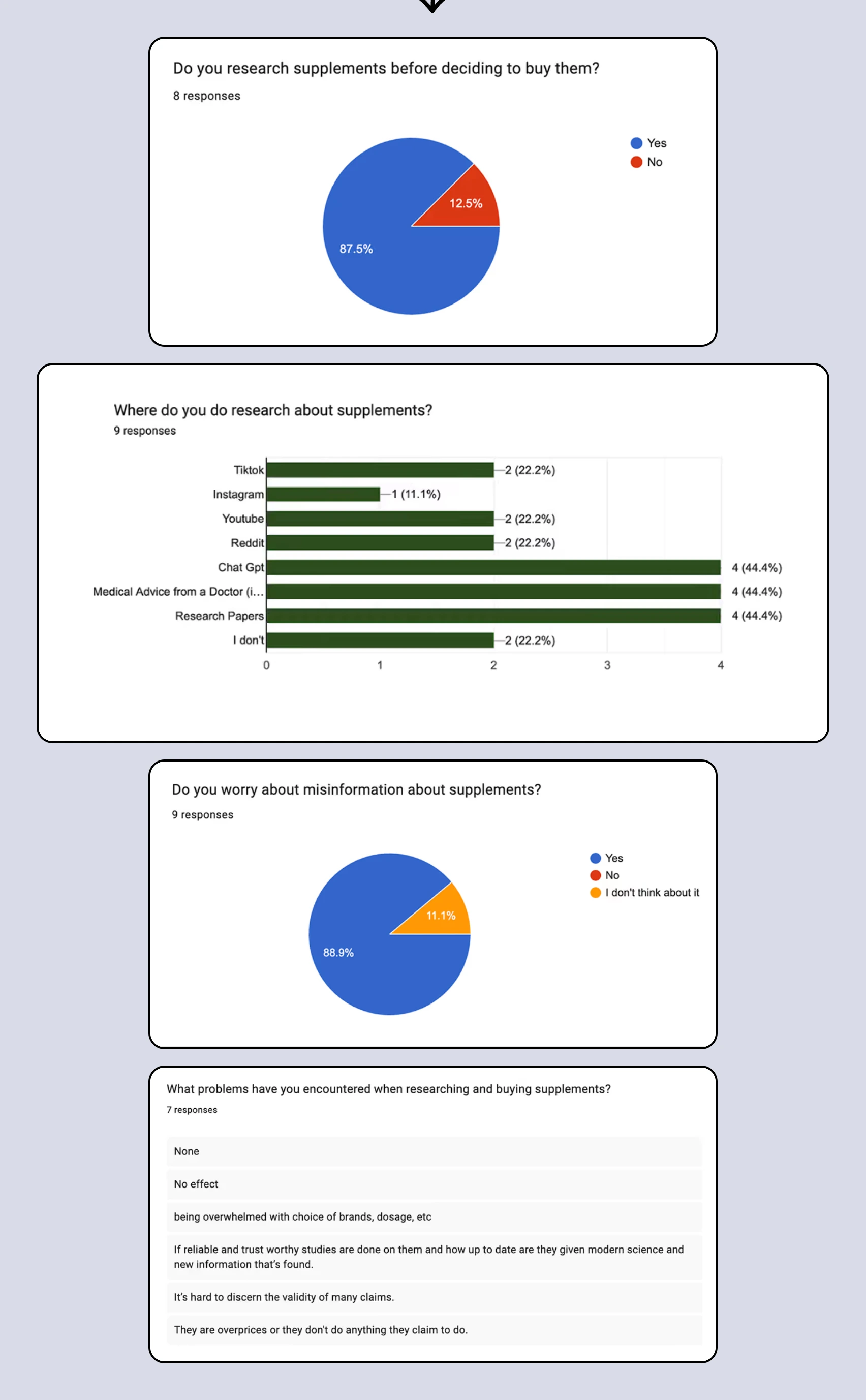
A user survey (11 questions, 11 responses) showed how people actually decide:
63.6% take supplements, and 87.5% research before buying.
ChatGPT, doctors and research papers were each used by 44.4% of respondents for research.
88.9% worry about misinformation.
People described feeling overwhelmed by brands and dosing, unsure which claims to believe, and worried products are overpriced.
Challenge statement: People who self-supplement need a one-stop, evidence-informed way to understand what a supplement can and can't do, vet credibility and avoid misinformation, manage multi-supplement stacks without being overwhelmed, and compare prices, while keeping strict guardrails so the experience never drifts into assertive medical advice.
Key design decisions
1. AI answers, inside guardrails
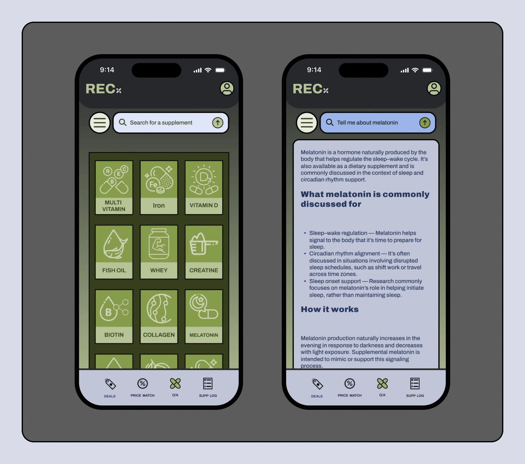
People already ask chatbots about supplements; the risk is a model that sounds like a doctor. I wrote a system prompt, drafted with GPT-5.2 Thinking, that keeps answers to neutral education on mechanisms, safety and interactions; blocks diagnosis, treatment plans and personalized dosing; and reframes symptom questions into general wellness topics with a nudge toward professional care. It powers the Q&A tab, the core of the app.
2. Price matching, modeled on GoodRx
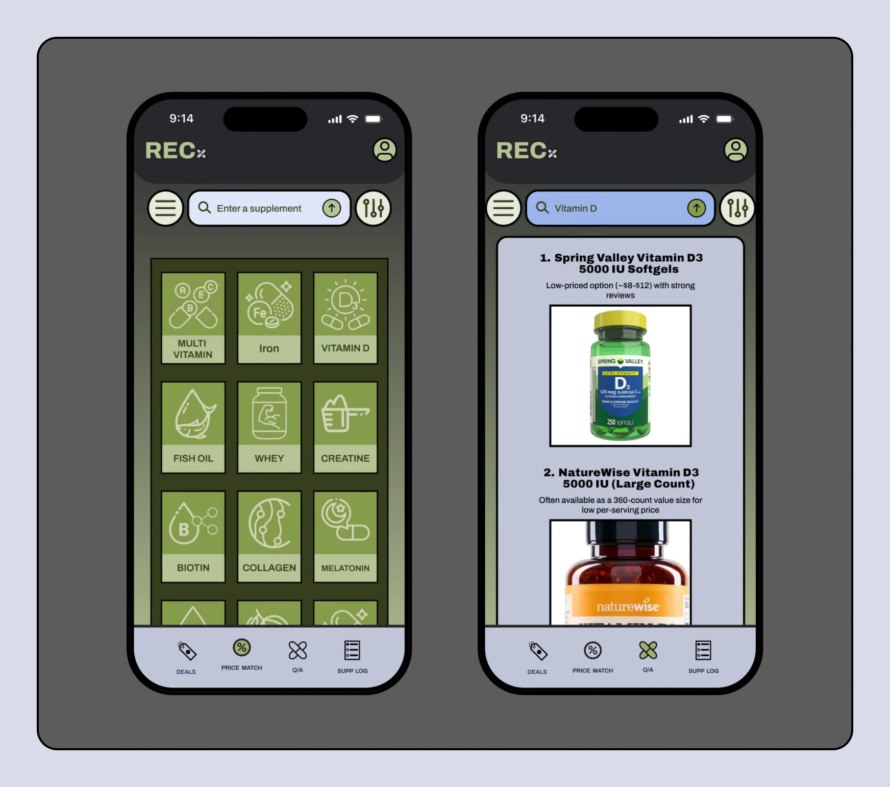
Supplements are cheap one at a time but add up across a stack, and not everyone has time to compare brands. Price Match lists the best available prices for any supplement, the way GoodRx does for prescriptions.
3. Promotions get their own tab
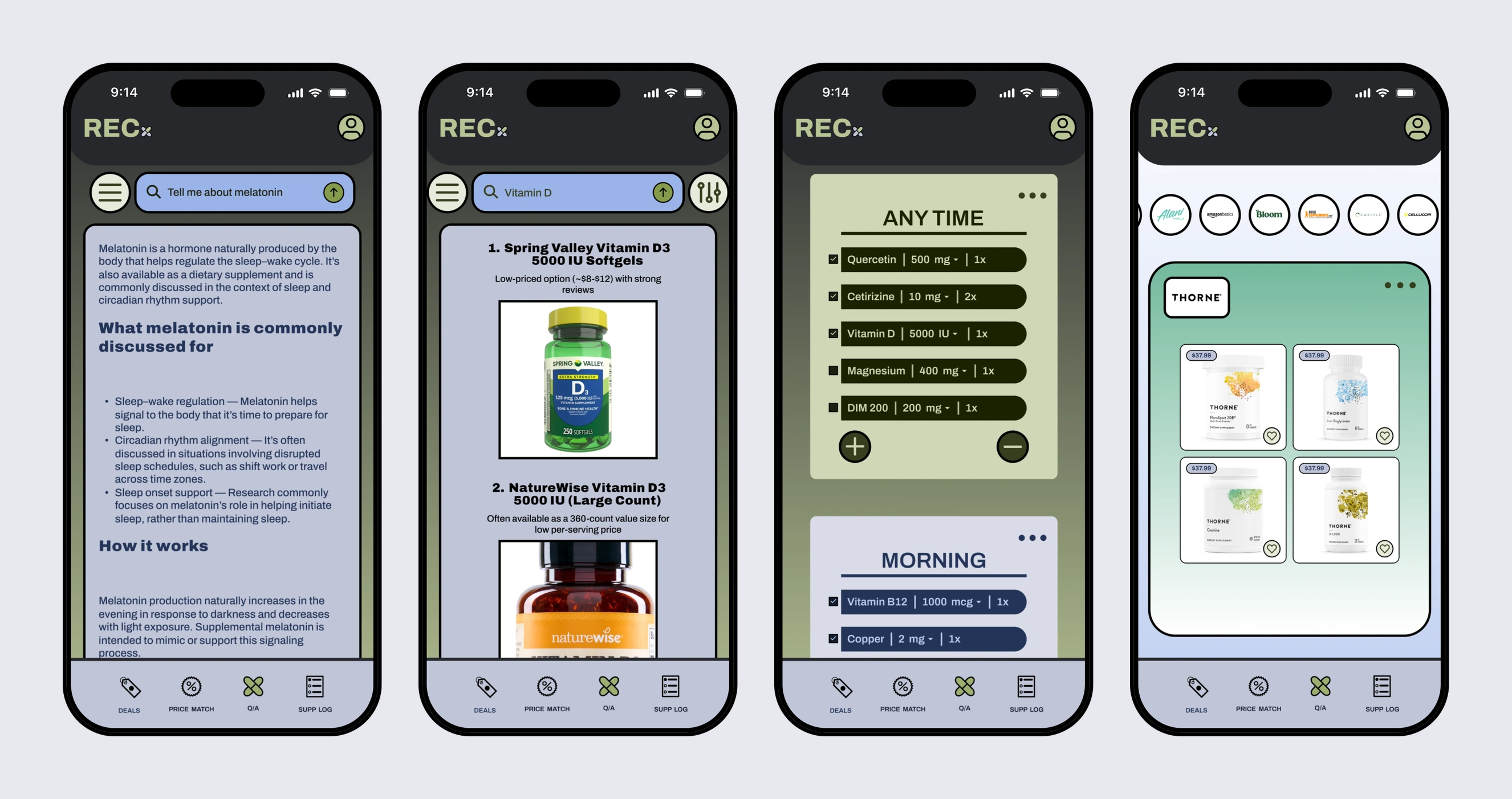
Deals is how the app makes money: daily coupons, time-sensitive discounts and sponsored promotions. Keeping them in a separate tab means sponsored content never muddies the intent of the Q&A answers.
4. A log that works like a to-do list
Staying consistent is the hard part. Users build a regimen once, then check doses off through the day in color-coded morning, midday, night and anytime cards, instead of tracking it in a separate notes app.
Brand
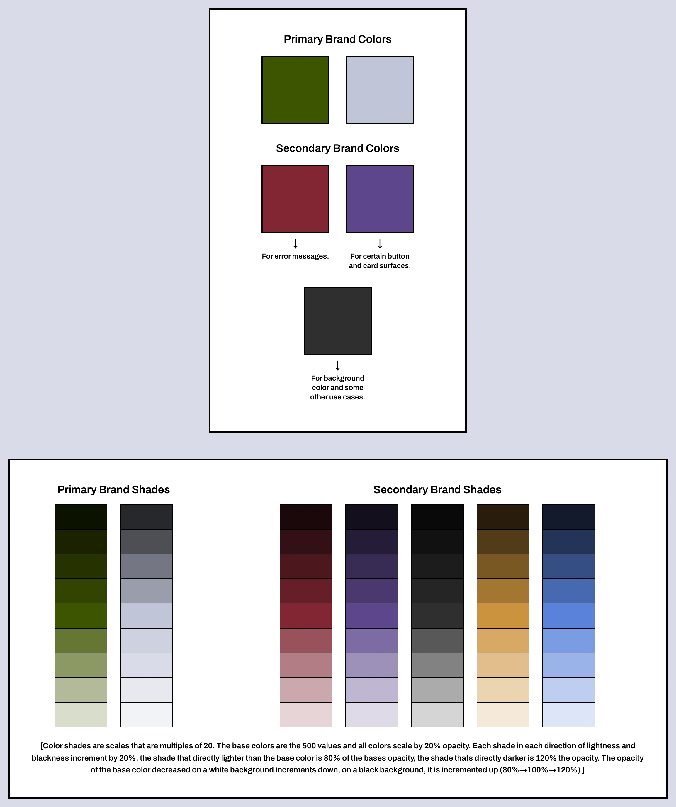
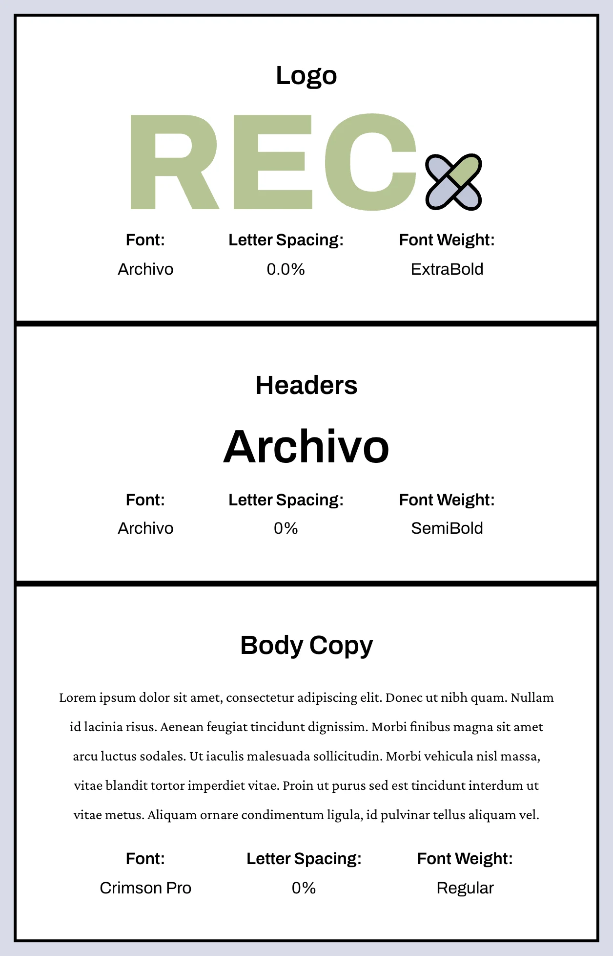
"RECx" combines recommendation and Rx, and a pill forms the x. Olive and cool grey lead the palette, with burgundy for errors, violet for some buttons and cards, and charcoal for backgrounds. Each color has shades in 20% steps from its base. Archivo carries the logo and headers; Crimson Pro is the body face.

Design system
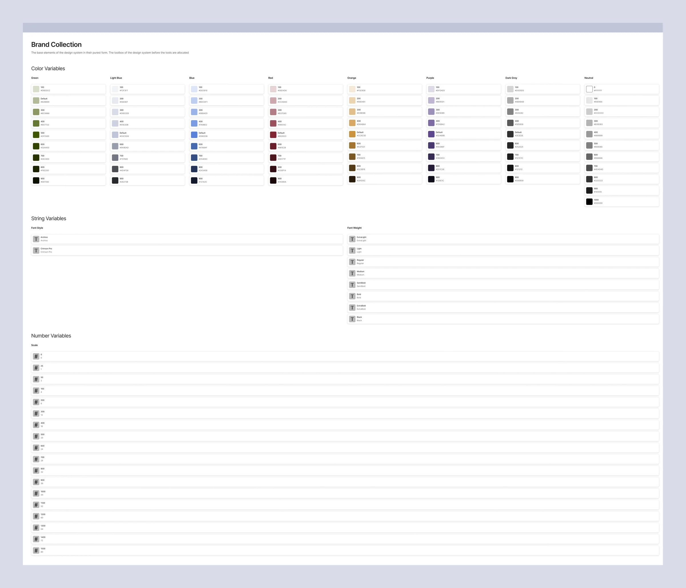
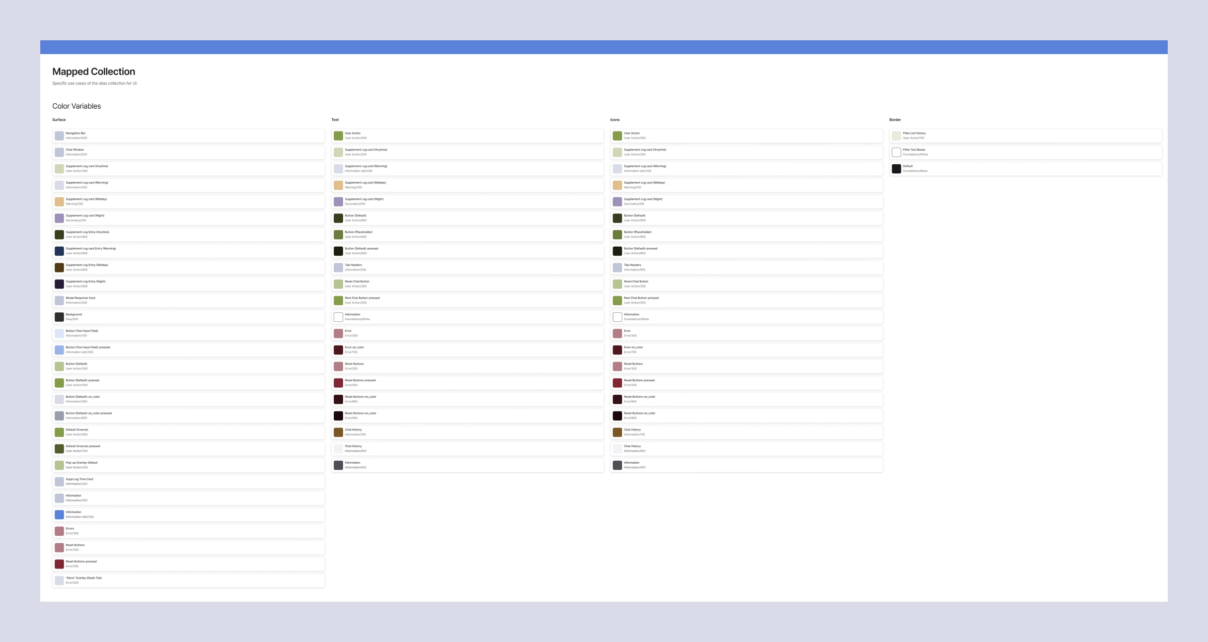
A three-tier variable system: a brand collection, an alias collection for intent and a mapped collection for specific UI, plus a responsive collection for type sizes and a component library built on top.
Hi-fi mockups
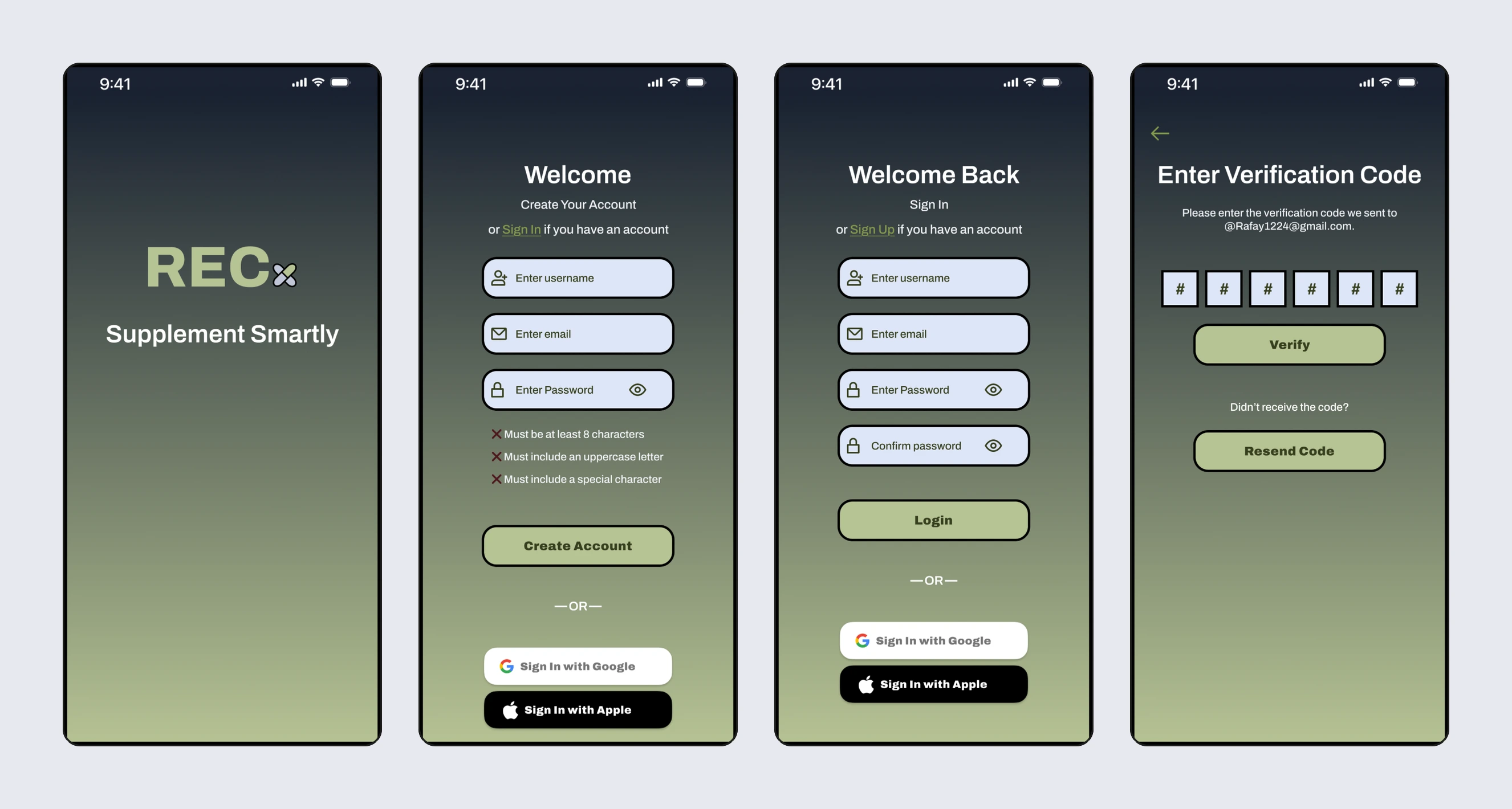
Onboarding: loading, sign up, sign in and verification.
What I'd test next
How often the guardrail prompt declines questions users consider reasonable, and whether its redirections still feel helpful.
Whether users can tell sponsored deals from neutral information at a glance.
Like this project
Posted Oct 5, 2026
Concept supplement app built on market and user research, with guardrailed AI Q&A, price matching, deals, a supplement log and a full design system.
Likes
0
Views
0