Nukta Magazine: Brand Identity & Website Design

Omar Alfageeh

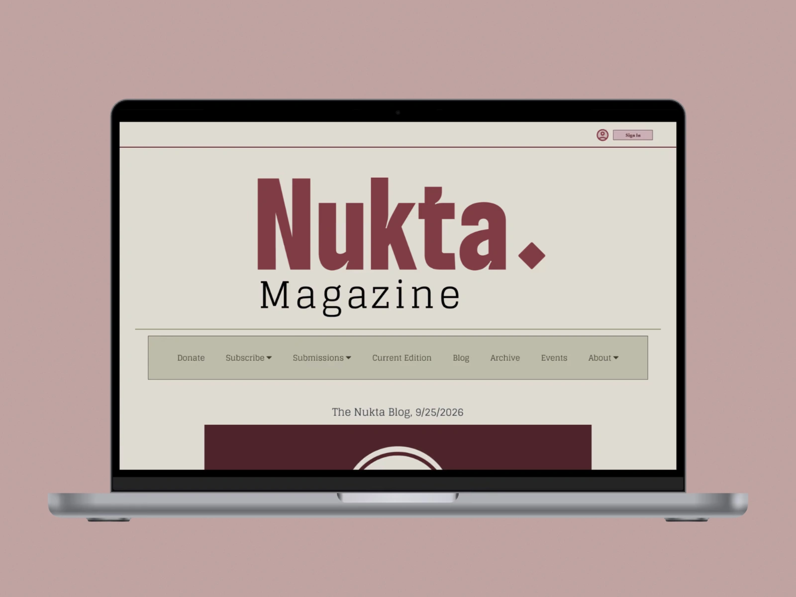
Client work for Nukta Magazine. Brand and UI/UX designer, working with Omar Shaker (CEO and editor-in-chief) · Fall 2025 · Figma. Deliverables: brand identity, a full design system, a hi-fi site mockup and a site prototype.
Overview
Nukta is a Muslim-led magazine for written and visual art by Muslim creatives who often lack accessible places to share their work. It honors the religious and cultural traditions its artists come from while making room for alternative expression, and it aims to reach Muslims across the U.S. I was brought on to give it a brand and a digital home.
The brief
A cohesive identity that honors Nukta's religious and cultural roots while feeling modern and accessible to the national Muslim diaspora.
A website that works as the hub for publishing, promoting initiatives and engaging the community.
A design system that stays clear and consistent as new team members and contributors join.
Direction
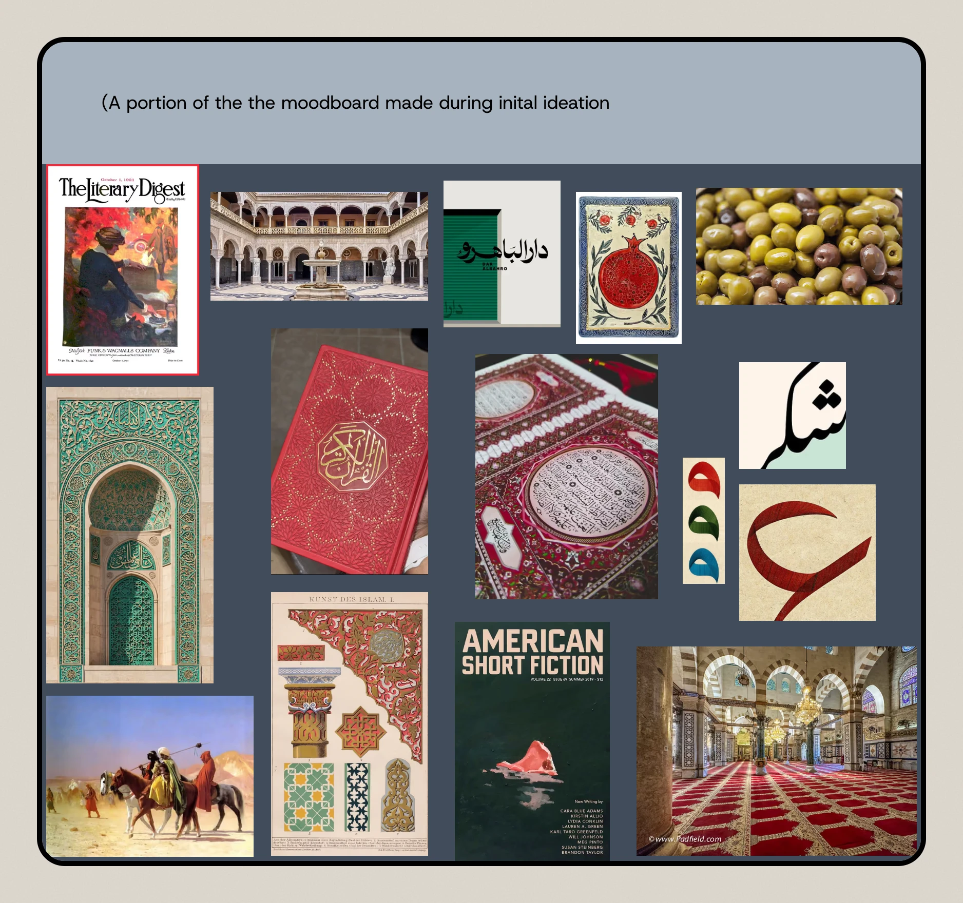
The moodboard grounded the brand in both halves of its identity: a Muslim organization and a literary magazine.
Key design decisions
1. Dulled colors for a paperback feel
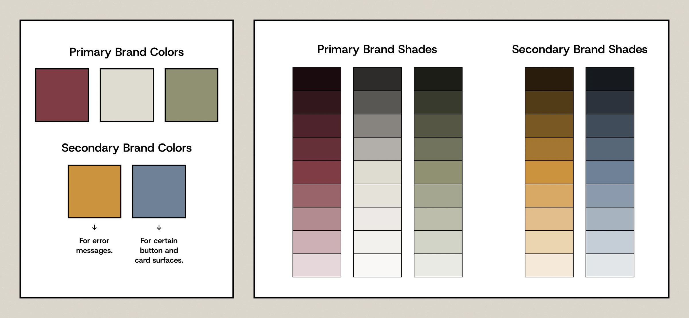
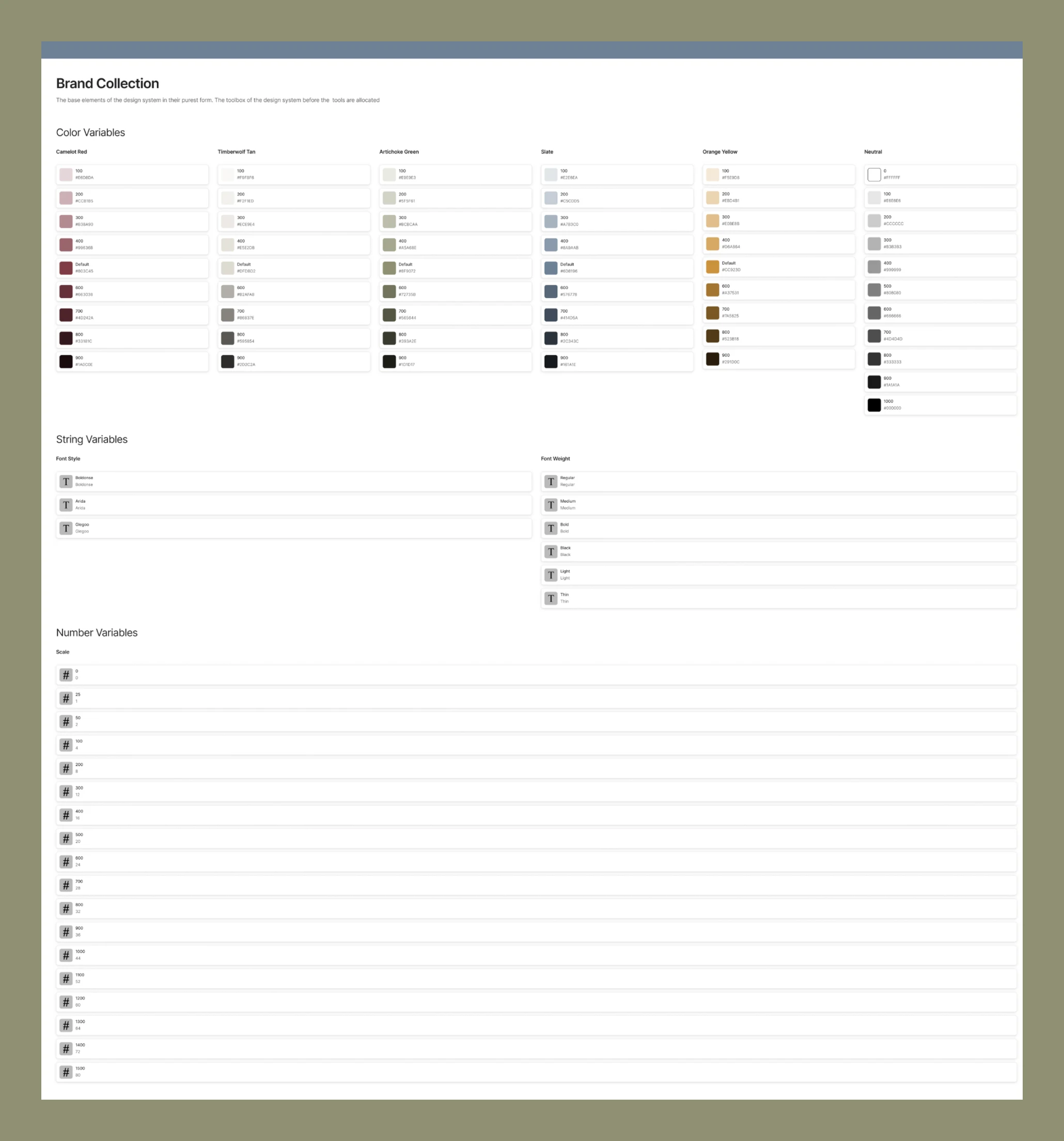
Red, beige and green, each in a muted shade, anchor the brand to cultural touchstones while feeling like printed pages. Ochre is reserved for error messages and slate for certain buttons and card surfaces, and every color has a full shade ramp.
2. Type with ink traps
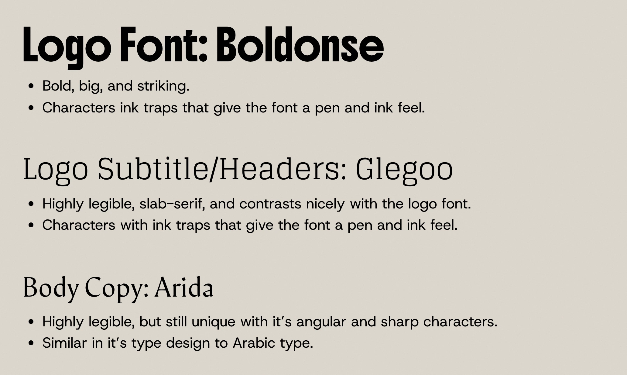
Boldonse for the logo, Glegoo for subtitles and headers, Arida for body copy. All three have ink traps that give a pen-and-ink feel, and Arida's angular, sharp forms are close in design to Arabic type.
3. A mark from the name
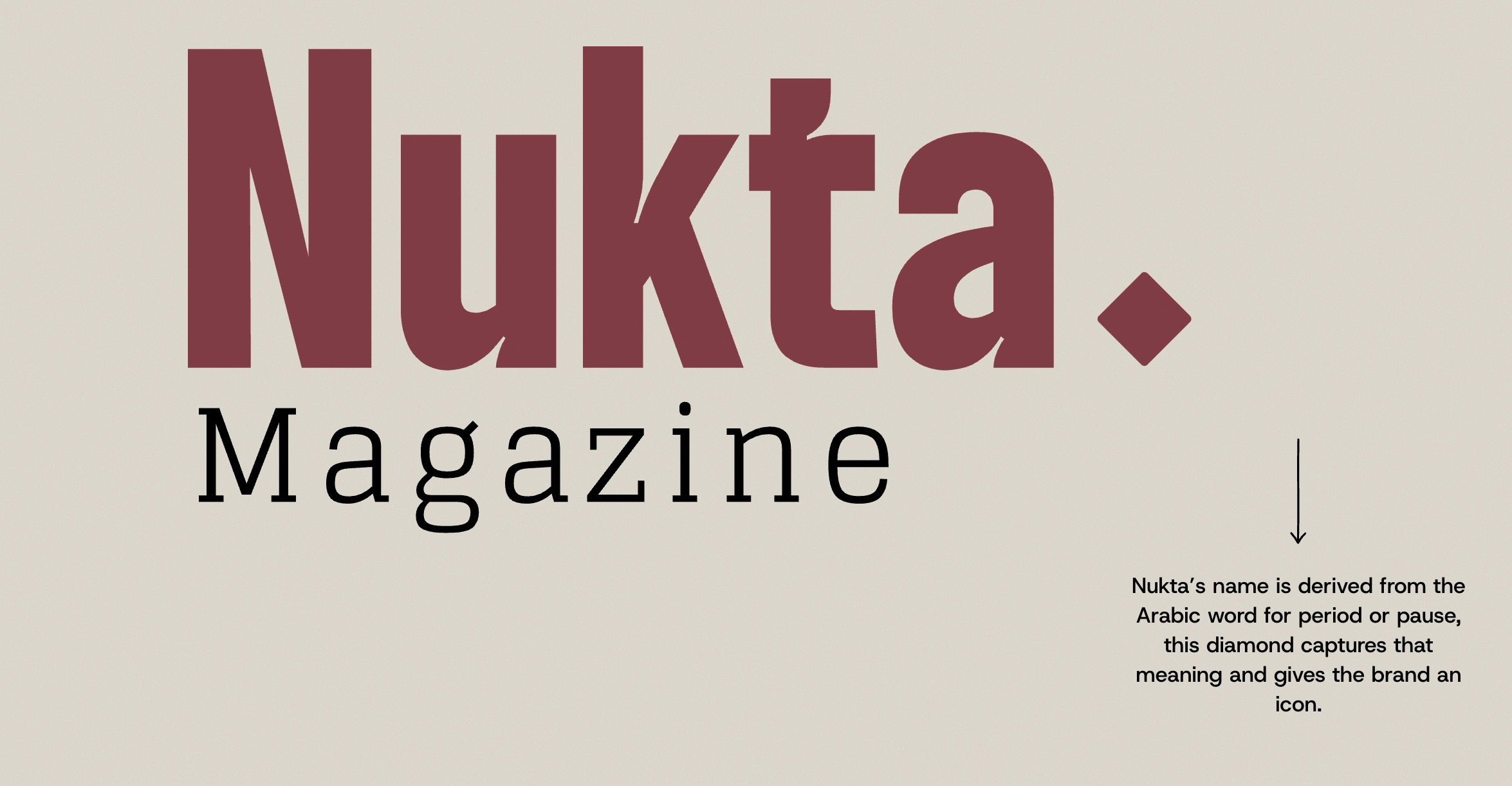
"Nukta" comes from the Arabic word for a dot, period or pause. The diamond captures that meaning and gives the brand an icon that works on its own.
4. Three tiers instead of two
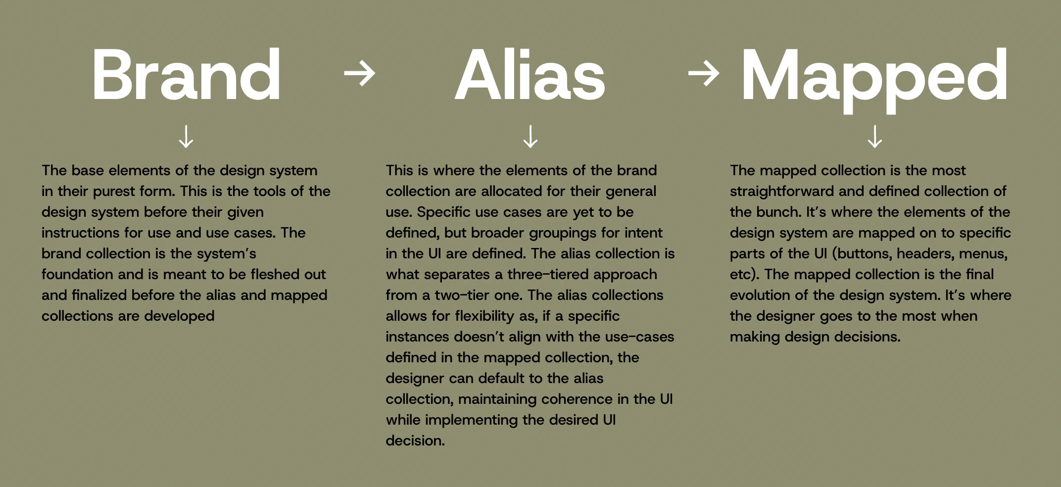
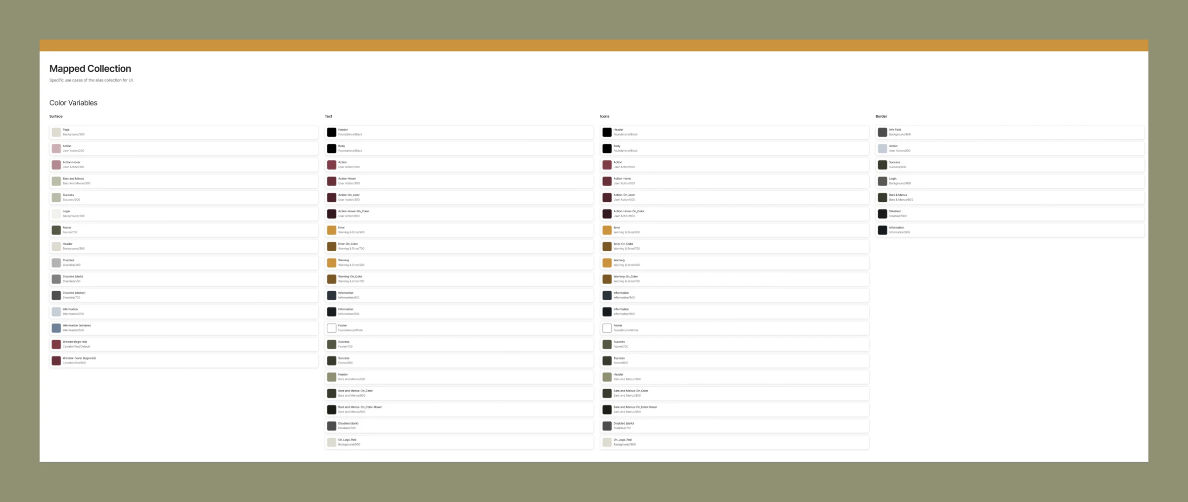
The variables go from a brand collection (raw values) to an alias collection (general intent) to a mapped collection (specific UI like buttons, headers and menus). The alias tier is the reason for three: when a case doesn't fit a mapped use, a designer can fall back to the alias and still stay consistent.
Component library
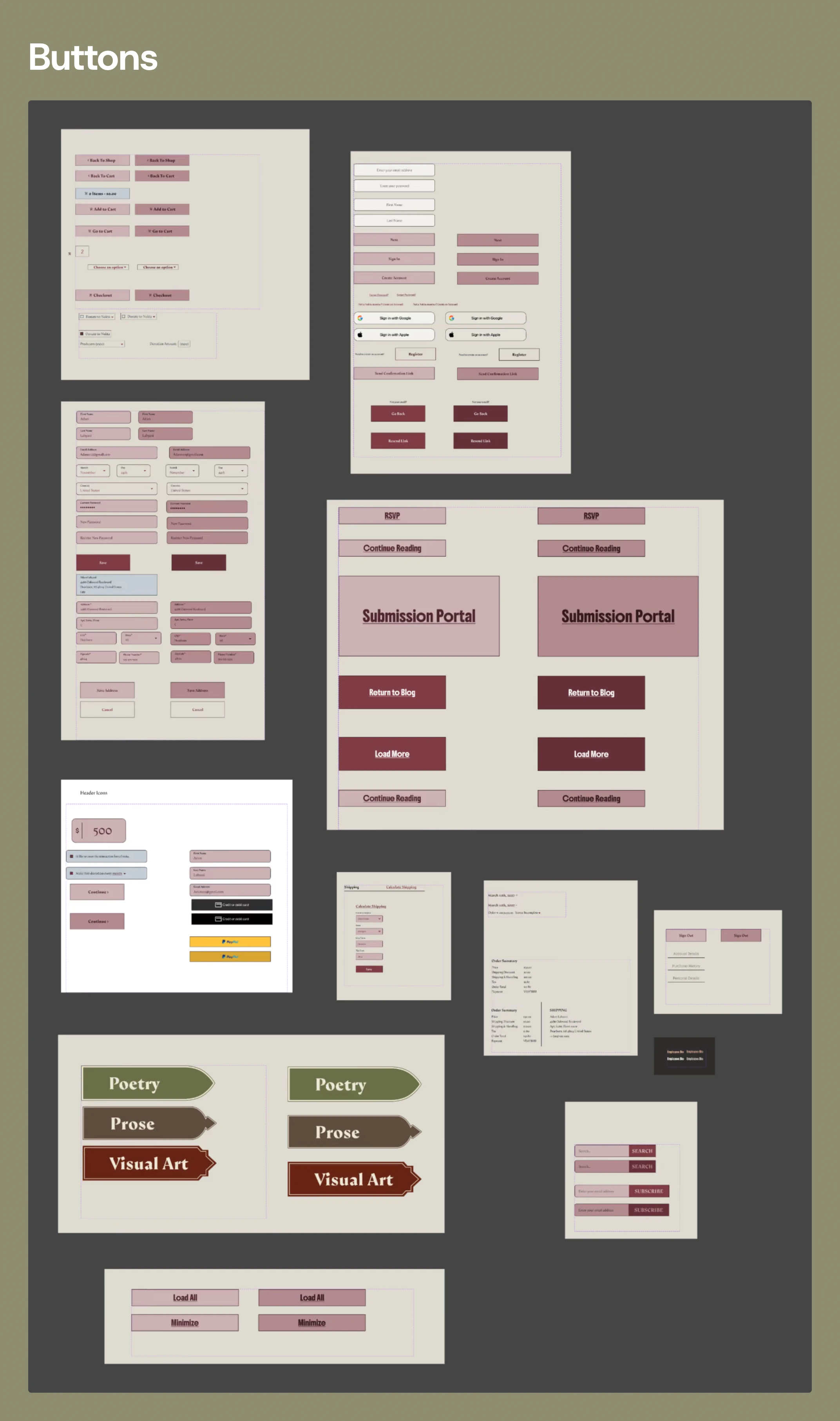
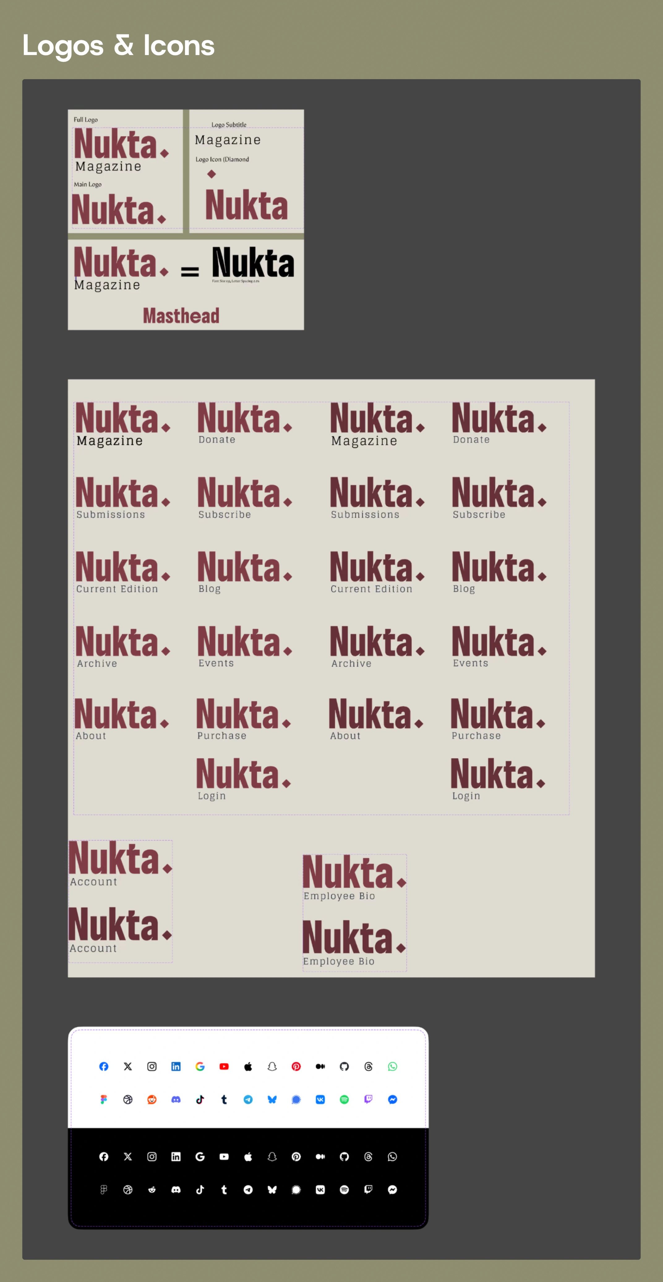
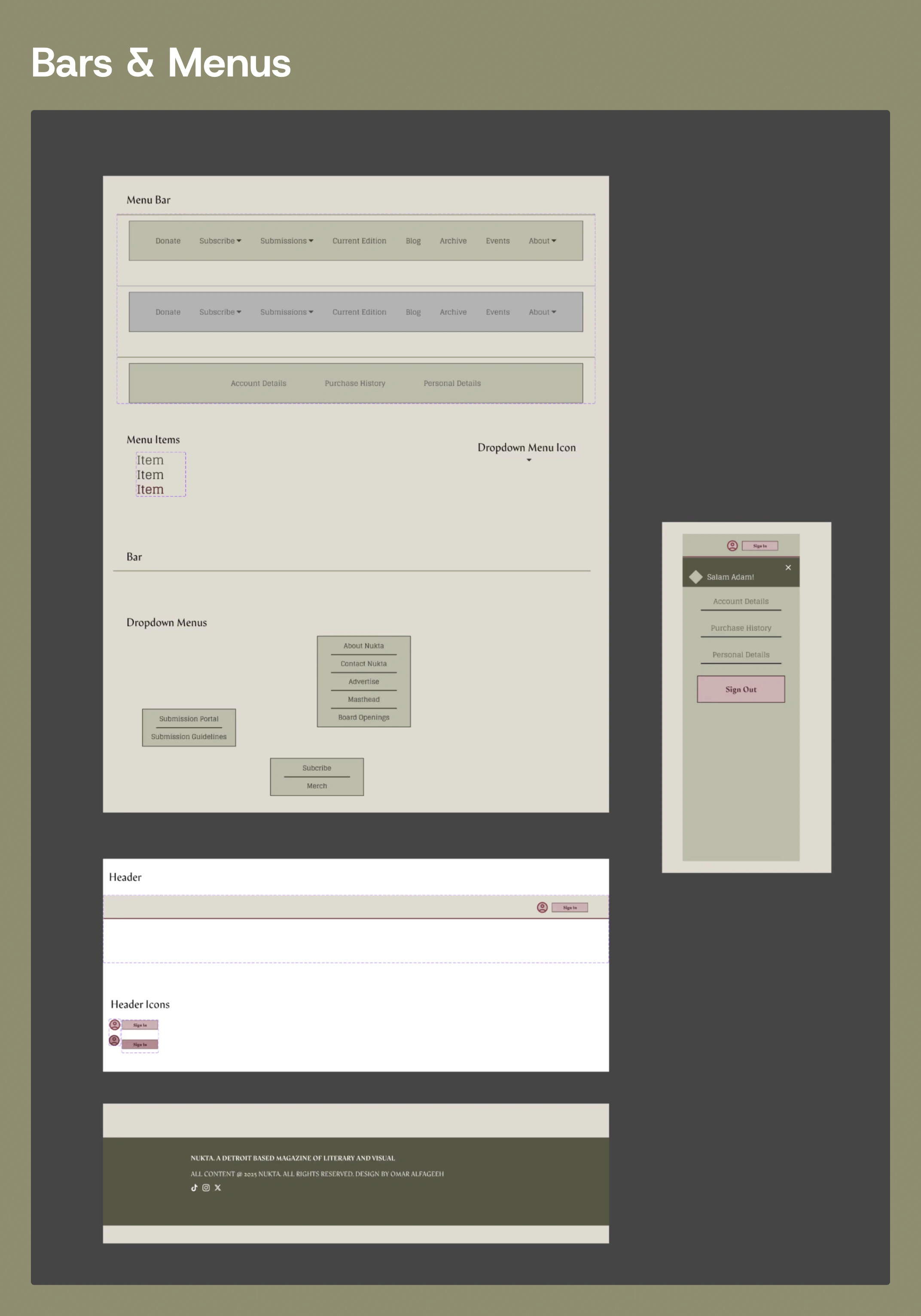
With the variables final, I turned them into components: buttons, logos and icons, bars and menus.
Site design
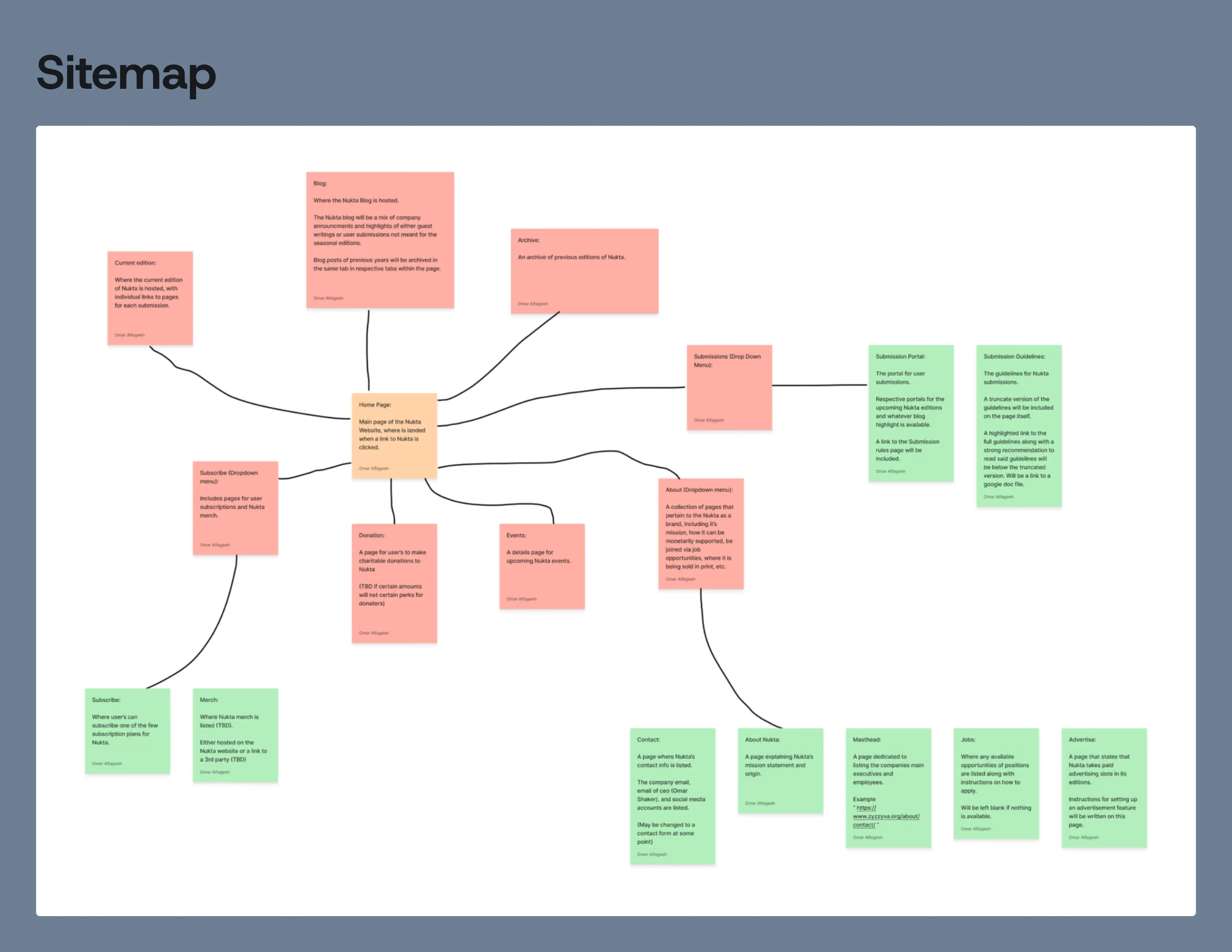
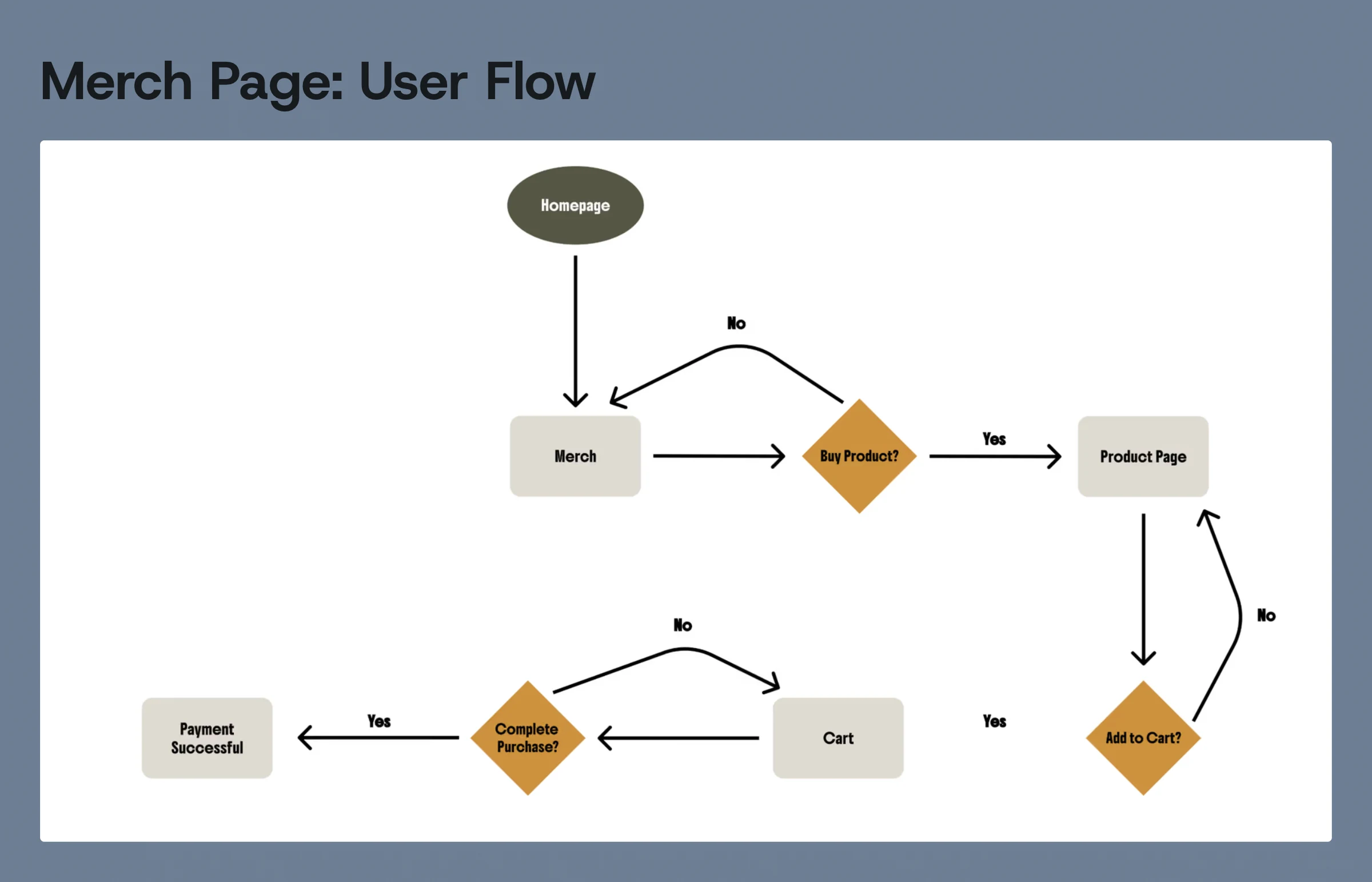
A sitemap set the structure (blog, archive, submissions, subscribe, donate, events and about), and a user flow mapped the merch purchase from homepage to payment.
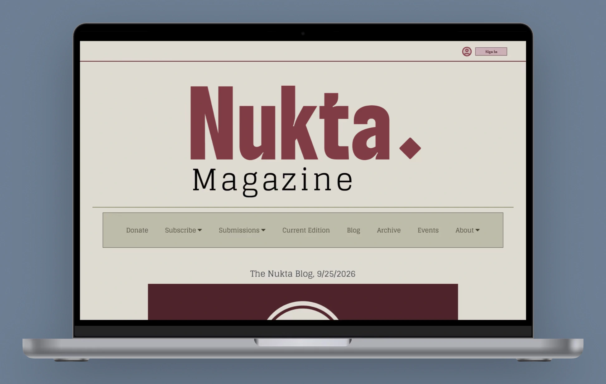
The finished site design, with a working Figma prototype.
Like this project
Posted Oct 5, 2026
Brand identity, a three-tier design system and a hi-fi site design with a working Figma prototype for a Muslim-led literary and art magazine.
Likes
0
Views
0
Timeline
Sep 1, 2025 - Nov 30, 2025