CME Rebrand: A 30 year old company re-fresh
Sydelle Creative
CME Tools - Industrial Brand System
Logo Redesign • Visual Identity System • Typography • Color System • Packaging & Industrial Applications
A full rebrand for CME, a metalworking distributor with 30+ years in the industry. Inspired by one of their best-selling tools, the new identity blends precision and modernity with bold industrial clarity.
The Goal: The aim was to develop a bold, refined identity that would reflect CME’s legacy while embracing a more modern, confident, and professional tone. The new brand system needed to feel rooted in structure and craftsmanship—while remaining approachable to their core audience of small-to-mid-sized industrial clients.
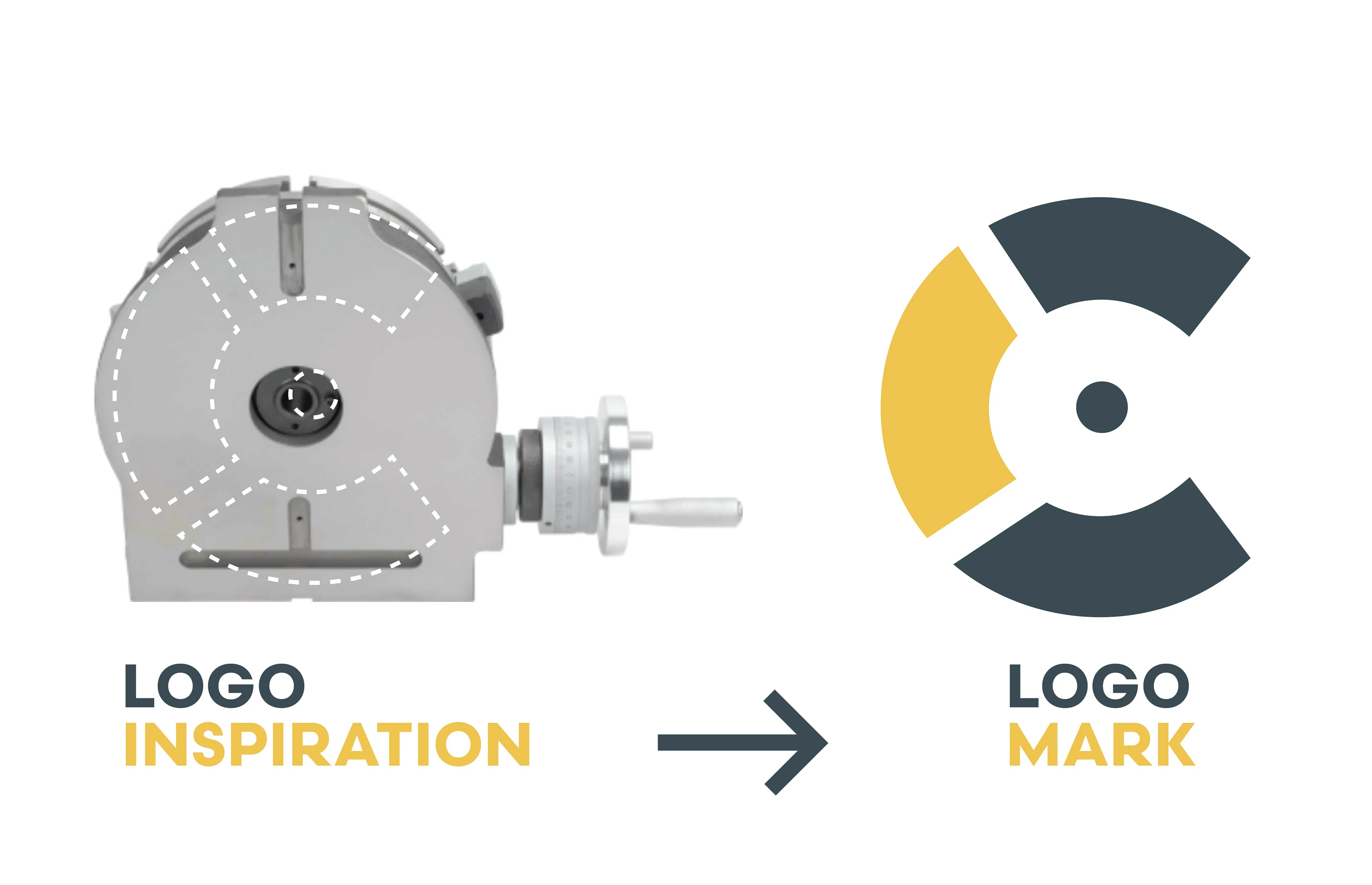
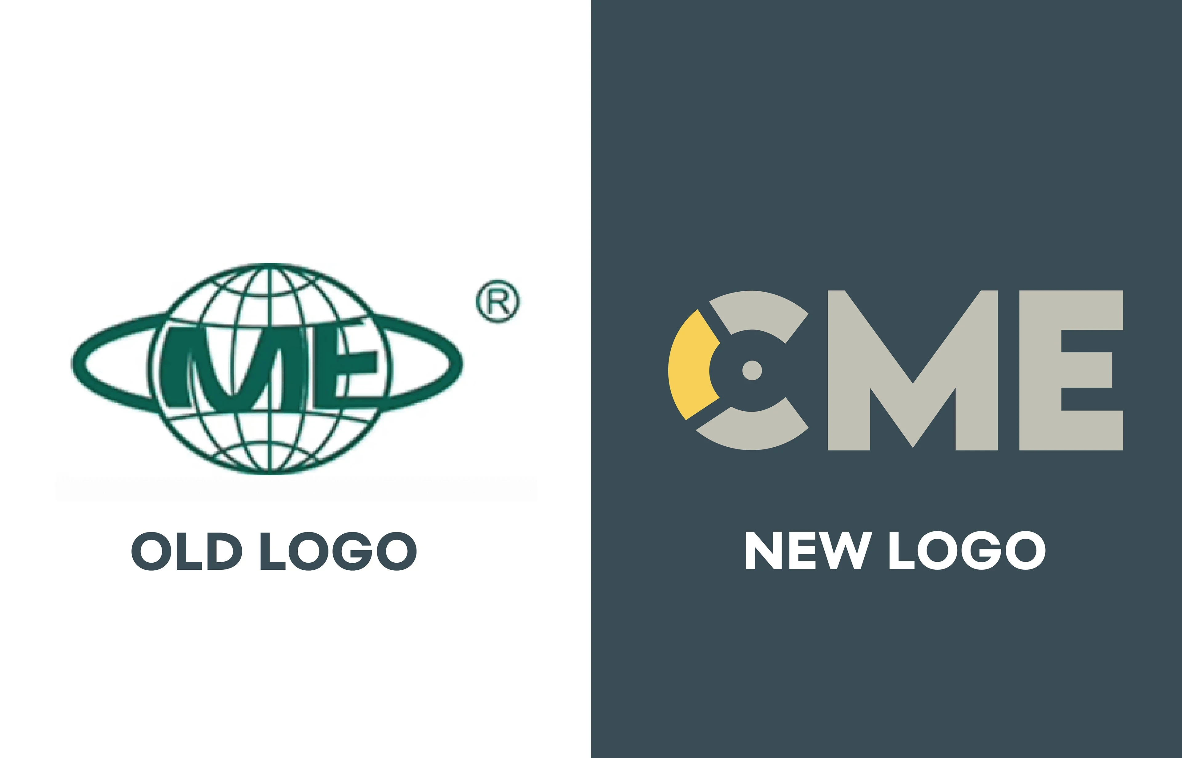
The Concept: The new logomark was inspired by one of CME’s best-selling tools, the precision rotary table. By abstracting the core mechanical components of this product into the letter “C,” I created a form that conveys movement, balance, and engineering precision. The resulting mark feels both strong and symbolic, anchoring the brand in meaning while offering visual simplicity and scalability.
The Solution:
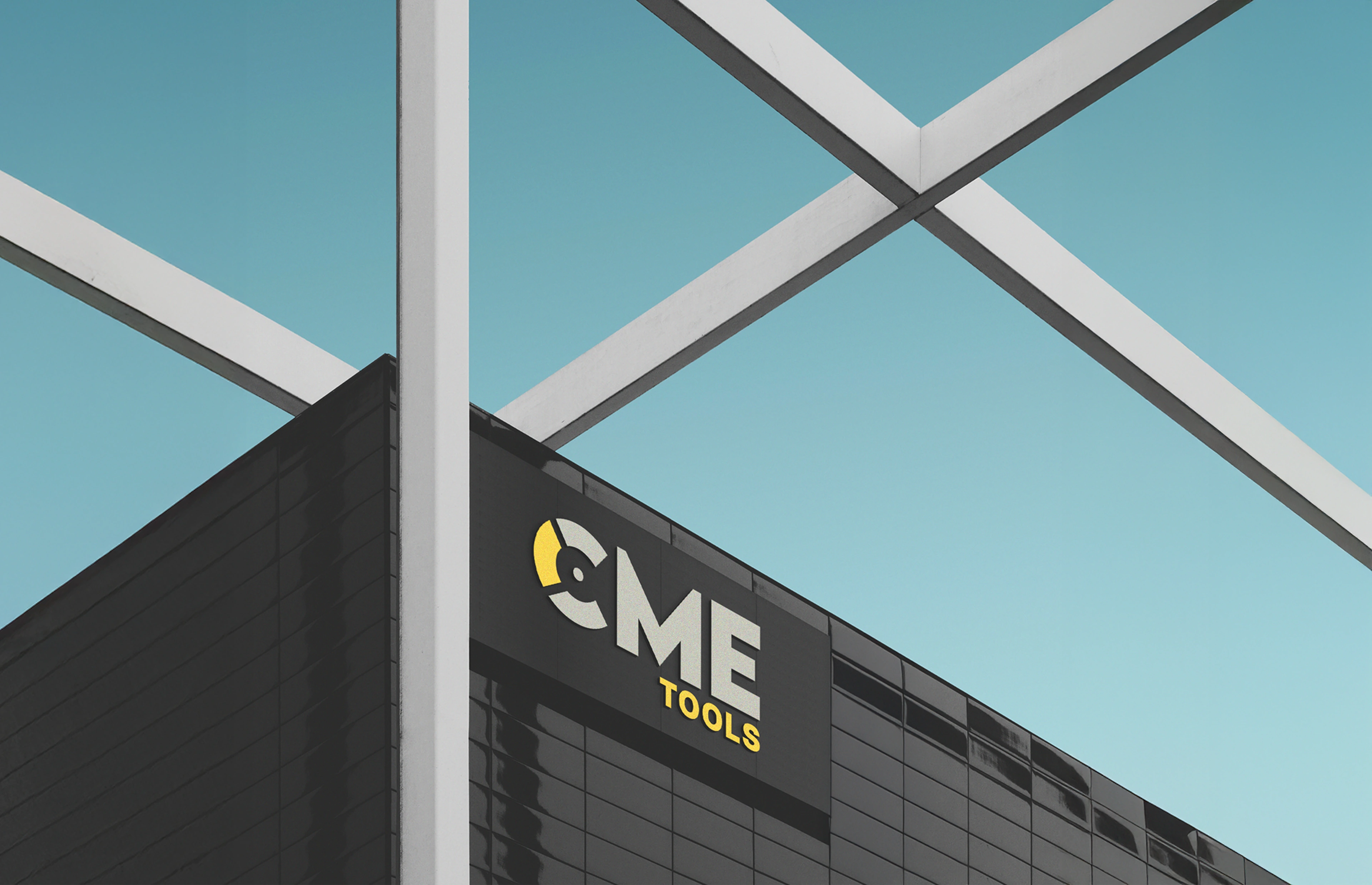
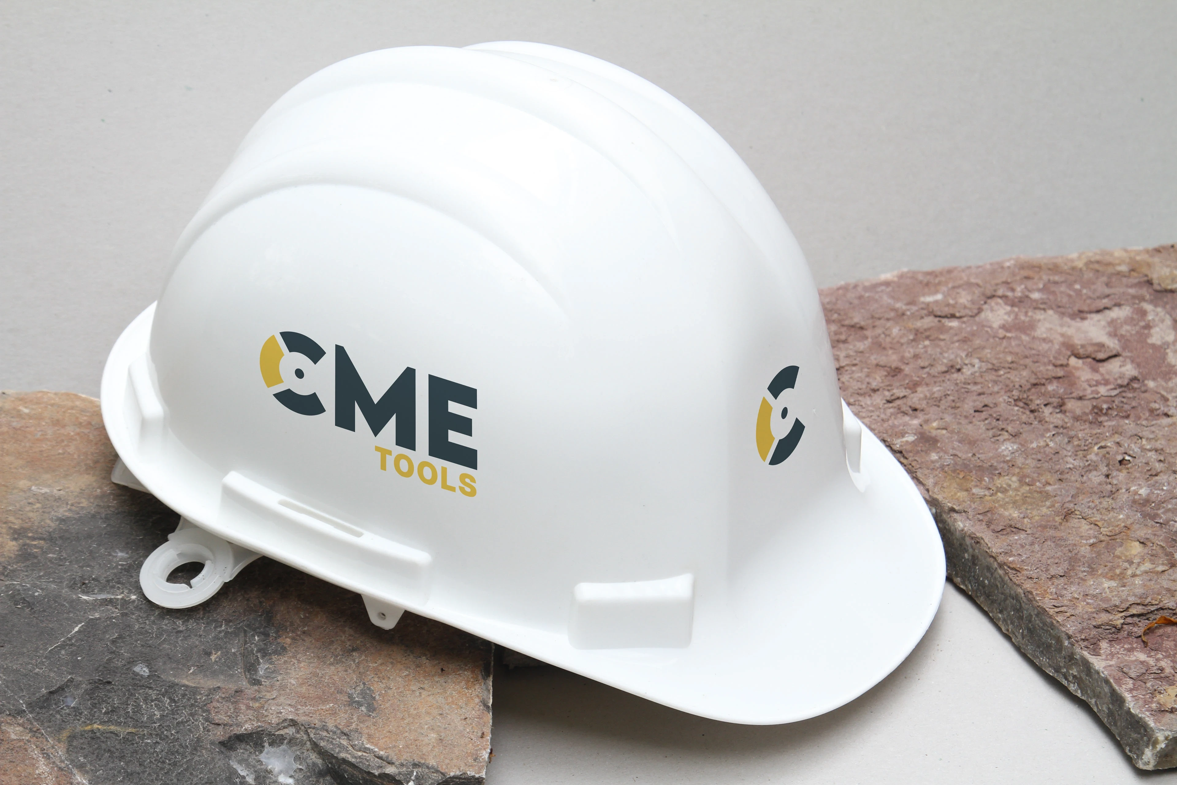
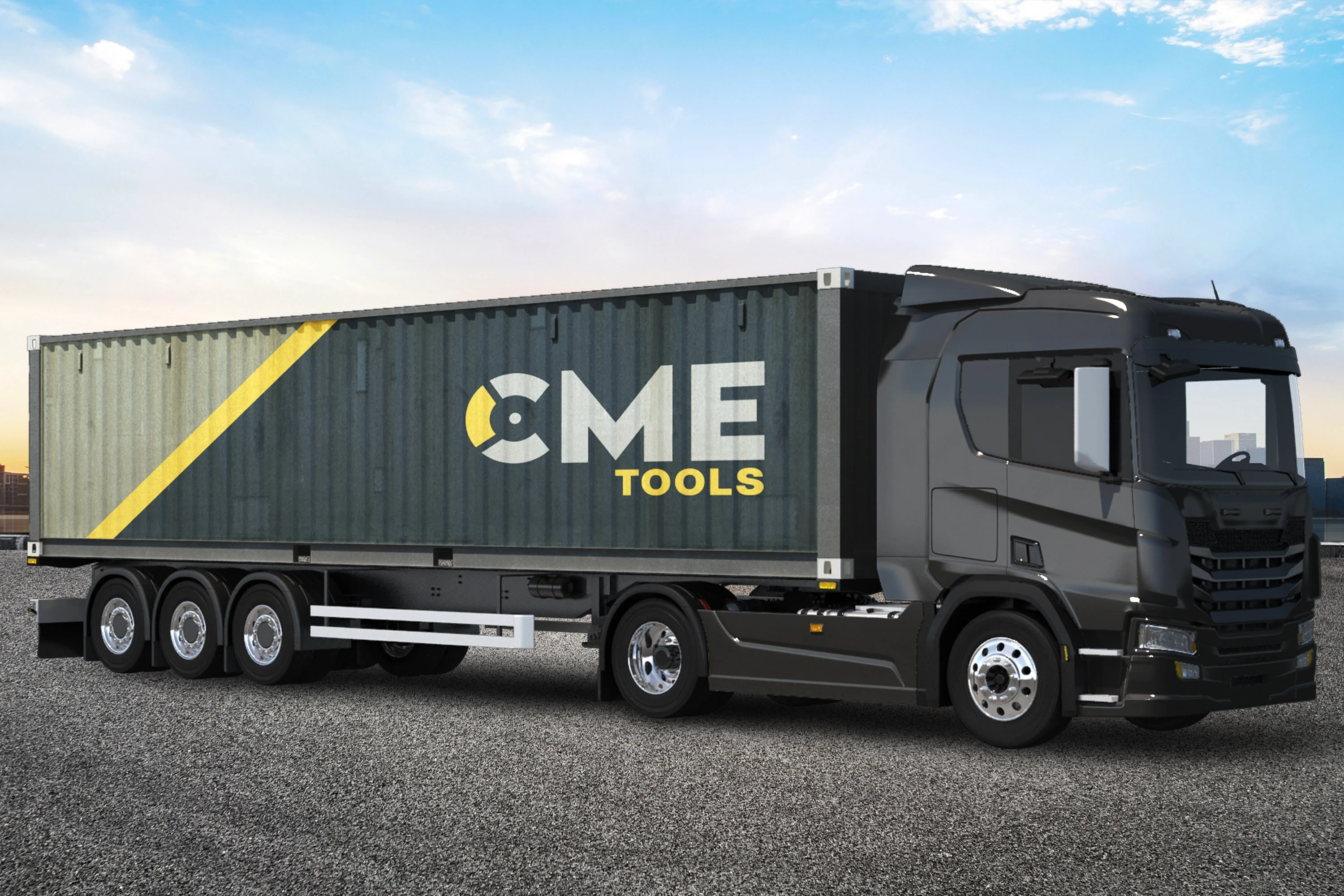
Logo System: A geometric, custom logomark that visually references a rotary table, paired with a clean and modern wordmark. The identity is designed to feel timeless, structured, and confident.
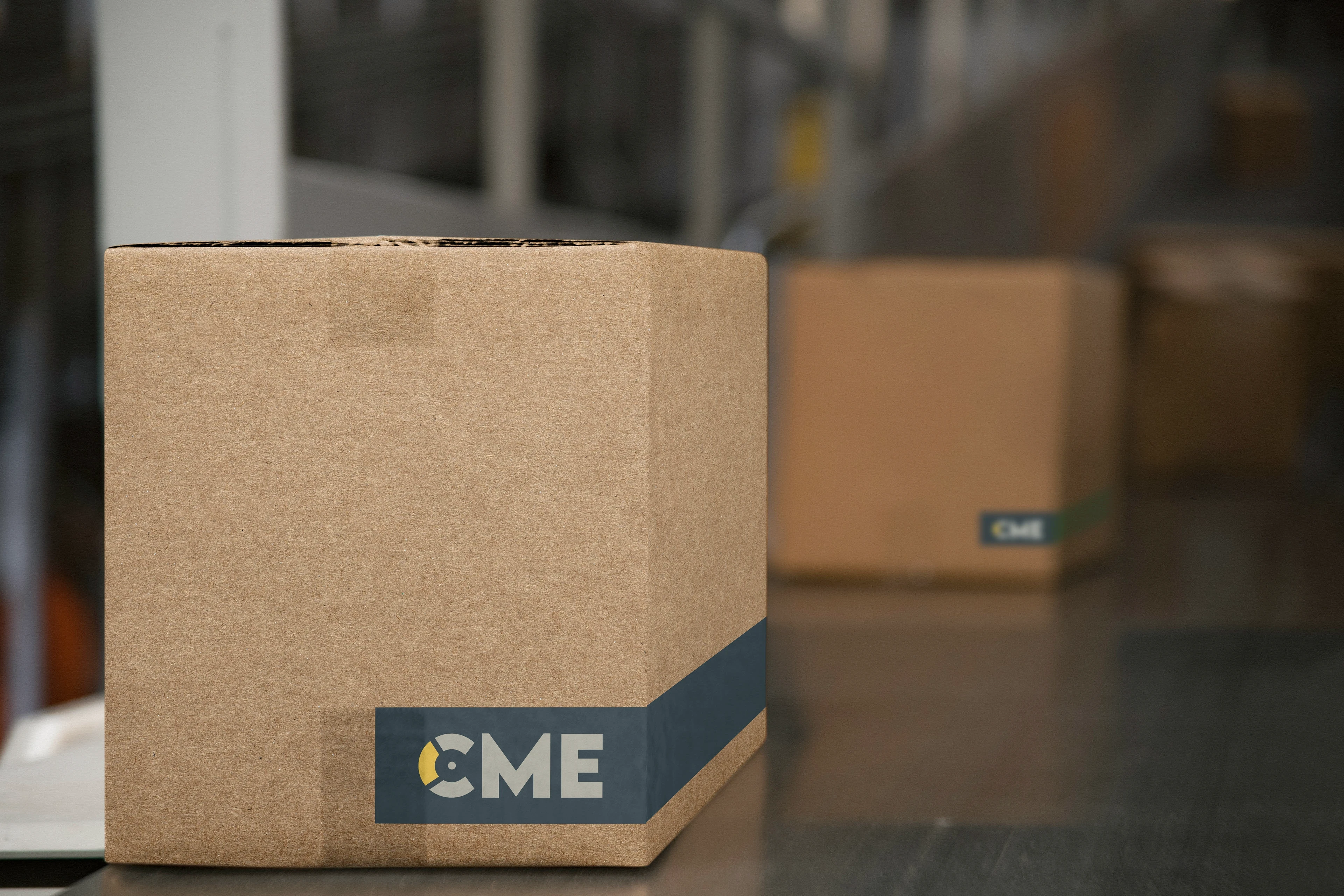
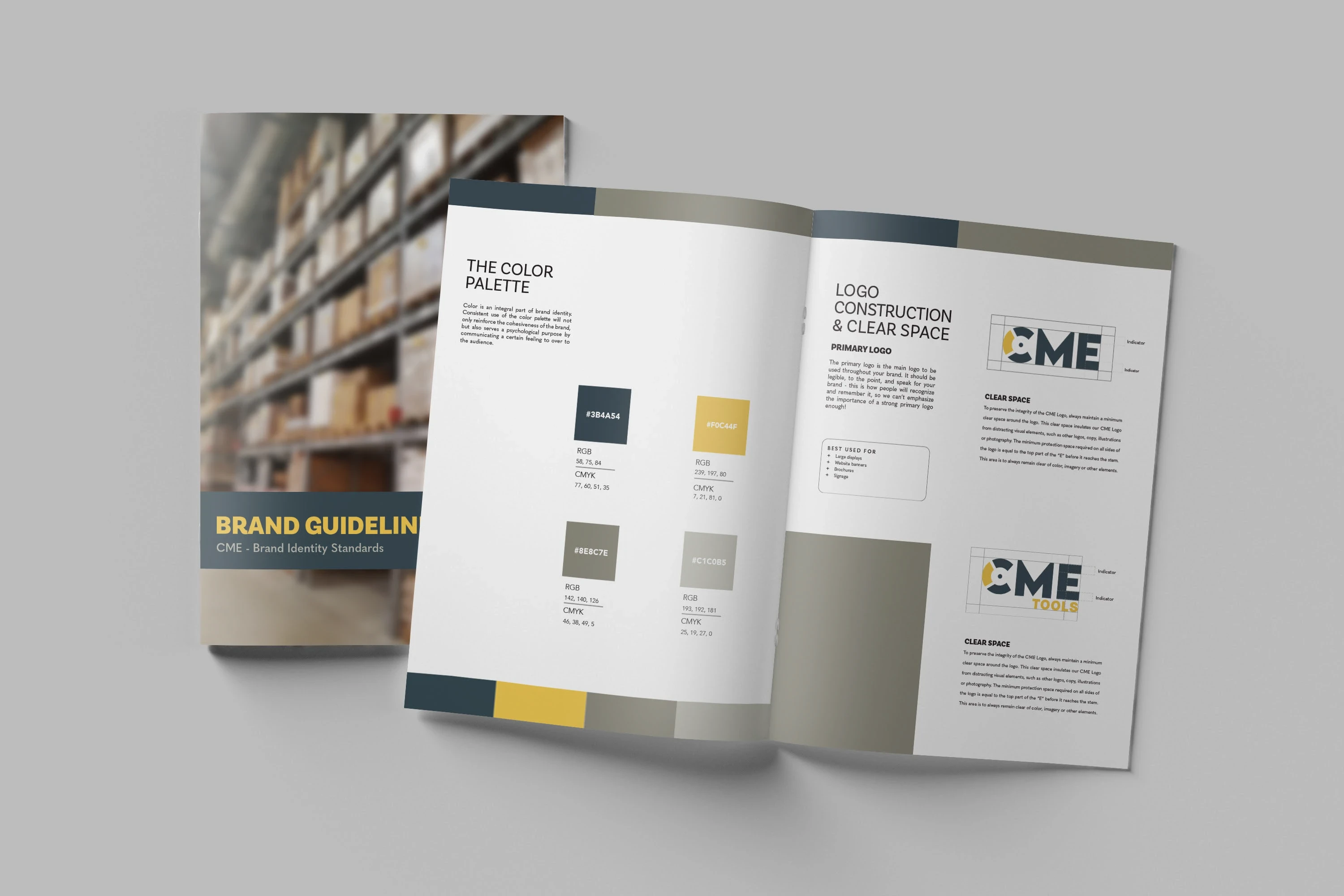
Color Palette: Slate blue and graphite tones create a professional, grounded foundation. A saturated yellow accent adds warmth and contrast, helping the brand stand out in print and digital formats.
Typography: A bold, industrial sans-serif typeface reinforces strength and clarity, chosen for legibility across signage, labels, and documentation.
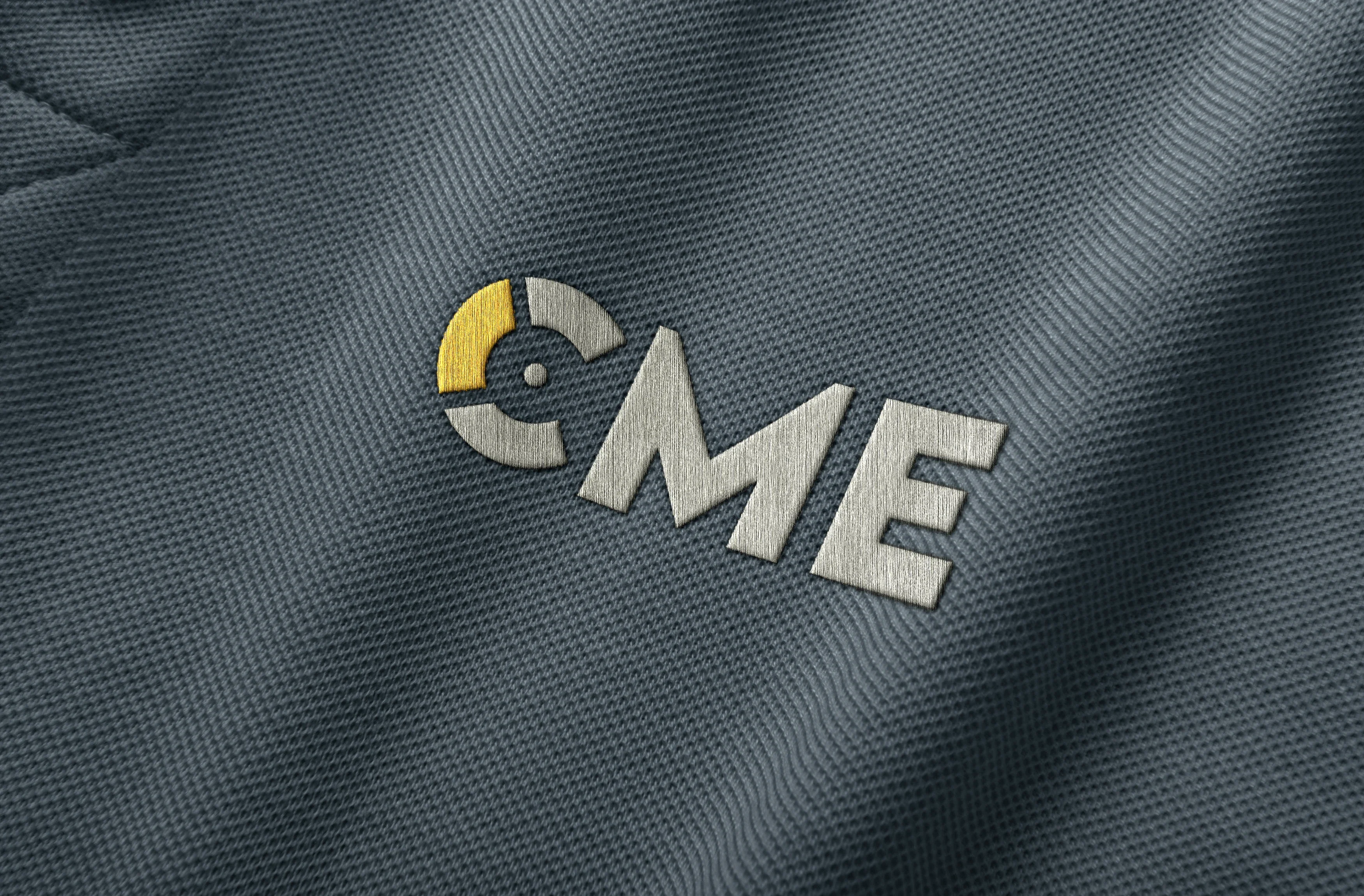
Applications: Mockups were created to show the identity across digital platforms, signage, and print—ensuring the system could flex across all touchpoints.
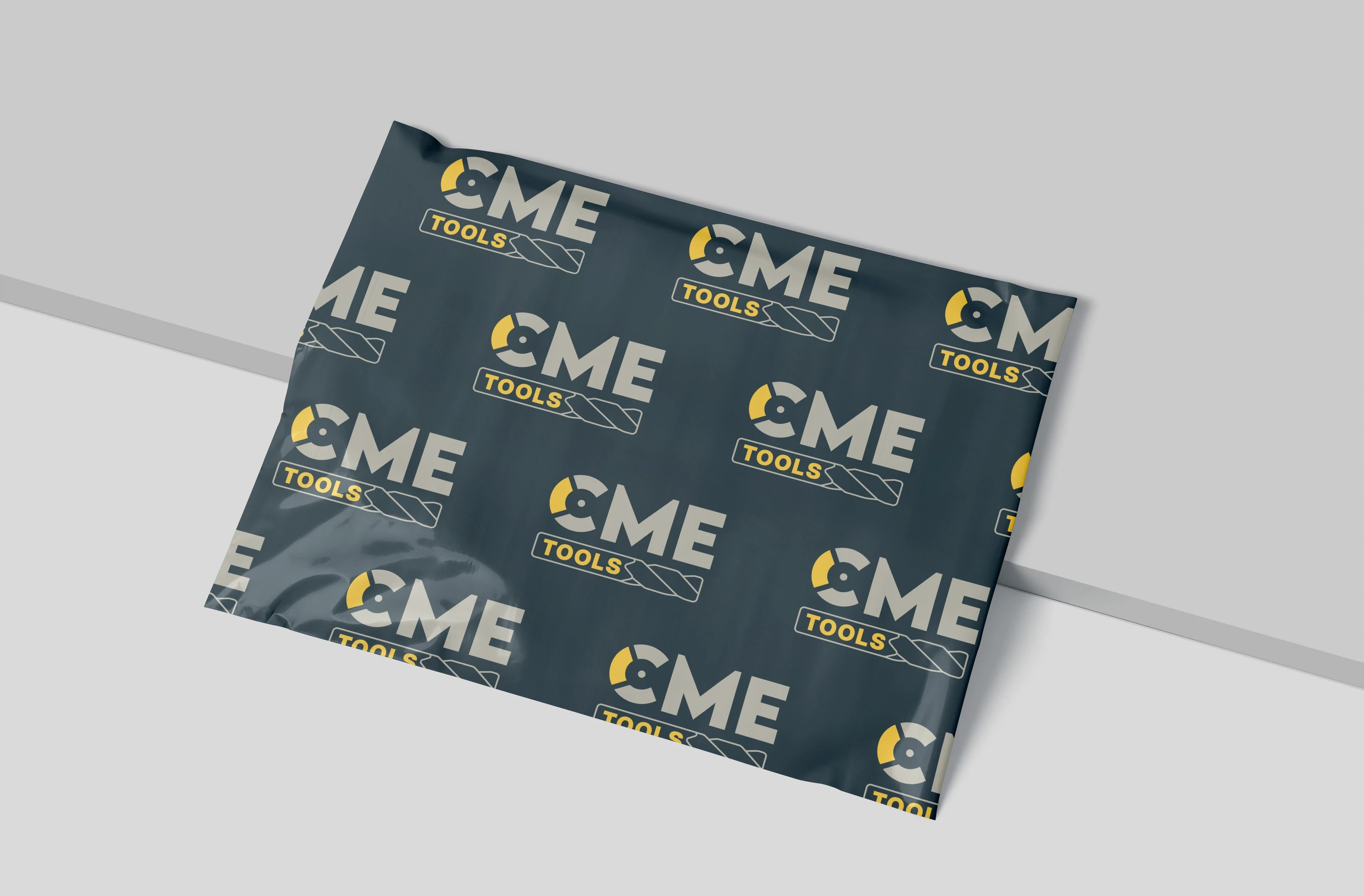
Packaging Design: To extend the identity, I developed a custom packaging pattern inspired by mechanical repetition and industrial form. Designed to echo the brand’s core values of precision and craftsmanship, the pattern adds visual interest while maintaining a clean, minimal look. It’s adaptable for use on shipping boxes, branded tape, and promotional materials.
Outcome: The new identity positions CME as a modern, technically proficient brand without losing the trust and integrity they’ve built over decades. With a conceptually strong logomark and cohesive visual system, CME is now equipped to scale their brand across platforms while standing out confidently in a competitive industrial market.
Like this project
Posted Jun 10, 2025
A full rebrand for CME, a metalworking distributor with 30+ years in the industry. This project includes a new visual identity and packaging.
Likes
2
Views
34
Clients
CME