ZING Pickles - Brand System & Packaging
Aliza Munir
About Zing
Zing is a bright, flavour-forward pickle brand built around freshness, crunch, and bold taste.
The brand is designed to feel energetic, punchy, and instantly appetising, turning a classic pantry staple into something fun and full of personality.
The Challenge
The goal was to create a pickle brand that feels fresh and modern while still communicating quality and flavour.
The challenge was to:
• Build a strong, recognisable identity using a limited colour palette
• Create packaging that feels bold but still clean and readable
• Design a system that works across jars, labels, and retail display
The Solution
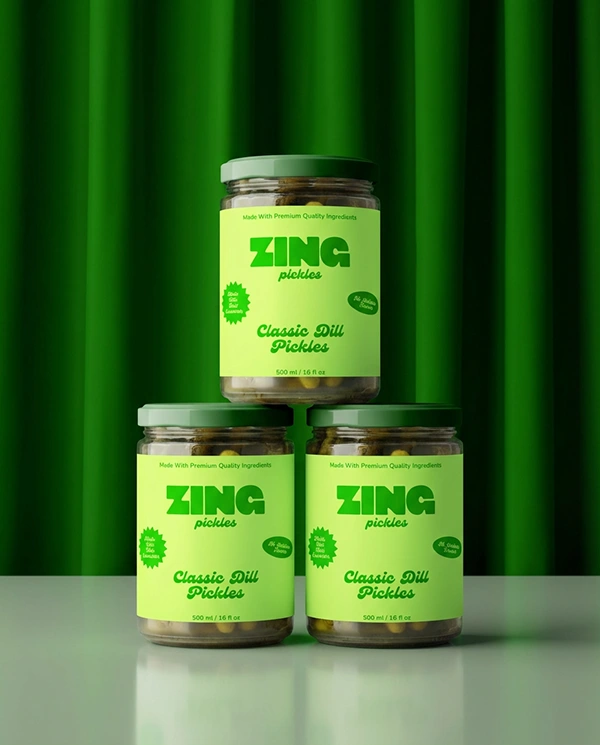
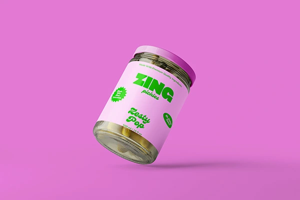
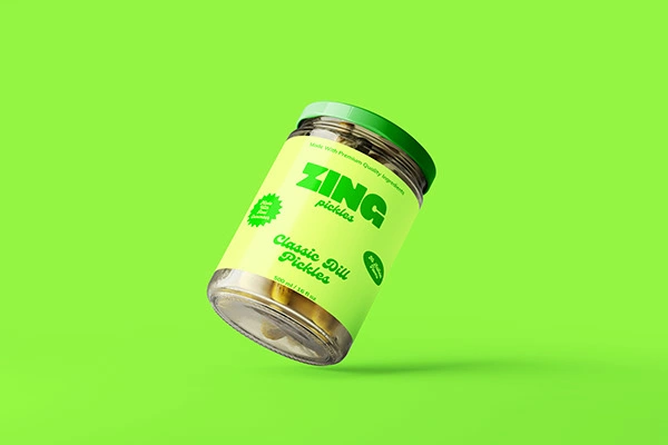
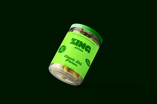
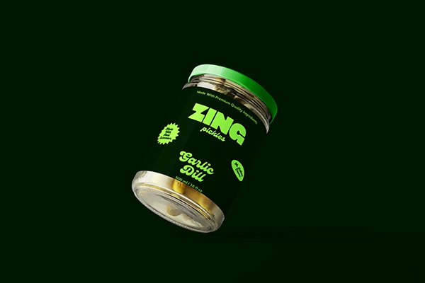
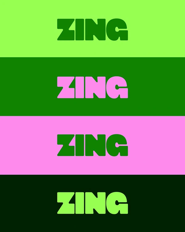
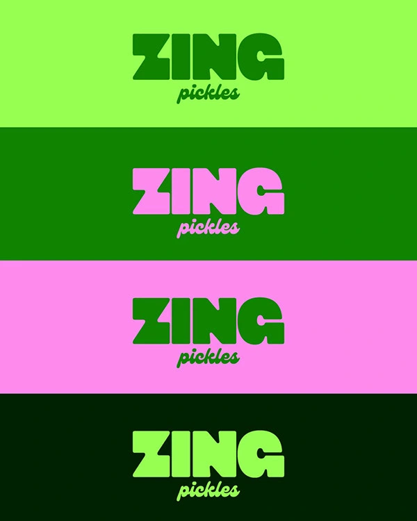
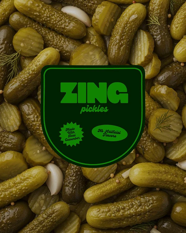
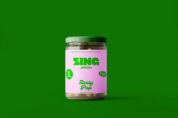
The Zing identity is built around a vibrant green colour system that instantly signals freshness and flavour.
The bold, rounded wordmark gives the brand a punchy, energetic feel while remaining friendly and approachable.
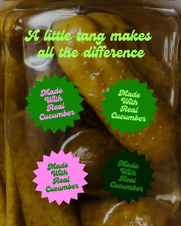
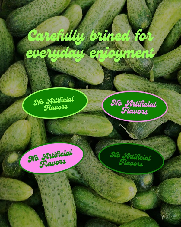
Clean layouts and simple badge elements highlight key product benefits without cluttering the design.
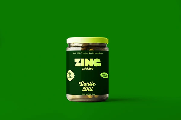
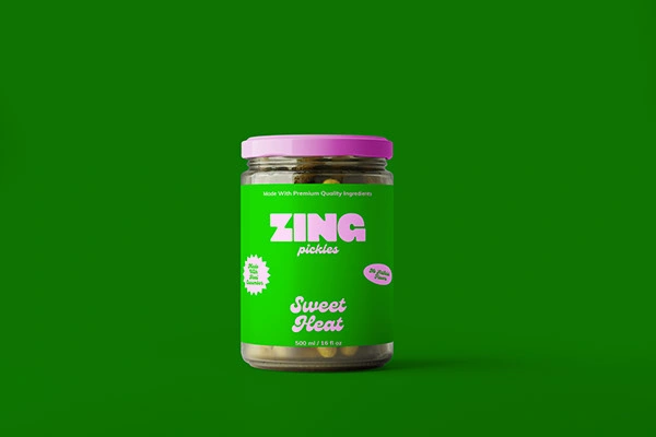
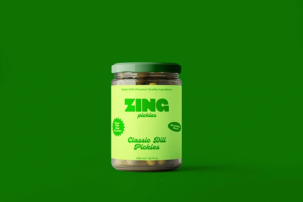
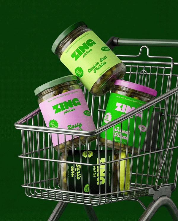
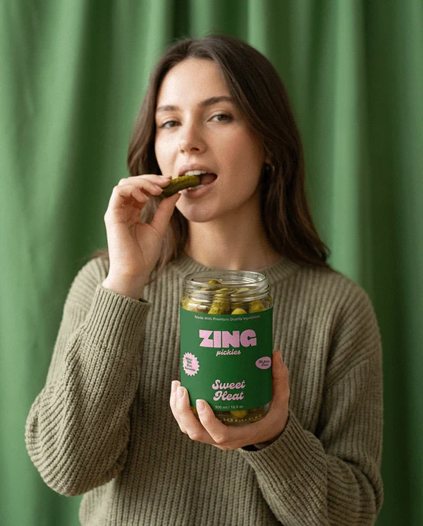
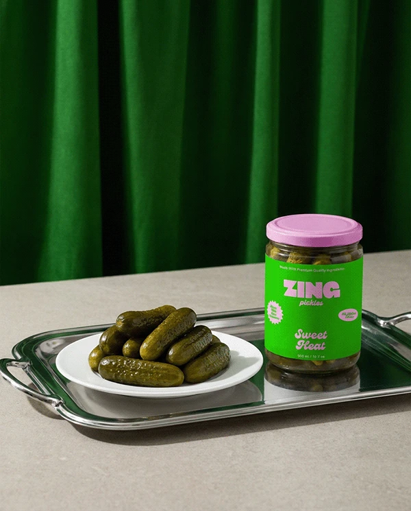
Packaging and Brand Experience
The identity extends across glass jars, labels, and stacked retail displays.
The bright green palette and strong typography create instant shelf visibility while maintaining a cohesive system across all formats.
Every touchpoint reinforces the idea of freshness, crunch, and bold flavour.
Final Thoughts
Zing transforms a traditional pickle product into a bold, modern brand that feels fresh, energetic, and full of personality.
Like this project
Posted Feb 28, 2026
I designed a bold, flavour-packed pickle brand using vibrant greens, punchy typography, and clean layouts to create a fresh, energetic identity.