Buns & Sons Brand Identity and Packaging
Aliza Munir
About Buns & Sons
Buns & Sons is a bold, feel-good burger brand built around flavour, fun, and personality.
The brand is designed to feel lively, cheeky, and instantly recognisable, turning a simple burger spot into a memorable, character-driven experience.
The Challenge
The goal was to create a burger brand that feels playful and eye-catching while still being clear and easy to recognise in a busy street setting.
The challenge was to:
• Build a strong, character-led identity that stands out instantly
• Use colour and typography to communicate fun, flavour, and energy
• Create a system that works across signage, packaging, and in-store visuals
The Solution
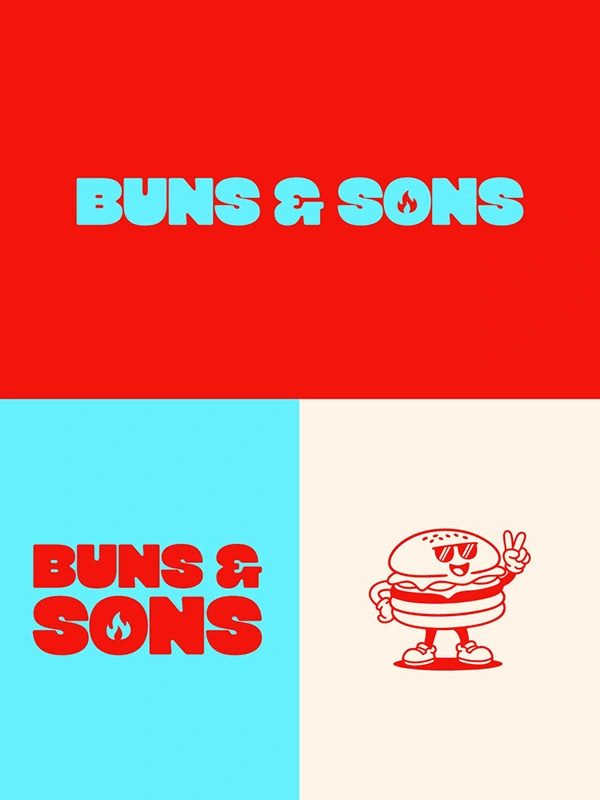
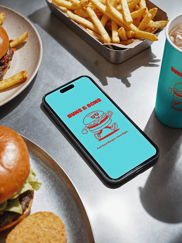
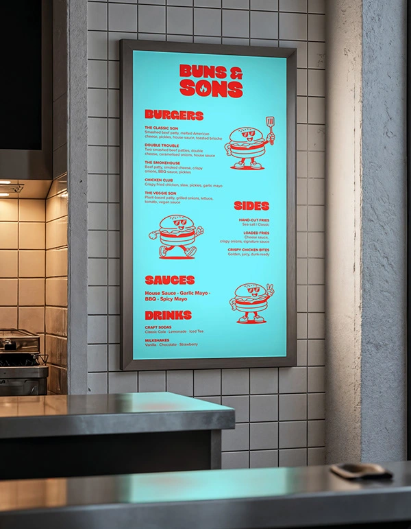
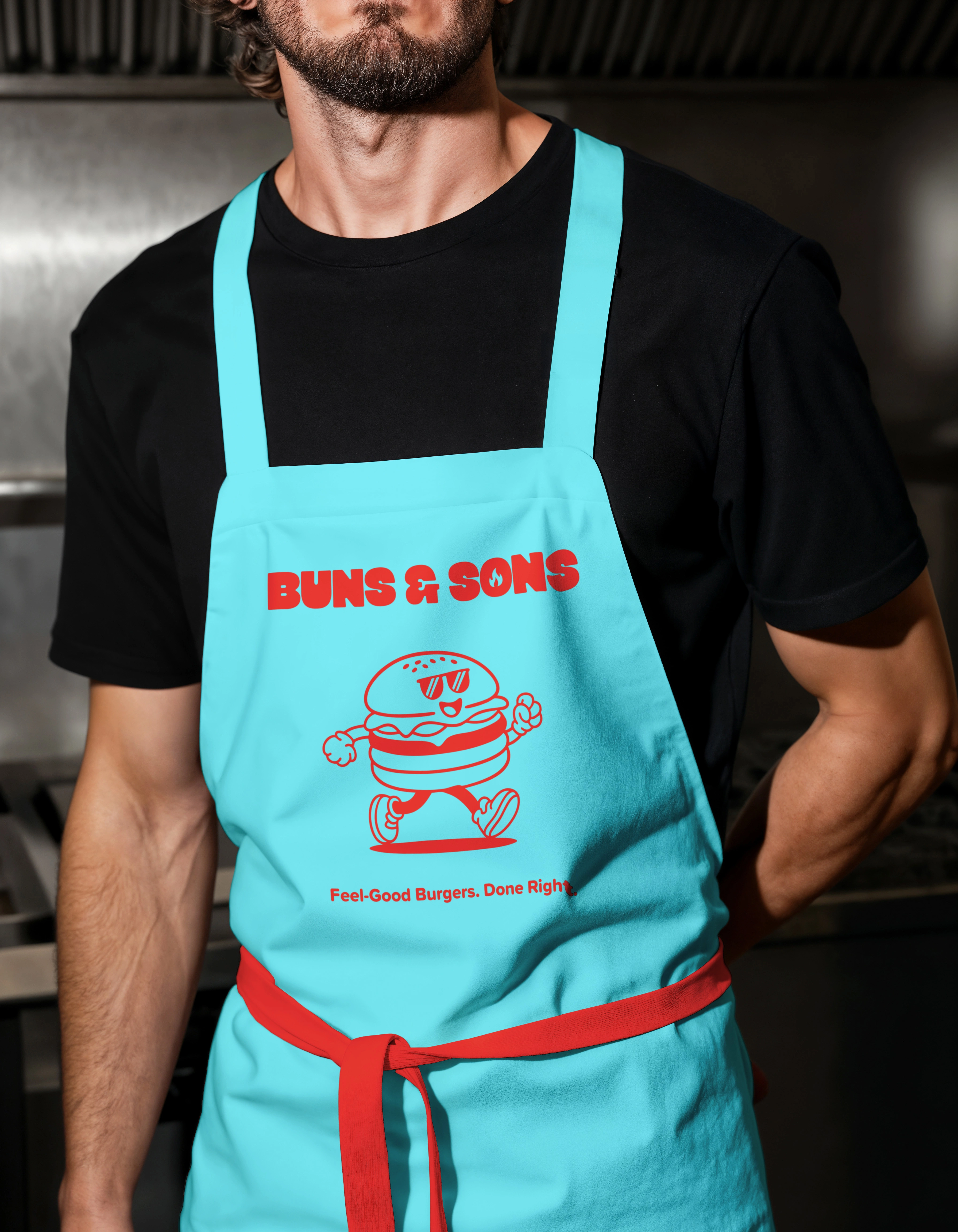
The Buns & Sons identity is built around bold, rounded typography and a vibrant colour palette that feels youthful and energetic.
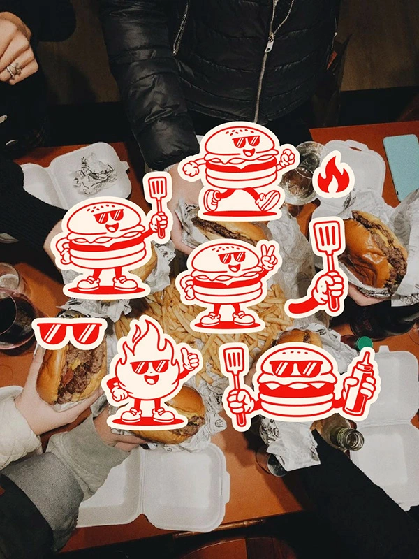
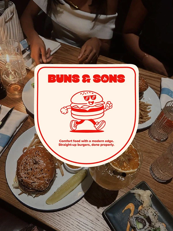
A custom mascot adds personality and memorability, giving the brand a friendly face that customers can instantly connect with.
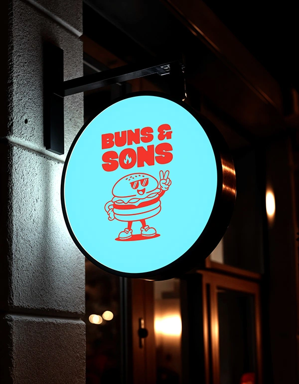
The strong contrast between bright teal and red creates high visibility, especially for signage and street presence.
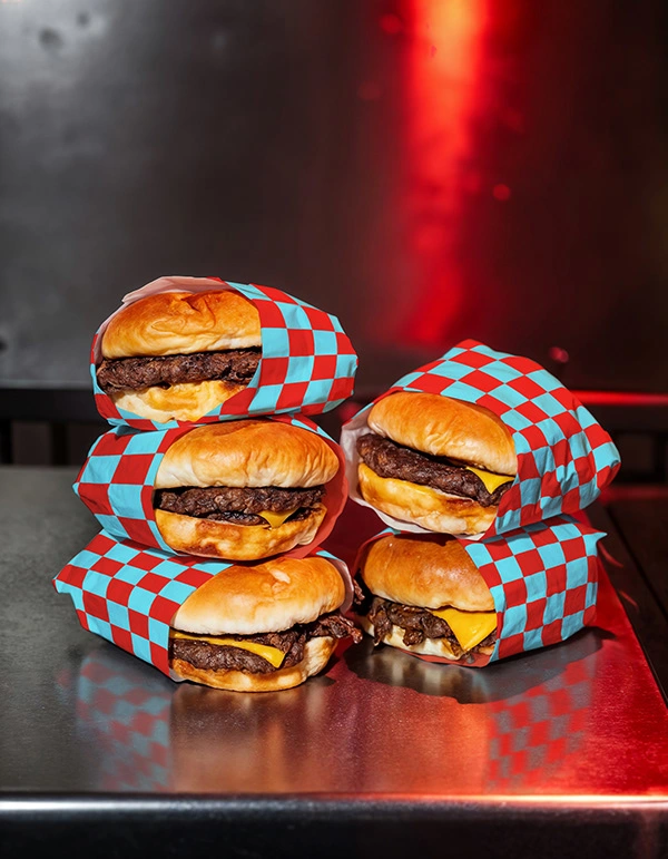
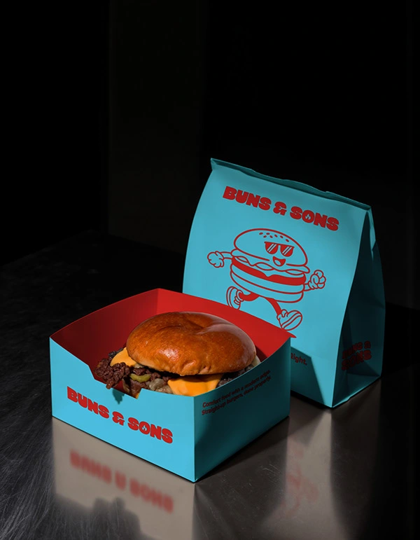
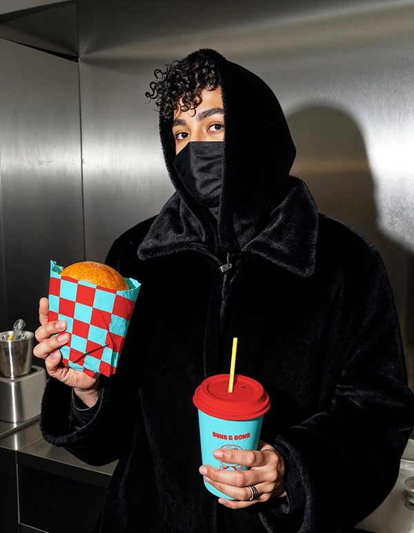
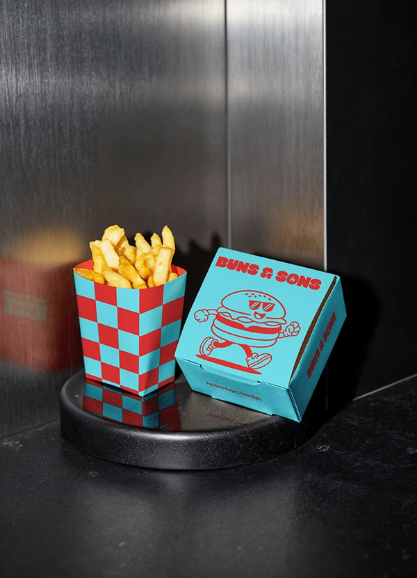
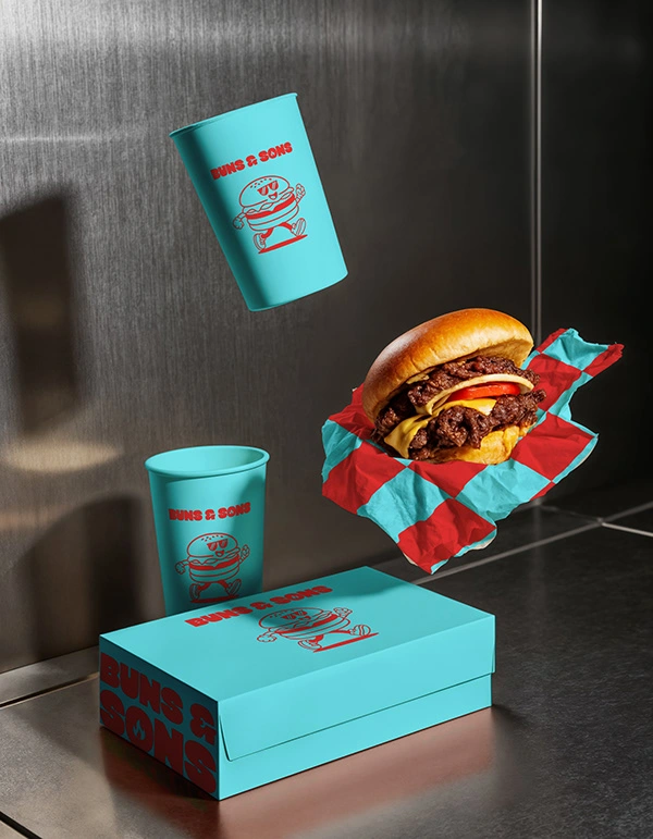
Packaging and Brand Experience
The identity extends across storefront signage, packaging, and promotional materials.
From takeaway boxes to exterior signs, every touchpoint reinforces the playful, confident personality of the brand while keeping the system cohesive and easy to recognise.
Final Thoughts
Buns & Sons turns a casual burger place into a bold, character-led brand that feels fun, memorable, and full of flavour.
Like this project
Posted Feb 28, 2026
I designed a playful, retro-inspired burger brand using bold typography, vibrant colours, and a mascot to create a fun, energetic fast food identity.