GLAZED - A Donut Shop
Aliza Munir
About Glazed
Glazed is a playful donut brand built around indulgence, personality, and bold visual energy. The brand is designed to feel fun, modern, and slightly cheeky, turning a simple donut into a full brand experience.
At its core, Glazed celebrates sweet cravings and feel good moments.
The Challenge
The goal for Glazed was to create a donut brand that feels bold and memorable in a saturated dessert market.
The challenge was to:
• Build a distinctive identity that stands out instantly
• Use colour and typography in a bold but controlled way
• Create a flexible system for packaging, menus, and in-store branding
The Solution
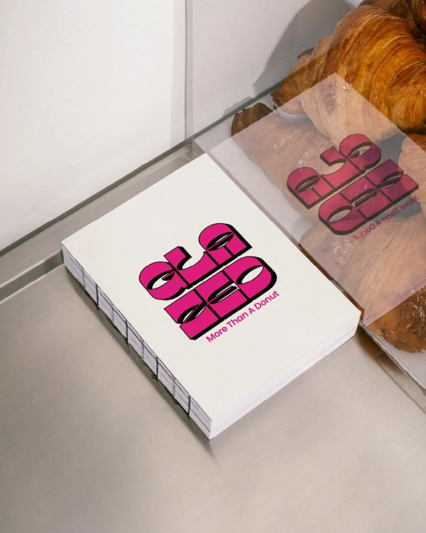
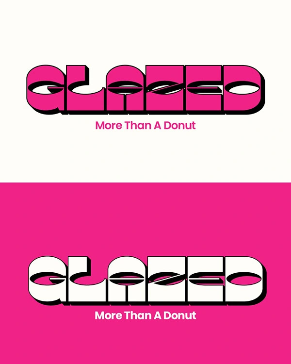
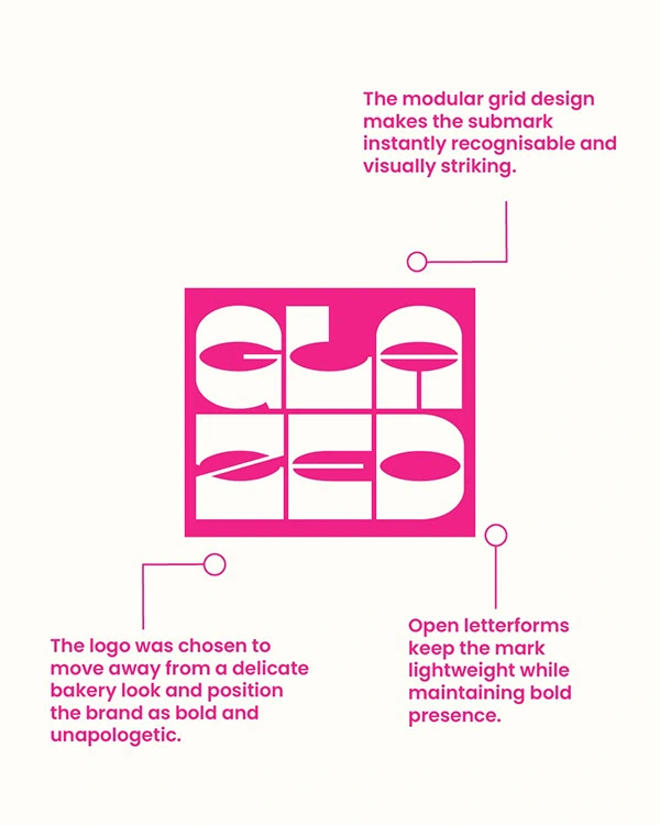
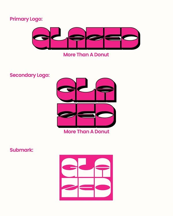
The identity for Glazed is driven by strong typography and a vibrant colour palette.
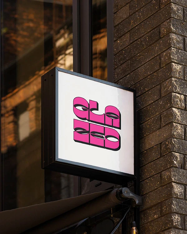
The custom logotype uses chunky, rounded forms that reflect the softness of donuts while adding personality and attitude. The signature hot pink acts as the core brand colour, creating instant recognisability and visual impact.
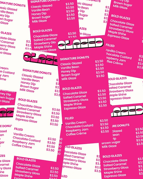
Layouts are playful and layered, using repetition and contrast to create energy while still keeping hierarchy clear and readable.
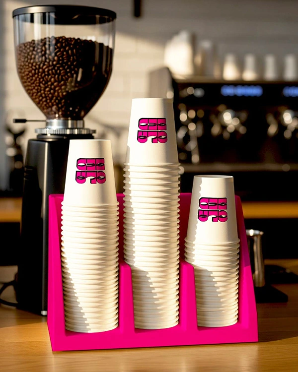
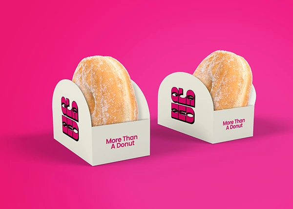
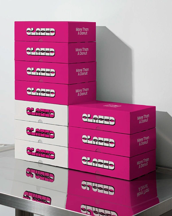
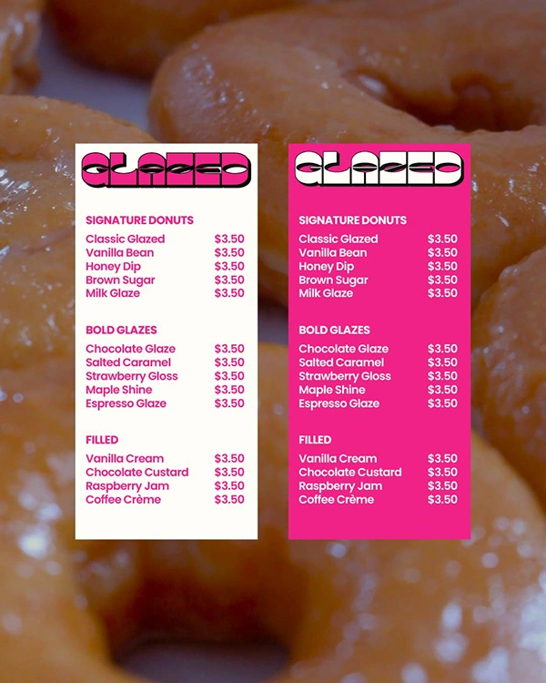
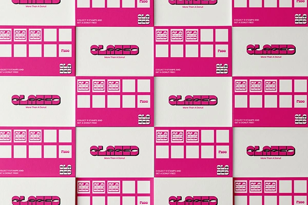
Packaging and Brand Experience
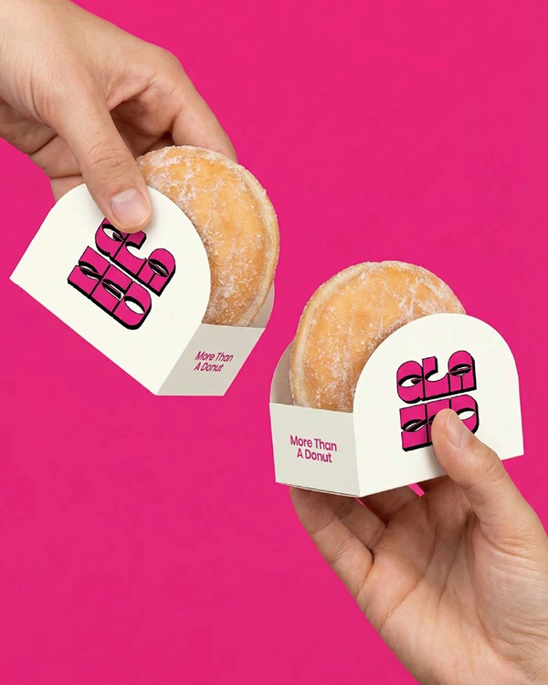
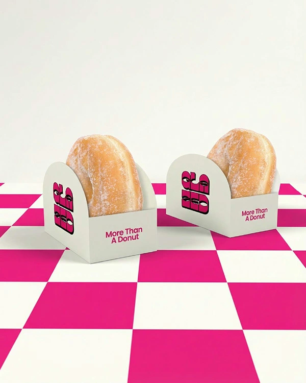
The Glazed identity carries across packaging, menus, coffee cups, and takeaway materials.
From donut wraps to in store menu boards, the bold pink and cream colour pairing keeps everything cohesive while maintaining a clean, modern feel.
The brand feels energetic, shareable, and designed for a social first audience.
Final Thoughts
Glazed turns a simple donut shop into a bold, personality driven brand that feels modern, expressive, and visually unforgettable.
If you are looking to build a brand with this level of energy and identity, feel free to reach out.
Like this project
Posted Feb 28, 2026
I designed a bold donut brand for Glazed using playful typography, vibrant pink tones, and expressive layouts to create a fun & instantly recognisable identity.