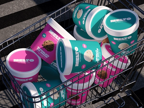
Melto - Ice Cream Brand Identity & Packaging
Aliza Munir
About Melto
Melto is a feel-good ice cream brand built around joy, flavour, and everyday indulgence. The brand is designed to feel bright, upbeat, and instantly recognisable on shelf.
It celebrates simple pleasures and bold taste moments.
The Challenge
The goal for Melto was to create a fun, energetic identity that stands out in a crowded freezer aisle while still feeling clean and modern.
The challenge was to:
• Build a bold visual identity that feels playful but premium
• Use colour and flavour cues to make each variant instantly recognisable
• Create a system that works across tubs, lids, and retail displays
The Solution
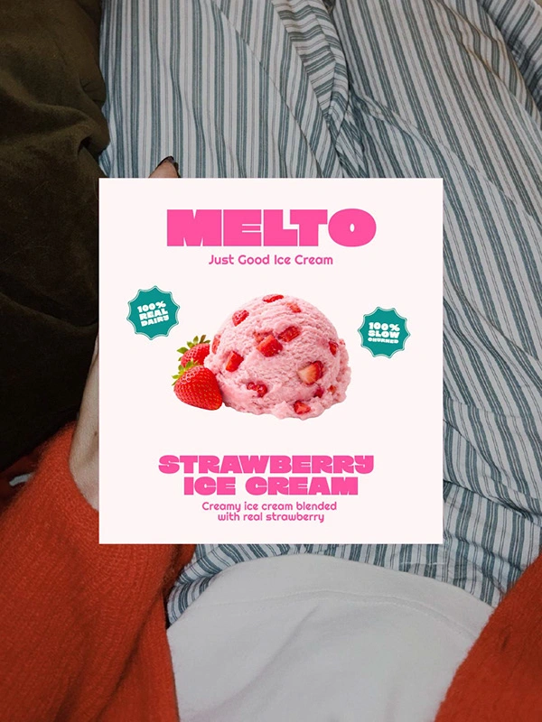
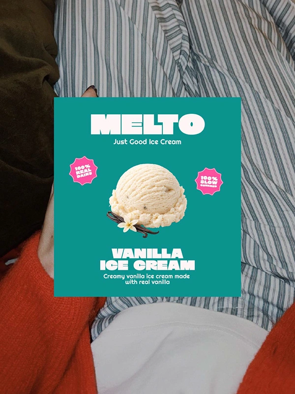
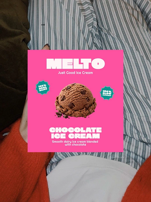
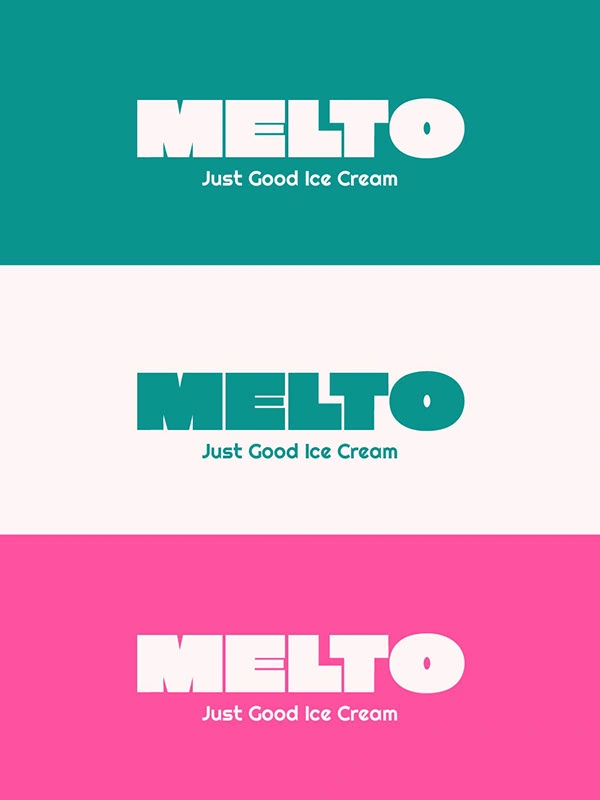
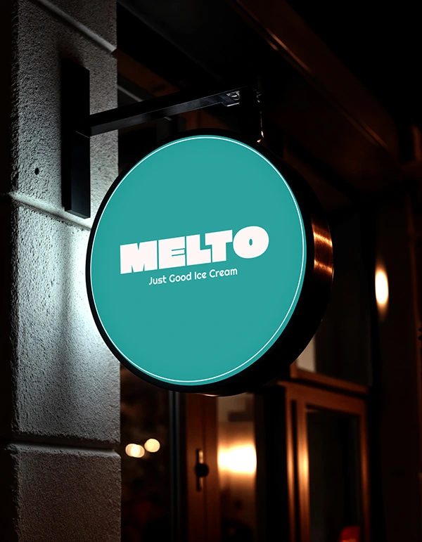
The Melto identity is built around strong, rounded typography and a high-contrast colour palette inspired by classic ice cream flavours.
Each flavour uses a vibrant colour pairing, supported by simple product imagery and clean layout to keep the design modern and easy to scan.
The wordmark is bold and friendly, creating instant brand recall across all touchpoints.
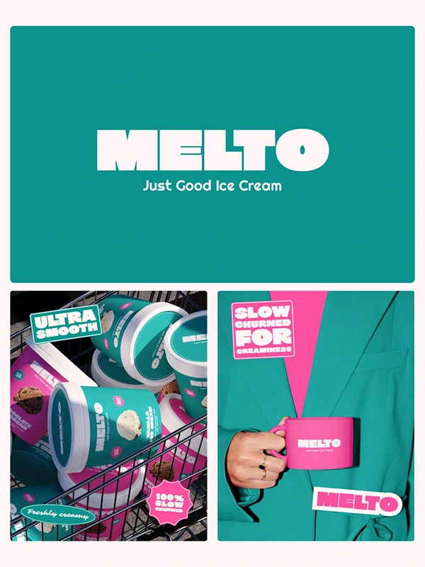
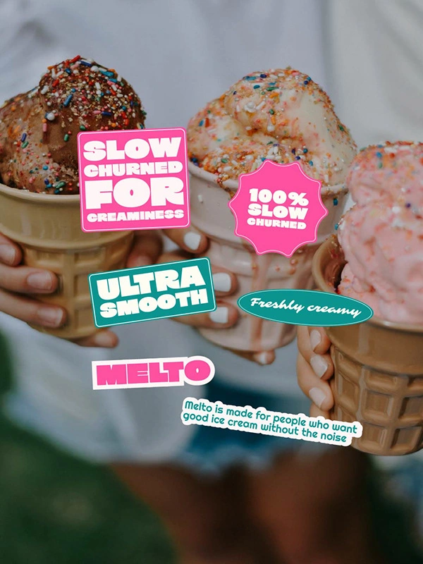
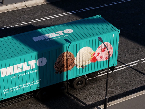
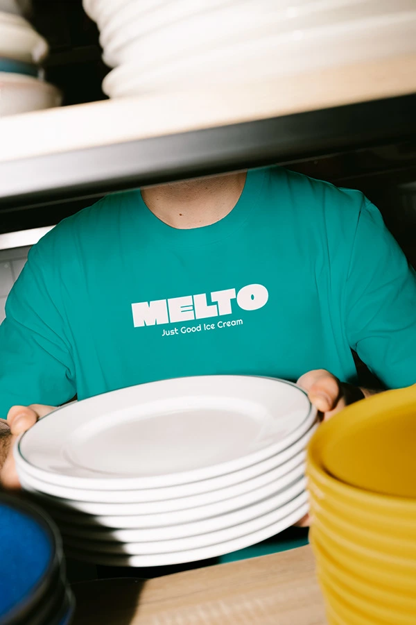
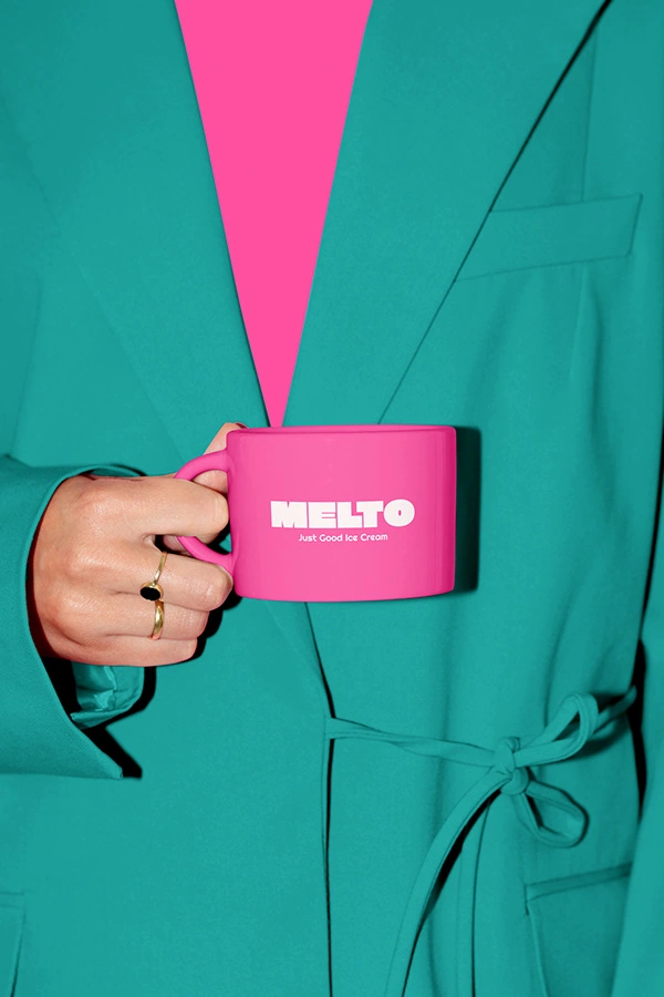
Packaging and Brand Experience
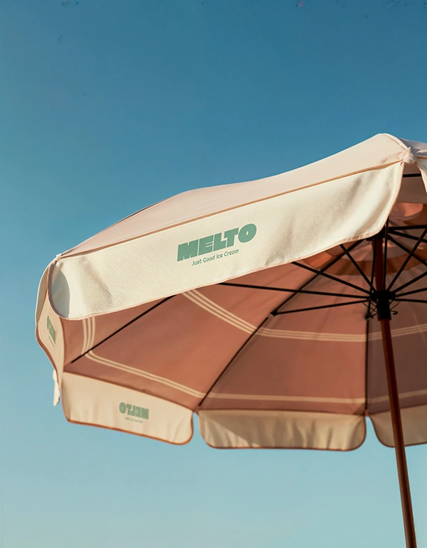
The brand extends across tubs, lids, and retail mockups with a consistent system of colour blocks, flavour visuals, and clear typography.
From stacked tubs to in-store displays, every element reinforces Melto’s playful, confident tone while remaining highly legible and shelf-ready.
Final Thoughts
Melto transforms a simple ice cream product into a bold, feel-good brand experience that is playful, vibrant, and confidently modern.
Like this project
Posted Feb 28, 2026
I designed a bold, playful ice cream brand for Melto using vibrant colours, clean type, and flavour-led packaging to create a fun, modern retail identity.