From Concept to Shelf: Branding & Packaging Design for Baek
Aliza Munir
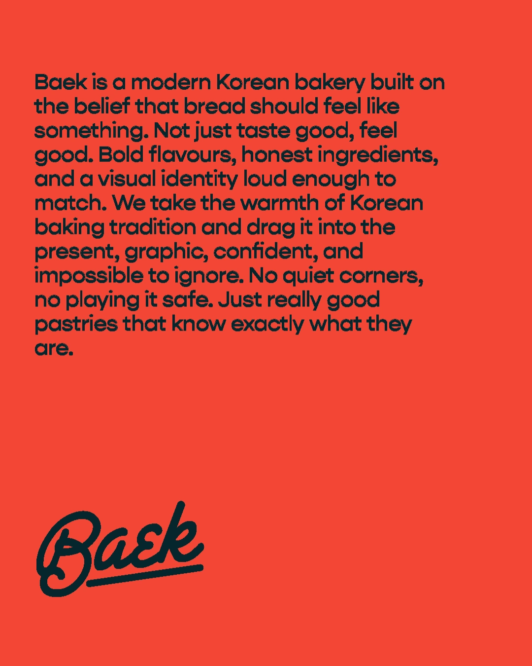
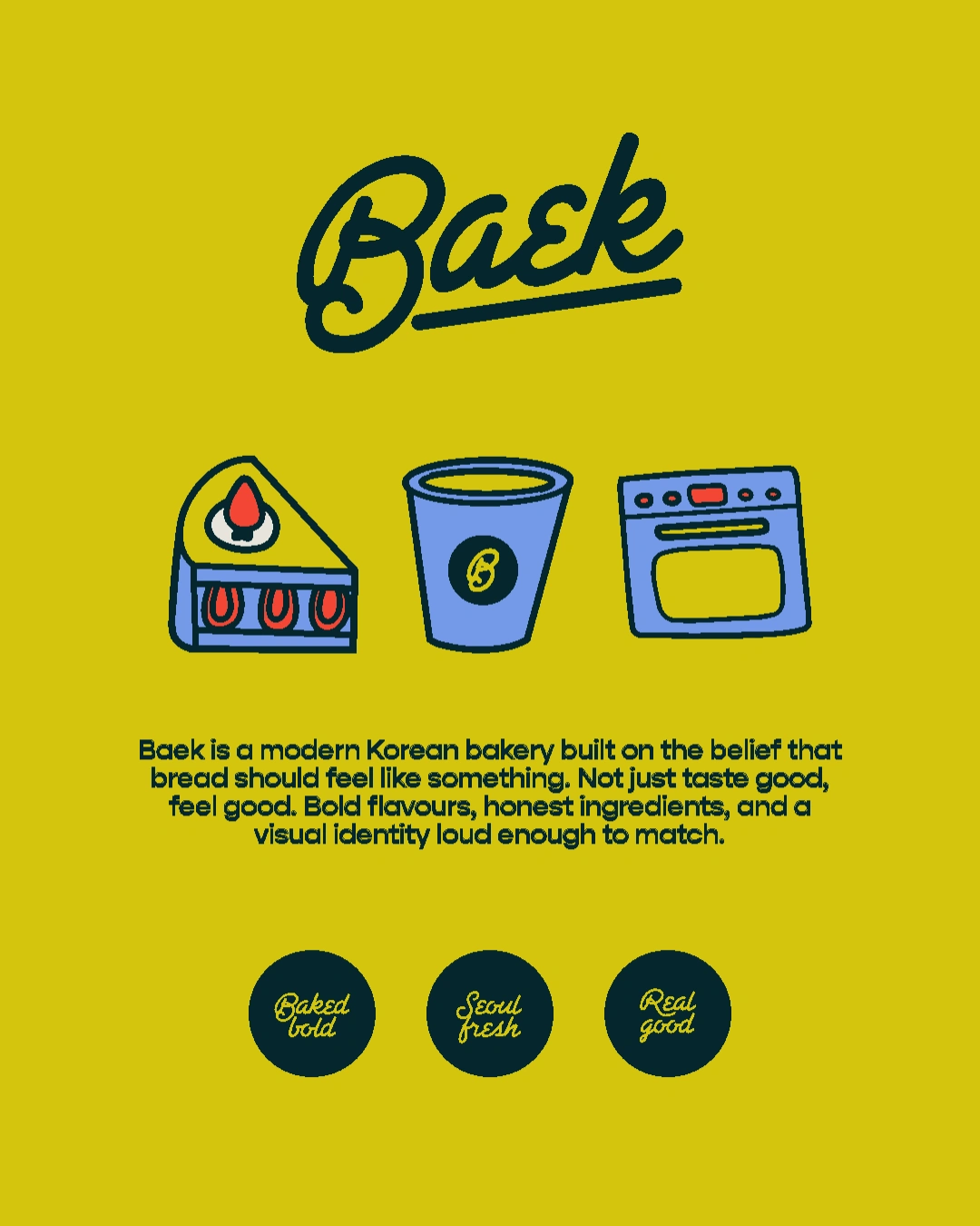
Baek is a modern Korean bakery brand built around bold flavours, graphic illustration, and a visual identity loud enough to match the food. This project covers full brand identity and packaging design.
Keywords:
Bold Graphic Seoul-rooted.
The Problem
Most bakery brands play it safe. They reach for minimal, neutral, and inoffensive, and end up looking like every other cafe on the block. Baek needed an identity that felt distinctly Korean without falling into tired clichés, and bold enough to stand out in a saturated market without losing warmth.
The Solution
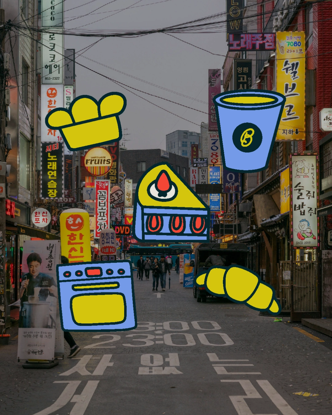
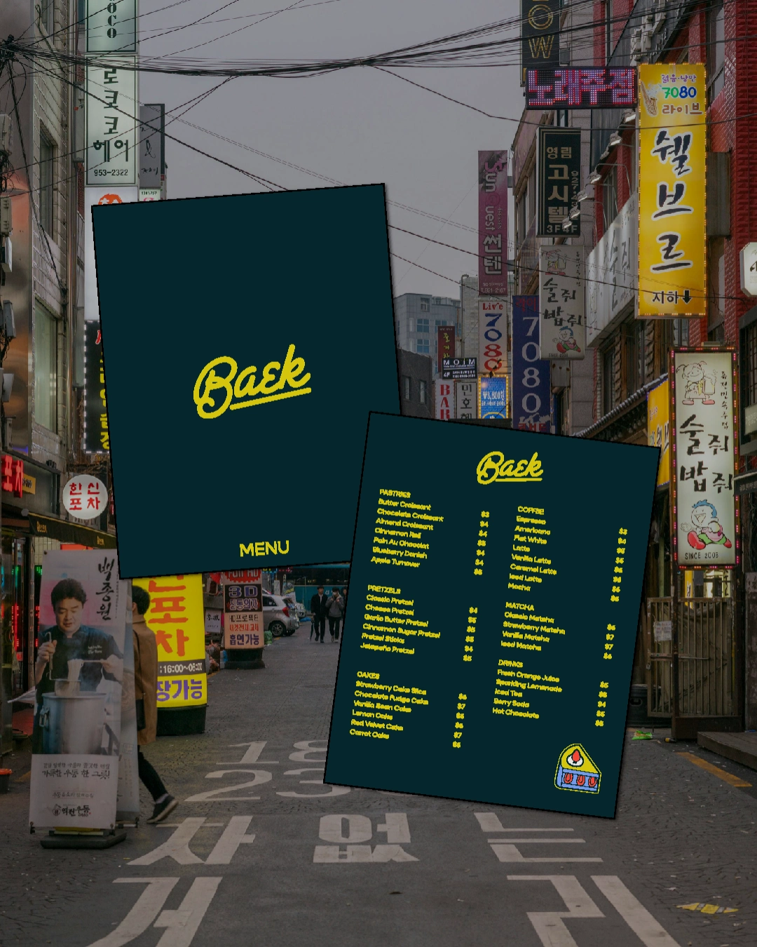
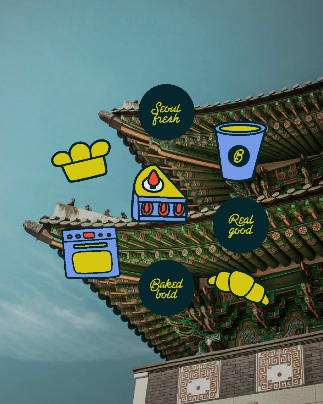
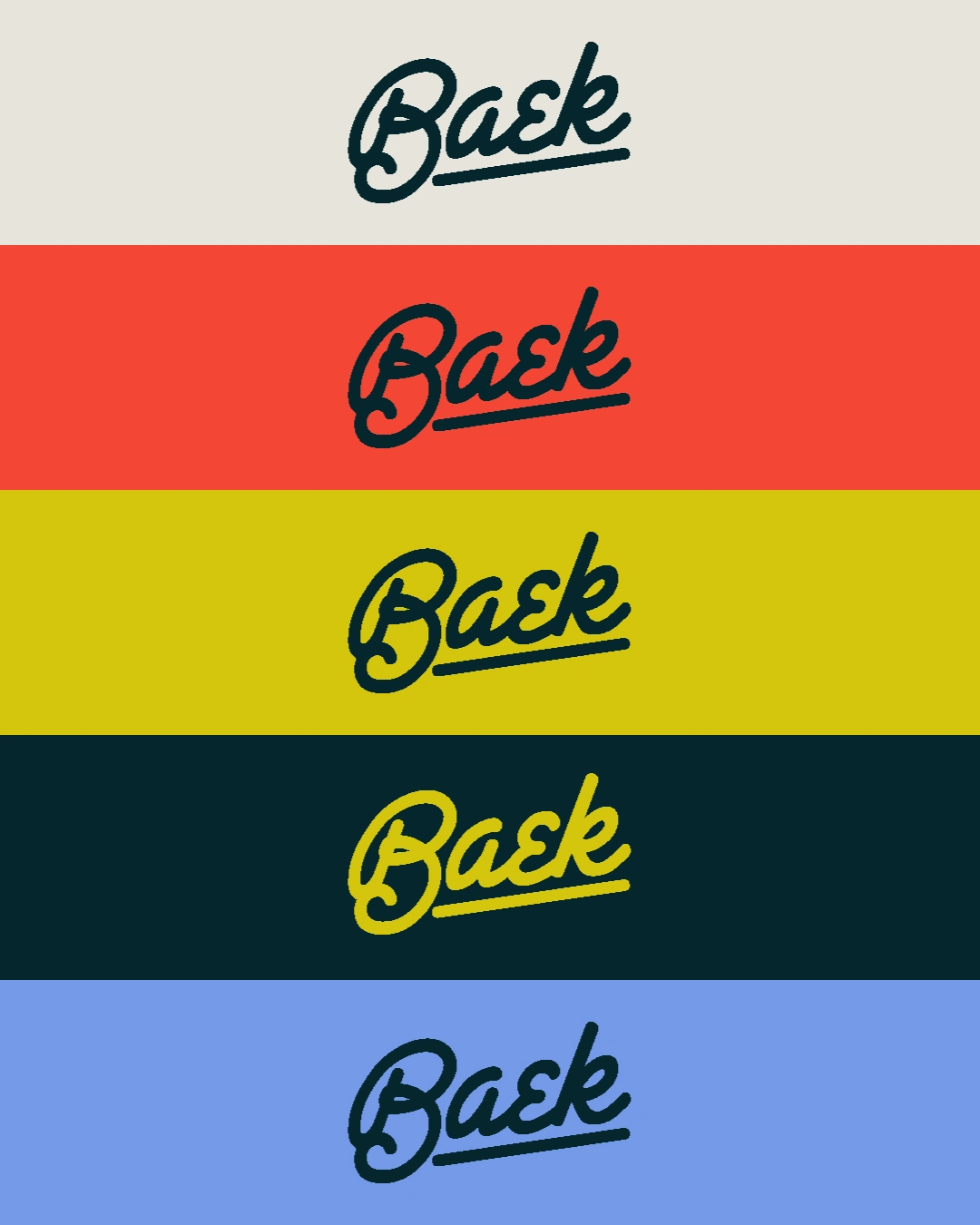
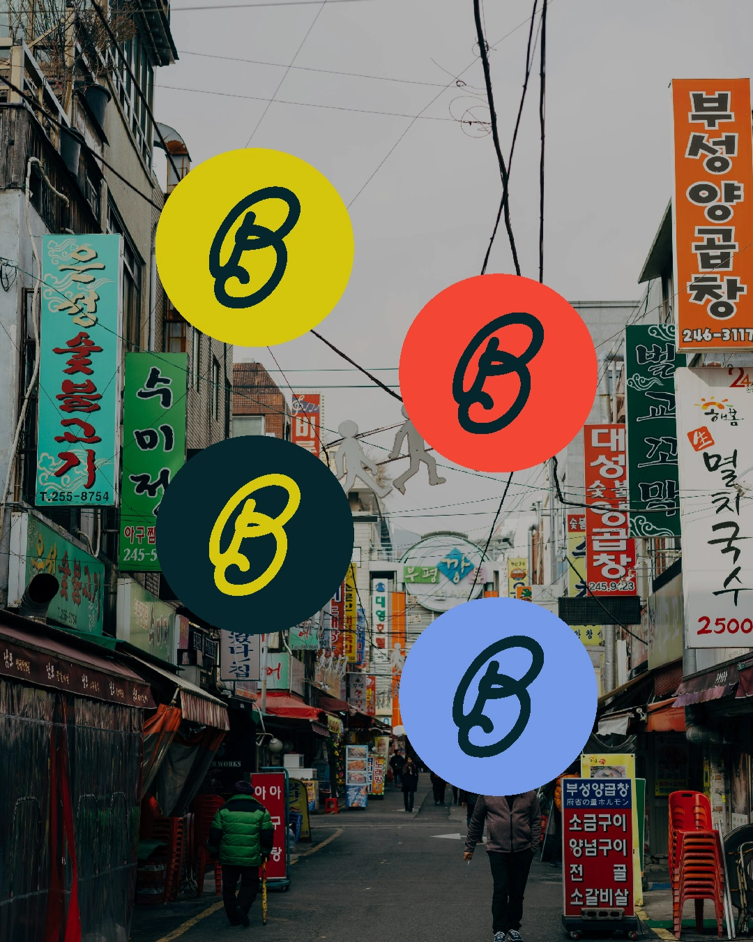
The brand draws from vintage Seoul street culture, bold hand-lettered typography, and a graphic illustration system built around the food itself. A confident colour palette of deep teal, yellow, red, and periwinkle blue gives the brand real presence across every touchpoint. The result is a brand world that feels modern and rooted at the same time.
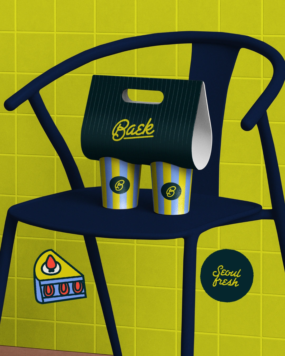
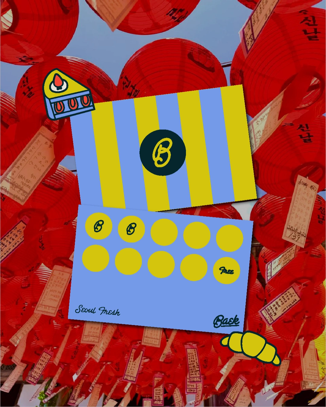
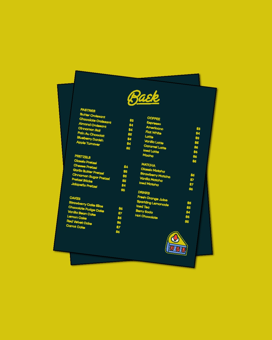
The Packaging
The packaging translates the brand into the physical world through paper bags, cups, loyalty cards, and a takeaway carrier. Each piece carries the illustration system and colour palette consistently, making every customer interaction feel intentional. The goal was packaging people don't want to throw away.
Like this project
Posted Jun 16, 2026
Designed bold brand identity and packaging for Baek bakery brand.