Peppa Please - Chilli Oil Branding and packaging
Aliza Munir
About Peppa Please
Peppa Please is a chilli oil brand built around flavour, heat, and personality.
The brand is designed to feel bold, cheeky, and energetic, turning a simple condiment into something expressive and fun to use in everyday cooking.
It celebrates spice, joy, and the little kick that makes food exciting.
The Challenge
The goal for Peppa Please was to create a chilli oil brand that feels bold and flavourful while still being approachable and memorable on shelf.
The challenge was to:
• Build a distinctive personality in a crowded condiment market
• Use colour and illustration to communicate heat and flavour instantly
• Create packaging that feels fun, modern, and recognisable at a glance
The Solution
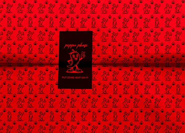
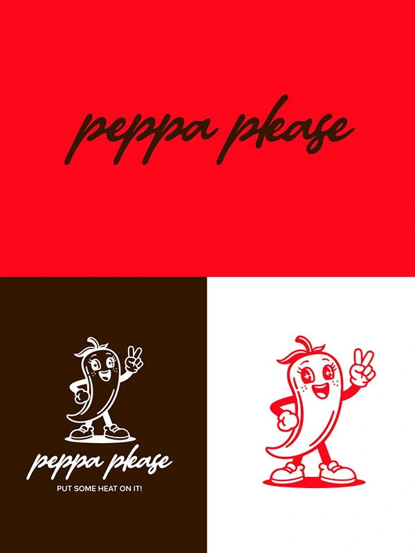
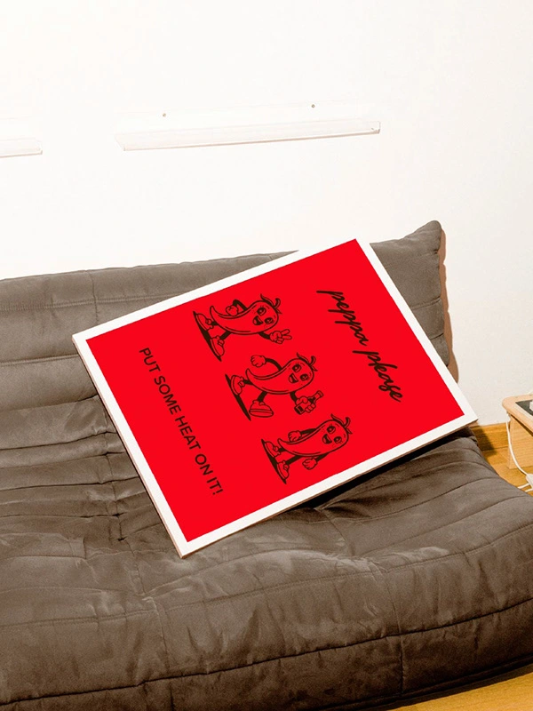
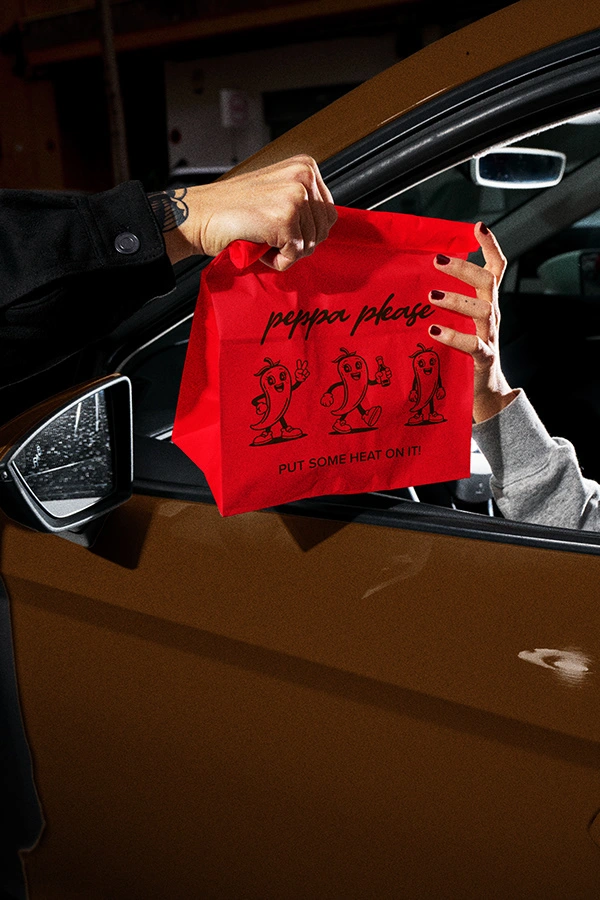
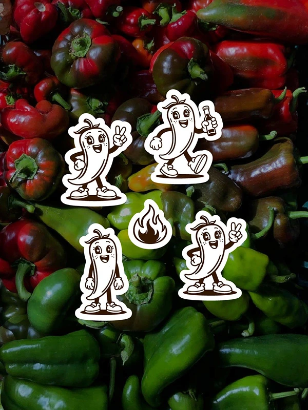
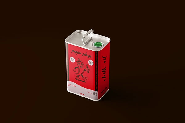
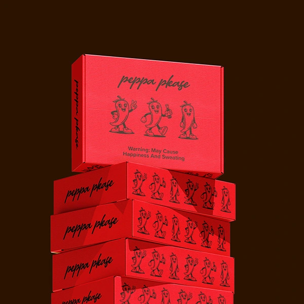
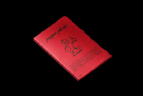
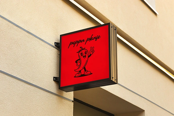
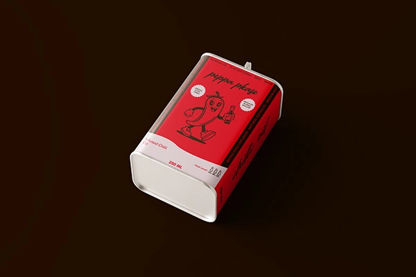
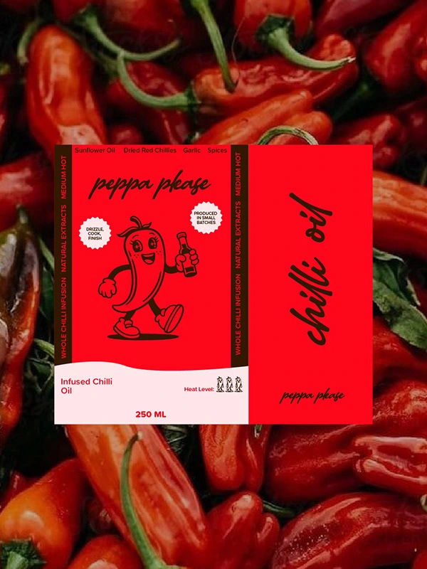
The Peppa Please identity is built around vibrant red tones, expressive typography, and a playful chilli character that brings the brand to life.
The hand drawn script logo adds energy and movement, while the bold base typography ensures strong visibility and shelf impact.
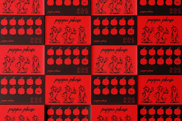
A simple but striking colour system centred on red, white, and black reflects heat, intensity, and clarity.
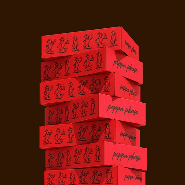
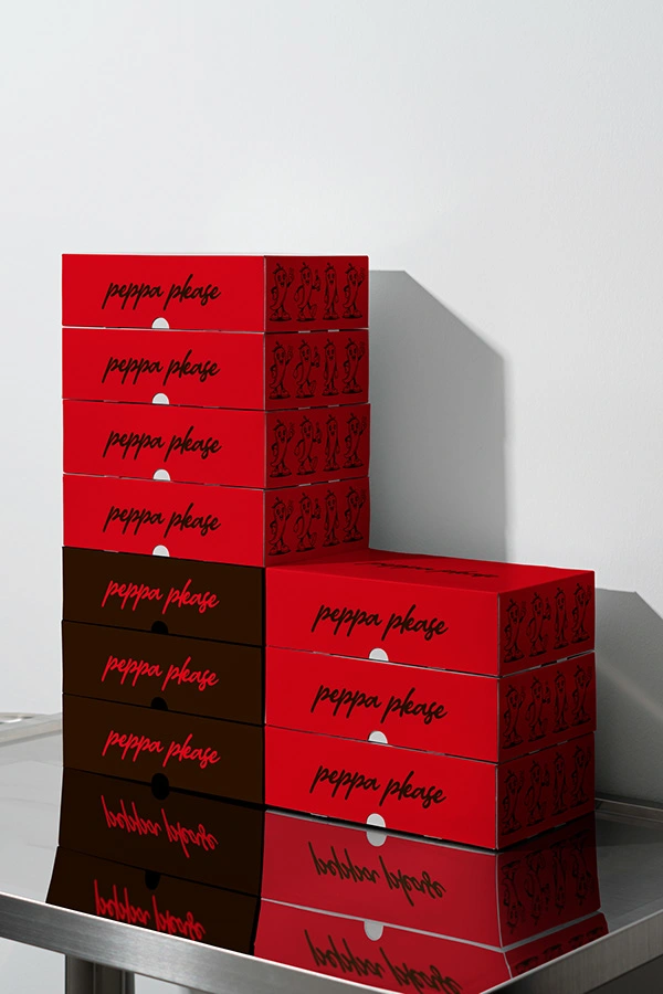
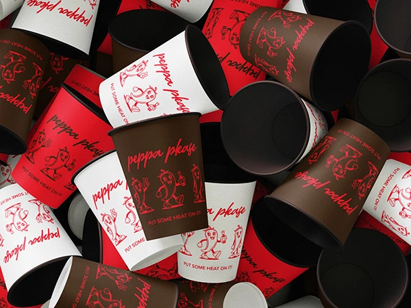
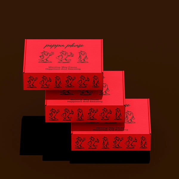
Packaging and Brand Experience
The brand extends across oil tins, labels, and product variants with a clear, repeatable system.
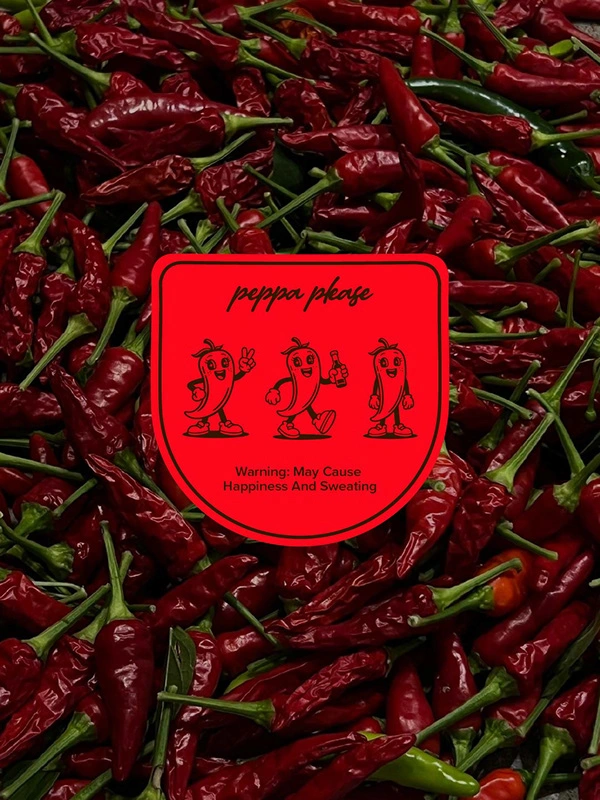
From heat level indicators to ingredient callouts, each element is designed to be both informative and playful.
The character illustration adds memorability while the layout keeps the product looking clean and premium.
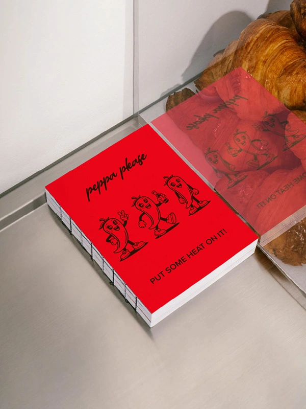
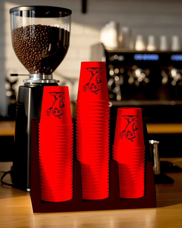
Packaging was designed to maximise shelf impact through strong colour blocking, clear hierarchy, and repeatable graphic elements. The system scales seamlessly across tins, boxes, and secondary materials while maintaining a cohesive and energetic brand presence.
Final Thoughts
Peppa Please turns chilli oil into a bold, personality driven brand that feels fun, expressive, and full of flavour.
If you are looking to create a brand with this level of personality and impact, feel free to reach out 🌶️
Like this project
Posted Feb 28, 2026
I designed a playful chilli oil brand for Peppa Please using bold red tones and character-led packaging to create a fun, flavour packed identity.