Petali - Branding and Packaging for a Botanical Soda
Aliza Munir
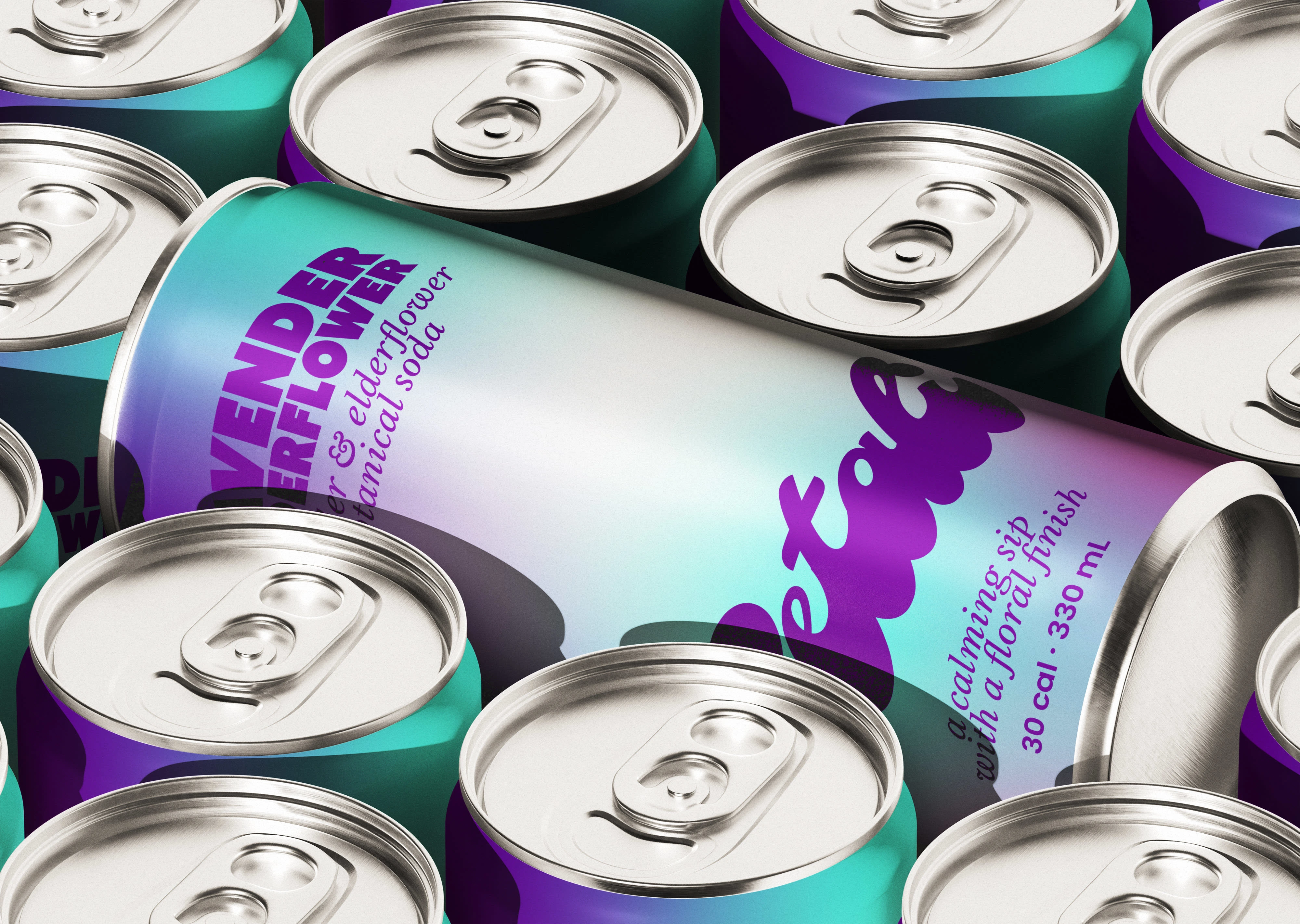
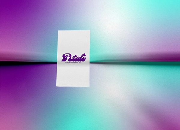
About Petali
Petali is a botanical soda brand inspired by flowers, calm moments, and light refreshment.
The brand is designed to feel soft, airy, and slightly dreamy while still being modern and shelf-ready. It brings together flavour, fragrance, and visual softness to create a drink that feels both refreshing and elevated.
It turns everyday soda into a more mindful, sensory experience.
The Challenge
The goal for Petali was to create a soda brand that feels floral and calming without looking overly delicate or generic.
The challenge was to:
• Build a soft but distinctive identity within a busy beverage category
• Use colour and gradients to communicate flavour and mood
• Create packaging that feels premium, modern, and refreshing
The Solution
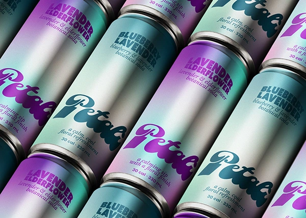
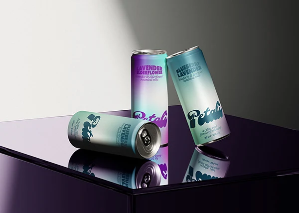
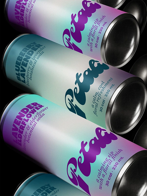
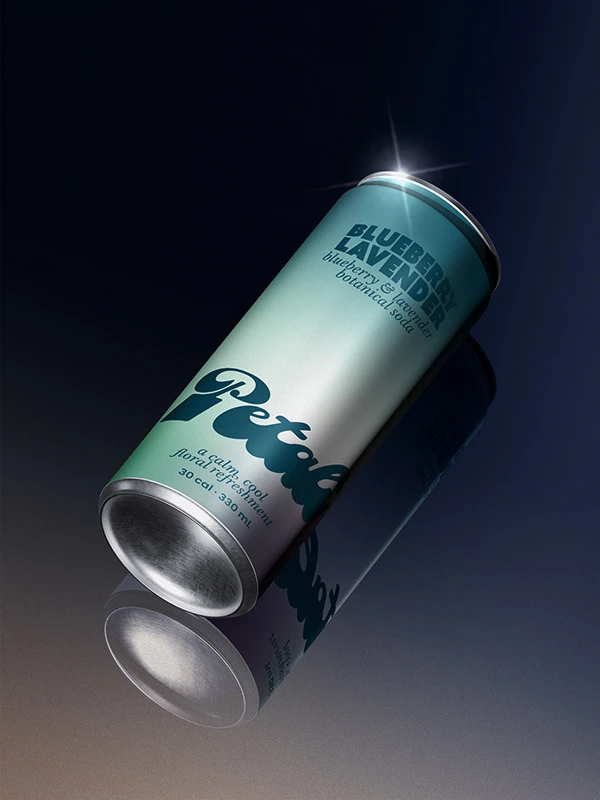
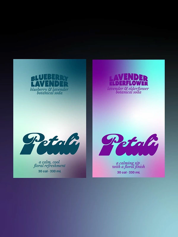
The Petali identity is built around smooth gradient colour transitions inspired by botanical flavours like lavender, elderflower, and blueberry.
The wordmark combines soft curves with confident structure, giving the brand a sense of elegance while staying easy to read on shelf.
Packaging and Brand Experience
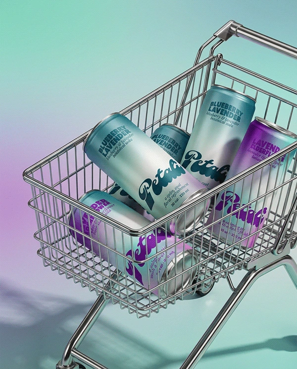
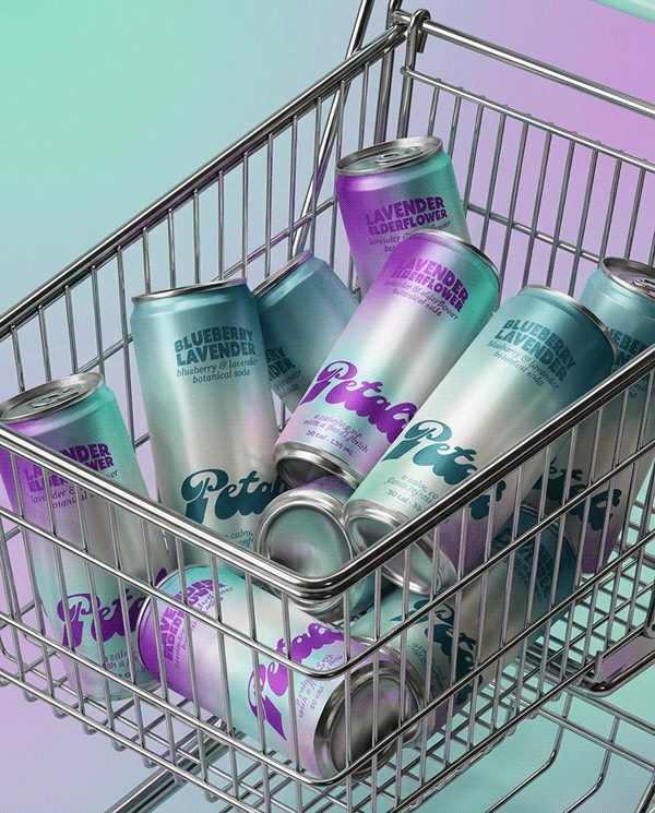
The identity extends across aluminium cans, flavour variants, and promotional visuals.
Each flavour is distinguished through its own gradient while maintaining a cohesive system through consistent typography and layout.
The result is a flexible packaging system that feels premium, modern, and instantly recognisable in a retail environment.
Final Thoughts
Petali turns a simple soda into a calming, sensory brand experience that feels fresh, floral, and visually elevated.
If you are looking to build a brand with this level of clarity and visual softness, feel free to reach out.
Like this project
Posted Feb 28, 2026
I designed a modern botanical soda brand using soft gradients, floral cues, and clean typography to create a refreshing and visually elevated identity.