Ultissimo Luxury Brand Repositioning
Alouette Marsh
Luxury Real Estate Brand Context – Lake Como Market Positioning
Repositioning a property business into a high-trust luxury advisory brand.
Ultissimo is a luxury property sourcing and consultancy firm based in Lake Como, specialising in high-value, often off-market properties.
Unlike traditional real estate agencies, Ultissimo does not represent the seller.
They represent the buyer.
Their role is to source, guide, negotiate, and unlock access – delivering a discreet, end-to-end experience for high-net-worth clients investing in multi-million euro properties.
Operating in one of the most visually saturated luxury markets in the world, their differentiation was clear internally.
But externally, it was invisible.
The Problem: Outdated Branding in a High-End Property Market
Despite an increase in high-value clientele, Ultissimo’s brand and website were no longer aligned with the level of service they provided.
Key issues included:
An outdated visual identity lacking authority
No clear user journey or website structure
Weak positioning within the luxury real estate space
Limited communication of their client-first consultancy model
The result:
A disconnect between perceived value and actual offering.
Without change, the business risked continuing to attract lower-value enquiries, or being overlooked by the very clients they were built for.
Brand Strategy for a Luxury Property Consultancy
This project was not about elevating aesthetics.
It was about redefining how the business was understood.
The core strategic shift:
Ultissimo is not a real estate agency. It is a luxury property consultancy built around the buyer.
From this position, the brand was rebuilt to emphasise:
Client-side representation over property sales
Access to off-market opportunities
Discretion, clarity, and trust
A highly curated, end-to-end experience
Lake Como remained central – but interpreted with restraint.
Instead of leaning into expected “Italian luxury” tropes, the direction focused on something more controlled: architectural precision, spatial clarity, and quiet authority.

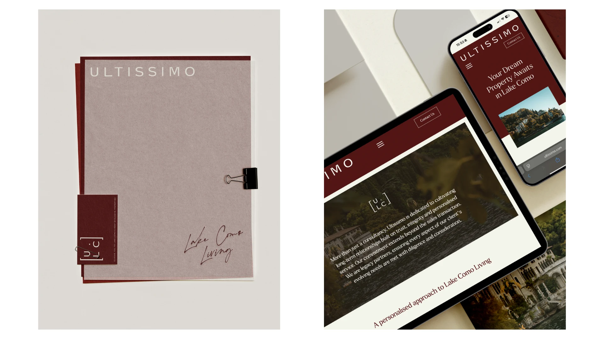
Luxury Brand Identity & Website Design Execution
Every element of the brand was designed to reinforce positioning and elevate perception.
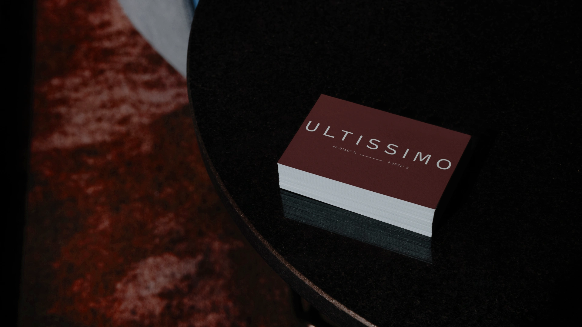
Brand Identity
A structured, ownable identity system inspired by architectural forms.
The bracket motif became a defining visual device, representing:
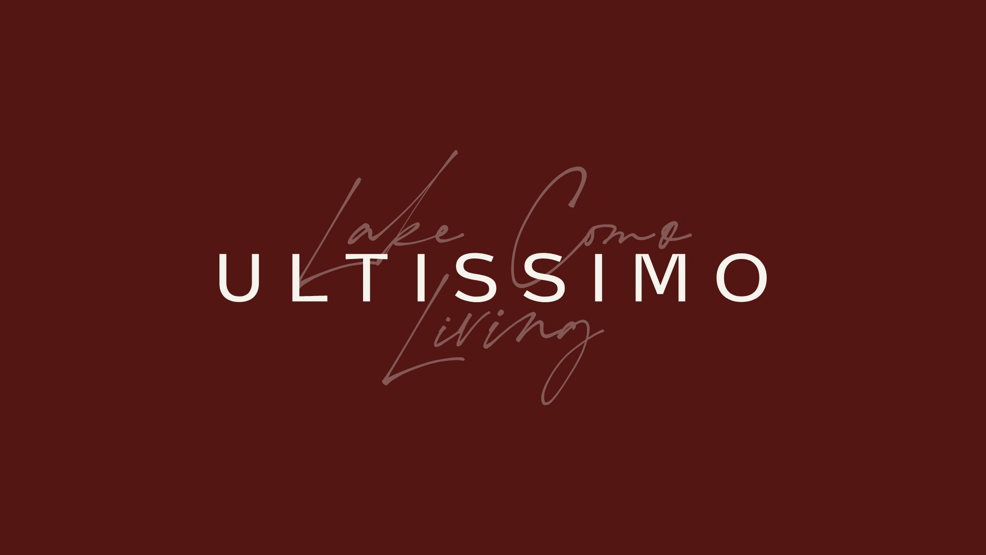
Typography
A balance of heritage and modernity, reflecting both legacy and contemporary luxury.
Colour Strategy
A distinctive burnt orange introduced contrast and memorability within a category dominated by safe neutrals.
This was a deliberate move away from predictable luxury.
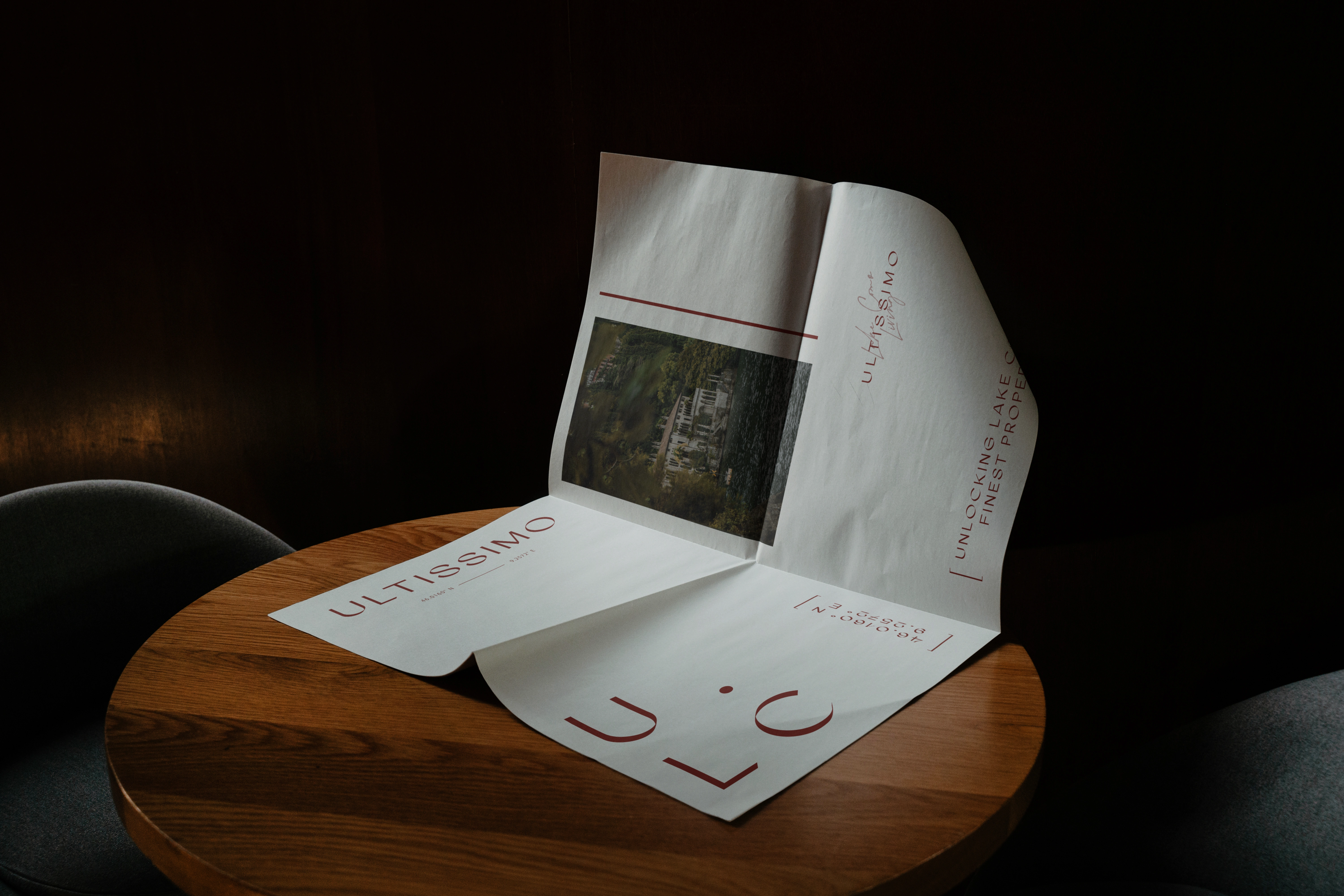
Spatial & Location Language
Coordinates embedded within the identity anchored the brand to Lake Como in a subtle, intelligent way.
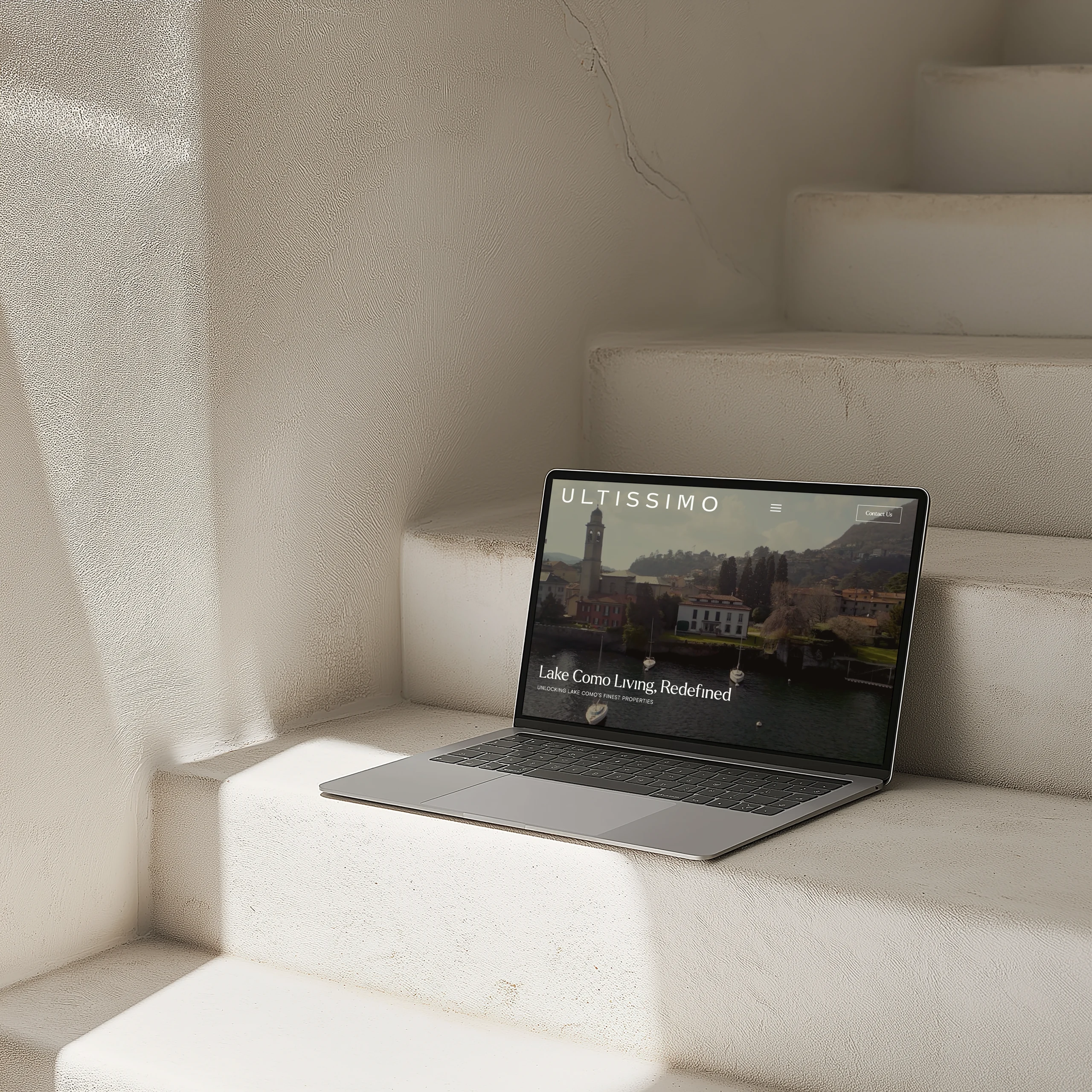
Luxury Website Design
The website was completely restructured to prioritise clarity and user experience:
No ambiguity. No unnecessary complexity.
Results: High-Value Property Enquiries & Business Growth
The shift in positioning translated quickly into tangible results.
Within the first month of launch:
Shortly after:
Additional outcomes:
Stronger alignment with high-net-worth clients
Increased confidence in brand positioning
Positive recognition from local luxury businesses
A consistent flow of higher-quality enquiries
Client Experience & Brand Transformation
Beyond metrics, the transformation was internal as much as external.
“I thought I might just get a ‘pretty’ website… instead we went deep into strategy, positioning, and how I show up as a business owner.”
The process reshaped not only the brand, but how the founder saw the business itself.
This is where the real shift happened.
Luxury Branding for Real Estate – Key Takeaways
This project demonstrates a critical distinction in high-end markets:
Most importantly: The strongest brands in luxury real estate don’t compete on listings. They compete on trust, access, and perspective.
This was not a surface-level rebrand.
It was a strategic repositioning designed to:
The result is a brand that no longer explains itself. It signals.
I'll only fill your inbox with treasures that inspire and uplift, no unnecessary noise here!
By subscribing you acknowledge that your information will be transferred to Flodesk for processing.
Like this project
Posted Apr 27, 2026
Repositioning a Lake Como property consultancy into a high-trust luxury brand attracting multi-million, off-market property buyers.