Zen Wellness Brand Identity Transformation
Alouette Marsh
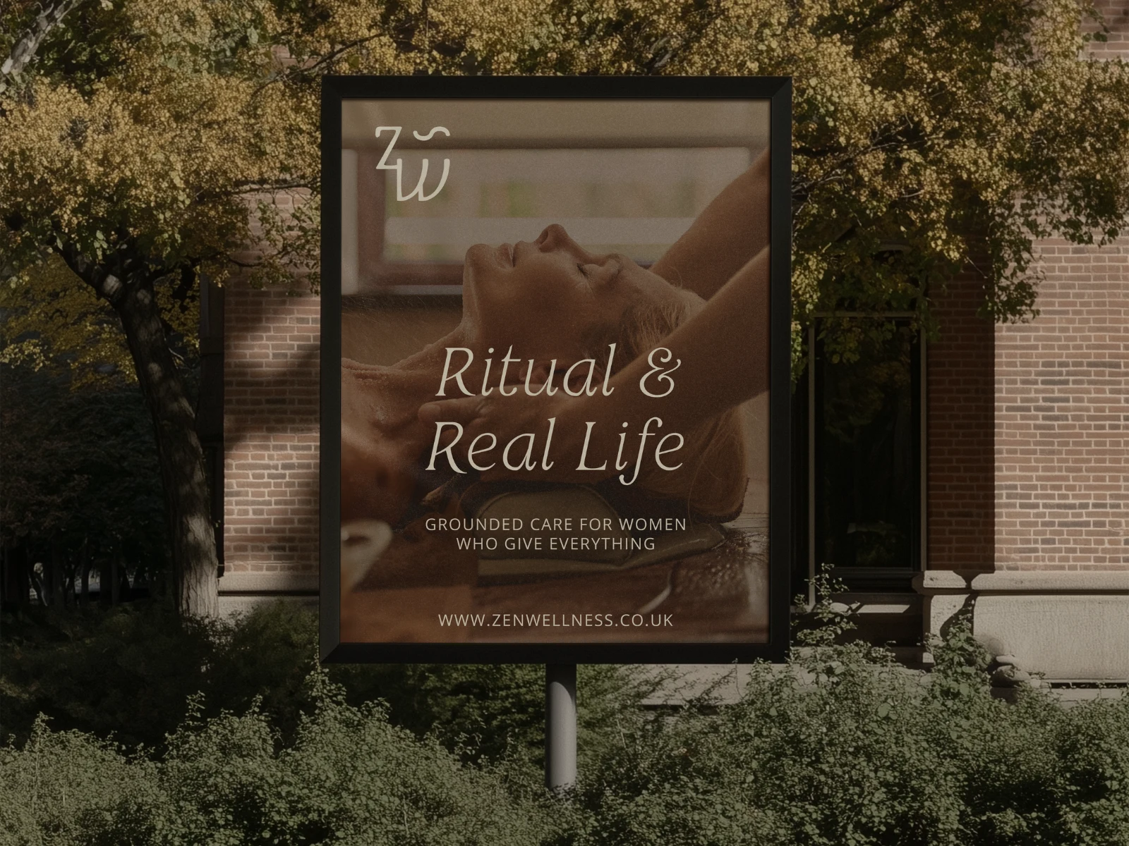
Zen Wellness; A Grounded, Transformative Identity Rooted in Human Connection
Where healing meets intention. Where design becomes embodiment.
Zen Wellness came to Lark seeking a brand that reflected the depth of their work; not just soothing aesthetics, but a visual language rooted in transformation, grounded energy, and the healing power of human connection. They needed an identity that moved beyond traditional spa minimalism and created a feeling of calm confidence, embodied care, and quiet emotional resonance.
This wasn’t about designing something zen-looking. It was about designing something alive.
The Strategy: Embodied Transformation Through Form + Meaning
Instead of leaning into generic wellness symbols, the Zen Wellness identity was built on a foundation of movement, breath, rhythm, and evolution. The entire logo system integrates symbolic forms that mirror the healing journey:
Motion & Flow: A visual representation of ongoing growth - renewal, balance, and energetic shifts.
Healing Touch: A nod to the reciprocal exchange between practitioner and client - the grounding connection at the heart of every treatment.
Grounded Energy: A stable, rooted centre that reflects the brand’s ethos: calm, safe, and full of life.
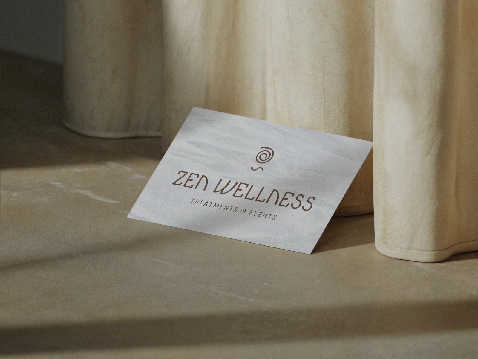
The Spiral: Inner rhythm. Expansion. Self-awareness. A symbol of inward journey and transformation.
Wholeness: The circular structure represents cyclical growth and completion - wellness that evolves, renews, and returns.
Together, these elements form a brand that feels quietly powerful, deeply human, and intentionally restorative.
Brand Identity: A Visual System Rooted in Breath, Balance & Embodied Connection
The Zen Wellness identity is built as a holistic visual language; one that moves, breathes, and grounds the viewer in an immediate sense of calm confidence. At its centre, the spiral emblem represents healing in motion; a gentle expansion of breath, energy, and human connection.
The bespoke hand-drawn wordmark extends this rhythm through flowing, organic letterforms that feel softly imperfect and warmly human, rejecting the sterile minimalism common in clinical wellness brands.
A palette of earthy, restorative tones and textural, sensory typography anchors the brand in authenticity and emotional intelligence. Together, these elements create an identity that feels elegantly crafted, quietly powerful, and deeply aligned with the transformative nature of Zen Wellness.
Tone & Personality
The identity maintains a balance of:
soulful vs. sophisticated
warm vs. professional
intuitive vs. structured
It communicates calm confidence - nurturing without being delicate, and expert without being distant.
Strategic Alignment
Every element, logo, form, type, structure, visualises the practitioner’s role:
not just a healer, but a guide helping clients move from stillness into strength, from introspection into connection.
Bespoke Typography: A Letterform Language Rooted in Breath & Human Touch
The Zen Wellness wordmark was crafted as a fully bespoke typographic system - designed to embody the brand’s grounded radiance through movement, texture, and organic form. Every curve, stem, and irregular stroke was shaped to mirror breath, release, and the gentle rhythm of healing. Instead of leaning into sterile, machine-perfect spa fonts, the custom letterforms feel warmly human: softly sculpted, slightly imperfect, and deeply connected to the emotional intelligence of the brand. Rounded terminals evoke ease and flow; widened forms ground the identity in touch and rhythm; upright structure maintains clarity and quiet professionalism.
This handcrafted typographic voice becomes the brand’s emotional anchor, expressive, intuitive, and unmistakably Zen Wellness.
Design Intent: A Brand That Breathes, Moves, and Holds Space
The entire identity was crafted to mirror the experience of Zen Wellness itself:
rounded terminals evoke breath and gentle release
curved stems mimic energy flowing through the body
widened forms ground the identity in touch and rhythm
upright structure maintains credibility and professionalism
The result? An identity that feels alive - breathing, moving, and holding space the same way Zen Wellness does for every client.
A Brand Built to Be Felt, Not Just Seen
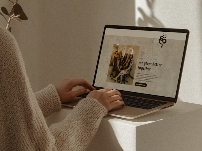
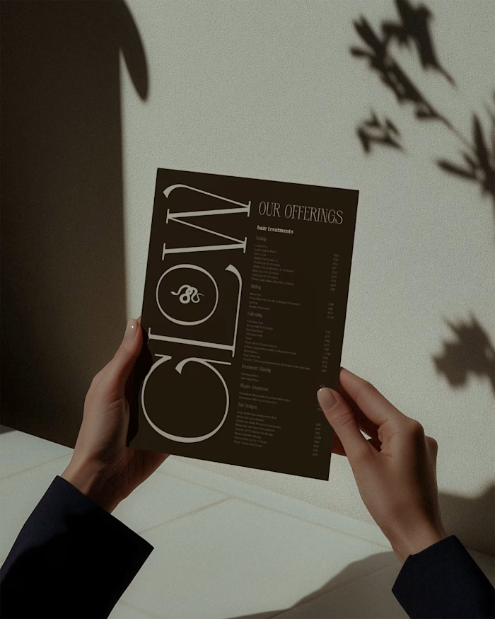
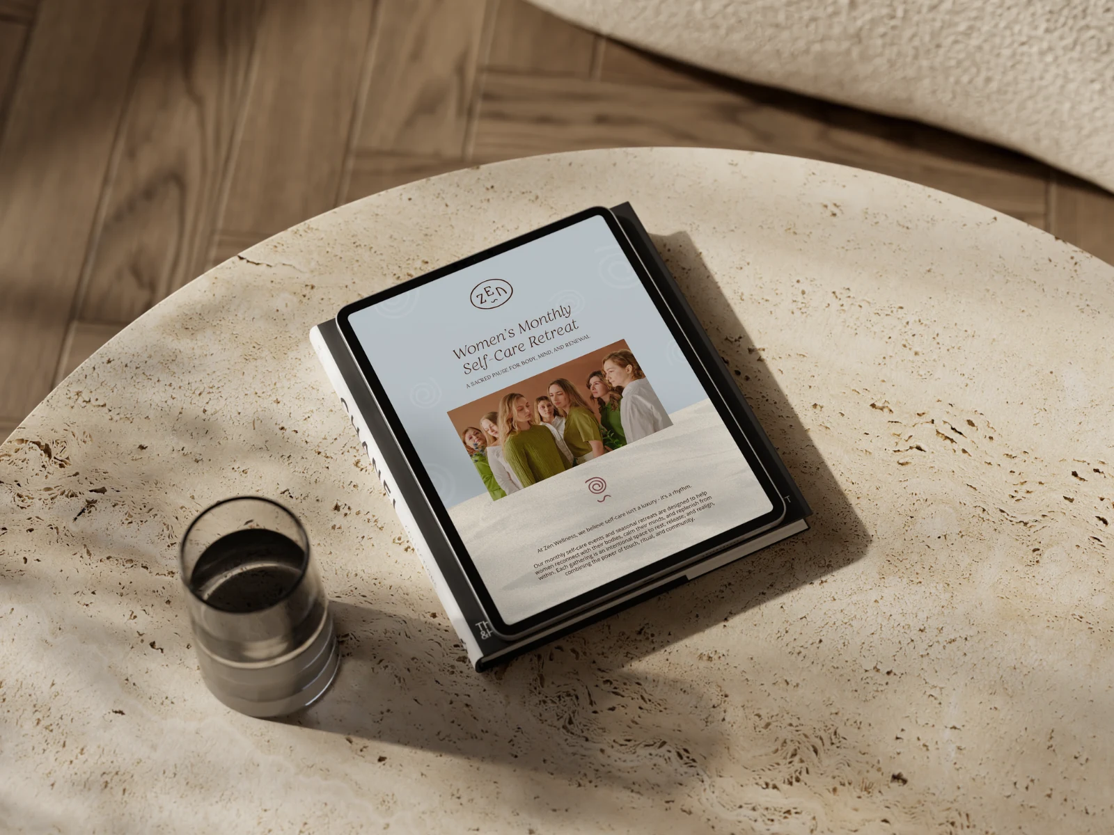
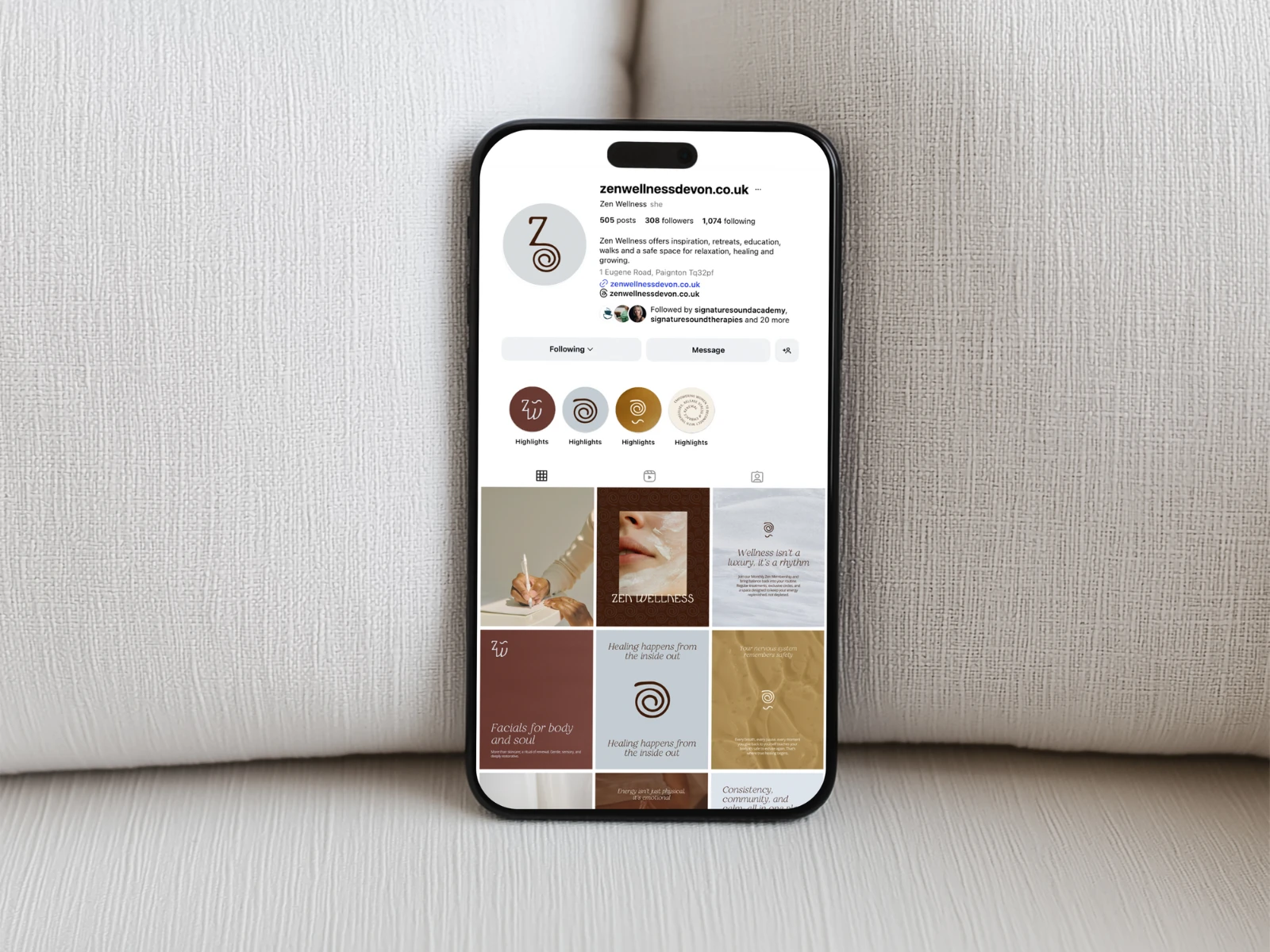
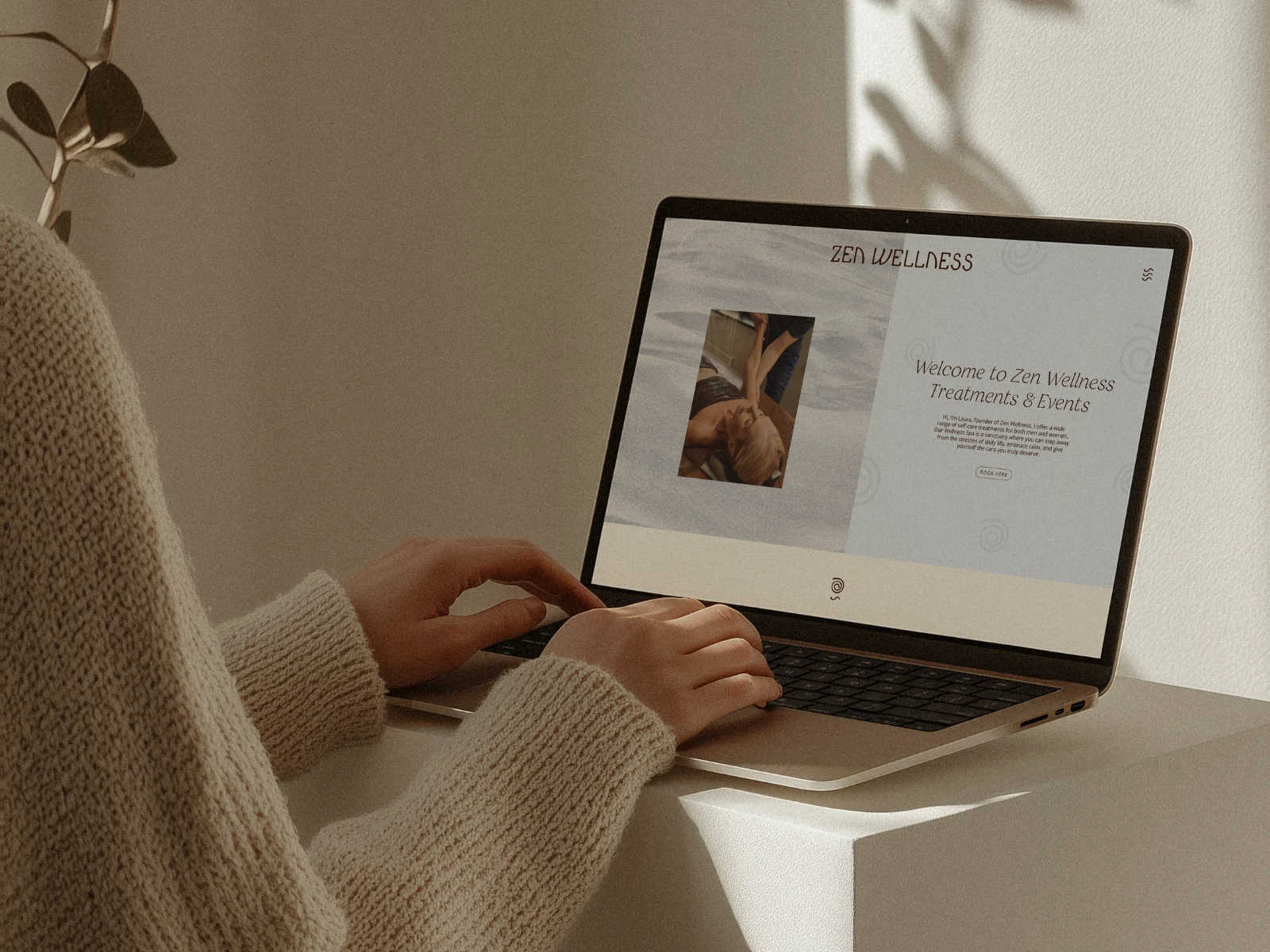
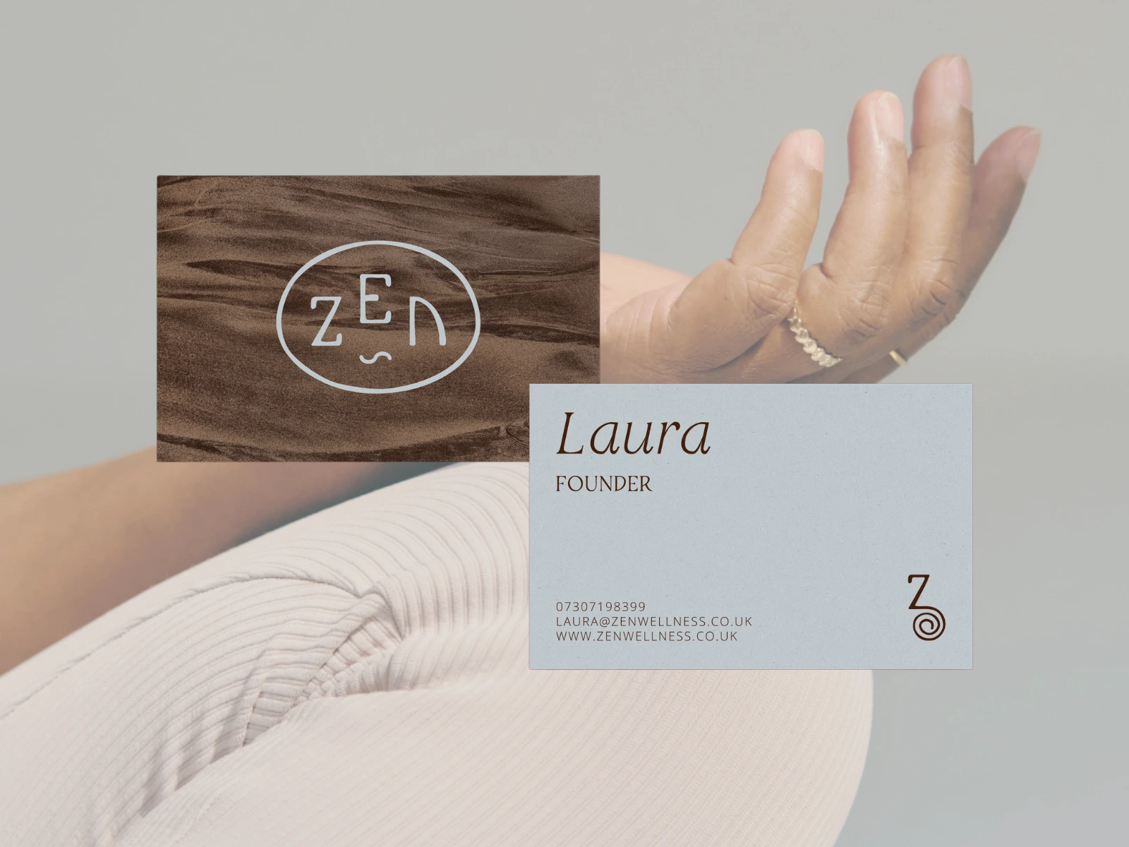
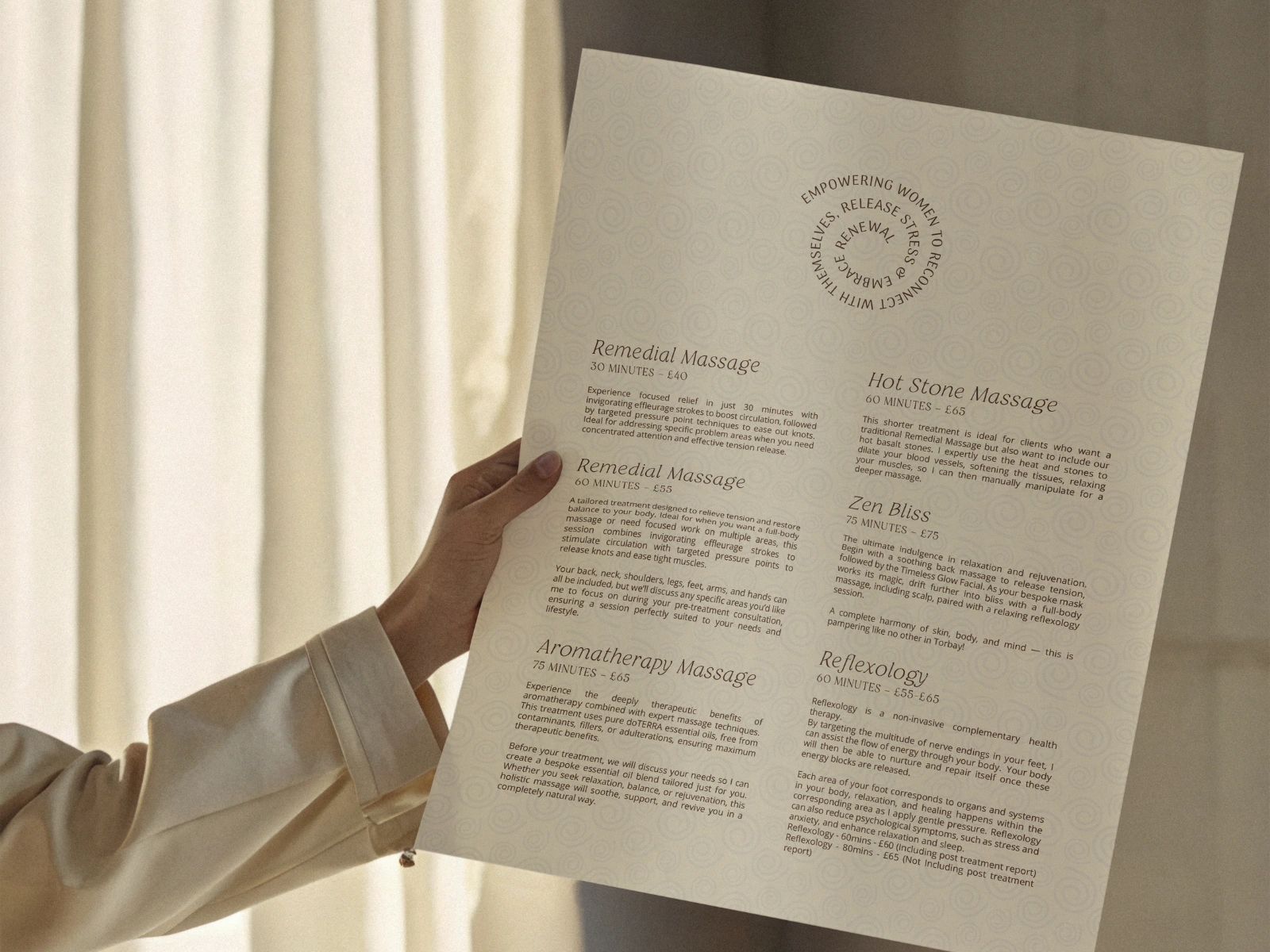
Zen Wellness’ new identity expands across treatments, events, digital presence, printed materials, and in-person experiences. The entire ecosystem reinforces the brand’s core values:
Calm
Rhythm
Compassion
Embodiment
Connection
Every touchpoint becomes an invitation to return to self, a living reminder that wellness isn’t a destination, but a continuous, cyclical journey.
The Impact
The rebrand positions Zen Wellness with a level of emotional intelligence, depth, and intention rare in the wellness space. It:
Differentiates them from sterile, corporate spa brands
Visually communicates their unique philosophy of grounded radiance
Deepens trust and connection with clients through authentic, human-led design
Provides a cohesive identity that naturally expands into events, experiences, and future offerings
Zen Wellness now shows up with a brand as powerful and present as the work they do.
This identity doesn’t whisper wellness. It embodies it.
Like this project
Posted Nov 28, 2025
Created a transformative brand identity for Zen Wellness, emphasising human connection and emotional intelligence.
Likes
1
Views
7
Clients
Zen Wellness