Modern Heritage-Led Brand Identity for Earsham Street Deli
Alouette Marsh
Earsham St. Deli; A Modern, Heritage-Led Identity for a Cult-Favourite Independent Deli
Where tradition meets modern warmth, and good food becomes a brand experience.
Earsham Street Deli approached Lark with a clear goal: create a brand identity that honours its roots while giving it the presence and flexibility needed to grow into multiple locations. The deli is known for its provenance-focused ingredients, curated shelves, and everyday community charm; and the brand needed to carry all of that without slipping into rustic clichés or corporate polish.
The result is an identity that feels curated, tactile, and quietly luxurious; a visual language that celebrates heritage, flavour, and the simple joy of good food done exceptionally well.
The Strategy: Heritage, Craft, Community
Rather than leaning into predictable artisan deli tropes, we anchored the brand in the core qualities that make Earsham Street Deli beloved: craft, care, provenance, local connection, and a refined sense of everyday pleasure.
The brand needed to hold its independent spirit while also feeling sophisticated enough to scale. Every decision was guided by three principles:
Rooted in heritage: honouring tradition without looking dated
Warm and contemporary: inviting, modern, quietly premium
Built for growth: adaptable for multiple locations and product lines
This balance formed the foundation of the visual system.
Brand Identity: A Curated Visual World With Modern Heritage at Its Heart
The new identity captures the deli’s quiet confidence, refined but approachable, grounded but expressive.
Logo Suite
A sophisticated logomark and wordmark pairing designed to feel timeless but fresh. The suite includes adaptable submarks and location-specific elements to support future expansion while maintaining cohesion and recognisability.
Typography
A rich, expressive serif leads the brand’s personality; full of character, warmth, and a touch of nostalgia. Paired with a clean, modern sans serif for clarity and function, the combination mirrors the deli’s blend of tradition and contemporary charm.
Colour Palette
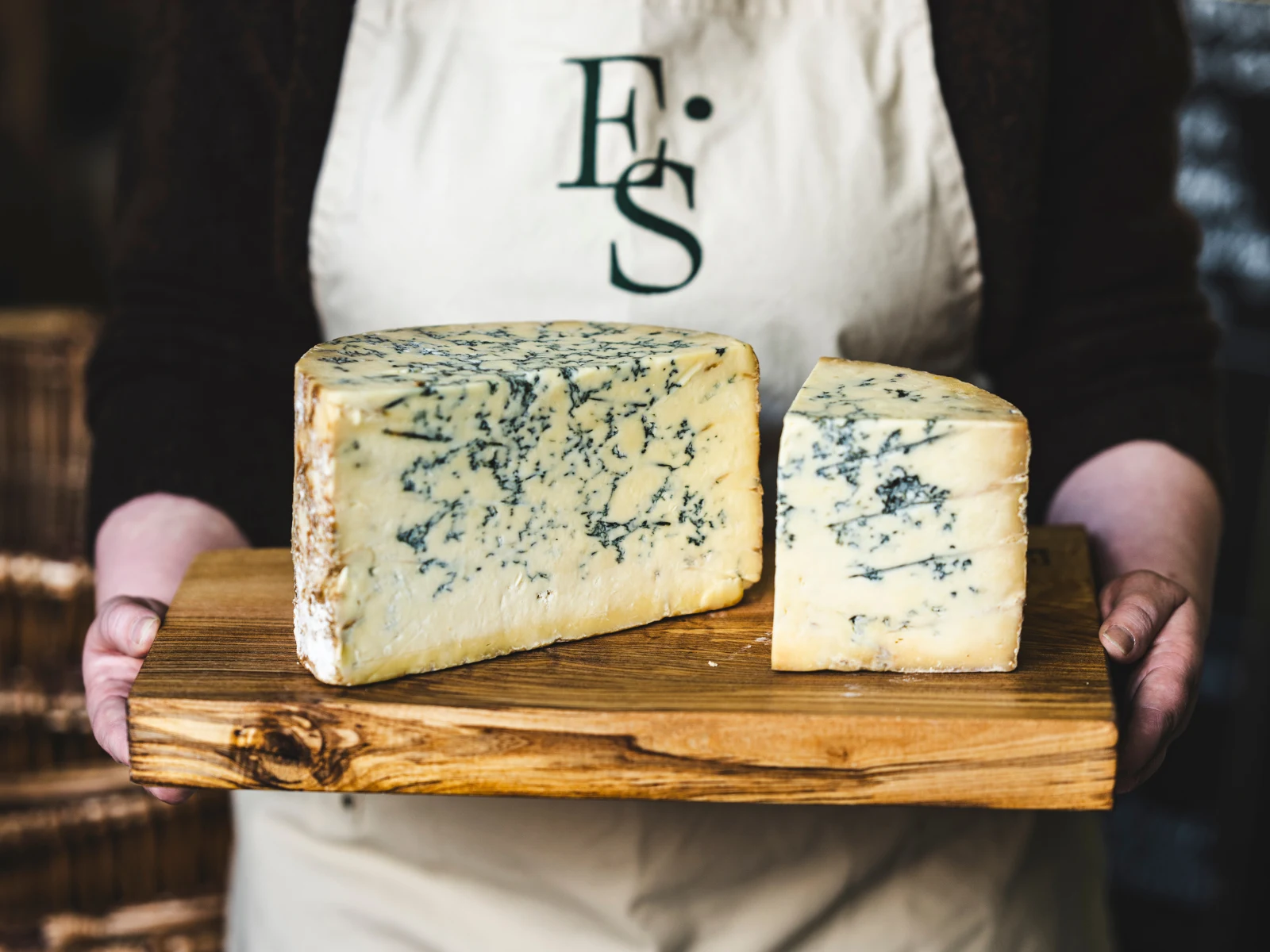
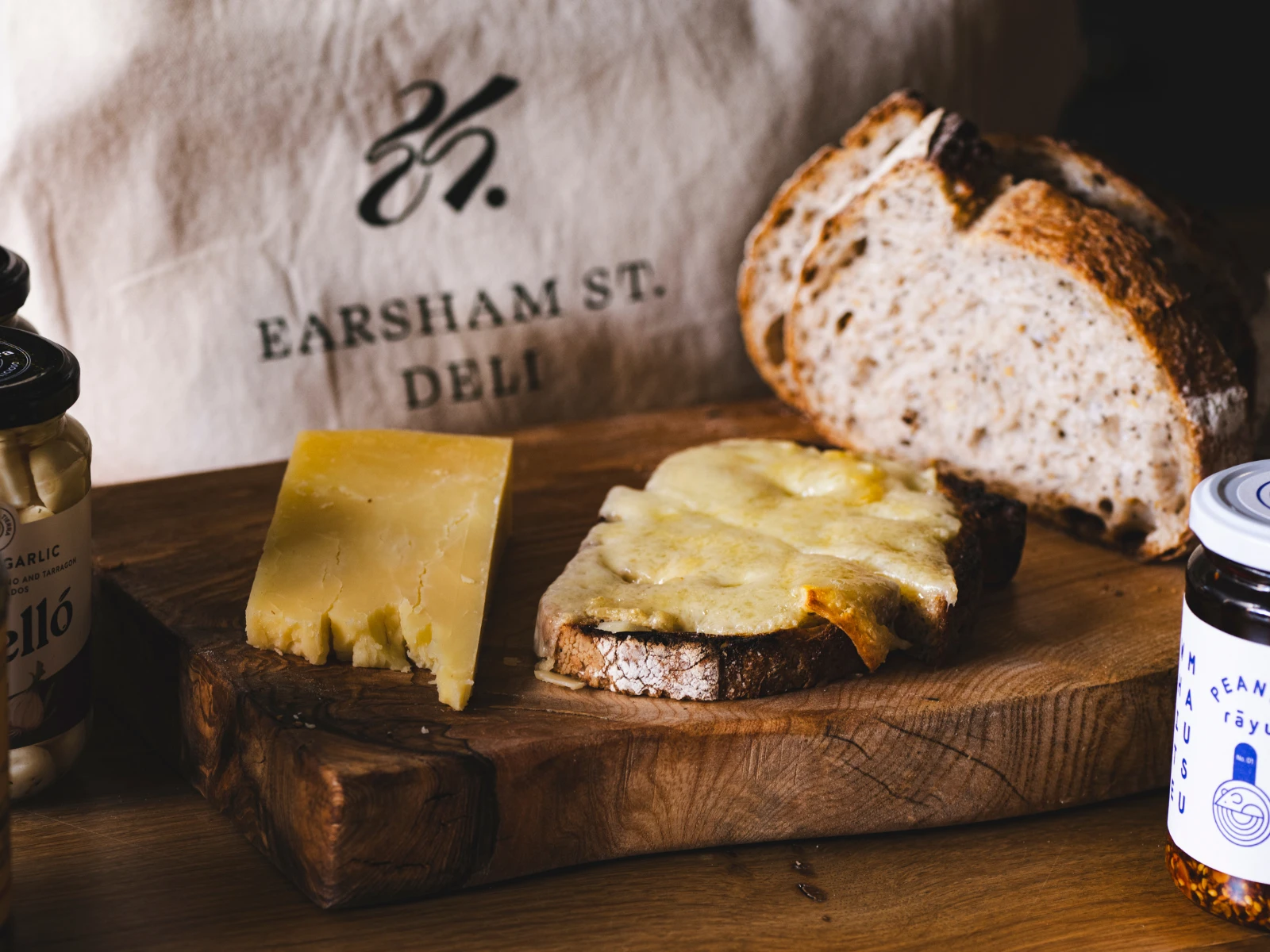
Heritage-inspired tones - earthy neutrals, deep greens, warm ochres - bring depth and tactility to the brand. The palette feels premium yet comforting, like stepping into a well-loved deli where everything is curated with care.
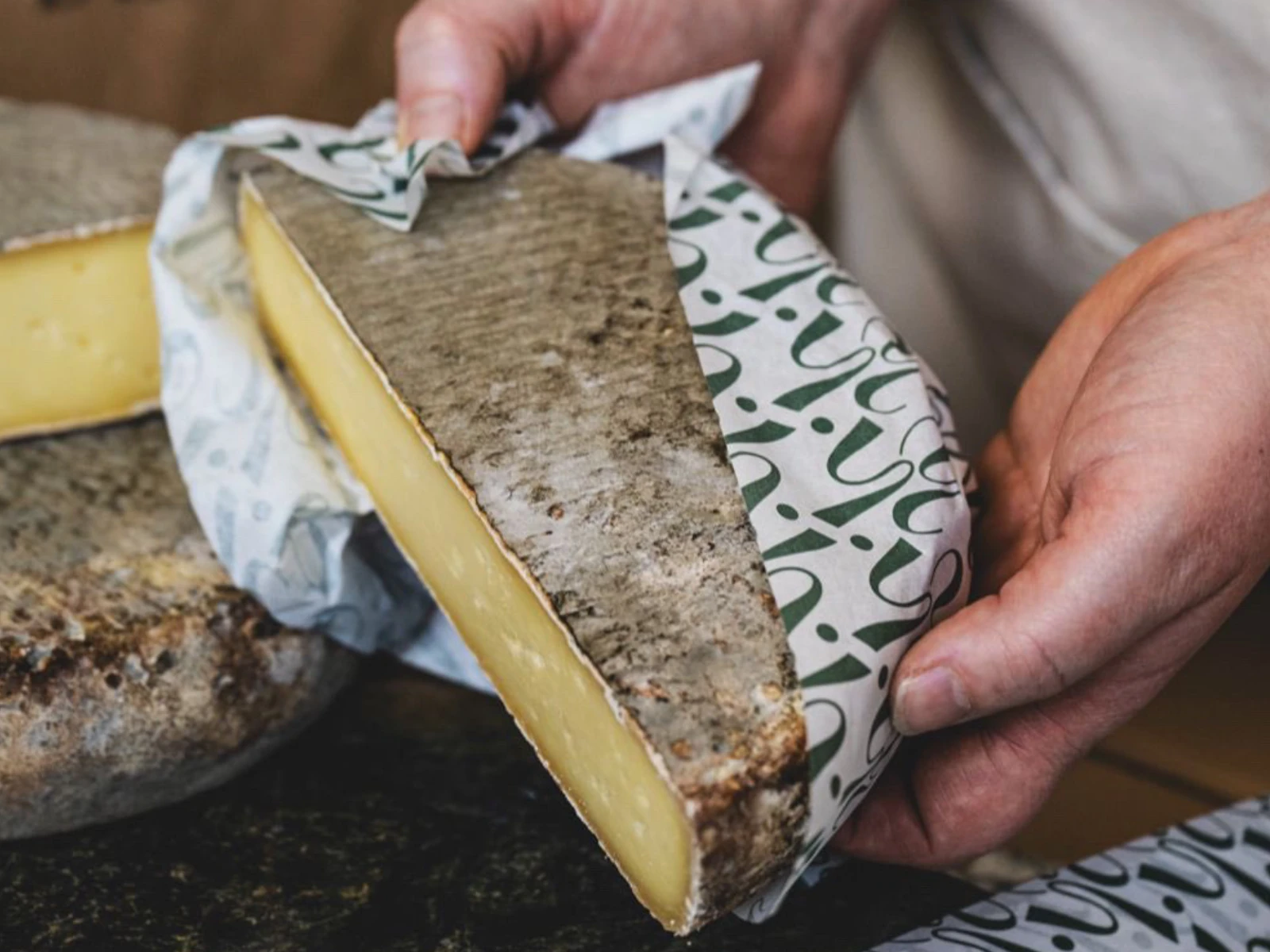
Textures & Visual Details
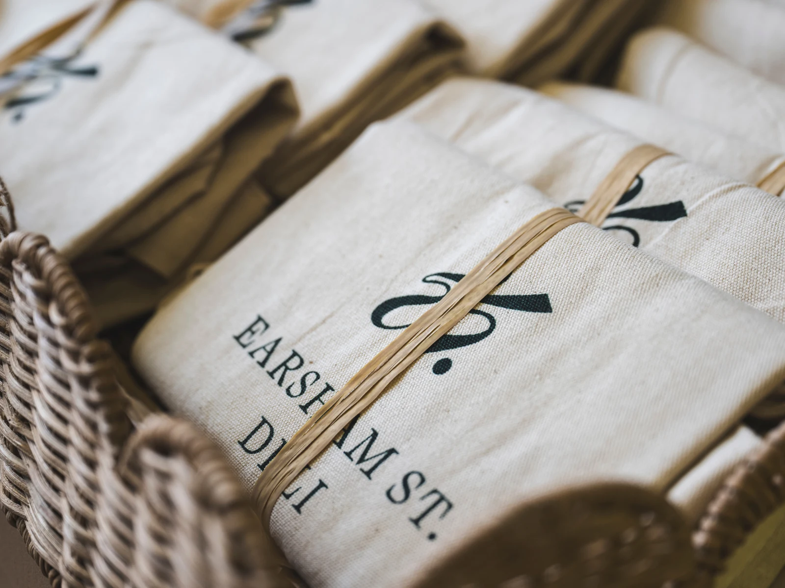
Soft textures, subtle patterns, and crafted details echo the tactile experience of the deli itself: wrapped goods, handwritten labels, wooden shelves, and thoughtfully sourced products. These textures build atmosphere and authenticity across every touchpoint.
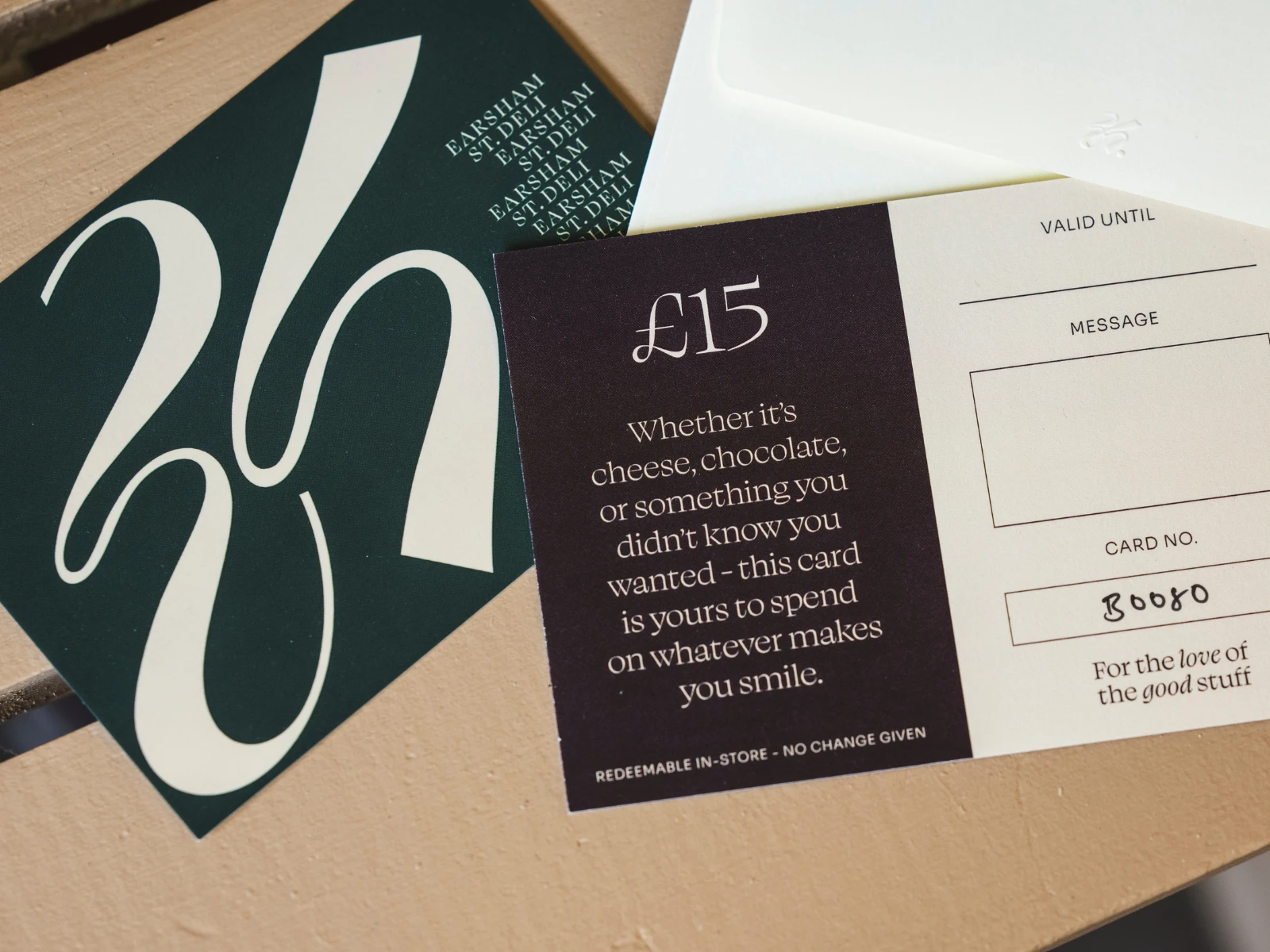
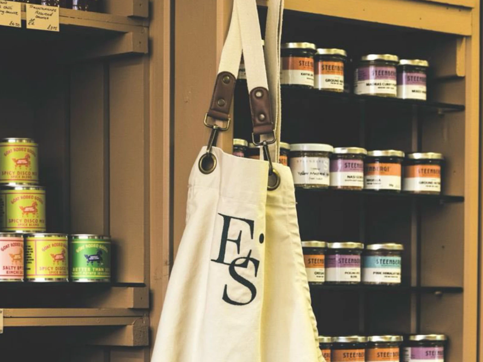
Packaging & Printed Collateral
From product labels to signage to take-home packaging, the system is designed to feel elevated yet familiar; the type of packaging clients want to keep, reuse, and display. Each piece reinforces the deli’s commitment to craft and quality, with enough flexibility to evolve as new products and locations emerge.
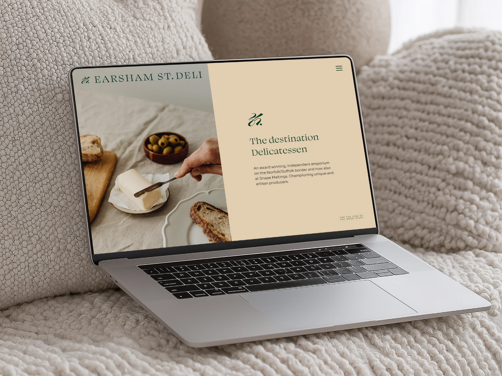
Website Design
The website mirrors the in-store experience: warm, curated, and full of flavour.
It highlights:
The deli’s product selection and sourcing philosophy
Community-led storytelling
Seasonal offerings
Location and expansion-friendly navigation
A brand voice full of character and charm
It feels like walking through the shop; only digitally.
A Brand Built for Shelves, Screens & Community
Every element was developed to support the deli’s evolution while staying true to its independent heart. From textured backgrounds to location-specific submarks to cohesive social templates, the brand can confidently show up anywhere, without ever losing its soul.
Earsham Street Deli now has an identity that:
✓ Elevates its heritage
✓ Strengthens its community presence
✓ Supports scalable growth
✓ Honours the craft and care behind every product
It’s a brand with history; built for the future.
Like this project
Posted Nov 28, 2025
Created a modern, heritage-led brand identity for Earsham Street Deli.