Tusi: Creative Marketing Studio
Cage Castro
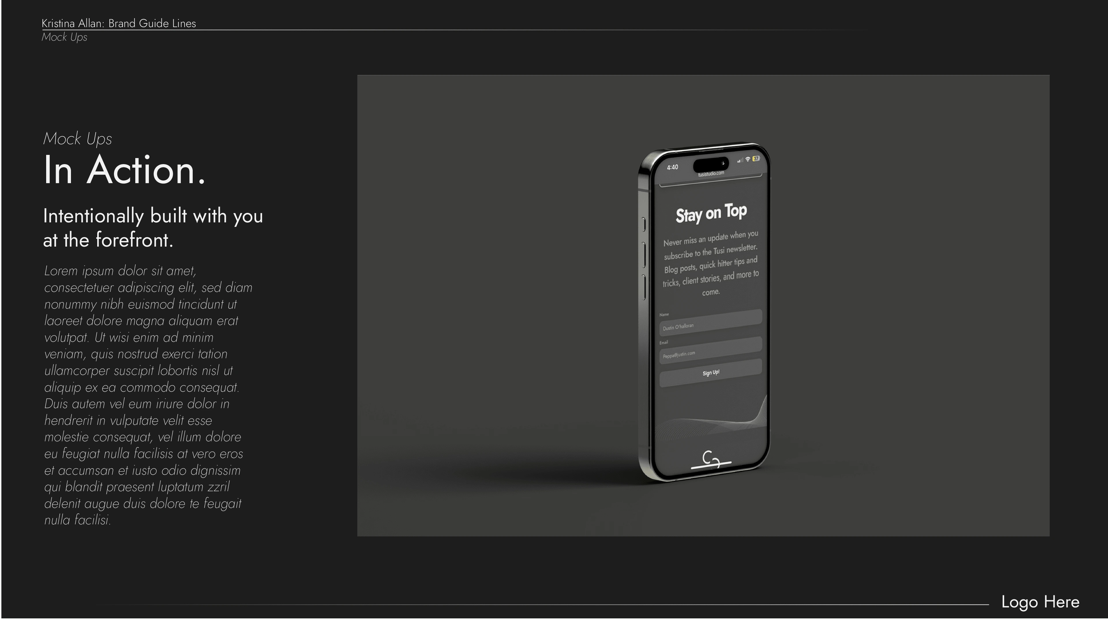
Creative Marketing Studio.
Overview
Tusi began as a creative studio that embraced simplicity and functionality. The initial brand was a strategic foray into the creative industry, embodying a modern, minimalist aesthetic designed to attract corporate clients. However, as the studio evolved, so did its personality and service offerings. Tusi’s branding pivoted to align more authentically with its founder’s bold, playful voice, reflecting a blend of artistry and strategic thinking.
Project Scope & Objectives
The primary objective was to establish a foundational brand that was easy to engage with while hinting at the creative potential the studio could offer. The visual identity needed to:
• Convey professionalism and trust.
• Appeal to corporate and tech-savvy industries.
• Act as a versatile platform to expand into more creative, non-conventional territories in the future.
Design Elements & Visual Identity
Typography:
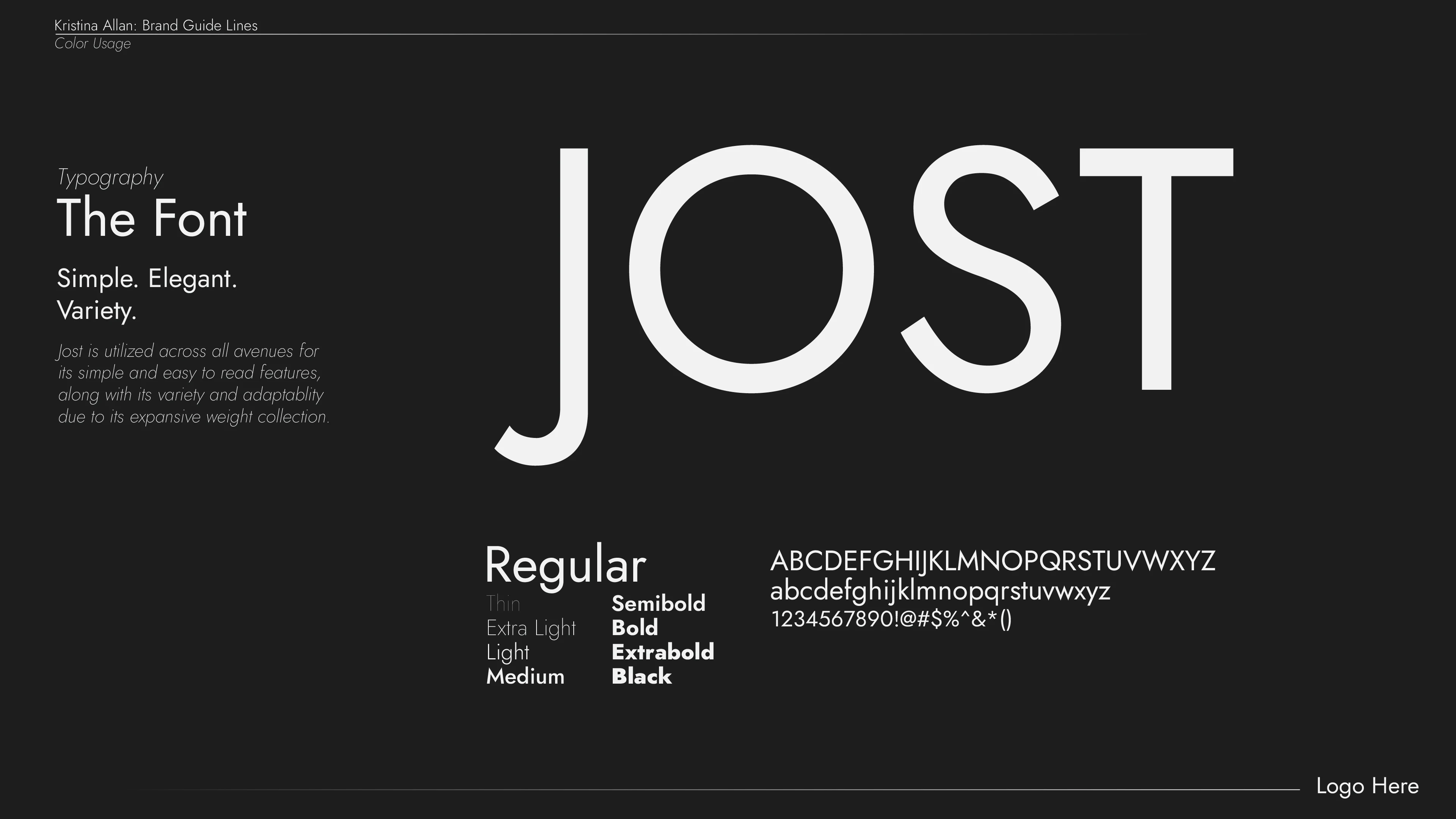
• Jost was selected as the primary font, chosen for its versatility and simplicity, with multiple weight options to emphasize different text hierarchies while maintaining a modern and professional feel.
Color Palette:
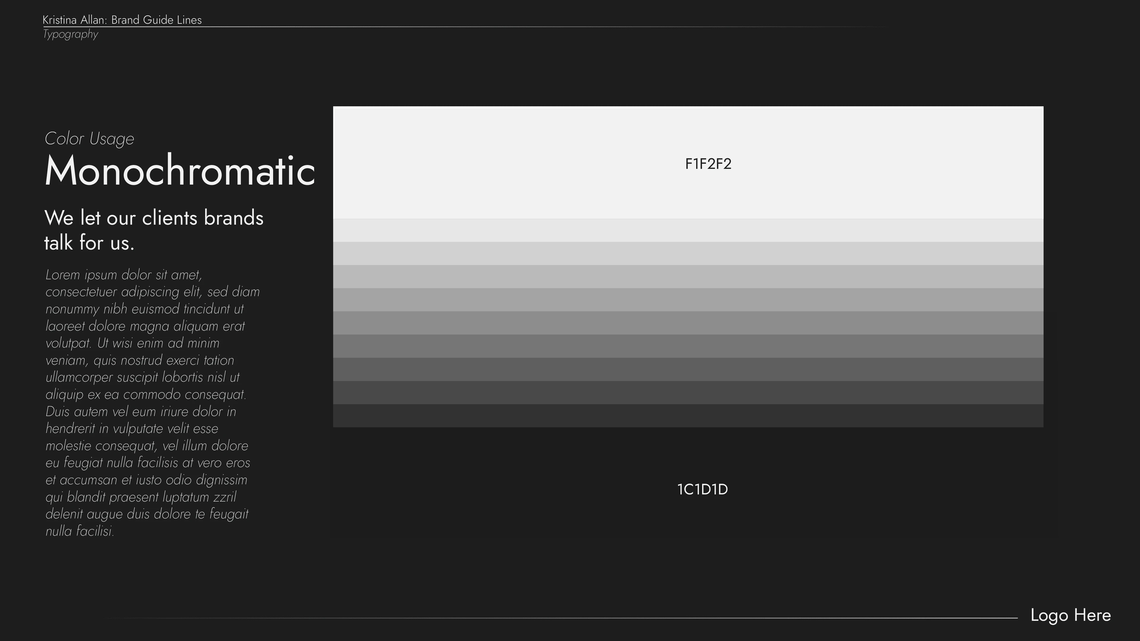
• Monochromatic tones (black, white, and grays) formed the core of the palette, enhancing a sleek and clean visual presentation. This allowed the focus to remain on the client work and case studies rather than the brand’s own presence.
Logo Design:
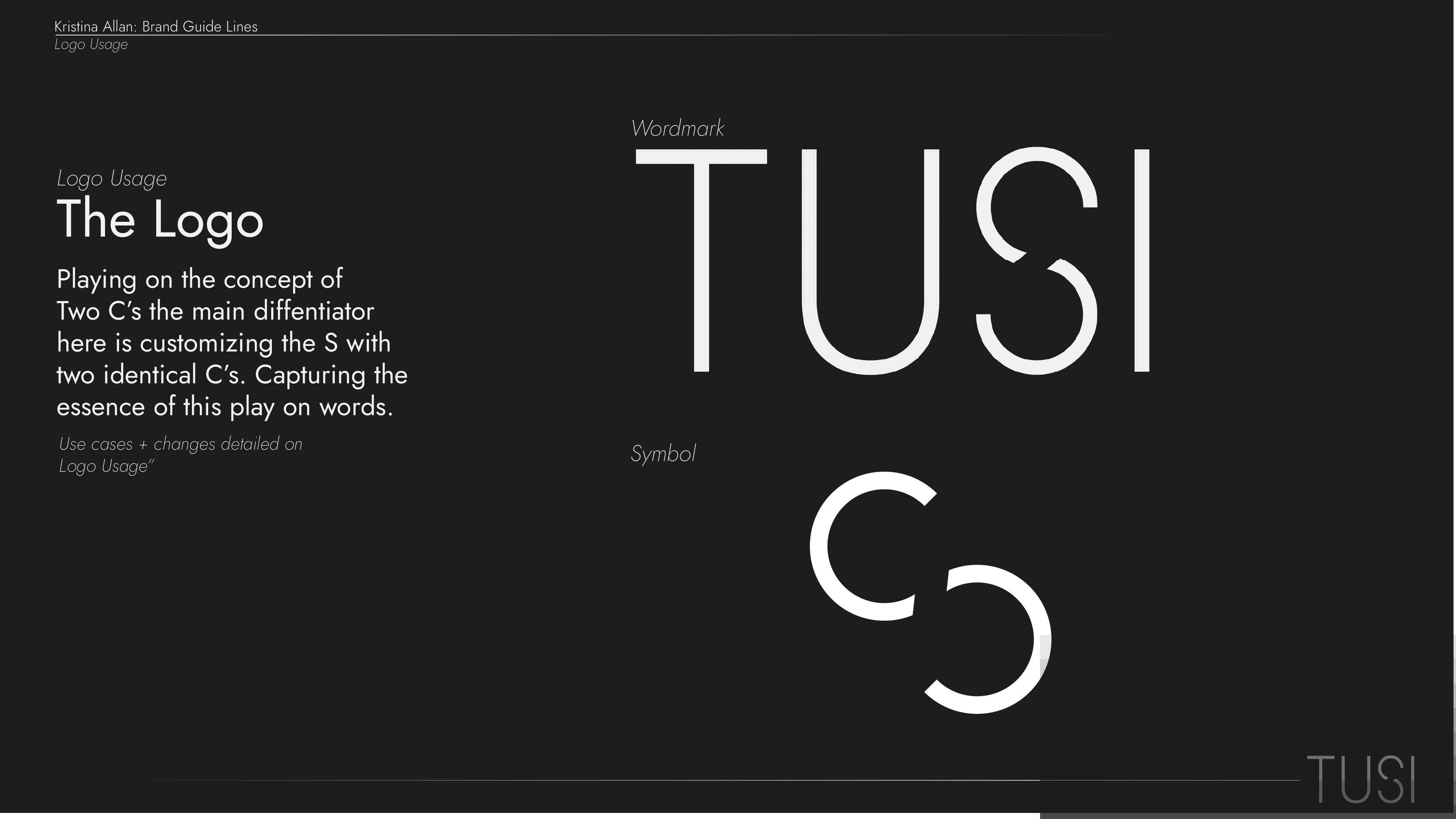
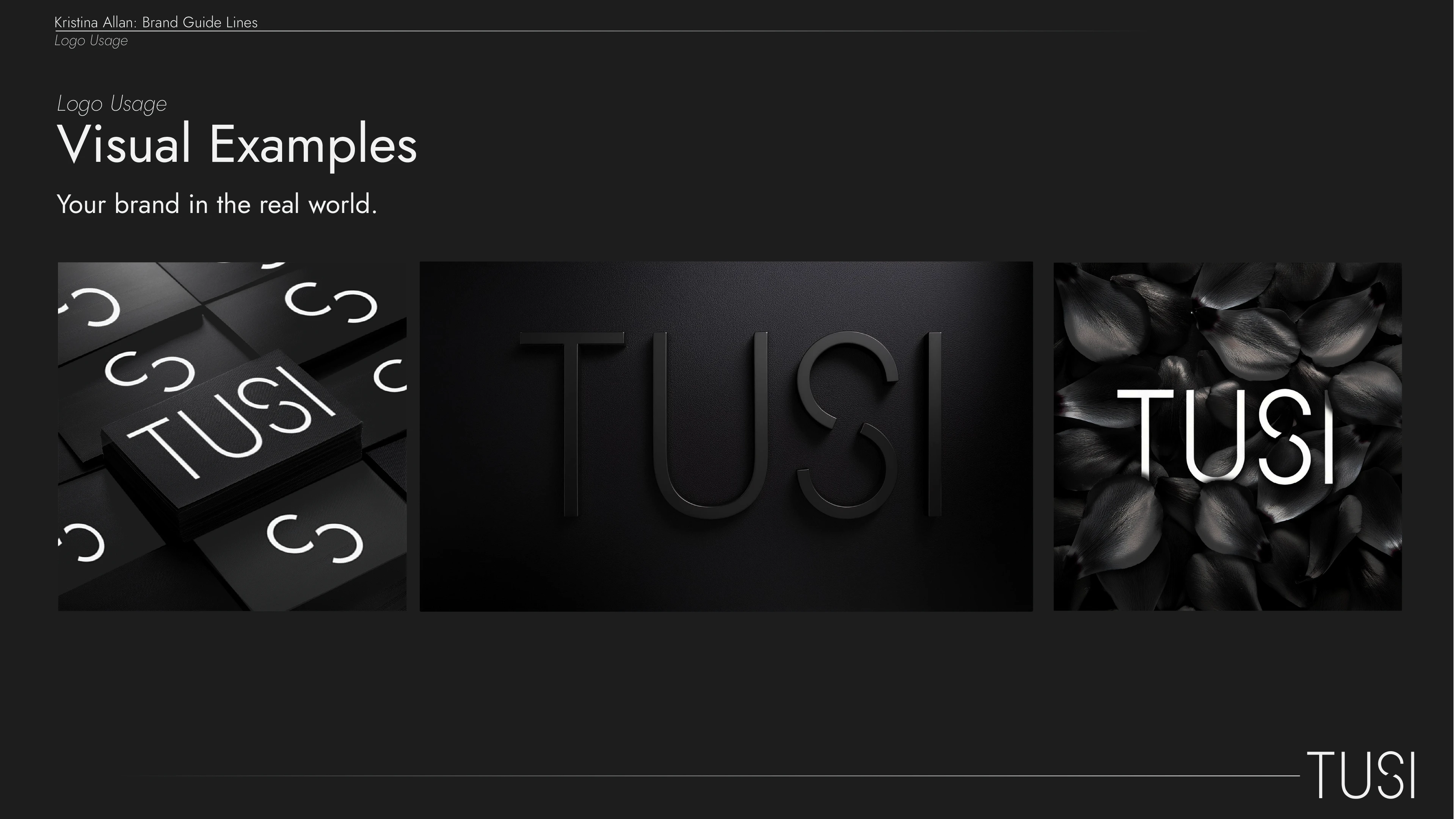
• The Tusi logo focused on simplicity with subtle nods to custom elements, like the “S” made from two mirrored C’s, creating a visual wordplay to reflect creativity embedded within structure.
Challenges
1. Balancing Simplicity with Impact:
The initial branding was designed to be sleek and corporate-friendly, which was effective in attracting tech-related clients. However, it felt limiting in expressing the full personality of the studio and its creative depth.
2. Establishing Identity in a Competitive Space:
As a new player in the branding and creative studio space, the challenge was to create immediate trust through a clear and professional identity while hinting at the creativity that set Tusi apart.
Solutions & Execution
• Brand Guide Development:

A detailed brand guide was created to maintain consistency across all client touchpoints. It included guidelines for typography, color usage, and logo application across platforms, ensuring brand cohesion in every project.
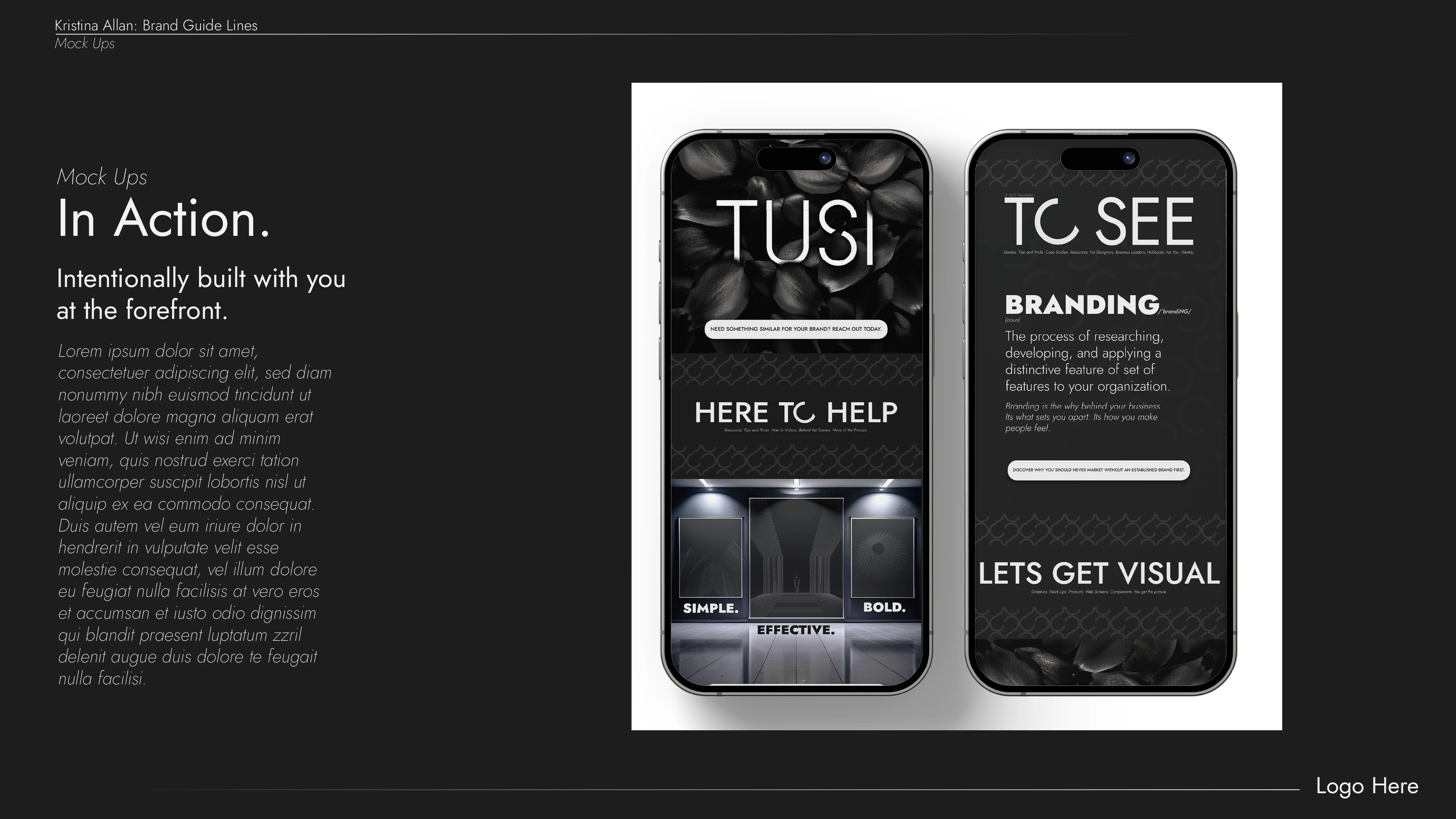
• Flexible Asset Creation:
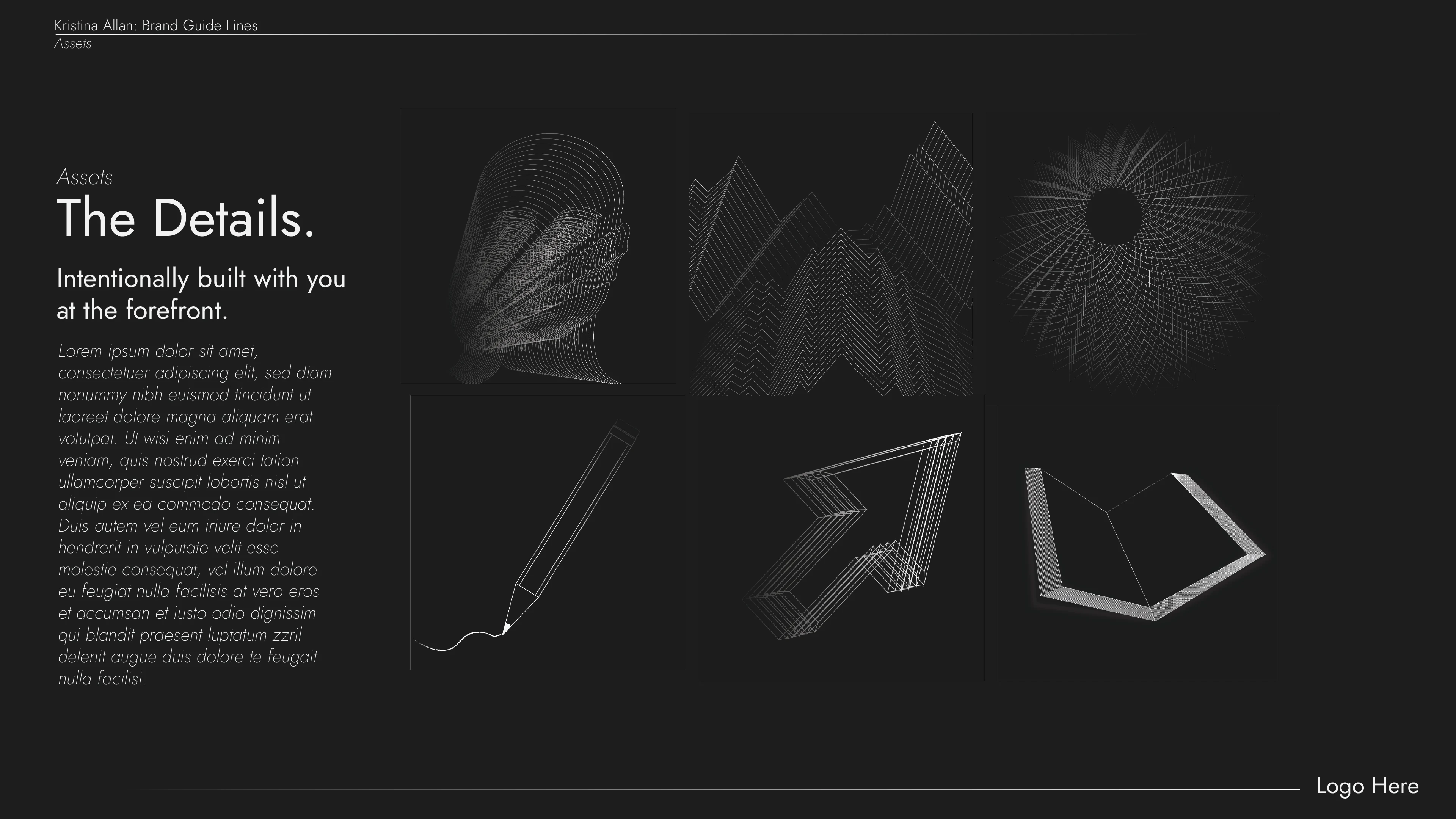
Assets like patterned backgrounds, social media templates, and wireframe graphics allowed the brand to scale easily and adapt to client-specific projects without losing coherence.
Outcomes
• Positive Client Feedback:
Clients praised Tusi’s ability to deliver consistent, polished work that communicated professionalism while remaining adaptable.
• Foundations for Future Growth:
Tusi’s initial branding laid the groundwork for the studio to explore more bold, playful elements, paving the way for the rebranding into DISCAGED.
Key Takeaways
1. Foundations First: The corporate, safe aesthetic provided the security and credibility needed to launch the studio, proving that starting with a solid foundation allows room for future creative growth.
2. Adaptability is Key: As Tusi evolved, it became evident that a brand needs to grow alongside its business. The rebranding into DISCAGED reflects this evolution toward a more personal, unapologetic identity.
3. Branding is Never Static: The journey from Tusi to DISCAGED illustrates the importance of continuously evaluating your brand’s alignment with your goals, services, and personality.
Conclusion
Tusi’s initial branding was the perfect launchpad for the studio, providing a structured, professional identity that resonated with corporate clients. However, as the founder leaned more into personal expression and creative freedom, DISCAGED emerged—carrying the lessons learned from Tusi while boldly breaking free from its original constraints.
Like this project
Posted Aug 9, 2024
Brand Strategy, Visual Identity, Newsletter Design, Social Media Management, Web Design + Development, Content Creation, Creative Direction.