Lifelne: Brand Identity, Packaging and Mock Ups.
Cage Castro
Hangover Remedy for High Achievers
An innovative supplement that aimed to be the right hand man of individuals that took work hard, play hard to the next level.
Hang in There!
Project Overview
What once was…
Lifelne is a premium hangover supplement designed for high achievers who enjoy a vibrant social life. Inspired by modern and sleek aesthetics, it seamlessly integrates with other high-class products, offering a sophisticated solution for those who demand the best in all aspects of their lives.
But first, we kind of need a brand, right?
0 to 1 Concepts to Ideation
Color Palette
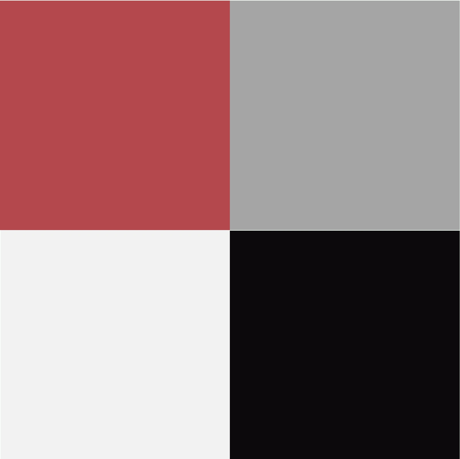
We wanted the color palette to be straight forward and evoke feelings of power, but not be overly distracting, to fit into the modern landscape.
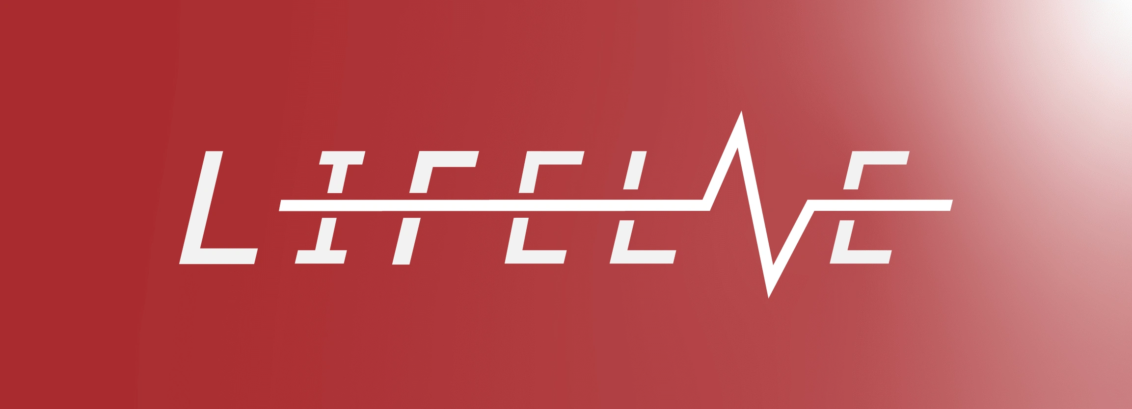
Logo
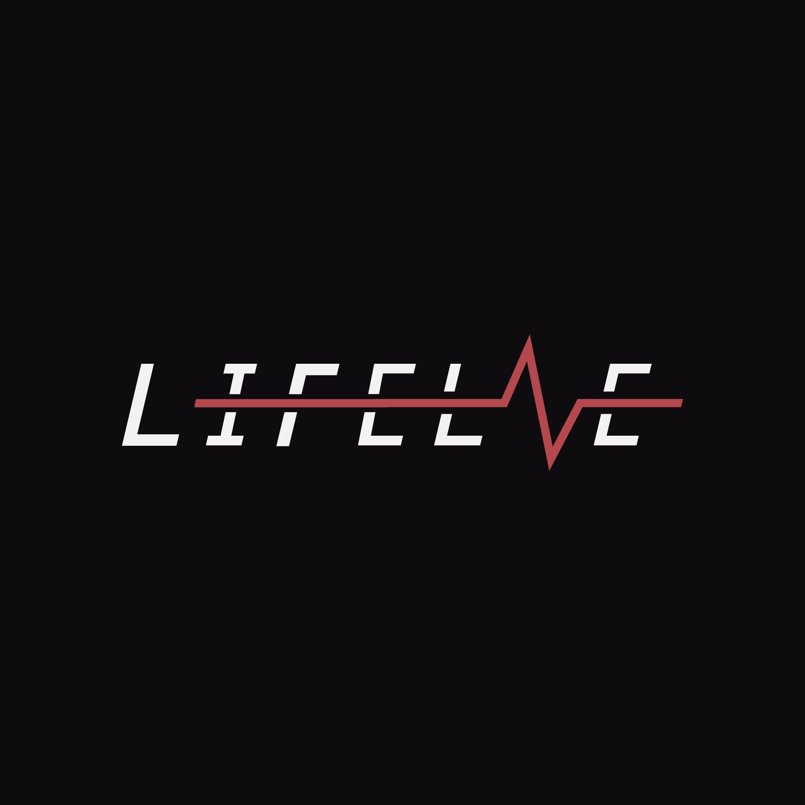
Sleek and simple. Inspired by heart rate monitors. Appealing to the high achiever in our target market, along with an essence of vitality.
Copy Strategy
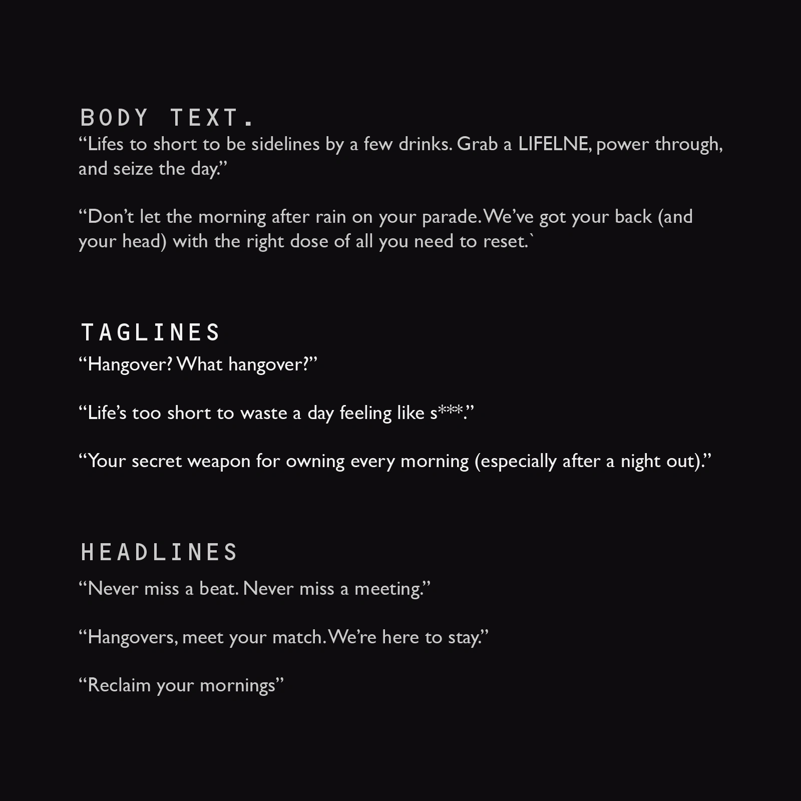
Pairing up visuals with intentional copy allowed for the brand to feel consistent across all mediums.
Visual Identity
How and where we were going to place the product in the real world. Utilizing subtle patterns, matte textures and holographic accents, a simple package becomes so much more.
How did you land on those?
The rationale and subtle nuance's explained for those who care.
Copy Direction
Playful yet informative tone, engaging customers with health tips and product benefits.
Color Palette
Utilized bold red and sleek black for a striking, high-energy aesthetic.
Logo Rationale
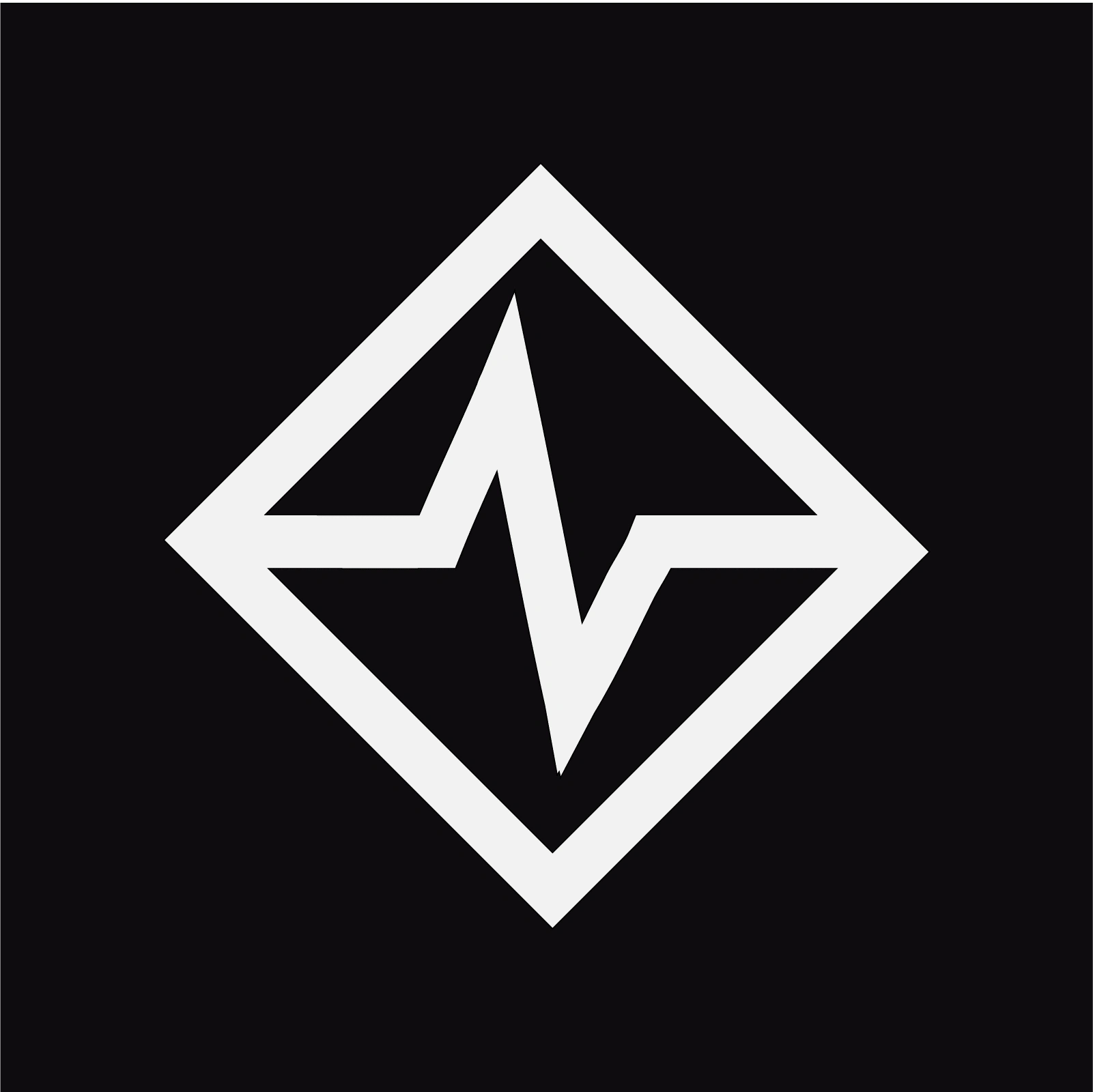
Inspired by a heart rate monitor, symbolizing health and vitality recovery.
Typography Choice
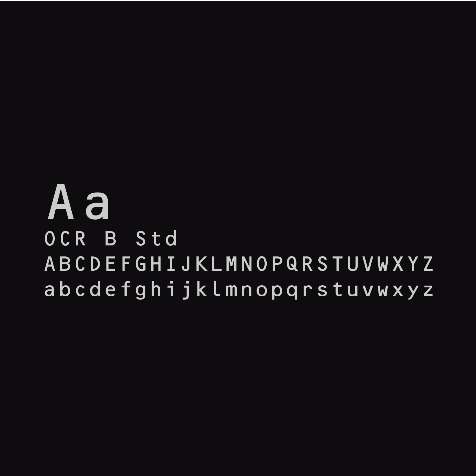
Bold and blocky fonts for a strong and impactful visual presence.
Bringing it to Life
Graphic Design and Visual Purpose
Guides + Content
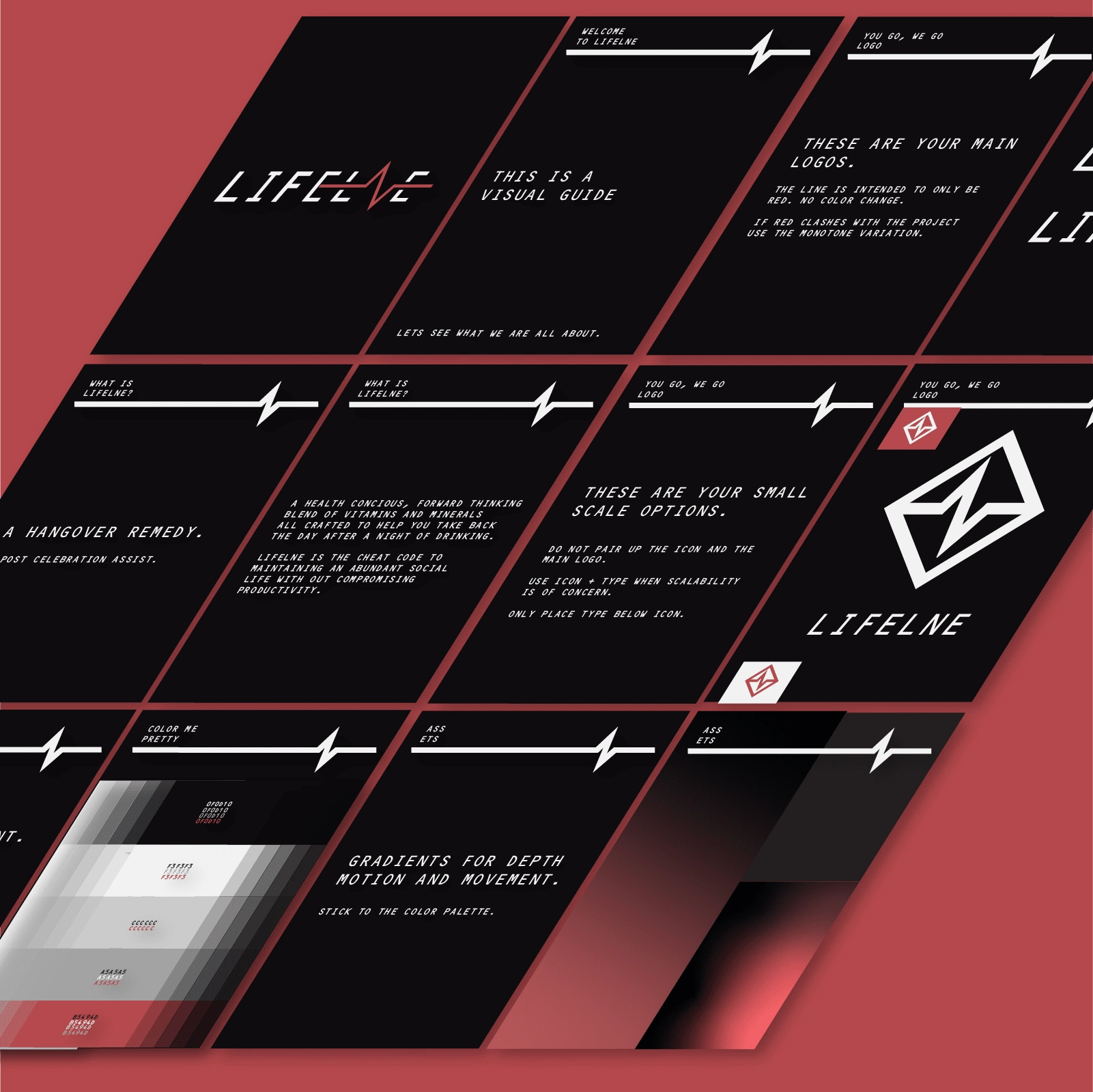
Visual Guide to allow Lifelne's marketing efforts to stay consistent in the future.
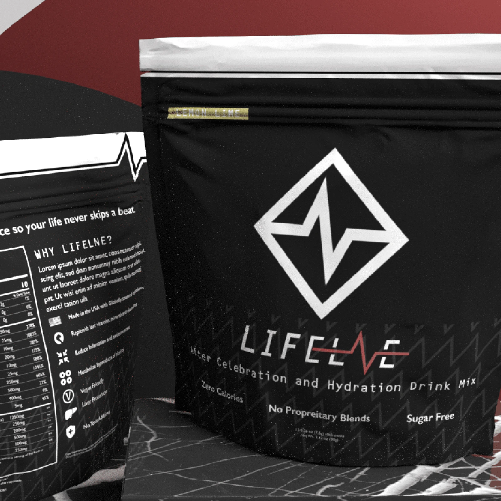
Packaging
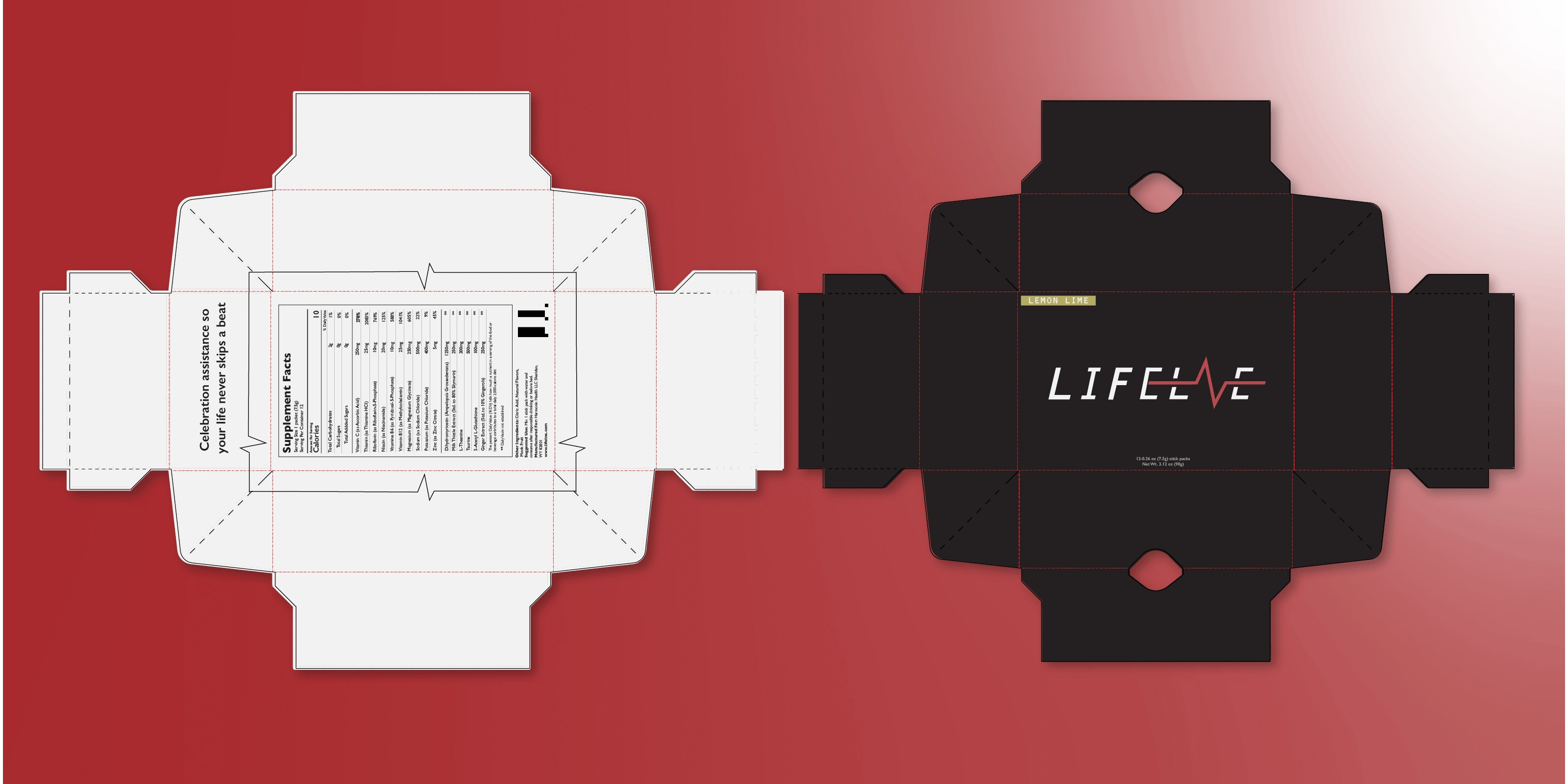
Spent time looking at various options from pouches to boxes. A huge focus of Lifelne was feeling modern and fitting into the aesthetic of a tech savvy individual. In the end we chose the box as it felt more elegant and modern.
Mock Ups
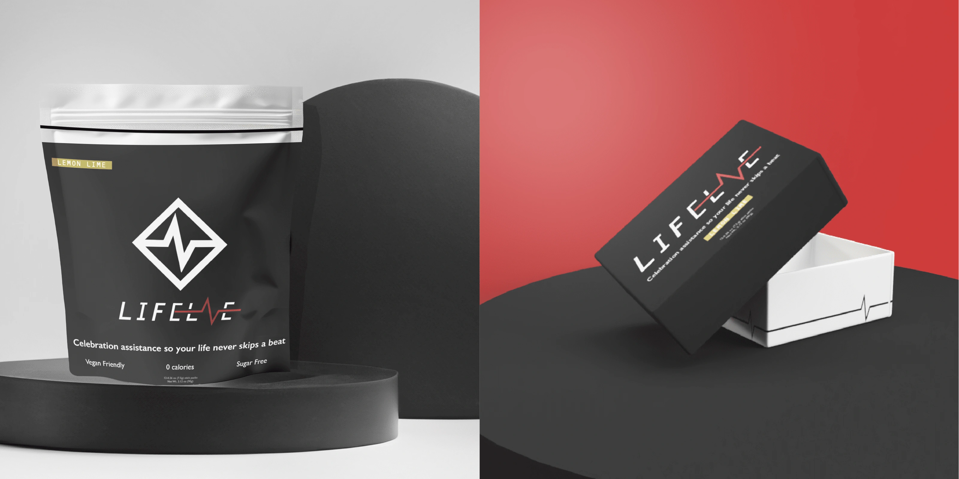
What's a package design without a proper mock up? We brought everything to life. To ensure the dielines translated to Lifelne's vision.
More Packaging
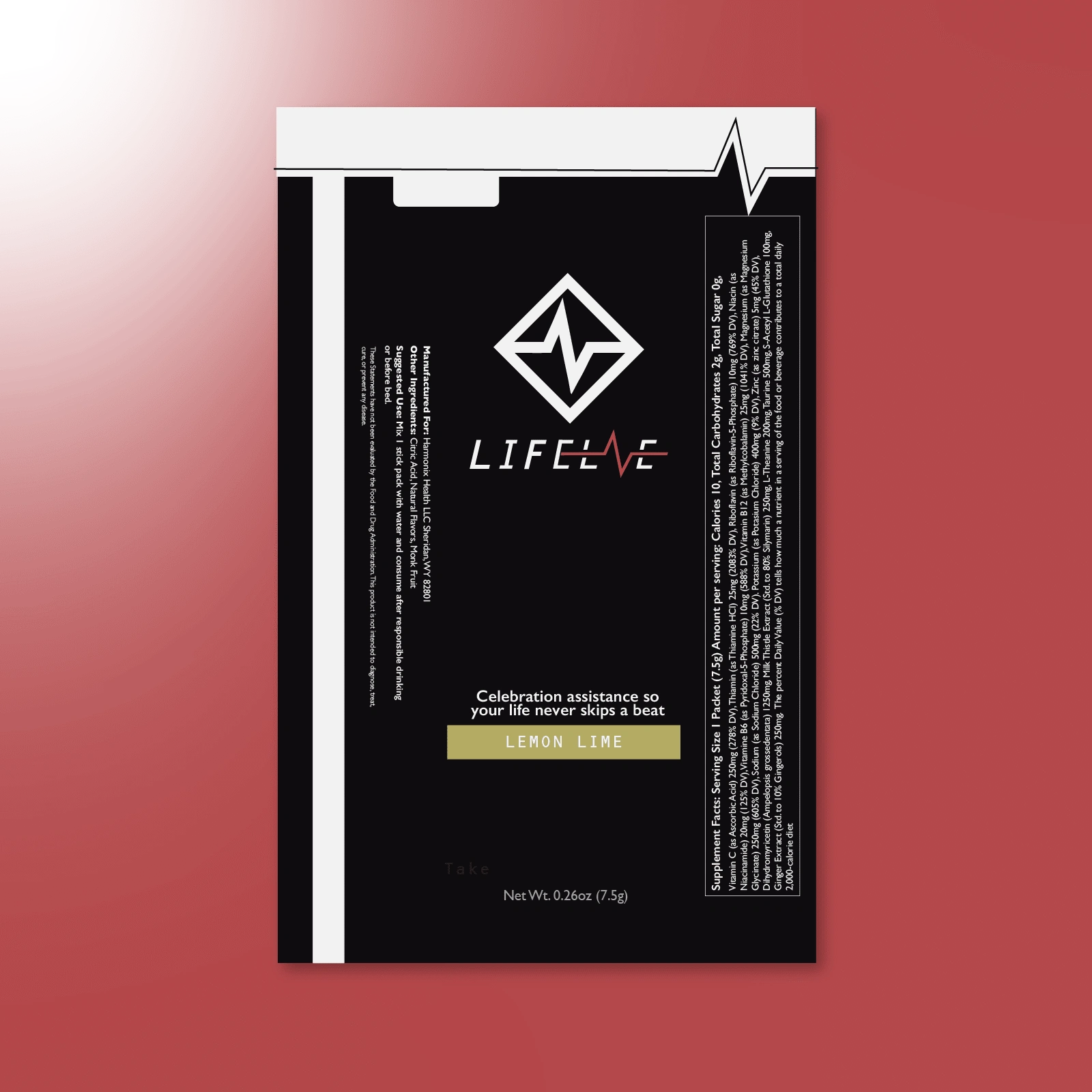
The individual packets had to stand out as well in and out of the box.
Wrap it Up!
Project Reflection.
It is always such a blast taking an idea and helping build it from the ground up. Lifelne was in need of an identity and we were able to bring their vision to life. The logo brings together elements of vitality, pairing with feelings of power from the use of reds and blacks, while staying modern and fun through its copy. The whole brand identity being set this early in the process will allow for Lifelne to launch with ease.
Check out the full case study on my website!
Like this project
Posted Aug 9, 2024
An innovative supplement that aimed to be the right hand man of high performers, needed me to bring their vision and product to life.
Featured on