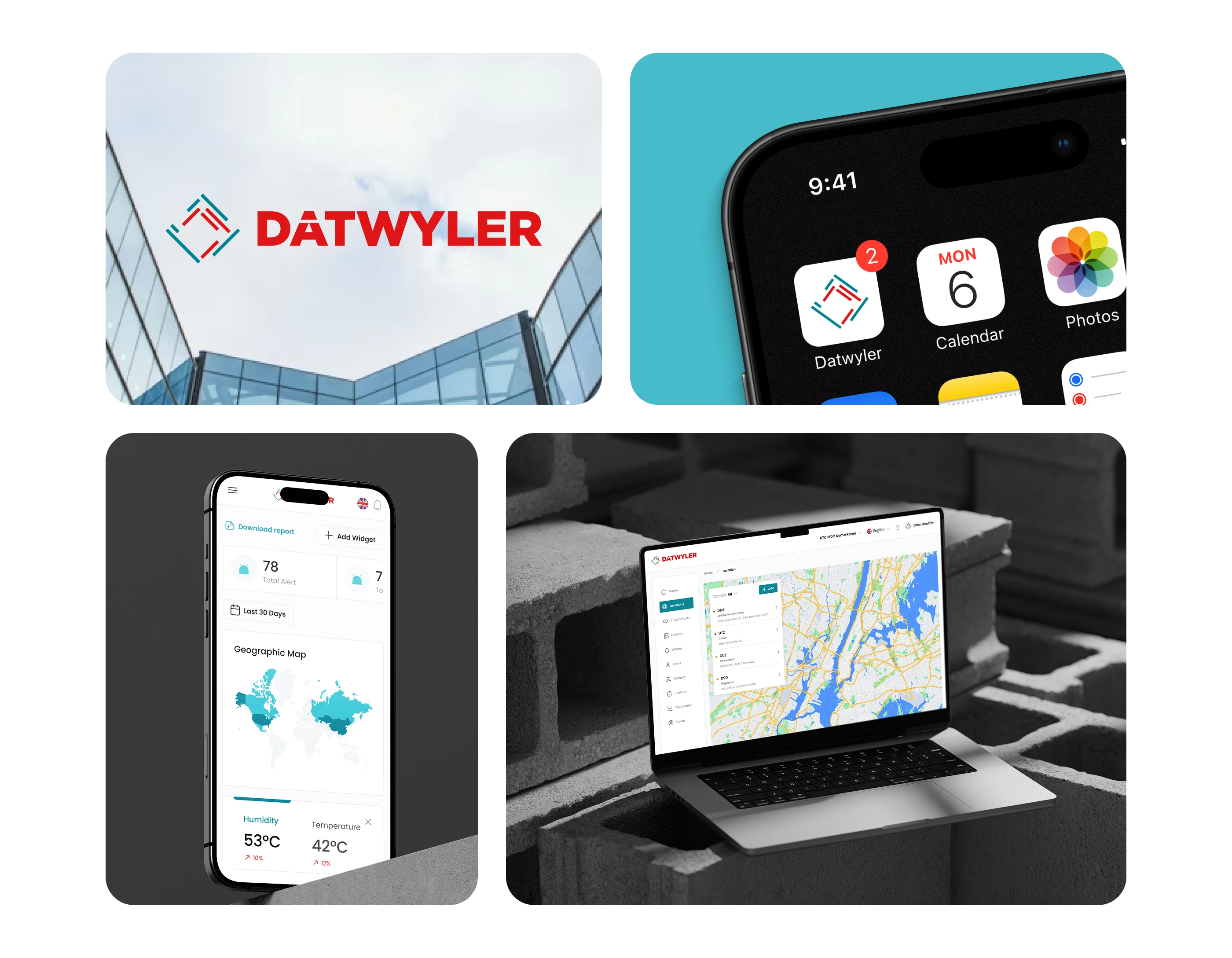
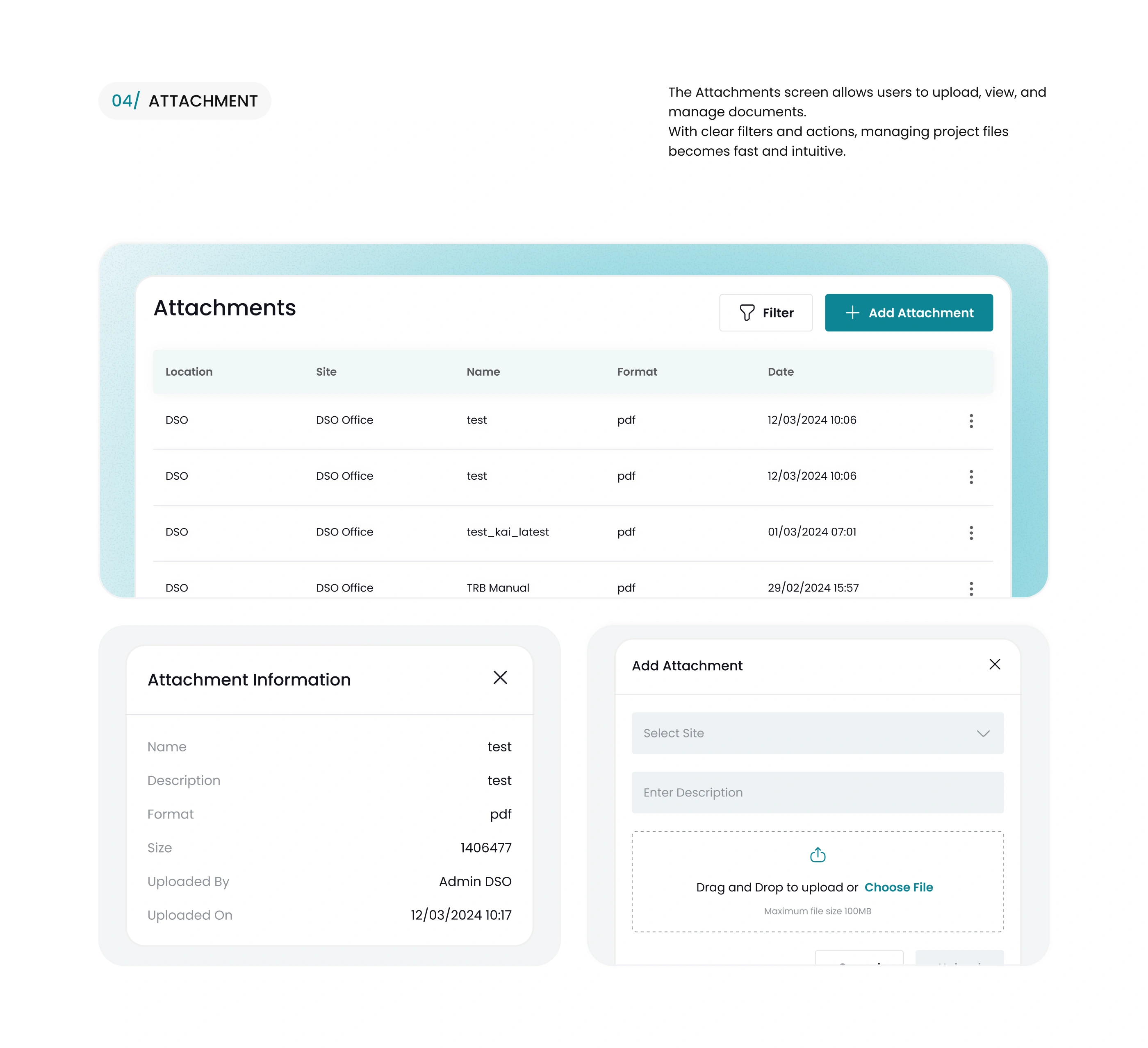
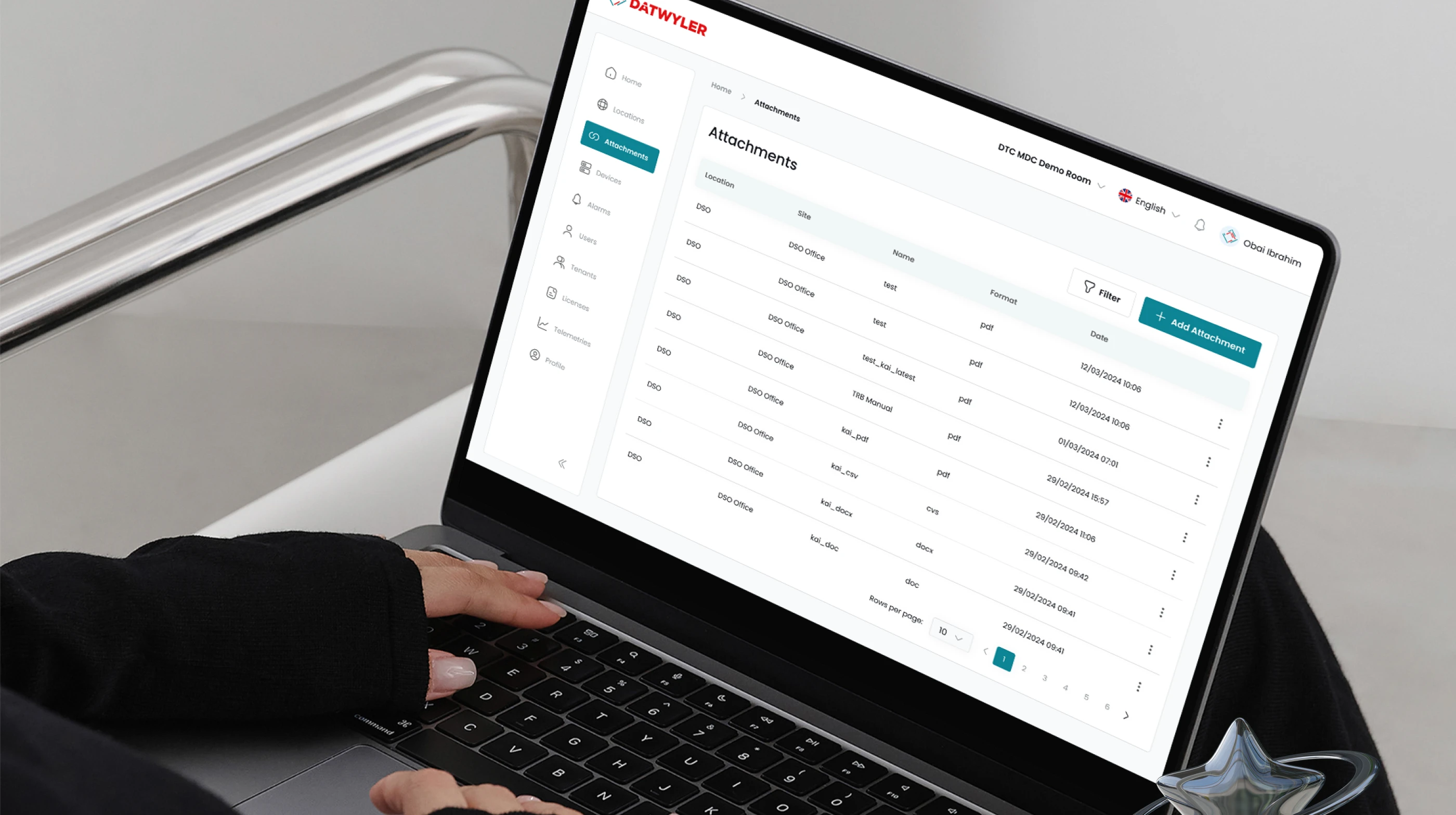
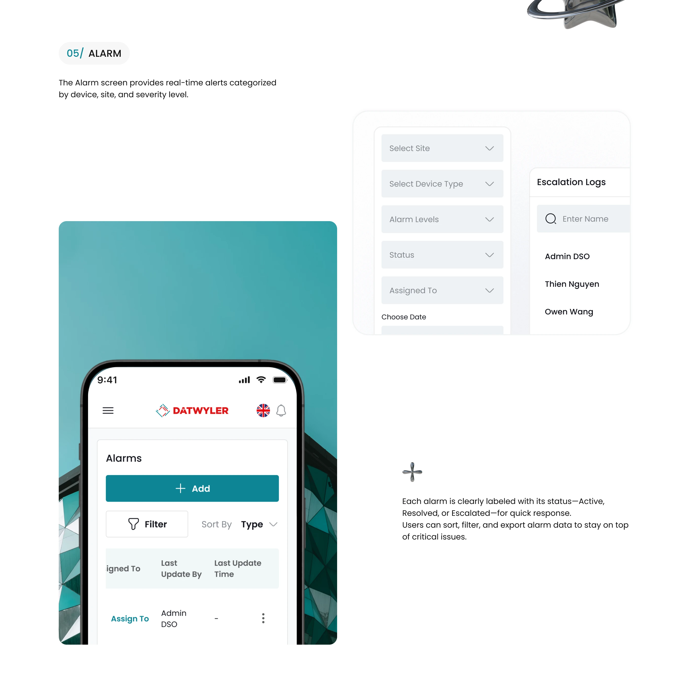
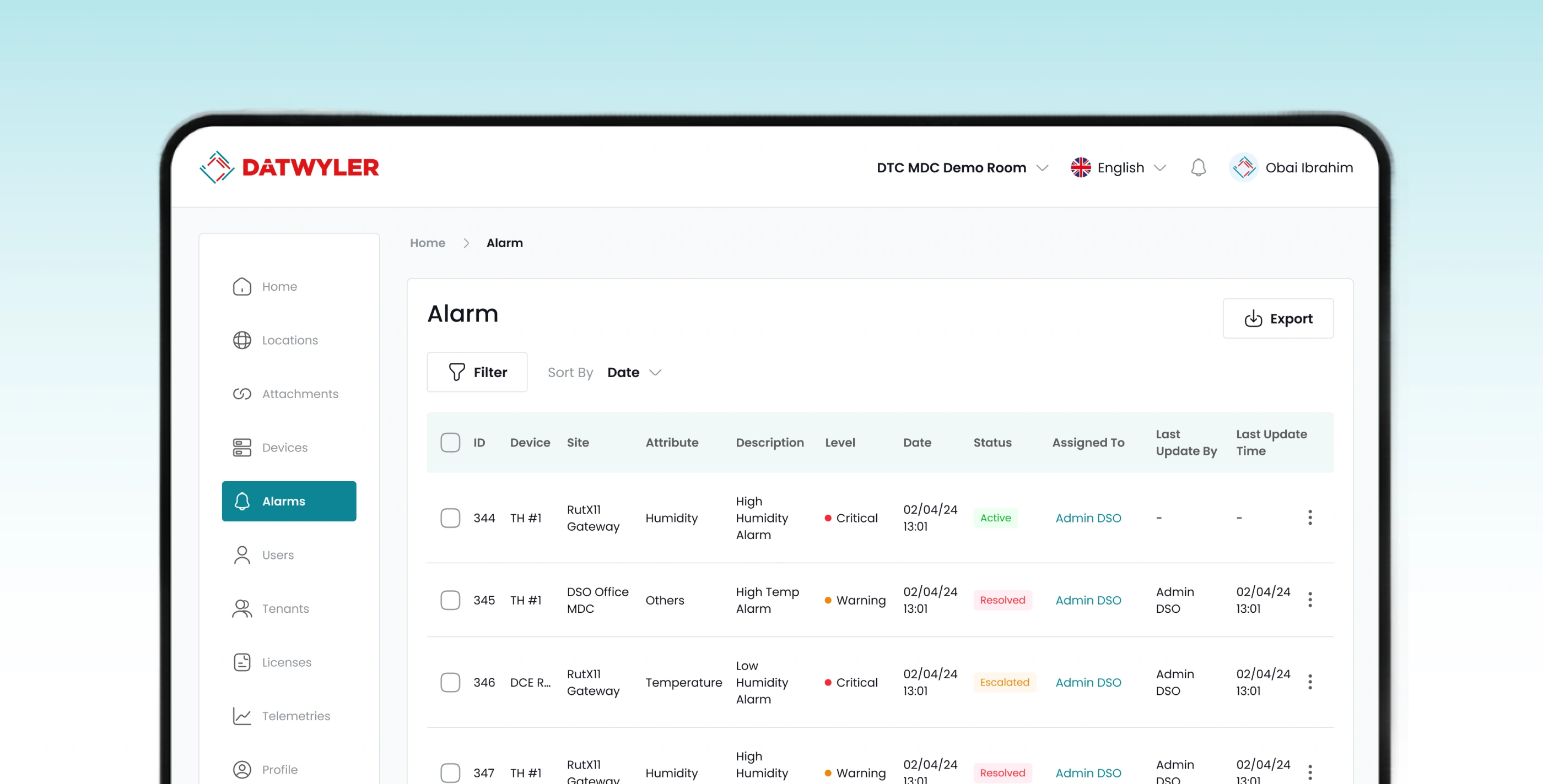
Web App & Dashboard redesign | Datwyler platform
Capi Product
Verified
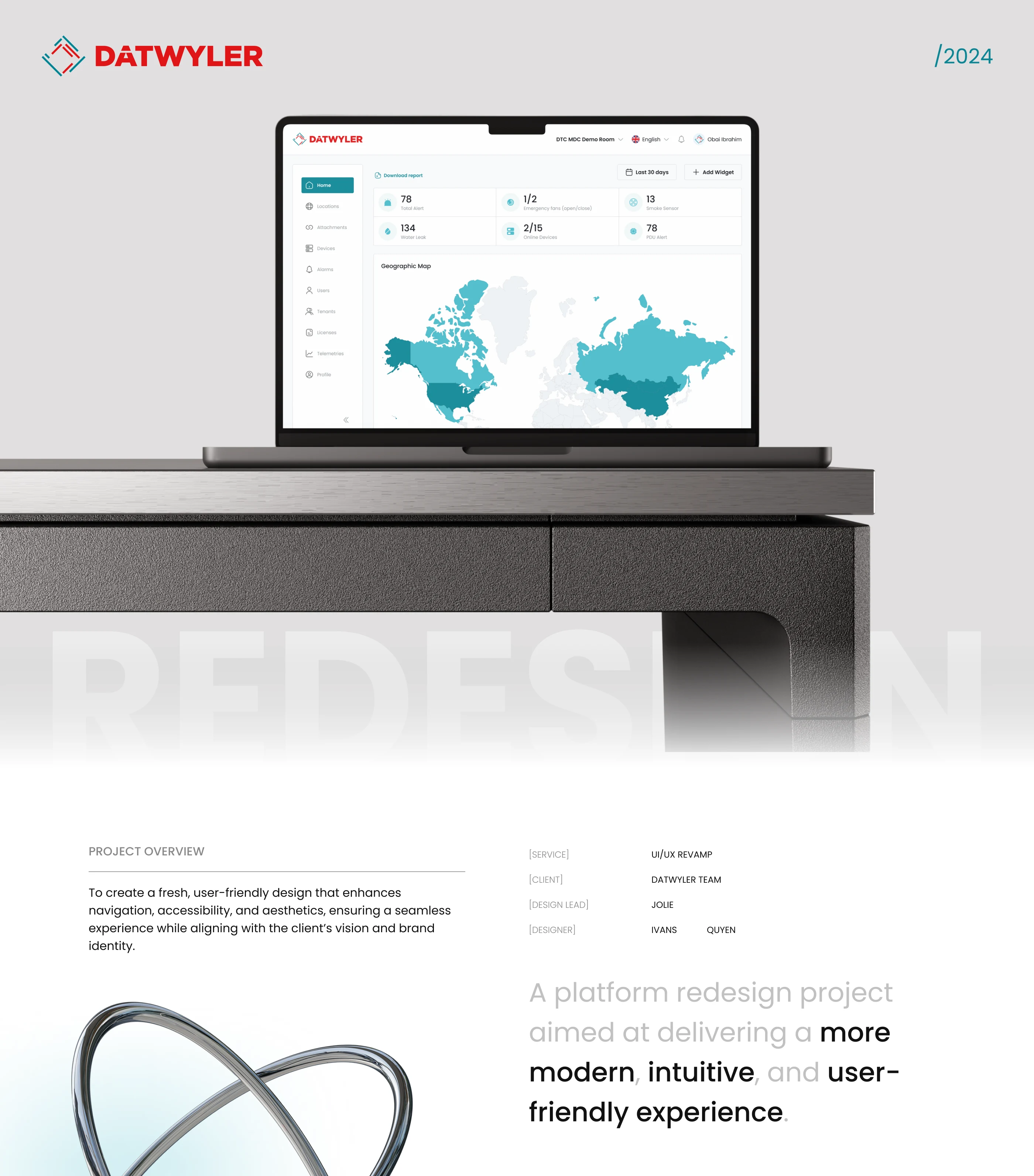
💻 Datwyler Platform – Web App & Dashboard Redesign
Client: Datwyler
Agency: Capi Product
Services: UX/UI Design · Web App Redesign · Dashboard System
Timeline: May – August 2024
1. Overview
Datwyler is a Swiss technology company providing high-performance infrastructure and connectivity solutions for industrial, medical, and telecommunications sectors.
Over time, its internal web platform had grown increasingly complex, with inconsistent UI patterns across modules, making data management and monitoring harder for both engineers and administrators.
Capi Product was brought in to redesign the entire user experience and interface of the Datwyler platform, with clear objectives to:
Simplify navigation and data workflows,
Standardize the design language across all modules,
Build a modern, scalable design system to support future product expansion.
“From complex data to clear insight — our redesign made Datwyler’s platform intuitive, fast, and visually unified.”
2. Context & Challenges
The existing system contained multiple independent modules built over years by different teams. Through user research and UX audit, we identified four major pain points:
Complex navigation and fragmented structure
Users had to open multiple tabs or switch modules repeatedly to locate specific datasets.
Inconsistent interface and components
Each module had its own visual style, causing cognitive overload and workflow friction.
Limited scalability
The old UI framework made it difficult to add new features or data types without breaking layout consistency.
Poor usability for data-heavy operations
Engineers and analysts struggled with cluttered screens and dense visual noise.
3. Design Objectives
Rebuild the information architecture for faster data access and smoother task flow.
Create a clear, data-driven dashboard that highlights key system insights at a glance.
Establish visual and interaction consistency across all modules.
Develop a comprehensive design system to enable efficient scaling and developer handoff.
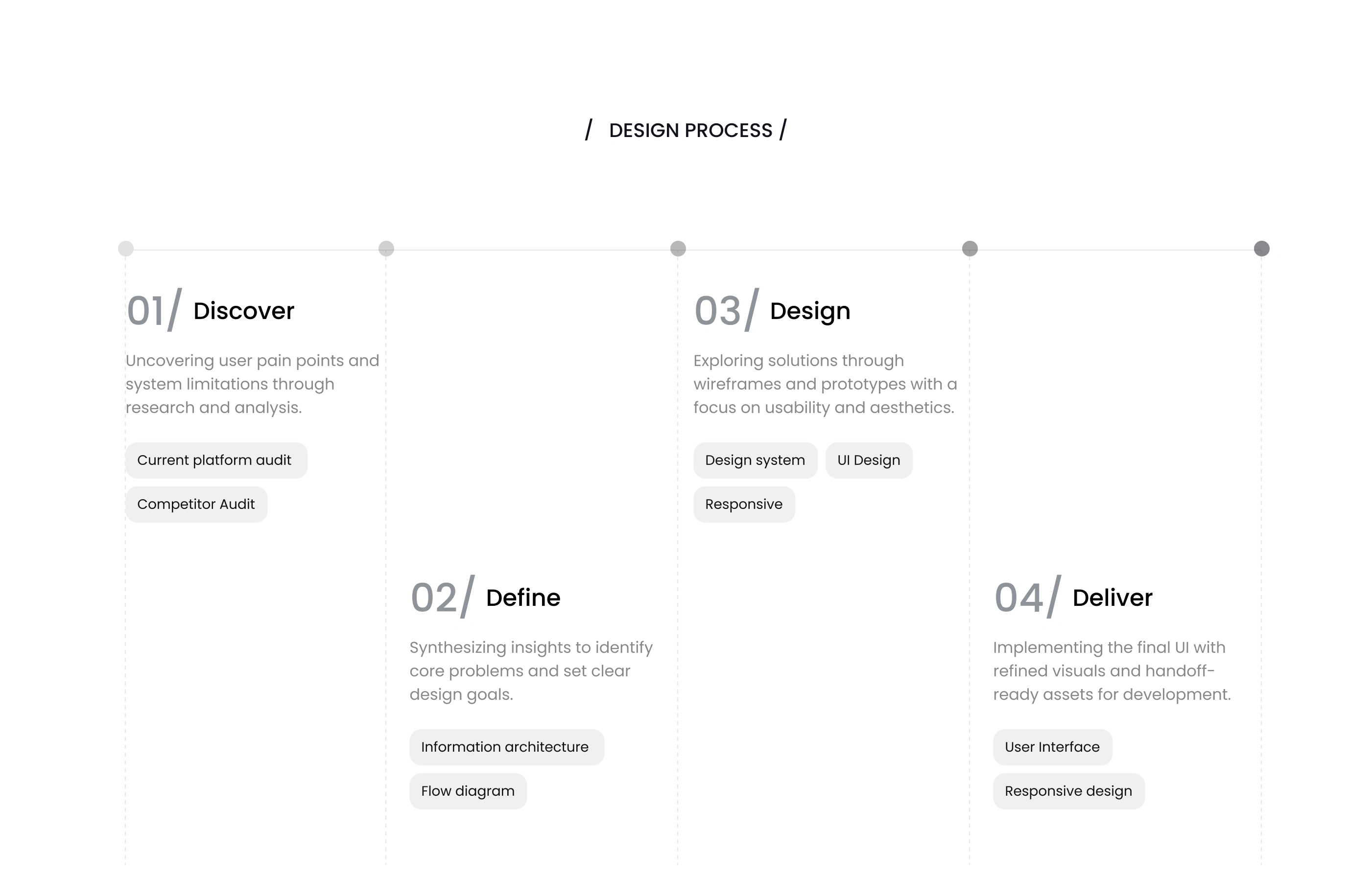
4. Process & Solutions
(a) Research & Insights
Conducted interviews with 10 internal users (engineers, PMs, and analysts).
Analyzed heatmaps and navigation paths — revealing that users needed 4–6 clicks to reach core data views.
Defined three key personas:
System Engineer
Maintenance Manager
Admin Analyst
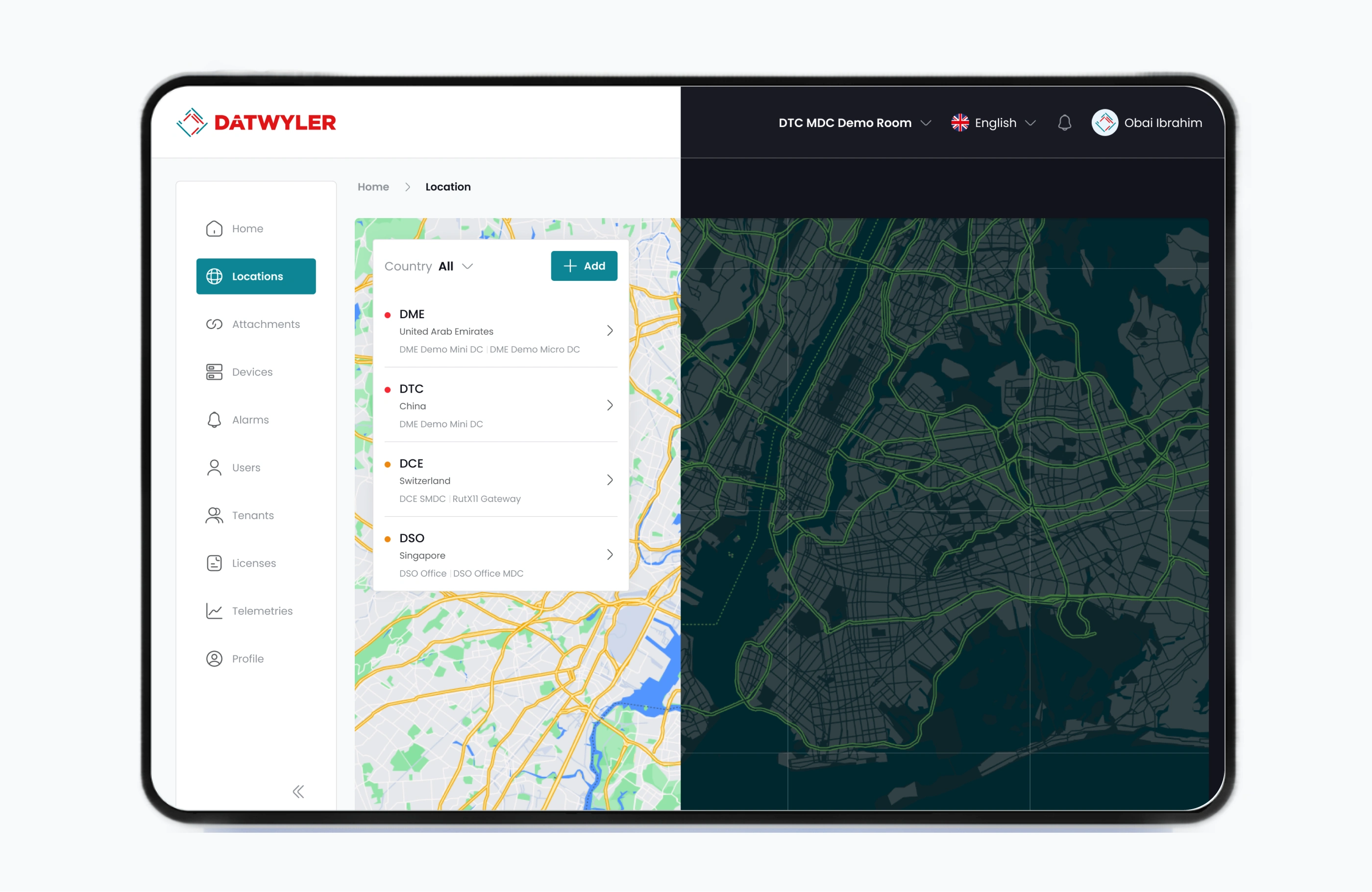
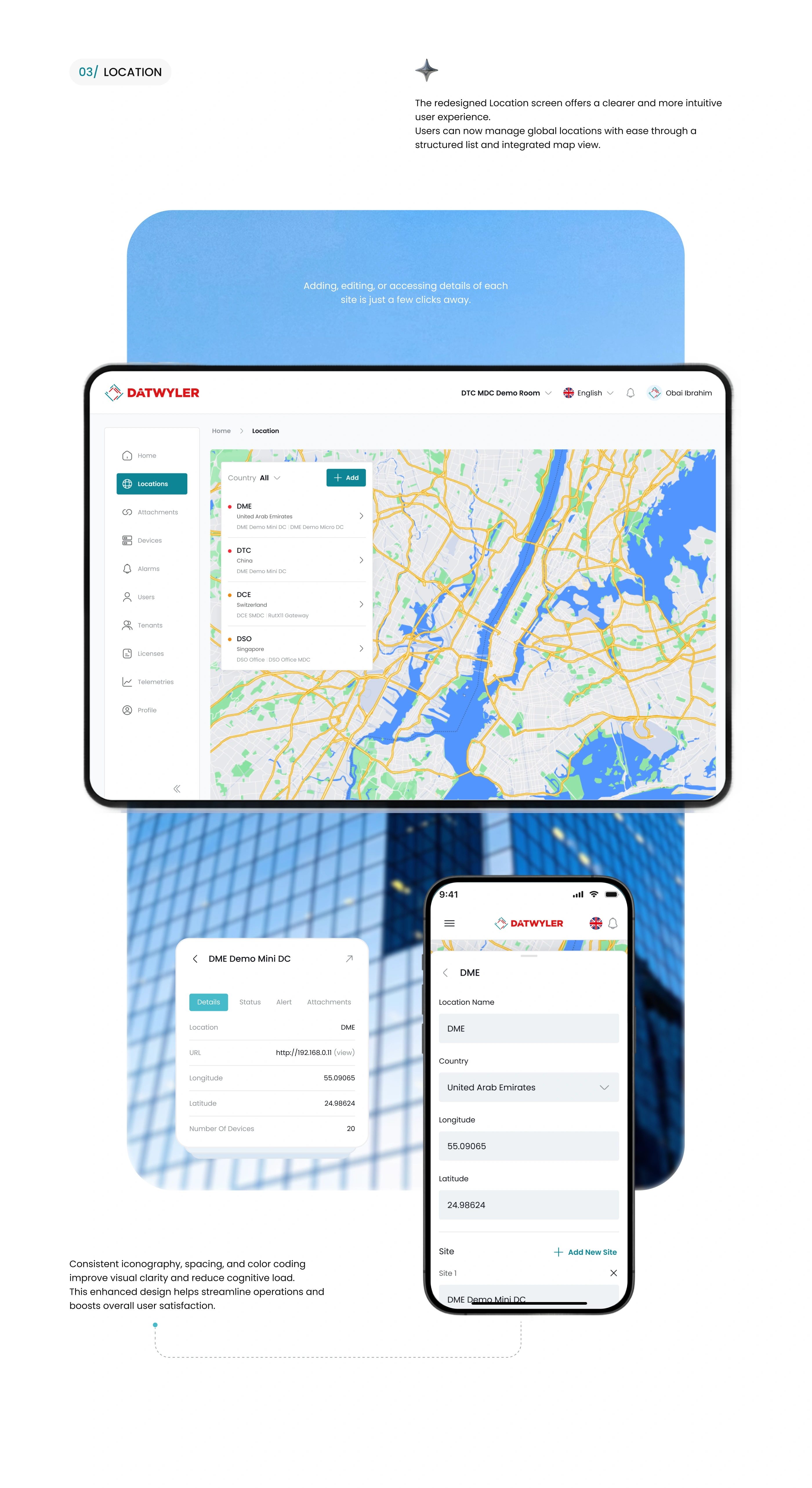
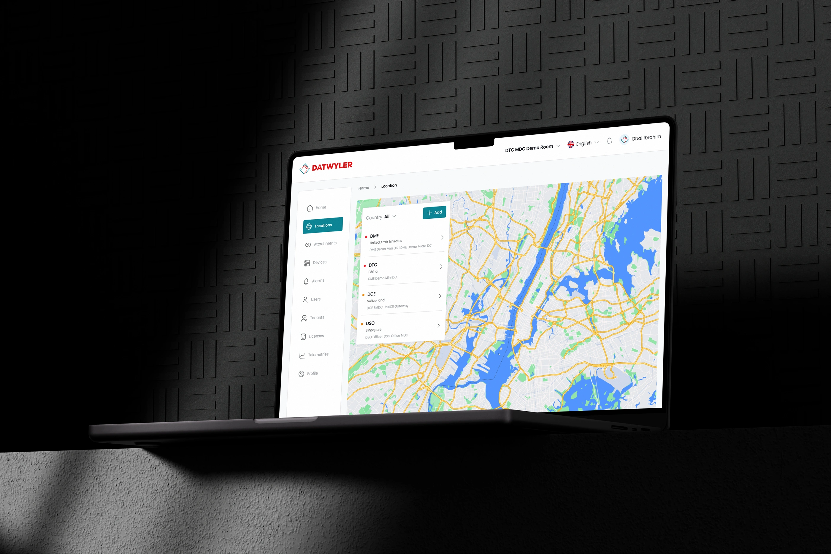
(b) Information Architecture & Navigation
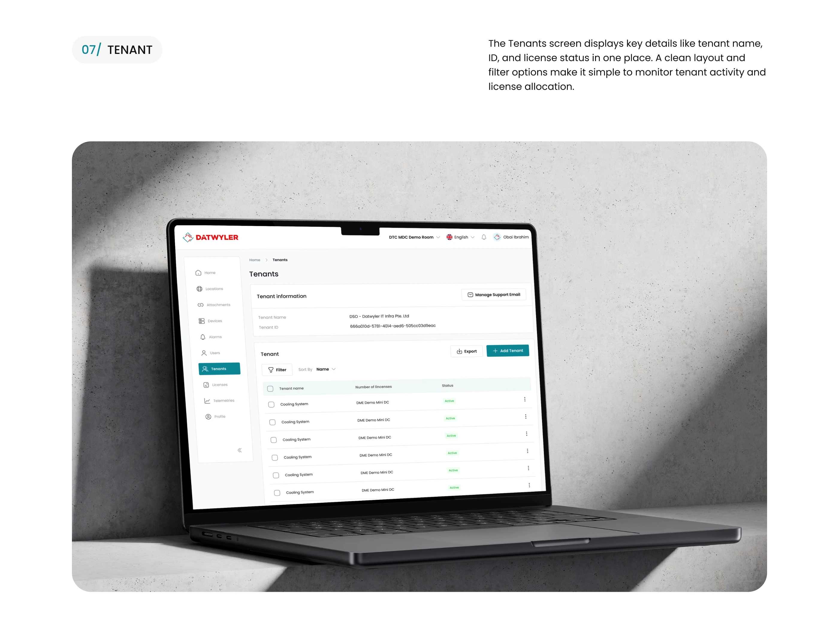
Consolidated platform functions into five main modules:
Overview, Analytics, Devices, Maintenance, Reports.
Introduced contextual sub-navigation to reduce back-and-forth steps.
(c) UI Design & Interaction
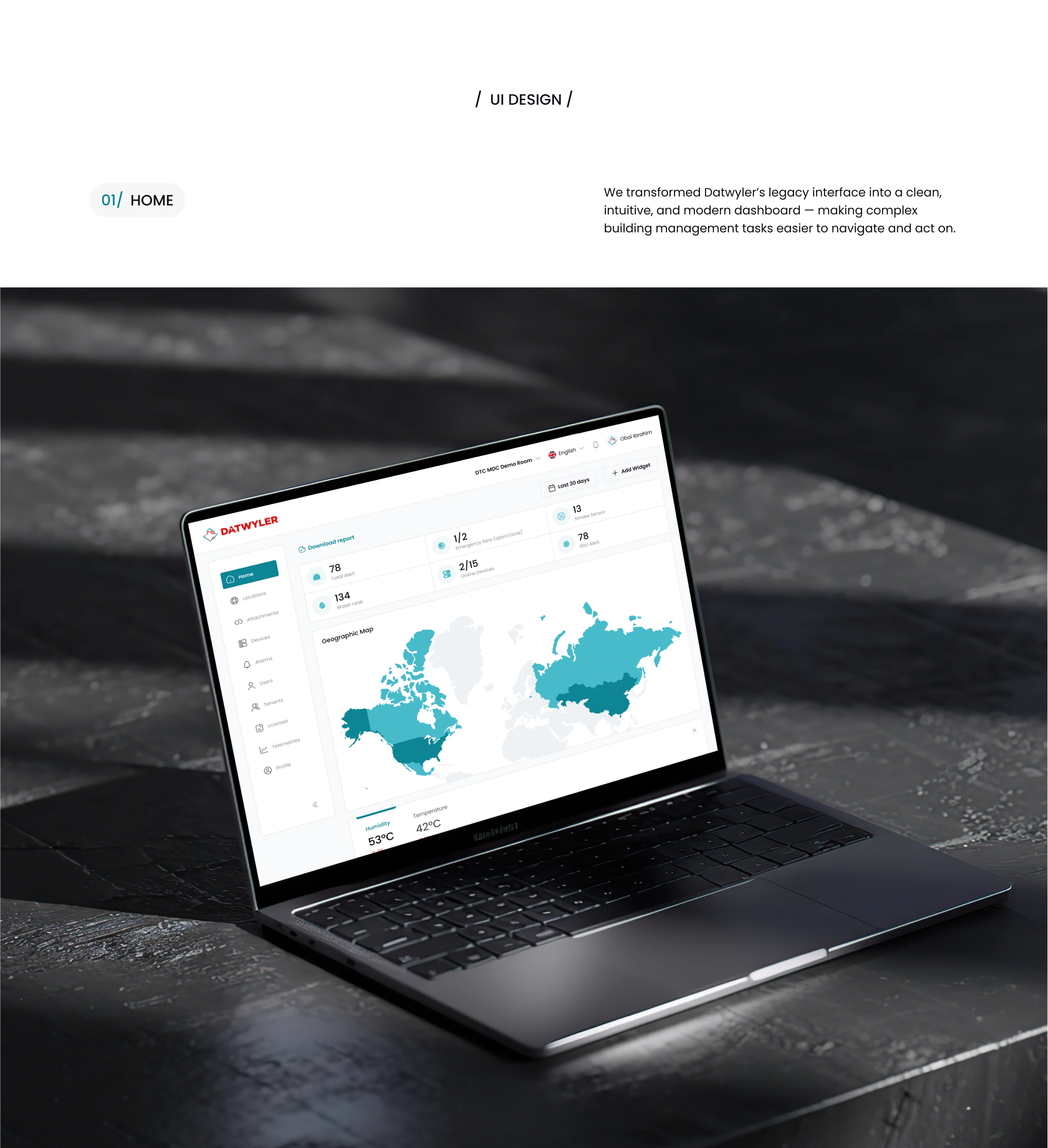
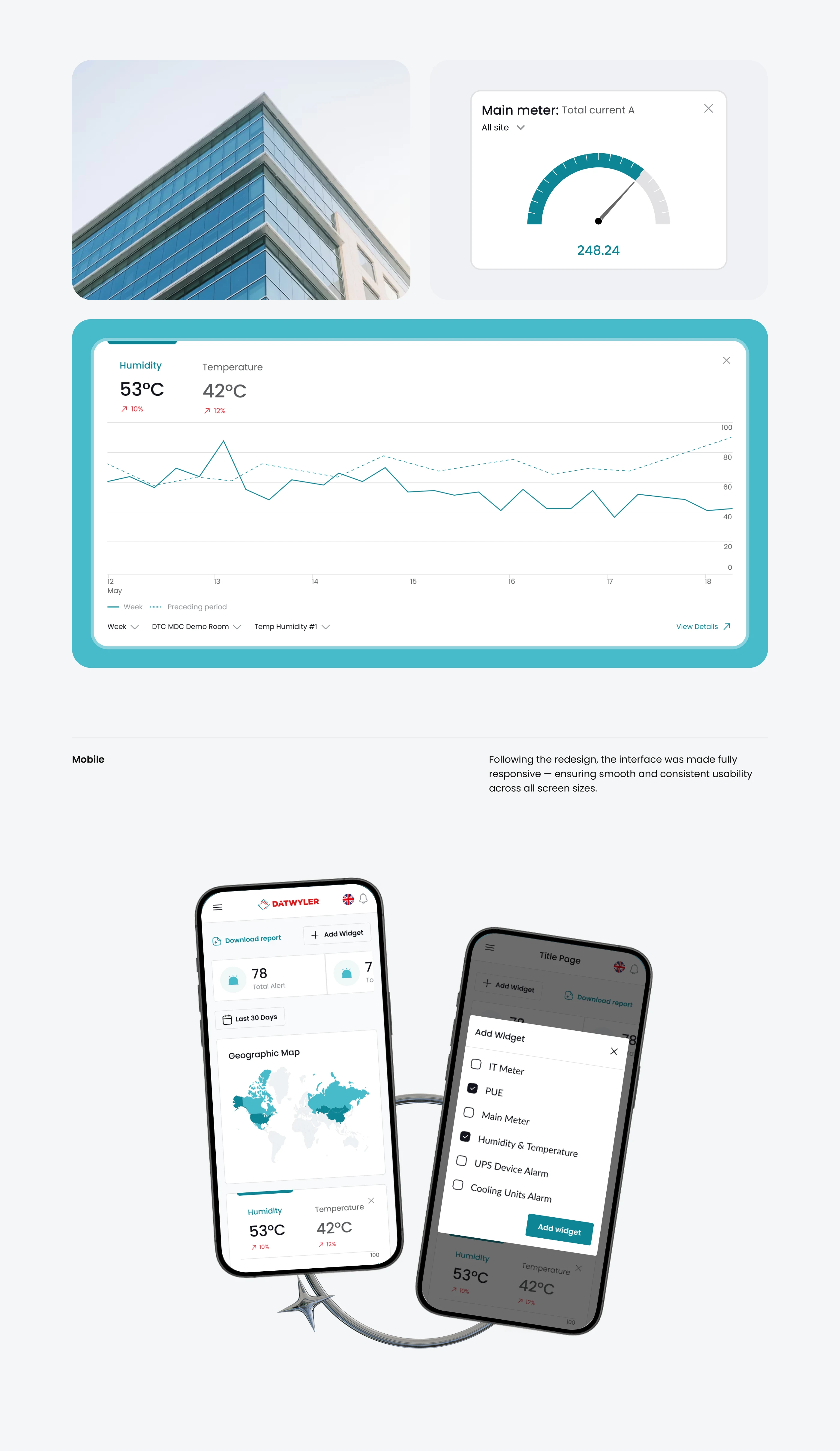
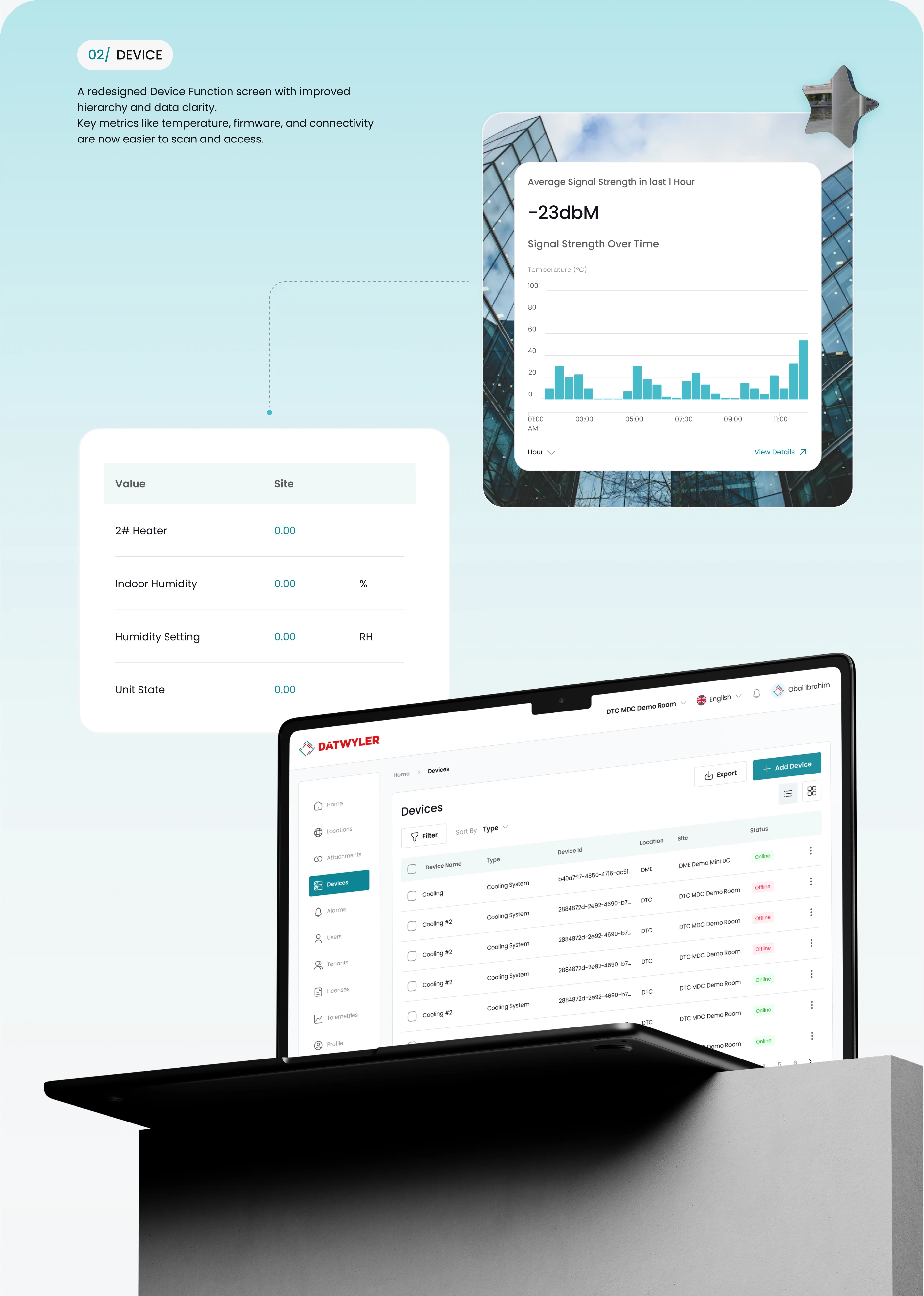
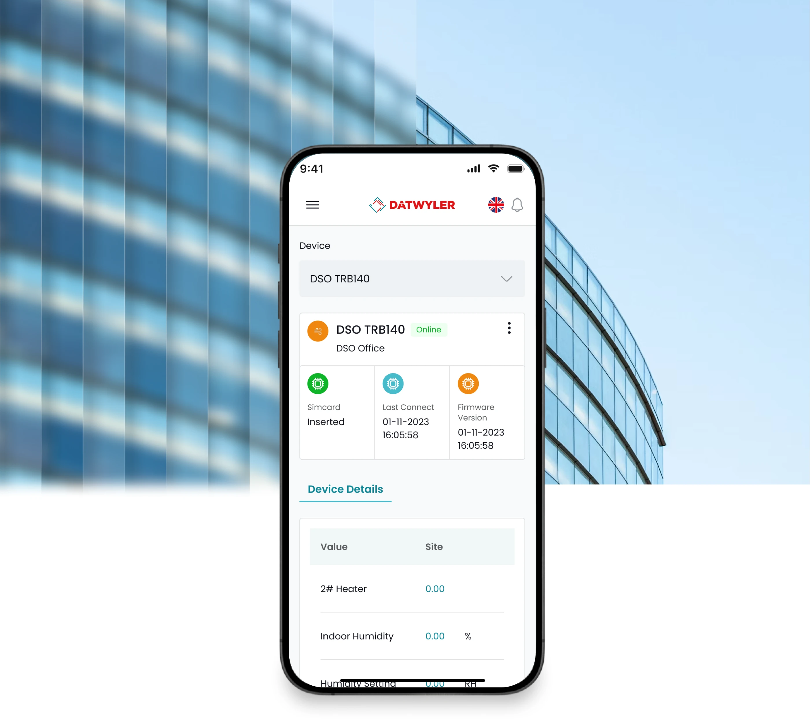
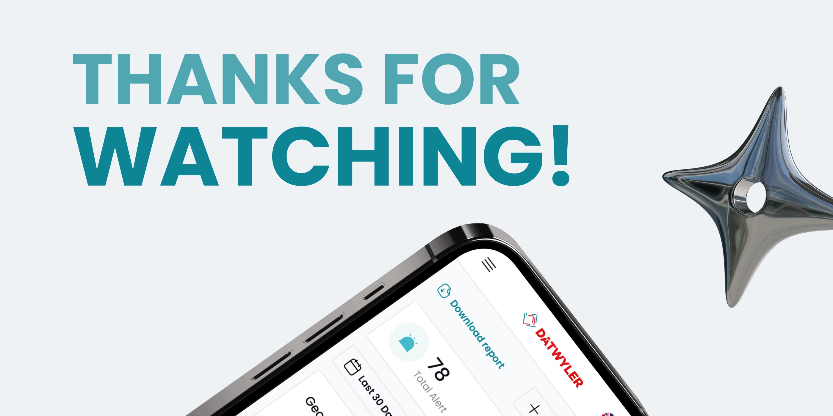
Dashboard Overview: clean layout with real-time data visualization and geo-mapping.
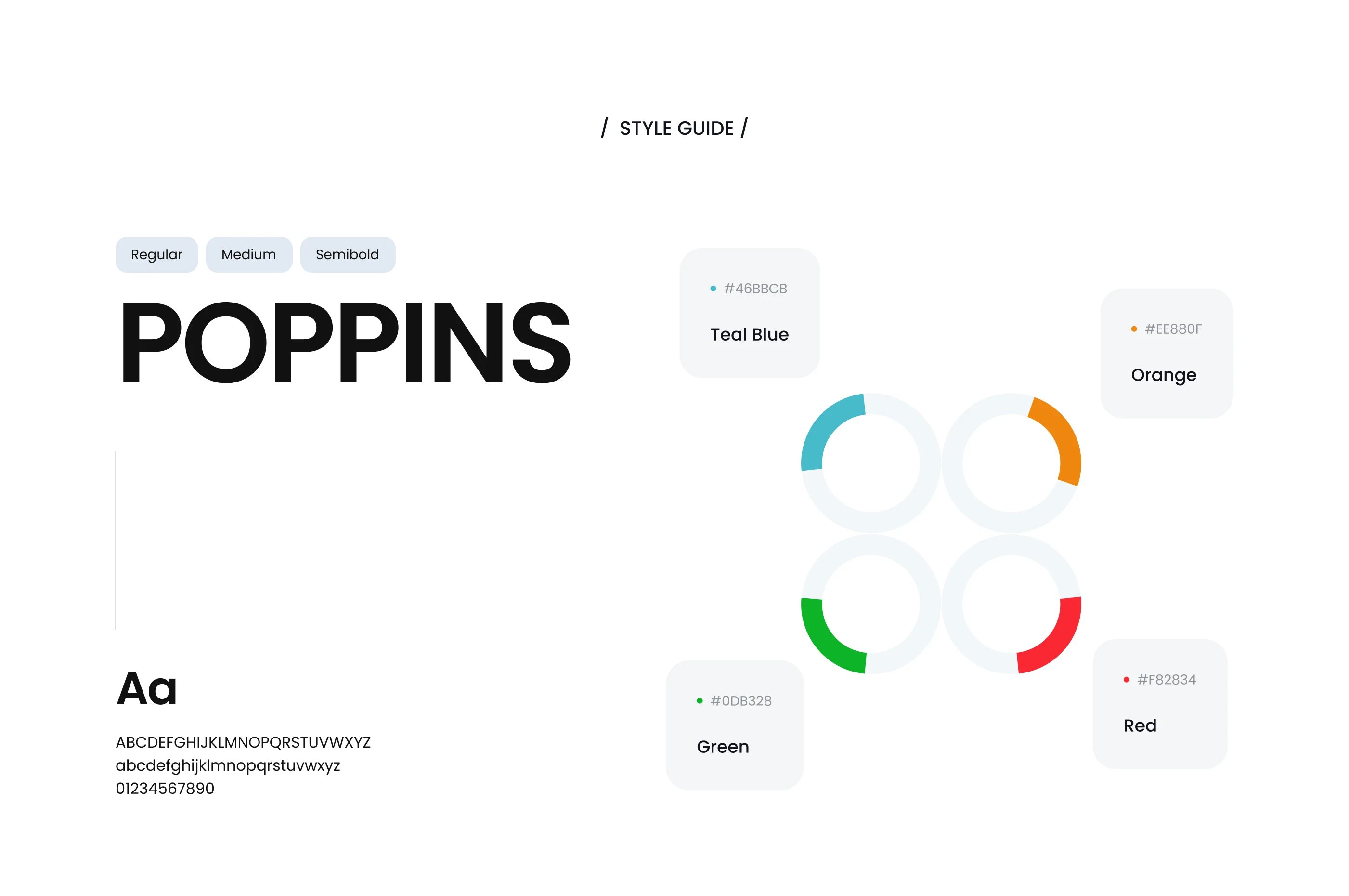
Color Palette: teal and graphite gray for an industrial yet modern tone.
Typography: Inter + Roboto Mono for high numerical clarity.
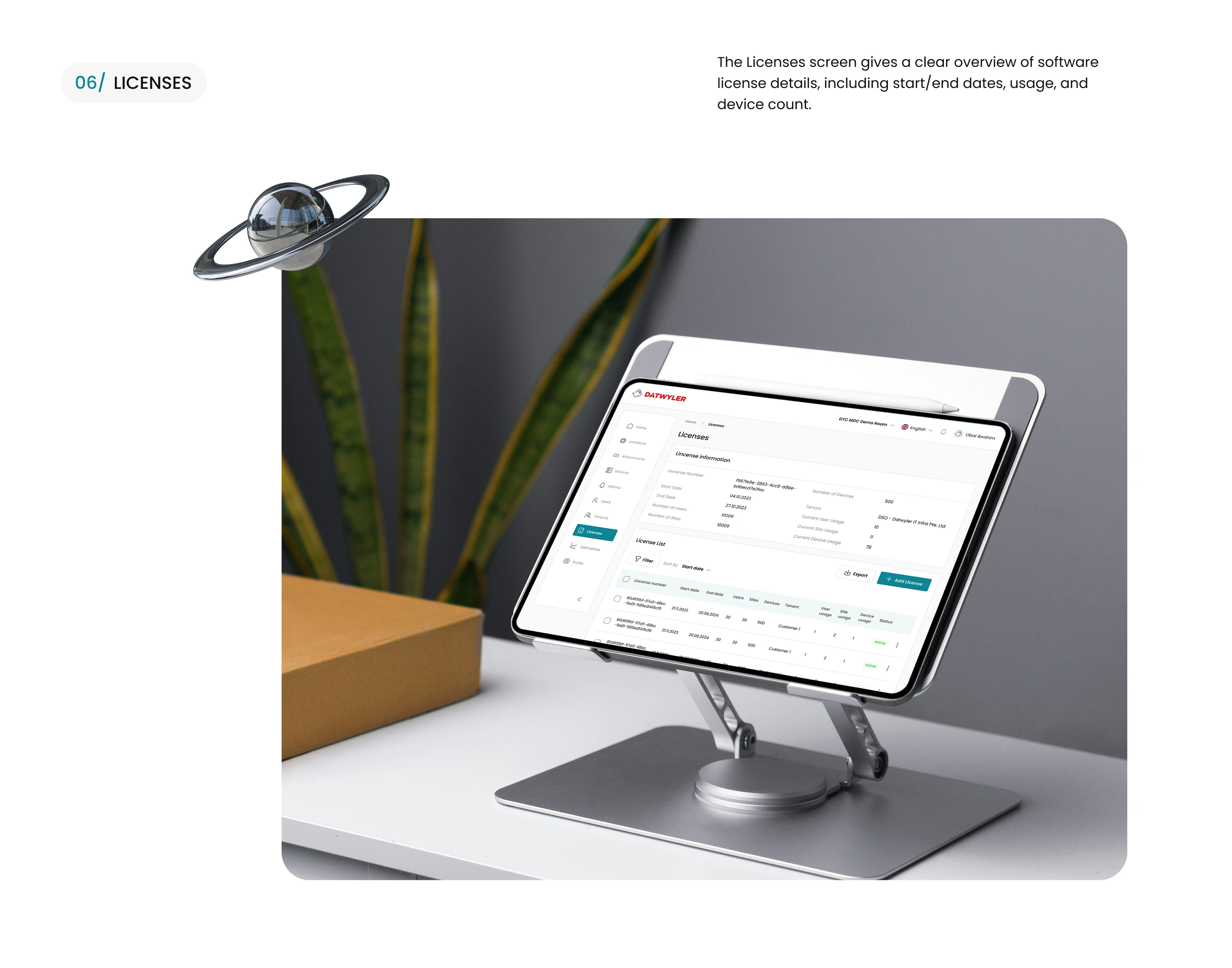
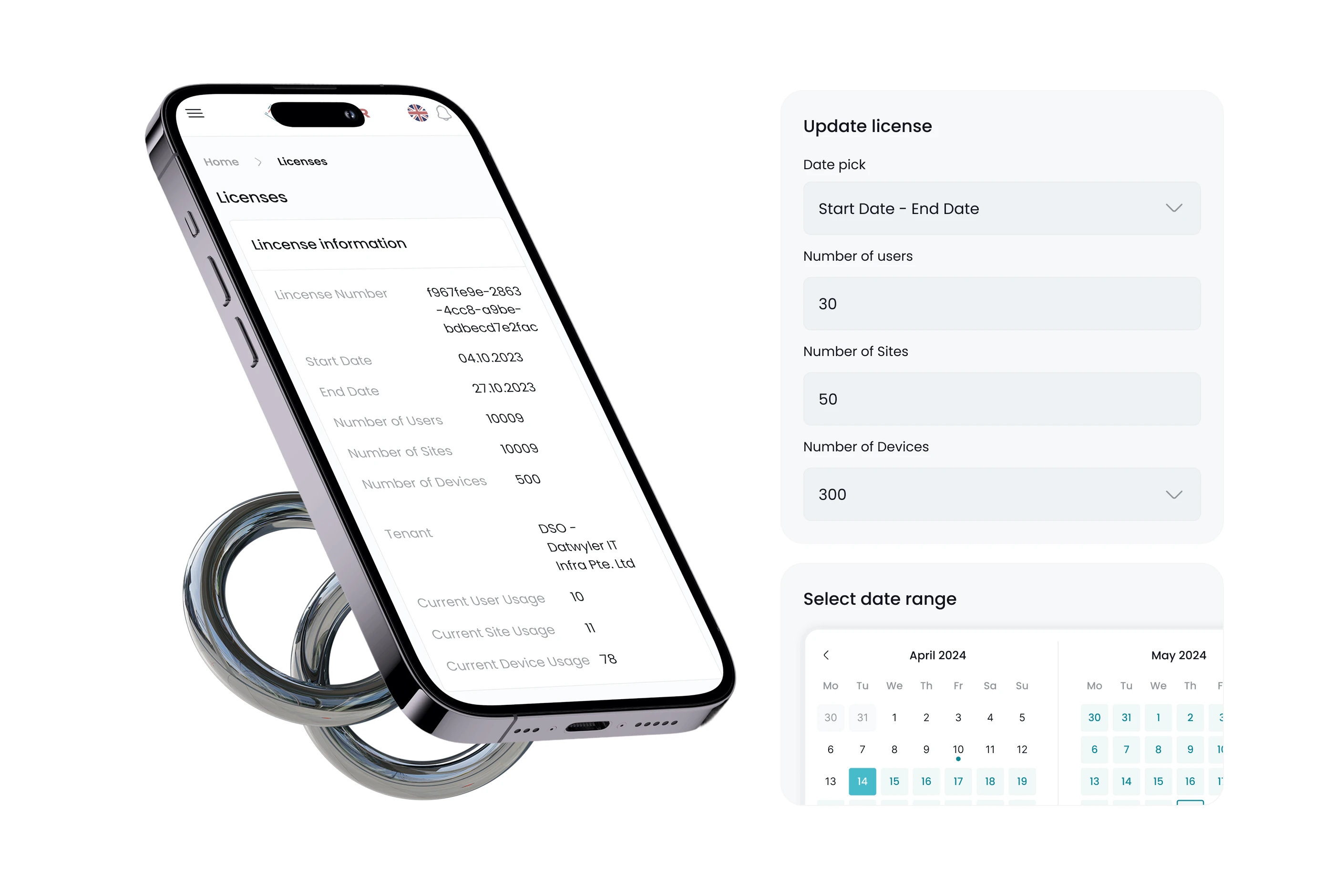
Visualization System: redesigned chart components with consistent scales, legends, and alerts.
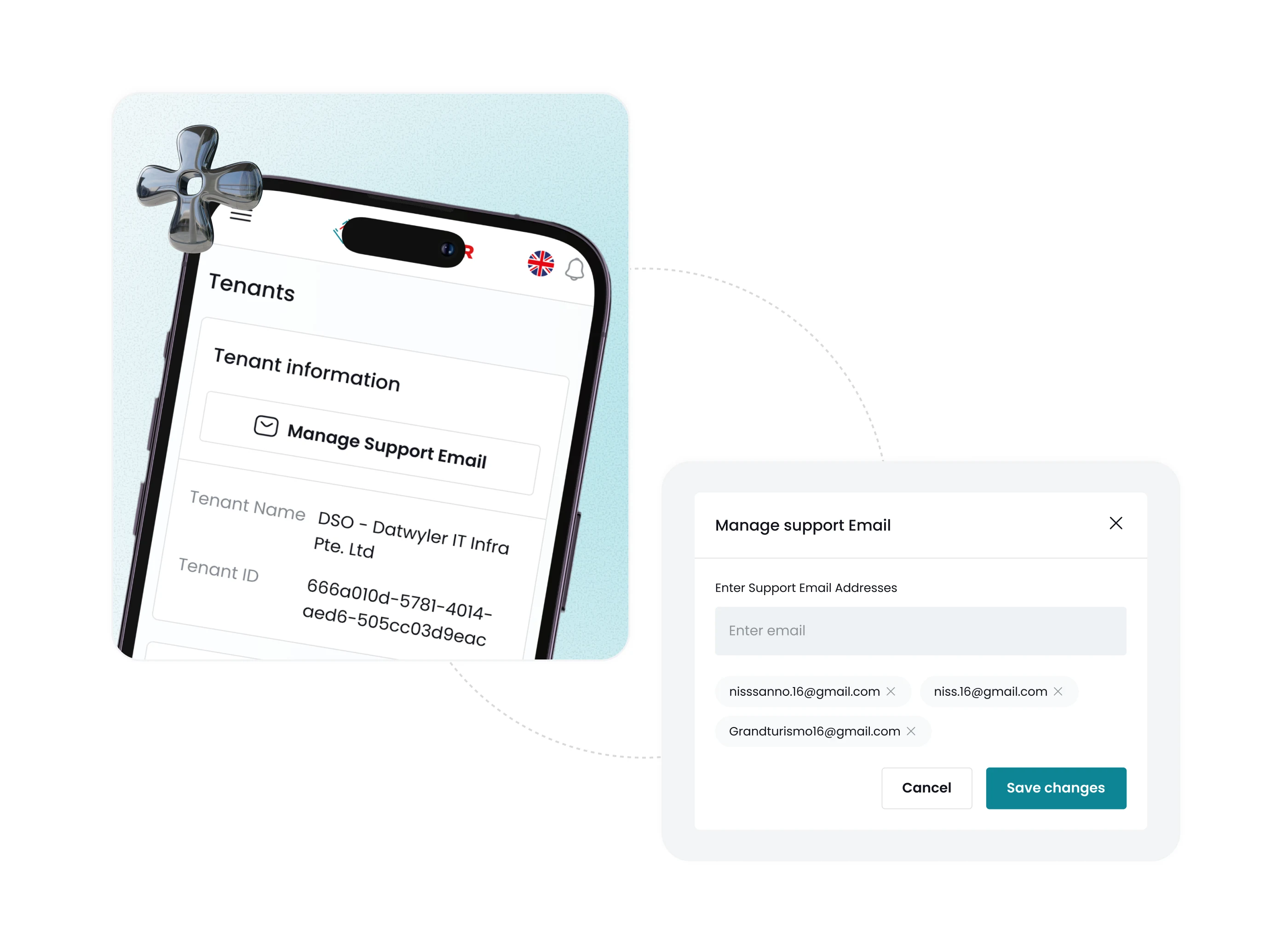
Status Indicators: standardized green / amber / red color states for health, warning, and error.
(d) Design System Development
Built a unified Figma component library with:
Navigation, Tables, Filters, Charts, Modals, Toasts.
8 interactive states for all core elements.
Created Design Tokens for colors, spacing, elevation, and radii.
Implemented Figma Variables & Auto Layout to streamline dev handoff and updates.
5. Outcomes & Impact
✅ 42% reduction in time-on-task for core operations (monitoring, data export, reporting).
✅ 60% faster development cycle when adding new modules.
✅ User satisfaction score: 8.6/10 post-launch (internal survey).
✅ Unified visual identity now adopted across Datwyler’s sub-platforms.
6. Conclusion
“The redesign wasn’t just about looks — it was about empowering users to navigate complex data effortlessly.”
This project demonstrates Capi Product’s clarity-driven design philosophy:
simplify workflows, unify visuals, and translate technical data into a clear, human-centered experience.
7. Deliverables
UX Research Report & Audit Summary
Information Architecture Map
UI Design (Web App + Dashboard)
Figma Design System & Tokens
Developer Handoff Documentation

Like this project
What the client had to say
The team demonstrated a strong understanding of our needs and delivered designs that matched our vision. Communication was clear throughout the process & they were receptive to feedback. Overall, it was a smooth & productive collaboration.
Obai Obrahim, ARABTEAM LTD
Jun 2, 2024, Client
Posted Apr 23, 2025
A platform redesign project aimed at delivering a more modern, intuitive, and user-friendly experience.
Likes
1
Views
16
Timeline
Mar 29, 2024 - Jan 15, 2025
Clients
ARABTEAM LTD