WeRise Logo
Capi Product
Verified
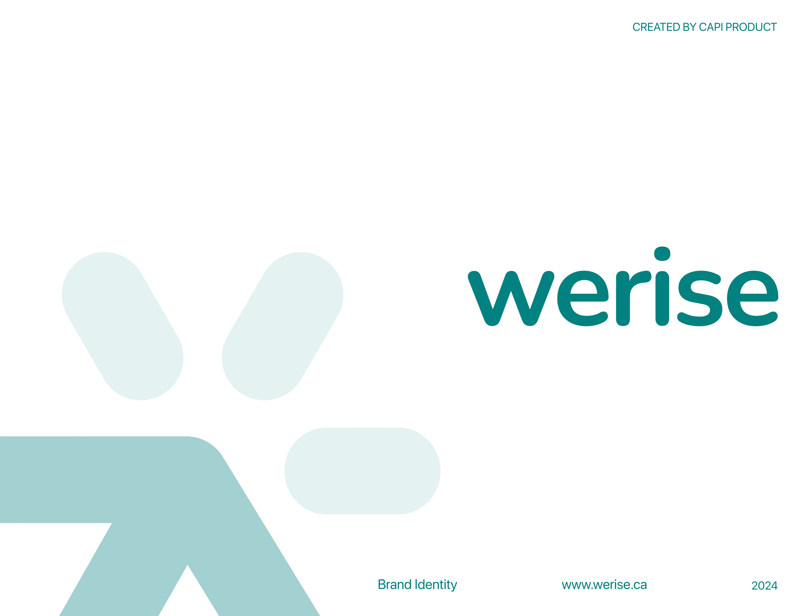
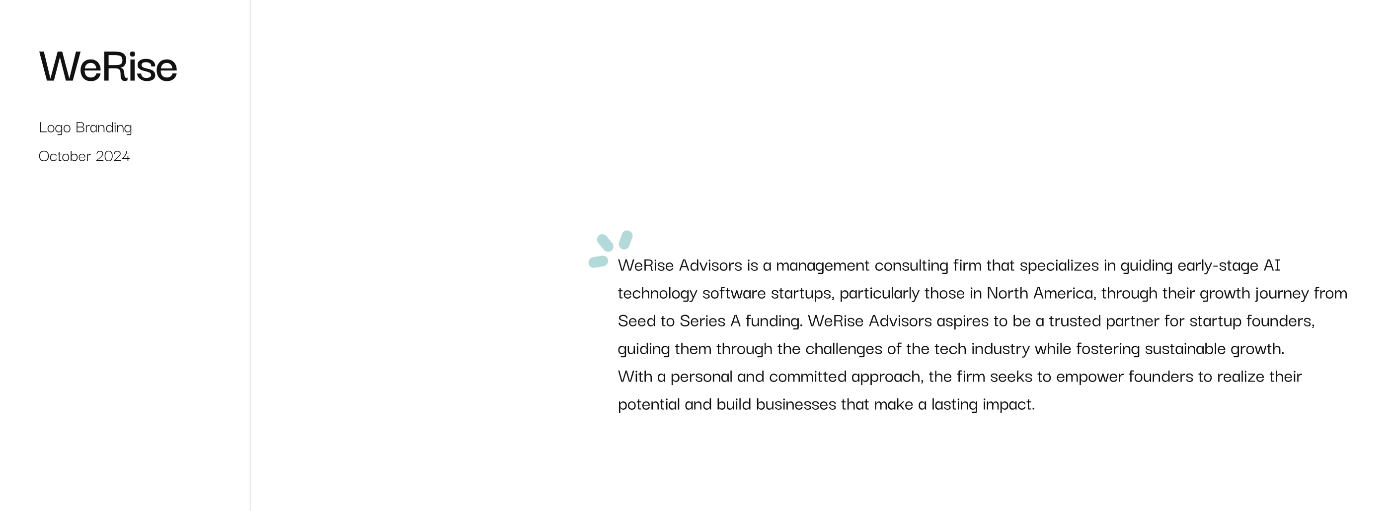
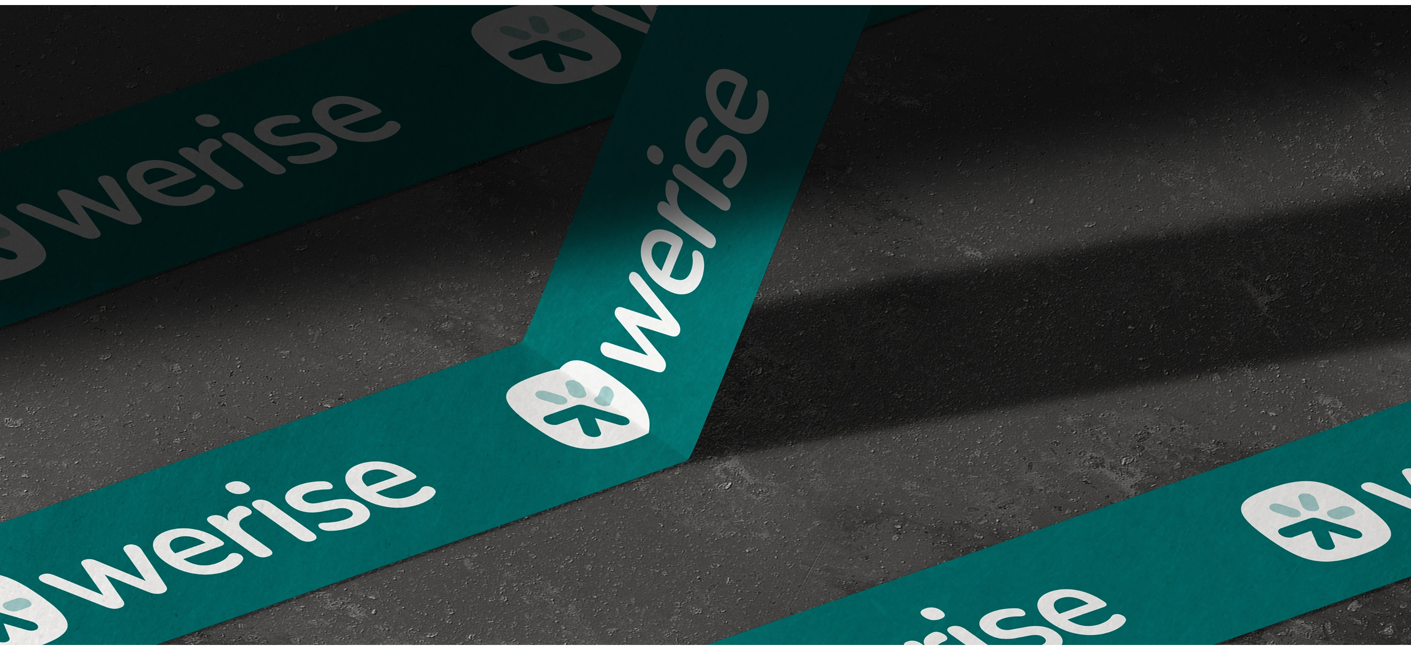
WeRise Logo Branding
Client: WeRise Advisors
Agency: Capi Product
Service: Logo & Brand Identity
Date: October 2024
1. Overview
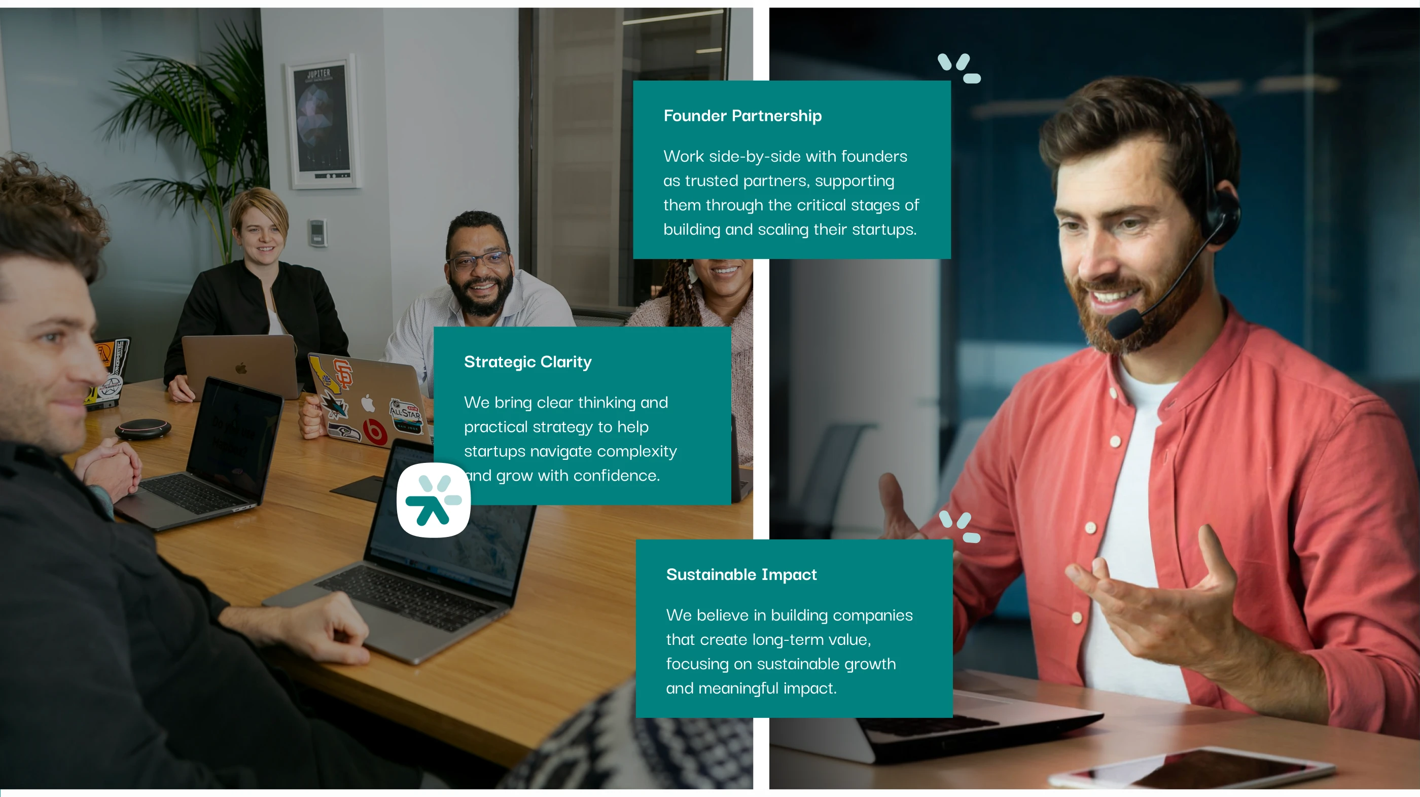
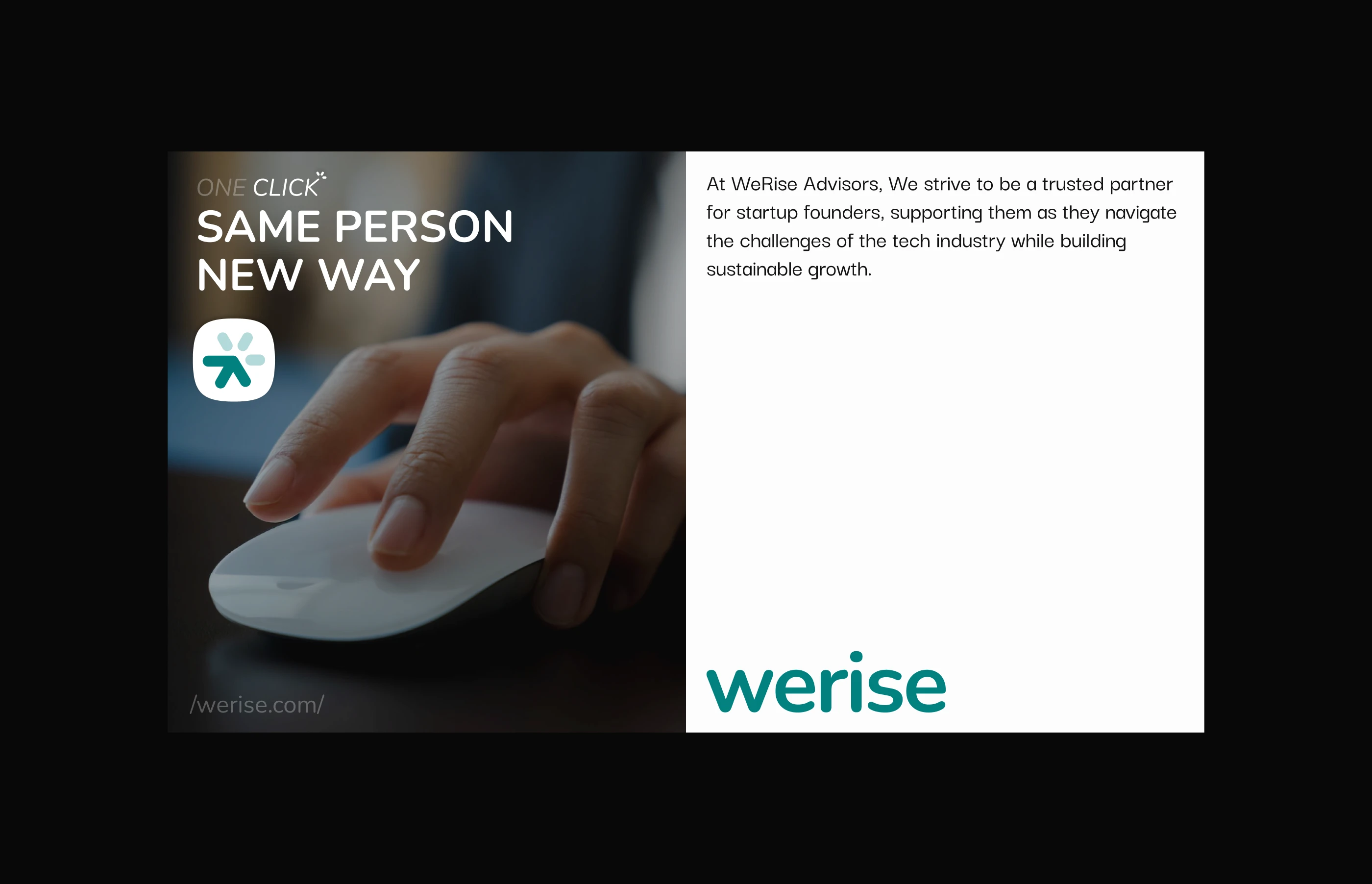
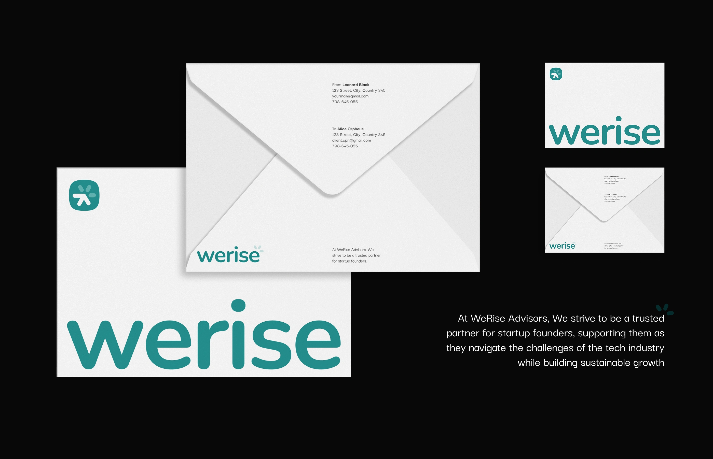
WeRise Advisors is a management consulting firm dedicated to empowering early-stage AI technology startups, particularly in North America, through their journey from Seed to Series A funding.
Capi Product was approached to design a brand identity system that reflects WeRise’s core mission:
“Guiding founders to rise through the challenges of the tech industry while fostering sustainable growth.”
The goal was to create a logo and visual language that embody trust, innovation, and forward momentum — a visual metaphor for “rising together.”
2. Challenge
WeRise Advisors operated in a competitive B2B landscape, where management consulting brands often looked overly corporate or generic.
The client wanted something different — a brand that feels:
Strategic, but also human-centered
Modern, yet timeless
Professional, but still approachable
The challenge was to translate WeRise’s philosophy of growth and partnership into a visual identity that resonates with AI startups and tech founders.
3. Strategy & Concept
We began with a brand discovery workshop to define three pillars that represent WeRise:
Growth – continuous elevation and learning
Partnership – collaboration and trust
Clarity – transparency and insight-driven decisions
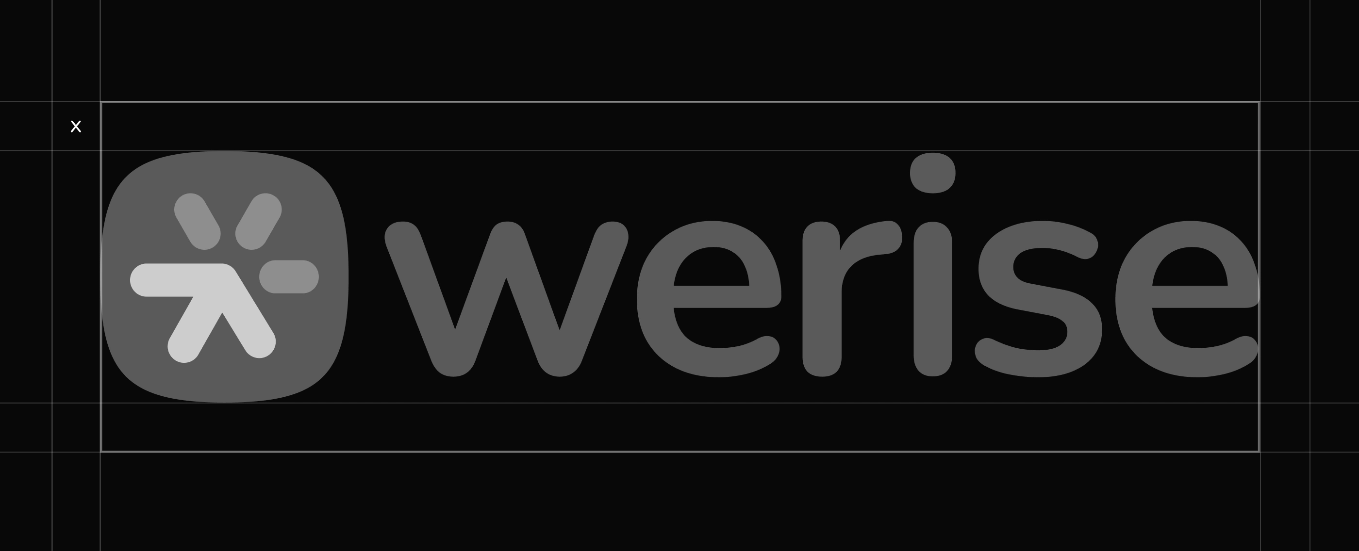
These pillars inspired the logo concept — a rising curve composed of geometric balance, symbolizing both the upward trajectory of growth and the steady guidance provided by WeRise.
The “W” letterform was stylized to represent two entities growing together, echoing the firm’s belief in shared success.
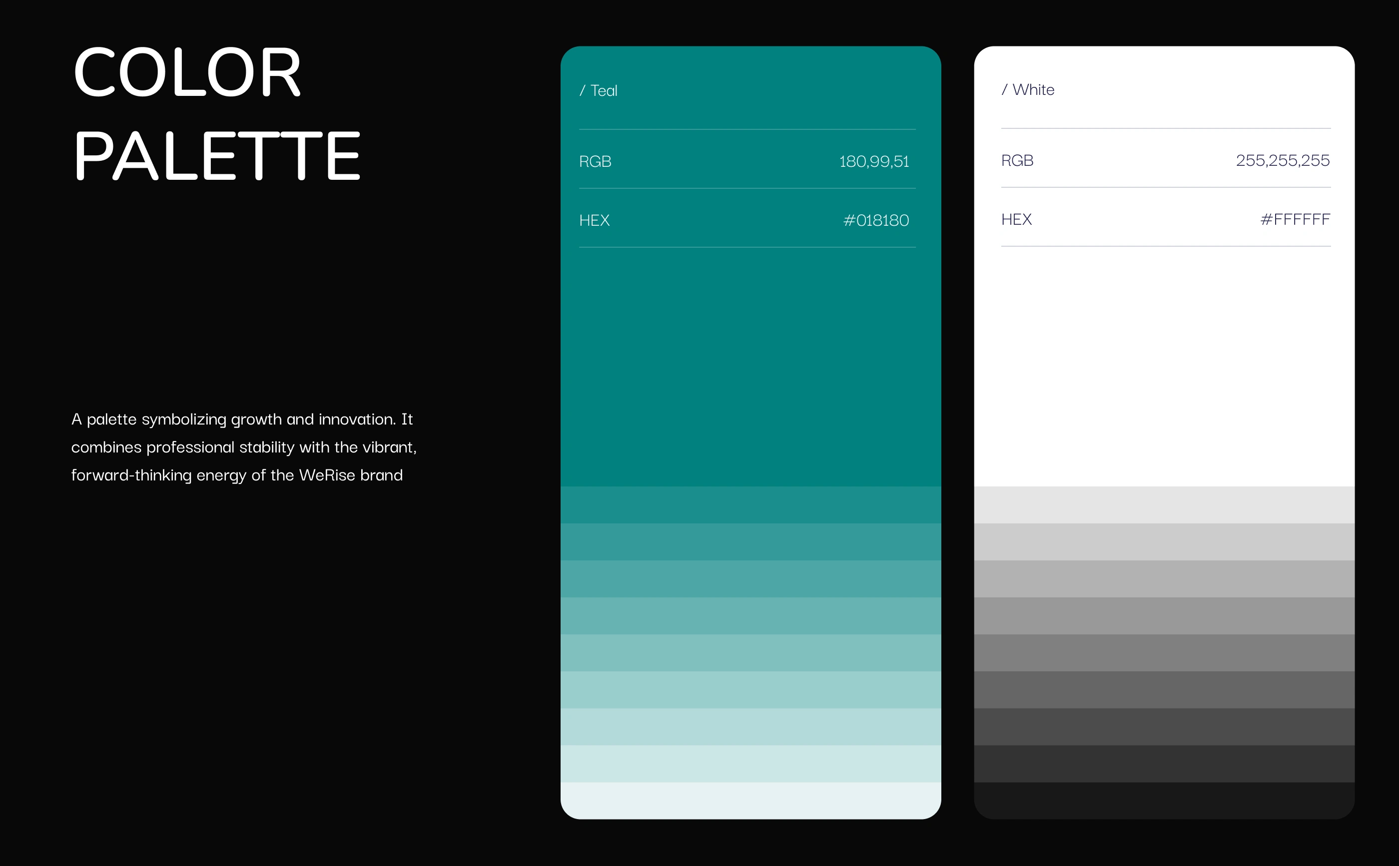
Color psychology played a major role:
Deep Navy Blue conveys reliability and intellect.
Bright Cyan Accent adds energy and reflects innovation in AI.
Warm Neutrals maintain approachability and balance.
4. Design Process
Logo Exploration
We explored over 20 initial directions combining symbolism from:
Growth curves, pathways, and arrows (progress)
Abstract lettermarks inspired by “W” and “R”
Minimal geometry to ensure scalability across media
Through iterative feedback with the client, we refined toward a minimal lettermark supported by a strong wordmark using a custom-modified sans-serif typeface for distinctiveness.
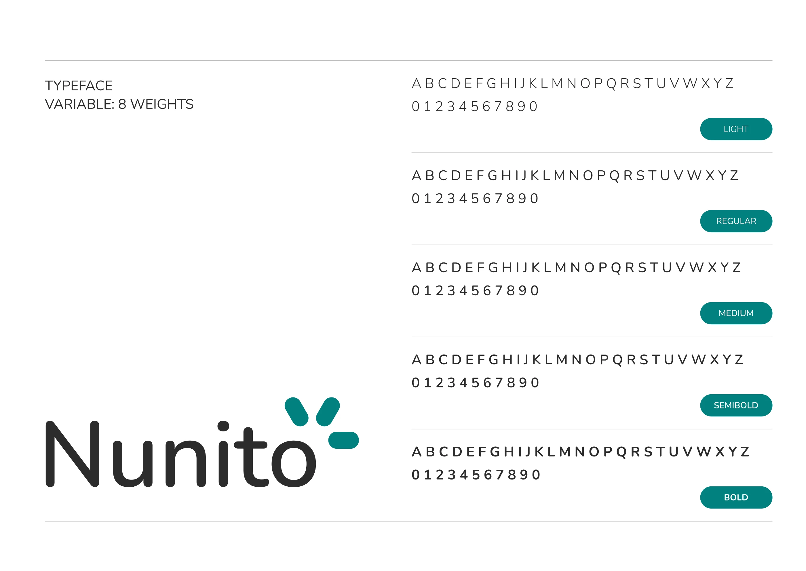
Typography & Grid
We built a modular grid system ensuring perfect optical balance across print and digital use. The typography system aligns with WeRise’s tone — confident, modern, and insightful.
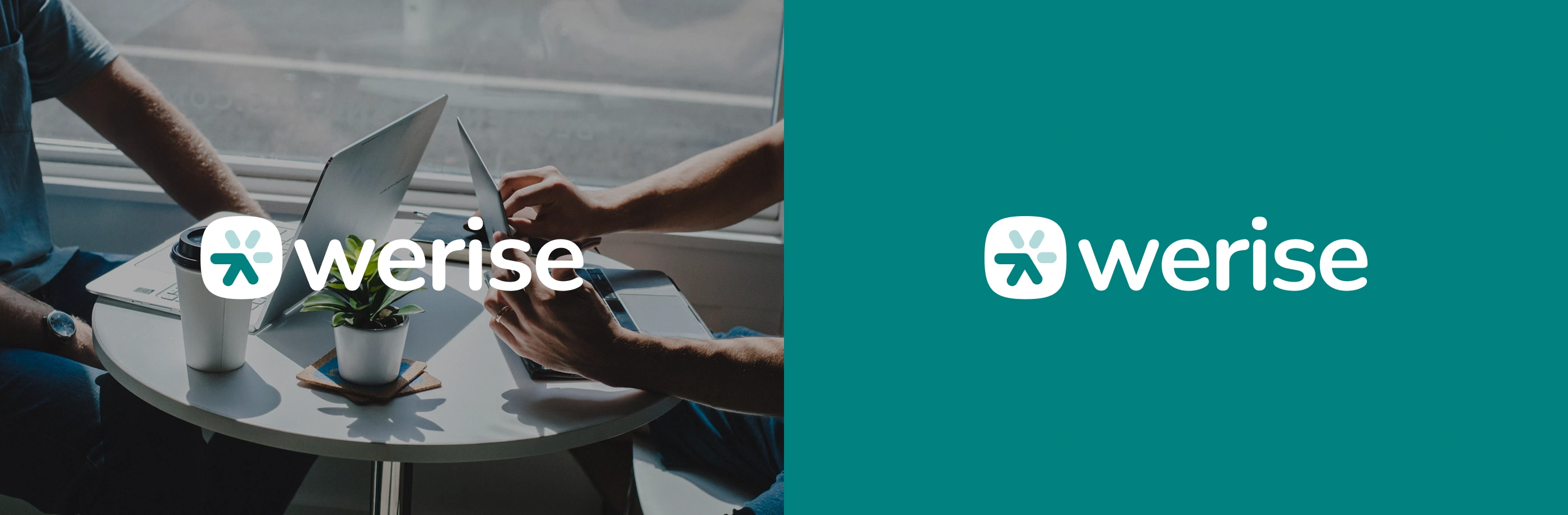
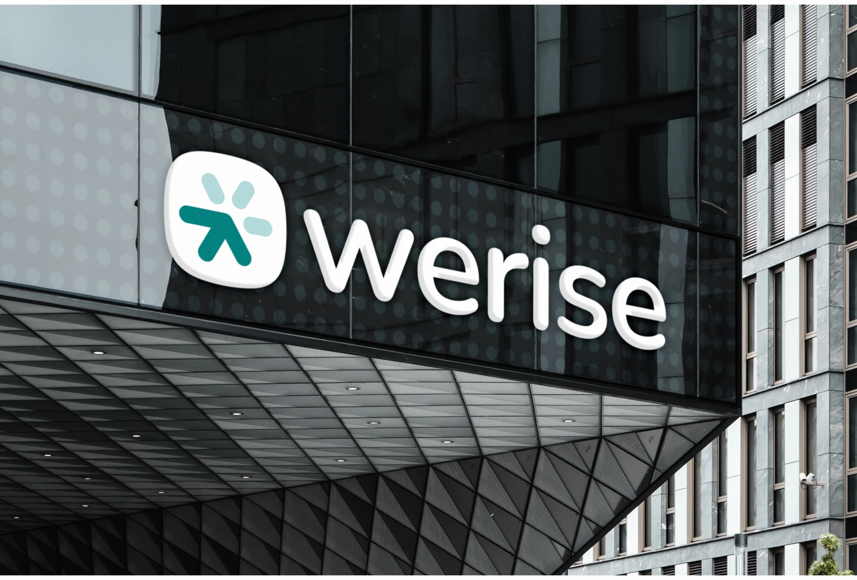
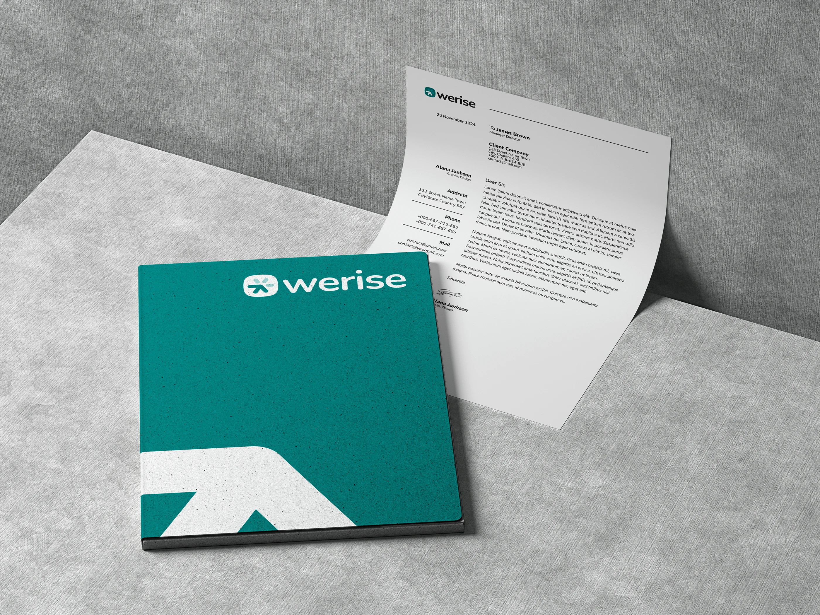
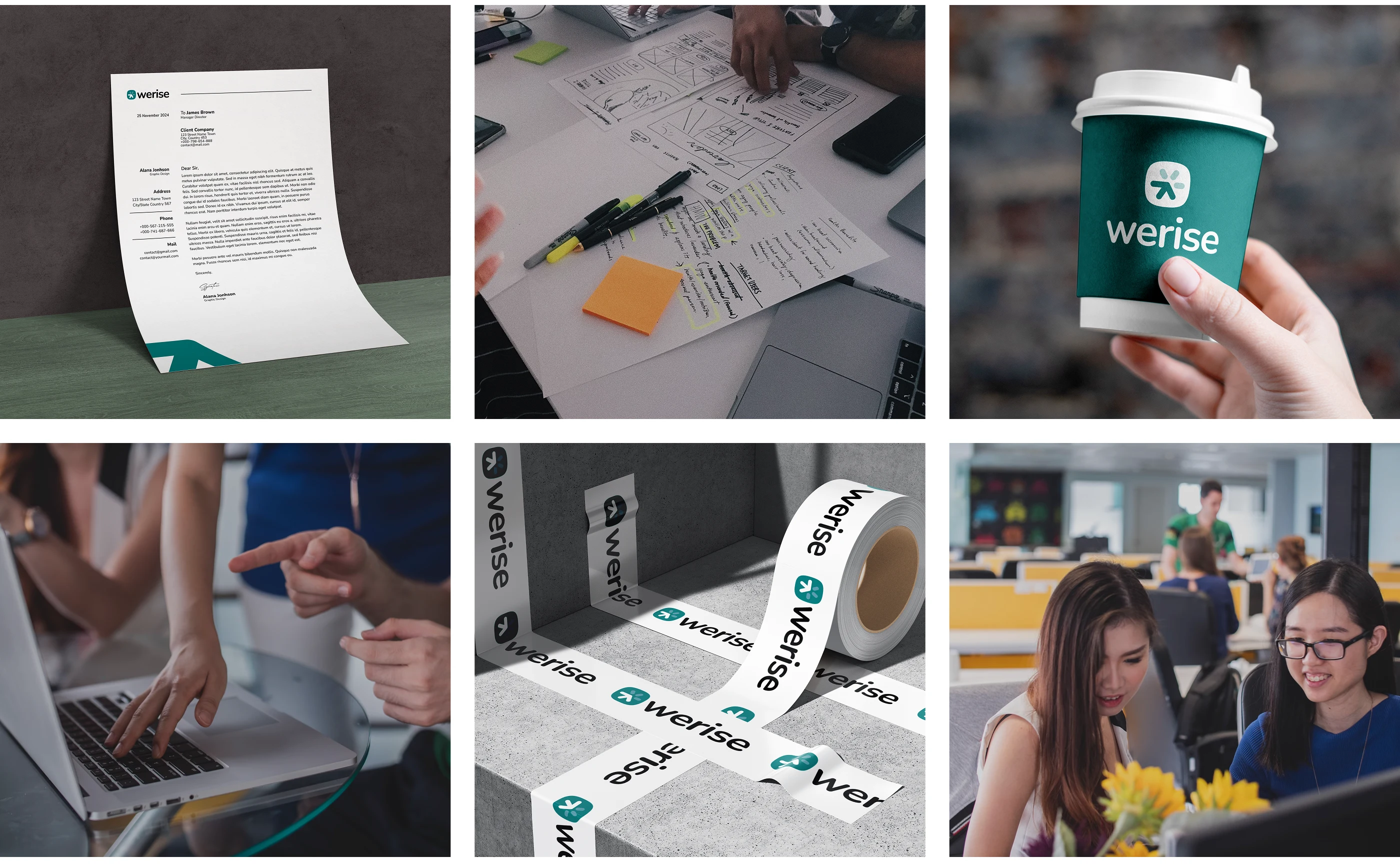
Application & Consistency
We developed a mini brand guide including:
Logo usage rules (light/dark backgrounds)
Color palette specifications
Typography hierarchy
Social media and pitch deck mockups
5. Outcome
✅ A distinct, modern logo representing growth through partnership
✅ Visual system adaptable for pitch decks, websites, and reports
✅ Increased clarity and recognition across digital touchpoints
✅ Positive feedback from founders and partners after rebranding
6. Reflection
“Our goal was to create an identity that’s not just seen — it’s felt.
The WeRise logo stands for founders who climb, fall, and rise again — with the right partner by their side.”
This project reaffirmed Capi Product’s approach to branding:
strategic foundations + timeless design + emotional connection.
Deliverables
Brand Discovery Workshop
Logo & Visual Identity System
Color & Typography Guide
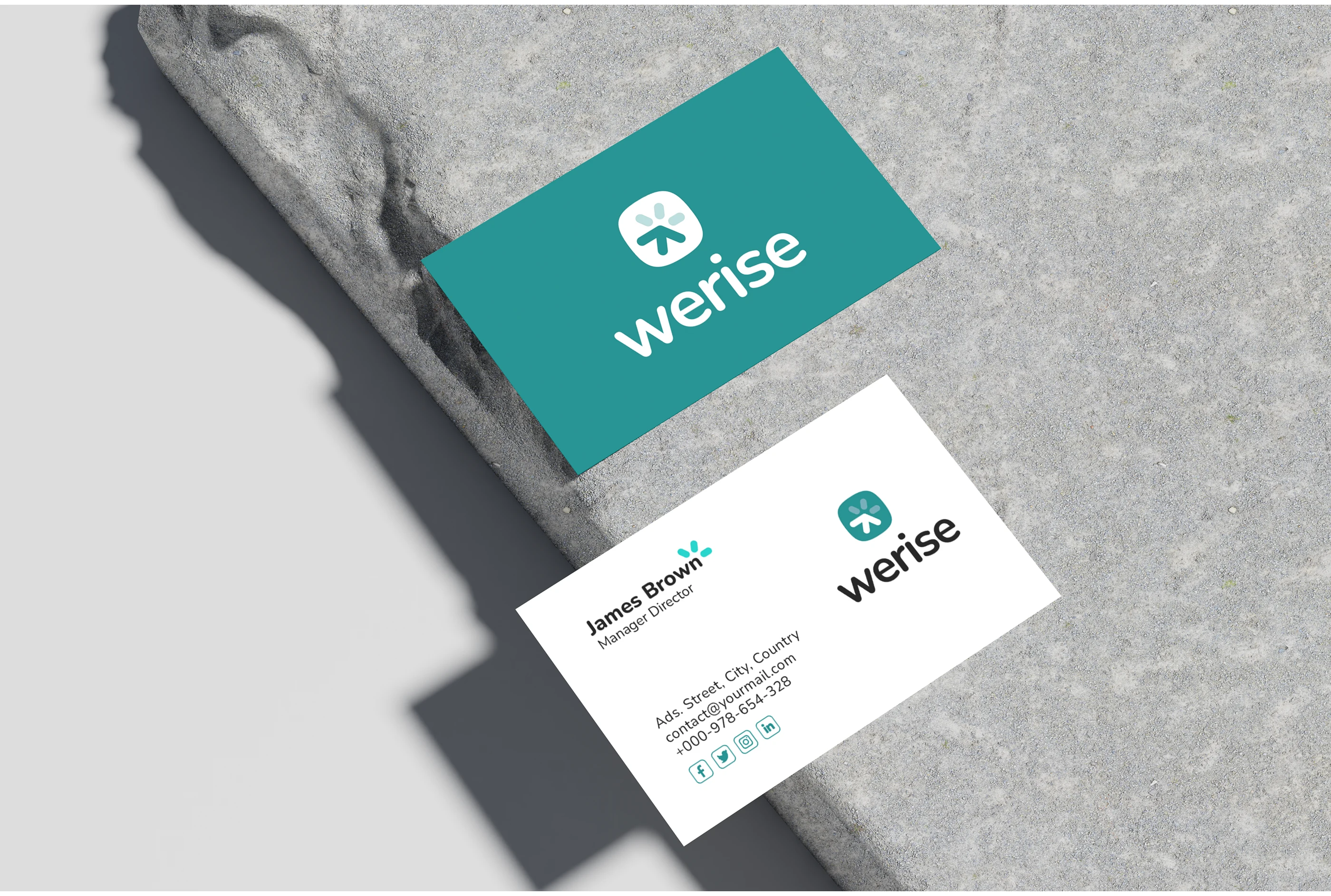
Brand Applications (Pitch Deck, Social Media, Business Card)
Like this project
Posted Apr 29, 2025
A modern identity that visualizes progress and partnership — guiding early-stage AI startups on their journey to rise and scale.
Likes
2
Views
23
Timeline
Oct 29, 2024 - Ongoing