Branding Identity | Appropriate Marketing
Capi Product
Verified
Appropriate Marketing – Branding & Identity Design
Client: Appropriate Team
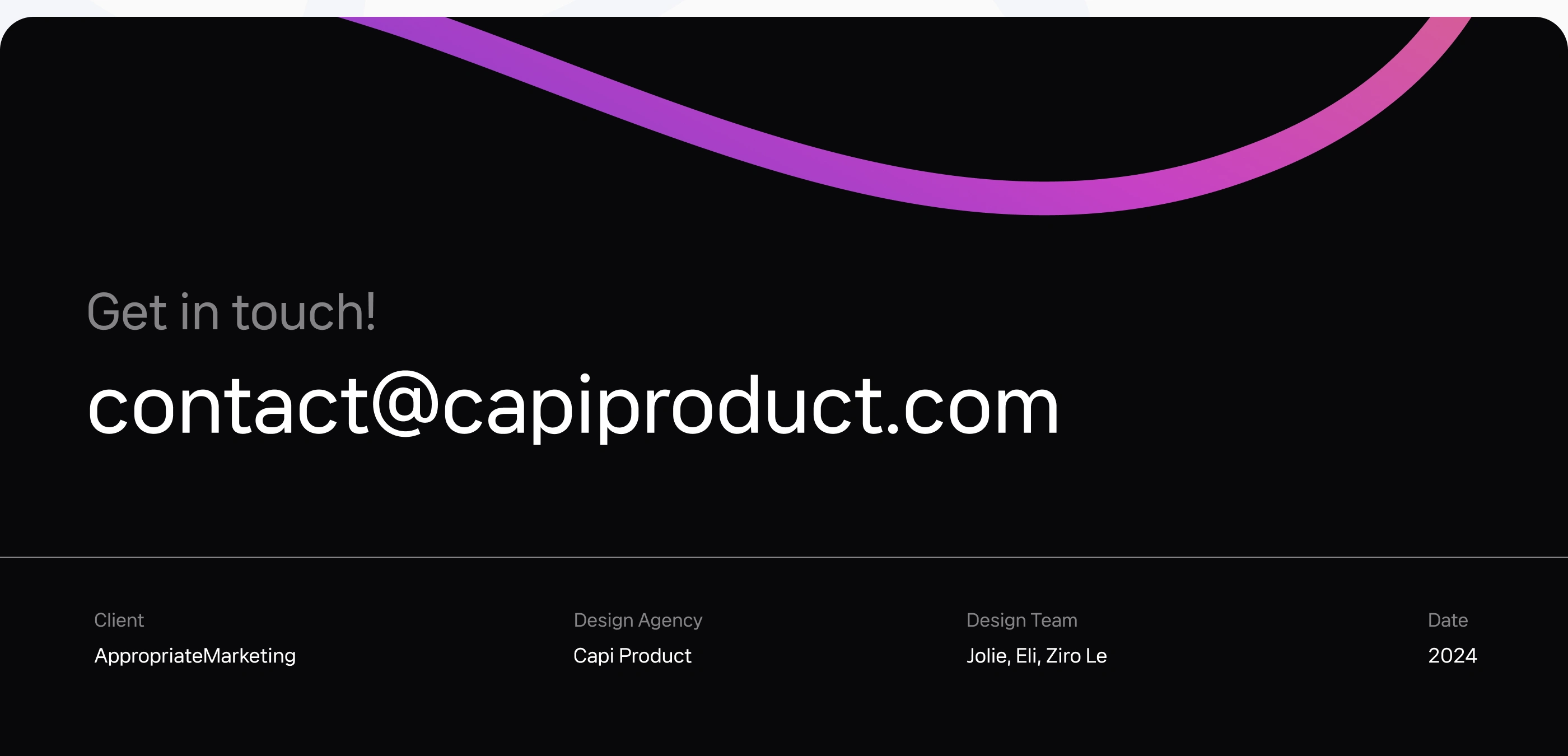
Agency: Capi Product
Service: Brand Identity · Visual Design · Creative Direction
Timeline: January – March 2024
1. Overview
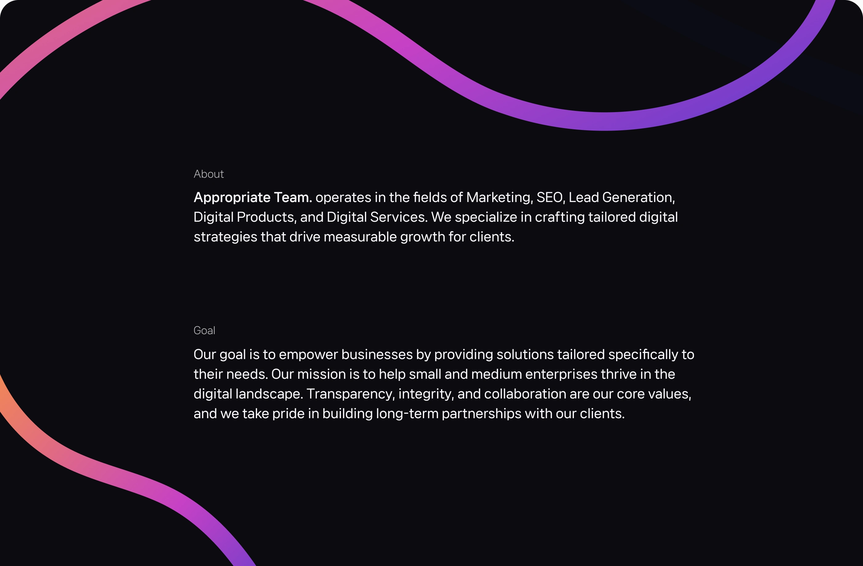
Appropriate Team is a digital agency operating across Marketing, SEO, Lead Generation, and Product Development. The company needed a cohesive brand identity that reflects professionalism, innovation, and credibility — helping it stand out in the crowded digital service landscape.
Capi Product was commissioned to build a full visual identity system that captures Appropriate Team’s values of transparency, collaboration, and measurable growth, while remaining adaptable for future service expansions.
2. Challenge
Before the redesign, Appropriate Team faced key brand challenges:
Inconsistent visual language across platforms weakened brand recognition.
Generic look and feel didn’t represent the company’s strategic and tech-driven nature.
Lack of flexibility in brand applications made internal and client-facing materials fragmented.
The goal was to build a modern and credible identity that aligns with the company’s digital-first mindset and empowers long-term brand growth.
3. Strategy
Our approach combined clarity, scalability, and distinctiveness.
Core positioning: A partner that drives measurable growth through integrity and innovation.
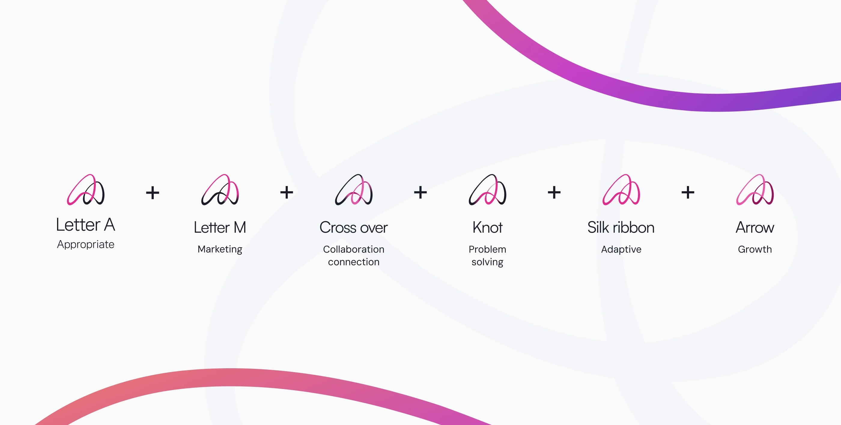
Visual concept: “Flow of connection” — symbolizing how Appropriate bridges creativity and technology to build lasting business relationships.
Design direction: Modern typography, balanced color contrast, and geometric compositions emphasizing stability and transparency.
4. Solution
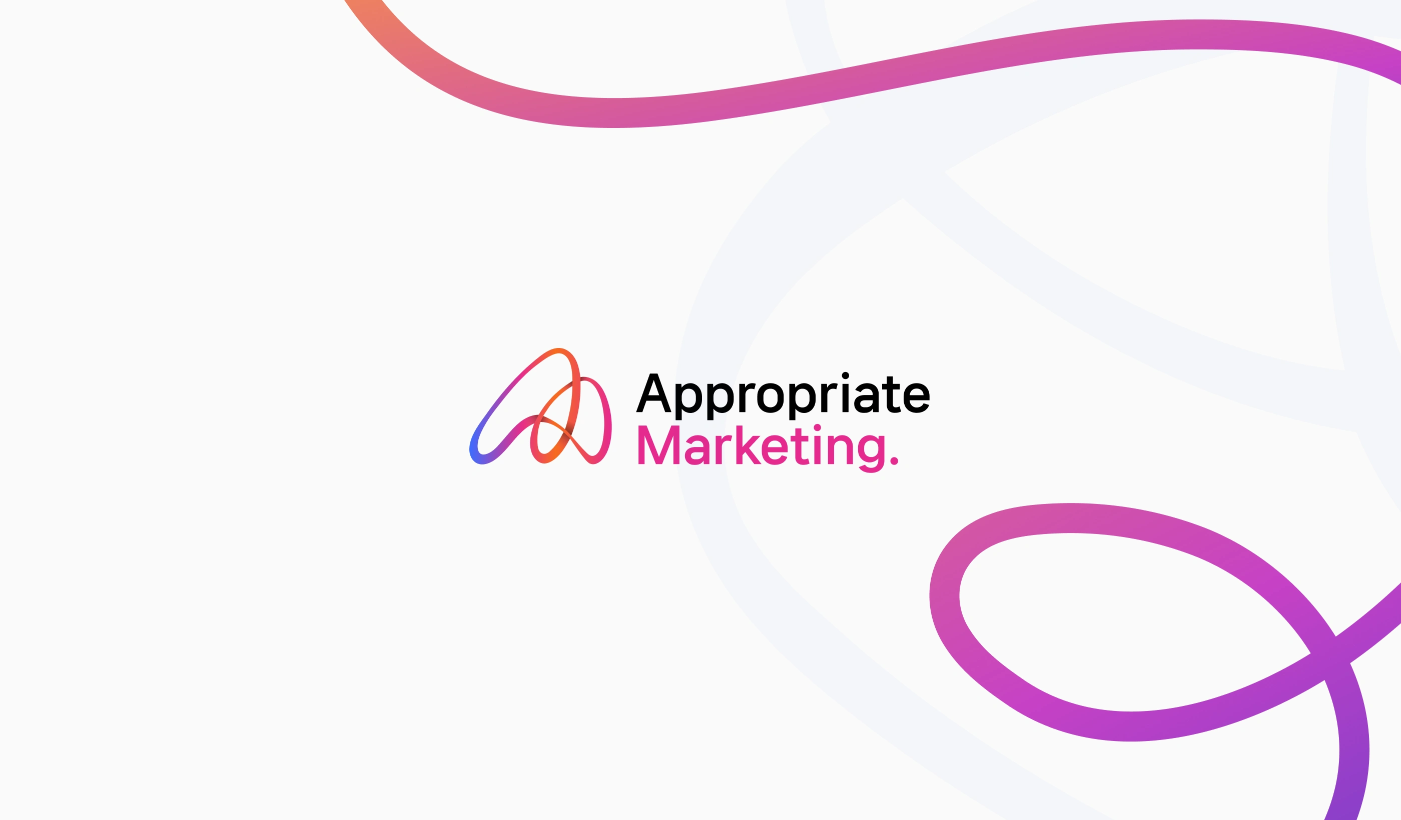
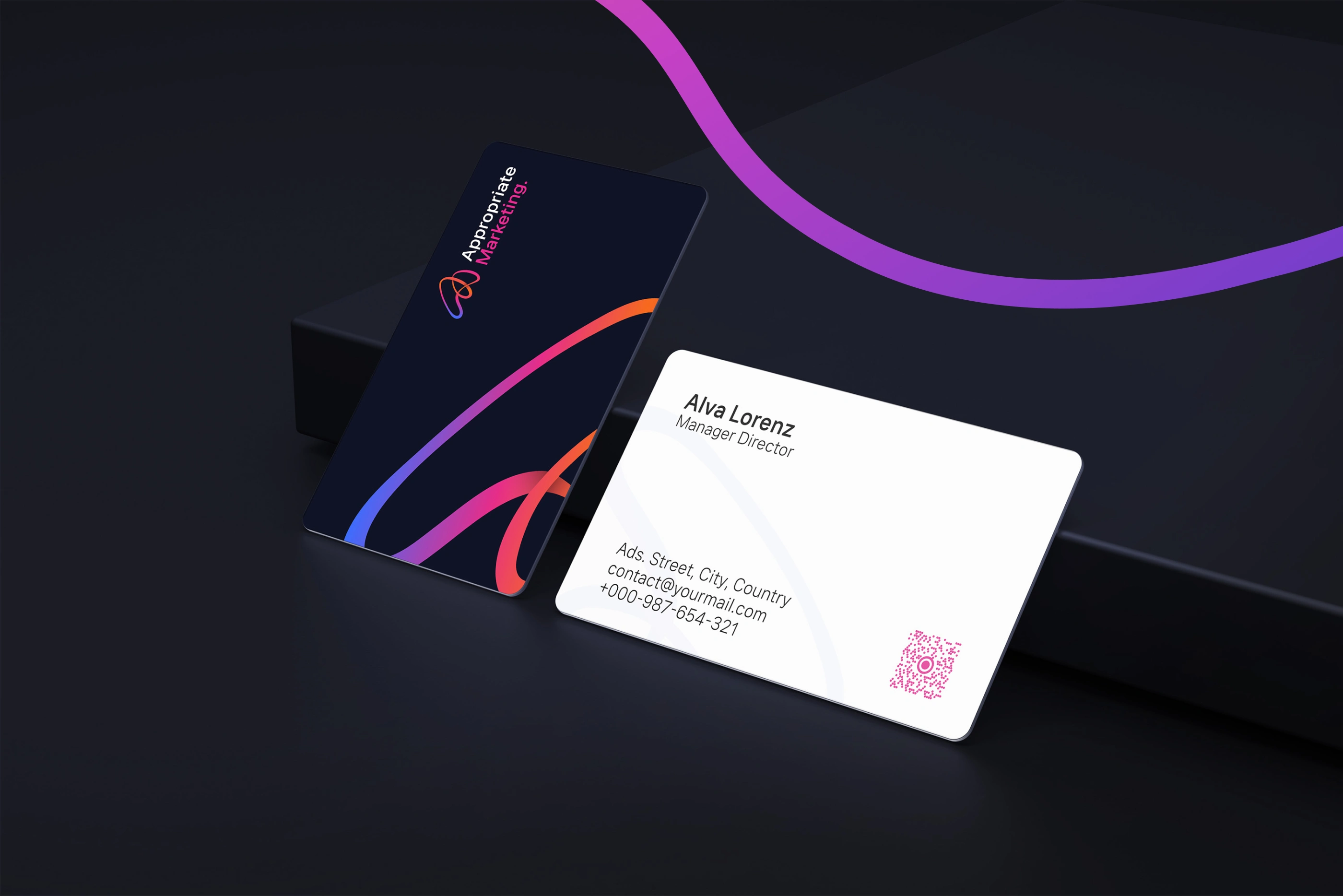
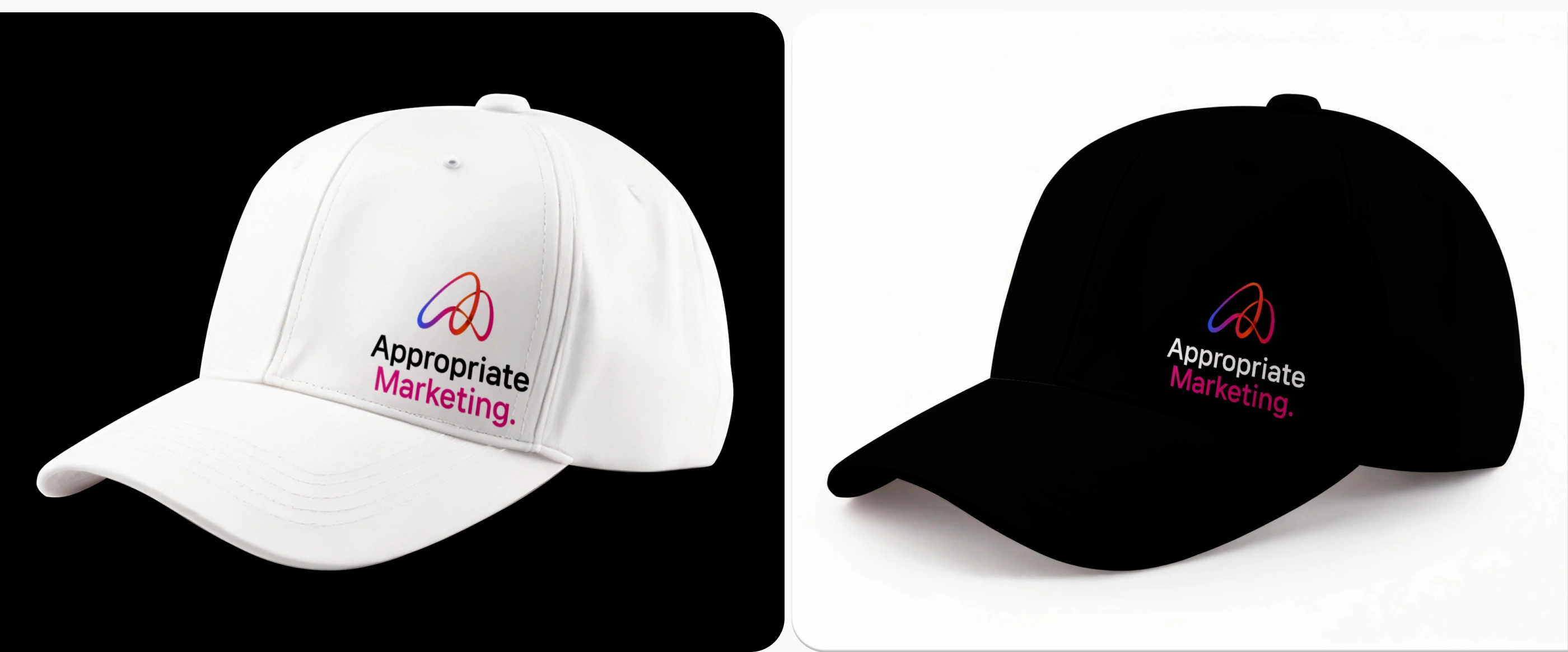
Brandmark & Typography
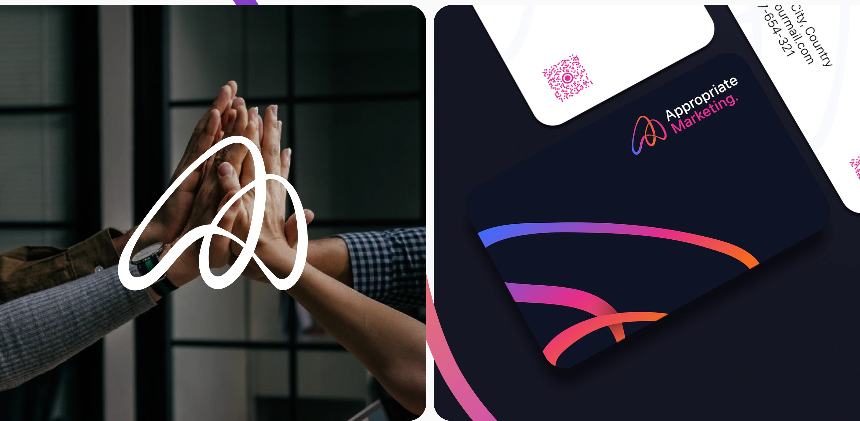
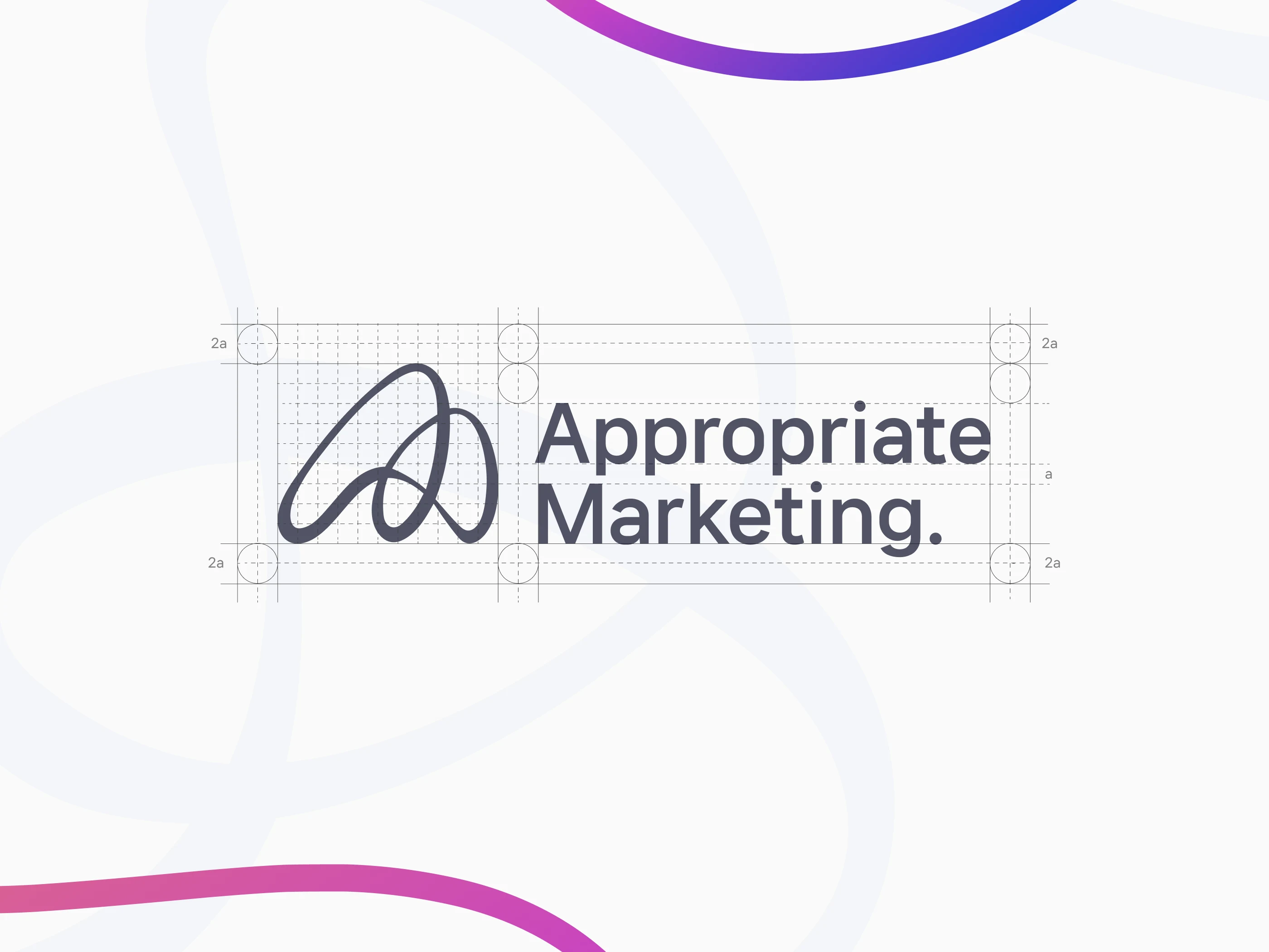
We developed a minimal monogram logo derived from the letter “A,” designed with modular geometry and soft edges to convey balance and approachability.
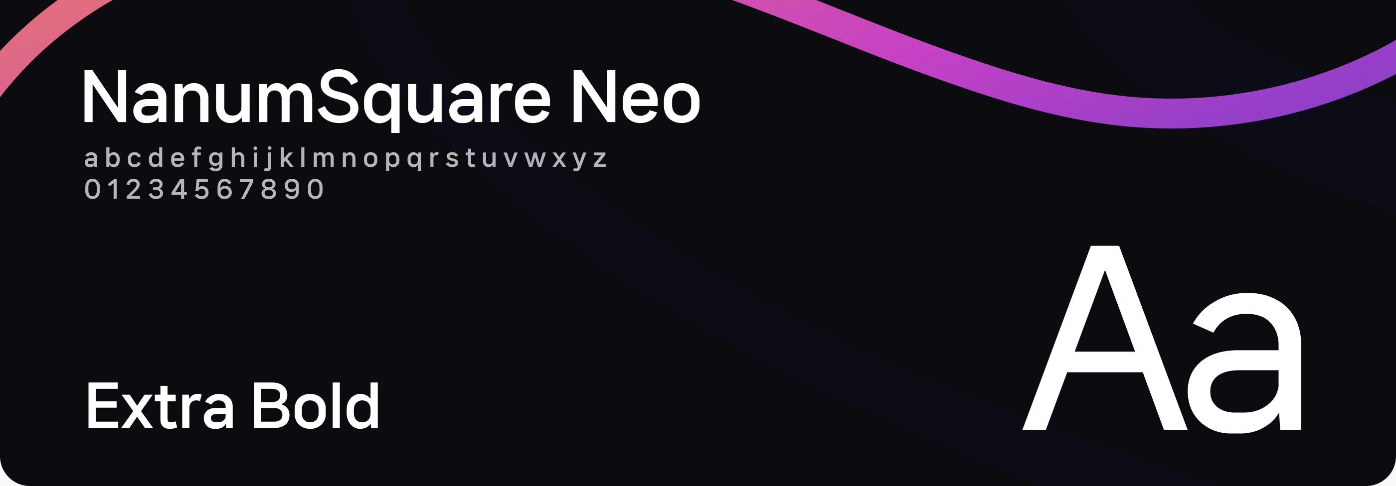
Typography was chosen to maintain legibility and confidence — pairing a modern sans-serif with a rounded display font for warmth.
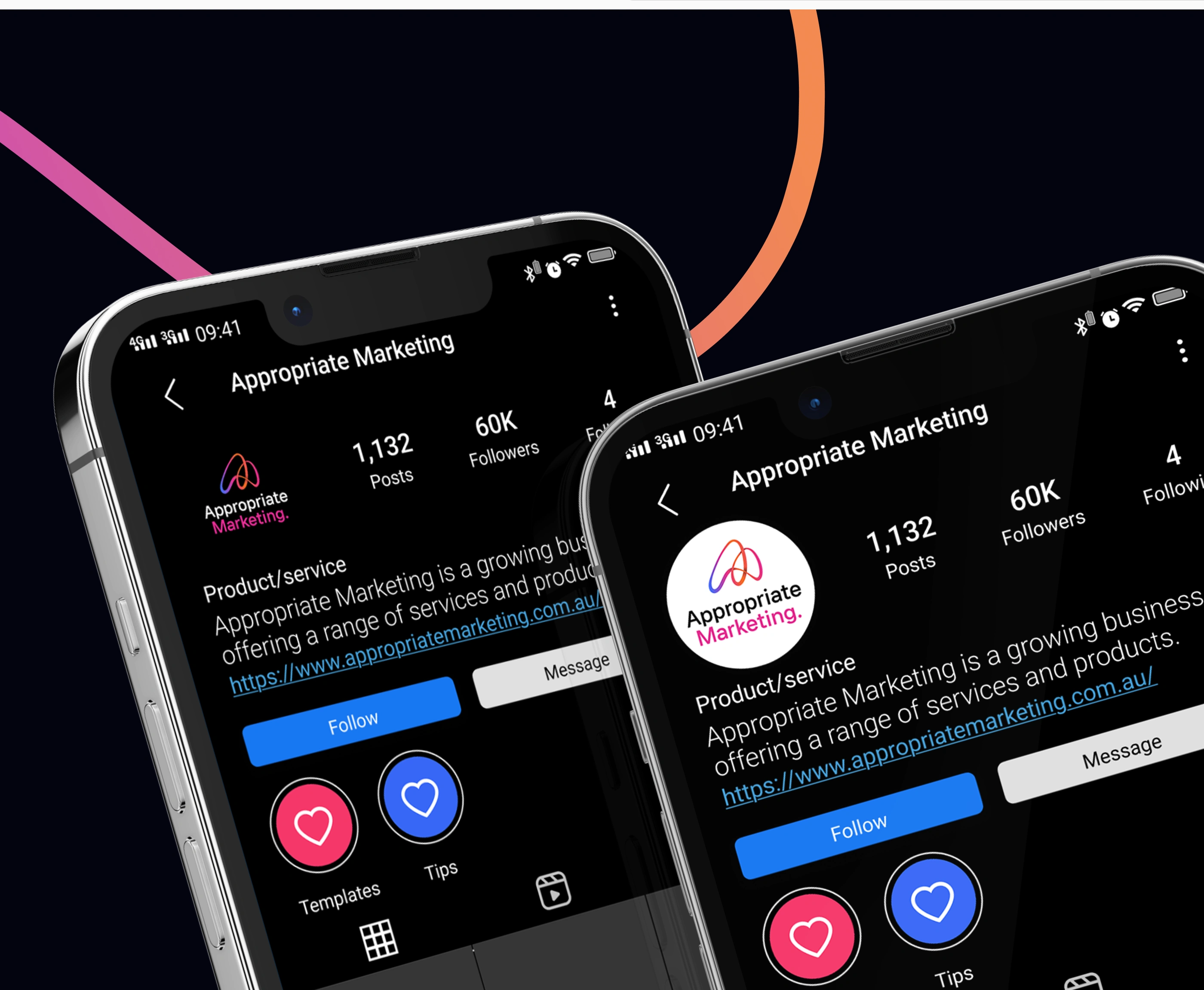
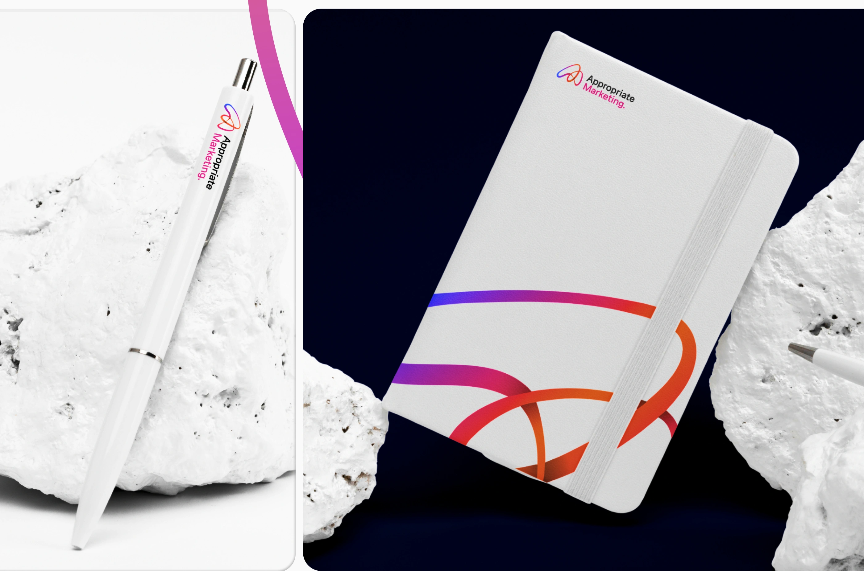
Color System
A gradient palette of violet and magenta reflects energy, creativity, and digital innovation — contrasted with deep neutrals for professionalism.
Visual Language
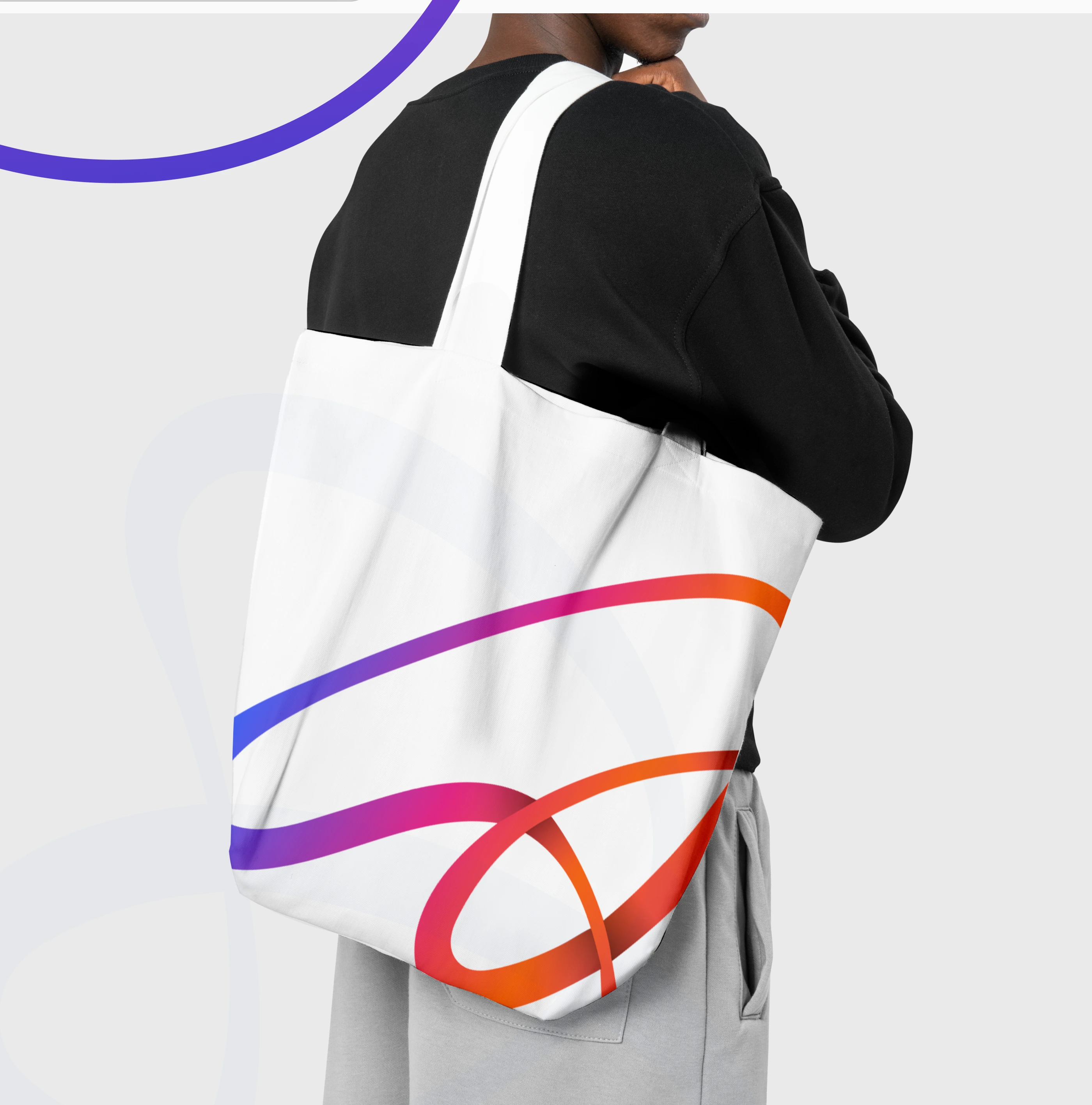
We introduced motion-inspired graphic elements — curved lines and wave forms — representing dynamic growth and connection in digital networks.
Applications
The identity was applied across:
Marketing materials (pitch decks, digital ads, social templates)
Internal collateral (business cards, email signatures, brand stationery)
Website & landing pages for lead generation campaigns
5. Outcome & Impact
✅ A strong and scalable identity system consistent across all digital touchpoints.
✅ Increased brand recognition and engagement on marketing channels.
✅ A visual foundation supporting Appropriate Team’s future service expansion into digital products and SaaS.
“Our goal was to create a brand that not only looks credible but also communicates measurable growth — visually, emotionally, and strategically.”
6. Deliverables
Brand Identity System (Logo, Color, Typography)
Visual Language & Key Visuals
Marketing Collateral Design
Brand Guidelines Document
Like this project
Posted Apr 29, 2025
Designed a modern identity that bridges creativity and technology, empowering Appropriate Marketing’s digital presence.
Likes
1
Views
24
Timeline
Dec 28, 2024 - Ongoing
Clients
Appropriate Marketing