Built with Framer
Rareform — Concierge Health Platform Landing Page

Anush | Foundrline
Verified


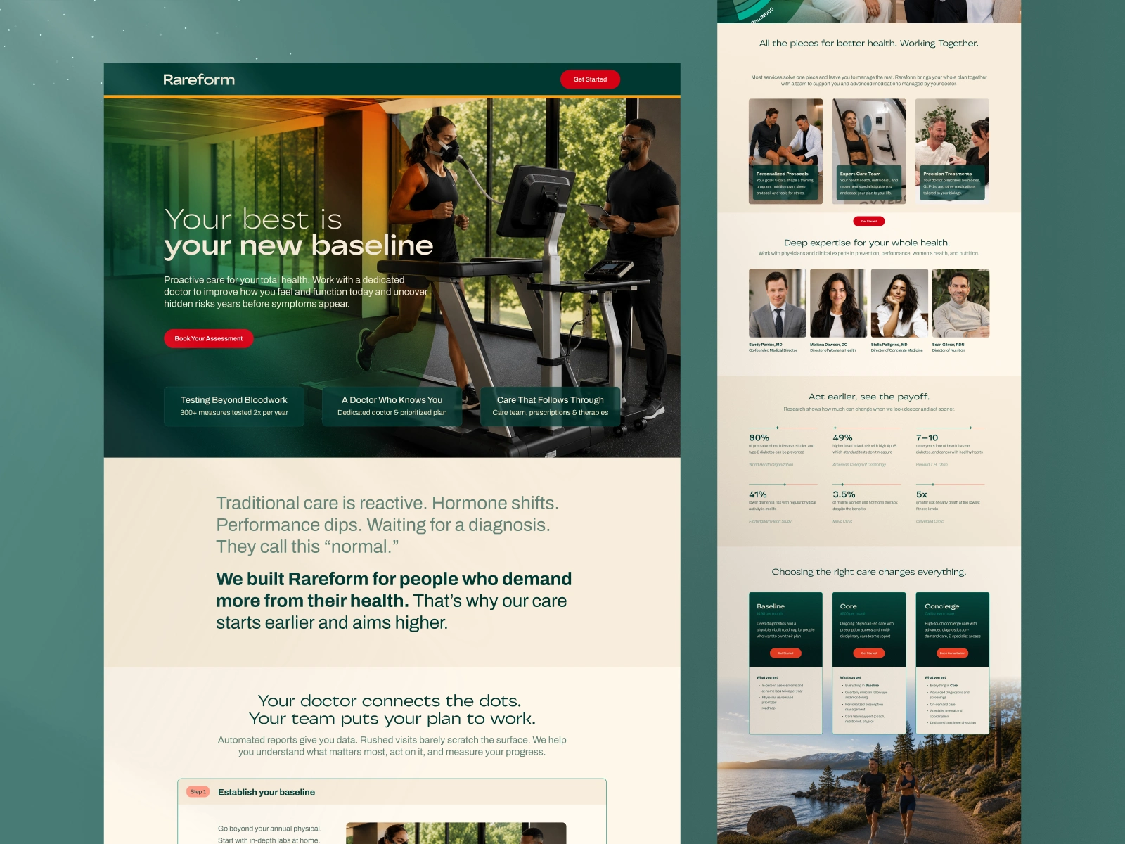
HEALTHTECH · FRAMER · 2-WEEK SPRINT
Rareform — Concierge Health Platform
A single landing page that positions premium healthcare as a
performance system, designed and built in Framer in under two weeks.
Project Snapshot
Sprint: Mini Sprint, under 2 weeks, brief to live
Platform: Framer
Scope: Brand direction · Messaging architecture · UI/UX design · Framer development · Responsive QA
Industry: Healthtech / Concierge Health / Direct-to-Consumer (DTC Health)
Deliverable: Single landing page, live in Framer
If you're building something similar
If you have a product or service that sits in a crowded, visually conventional market, health, finance, legal, professional services, and you need a website that looks like neither the incumbents nor the generic alternatives, this is the kind of problem Foundrline is built for.
Rareform came to us knowing what they were not: not a hospital website, not a wellness brand. They needed to occupy the narrow, credible territory between the two, and they needed it built fast, because a launch window doesn't wait for a six-week agency timeline.
If you're a founder, marketer, or business owner who needs a high-quality landing page that positions you clearly against the market, without looking like everyone else in your category, a Mini Sprint is likely the right model.
Your website is not a brochure. It is the first time a potential customer decides whether you're worth their attention. Getting that wrong is expensive. Getting it right quickly is possible.
The Problem We Solved
Premium healthcare has almost no credible visual language to borrow from. Clinical looks like a hospital; cold,transactional, designed for compliance rather than trust. Warm looks like a wellness brand; vague, atmospheric, designed for aspiration rather than outcomes.
Rareform is neither. Their patients are high-achievers who want a doctor who treats the person, not the symptom. Proactive management rather than reactive triage. That story needed a design language that communicated both clinical authority and personal warmth in the same breath, without either cancelling the other out.
The additional constraint: under two weeks, start to finish, brief to live.
What Was Built — and What It Can Do for a Business Like Yours
A visual identity that occupies a specific position
Warm off-white cream base, forest green accent, real photography throughout. Human imagery. No clinical white and blue. The palette communicates 'premium and human' without a single word, which matters because visitors decide whether to keep reading before they've processed your first headline. If the visual register feels wrong for your buyer, the copy never gets a chance.
For your business: if your visual language doesn't immediately signal 'this is for someone like me' to your ideal buyer, you're losing prospects before the conversation starts. A design system built around your buyer's trust framework changes that.
Messaging that sells by naming the alternative
'Traditional care is reactive, formulaic, triage. They treat the symptom. We treat the person.' Rareform's most persuasive line is not about Rareform, it's about what the alternative delivers. Anti-positioning rather than self-positioning. Visitors who recognise themselves in that description have already been given a reason to act.
For your business: if your category has a status quo that your buyers are frustrated with, naming it precisely is more powerful than any claim you can make about yourself. Most businesses don't do this because it feels risky. It works because it's honest.
A page structure built around how buyers actually decide
Hero → philosophy → conditions (specific recognition moments for different buyer segments) → named practitioners → proof stats → care pathways → health diagnostic CTA → FAQ → consultation booking.
Proof arrives before the midpoint. The conversion ask is soft before it's direct. Every section earns the next one rather than existing in parallel.
For your business: most landing pages are structured around what the business wants to say, not around the sequence of belief a buyer needs to build before they act. Getting the sequence right is the single highest-leverage change most businesses can make to their conversion rate.
Two-week delivery in Framer
Full responsive build, parallel design and development, live within the Mini Sprint. For businesses with a launch window, an investor meeting, or a campaign that can't wait, two weeks to a high-quality live page is the right model.
See the full case study
The full write-up covers the diagnostic, every design decision and the reasoning behind it, the page architecture, and what this approach reveals about landing page design in high-trust consumer categories.
Read the full Rareform case study
If your business needs a landing page that positions you clearly and converts the right visitors, book a sprint diagnostic. It's free, takes thirty minutes, and tells you exactly what your site needs and whether a sprint is the right model to get there.

Like this project
What the client had to say
This is my second project with Anush and will work with him again in the future. Great execution of our site and attention to detail. Turned around the project very quickly

Andrew MacDonald
Aug 14, 2026, Client
Posted Aug 10, 2026
It positions premium healthcare as a performance system, not a service. Designed and built in Framer in under two weeks, from brand direction to live build.
Likes
0
Views
14
Timeline
Aug 3, 2026 - Aug 13, 2026
Clients
Dialer.io