Redesigning ServCraft to reduce churn and increase conversions
Introduction & Summary
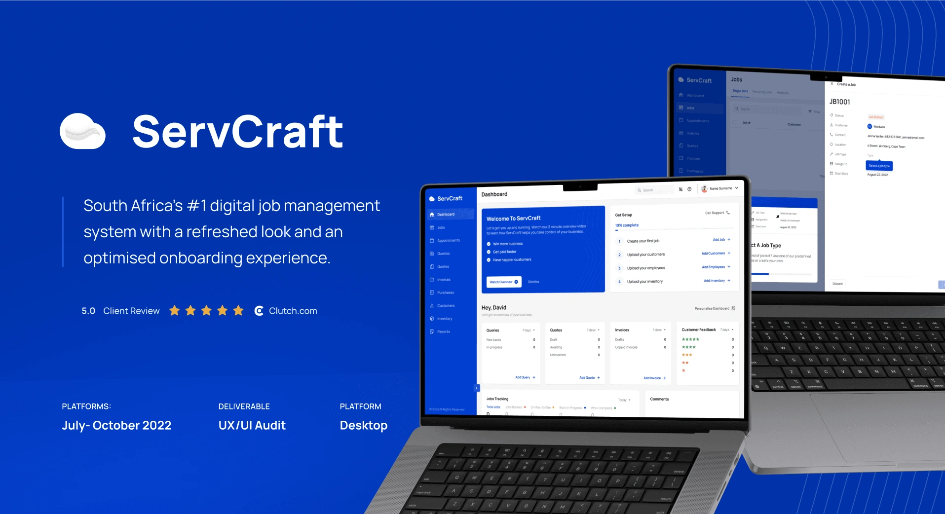
ServCraft is a job card, payments, scheduling, employee and inventory management system that helps installation businesses win more business in order to get paid faster and have happier customers. They had built out a robust feature set, yet were struggling to convert users on a free trial into paying customers. ServCraft come to Specno to diagnose their shortcomings and solve them.
We conducted a thorough Product Audit, identifying that low feature discovery, poor application of onboarding practices and an overwhelming navigational interface were the core issues. We redesigned the onboarding experience as well as overhauled the system's navigation & UI, employing staggered feature introduction, guided interactive tutorials, and an in-product help section, resulting in a much more intuitive and less overwhelming user experience.
My Role
I was lead designer and was supported by a supplementary designer. My responsibilities included working closely with stakeholders to synthesise user requirements, conducting user research, communicating audit findings and consequent recommendations, managing timelines & expectations, leading the end-to-end design process, and working closely with the client's development team to optimise the designs for implementation.
Results
Massive increases in both conversion rates and user retention rates.
A large decrease in time needed for customers to onboard onto the system.
A fully fleshed out design system that has allowed their development team to scale the product without the need for extra design time.
Product Audit
Being the first of two main project phases, our aim with the product audit was to develop a deep understanding of the current system and their users, as well as gather both qualitative and quantitative data that could be used to objectively diagnose where and why the issues were occurring. We identified that low feature discovery, poor application of onboarding practices and an overwhelming navigational interface were the core issues.
These findings were compiled and summarised and presented to the client, ensuring that all stakeholders were well-informed on the findings and the steps required to address them.
Product Discovery
We screenshotted their entire system, allowing us to develop a deep understanding for how it currently functions and have reference screens to compare against, making sure we didn't miss a feature or element.
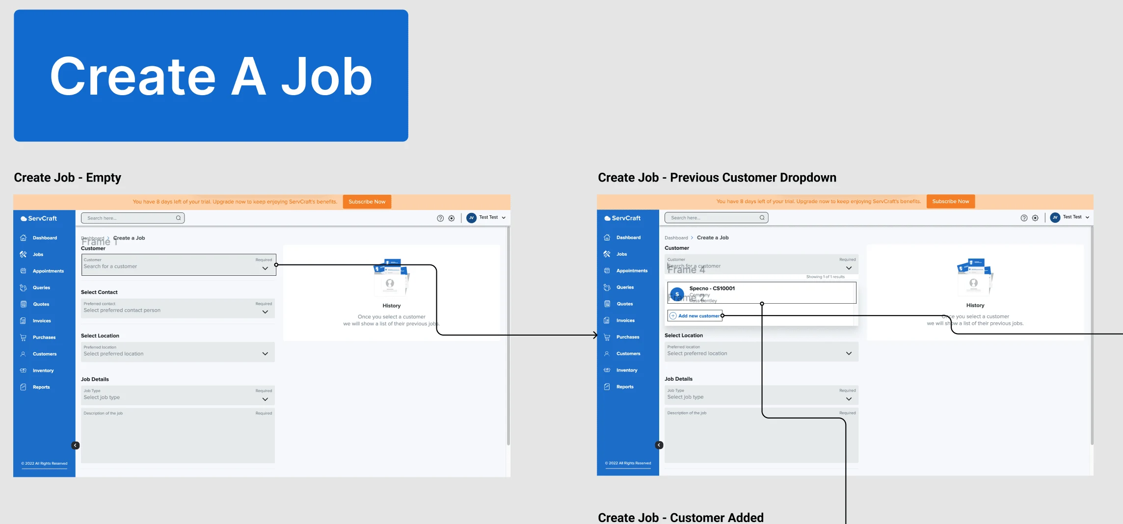
Screenshots of their existing job card.
Interviews
Stakeholders
We conducted interviews/workshops with the ServCraft team to better understand their business goals, development limitations, and hear their hypotheses for where users were dropping off.
Users
We conducted six interviews with - 4 with converted users and 2 with non-converted users. We summarised these interviews and were already identifying where and why drop-offs were happening.
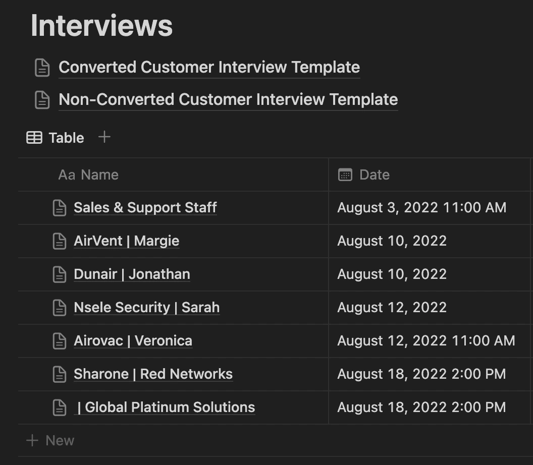
We documented all of our interviews in Notion
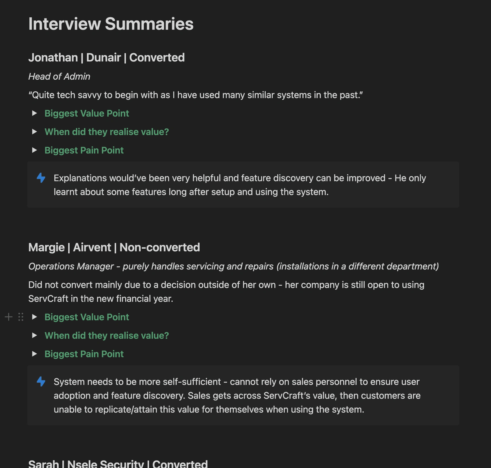
As there was a ton of data gathered from each interview, we summarised the key points to make identifying patterns easier.
Competitor Analysis
We identified key flows in the system (primarily around onboarding) then compared ServCraft with their competitors. We found that ServCraft had the largest feature set, yet them and their competitors had poor onboarding practices and disappointing user experiences. To help us illustrate where ServCraft was at compared to industry standards, we also compared the same patterns with market-leading companies in similar industries.

A summary of our competitor analysis. There were several patterns within each of the main categories.
Personas & User Journey Mapping
Through our interviews and research, we developed three personas that represented their average users. We then plotted their first-time experience using ServCraft in a journey map, highlighting key pain points and documenting these examples as we went. We also made use of the Psych Framework, which allowed us to measure the user's emotional experience at every touch point. This was critical in highlighting where users got the most frustrated and mapping these frustrations to the relevant parts of the system.
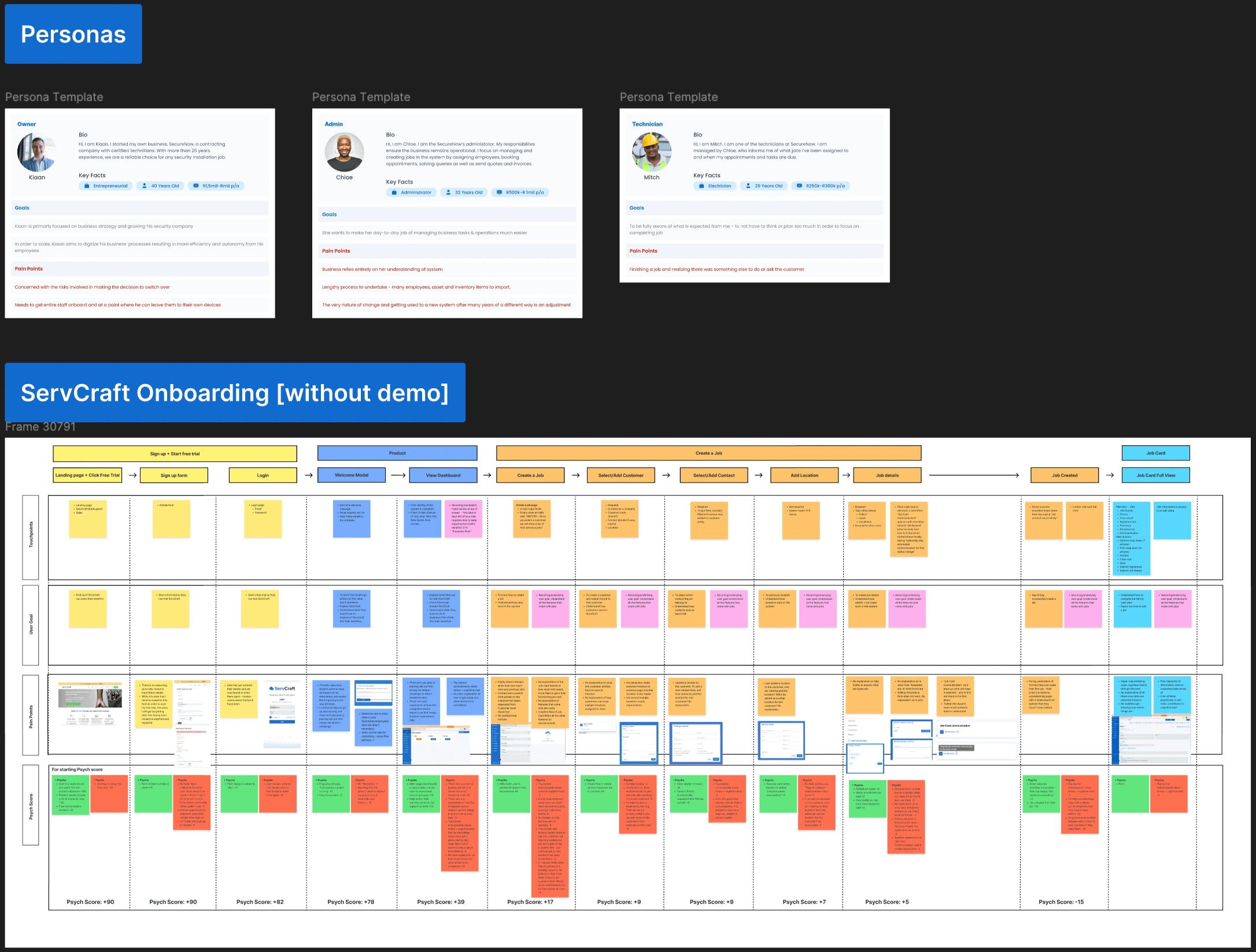
Heuristic Analysis
We evaluated the system against the 10 usability heuristics defined by Niels & Norman. This gave us further evidence for which areas in the system were proving problematic.
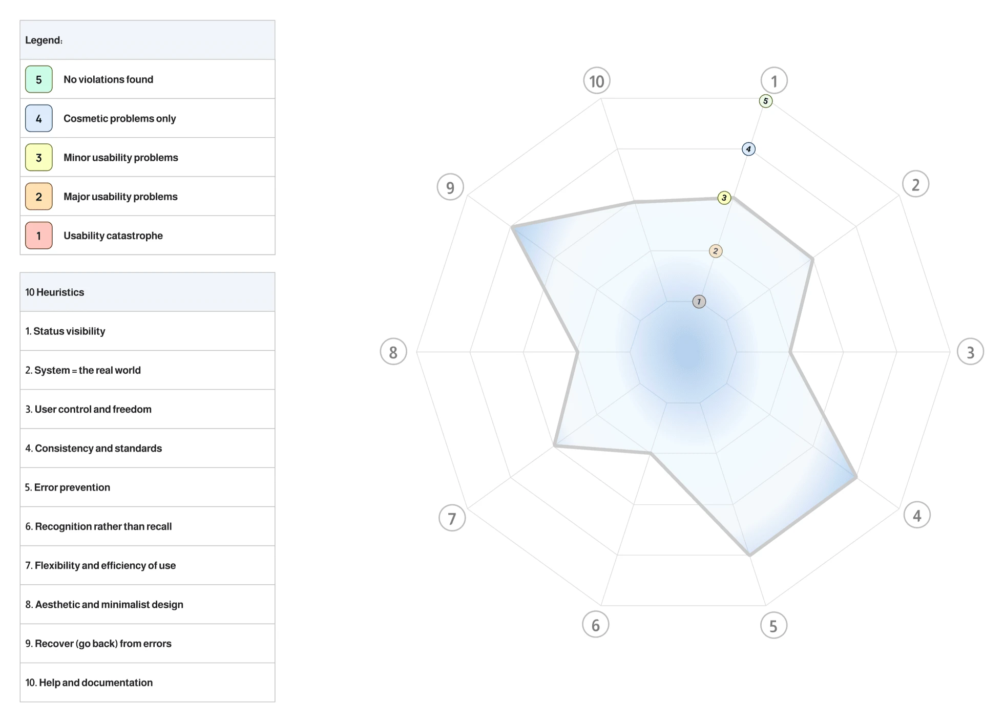
We plotted the final scores for each heuristic into a matrix to give us and the client a visual on how the system scored.
Redesign
Having established a clear blueprint for how to improve the system, we embarked on our redesign.
Phases
Layout & Mapping
This involved brainstorming sessions to ideate how to tackle the overall navigation, onboarding, and how each feature should be designed. We then created low-fidelity wireframes, ensuring we knew what screens we would need and what information would go on them.
Wireframing
We created relatively high fidelity wireframes, creating components for our design system as we designed. We kept these monotone and used a basic font to avoid getting distracted from the underlying UX of the system by UI elements. The full wireframes were prototyped to assist with presenting to the client and the external development team.
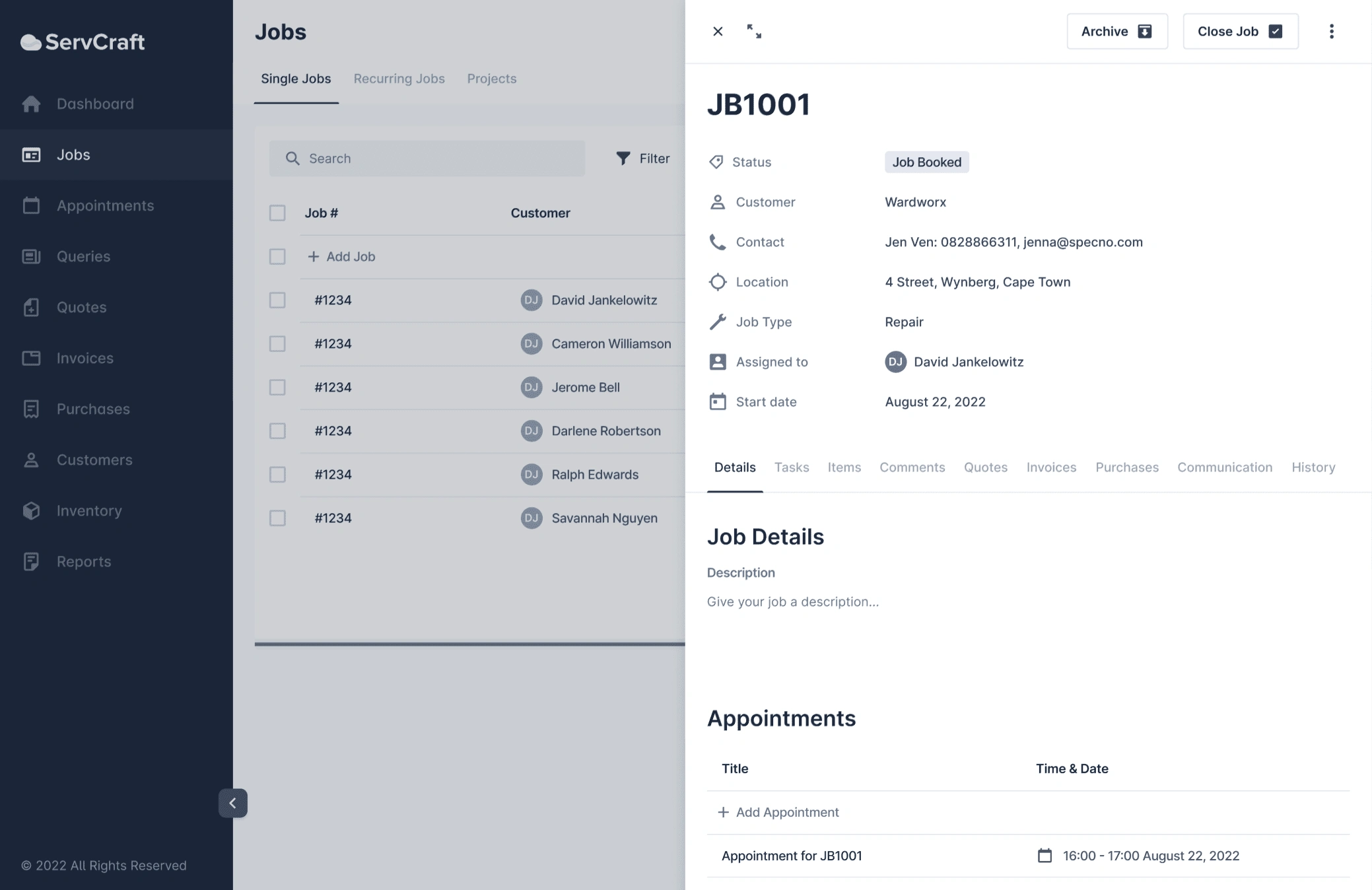
Job card wireframes, with the "Jobs" destination in the background.
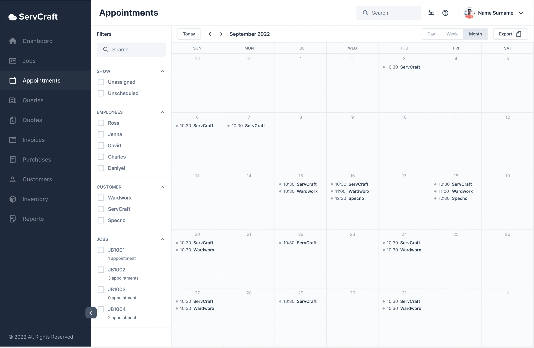
The "Appointments" destination wireframes.
High Fidelity Designs
We created a style that included a slight rebrand, got sign off from the client, then rolled this style out to the system. The time this took was greatly decreased by correct use of components and styles during wireframing, allowing us to easily apply the fonts, colours and graphics to the system.
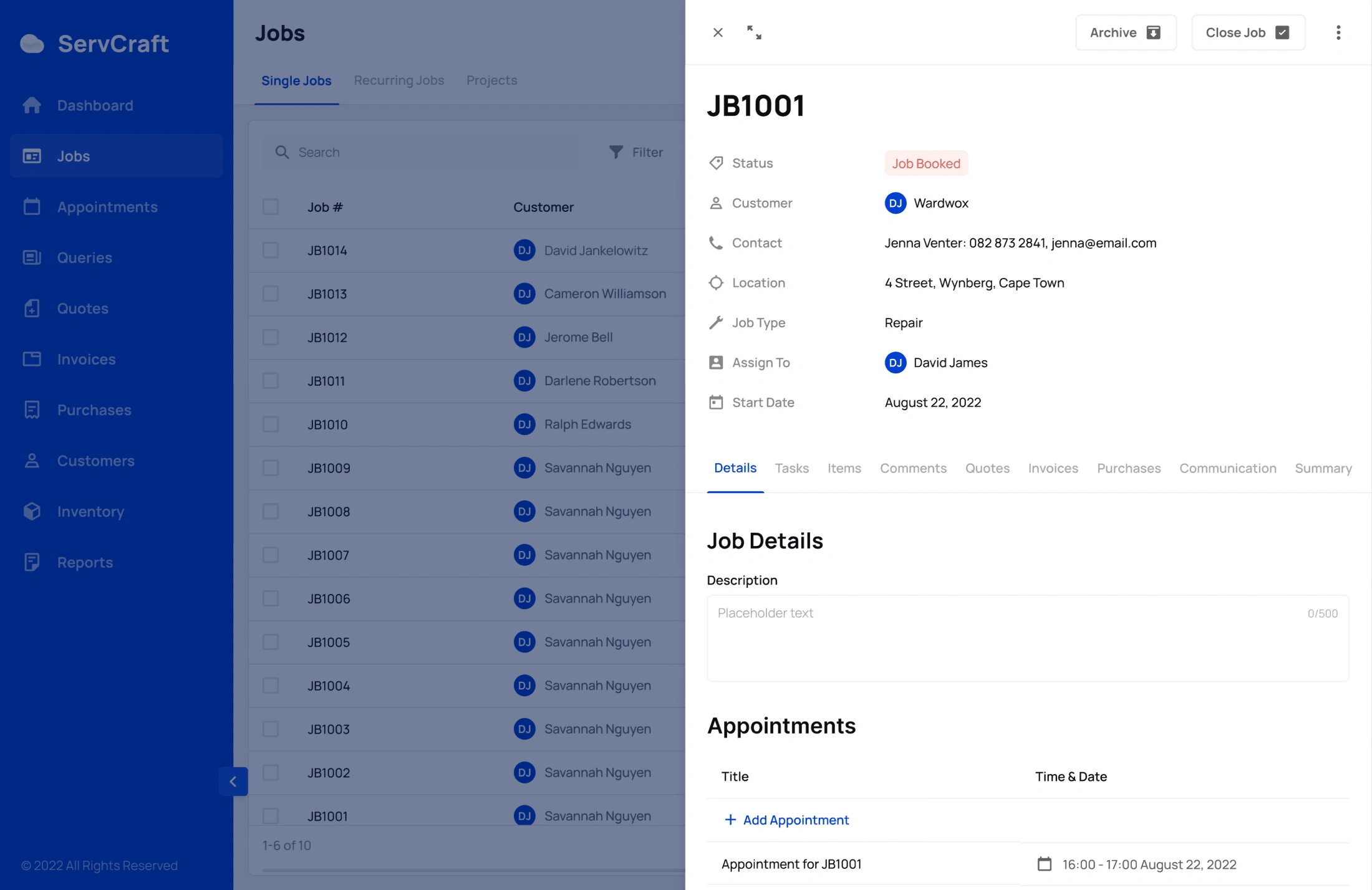
High fidelity version of the job card with the "Jobs" destination in the background.
Final Designs
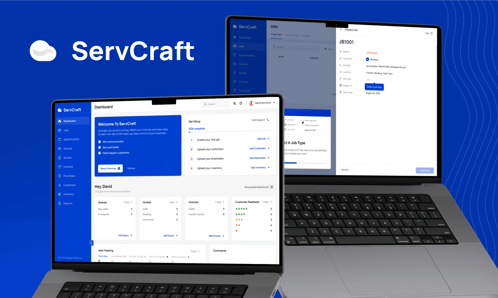
Dashboard & guided onboarding when a user creates their first job
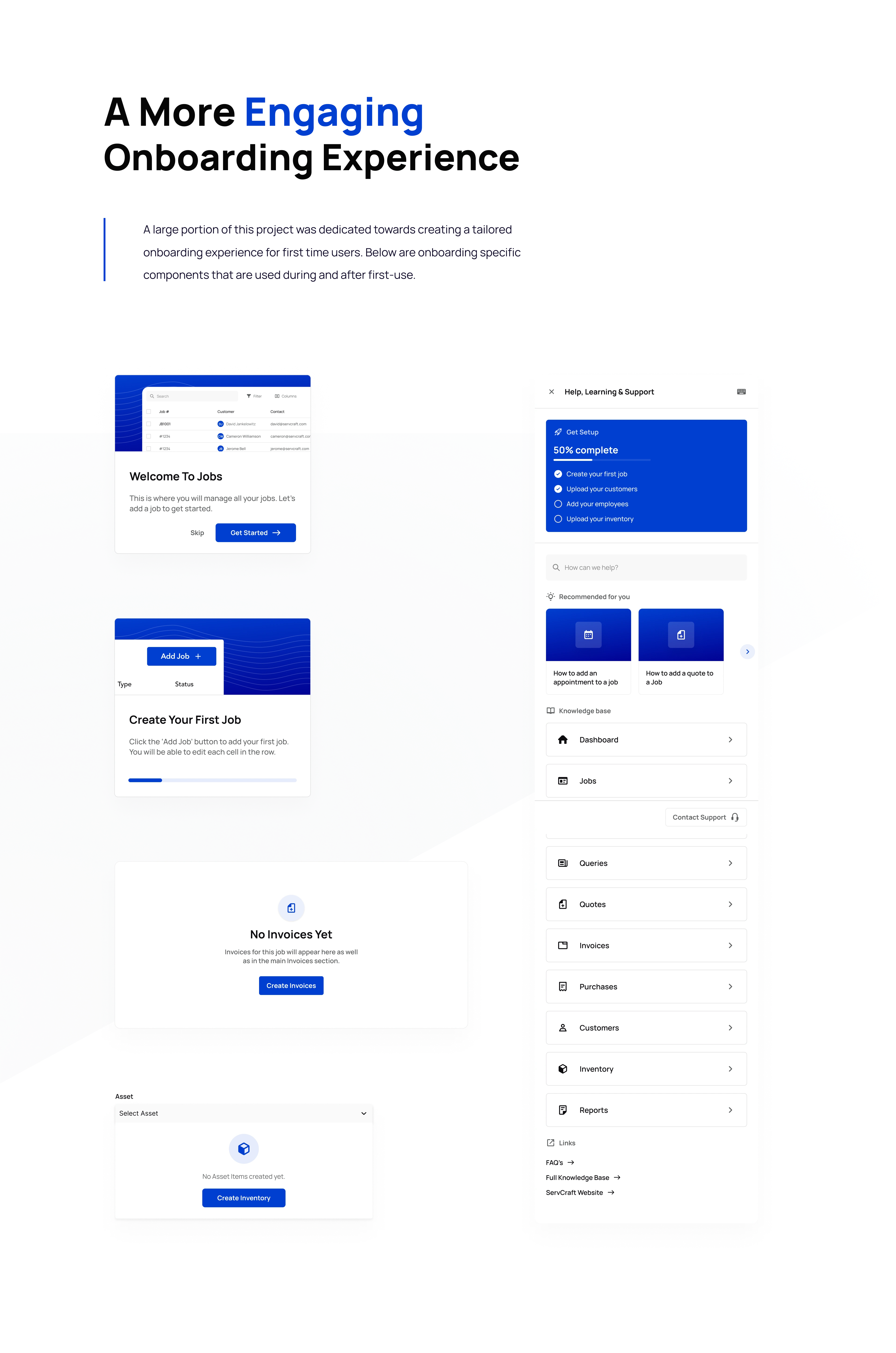
Onboarding components

A few of the components created for the system.
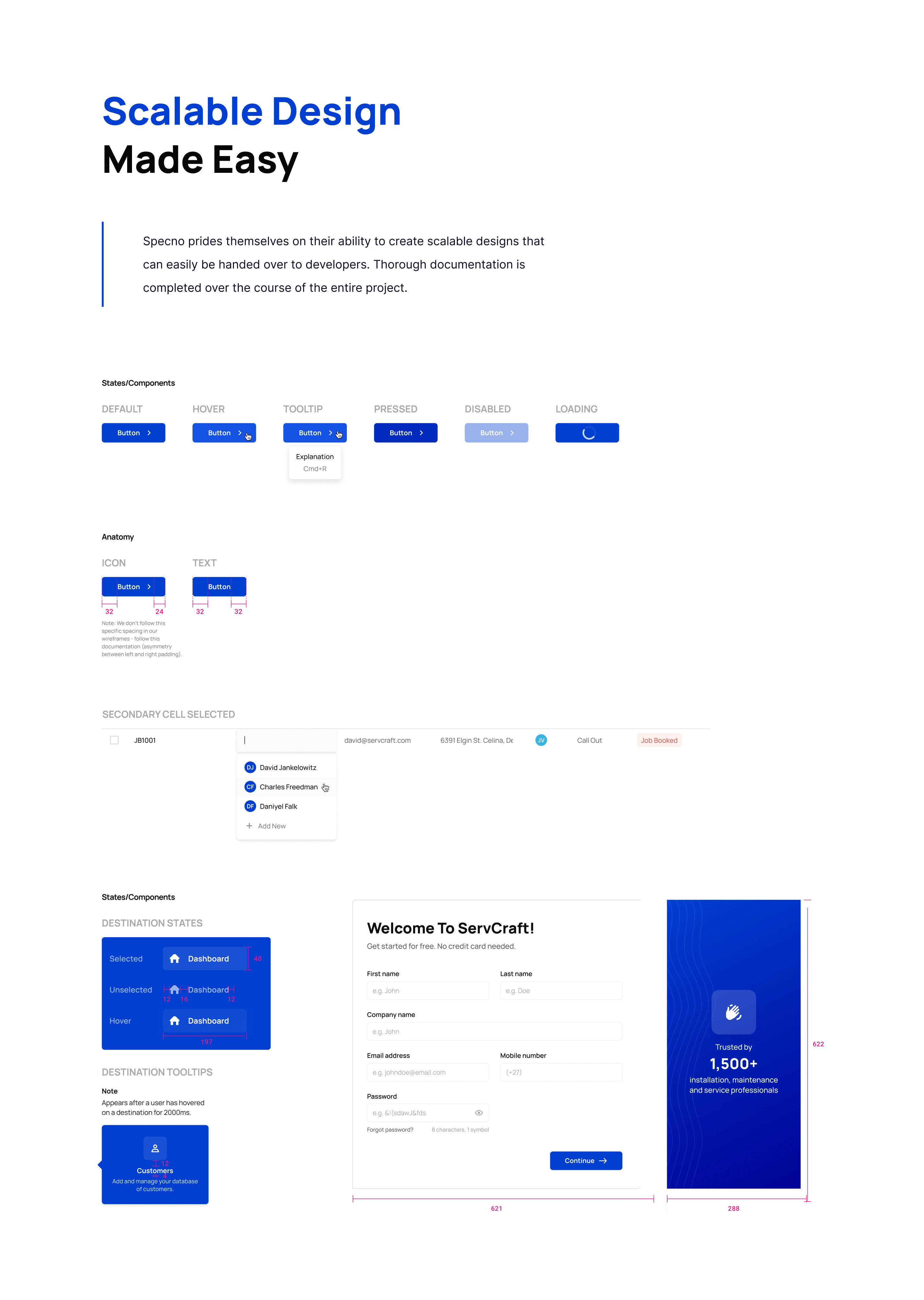
A snippet of the scalable design system created.
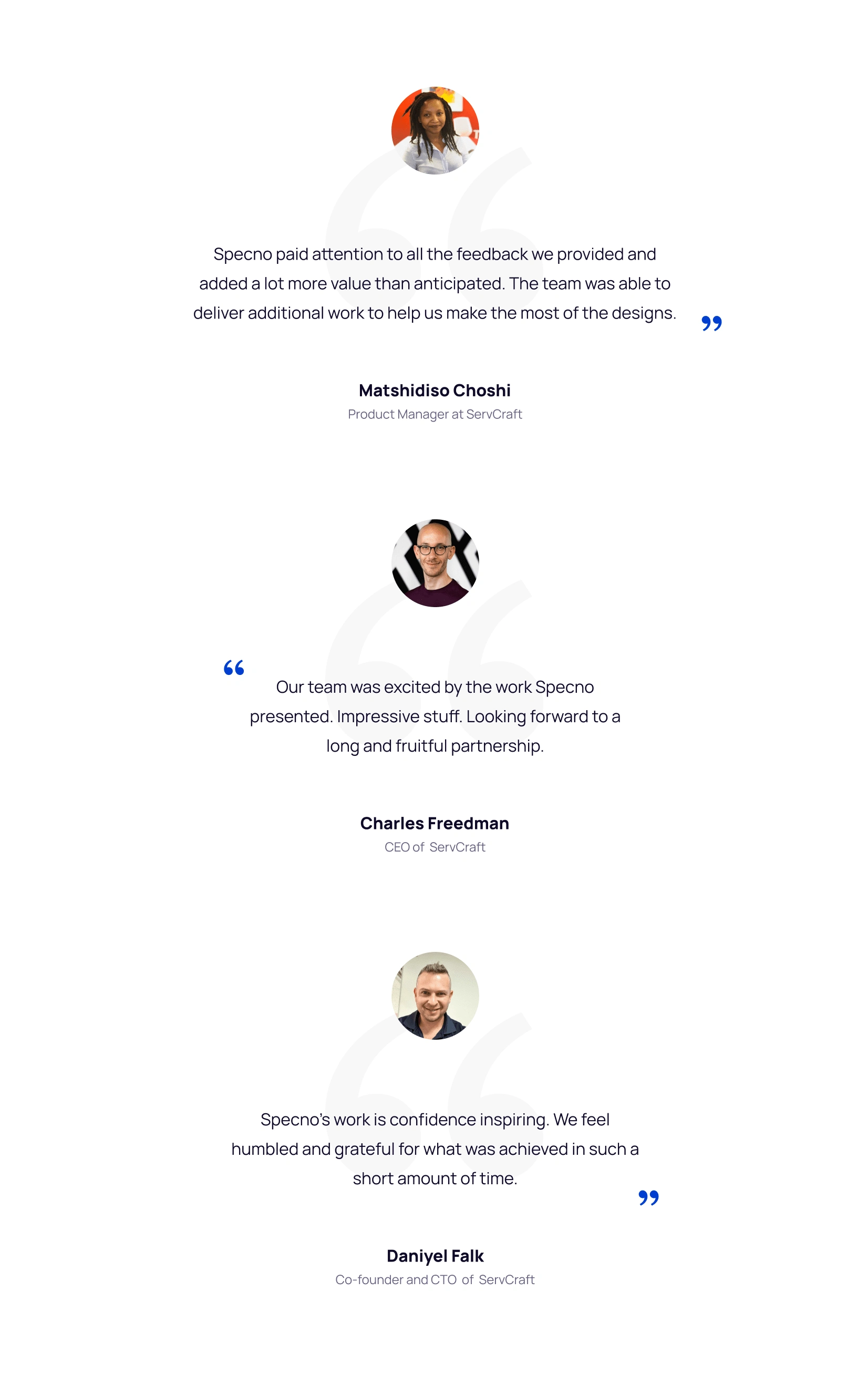
Testimonials
Like this project
Posted Jul 2, 2024
Redesigned ServCraft to reduce churn and boost conversions with improved onboarding, navigation, and UI for a seamless user experience.
Likes
0
Views
76

