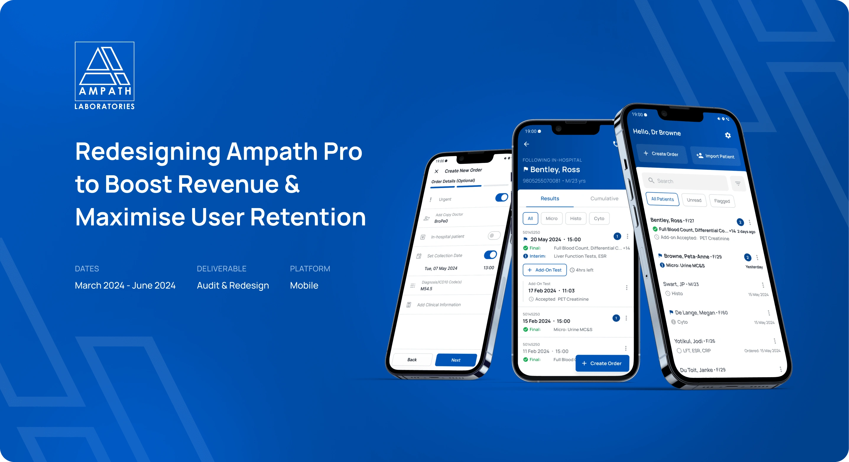
Redesigning Ampath to boost revenue and maximise user retention
Introduction & SummaryMy RoleResultsProcess Overview1 | Product Audit2 | RedesignFindings & SolutionsExcessive app notifications were highly frustrating for doctors, leading many to disable them or switch to a competitor.Poor navigation practices were leading to low feature usage.Creating a new order takes more effort than the paper request form.
Introduction & Summary
Ampath is one of the largest pathology laboratories in South Africa. Their Ampath Pro app is used by thousands of doctors to view lab results, order tests, and access patient information. Facing strong competition from PathCare and Lancet, Ampath recognized the need for an improved mobile app that would draw doctors to their services and keep them using the platform. They observed a decline in user retention and an increase in complaints about app usability directed to their marketing team. As a result, Ampath approached Specno for an audit and redesign of their app, with a significant focus on making the doctors who use the app central to the project.
My Role
I was lead designer and worked with a supplementary designer, scrum master, product owner, frontend developer, external developers & a consultant doctor. My responsibilities included working closely with stakeholders to synthesise user requirements, conducting user research, communicating audit findings and consequent recommendations, managing timelines & expectations, leading the end-to-end redesign process, collaborating closely with Dr. Peta-Anne Browne throughout the project and working with the client's & our internal development team to optimize the designs for implementation.
Results
+ A total of 145 doctors were engaged through interviews, surveys, a WhatsApp group, and usability tests, ensuring that the primary users were integral to the project at every stage.
+ A redesigned app with massively improved navigation, new UI, optimised notification strategy, and greatly improved usability of features, resulting in large increases in user satisfaction & engagement and a massive decrease in churn rate.
+ Designs optimised for development and continued design support during implementation. This included a scalable design system that Ampath will use on other projects as well.
Process Overview
To thoroughly understand the system, align with Ampath's business objectives, and identify issues, we conducted an in-depth product audit. We then redesigned the app, continuously performing usability tests to refine the designs and ensure doctors were satisfied with the results. The processes & deliverables are outlined below:
1 | Product Audit
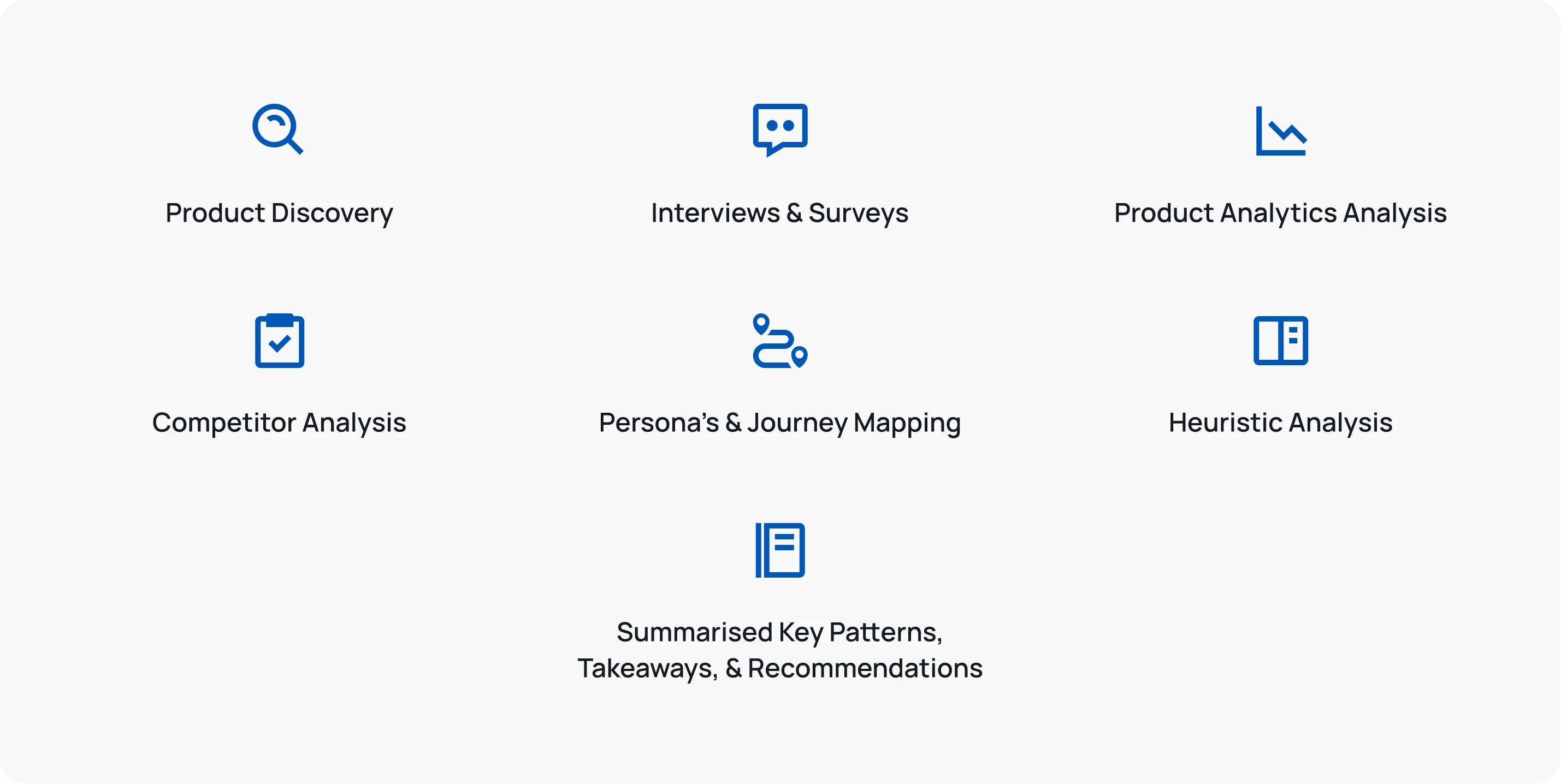
We conducted a comprehensive product audit, which included competitor analysis, a thorough review and critique of the existing system, and numerous interviews and surveys with doctors. We conducted 19 discovery interviews, and had 85 survey responses. This phase included:
Product Discovery (stakeholder workshops, internal survey & system mapping)
Interviews & Surveys
Product Analytics Analysis (Google Analytics, Apple App Store, Internal Data)
Competitor Analysis
Persona's & Journey Mapping
Heuristic Analysis
Summarising of Key Patterns, Takeaways, & Recommendations
2 | Redesign
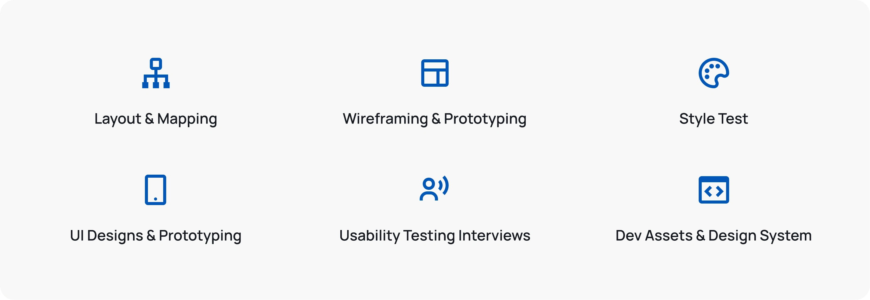
We then redesigned the app, continuously performing usability tests to refine the designs and ensure doctors were satisfied with the results. This phase included:
Layout & Mapping (whiteboard sessions & low fidelity wireframing)
Wireframing & Prototyping
Style Test
High fidelity UI Designs & Prototyping
Usability Testing Interviews
Development Assets & Design System
Findings & Solutions
Excessive app notifications were highly frustrating for doctors, leading many to disable them or switch to a competitor.
The previous app sent a push notification for every update. For doctors ordering multiple tests a day, this caused an overwhelm of non-urgent notifications - resulting in many doctors turning notifications off (leading them to miss the critical updates as well) or moving to a competitor.
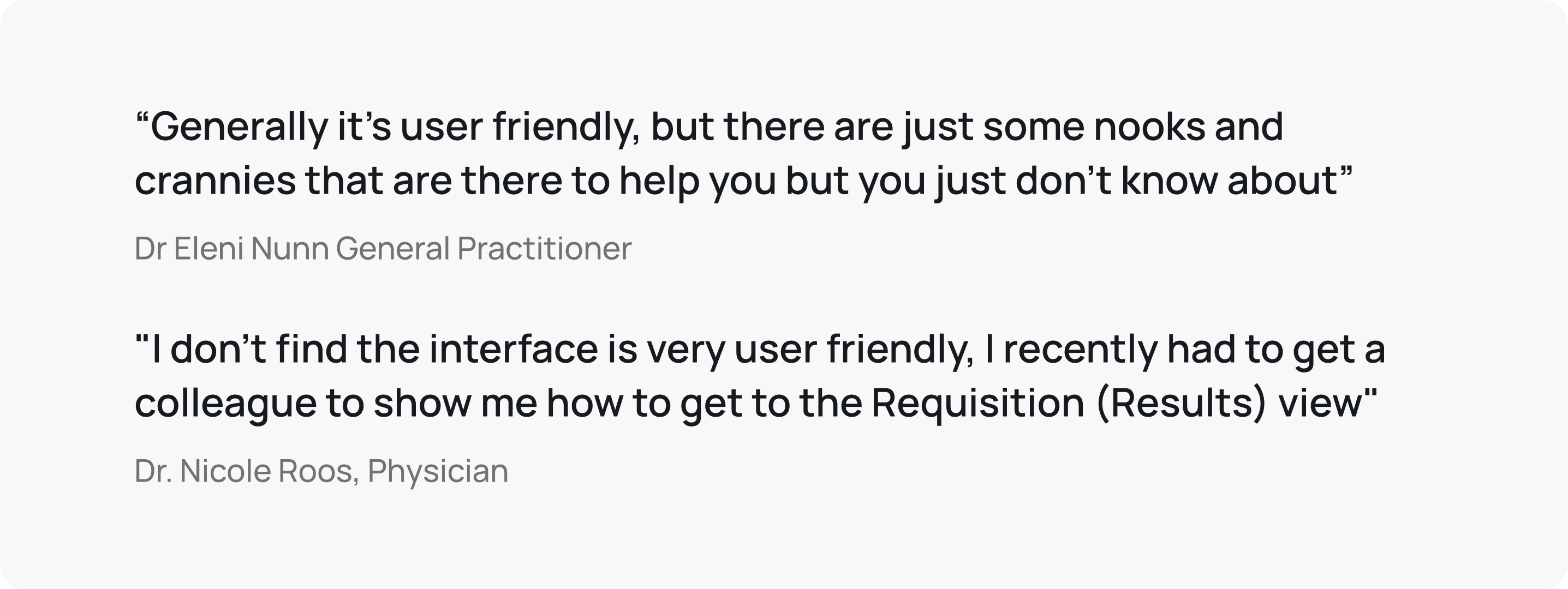
Interview quotes highlighting the frustrations doctors had with the overwhelming notifications.
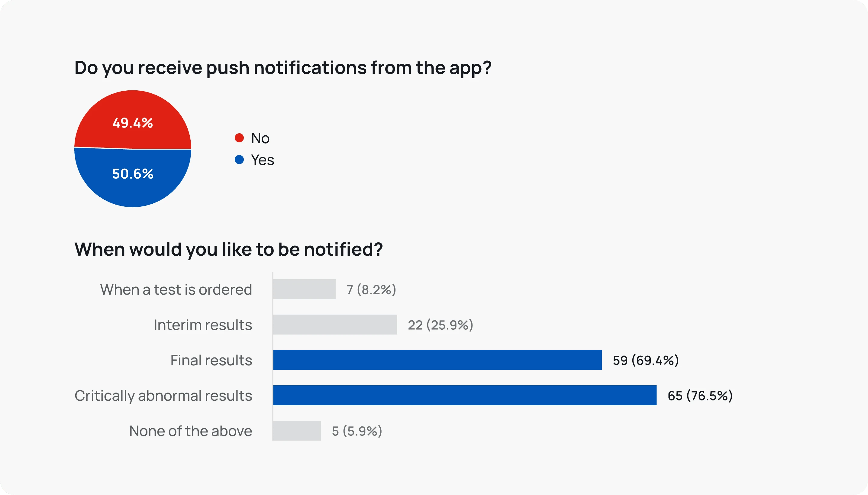
Survey responses showing that at least half of users had turned off notifications, and that the majority only wanted to be notified for Final and Critically Abnormal results
We identified three objectives:
Reduce notification quantity.
Give users more control.
Increase notification adoption.
The Solution
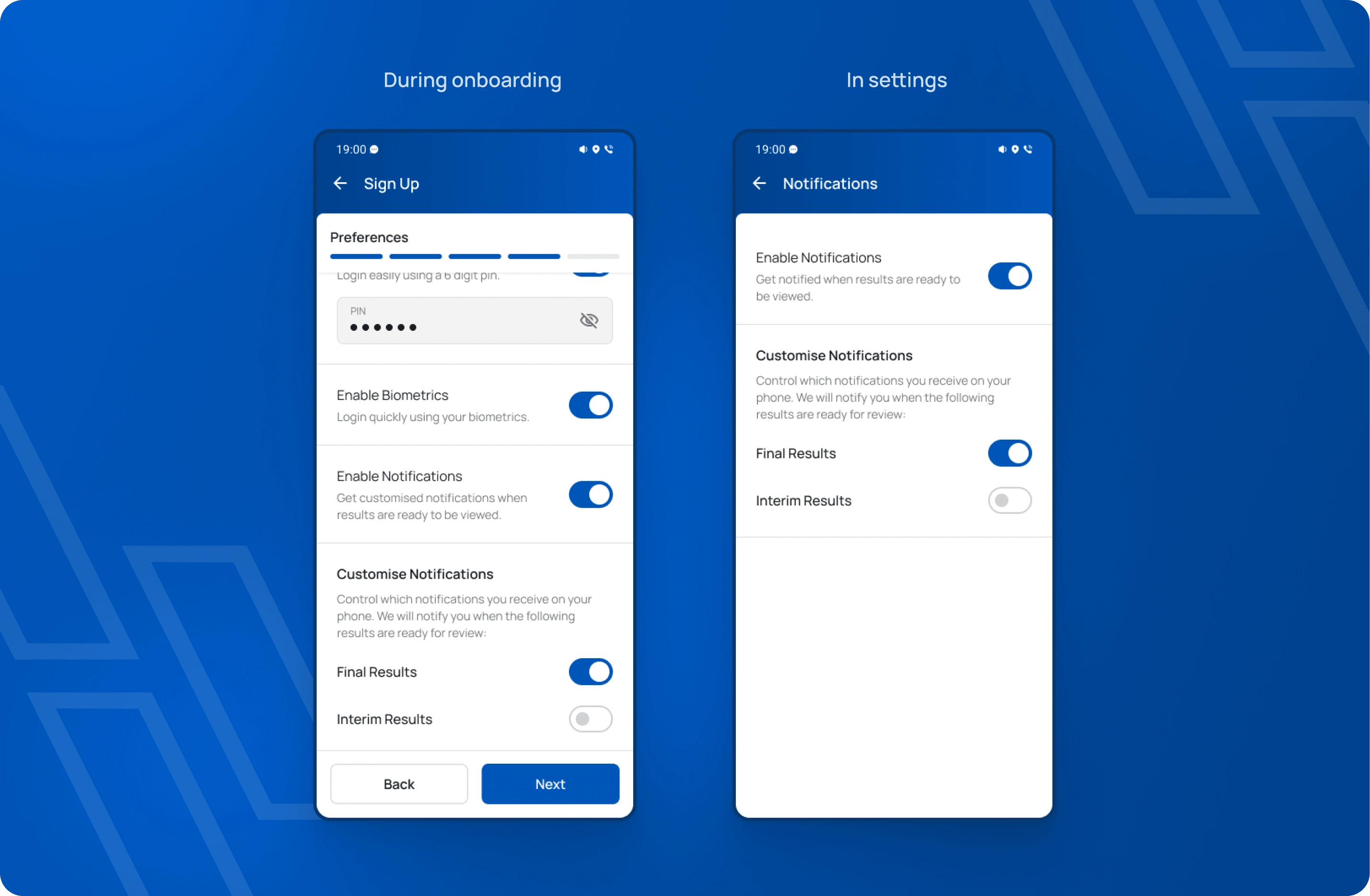
We introduced customizable notification preferences, enabling doctors to select which tests they want to receive notifications for. The result:
+ Increase in daily active users.
+ Increase in app engagement.
+ Large reduction in user dissatisfaction.
Poor navigation practices were leading to low feature usage.
The app had several navigation and feature discoverability issues, highlighted during our interviews, surveys and heuristic analysis.
Hidden Features: Destinations were hidden in a side menu, leading to many features being undiscovered, including the revenue-driving "Create Order" action.
Navigation Issues: Switching views from results to cumulative results required tapping the patient name, which is unintuitive and against standard mobile navigation practices.
Add-on Tests Visibility: The "Add-on Test" action was only available for 48 hours on a test without clear indication, causing users to miss it, negatively impacting Ampath's revenue.
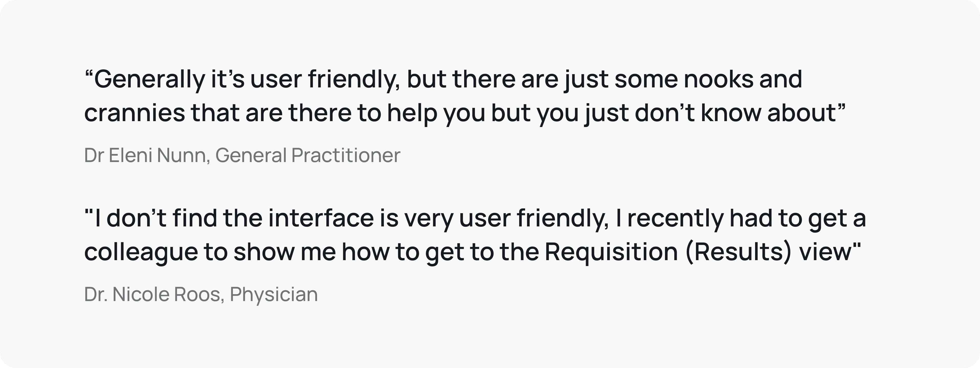
Interview quotes highlighting the frustrations doctors had with navigating the interface.
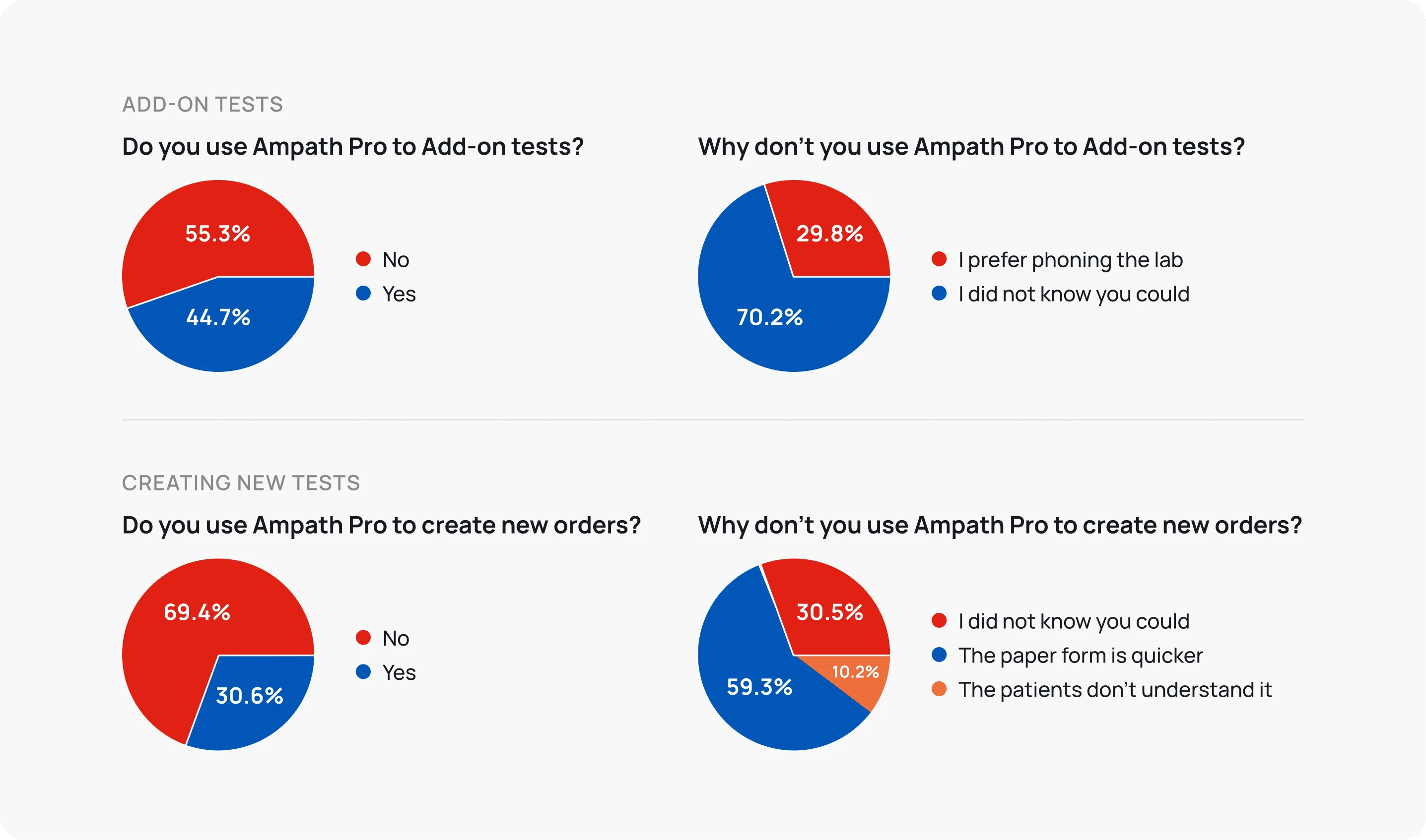
Survey responses showing the alarming amount of users that did not create new orders or order add-on tests.
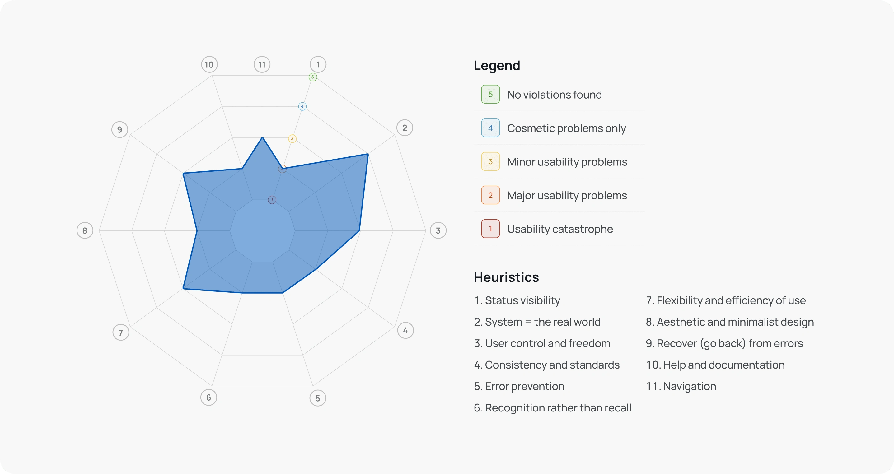
Our heuristic analysis scores in a matrix. We added a "Navigation" heuristic to help illustrate the issues to the client.
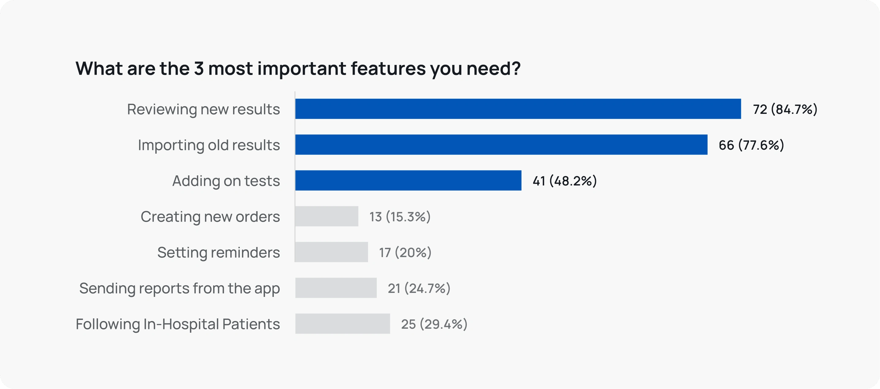
Feature prioritisation - our survey responses clearly pointed to 3 features being the most important.
We identified two objectives:
Simplify navigation.
Improve feature discoverability.
Place more focus on the 3 most requested features.
The Solution
We reworked the navigation from the ground up, aiming to create a one-page top destination that would allow doctors to immediately create new orders, import patients, and easily view their existing patients & results - matching what doctors had clearly asked for in our surveys and interviews. We included a clear status system & the ability for doctors to flag results or patients they needed to follow up on.
+ Increased discoverability, leading to higher feature usage.
+ Increase in new & add-on orders, resulting in an increase in revenue generation.
+ A large reduction in customer support calls.
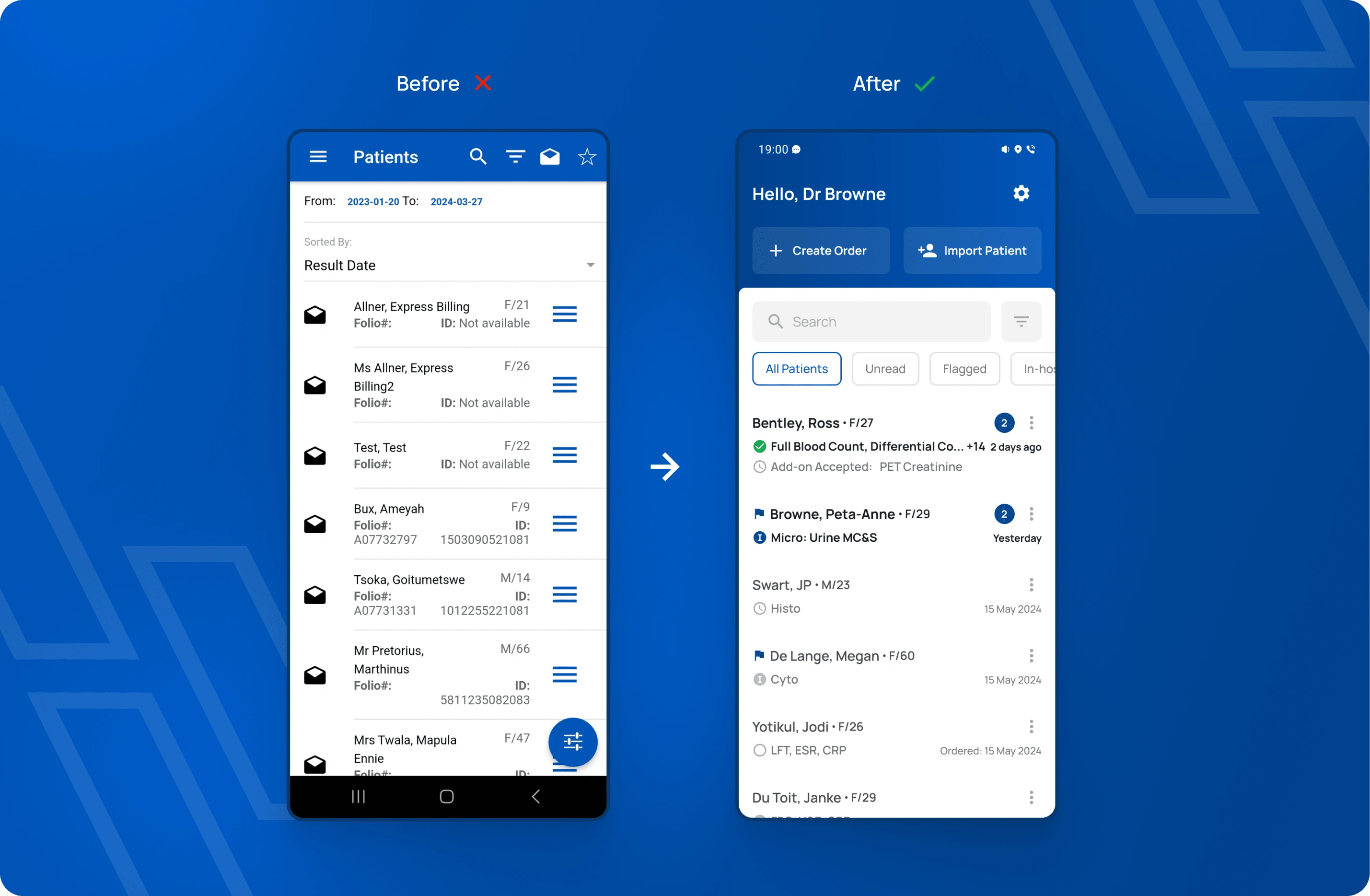
The redesigned Home screen.
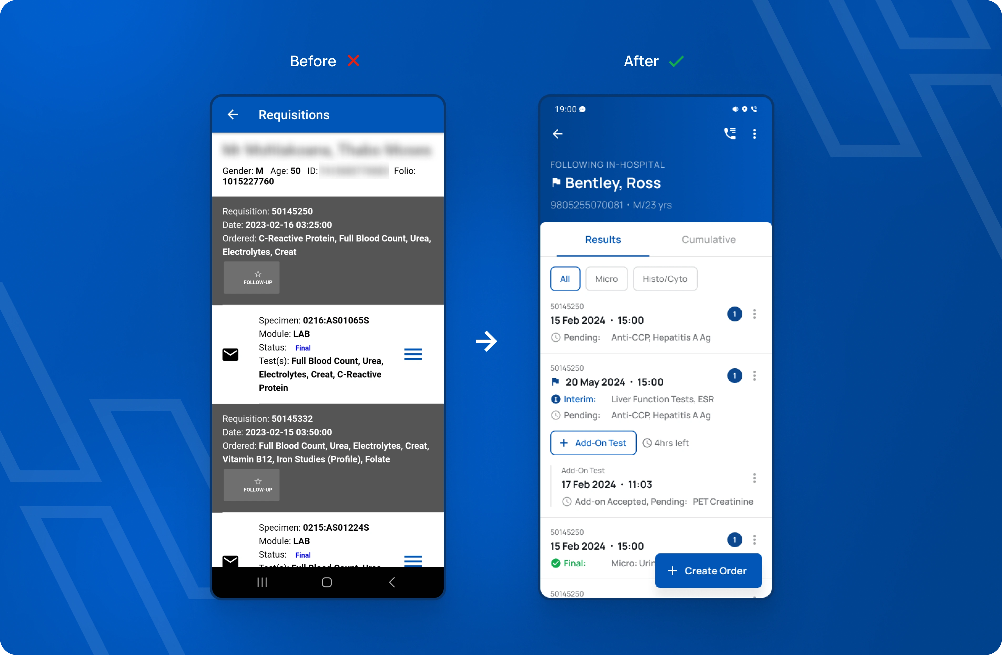
The redesigned Patient screen. The top header and the "Create Order" FAB collapses to provide more screen real estate.
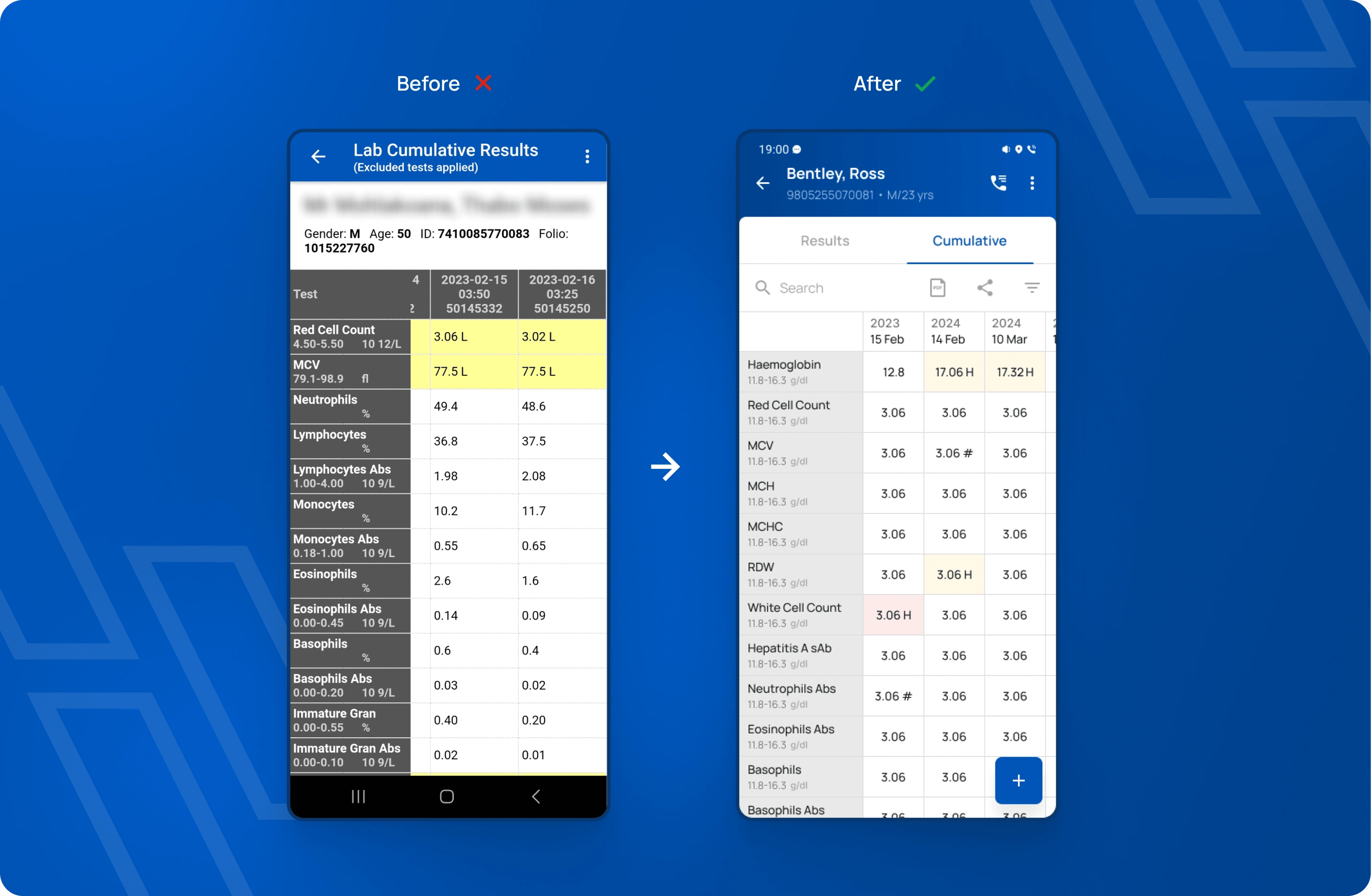
Redesigned cumulative view for a patient. We added the ability to search the table, collapse the row headings, filter for specific tests & dates, view the PDF version, easily share it, and narrowed the columns.
Creating a new order takes more effort than the paper request form.
Creating an order was hidden and a cumbersome process, leading to the majority of doctors either not finding it or choosing to still submit new orders via a physical paper form.
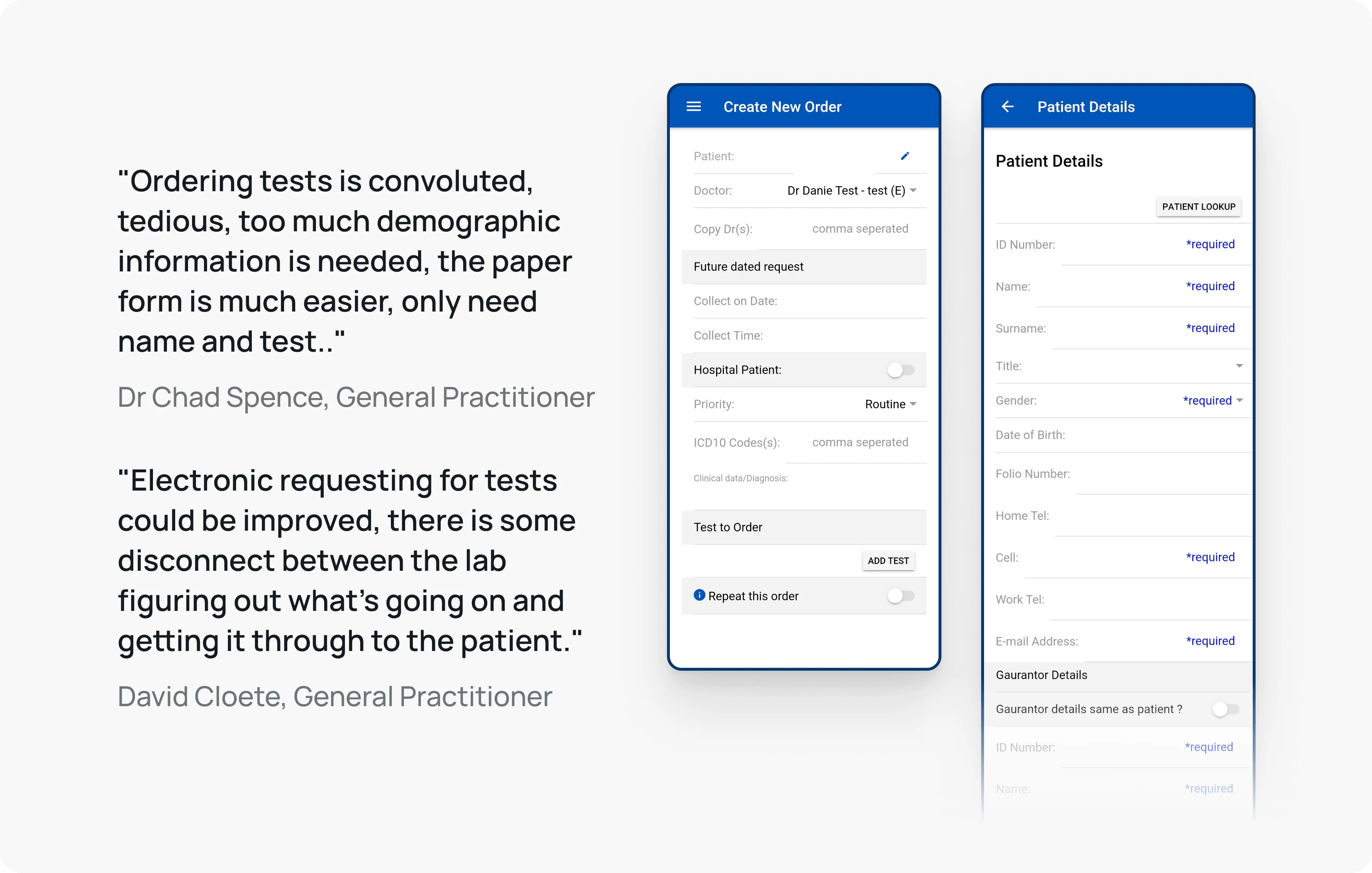
Quotes showing doctor's frustrations & screenshots of the previous create order process.
We had two objectives when redesigning this flow:
Simplify the process, making it as quick as paper.
Improve how the request is received by a patient to be better than paper.
The Solution
We reworked the flow, making it less intimidating and much more efficient. This was achieved in 5 ways:
Compartmentalising the steps to make them more manageable
Reducing the required fields to only what is critically needed, while still allowing for optional fields.
Adding a "Quick Order" option, a process that mimicked the paper form.
Focused the UI redesign to be as minimal as possible.
Reworked how doctors add patients, copy other doctors, add tests, schedule repeats and add diagnoses.
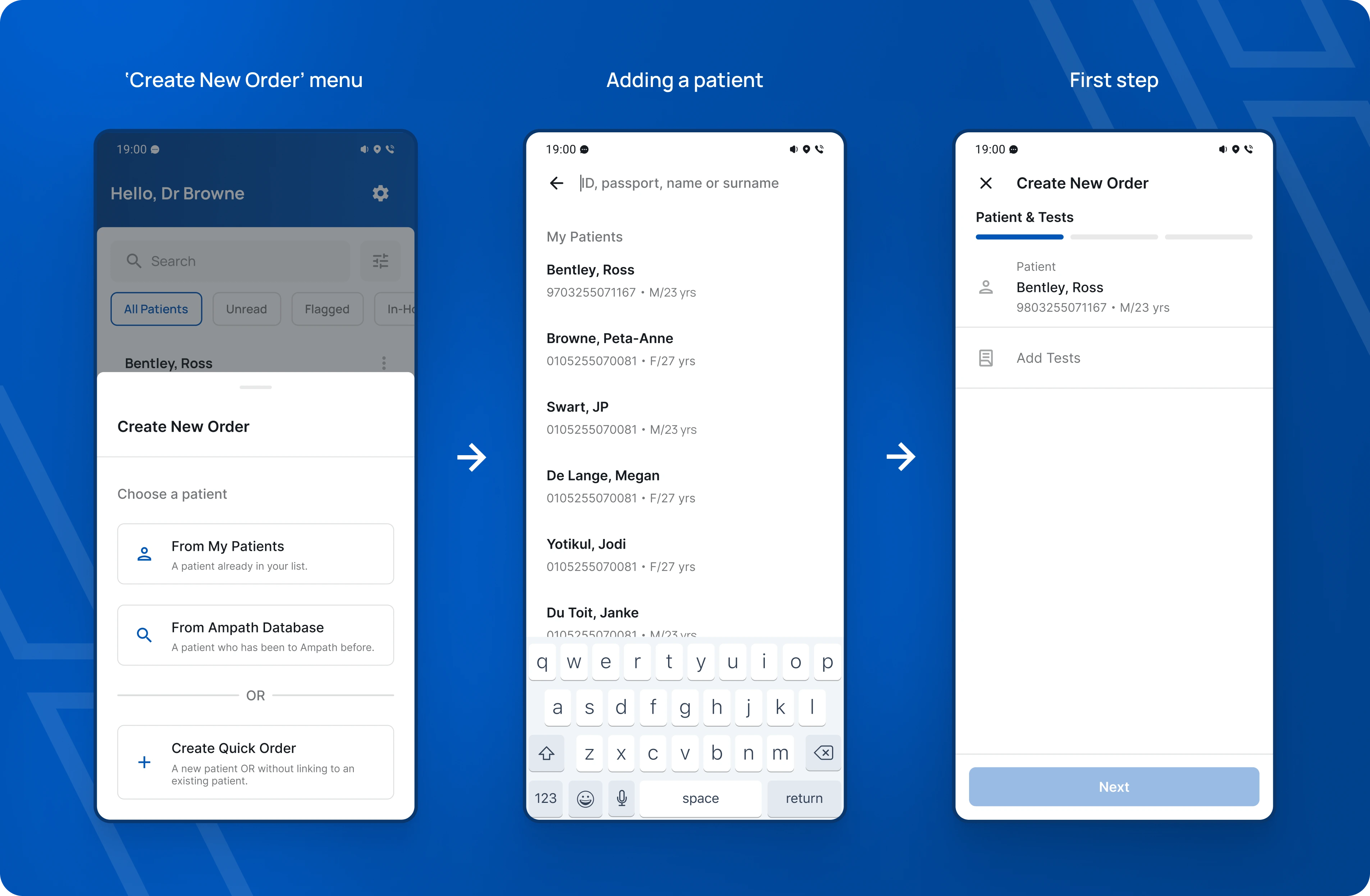
Creating a new order.
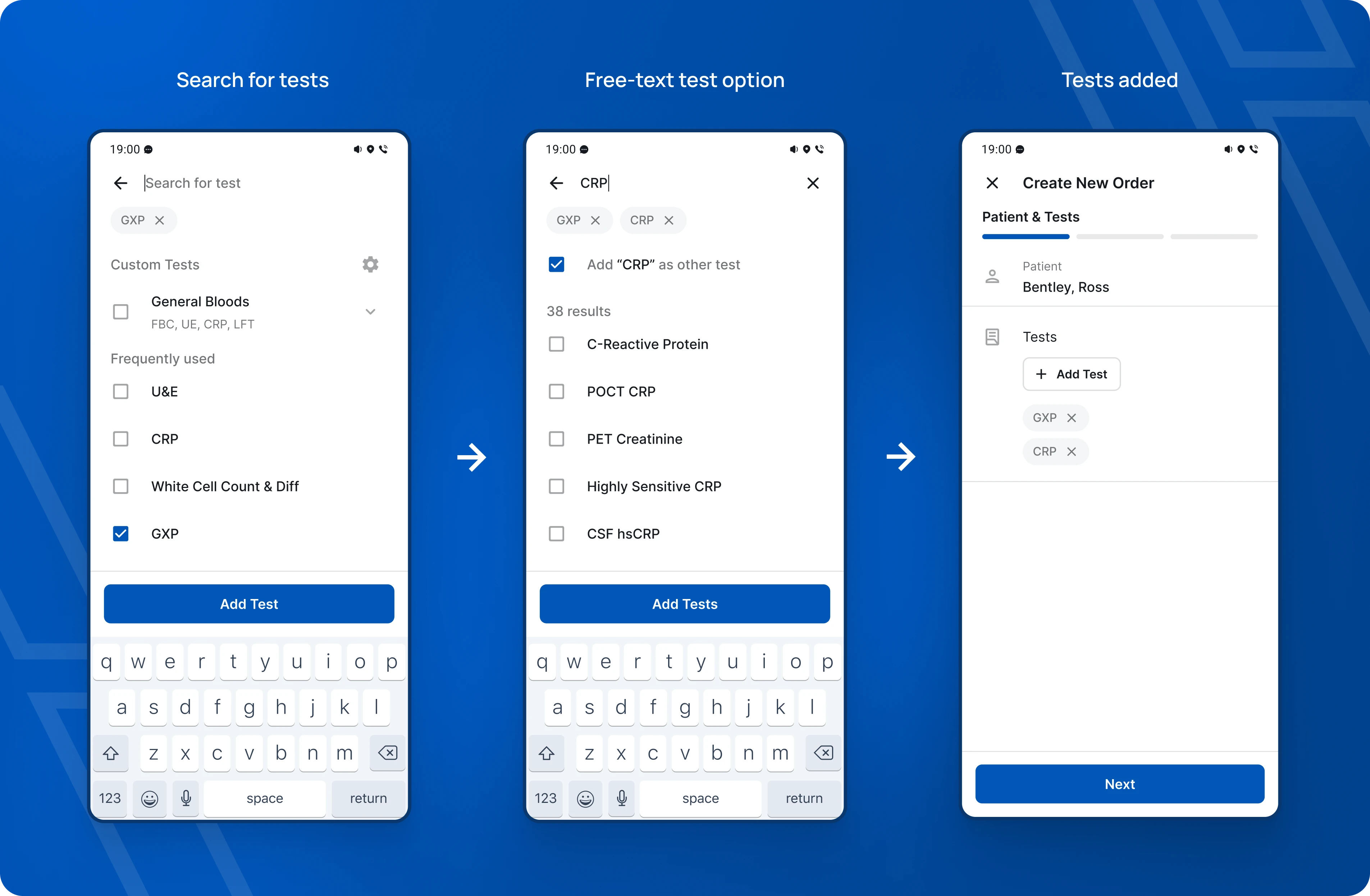
Adding tests. We added custom test groups, allowing doctors to easily select groups of tests that they use often. If they don't find the test they want, they can add what they type as a test.
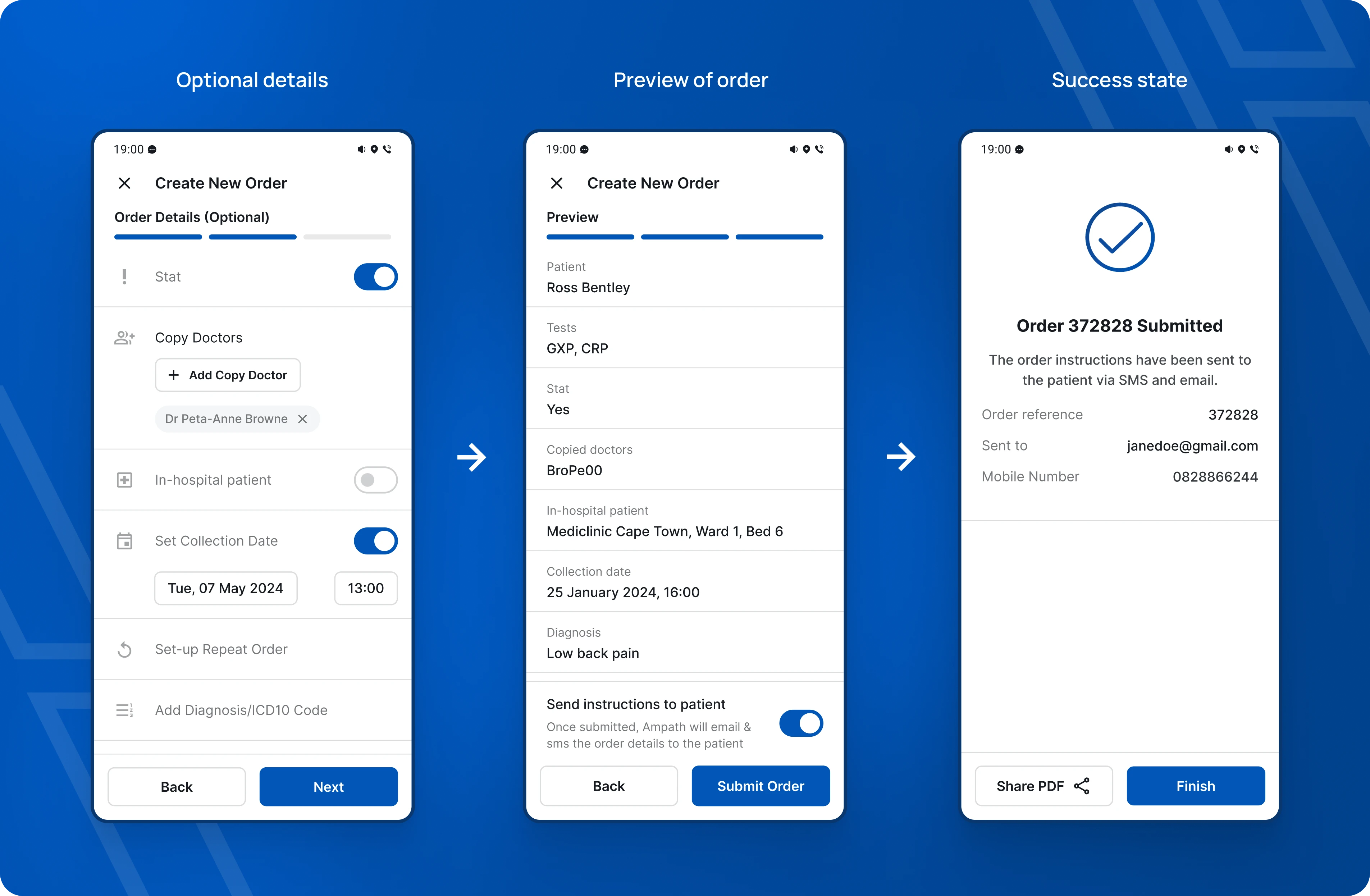
Optional details (easily skipped if not needed), preview and a clear success state that allows sharing of the order PDF that is generated.
Like this project
Posted Jul 18, 2024
A thorough product audit & redesign of an app used by thousands of doctors. This resulted in massive increases in user retention and revenue generated.
Likes
0
Views
17

