SUBHANDESIGNS — Personal Identity

SUBHANDESIGNS is a solo brand design studio owned by Subhan Mughal, based in Pakistan. Subhan Mughal is a young and reputable Logo and Brand Identity Designer working globally & helping small businesses, shaping them into memorable brands through timeless identities. At SUBHANDESIGNS, I am committed to nurturing the creative capabilities of startups, small businesses, and ambitious entrepreneurs who seek to establish a lasting brand image that stands out in a competitive market and resonates with their target audience through captivating visual Identity Design.
The Goal of this project was to craft an identity system that seamlessly incorporates innovation, modernism, timelessness, and trust, effectively capturing the essence of the target audience while communicating my own strengths and values. Embarking upon the endeavor of designing my own identity was an exceptionally meaningful experience, representing the most arduous project I have ever undertaken. Nevertheless, I approached it as an invaluable opportunity for profound self-discovery, delving into the depths of my being as a Logo and Brand Designer.
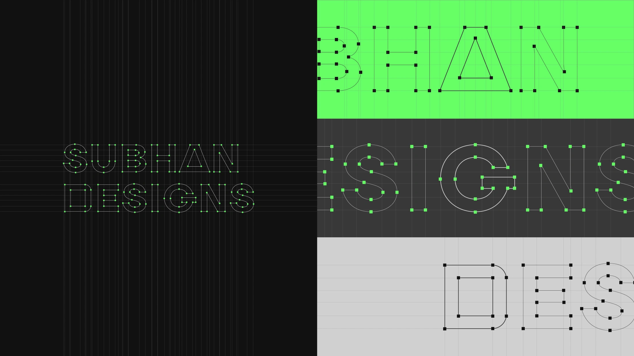
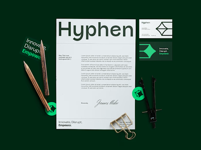
The Solution devised for this project was elegantly simple, yet timeless and remarkably impactful. After meticulous exploration of numerous possibilities, I ultimately selected the ubiquitous design shapes of squares, circles, and triangles, which were thoughtfully combined with a customized logotype to form the foundation of the primary logo. The resulting design epitomized a timeless and modern aesthetic, seamlessly evoking a profound sense of innovation. Building upon this core concept, I further integrated the design shapes as integral elements of my overall brand identity. To complement this foundation, I intentionally chose a striking "Screamin' Green" color, harmoniously paired with carefully selected shades of black, white, and gray. The final color palette embodies the values of timelessness, modernism, innovation, and trust, further enhancing the overall impact and resonance of the brand identity.
—
Client: SUBHANDESIGN — Project Scope: Personal Brand Identity


Like this project
Posted Jun 14, 2023
Personal Identity Design of SUBHANDESIGNS©. A solo brand design studio owned by Subhan Mughal, based in Pakistan.


