WidaTech Brand Guideline Development
Julyo Design
Widatech Brand Guideline - Visual Identity for Indonesia's Cloud Banking Pioneer
Built the full brand identity for WidaTech, including competitor analysis, strategy, logo, color, typography, imagery, and a 66-page guideline document.
Problem
WidaTech does what McKinsey, BCG, and Accenture don't, they advise and build. But their old brand made them look like just another local IT vendor. The credentials were there (ASEAN's first cloud-native banking system), but visually they were invisible next to the global consulting players.
Approach
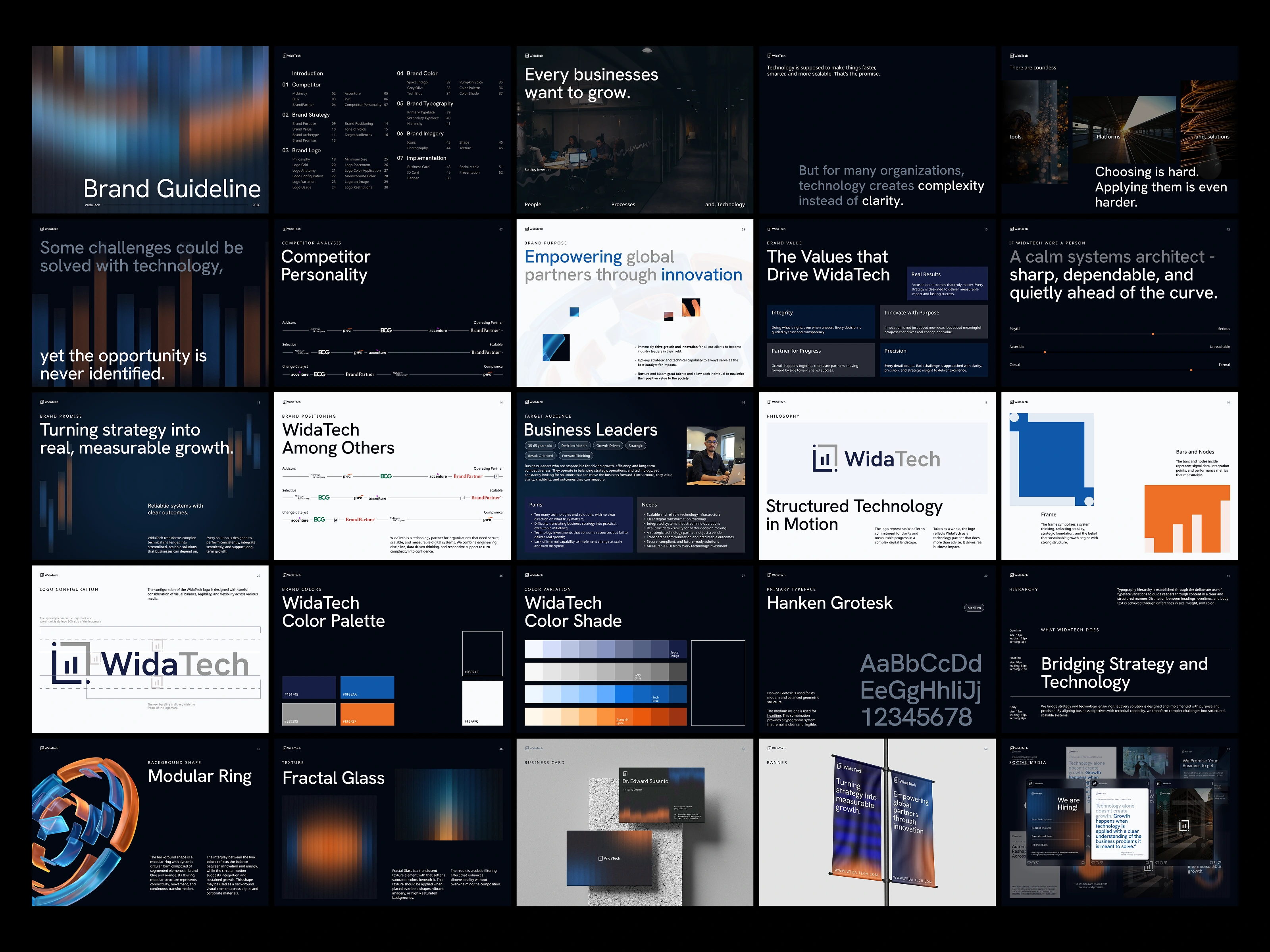
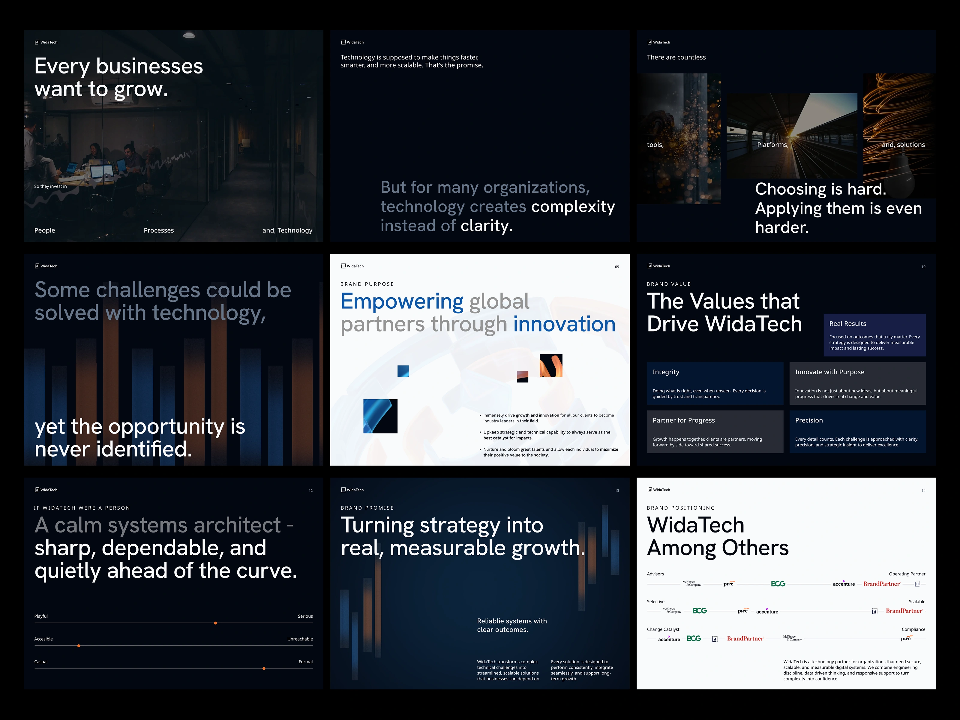
Positioning first, pixels later. I mapped WidaTech against the four major consultancies across three axes and found a defensible space: operating partner, scalable, change catalyst. From there came the brand personality — "A calm systems architect, sharp, dependable, and quietly ahead of the curve" — and the brand promise: "Turning strategy into real, measurable growth." Every visual decision after that point traced back to those two sentences.
Logo
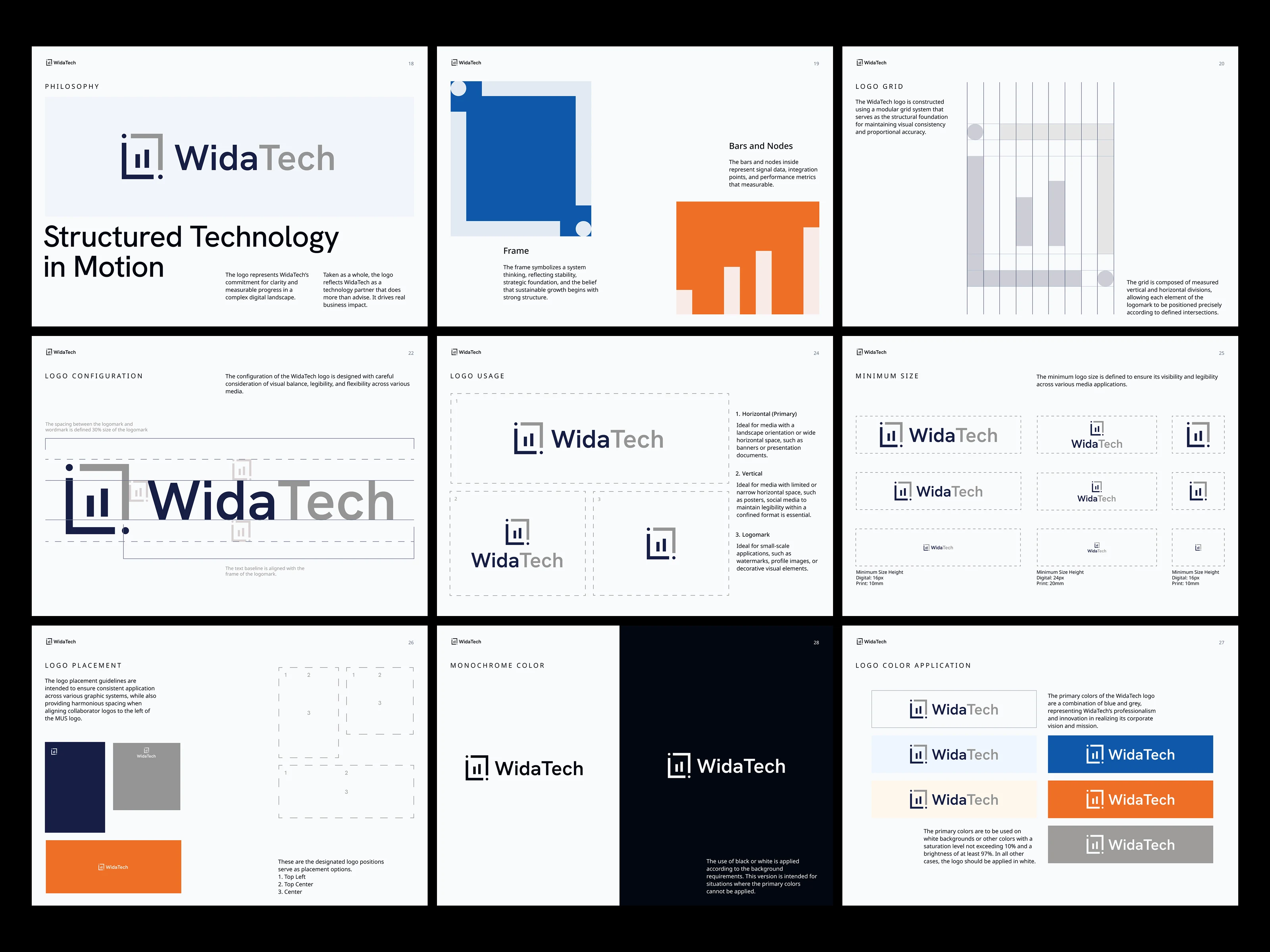
Built on the concept of "Structured Technology in Motion." The Frame represents system thinking and strategic foundation. The Bars and Nodes inside represent signal data and measurable performance.
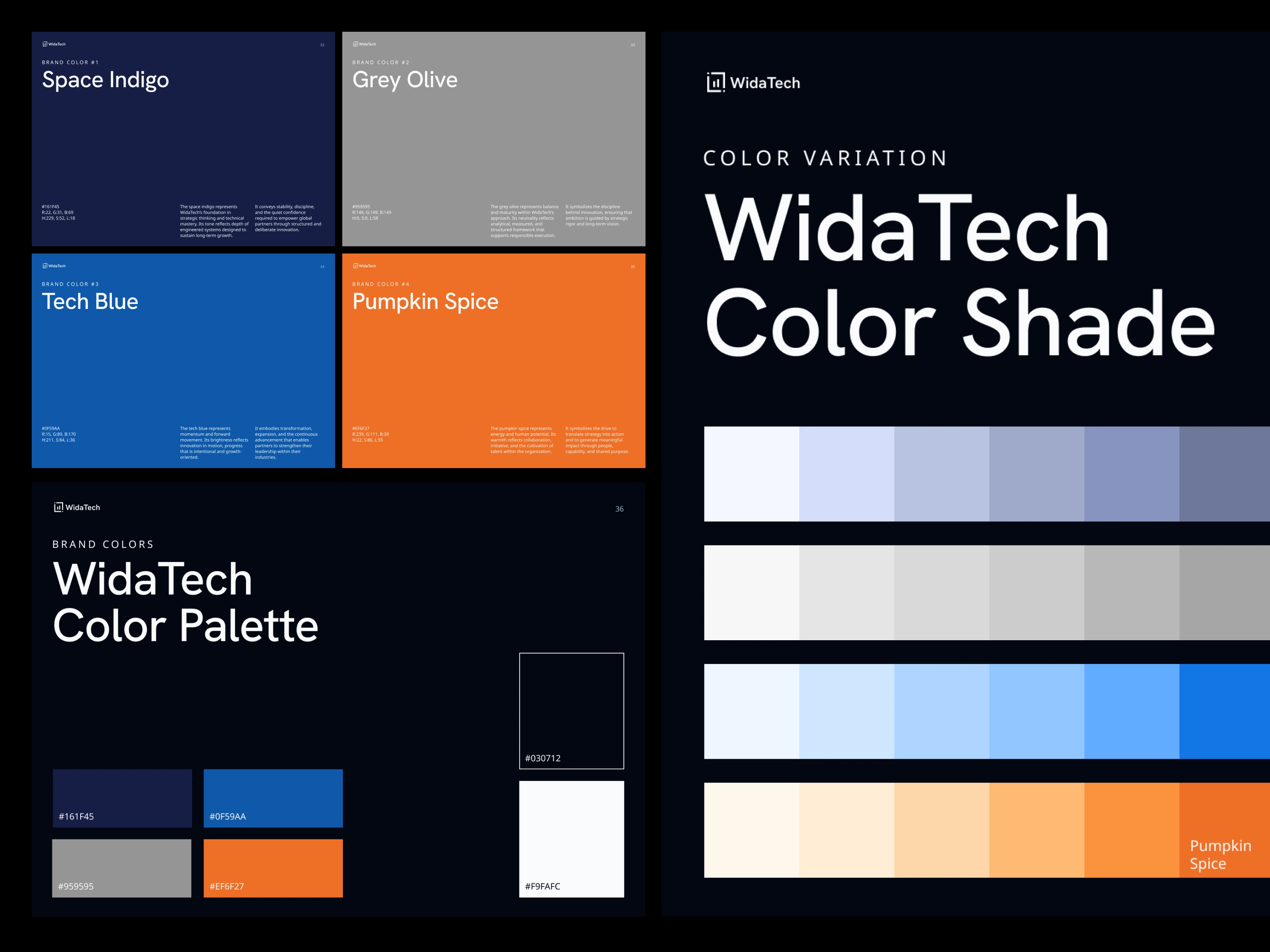
Colors
Four colors, each with a job. Space Indigo (#161F45) for foundation. Grey Olive (#959595) for neutrality. Tech Blue (#0F59AA) for momentum. Pumpkin Spice (#EF6F27) for the human spark.
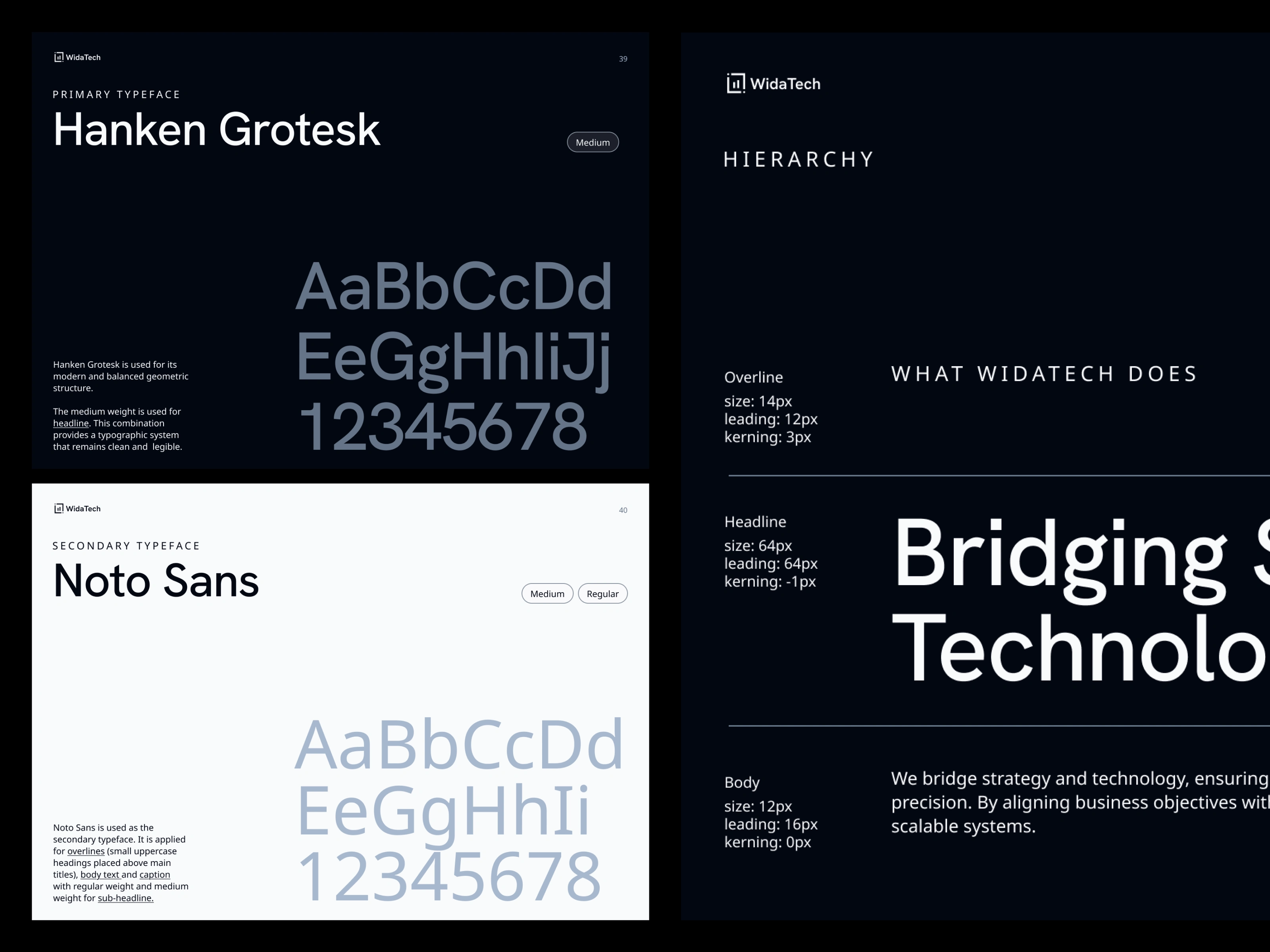
Typography
Hanken Grotesk for headlines, Noto Sans for body and supporting text. Two typefaces, infinite combinations, a hierarchy clean enough that anyone on the team can write a deck without breaking the brand.
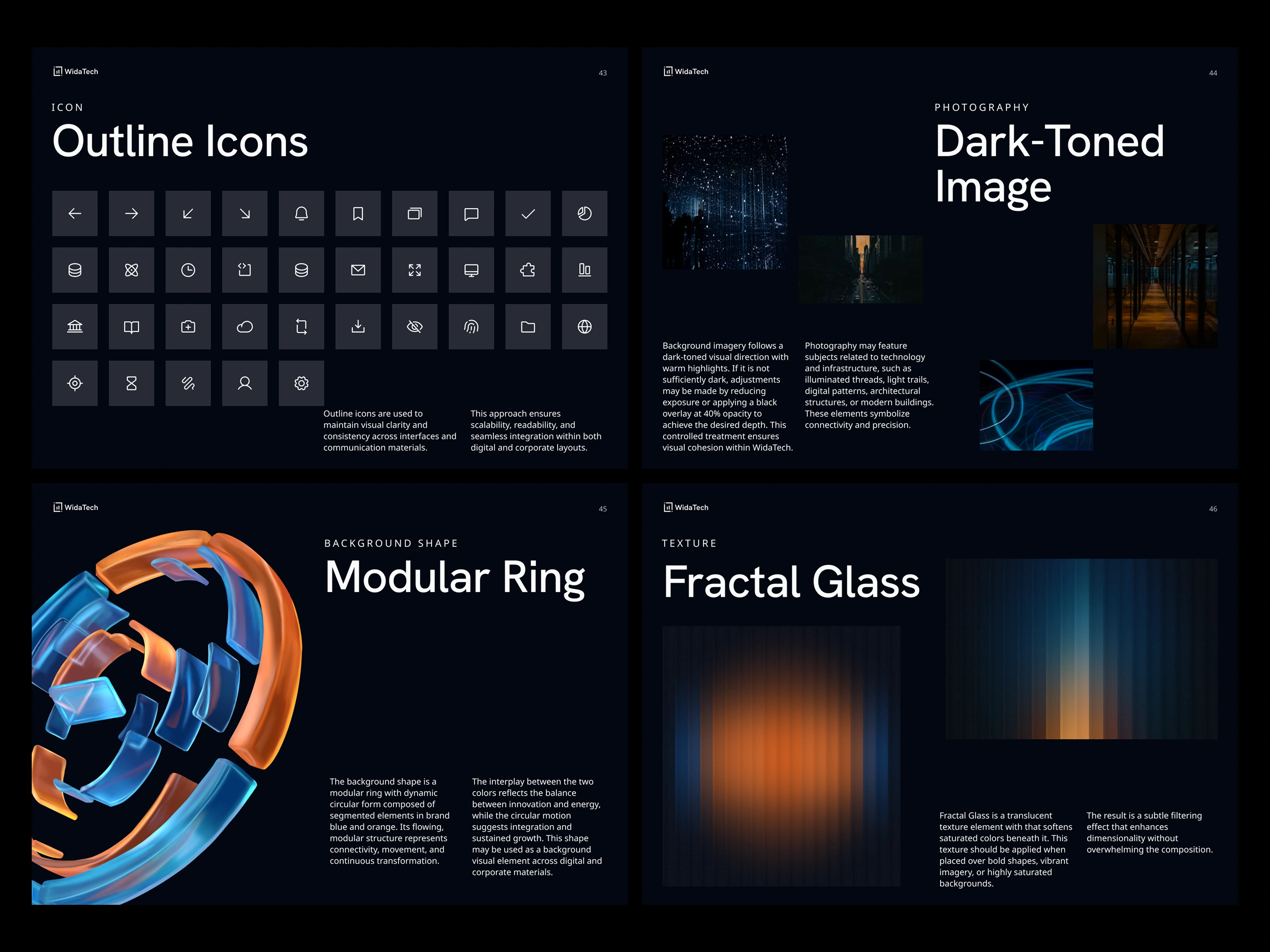
Imagery
Two signature elements, Modular Ring, a 3D form in brand blue and orange representing connectivity and transformation, and Fractal Glass, a translucent texture that adds depth without overwhelming. Photography stays dark-toned with warm highlights.
Output
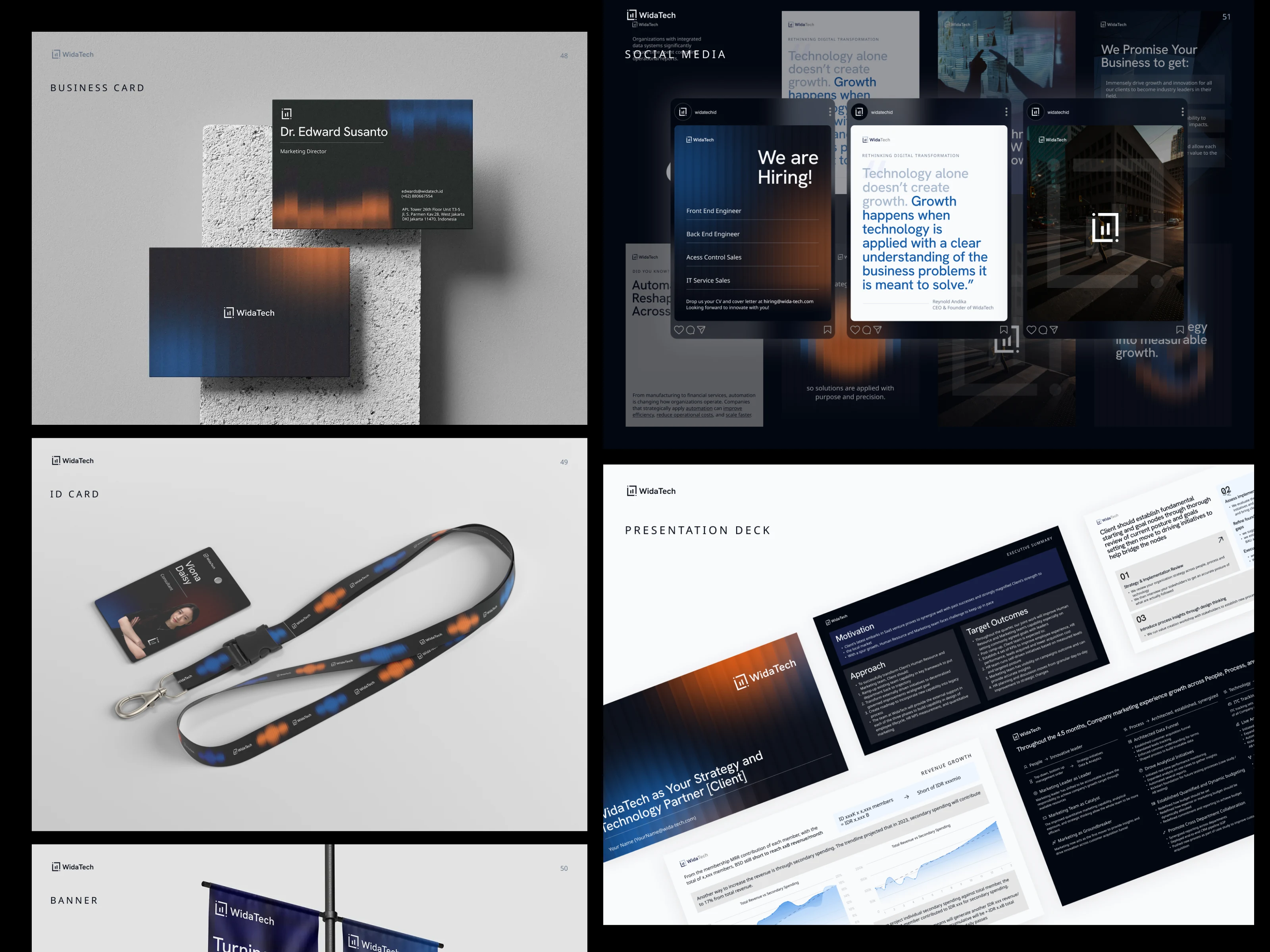
A 66-page brand guideline covering strategy, positioning, logo system, color, typography, imagery, and full application set (business cards, ID cards, banners, social templates, presentation deck).
Outcome
The brand guideline is the source of truth that made every other WidaTech project possible, website, service pages, careers, decks, social content. Instead of designing each touchpoint from scratch, the team now opens one 66-page reference and makes decisions in minutes.
Like this project
Posted May 15, 2026
Full identity system grounded in competitor analysis, strategy, positioning, logo, palette, typography, and imagery across 66 pages
Likes
0
Views
17
Timeline
Mar 1, 2026 - Mar 31, 2026
Clients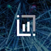
WidaTech