Mitra Usaha Sarana Brand Identity Redesign
Julyo Design
Mitra Usaha Sarana - New Logo Concept & Brand Guideline
A Brand Identity for Indonesia's Multi-Sector Holding Company
About Project
Designed the full brand identity for PT Mitra Usaha Sarana (MUS) — a Jakarta-based holding company established in 1998, operating across banking and non-banking sectors through subsidiaries like PT BPR Dhaha Ekonomi, PT Mitra Data Sarana, and PT Arranet Indonesia Sejahtera. Built the logo, color palette, typography, supergraphic system, and a full brand guideline document.
Problem
MUS had grown for over 25 years through acquisitions and new ventures, but their visual identity hadn't kept pace. The old brand looked like a 1990s holding companym formal, static, and disconnected from the modern subsidiaries operating underneath it.
The challenge - design an identity that honors the legacy while signaling that MUS is still adaptive, progressive, and ready for the next 25 years.
Approach
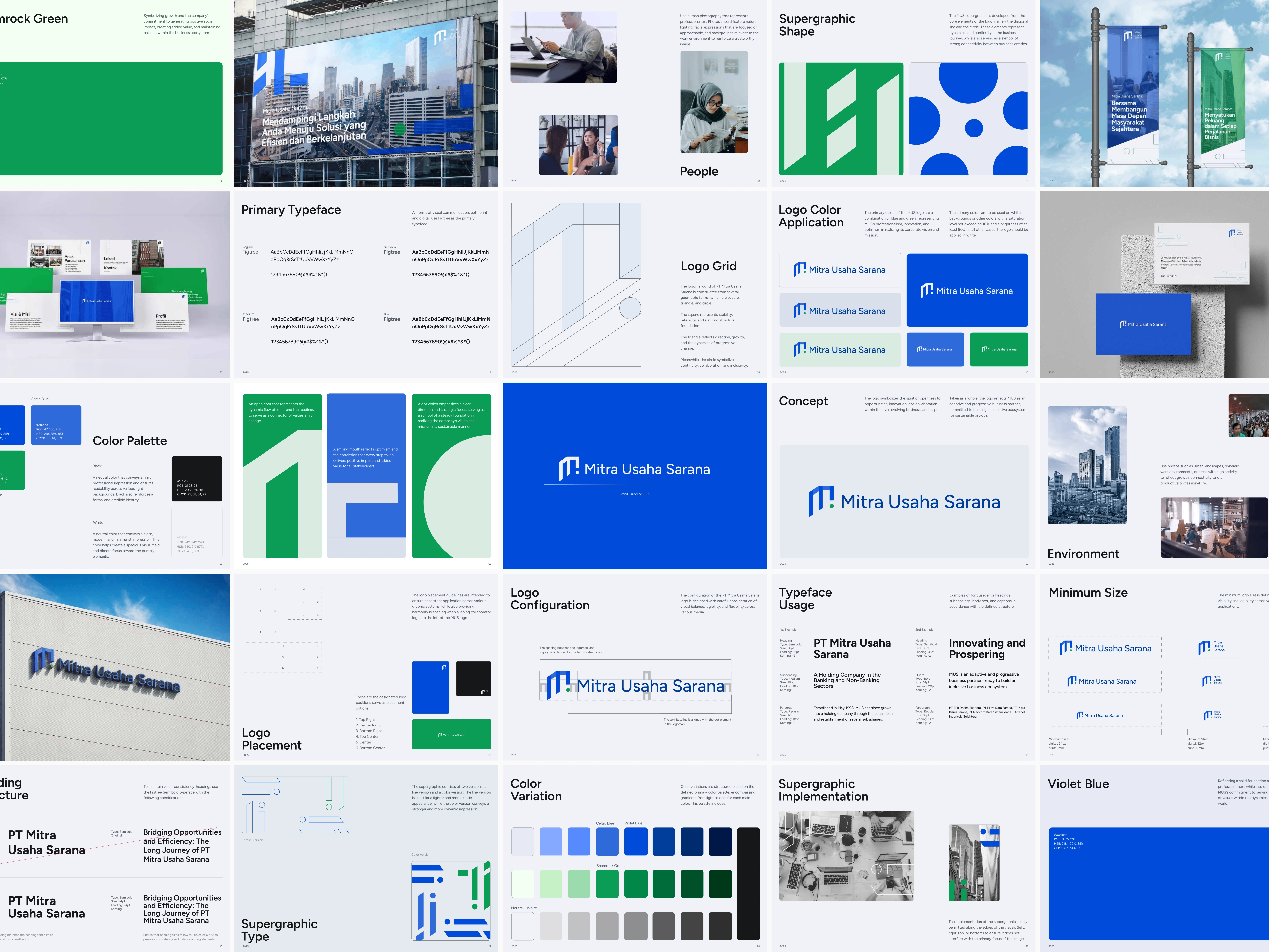
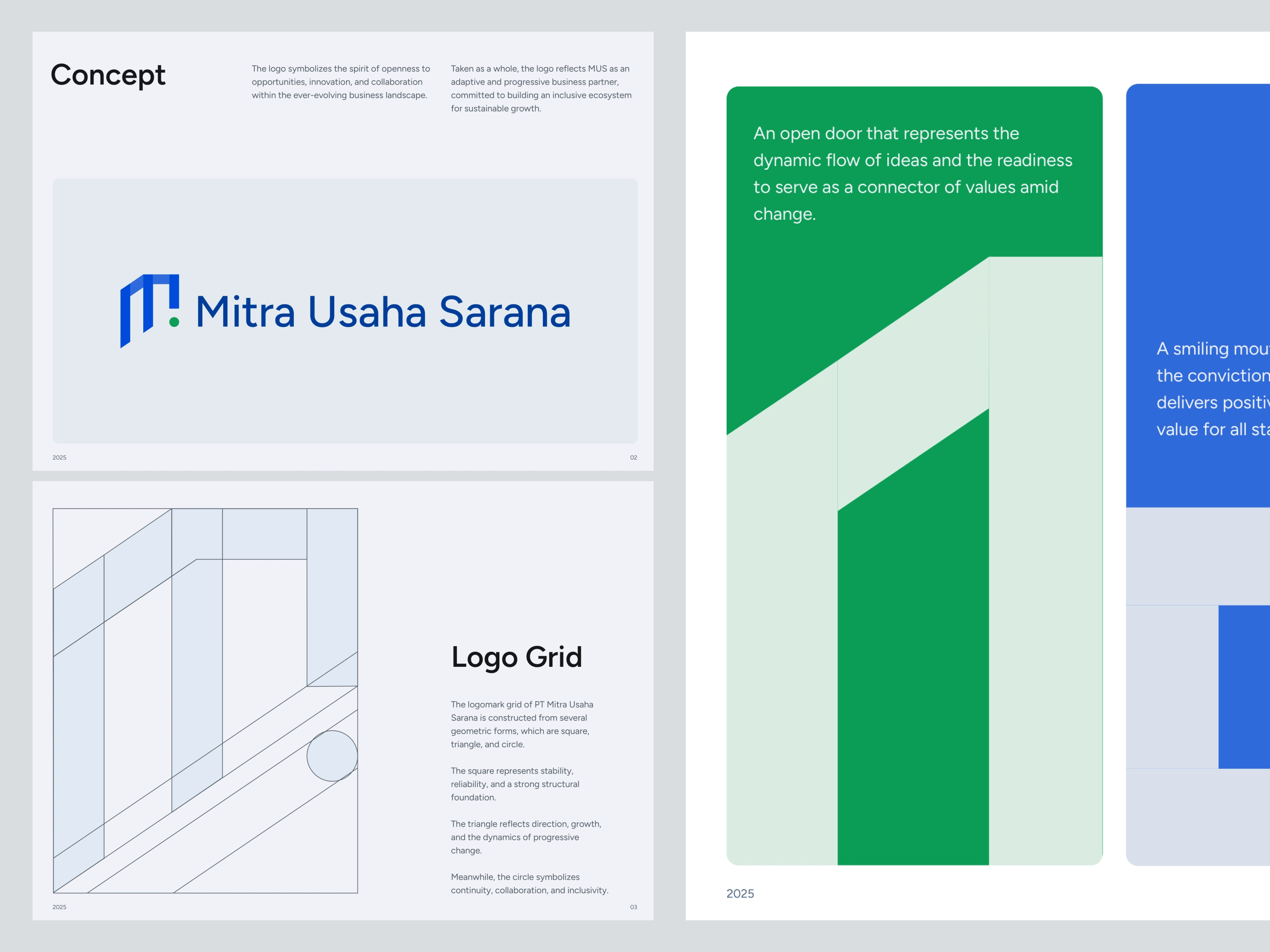
The brand concept centered on one idea: "an open door", MUS as a connector of values, opportunities, and people across an evolving business landscape.
That concept drove every visual decision. The logomark is built from three geometric forms
square (stability and structural foundation),
triangle (direction and progressive change), and
circle (continuity, collaboration, inclusivity).
Together they form an "M" that reads as an open doorway with a green dot punctuating the entrance, a small but deliberate signal of optimism and growth.
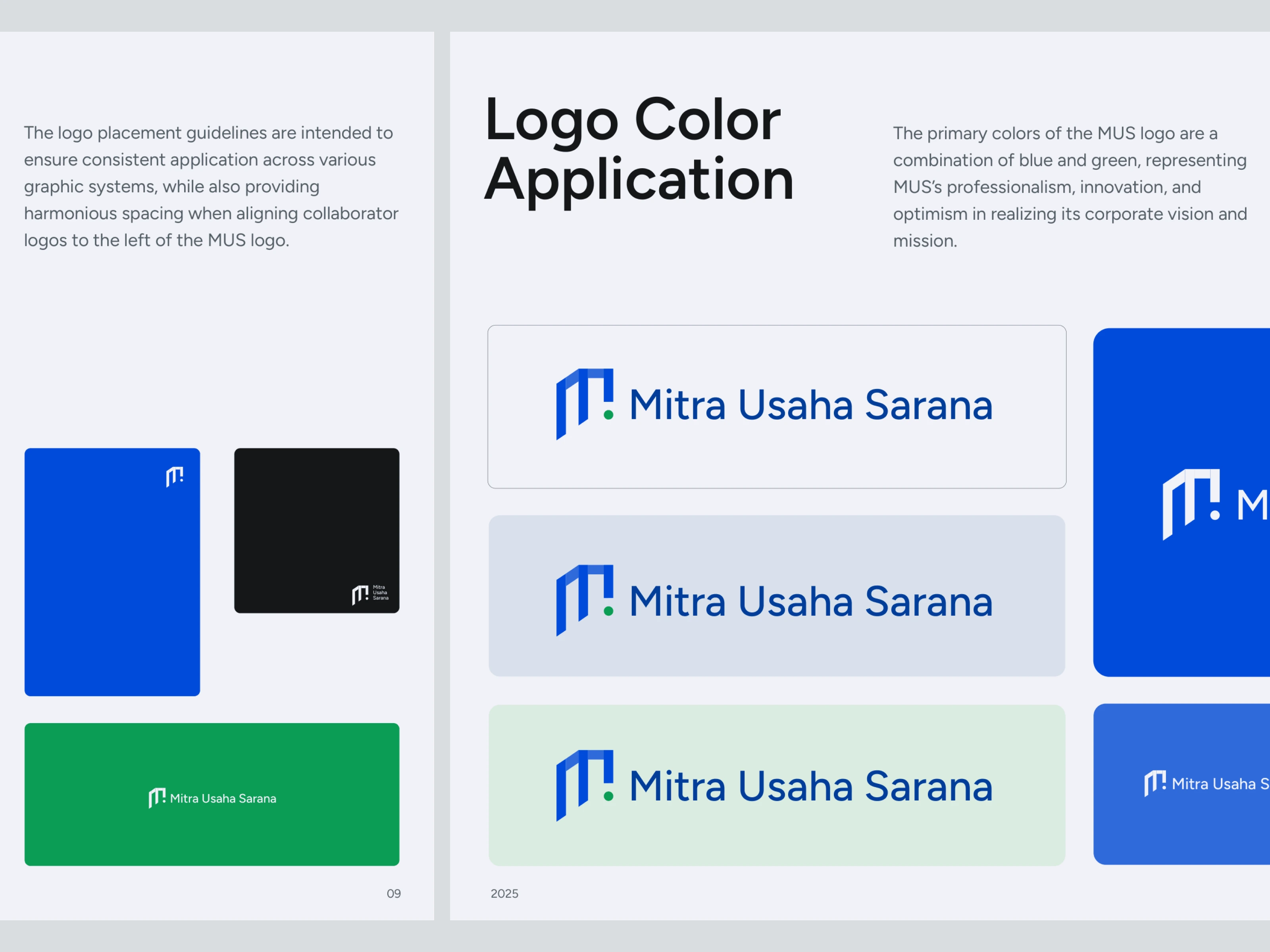
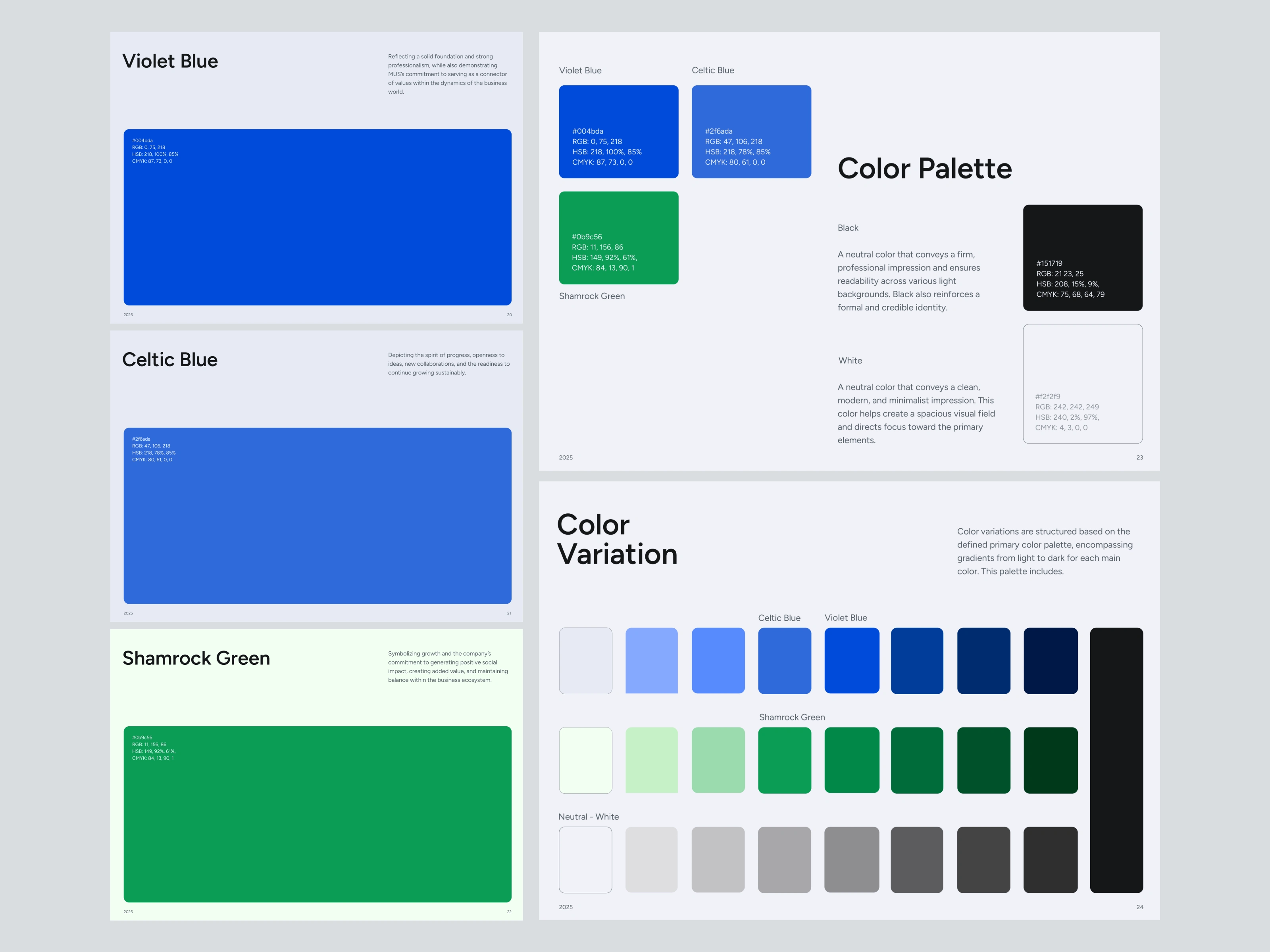
The color system uses two blues (Violet Blue + Celtic Blue) for professionalism and trust, balanced by Shamrock Green for growth and social impact. Two colors do two different jobs, blue carries the institutional weight, green keeps the brand from feeling cold or bureaucratic.
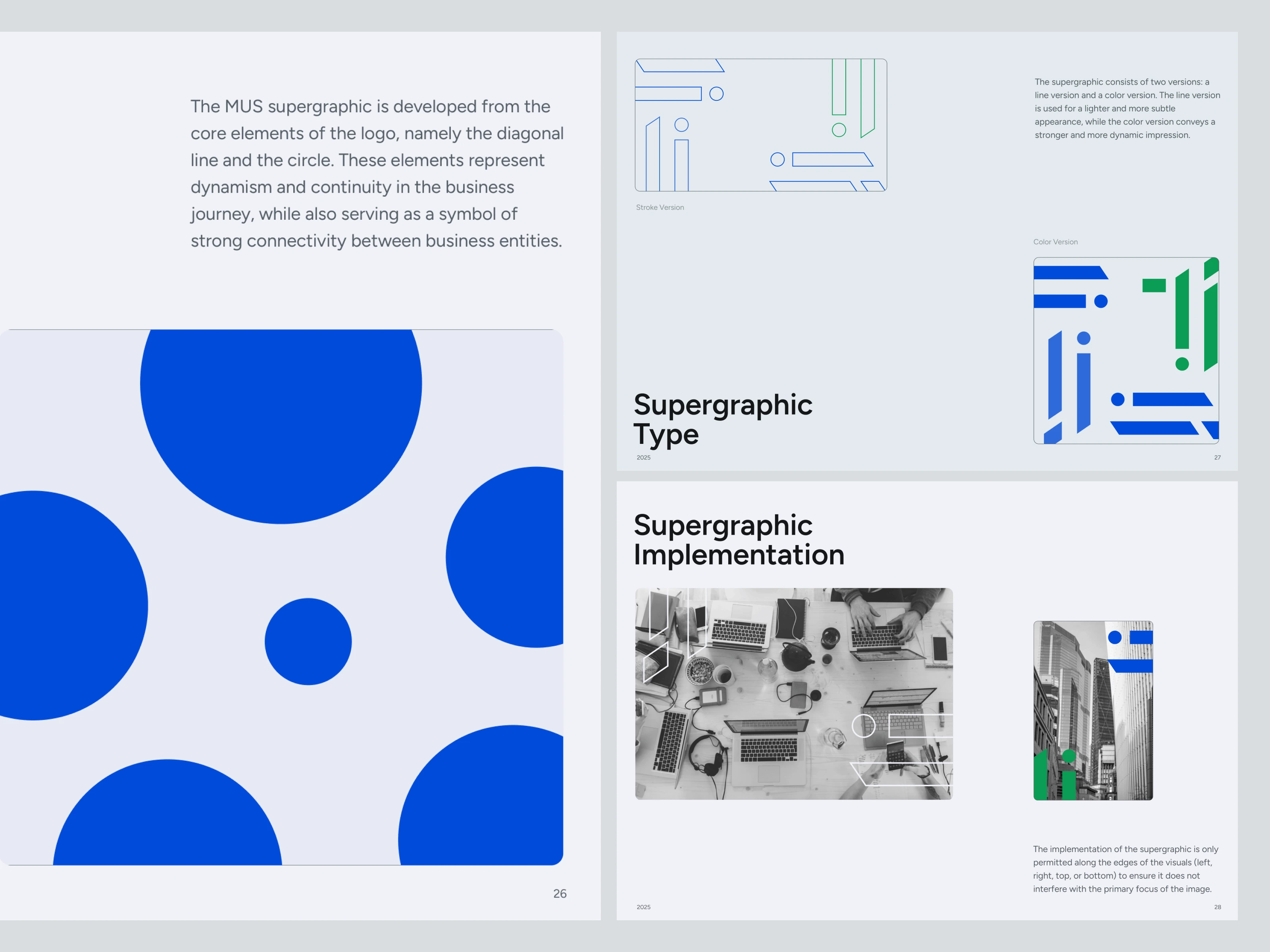
The supergraphic, built from the logo's diagonal line and circle, gives the brand a flexible visual language that scales from business cards to billboards without ever needing decoration.
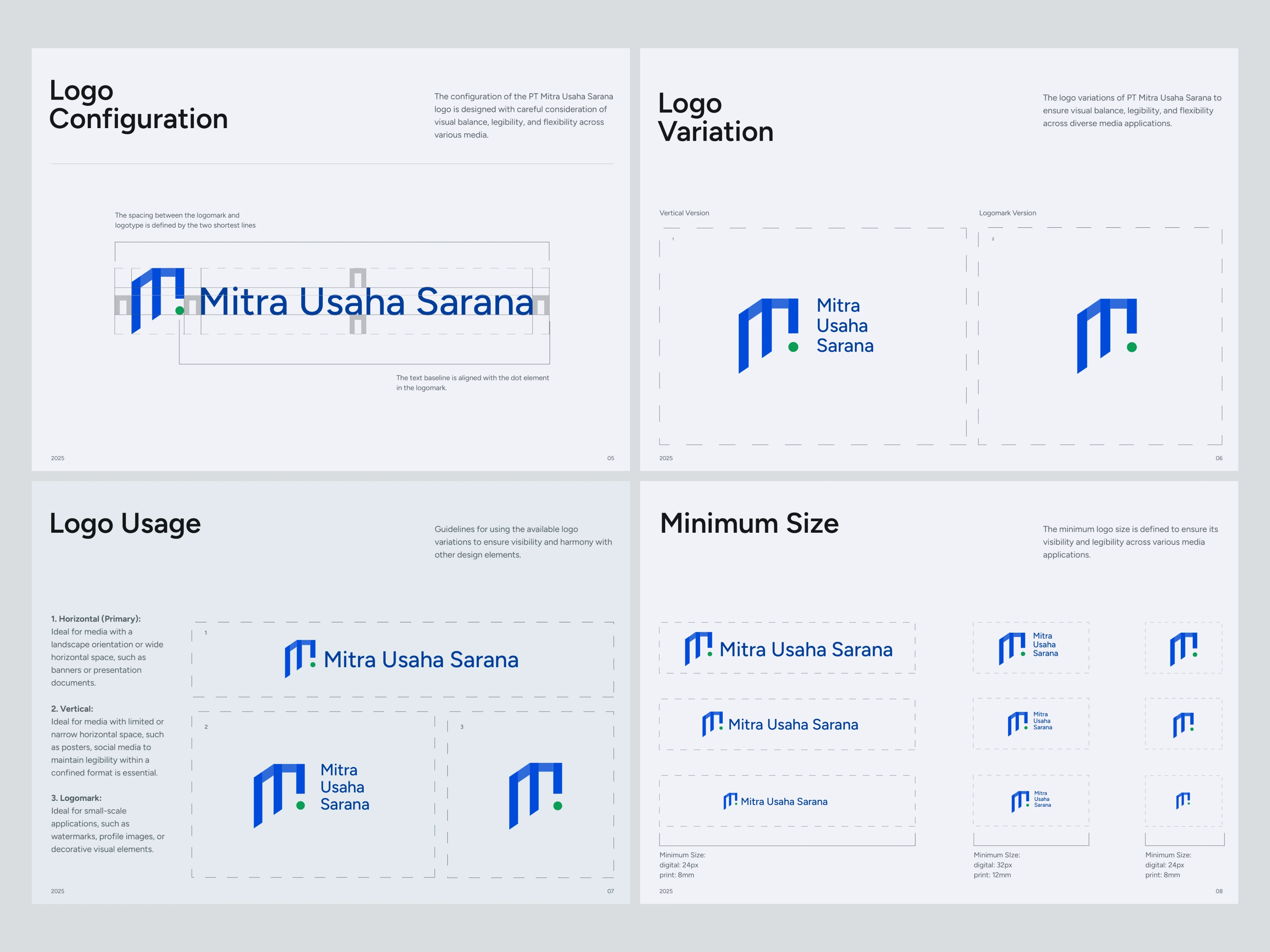
Logo
A monogram "M" built on a geometric grid, paired with a Figtree wordmark. The dot element in the logomark doubles as both a punctuation mark and an anchor point for typography baseline alignment across applications. Full system includes horizontal (primary), vertical, and logomark-only variations, with minimum size specs for digital (24px) and print (8mm).
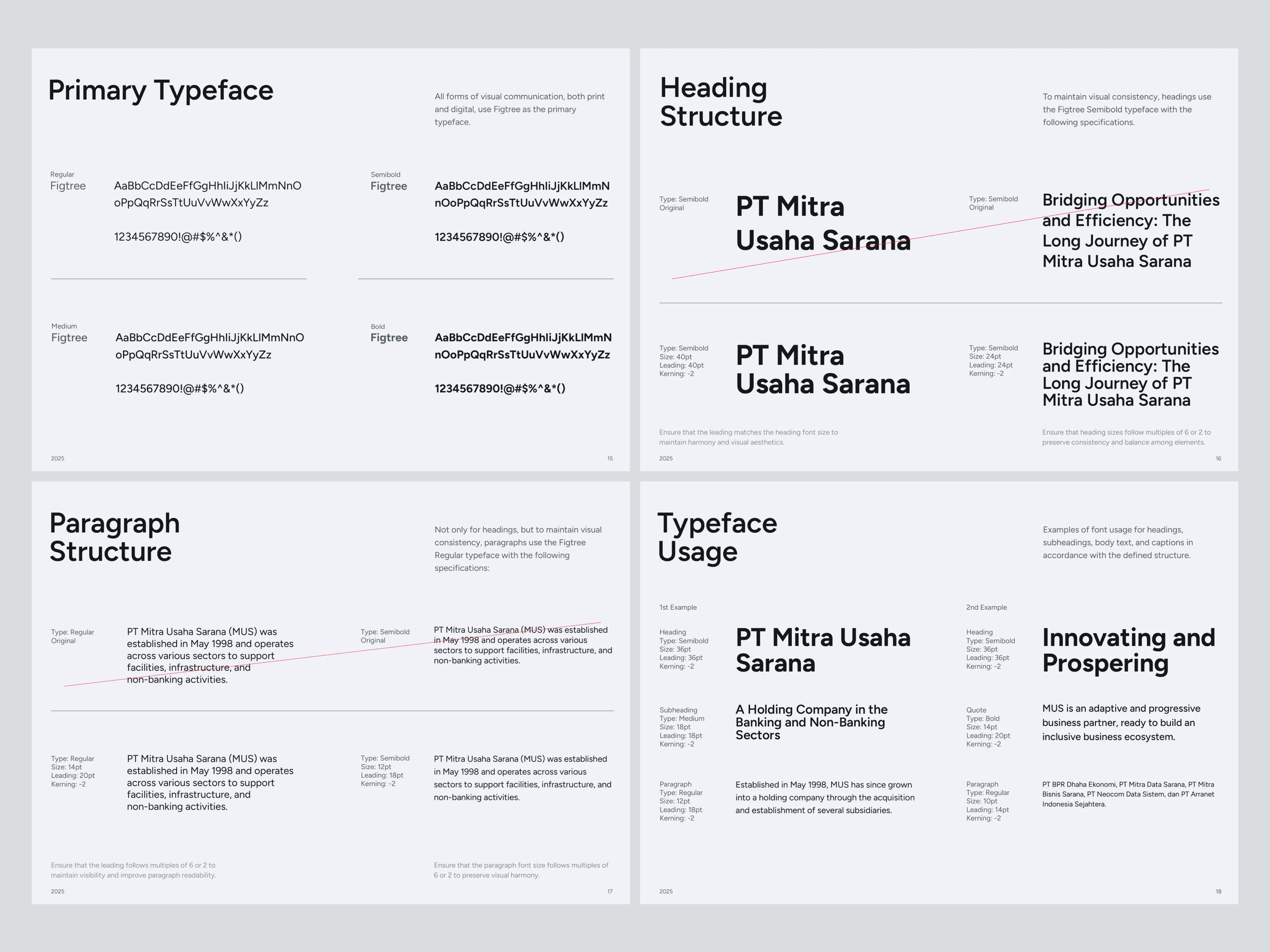
Typography
Figtree as the primary typeface across Regular, Medium, Semibold, and Bold weights. Chosen for its geometric clarity and modern feel, formal enough for corporate communication, friendly enough to feel approachable.
Colors
Violet Blue (#004BDA) Foundation and professionalism. The institutional anchor.
Celtic Blue (#2F6ADA) Progress and openness to new collaborations.
Shamrock Green (#0B9C56) Growth, social impact, and ecosystem balance.
Black (#151719) + White (#F2F2F9) Neutral support across light and dark applications.
Full color variation system extends each primary across nine-step tonal ramps, giving the team flexibility without breaking the palette.
Output
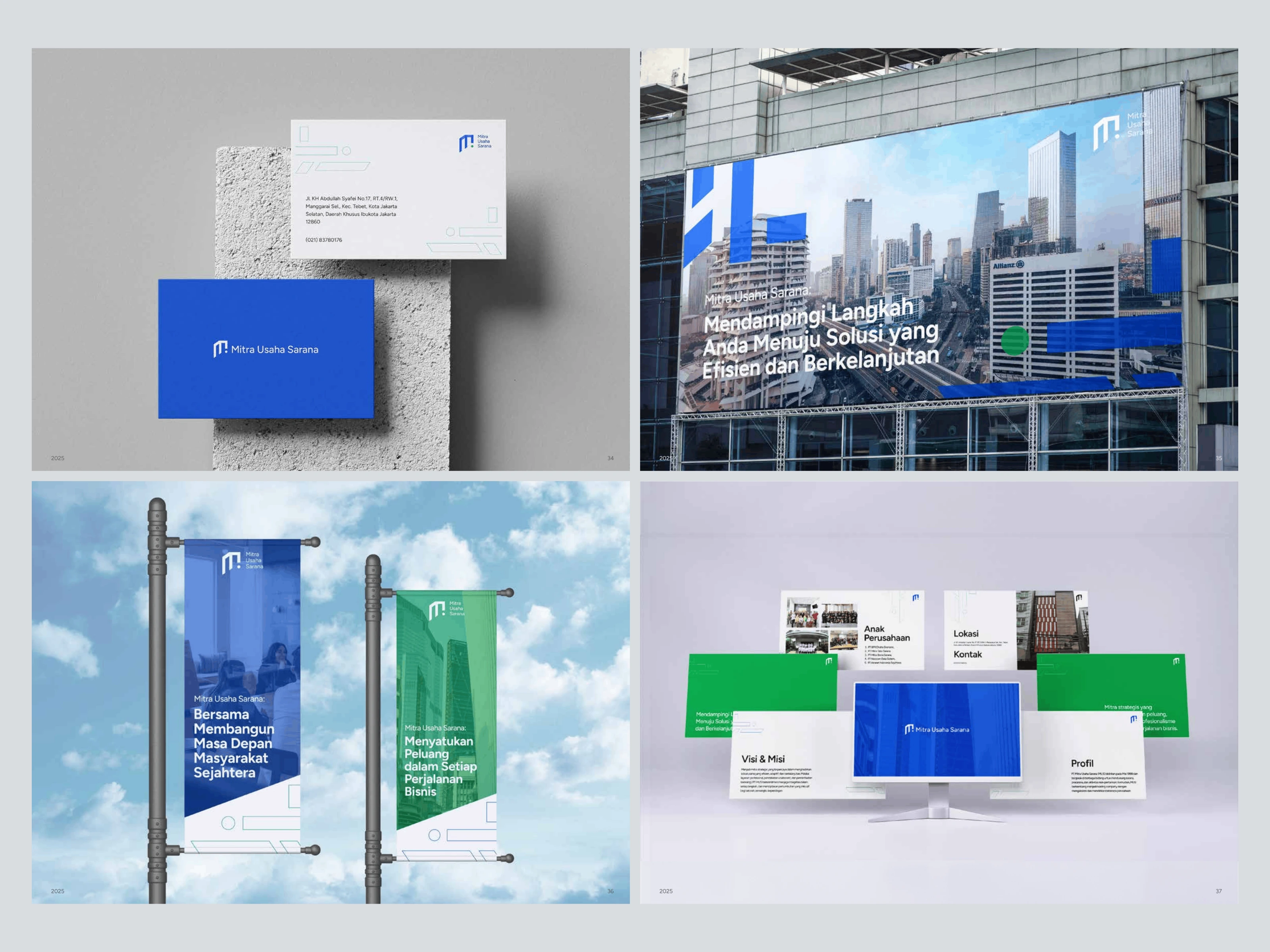
A complete brand guideline document covering logo concept, configuration, variations, color palette, color variations, typography hierarchy, supergraphic system, photography direction, and application set — business cards, letterheads, banners, building signage, billboards, and presentation templates.
Outcome
MUS now has a brand that holds two truths at once, a 25-year legacy and the readiness to keep growing. The visual system gives the holding company a unified identity across all subsidiaries while leaving room for each one to operate in its own sector. Internal teams have a single reference document for every future touchpoint, from new acquisitions to corporate communications.
Like this project
Posted May 18, 2026
Full brand system, logo, color, typography, and supergraphic for a 25-year-old Indonesian holding company.
Likes
0
Views
7
Timeline
Jan 1, 2025 - Mar 8, 2025
Clients
Neocom Data Sistem