SaaS Marketing Site for Tagni

Boluwatife Taiwo


SaaS Marketing Site & Content System for Tagni — AI Customer Support
Timeline: 1 week
Role: Web Design & Next.js Development
Live site: Tagni live
Project Overview
Tagni is an AI customer support product agents that learn a company's product from its docs and its best tickets, then resolve customer questions without a human touching them.
It sits in the most crowded category in software. Every competitor says the same sentence: AI-powered support that scales with your business. The buyer has read that sentence forty times this quarter and it no longer registers.
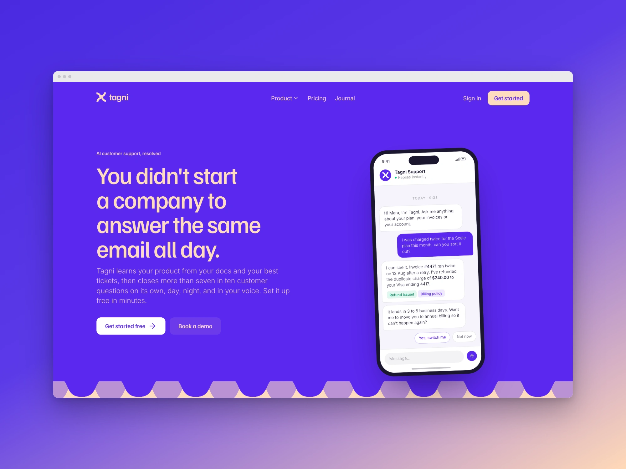
The site had to do something different in the first three seconds. So the headline does not describe the product at all. It describes the founder's Tuesday:
You didn't start a company to answer the same email all day.
That is the whole positioning. Everything below it earns the claim.
Challenge
Design and build a full SaaS marketing site home, pricing, waitlist, and a journal that:
Differentiates in a saturated category without resorting to bigger claims or louder gradients.
Demonstrates the product convincingly before it has a public app to screenshot, or a single customer logo that can be used.
Ships with a real content system, so the team can publish without a developer or a CMS bill.
Approach
Day 1: Positioning and art direction. The strategic decision was to lead with the founder's pain rather than the product's features. Once that was set, the visual direction followed: a confident violet-and-peach palette instead of the default SaaS blue, wave dividers that give each section a soft hand-drawn edge, and a display face with real personality. The result reads as a product with a point of view rather than a template.
Day 2: Designing the product itself. With no app to screenshot, I designed the product as code, not as flat images. Ten bespoke React mockups: a phone conversation, an inbox tablet view, a reply composer, a sources panel, a thinking panel, a training flow, a code panel, and a draft thread. Being components rather than PNGs means they are crisp on every display, theme-consistent by construction, and editable in a text file when the messaging changes.
Days 3–4: Building the fourteen-section home page. Hero → logo strip → intro statement → feature accordion → problem solved → speed banner → continuous training → tone banner → workspace → pricing CTA → launch → explore → journal → developer. Each section chosen to answer the next question a sceptical buyer would ask, in the order they would ask it.
Day 5: Pricing, waitlist and the journal. Pricing built around resolutions rather than seats free forever at 100 resolutions, then $79/month plus $0.55 per resolution, then enterprise. A waitlist with intent routing, so
?intent=sales produces a different conversation from a cold signup. And a full MDX journal with seven written articles.Day 6: Motion, responsiveness, and polish. Lenis smooth scrolling, reveal-on-scroll groups with reduced-motion paths, and a responsive pass down to 320px.
Solution
A feature accordion that shows rather than lists. Six product surfaces AI agents, Inbox, Chatbots, Ask Tagni, Training, Reporting each pairing a short plain-English explanation with its own live mockup panel. The active item advances on a CSS-driven timer, so the section demonstrates six capabilities to a passive reader without demanding a single click, while remaining fully clickable for someone who wants to drive it.
The hero conversation does the heaviest selling. A phone mockup shows a real support exchange: a customer reports being double-charged; the agent identifies invoice #4471, confirms the duplicate charge ran on a retry, refunds $240.00 to the Visa ending 4417, cites its billing policy, states the 3–5 day settlement window, and then offers to move the customer to annual billing so it cannot happen again.
That last offer is the entire product thesis in one line. It is the difference between a bot that answers a question and an agent that solves a problem argued through a concrete example rather than a claim.
"Solve the actual problem, not just the question." The section that follows names the competitor weakness directly: most bots hand back a link and call it a win. Paired with a thinking panel and a sources panel side by side, it shows the agent reasoning and citing the two things a buyer burned by a previous chatbot is actually worried about.
A content system the team owns. The journal is MDX compiled at build time, with typed frontmatter, automatic date sorting, generated reading times, and three rotating generative cover treatments so posts look designed without anyone opening Figma. Seven articles ship with it including "Deflection is not resolution" and "Keeping agents honest" which means the site launches with a point of view already published rather than an empty
/blog that quietly signals abandonment.Honest pricing design. Usage-based, no seat tax, with the per-resolution cost printed on the page rather than hidden behind "contact sales". In a category where buyers expect to be nickel-and-dimed, showing the number is a differentiator.
Scope of Work
Positioning and messaging strategy — headline through to CTA copy
Brand direction: violet/peach palette, type scale, wave-divider system
Home page design and build — 14 bespoke sections
Ten custom product mockups built as React components, not images
Interactive feature accordion with auto-advance and six live panels
Pricing page with three tiers and a full comparison matrix
Waitlist page with intent-based routing and form validation
MDX journal system — index, dynamic post routes, typed frontmatter, 7 written articles
Generative cover-art system for posts
Smooth scrolling (Lenis) and scroll-reveal motion with reduced-motion support
Technical SEO — metadata, generated OG image,
sitemap.ts, robots.tsResponsive from 320px to desktop
Result
A SaaS site that leads with a human problem instead of a feature list, and proves the product through a worked example rather than adjectives. Every claim on the page is backed by something the visitor can look at: the accordion shows the surfaces, the phone shows the resolution, the sources panel shows the citations, the pricing page shows the number.
It launches with a functioning content engine and seven published articles, so the team can ship a post the week after handover without touching a developer or paying for a CMS.
Like this project
Posted Aug 6, 2026
Developed a SaaS marketing site for Tagni emphasizing human-centered design.