Interactive Website for Blockchain Security Firm

Boluwatife Taiwo


Interactive Investigation Website for Rolled — Blockchain Security Practice
Timeline: 1 week
Role: Web Design & Next.js Development
Project Overview
Rolled is a blockchain security practice the people a company calls at 3am when eighteen thousand ETH leaves a treasury multisig that should not have moved. They trace stolen assets, reconstruct exploits, harden custody, and walk teams through what the regulator asks afterwards.
The category has a credibility problem. Every firm in it uses the same three words trusted, leading, secure over a stock photo of a padlock. When a client is losing money by the hour, adjectives are worth nothing. They need to see that you can actually do the work, in the first ten seconds, before they will pick up a phone.
So I designed and built a site where the proof is the interface.
Challenge
Design and ship a six-page marketing site for a technical security practice that does three genuinely different things investigation, security assessment, and compliance advisory without the site collapsing into a generic services page.
Three specific problems had to be solved:
Make the expertise visible, not claimed. A firm that traces stolen crypto should be able to show you a trace, not tell you about one.
Serve two readers at once. A panicking founder scanning for "can you start today", and a general counsel reading every word before signing a retainer. Same page, opposite reading speeds.
Stay fast while doing it. Heavy motion and an interactive diagram are exactly the things that make a site feel expensive and exactly the things that usually make it slow.
Approach
Day 1: Positioning and structure. Before any pixels, I mapped what the site actually has to argue: that Rolled can be trusted with evidence that may end up in front of a court. That set the tone for everything technical grotesque headings instead of a friendly rounded font, a monospace reserved strictly for addresses, hashes and case IDs, and a near-black
#07090b base so the one signal-green accent means something when it appears.Day 2: The trace graph. The centrepiece came first, because everything else had to be designed around it. I built a synthetic investigation as data a fictional matter, from the point of loss through a drainer contract, a mixer, a bridge, and out to a named endpoint with every node carrying a risk level, a cluster score, signals, and a seven-day inflow sparkline. Then I rendered it as an interactive SVG.
Days 3–4: Page design and build. Thirteen home-page sections, each earning its place: the hero trace, a chain coverage strip, the practice's actual argument in a scroll-driven narrative, a layered explorer, a case flow, the three service pillars, a report stack, and a credentials wall. Then the five inner pages Advisory, Investigation, Training, Security, About plus a Contact page with separate intake paths for a live incident versus a scheduled engagement.
Day 5: Motion, accessibility and performance. The part clients never see and always feel. Every animation got a reduced-motion path, a no-JavaScript fallback, and a hard rule that an interrupted timeline can never strand an element invisible.
Day 6: Copy, SEO and polish. Six FAQs written to answer what a buyer is actually thinking including "Can you recover funds yourselves?", answered with no, because any firm promising recovery should worry you. Honesty converts better than optimism in this category.
Solution
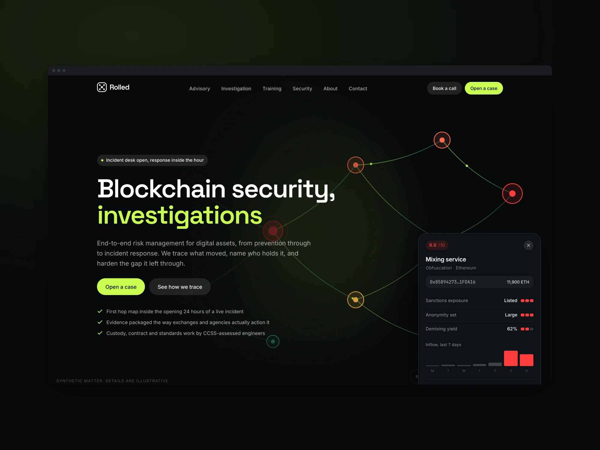
The hero is a working investigation. The trace graph is a live SVG diagram in a fixed 1440×860 stage, so it scales with
preserveAspectRatio rather than recalculating layout at runtime. Click any node and a dossier opens entity name, chain, full address, risk score, hop count, last-seen block, weighted signals. The edges draw themselves in with GSAP's MotionPath plugin, value pulses travel along the paths, and a risk key sits pinned to the corner so the colour vocabulary established in the first five seconds carries through every other page.It is clearly labelled "Synthetic matter details are illustrative", because a security firm that fakes evidence in its own marketing has already failed the brief.
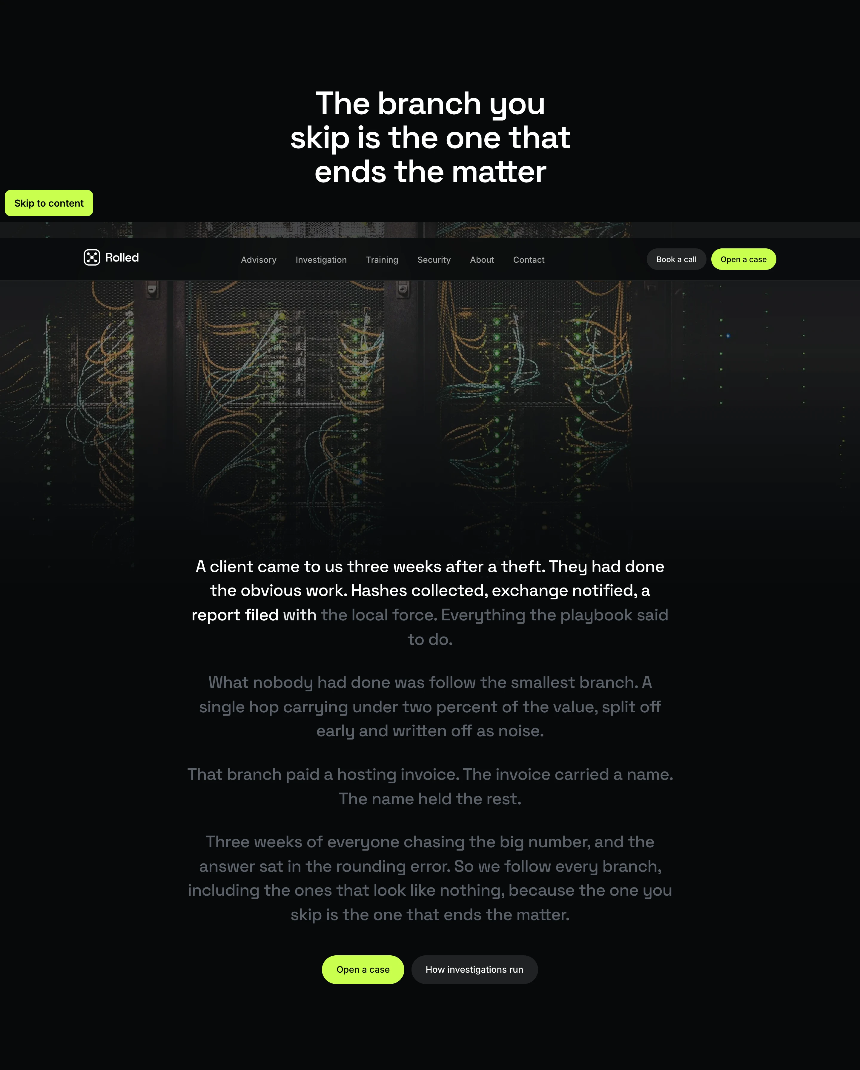
The narrative section makes the argument. Rather than a "why choose us" grid, there is a story, revealed word-by-word as you scroll: a client came in three weeks after a theft, having done everything right. Nobody had followed the smallest branch one hop carrying under two percent of the value, written off as noise. That branch paid a hosting invoice. The invoice carried a name. The name held the rest.
It closes on the line the whole practice is built on: the branch you skip is the one that ends the matter. That single section does more selling than a page of capability bullets, because it shows how these people think.
The layered explorer lets a visitor toggle between fund flow, sanctions exposure, cluster attribution, and behavioural signals over the same graph the same mental model an investigator uses, made touchable.
Performance was treated as a design constraint. All animation is scoped through
gsap.context() so tweens and ScrollTriggers revert on unmount instead of leaking across navigations and firing at detached nodes. Elements render visible by default and are hidden only by script, so a failed hydration degrades to a readable page rather than a blank one. A <noscript> block force-reveals everything. React Compiler is enabled, fonts are self-hosted through next/font with display: swap, and every animated property is transform or opacity.Scope of Work
Brand direction, colour system and type scale (Space Grotesk / Inter / JetBrains Mono)
Full site design — 6 pages, 13 bespoke home-page sections
Interactive SVG trace-graph system with click-through dossiers, reused across pages
Layered evidence explorer, animated case flow, and report-stack components
Scroll-driven narrative with word-level reveal
Dual-path contact intake (live incident vs. scheduled engagement)
Full accessibility pass — skip links, reduced-motion paths, no-JS fallbacks, focus states
Technical SEO — metadata templates, Open Graph, canonical URLs,
sitemap.ts, robots.tsResponsive across mobile, tablet and desktop
Result
A site that argues for itself. Instead of claiming investigative capability, it hands the visitor a working trace and lets them click through it so credibility is established before a single line of body copy is read.
The vocabulary introduced in the hero (clean / watch / flagged / severe) carries through every page, which means a visitor who spends ten seconds on the home page already knows how to read the service pages. The FAQ answers the hard commercial questions directly, so the first sales call starts past the objections rather than inside them.
Like this project
Posted Aug 6, 2026
Designed and developed a six-page website with interactive features for a blockchain security firm.
Likes
1
Views
26
Clients
Rolled