LOOP 2026 Conference Landing Page

Boluwatife Taiwo


Conference Landing Page — LOOP 2026
Timeline: 4 days
Role: Web Design & Next.js Development
Live site: Loop 2026
Project Overview
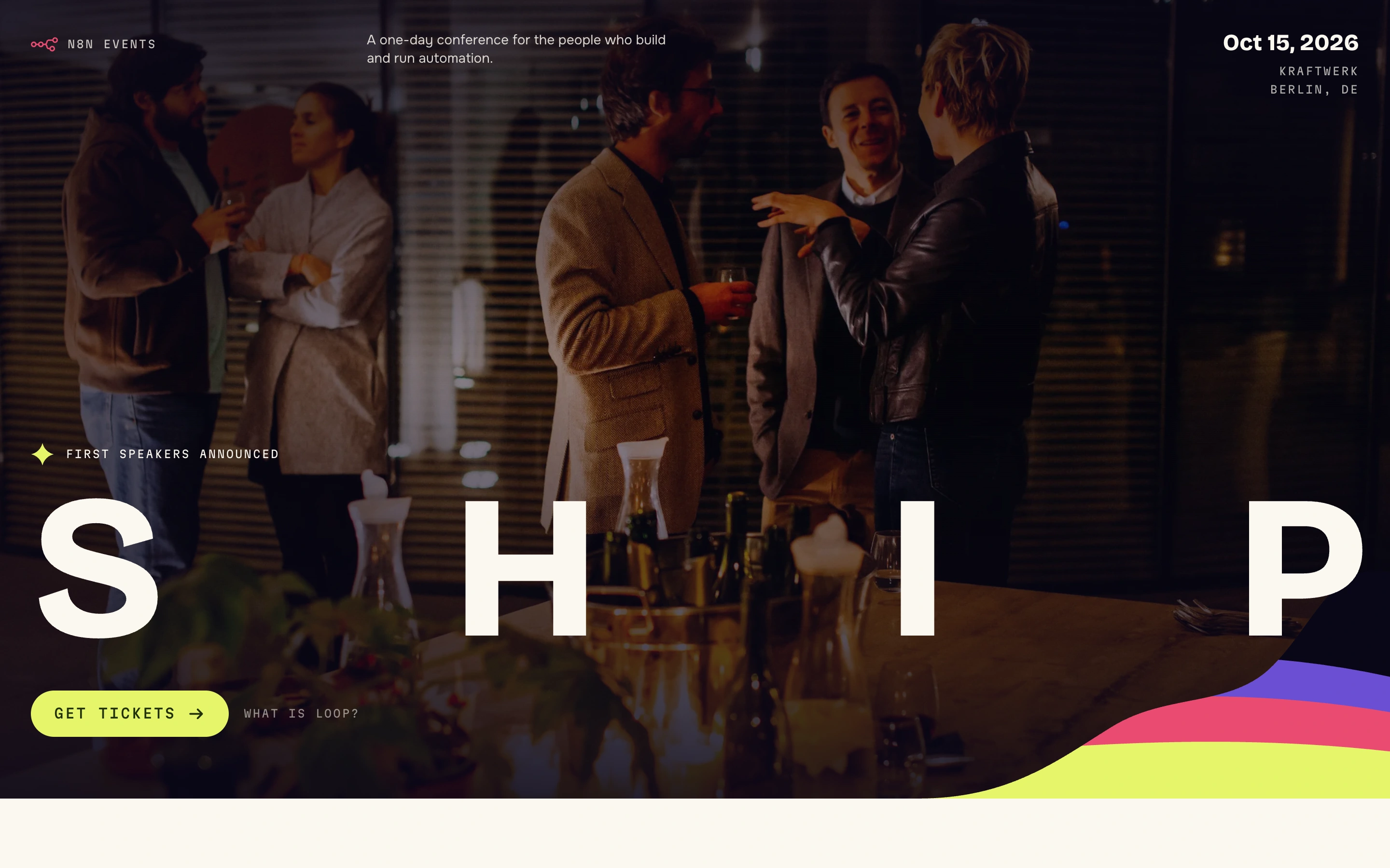
LOOP 2026 is a one-day automation conference a concept event set at Kraftwerk, a converted power station in Berlin Mitte, for the engineers who build and quietly maintain the automations everyone else in the company depends on.
I built it as a design exercise with a specific goal: prove that a conference site can carry real editorial personality and a complete ticketing flow, without a booking platform, a CMS, or a backend.
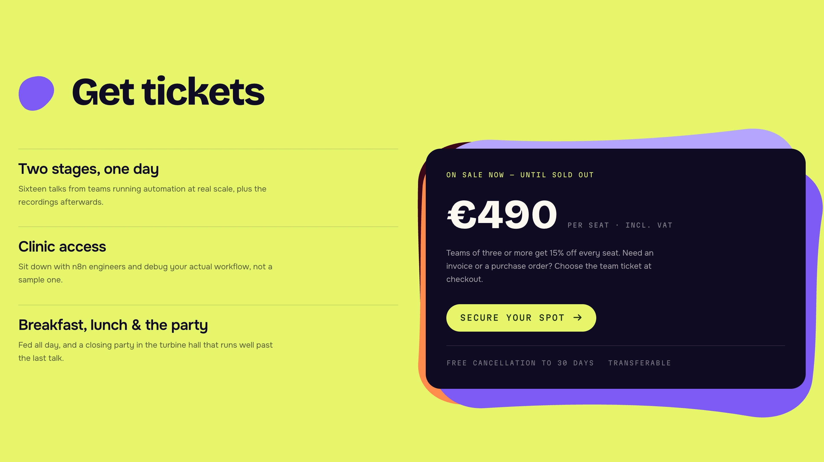
Conference sites are usually one of two things. Either a beautiful poster that makes you hunt for the date and the price, or a functional booking form with no atmosphere at all. This one had to be both a page that feels like the event, and sells a €490 ticket without ever leaving the tab.
Challenge
Design and build a conference landing page that:
Feels like a real event brand, not a template with a hero image swapped in.
Takes a visitor from curiosity to a ticket in hand including payment, confirmation, and a calendar file with no backend, no Stripe account, and no third-party ticketing embed slowing the page down.
Stays fast under heavy motion. The hero runs a full-viewport animated wordmark behind a photograph. That is exactly the kind of effect that wrecks interaction responsiveness if it is built naively.
Approach
Day 1: Brand and structure. The event needed a voice before it needed pages. I built the identity around one idea — the loop — and expressed it as a wordmark that never sits still: LOOP → BUILD → SHIP → REPEAT. Then the page architecture: hero, about, pillars, why attend, speakers, tickets, FAQ, closing CTA.
Day 2: The morphing wordmark. The centrepiece. Two stacked copies of the word cross-fade through a blur while an alpha-threshold SVG filter on the wrapper re-hardens the edges which is what makes the glyphs genuinely melt into one another instead of simply dissolving. Individual letters respond to hover with their own accent colour and a slight lift, and their neighbours react too.
Day 3: The ticket flow. A four-step simulated checkout: details → payment → processing → issued ticket. It ends in a real ticket stub with notch cut-outs, a generated entry code, and a downloadable
.ics calendar file.Day 4: Performance, accessibility and content. The final commit on this project was titled "Cut main-thread work behind INP on the hero" the animation was rebuilt to stop costing interaction responsiveness. Then the supporting pages: group orders, privacy, and a code of conduct.
Solution
A wordmark engineered for performance, not just for looks. This is the part I am most pleased with, because the naive version of this effect is a genuine performance disaster a viewport-wide, blur-filtered element repainting every frame lands directly in your INP score.
So the morph is driven imperatively through refs: React state changes once per word, roughly every 3.5 seconds, not once per frame. The blur radius is capped at 26px because filter cost scales with radius. The expensive SVG threshold filter is only attached during the morph itself and detached while a word is held legible. And the entire loop suspends when the hero scrolls out of view or the tab is hidden so it costs precisely nothing for the rest of the page. Under
prefers-reduced-motion the animation is skipped entirely and the wordmark simply sits still.The result is an effect that looks expensive and behaves cheaply.
A complete checkout with no backend. The ticket modal runs the full purchase psychology: tier selection with a genuine team discount (15% off per seat at 3+), dietary requirements, role, and quantity then a payment step, then staged processing messages ("Reserving your seat…", "Authorising demo payment…", "Issuing ticket…"), then the ticket itself.
The issued stub is a designed object, not a receipt: real notch cut-outs punched into the shape, a generated order code in
LP-XXXX-XXXX format, and an .ics download so the date lands in the visitor's actual calendar. The card field is a locked, clearly-labelled public test number the flow is honest about being a demonstration while still proving the entire interaction is designed and built.A hand-authored shape system. Rather than buying an icon set, the site uses organic squiggles drawn as section marks, stacked card outlines, and ambient page decoration. It is what stops the page reading as a Tailwind template the imperfection is the brand.
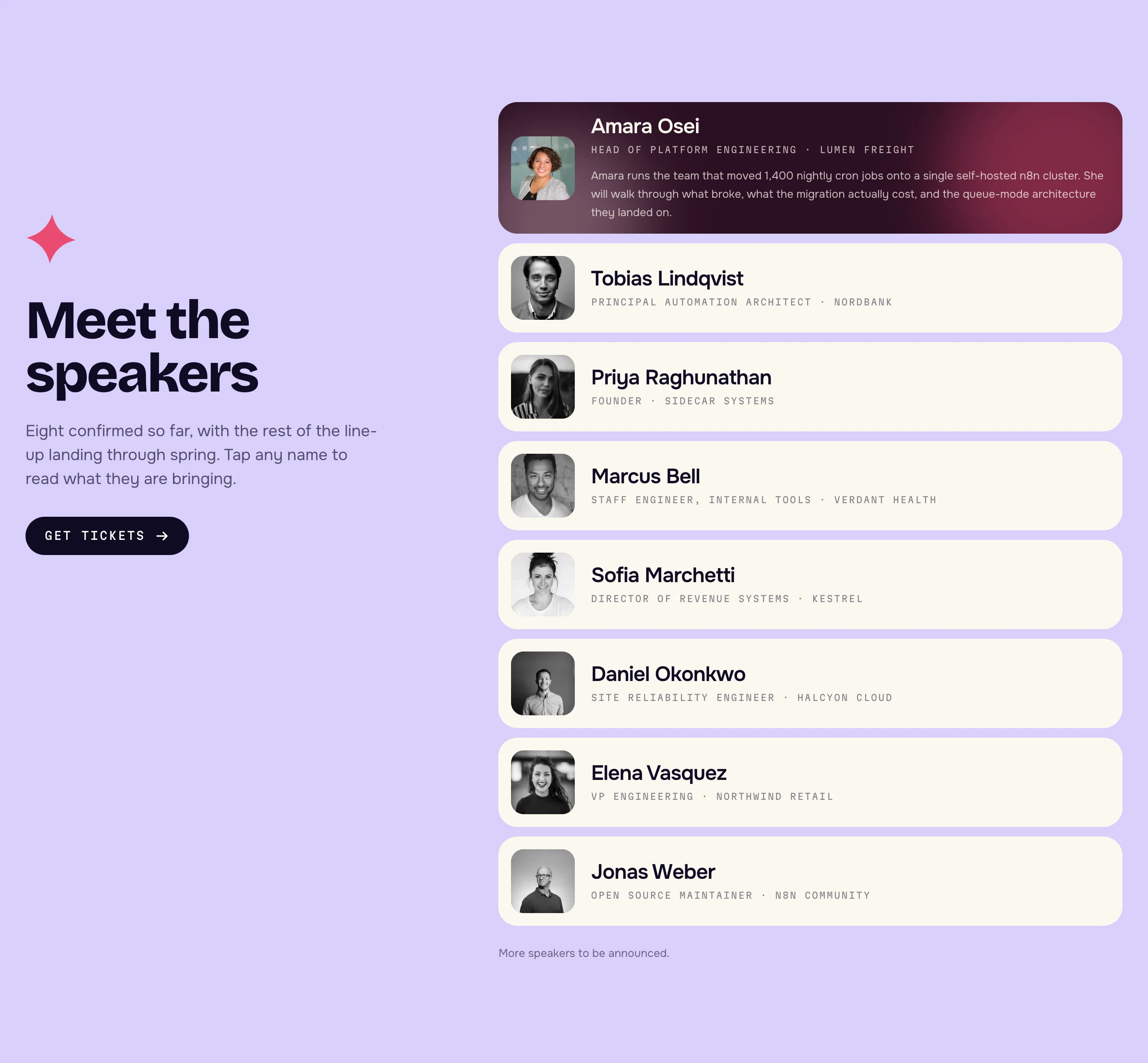
Speakers as a designed system. Eight speakers, each with their own background colour and two accent blob colours drawn from the event palette, so the section has rhythm and variation without a single bespoke layout. Every bio says what the talk actually covers "what broke, what the migration actually cost, and the queue-mode architecture they landed on" because that is what makes an engineer buy a ticket.
SEO done properly for an event. A dynamic Open Graph image, generated sitemap and robots files, and
schema.org/BusinessEvent JSON-LD carrying the date, venue, address, price, currency, availability and organiser so the event is eligible to appear as a rich result in search rather than a plain blue link.Scope of Work
Event brand direction, palette and type system
Animated morphing wordmark (LOOP → BUILD → SHIP → REPEAT) with per-letter interaction
Landing page design and build — 8 sections
Four-step simulated ticket checkout with tier logic and team discount
Designed ticket stub with generated entry code and
.ics calendar exportHand-authored organic shape system used throughout
Speaker system — 8 profiles with per-speaker colour theming
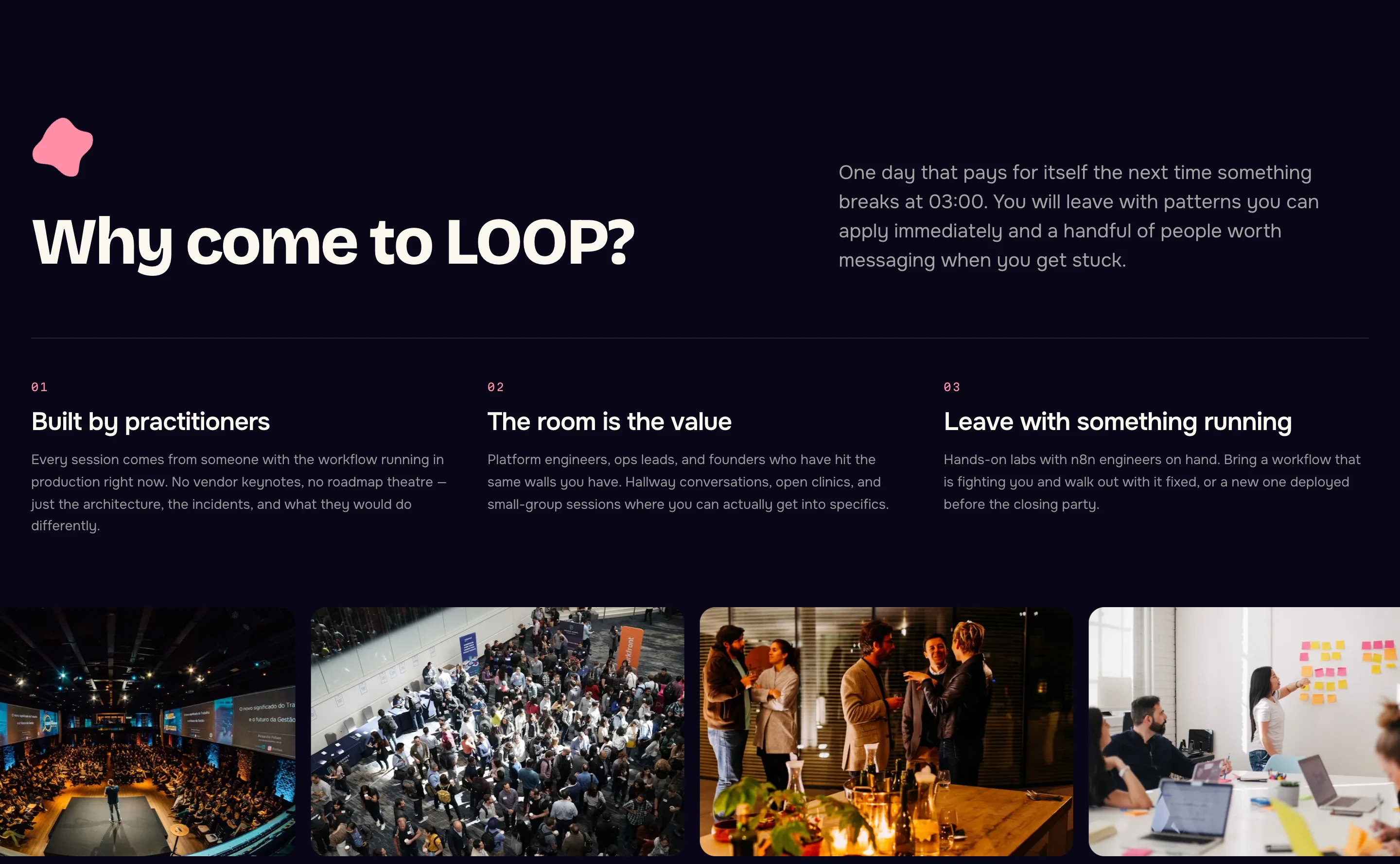
Photo marquee and gallery with written alt text on every image
Supporting pages — group orders (with form), privacy, code of conduct
Performance work targeting INP on the animated hero
Accessibility — reduced-motion paths, focus management in the modal, step-free venue info
Technical SEO — dynamic OG image,
sitemap.ts, robots.ts, BusinessEvent JSON-LDResult
A conference site that carries a genuine brand voice and closes the loop from "what is this?" to a ticket in the visitor's calendar entirely client-side, with no ticketing platform, no backend, and no third-party embed.
The hero effect is the proof point I would put in front of any client worried that a distinctive site has to be a slow one: it is a full-viewport, blur-filtered, continuously animating wordmark that costs nothing when it is off-screen and degrades to static under reduced-motion.
Like this project
Posted Aug 6, 2026
Designed and developed a fast, brand-specific conference landing page with a complete ticketing flow using Next.js.