Enterprise AI Landing Page Development for Yartsim

Boluwatife Taiwo


Enterprise AI Landing Page & Waitlist — Yartsim
Timeline: 3 days
Role: Web Design & Next.js Development
Live site: Yartsim Live
Project Overview
Yartsim is a frontier AI company models, plus the platform to run them inside the systems an organisation already operates. The buyer is not a developer trying a free tier. It is a bank, a manufacturer, or a government department, and the person reading the page has to take it to a procurement committee.
That changes what the site has to do. Enterprise AI buyers are not looking to be impressed by the technology; they assume it works. They are looking for the answer to one question, and they want it above the fold:
Where does our data go?
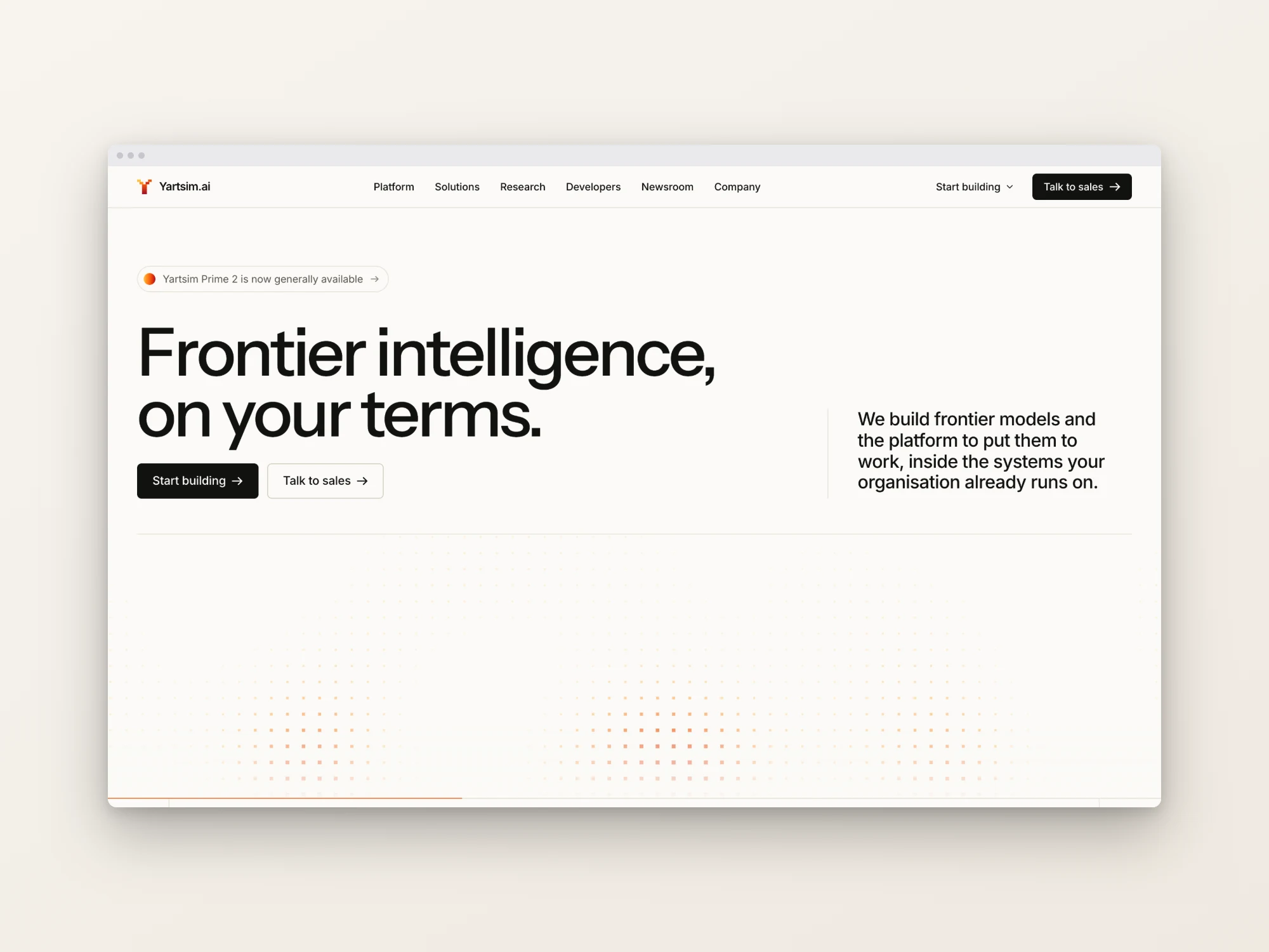
The entire site is built around answering that in the headline - Frontier intelligence, on your terms and then proving it, section by section.
Challenge
Design and build a single high-finish landing page plus a waitlist that:
Reads as institutional-grade. Restraint, not spectacle. The design has to feel like something a CIO would forward to a compliance officer without embarrassment.
Answers the deployment and sovereignty question early, because for this buyer it is a gate, not a detail.
Loads fast on a corporate network while carrying full-bleed photography and scroll-driven motion.
Approach
Day 1: Design system and content architecture. I started with tokens rather than screens: a two-layer system where a raw palette and spacing scale feed a semantic layer, so a component references purpose (
--color-surface, --color-ember-400) and never a raw hex. Fluid type sizing throughout, so headings scale continuously with the viewport rather than jumping at breakpoints.Then a structural decision that shaped everything after it: all copy lives in
src/content/, completely separated from JSX. Fifteen typed content modules — hero, principles, solutions, lattice, deployment, cases, newsroom, partners, access, waitlist, navigation, footer. Editing the site's messaging never means opening a component.Day 2: Sections, motion and the media pipeline. Twelve sections built out. GSAP ScrollTrigger for reveals and a scroll-driven text statement. And a build-time image pipeline instead of runtime optimisation.
Day 3: Responsive verification and the mobile pass. The final commit was "Fix mobile hero statement, dark-card buttons and rail touch targets" — the unglamorous pass that separates a site that looks good in a screenshot from one that works on a phone.
Solution
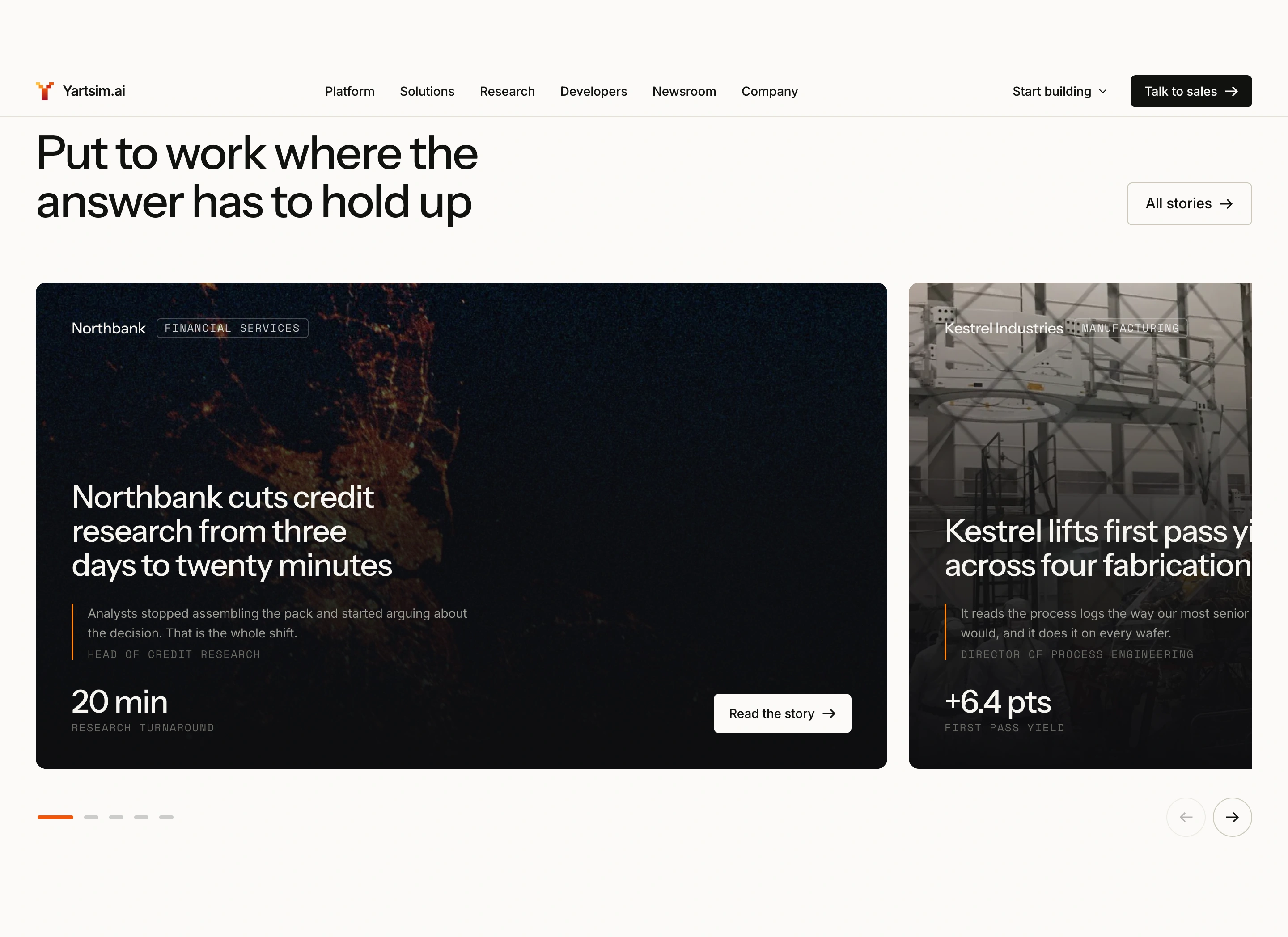
A restrained visual system that still has a point of view. A warm off-white canvas rather than the default AI-company black, with a single ember accent used sparingly a dot-matrix field fading behind the hero, an underline on the active ticker item, the arrow on a primary action. Because the accent is rationed, it directs attention every time it appears.
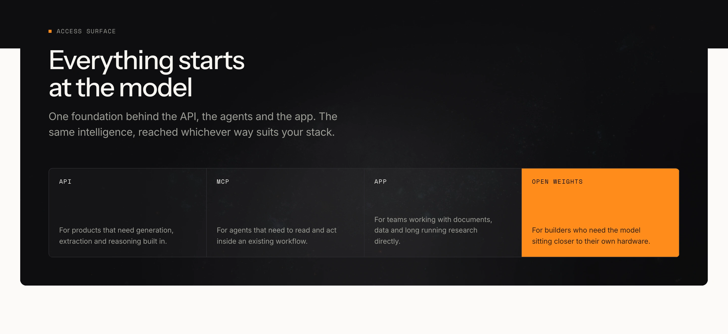
Deployment answered as a first-class section, not a footnote. Three options laid out plainly: self-hosted (your VPC or datacentre, air-gapped supported, bring your own keys), Yartsim Cloud (regional residency, no training on your data, SOC 2 and ISO 27001), and cloud marketplaces (private offers, committed spend eligible, single invoice). That last one matters more than it looks enterprise buyers with existing cloud commitments care enormously about drawing down against them, and almost no AI landing page says so.
Four principles that read as commitments rather than adjectives. You stay in command the model does the analysis, never the deciding; every output carries its sources and every step can be inspected, replayed or reversed. Runs where your data lives. Sharper with every run. Secure end to end. Each one is a sentence a procurement officer can actually test you against, which is the point.
A platform lattice instead of a feature grid. The product surfaces Pulse, Atlas, Anvil, Core, the frontier models, and applied AI services are laid out as an asymmetric CSS-grid lattice, each tile entering with its own motion (slide, tilt, lift, rise) and collapsing to a sensible mobile order. It communicates "platform" structurally, in a way a row of equal cards cannot.
A build-time media pipeline, so images cost nothing at runtime. Rather than using runtime image optimisation, source imagery is processed ahead of time by a Python script into responsive WebP variants at three widths each, plus a 20px base64 LQIP placeholder painted while the real image decodes all emitted as a typed TypeScript manifest that the
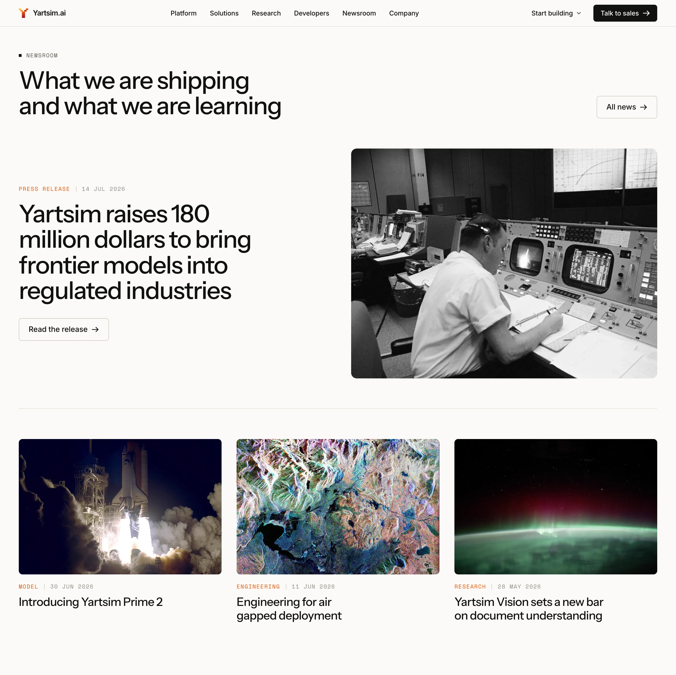
<Media /> component consumes.The payoff: the app ships static assets with zero runtime image optimisation, which keeps server cost at zero and makes the LCP image cacheable at the CDN edge indefinitely. Source imagery is from the NASA Image and Video Library public domain, cleared for commercial use, and documented as such in the generated file.
Motion that cleans up after itself. Every animation runs through a
useGsap hook that scopes a gsap.context() to its container, so tweens and ScrollTriggers revert on unmount. Without it, ScrollTriggers leak across client navigations and start firing against detached nodes a bug that only shows up after a user has browsed for a while, which is exactly when you least want it.There is also a
?motion=off query flag alongside the standard reduced-motion check, so screenshots and end-to-end runs capture the settled state instead of a random animation frame. Small thing; saves real time on every future capture.A waitlist wired for a real backend. The form runs on a React 19 server action with field-level validation and proper pending states. Nothing is persisted yet deliberately and the success branch is commented for exactly where the store goes. Swap in a database call and the form, its pending state and its error handling all keep working unchanged.
Verified, not assumed. The build was checked at 320, 375, 390, 768, 834, 1024 and 1440: no horizontal overflow at any width, no runtime errors, and every non-inline control at or above a 44px touch target. Error, loading, not-found and global-error routes are all implemented, so the edges of the app are designed rather than default.
Scope of Work
Two-layer design token system (raw palette → semantic layer) with fluid type scale
Landing page design and build 12 sections
Content architecture 15 typed content modules, copy fully separated from JSX
Platform lattice with per-tile entrance motion and mobile reflow
Deployment, principles, solutions, case-study and newsroom sections
Mega-menu navigation with mobile drawer
Waitlist page with React 19 server action and field-level validation
Build-time responsive image pipeline (Python → WebP + LQIP → typed manifest)
GSAP ScrollTrigger motion with scoped contexts and reduced-motion support
Full status-page set error, global-error, loading, not-found
Technical SEO generated OG image,
sitemap.ts, robots.ts, JSON-LD structured dataResponsive verification at 7 widths with documented results
Result
An enterprise AI landing page that answers the sovereignty question in its headline and proves it three sections later, with a design restrained enough to survive a procurement review and a build fast enough to survive a corporate network.
The architecture is the part that pays off after launch: because every word lives in a typed content module, the team can rewrite the site's entire messaging without a developer opening a component and because images are pre-optimised at build time into a typed manifest, the page ships with no runtime image cost at all.
Like this project
Posted Aug 6, 2026
Designed and developed an enterprise AI landing page with a waitlist, optimized for corporate use.