
Project Overview
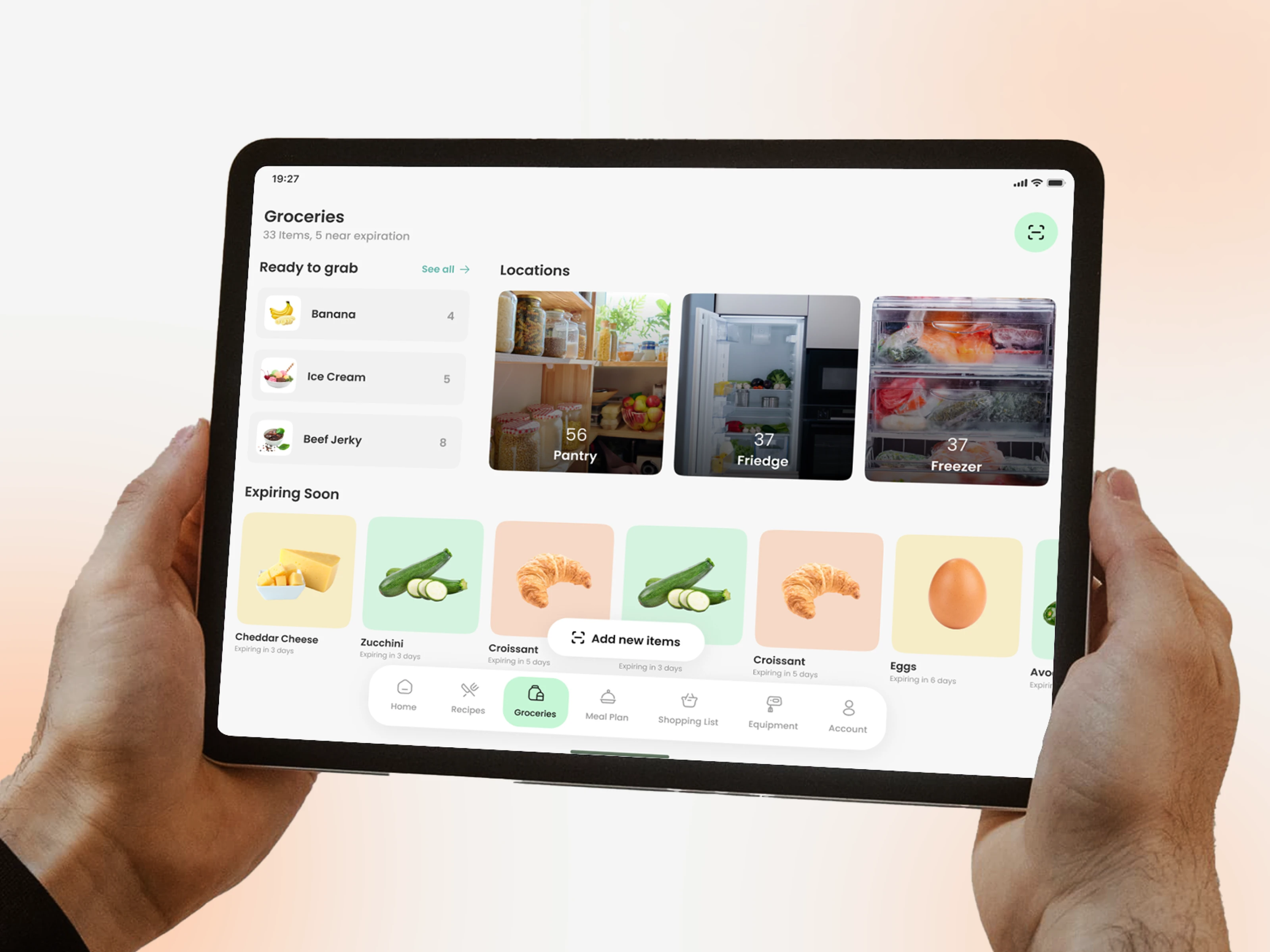
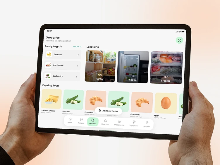
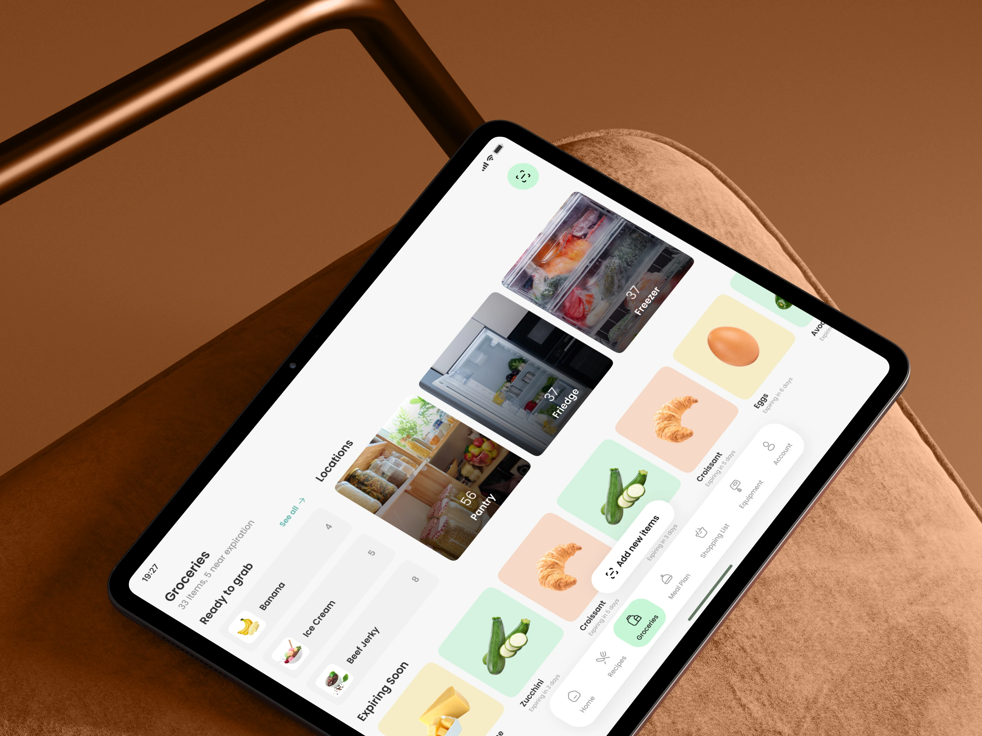
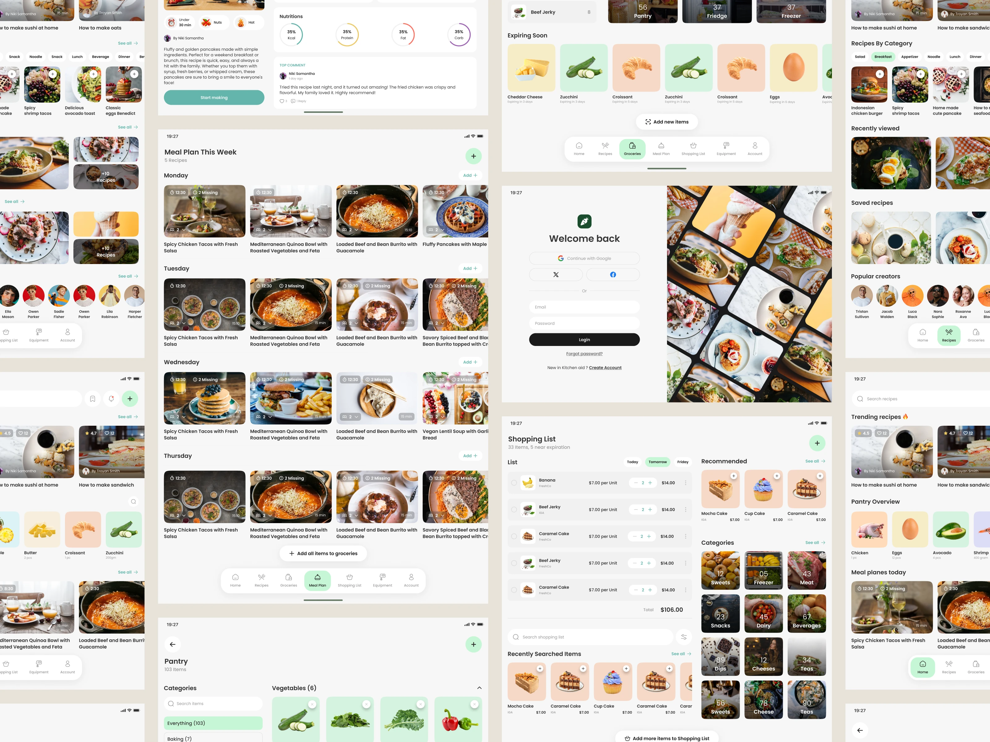
This screen focuses on helping users manage their household groceries with clarity and ease. From ready-to-grab items to a visual breakdown of pantry, fridge, and freezer storage, the goal is to give users a quick understanding of what they have, what’s expiring, and what needs attention. The layout keeps everything organized and simple for everyday cooking.
Design Approach
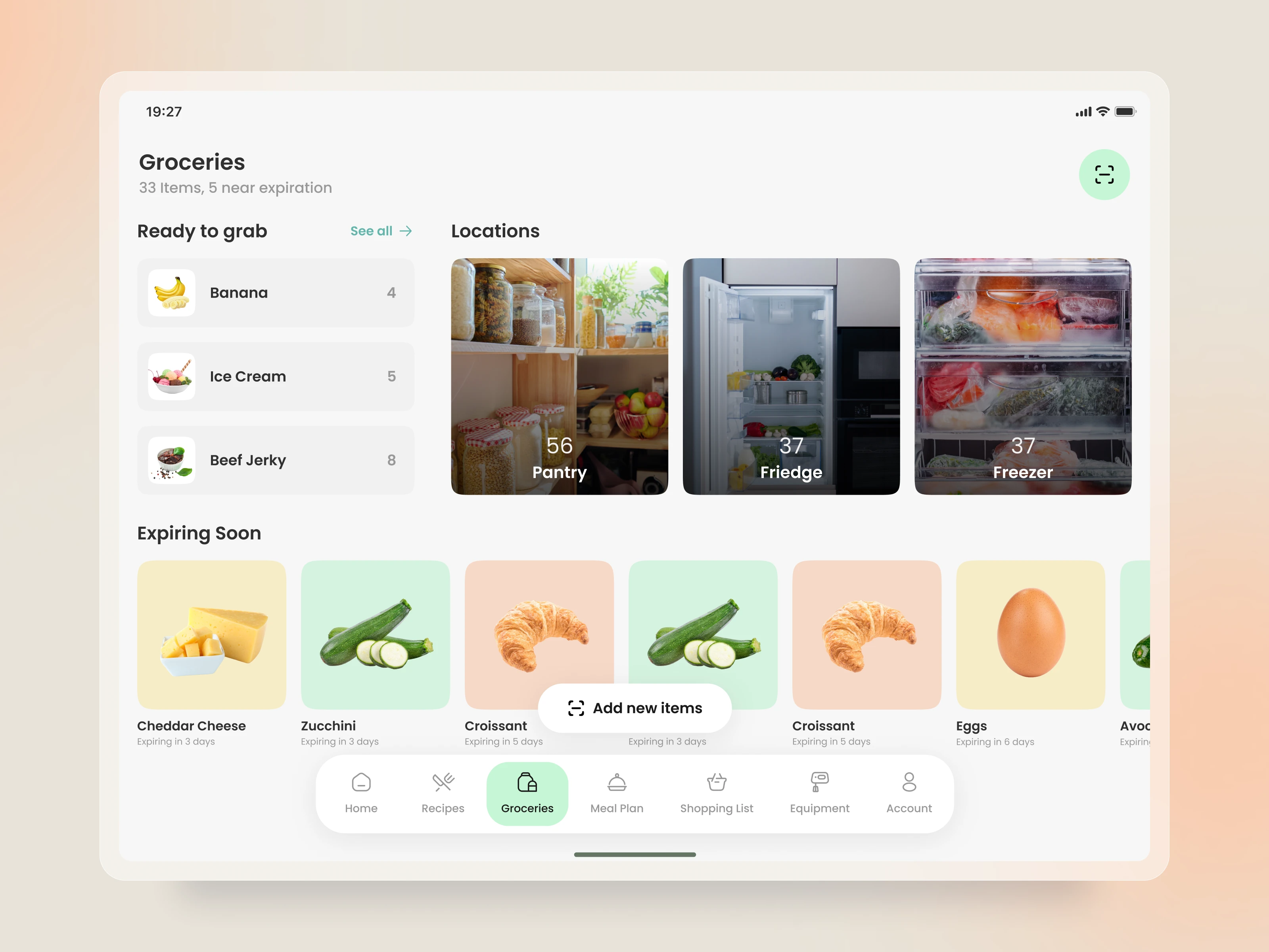
We designed this experience around real user needs such as avoiding food waste, remembering expiry dates, and managing multiple storage locations. Clear categories, soft visuals, expiration tags, and structured item cards help users scan their inventory effortlessly. The intention was to reduce decision fatigue and make grocery tracking feel natural and stress-free.
Feature Highlight
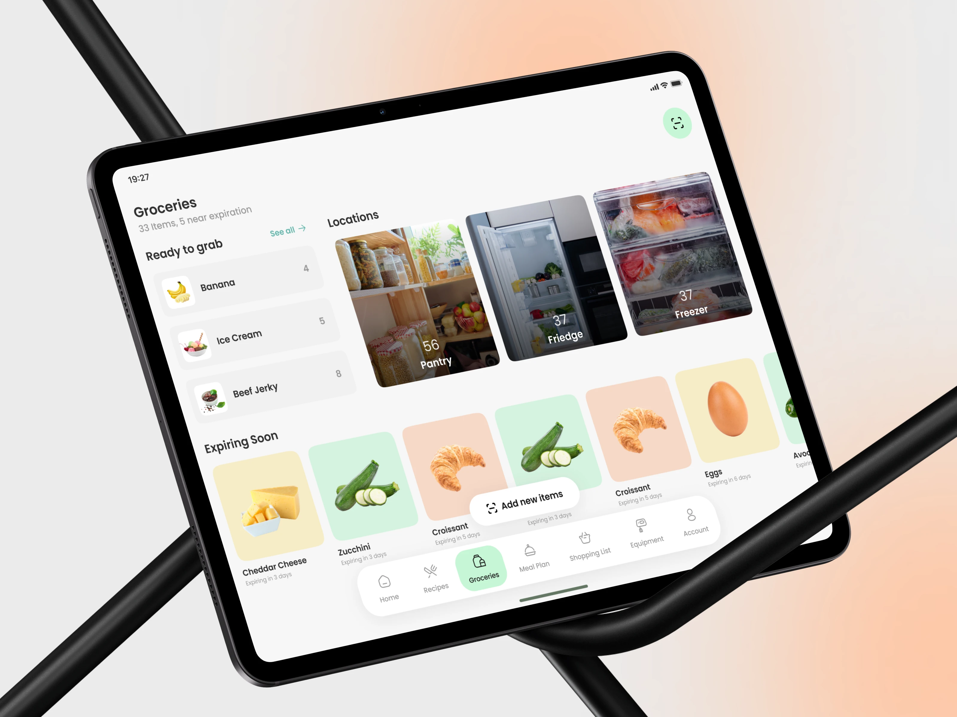
The screen introduces an intuitive “Expiring Soon” section, allowing users to act before food goes bad. Combined with quantity indicators and storage-specific grouping, users can instantly identify what to use first or restock. This creates a smarter kitchen routine and supports better meal planning.
Final Experience & Outcome
The final design provides a calm, intuitive overview of all groceries at home. Users can check items, explore storage locations, and add new entries without disrupting their flow. This structured and visually balanced approach helps users stay organized, reduce waste, and maintain a more efficient cooking routine every day.

0 likes · 2 views · Oct 25, 2026
Final Experience & Outcome The final design provides a calm, intuitive overview of all groceries at home. Users can check items, explore storage locations, and add new entries without disrupting their flow. This structured and visually balanced approach helps users stay organized, reduce waste, and maintain a more efficient cooking routine every day.


