YUMA
YUMA
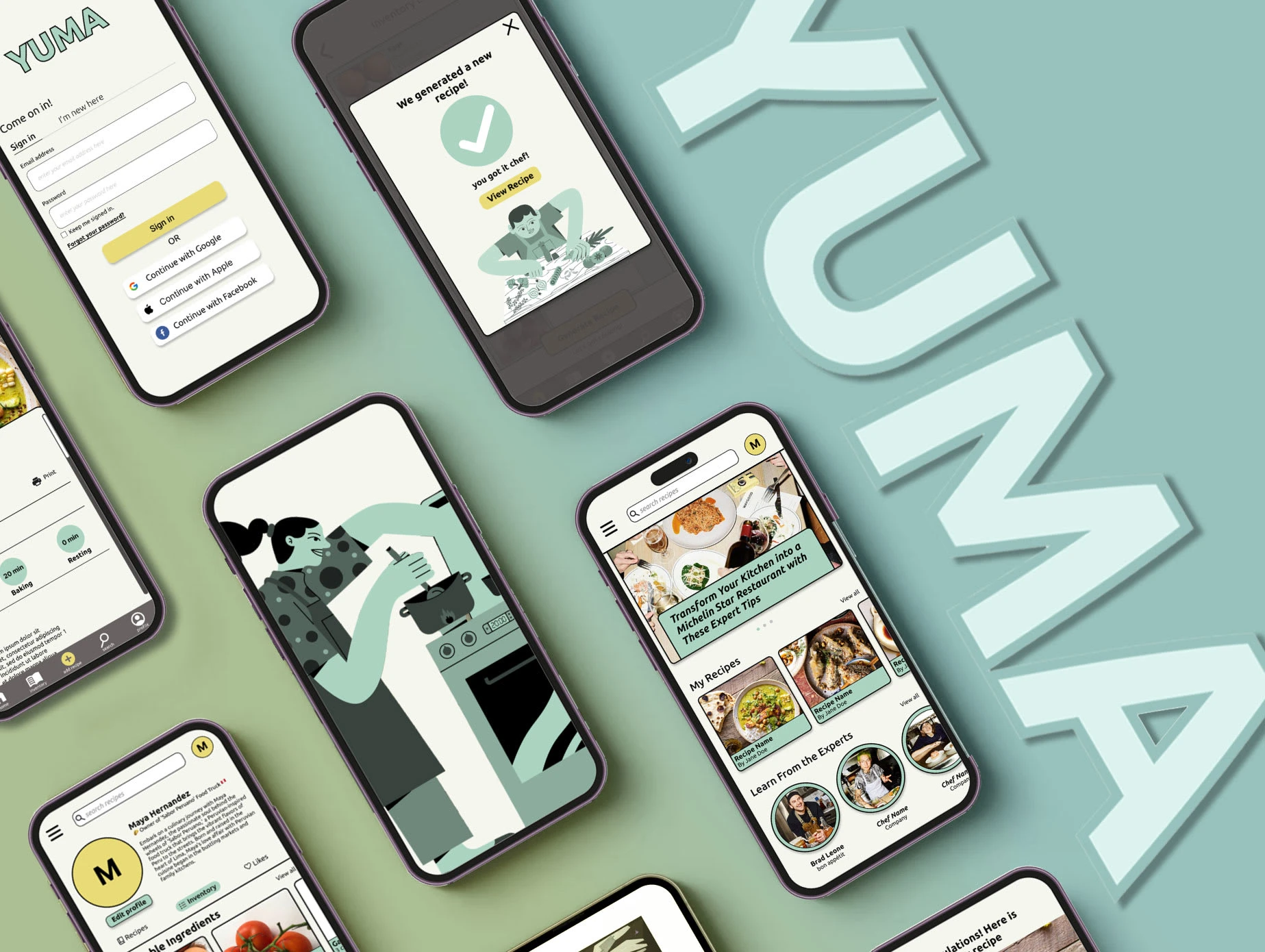
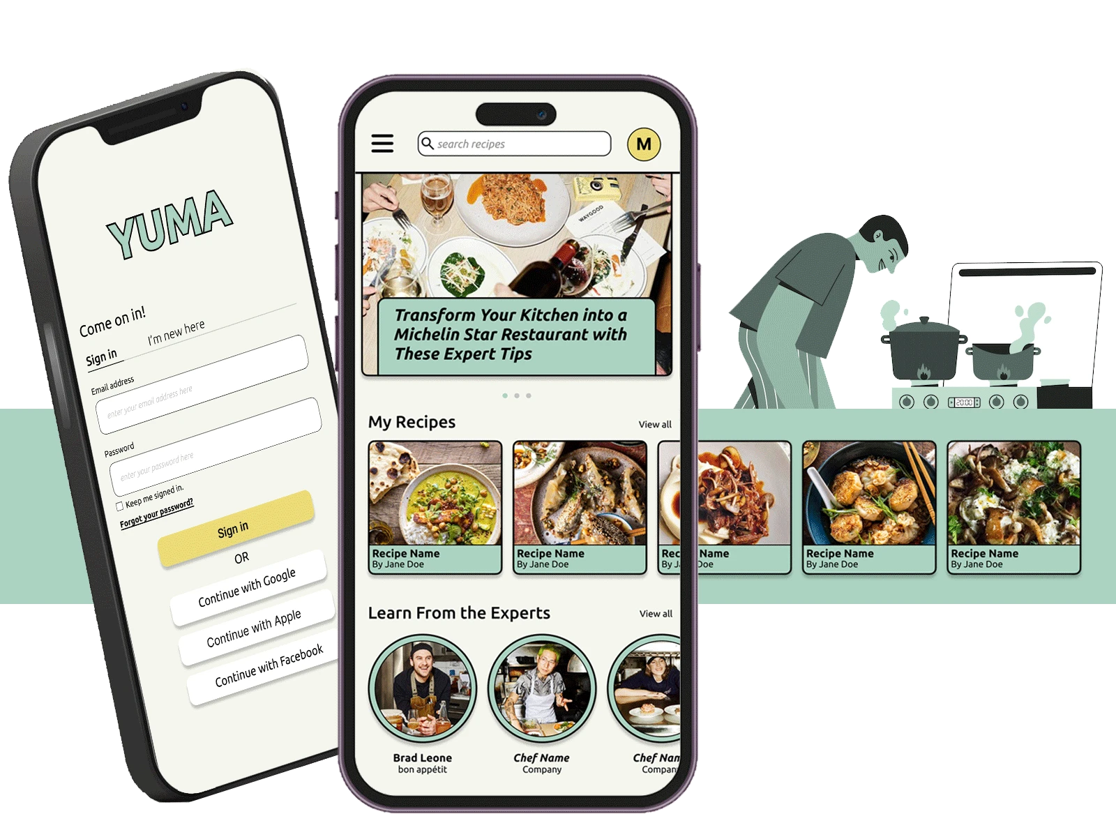
Elevate your kitchen game! YUMA —the ultimate tool for culinary innovation. Streamline recipes, inspire collaboration, and fuel success.
Who? One member, responsible for research, ideation, interface, prototyping, and documentation.
What? Culinary Companion: A Recipe Organizing App Tailored for Every Chef
When? Google UX Design Professional Certificate, Fall 2023
Where? Remote from San Francisco, CA
Why? and How?
Challenge
Individuals, including home chefs, food truck entrepreneurs, and culinary professionals, share the challenge of effectively managing kitchen operations, maintaining menu innovation, and collaborating seamlessly with their teams. The challenge is to cater to the diverse needs of these culinary enthusiasts and enhance their overall cooking and business experiences.
Goal
To empower users, spanning from home chefs to culinary professionals, with the Yuma platform—a versatile recipe organizing app. This app aims to streamline recipe management, inspire creativity through collaborative features, and provide real-time insights, fostering a more efficient, enjoyable, and successful culinary journey for users across various roles and establishments.
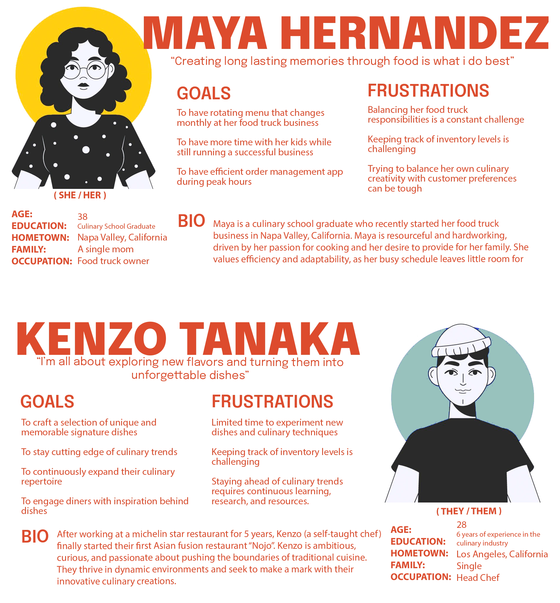
Personas
User Journey
Persona: Maya Hernandez
Goal: to achieve greater efficiency, innovation, and success in managing her food truck business
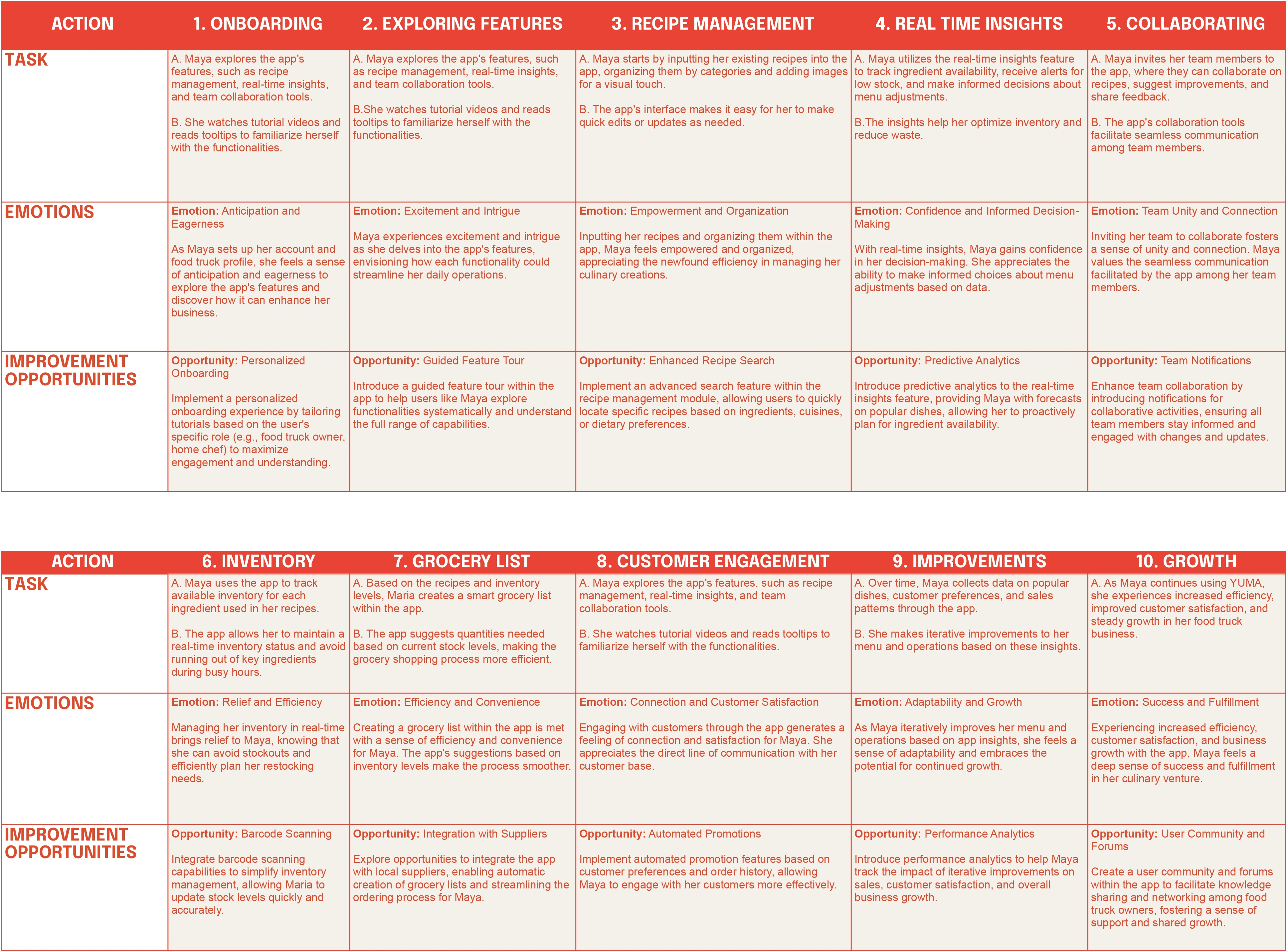
Maya Hernandez's User Journey Map
Creating a user journey map for our app, YUMA, is integral to understanding and addressing the unique needs and aspirations of culinary entrepreneurs like Maya. By mapping Maya's experiences and emotions throughout her interaction with the app, we gain invaluable insights into the pain points and opportunities within her food truck journey. This user-centric approach enables us to refine and optimize the app's features, ensuring they align seamlessly with Maya's goals of streamlining operations, fostering menu innovation, and enhancing team collaboration. Through this detailed journey, we not only tailor the app to meet Maya's specific needs but also pave the way for a comprehensive solution that empowers culinary enthusiasts, from food truck owners to home chefs, to achieve their culinary aspirations efficiently and with a sense of fulfillment. Ultimately, the user journey map serves as a compass, guiding us to create an app that not only meets functional requirements but also resonates with the emotions and aspirations of our users, making YUMA a transformative tool for success in the dynamic culinary landscape.
Key Insights
Holistic Operational Efficiency Matters:
Innovation Fuels Engagement and Satisfaction:
Collaboration Enhances Creativity:
Real-Time Insights Empower Informed Decision-Making:
Wireframes & Prototype
User Scenarios
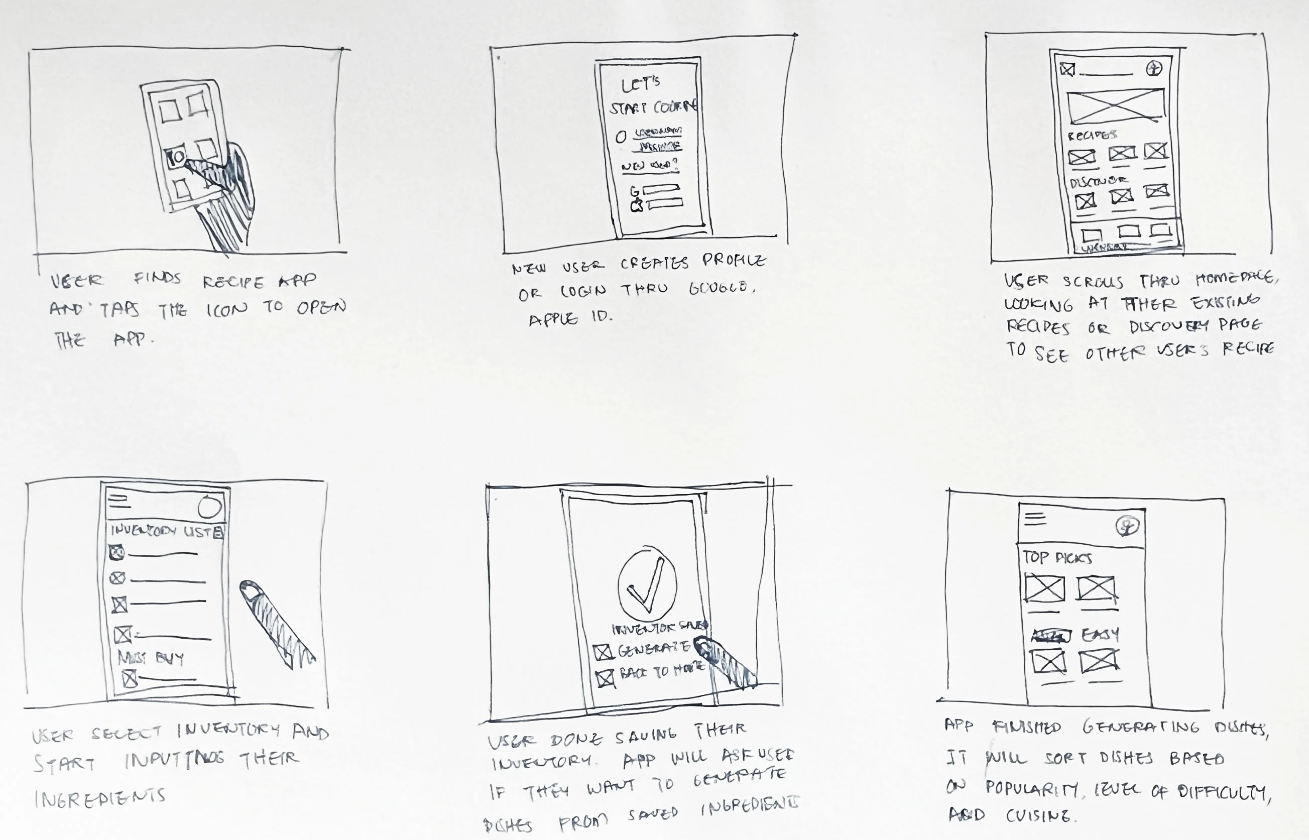
Maya's User Scenarios
Paper Wireframes
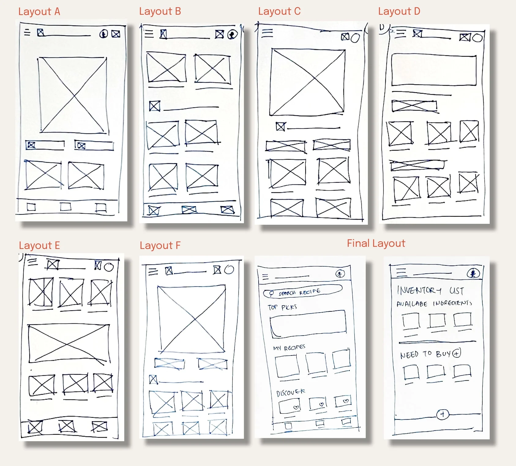
Paper Wireframes
Lo-Fi Prototype
After talking with users about the paper wireframes, I tinkered around a bit more. Now, the homepage is like the heart of a bustling culinary community—it's got everything from new articles to your recipes and the discovery page. Oh, and guess what? Your saved recipes, the ones that feel like your secret cooking gems? They're all snug under your profile now for easy access, just as you guys suggested. Plus, for a smoother ride through the app, I threw in an AI-generated recipe option right on the inventory list page. It's like having a recipe wizard at your fingertips!
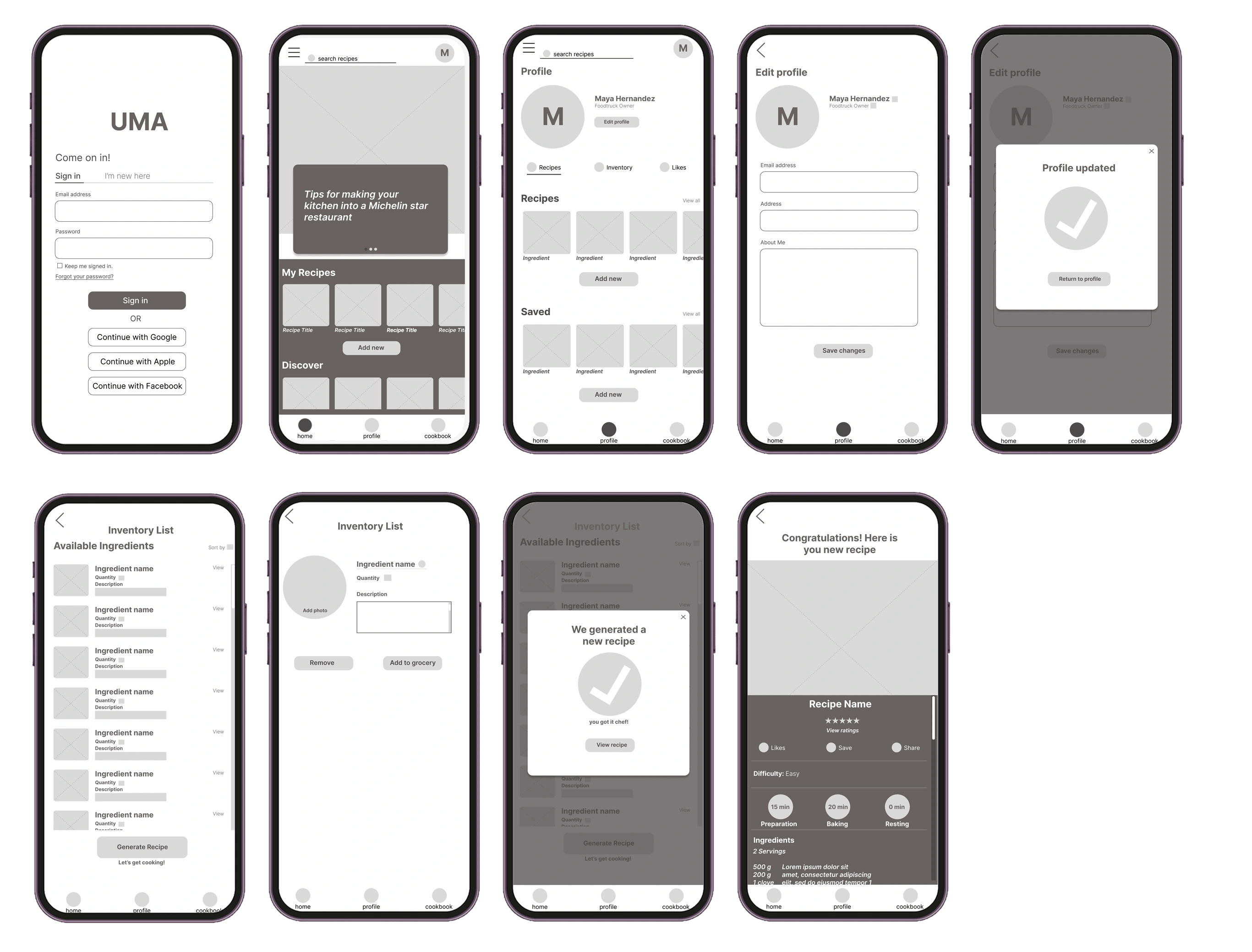
YUMA Lo-Fi Prototype Frames ( Partial )
Link to Prototype: Click Here
Hi-fi Prototype
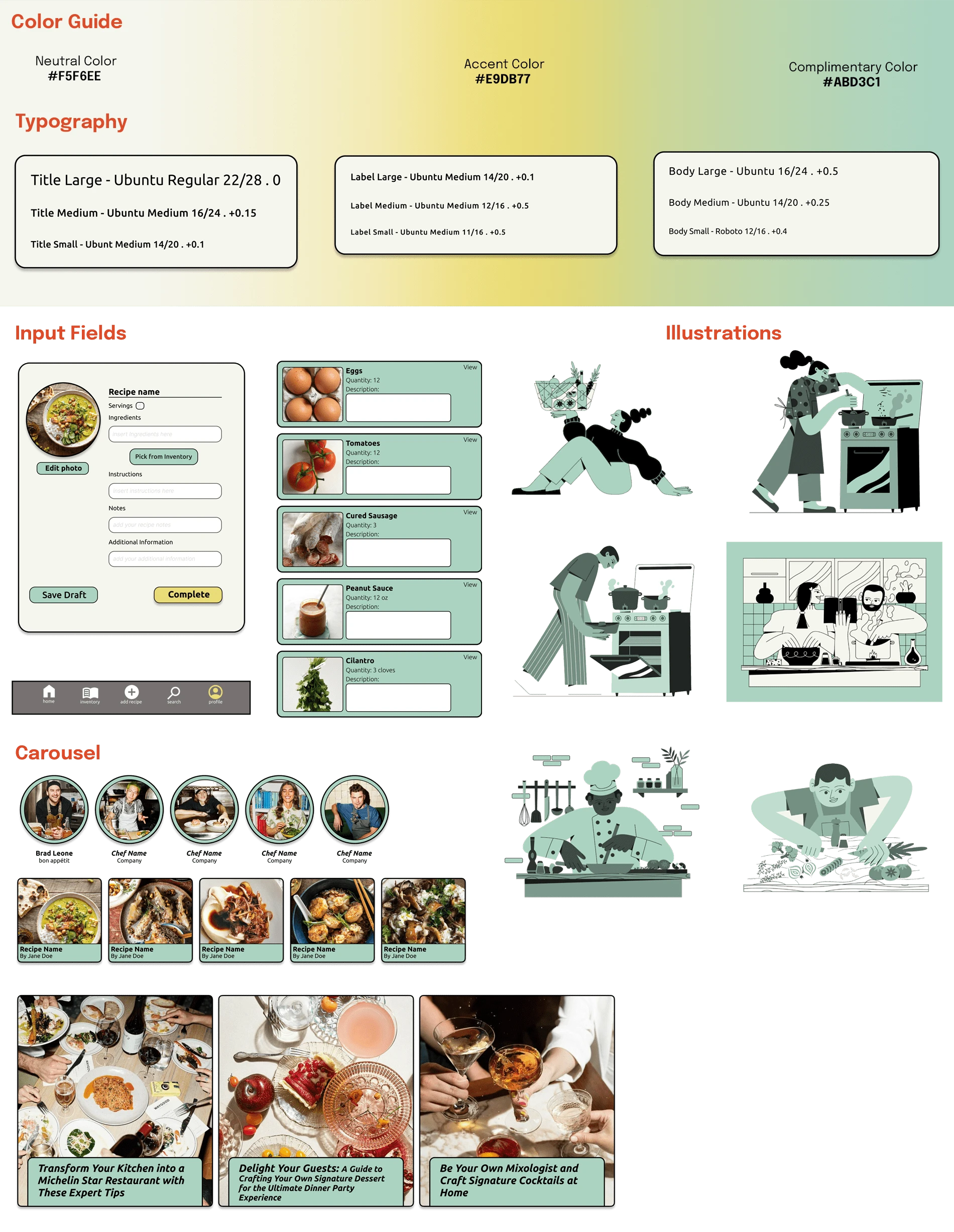
So, after every round of playing around with personas, I fine-tuned things until the user flow high-fived our main persona. Then, I dove into the Hi-fi Prototype, the stage where we figure out typography, iconography, and color scheme. All the stuff that makes our app super user-friendly, accessible, and easy on the eyes. Oh, and about the name game? Switched it up to YUMA from UMA because, well, it's closer to that mouth-watering "yum" factor. 🌮 I kept on testing our inventory wireframes, jotting down notes, and making tweaks to keep the design on point. It's like a constant kitchen experiment.
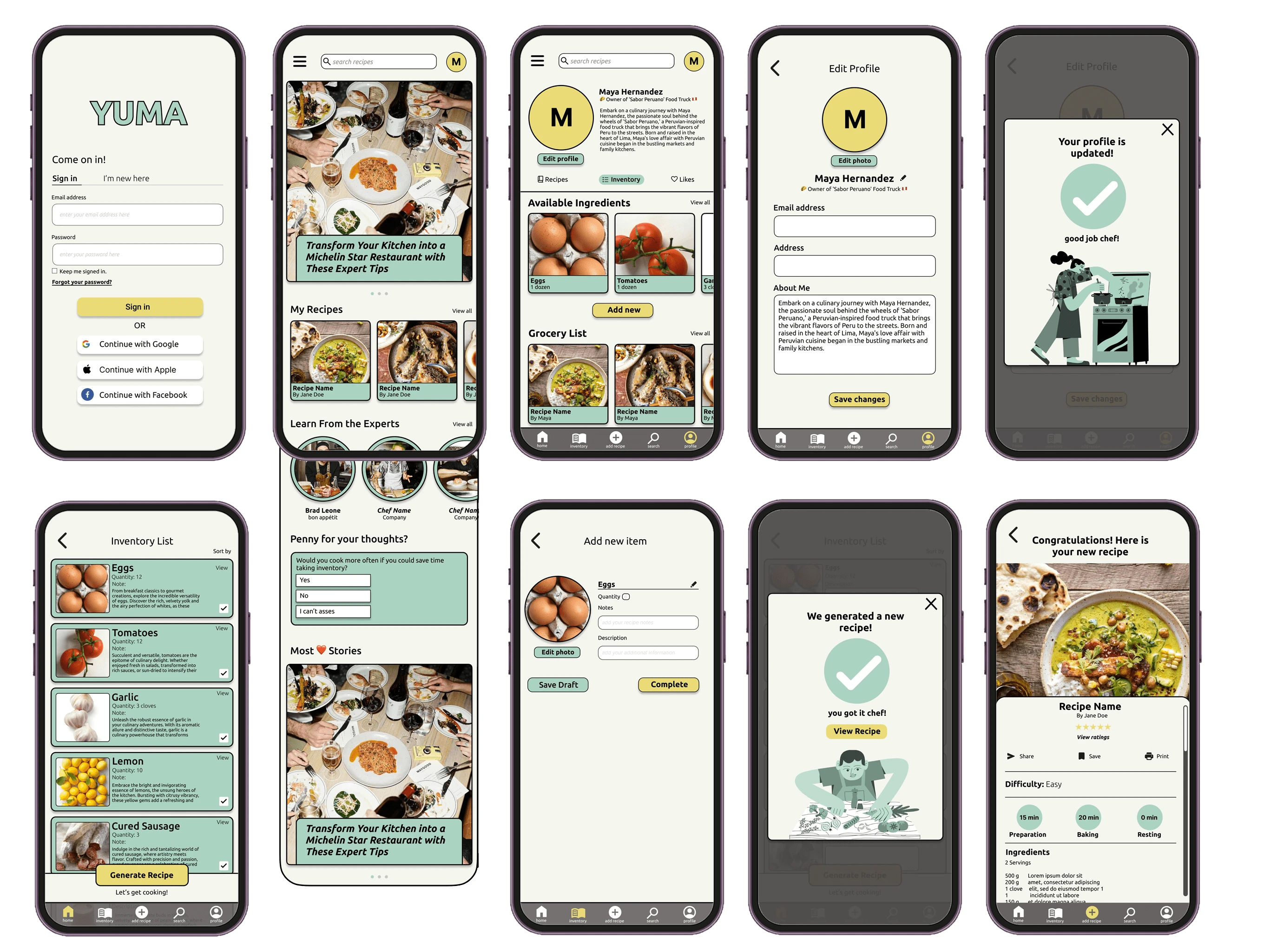
YUMA Hi-Fi Prototype ( Partial )
Link to Prototype: Click Here
Design
Conclusion
What I'd do differently?
If I were to revisit this project with additional time and an increased proficiency in the design tools, my approach would involve a more in-depth exploration and design focus for various user personas and scenarios. Given that this project marks my initiation into UX, a significant portion of my time was dedicated to honing my skills within Figma and crafting the prototype. In hindsight, I recognize an opportunity to optimize the design process further. Specifically, I would allocate additional time towards meticulously creating components and a comprehensive sticker sheet. This investment would ensure a more seamless design workflow, allowing for greater flexibility, consistency, and efficiency in adapting the design to diverse user needs and scenarios.
Key Takeways
What are the key takeaways from this project? Well, being my first-ever foray into UX design, having learned from a course that throws you headfirst into projects with limited time, it's safe to say this journey has sparked a fire in me to up my UX design game. The positive feedback from users, even in the initial testing phase, is a huge confidence booster. The realization hit me hard—designing an app requires a ton of thoughtful consideration, something I didn't fully grasp despite using them every day. From my debut project, the big lesson is crystal clear: user priority is non-negotiable. That nugget of wisdom is definitely coming along for the ride in all my future projects.
Like this project
Posted Dec 22, 2023
Elevate your kitchen game! YUMA the ultimate tool for culinary innovation. Streamline recipes, inspire collaboration, and fuel success.


