Horizonte Potencial | Child Psychoanalysis Identity

Thayline Vargas


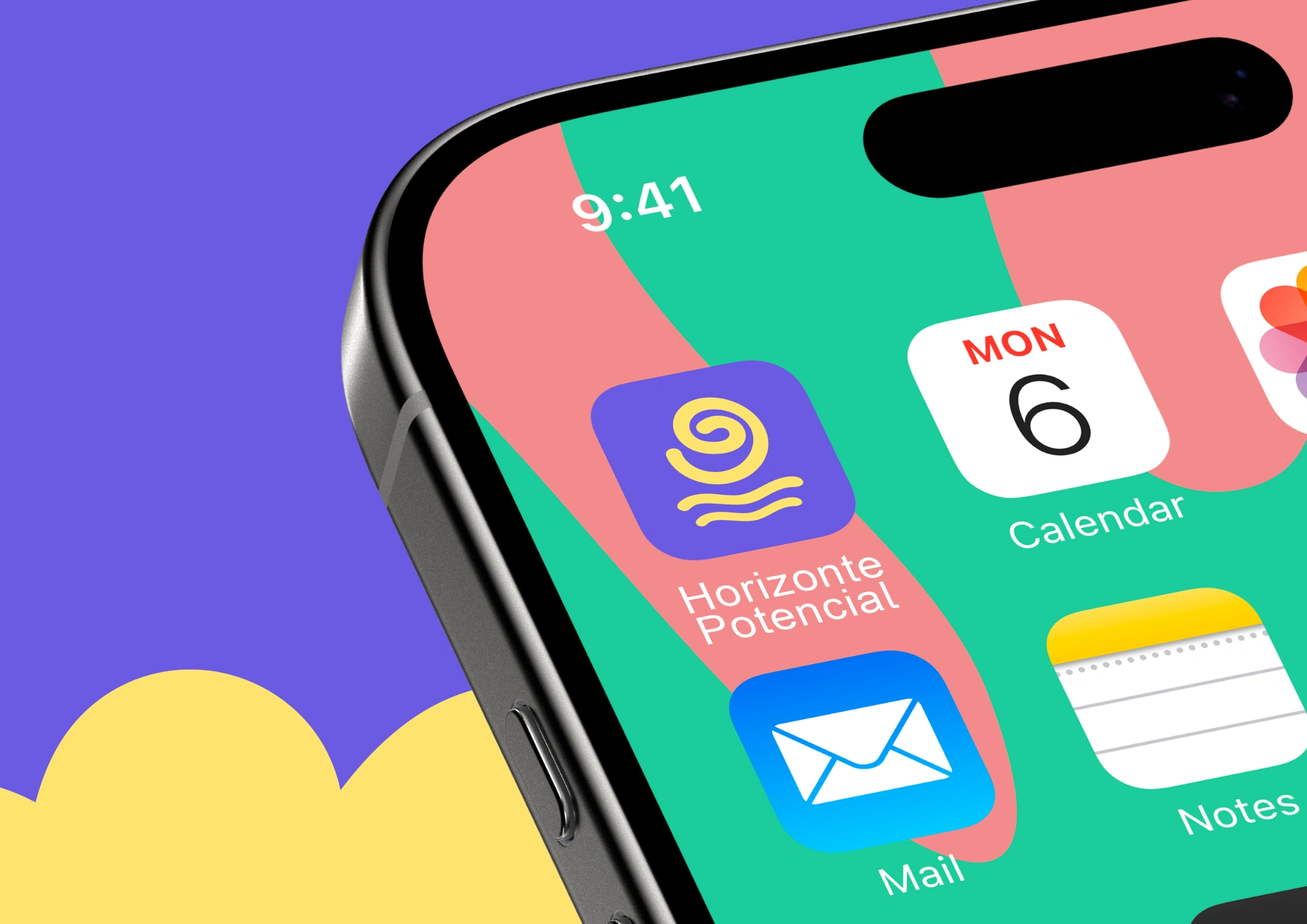
A visual identity for child psychoanalysis and technology
Horizonte Potencial was created at the intersection of child psychoanalysis and technology. The project begins with a central belief: play remains a child’s primary path to expression, even in a world shaped by screens.
Innovation and care move together in this identity. Every element was designed to preserve the symbolic nature of play while opening new possibilities for connection. More than a digital platform, Horizonte Potencial supports child psychoanalysts in clinical practice and keeps each child’s creativity, pace, and subjectivity at the centre.
Purpose and positioning
Horizonte Potencial is a space for innovation in child care, bringing psychoanalysis and technology into dialogue. It is a living field of creation where play continues to support expression and symbolic elaboration.
The platform offers child psychoanalysts tools that bring digital play into the clinical setting while preserving its symbolic and therapeutic function. Its purpose is simple and deep: to ensure that play remains the way forward, in consulting rooms and across clinical and educational contexts.
The challenge
The identity needed to feel current alongside contemporary children’s brands without losing clinical restraint. It had to balance the seriousness of psychoanalysis with the lightness, imagination, and openness needed for childhood.
Logo concept
The geometric, rounded typography brings a sense of modernity and closeness. It communicates trust without becoming rigid, leaving room for the playfulness essential to the brand’s world.
The logo avoids literal visual cues. Its almost child-drawn quality creates a distinctive, functional mark that works in both full and reduced formats.
Integrated into the letter “o,” the symbol combines a spiral and waves. Together, they suggest a horizon, a sun, and movement, evoking the emergence of new possibilities, creative flow, and Winnicott’s concept of potential space.
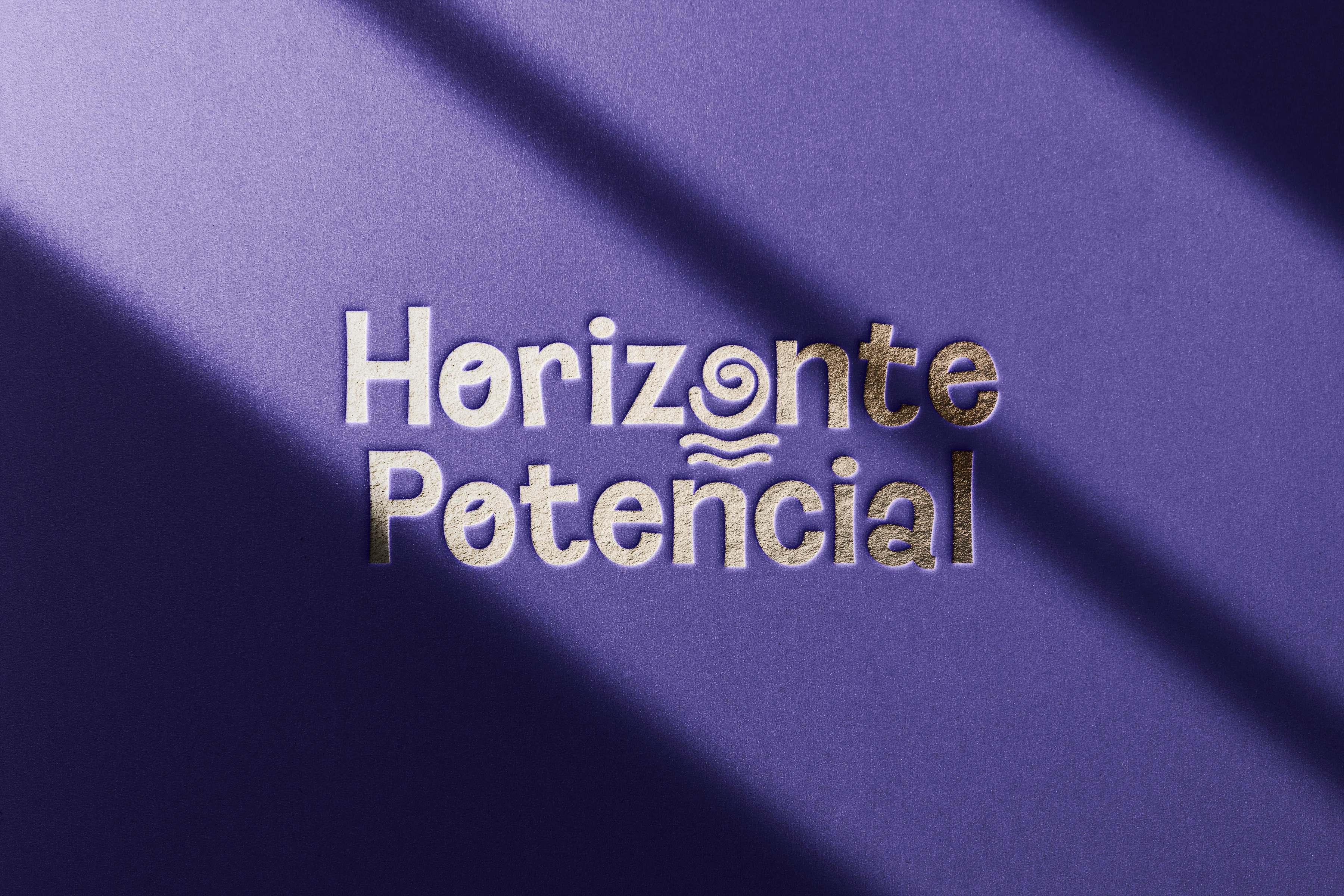
The logo combines a warm, approachable wordmark with imperfect stars inspired by children’s drawings and individual expression.
A personal symbol
The imperfect star was drawn by hand to echo the designer’s own childhood marks. Its uneven sides represent authenticity and the idea that every person is unique, a perspective central to psychology.
Rather than smoothing out those irregularities, the identity treats them as a source of character. The star becomes a recurring symbol of creativity, subjectivity, and each child’s individual way of being in the world.
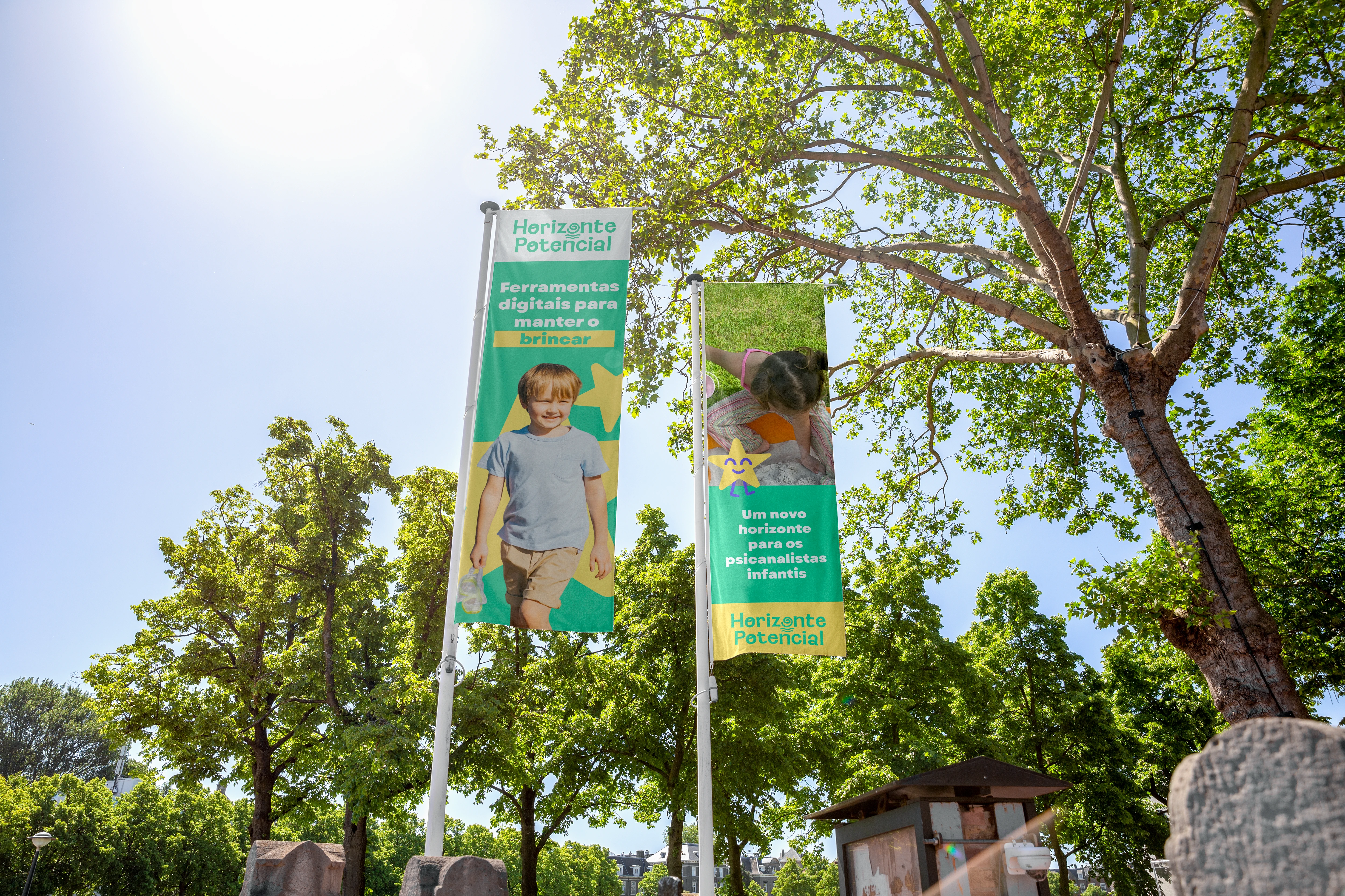
The visual system extends beyond the screen, creating a recognizable presence for Horizonte Potencial across physical touchpoints.
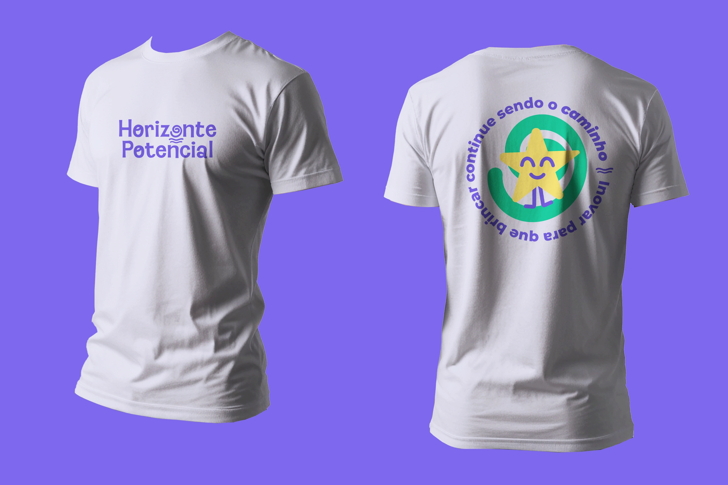
Branded apparel translates the identity into a human and accessible expression of the platform’s community.
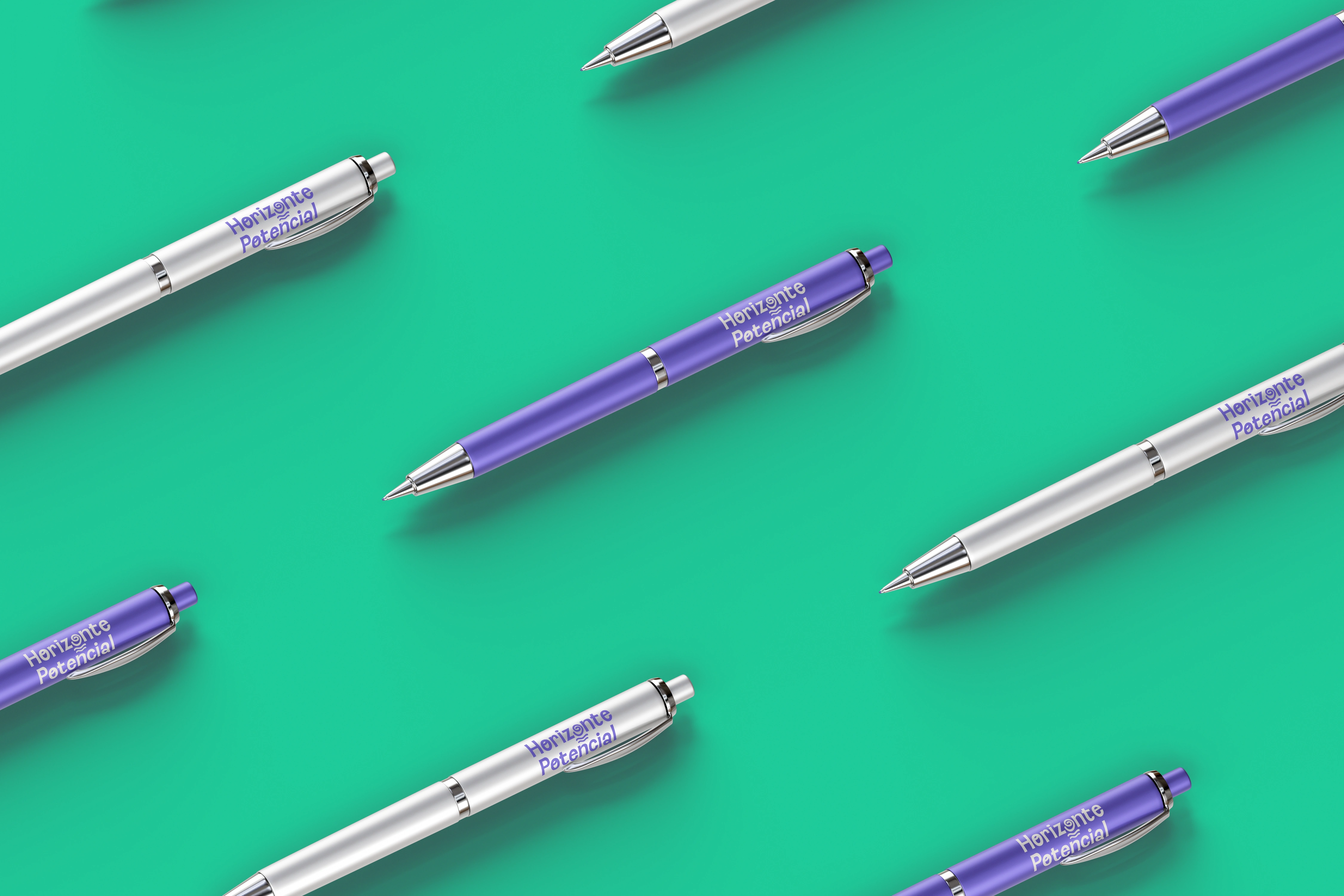
Everyday objects carry the visual language, reinforcing care and connection through small clinical moments.

The identity remains soft, practical, and recognizable across simple brand applications.

The imperfect star becomes a recurring symbol of creativity, subjectivity, and the unique pace of every child.
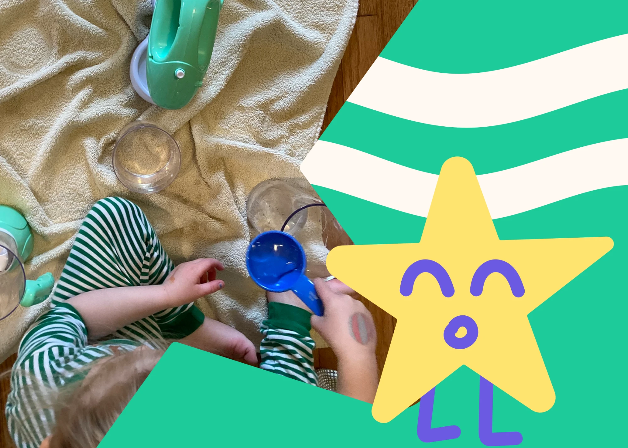
A flexible visual system designed to support communication in clinical and educational settings.
Project details
Client: Horizonte Potencial
Design: Thayline Vargas
Duration: 6 weeks
Like this project
Posted Aug 12, 2026
Brand identity for Horizonte Potencial, a child psychoanalysis and technology platform where play is a more human digital experience.
Likes
0
Views
5