MobivoltzX | EV Charging Brand Identity

Thayline Vargas


MobivoltzX
Energy That Moves
MobivoltzX is a technology-driven electric mobility brand built for the infrastructure behind reliable EV charging. Its offer brings together charging equipment, digital management, connectivity, monitoring, operations, and the systems required to make electric mobility work at scale.
The brand serves environments ranging from residential developments and companies to commercial spaces, fleets, public locations, and charging hubs. Rather than positioning the charger as an isolated product, MobivoltzX frames it as part of an intelligent ecosystem that connects stations, manages users and charging sessions, organizes data, supports billing, and gives operators visibility across the network.

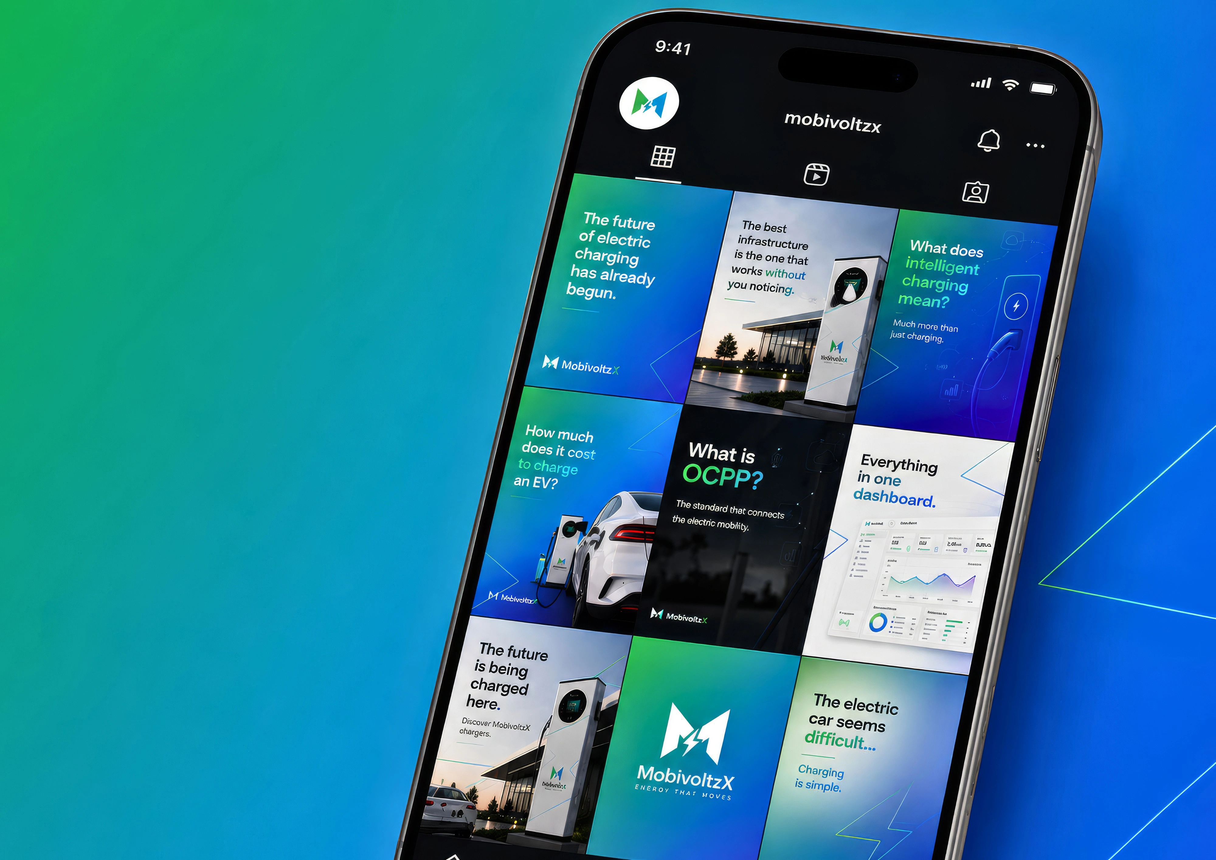
The app

MobivoltzX brand material 02
The Challenge
Electric mobility brands often lean on the same visual shortcuts: dark backgrounds, excessive neon, glowing interfaces, electric bolts, and science-fiction imagery. Those cues signal innovation quickly, but they can make brands in the category look interchangeable.
MobivoltzX needed to communicate energy, movement, technology, and reliability without slipping into a cyberpunk or artificial aesthetic. The visual system had to feel contemporary and distinctive while remaining professional, clear, and credible for a real infrastructure market.
It also needed to operate across a broad range of touchpoints: charging stations, management dashboards, digital interfaces, uniforms, vehicles, signage, commercial proposals, and social media.
Strategic Direction
The identity was shaped around a clear idea: electric mobility only works when energy, hardware, software, and people stay connected.
The design shifts attention from the vehicle alone to the infrastructure behind it. It communicates sustainability without generic green branding, technology without making the brand inaccessible, and mobility through systems of connection, monitoring, and intelligent management.
The Mark
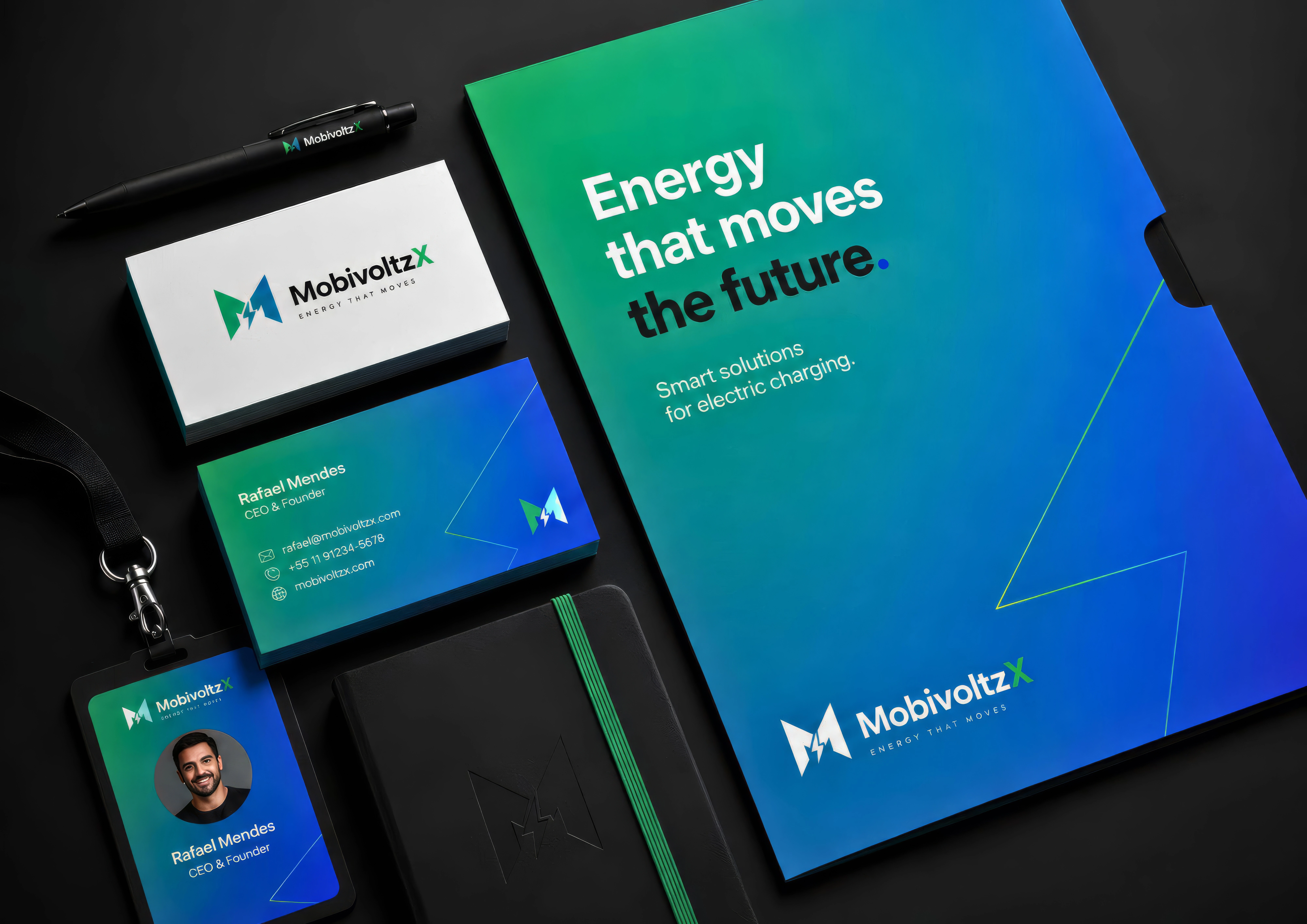
The symbol combines a geometric “M” with a lightning element, creating a compact form associated with energy and mobility. Its angular construction brings direction and movement, an appropriate expression for a brand connected to circulation, charging networks, and the transition to electric transportation.
Designed to work independently from the wordmark, the symbol functions as a recognizable asset across physical and digital applications, from charging stations and interfaces to uniforms, vehicles, and wayfinding.
MobivoltzX brand material 03
A System for Flow
The color palette reinforces the same positioning. Green signals energy transition, sustainability, and availability. Blue introduces precision, reliability, and a technological dimension. Their gradients become a visual metaphor for flow, energy transfer, and movement.
White creates clarity and breathing room for institutional and commercial communication. Black and darker neutrals bring impact when a more technical atmosphere is needed, without becoming the identity’s dominant language.
This flexibility allows MobivoltzX to move between clean corporate communication and more expressive digital applications while staying unmistakably connected to the same brand system.
Typography & Graphic Language
A contemporary sans-serif typography system creates a direct, accessible, and functional tone. Large, concise headlines establish hierarchy, often using green-to-blue color shifts to emphasize key words without relying on excessive text.
Geometric line elements extend the logic of the logo across the full identity. Inspired by energy paths and the symbol’s lightning geometry, they frame imagery, organize layouts, divide content, and introduce movement. This gives the system recognition through composition, color, geometry, and hierarchy, even when the logo is not the main focus.
MobivoltzX brand material 04
From Infrastructure to Interface
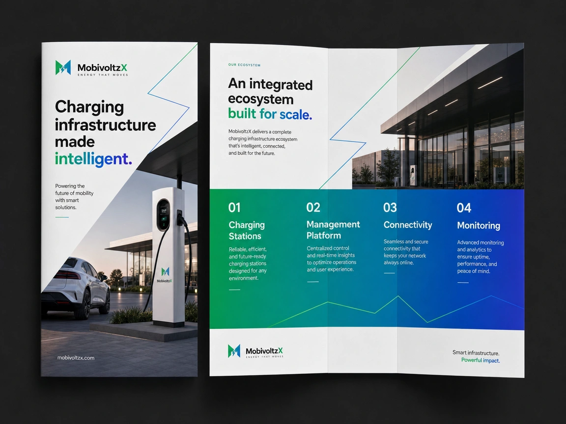
MobivoltzX was designed to feel real in the places where charging happens: contemporary architecture, corporate locations, residential environments, parking structures, urban settings, and charging hubs.
The digital system follows the same principle. Dashboard and mobile interfaces use the identity to organize operational data, including activity, availability, performance, and energy information. Dark and light environments can adapt to technical needs without making information feel overwhelming.
The digital product becomes part of the identity itself, showing how complex charging operations can be monitored and understood through a clear, approachable system.

MobivoltzX EV charging close-up
MobivoltzX brochure design

MobivoltzX brand material 05
Built to Scale
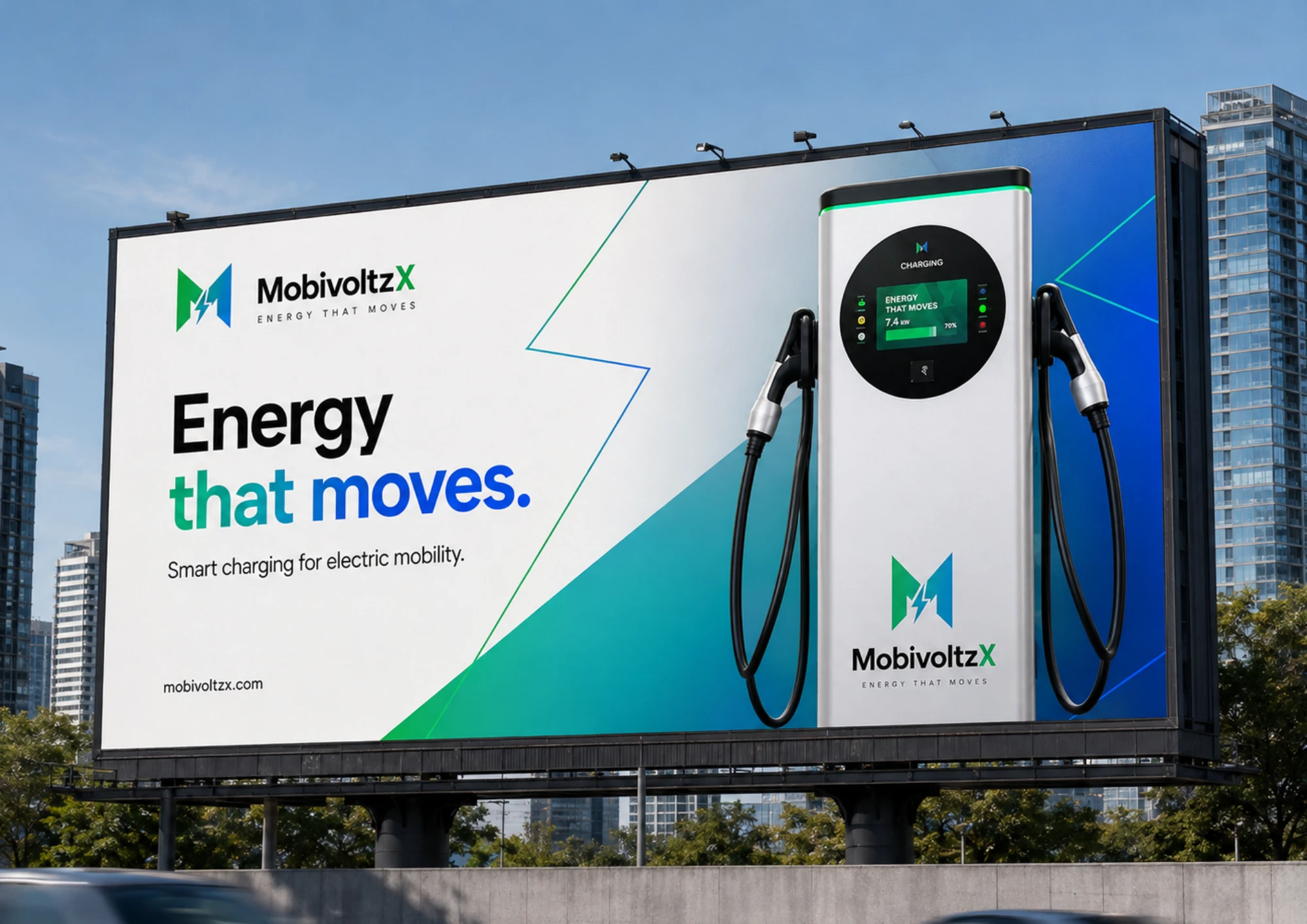
The identity is designed to remain consistent across hardware, software, and communication. Strong logo construction, gradient color, and geometric line language scale from a compact charging station to a detailed commercial presentation.
That adaptability allows MobivoltzX to be minimal when clarity matters, more expressive when visibility is the goal, and more technical when data and infrastructure lead the message.
MobivoltzX brand material 06
Deliverables
Brand strategy and creative direction
Logo and symbol system
Color palette and gradient language
Typography and graphic system
Digital interface direction
Charging station, vehicle, uniform, signage, and communication applications
MobivoltzX positions electric charging as more than energy delivery. It is the connected infrastructure that makes electric mobility accessible, reliable, manageable, and ready to grow.
Like this project
Posted Aug 24, 2026
Brand identity for MobivoltzX, an electric mobility and EV charging infrastructure company built around connected energy systems.
Likes
0
Views
0
Timeline
Feb 10, 2026 - Apr 15, 2026