Jung Pet | Brand Identity & Print Design

Thayline Vargas


Jung Pet
Overview
Jung is a pet e-commerce brand created to make the everyday routine of pet owners easier while building a more emotional and meaningful shopping experience. The business brings together food, toys, accessories, and other everyday pet products, but its positioning goes beyond functionality. Jung was built around connection: the bond that grows through routine, care, presence, and the small gestures shared between people and their pets.
The intention was to create a brand that felt young, creative, welcoming, and emotionally close without becoming childish. The identity needed enough structure and consistency to support a growing e-commerce business across physical and digital touchpoints.
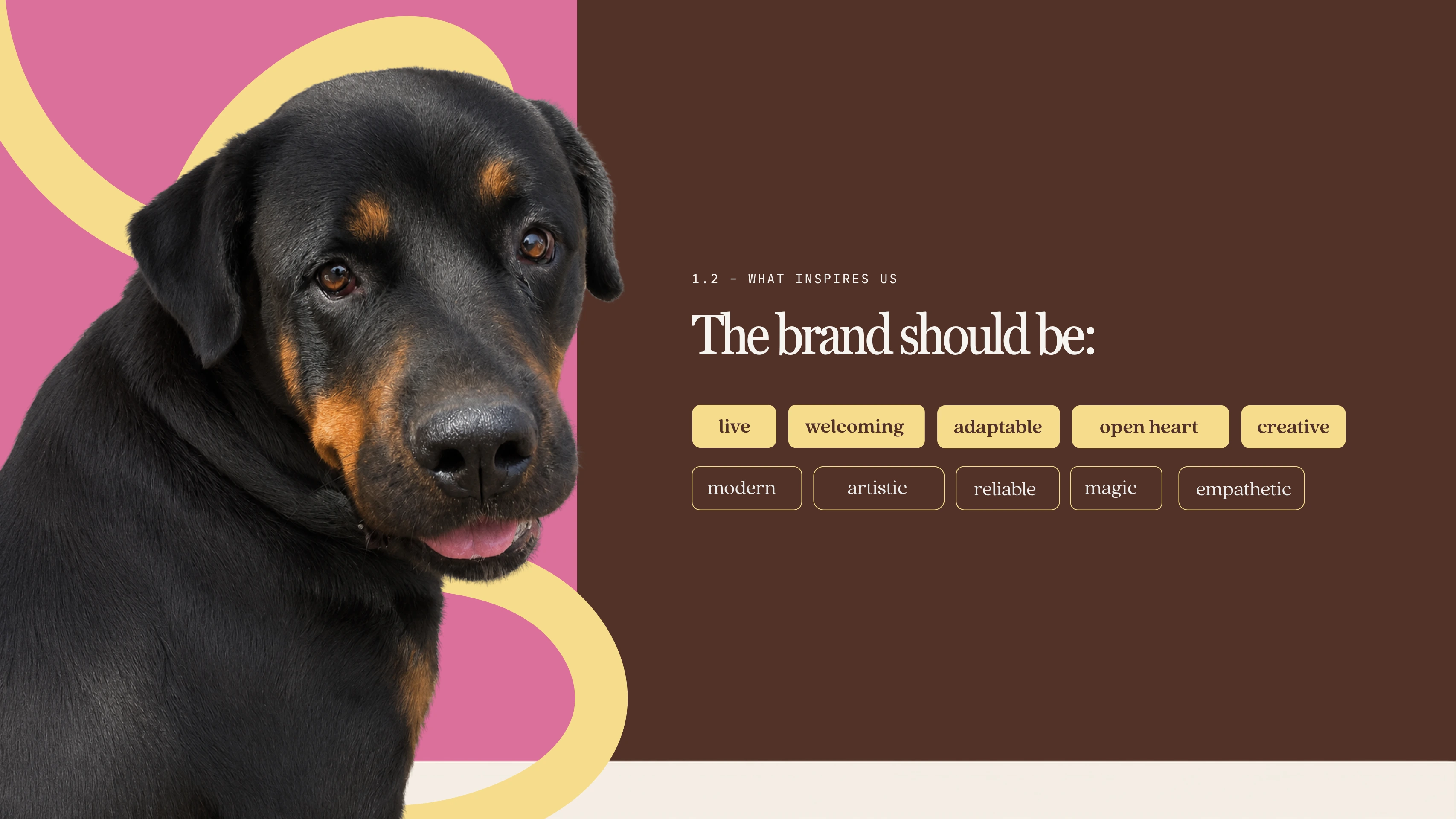
Jung brand material
Jung Pet
Overview
Jung is a pet e-commerce brand created to make the everyday routine of pet owners easier while building a more emotional and meaningful shopping experience. The business brings together food, toys, accessories, and other everyday pet products, but its positioning goes beyond functionality. Jung was built around connection: the bond that grows through routine, care, presence, and the small gestures shared between people and their pets.
The intention was to create a brand that felt young, creative, welcoming, and emotionally close without becoming childish. The identity needed enough structure and consistency to support a growing e-commerce business across physical and digital touchpoints.
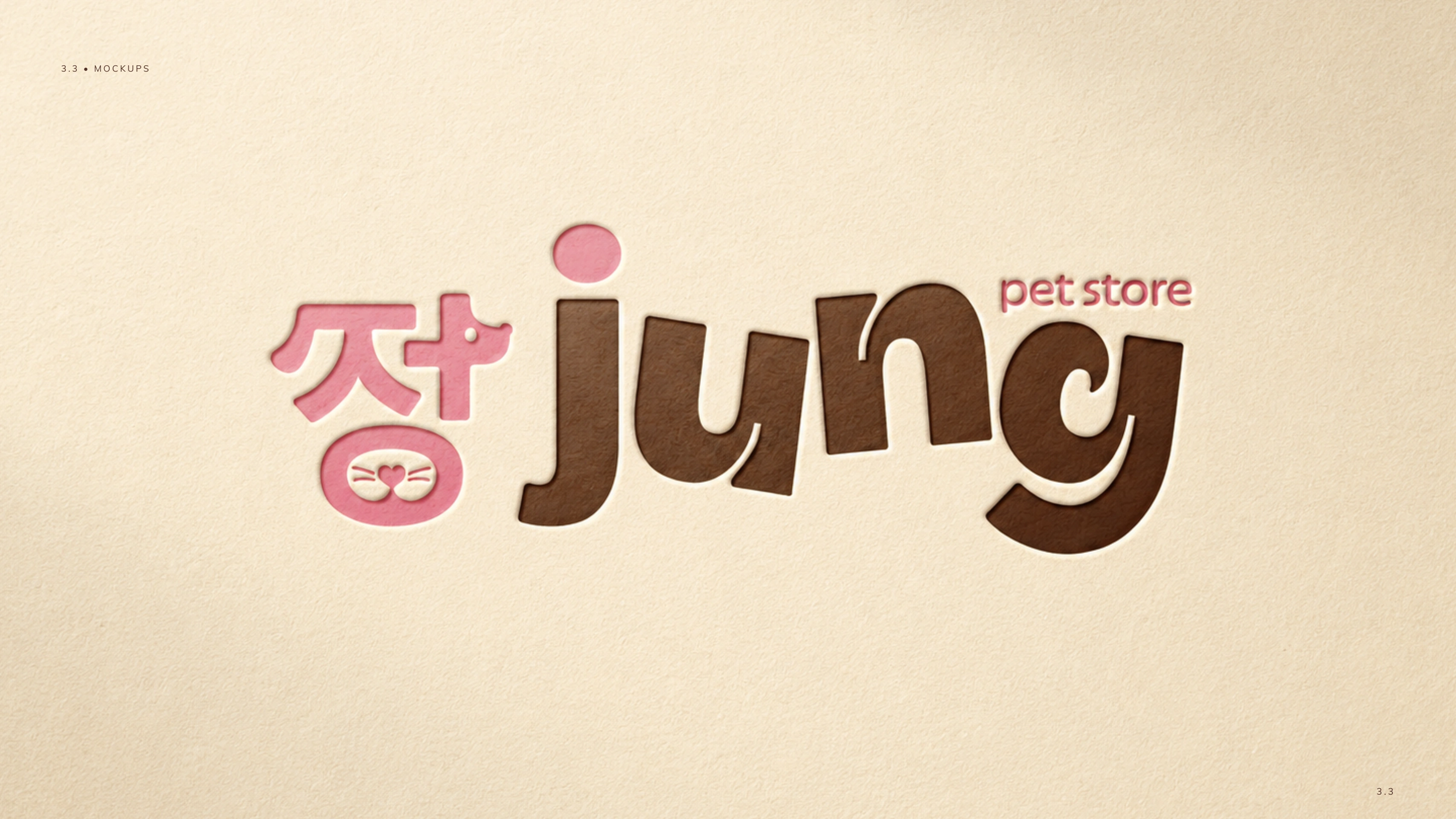
Jung brand identity material
The Challenge
The pet category often relies on familiar visual shortcuts: paw prints, bones, generic dog-and-cat combinations, overly playful typography, and literal pet imagery. Jung needed to move away from that predictable language and establish a more distinctive, ownable, and emotionally relevant identity.
The system had to hold several qualities at once: affectionate without becoming overly sentimental, playful without looking amateur, modern without feeling cold, and approachable without losing credibility.
It also needed to translate intangible ideas, including bond, care, and connection, into a visual language that could extend across packaging, digital communication, social media, printed materials, and future brand extensions. The identity could not depend on a single logo or a decorative style, and it could not be tied to one product category or type of animal.
Research & Strategy
The research explored how a pet brand could feel emotionally warm while remaining contemporary and visually sophisticated. References included brands with strong emotional storytelling, editorial composition, handmade illustration, soft but confident color palettes, and packaging systems that feel closer to lifestyle brands than traditional pet shops.
The moodboard established a direction built around softness, organic forms, playful details, expressive typography, and an intimate visual tone.
Two brand archetypes shaped the strategic foundation:
The Innocent brought optimism, simplicity, trust, lightness, and the idea that everyday care can feel beautiful and uncomplicated.
The Lover added warmth, affection, emotional connection, and closeness through the welcoming color palette, handmade illustration style, and a tone that seeks to make pet owners feel emotionally understood.
Together, they created a balanced personality: light, caring, emotionally expressive, and trustworthy.
The key insight was that buying something for a pet is rarely only a practical transaction. Choosing food, a toy, or an accessory is often part of a ritual of care and an expression of affection.
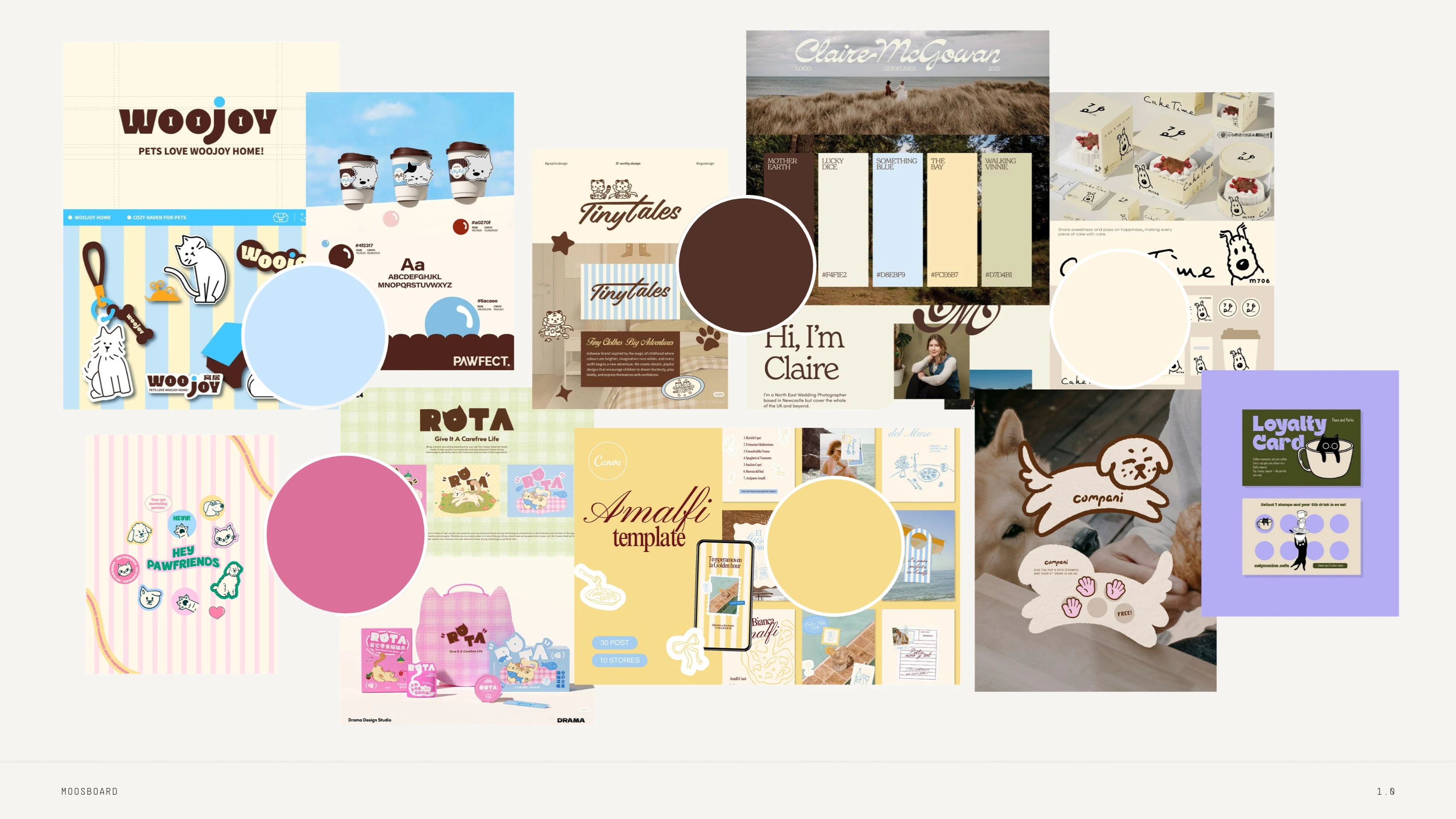
Jung visual research and direction
The Concept
The core concept was built around connection.
The name inspired the visual development, especially through the Korean character 정, which became the starting point for the symbol. Its structure was reinterpreted and adapted into a form connected to the pet universe.
The upper part was modified to subtly suggest a dog, while the circular form below references a cat’s muzzle through a heart-shaped nose and whisker-like details. The symbol carries several layers at once: language, connection, pet imagery, affection, and memorability.
Rather than making the animal references immediately literal, the symbol creates a moment of discovery. The viewer first sees an unusual graphic form, then notices the pet references within it. That added depth helped the identity move beyond the clichés deliberately avoided from the beginning.
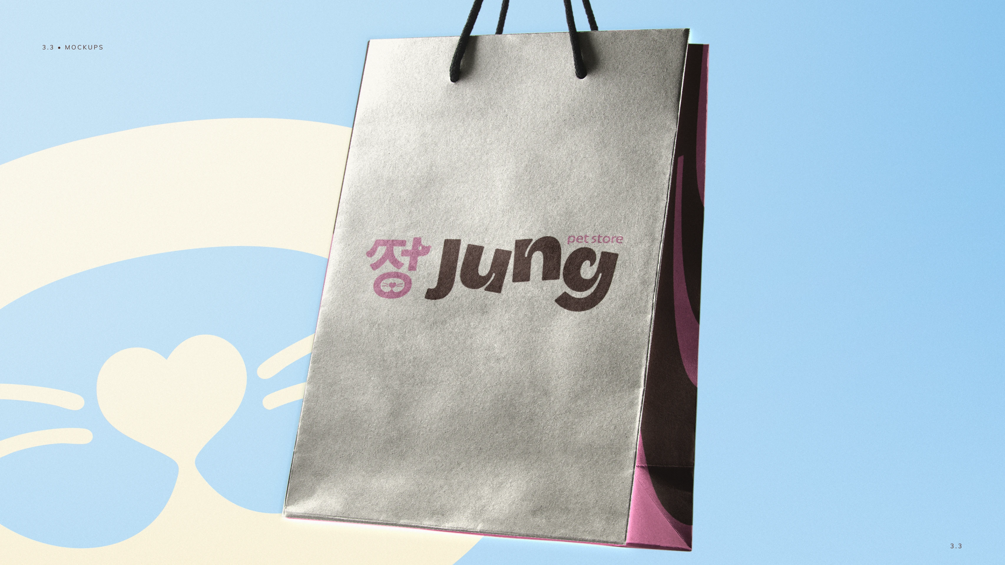
Jung symbol development
Logo Development
The wordmark was designed to feel friendly, expressive, and slightly unconventional. Its most distinctive detail is the letter “g”, whose shape suggests a wagging tail. This small gesture connects the typography to the pet world without turning the full logo into an illustration.
The letters remain slightly irregular instead of perfectly aligned or geometrically rigid. That choice brings movement and personality while reinforcing the identity’s handmade, artistic quality. Rounded terminals and curved shapes create a softer, more approachable presence.
The relationship between symbol and wordmark was also designed to feel dynamic rather than overly formal. Different color treatments keep the system recognizable while opening room for more expressive applications.
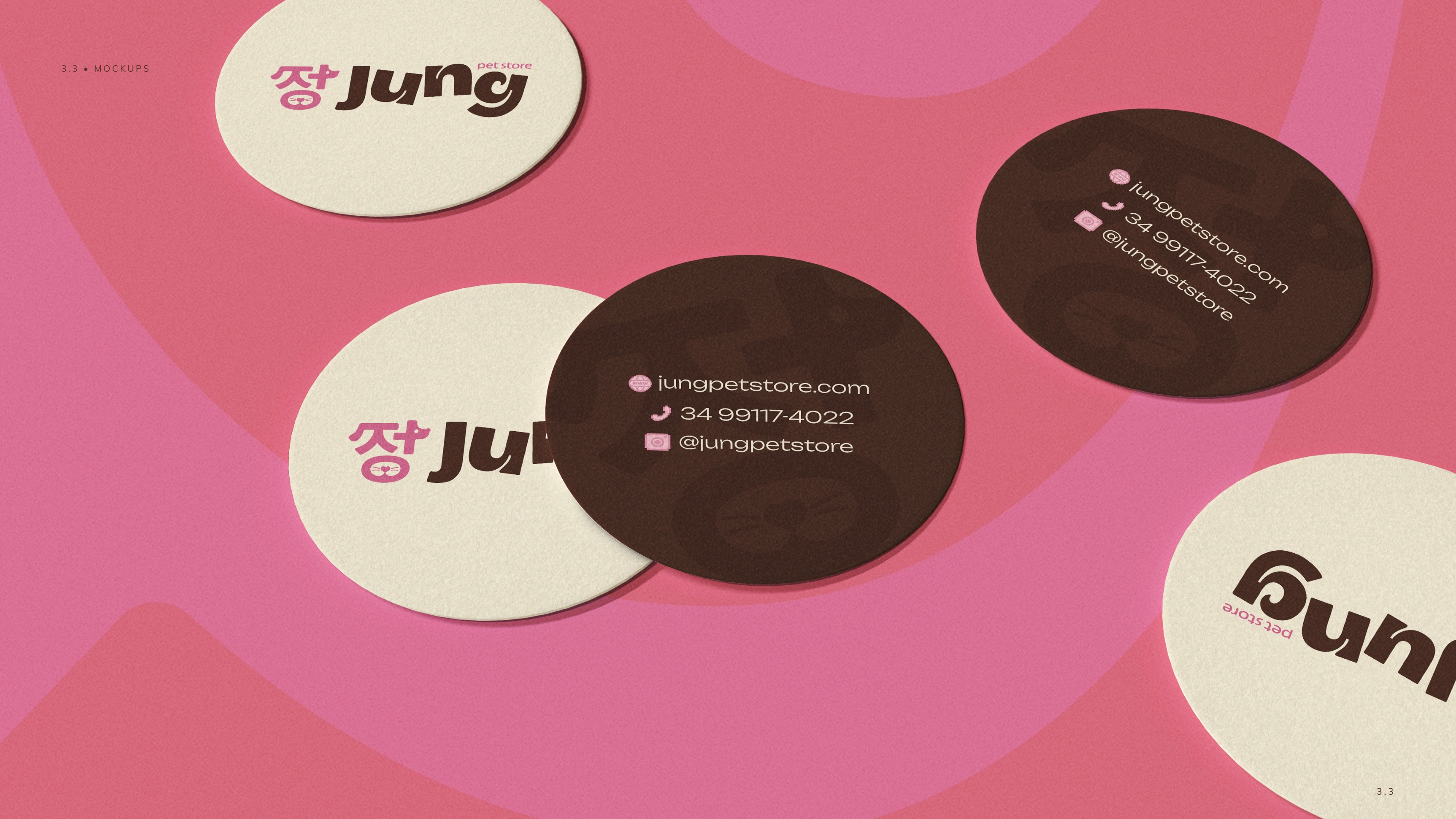
Jung logo applications
Visual Identity
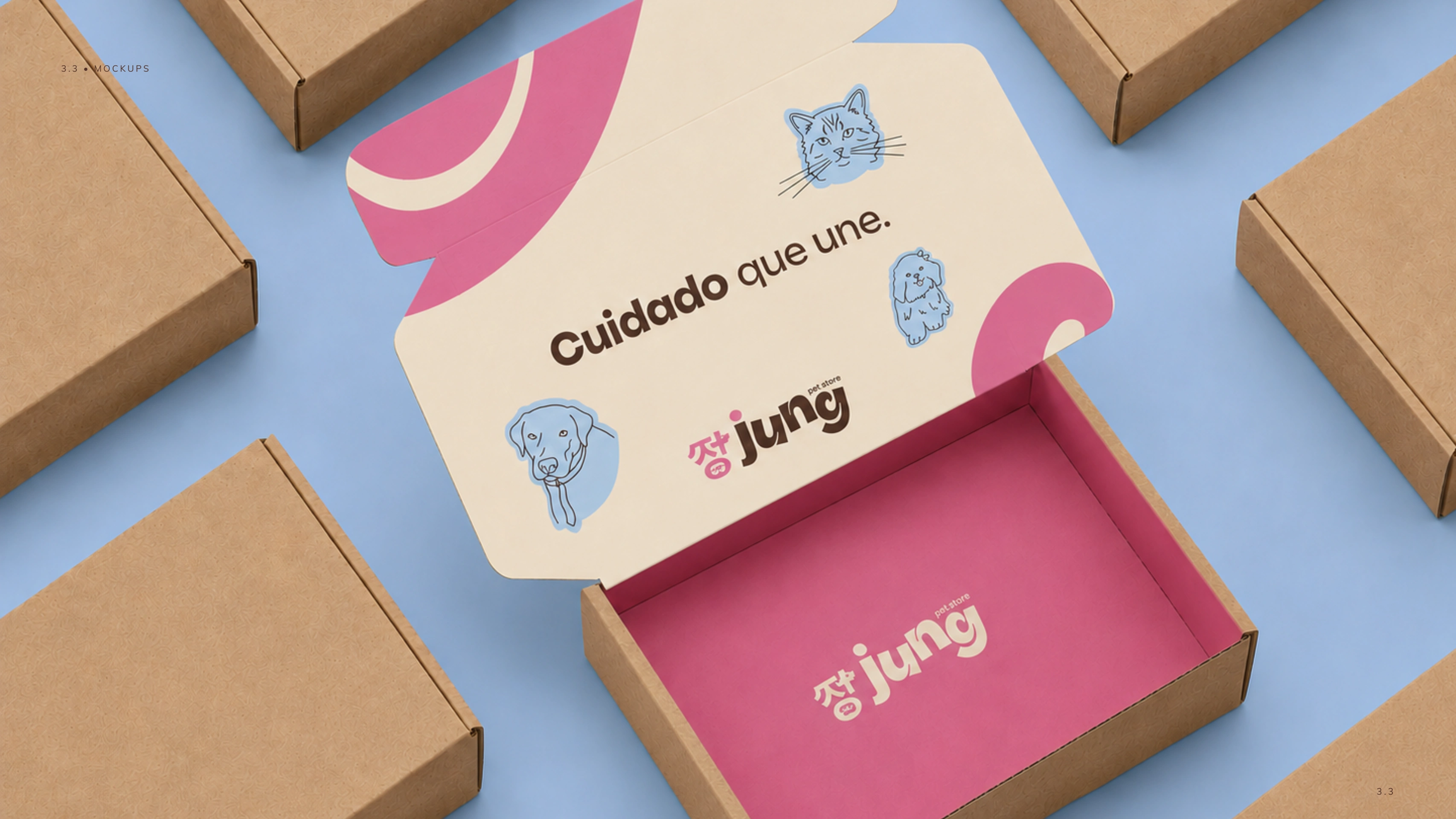
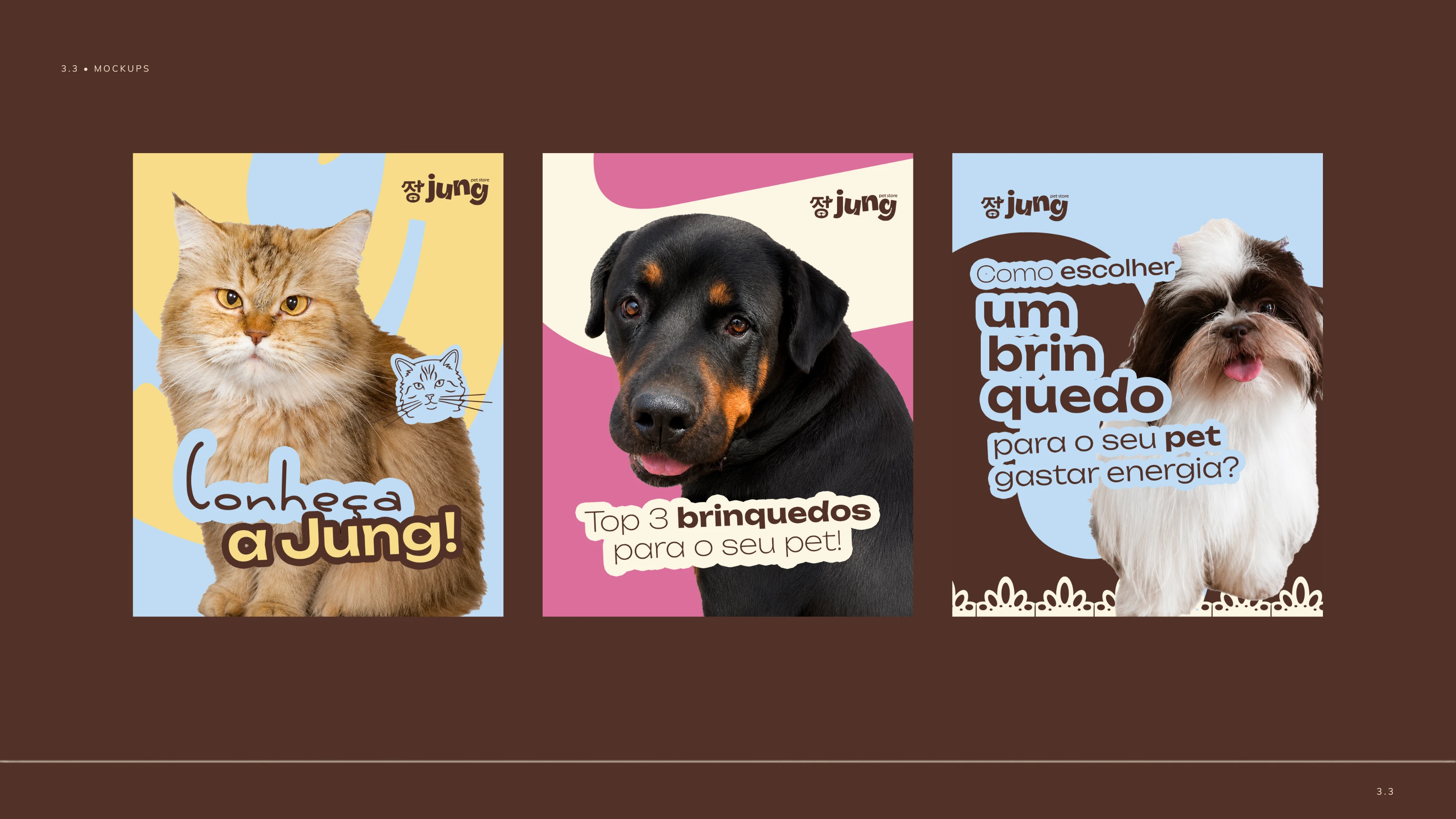
The visual identity extends beyond the main logo through custom illustrations created from pets connected to the brand. These assets bring a more personal and narrative quality to the system while allowing the brand to communicate care, personality, and everyday rituals across its applications.
Organic forms, expressive type, soft color, and playful graphic details work together as a flexible visual language for digital and printed materials.
Jung visual identity materials
Deliverables
Brand strategy and visual direction
Logo and symbol system
Custom pet illustrations
Color palette and typography direction
Visual identity system
Brand applications across the attached materials
Jung brand applications
Like this project
Posted Aug 24, 2026
Brand identity for Jung, a pet e-commerce brand built around care, connection, and everyday rituals with pets.
Likes
2
Views
34