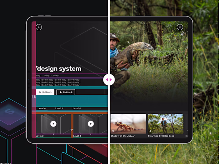
My5®
Helder Leal
Project Duration
6 Months
Services Provided
Ux Design, UI Design, Prototyping, User Testing
Trailers and previews
We aimed to integrate trailers and preview videos throughout the platform to give users a sneak peek of available content and TV shows, helping them make informed decisions about what to watch.
The Challenge
The primary challenge of this project was to seamlessly integrate trailers and preview videos into the My5 platform while maintaining visual consistency, balancing user engagement with performance, ensuring navigational fluidity, addressing personalization and content discovery needs, and ensuring accessibility and device compatibility. This required close collaboration with cross-functional teams, thorough research, usability testing, and iterative design refinement to overcome these complexities and deliver an enhanced user experience.
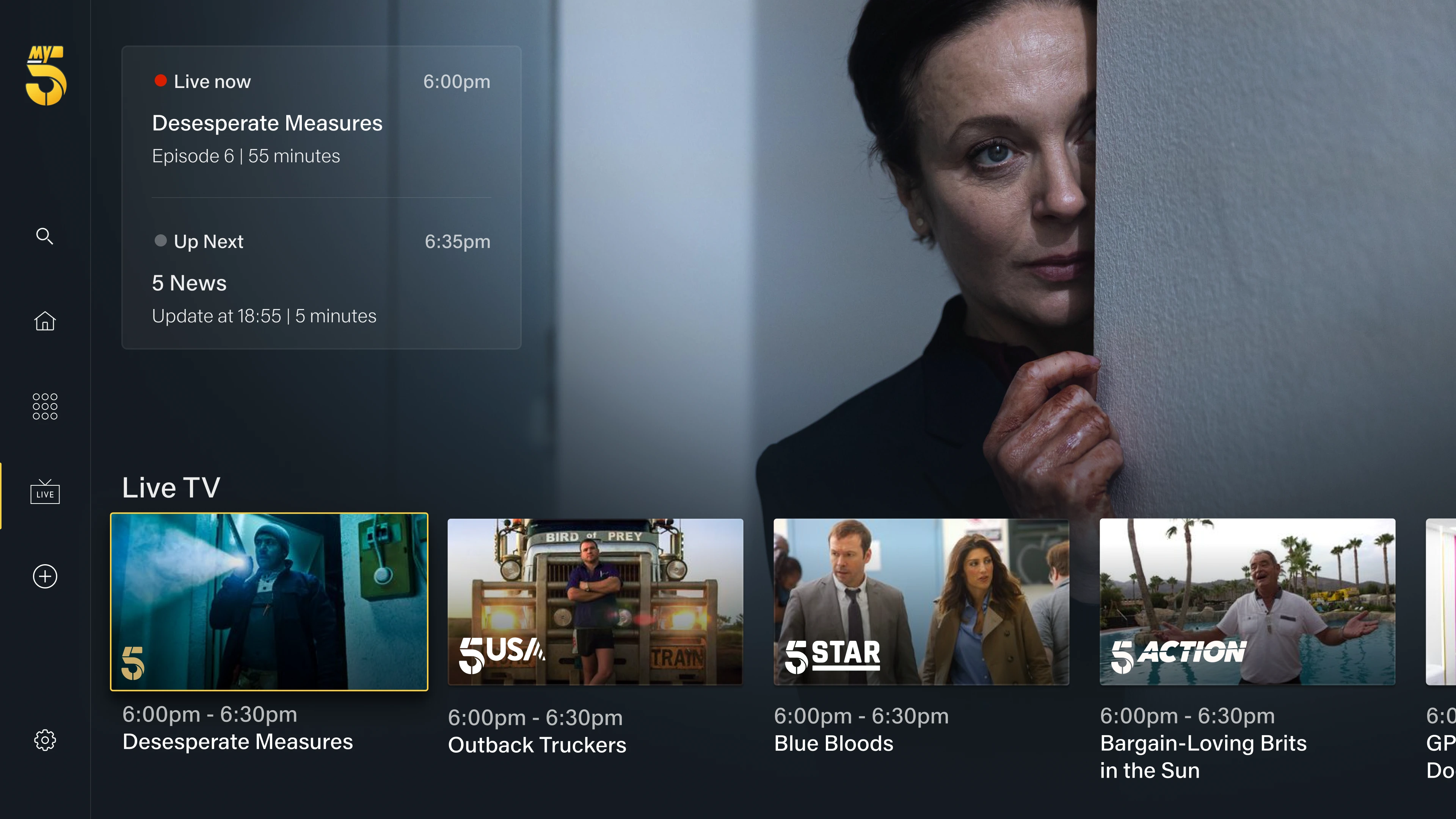
Home Page Integration
On the Home Page, a trailer begins playing after two seconds of "Focus" on the "Popular" rail. Once the trailer ends, it returns to the backdrop image.
"Recommended for You" Portrait Rail
Integrated trailers into the Portrait Rail section to provide personalized recommendations.
Intuitive interaction flow where, after two seconds of "Focus", the Portrait image expands to landscape, displaying additional metadata.
Implemented auto-play functionality to start trailers if the user remains idle for two more seconds, enhancing engagement.
Users can now easily navigate using directional keys and switch between cards or go to the show page by pressing "Enter" while in "Focus" mode.
Show Page Enhancement
Implemented a timed trigger to initiate the trailer two seconds after "Focus", providing users with a seamless viewing experience.
User-friendly navigation options, such as pausing the trailer and scrolling down to the episodes list with a press of the "Down" key.
Enabled users to resume the trailer from where it was paused by pressing the "Up" key, ensuring uninterrupted viewing.
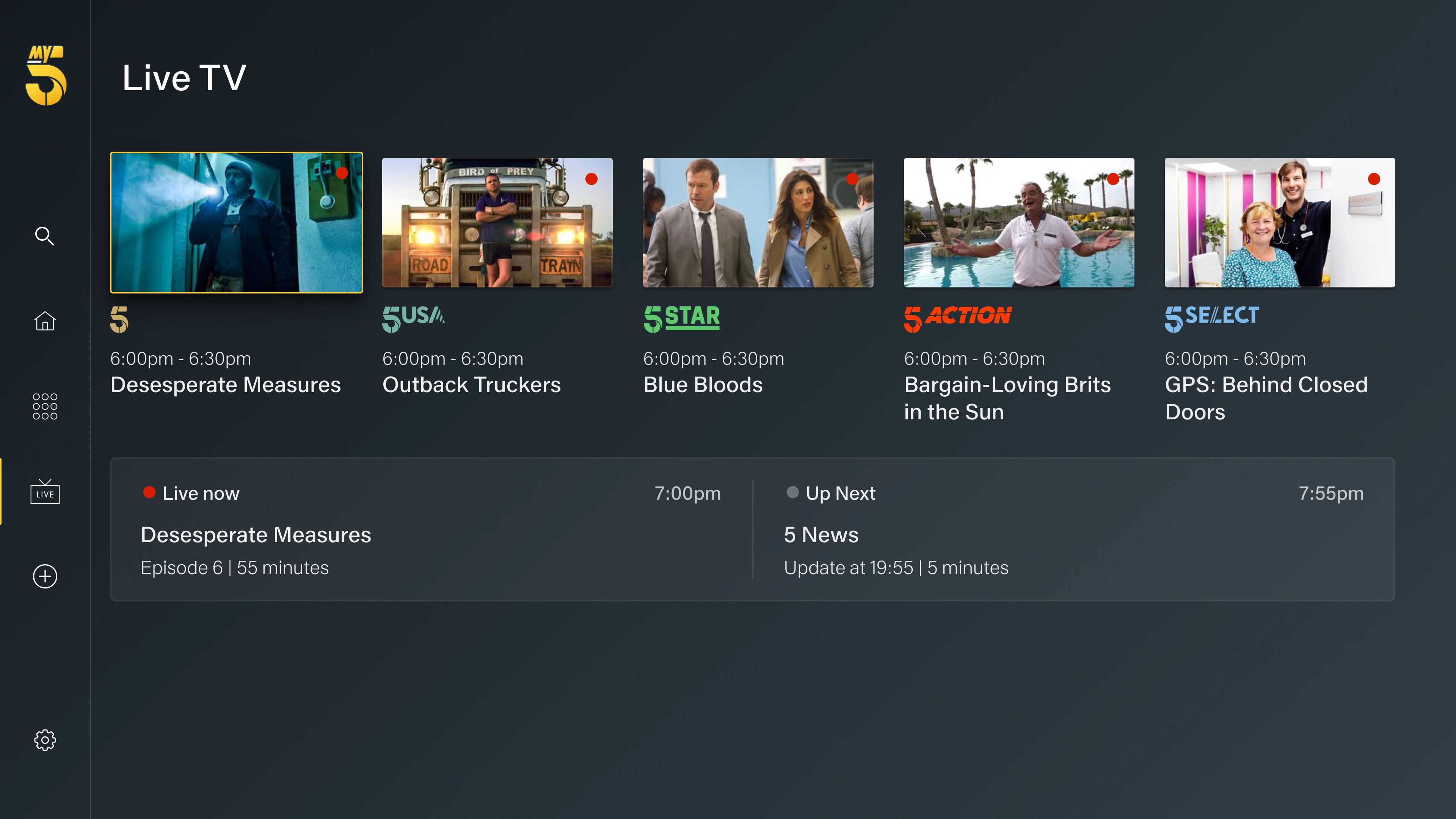
Live TV
Over a dedicated and intensive six-month collaboration, I undertook the ambitious task of redesigning the HealthHub® app from the ground up. My primary focus was on revolutionizing the user experience, and I left no stone unturned in pursuit of this objective.
Version 1
Positive feedback
✔ It is convenient to get a glance at the live content available on different channels.
✔ It is easy to switch between channels and view what is coming up next.
Negative feedback
✘ Not all channels are visible at the same time.
✘ Some users were ignoring the channel logo and focusing solely on the top component while switching channels.
Version 2
Positive feedback
✔ It is easy to navigate between channels while watching the content of the selected channel.
✔ Users easily understood what was "On" and what was "Up Next"
Negative feedback
✘ This version is missing an overview of what's live on all channels.
✘ Animations affected performance in old devices such as VOD set-up boxes.
Final Version
Conclusion
Throughout the design process and user testing phases with My5 users, we gained valuable insights that informed our design decisions. It became evident that providing users with a comprehensive overview of all five channels on the Live TV page was essential for facilitating easy access to live content.
After evaluating both "Version 1" and "Version 2" of the Live TV page, we recognized the strengths and limitations of each iteration. While "Version 2" boasted a visually appealing interface and streamlined channel-switching experience, we encountered performance issues with animations on certain devices. Consequently, we opted to maintain a carousel-based navigation system to ensure consistent performance across all devices.
During our assessment of "Version 1," we identified an issue where some users were losing track of the selected channel due to the placement of the Live/Up next component at the top of the page, obscuring the channel logos. To address this issue, we repositioned the component beneath the carousel, allowing for improved visibility of the channel logos beneath the show thumbnails. This adjustment significantly enhanced user clarity and navigation efficiency.
Thank you for watching.
Like this project
Posted Mar 21, 2024
We aimed to integrate trailers and preview videos throughout the platform to give users a sneak peek of available content and TV shows, helping them make inform
Likes
0
Views
13