Design System - Streaming Platform
Helder Leal
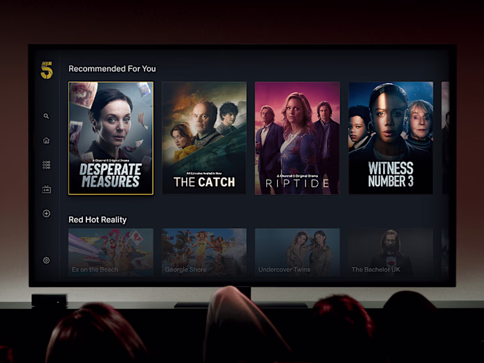
I started the creation of a Design System to unify the user experience across platforms. By delivering efficient design components, the system saves time and aligns seamlessly with urgent business goals, ensuring a consistent and purposeful user journey.
Product Audit
Conducting a comprehensive product audit served as a crucial starting point in our design process, offering valuable insights into the intricacies of our product ecosystem. This step involved a meticulous examination of each element, leading to a holistic understanding of our digital landscape.
Objectives
Holistic View: Our primary goal was to perceive the product as a unified ecosystem rather than a collection of individual elements. This approach allowed us to appreciate the interconnectedness of various components.
Component Analysis: We aimed to answer essential questions such as the number of distinct components, styles, and variations existing across different pages. This involved scrutinizing every aspect, from buttons and forms to typography and colour schemes.
Identifying Pages and Patterns
Once all the user flows across platforms were identified, our focus shifted to detecting inconsistencies in user experience (UX) across similar pages. This step was crucial in understanding and addressing discrepancies, ensuring a seamless and unified experience for our users.
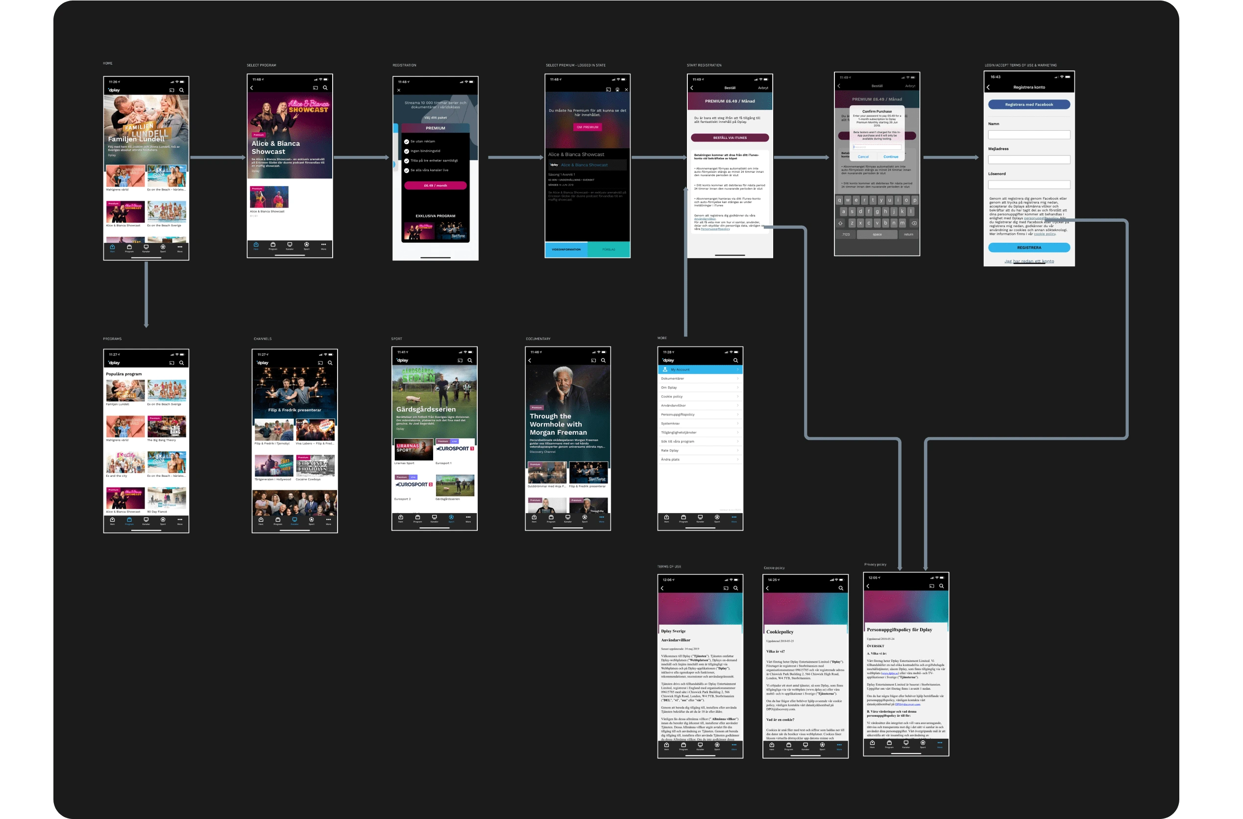
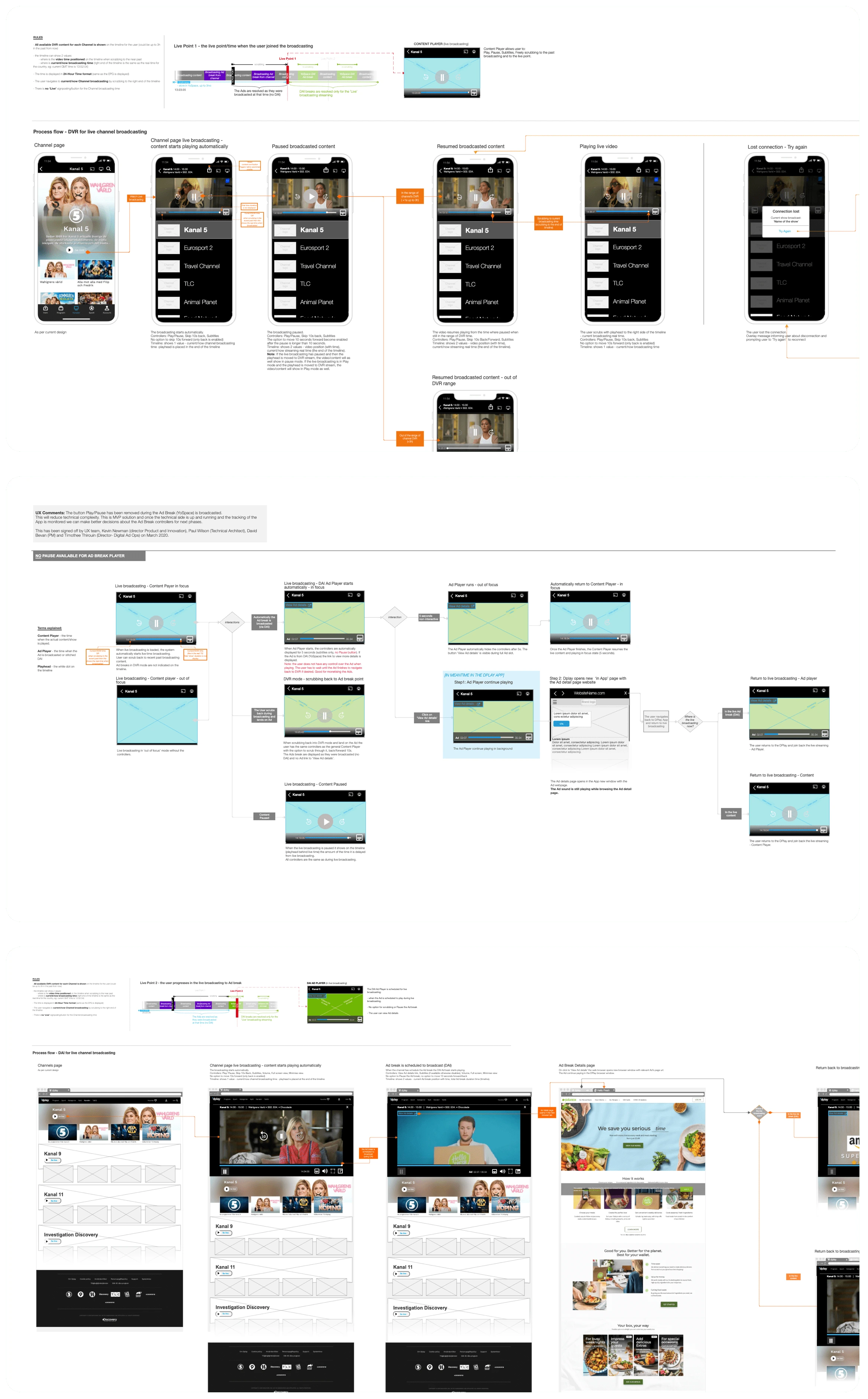
iOS app user flow
We systematically examined each user flow across different platforms, meticulously comparing the same pages on iOS, Android, and the web.
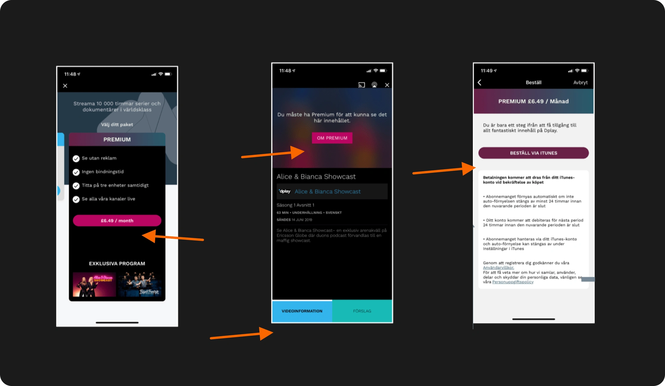
The 'Product Page' was a notable example, showcasing different UX designs on iOS and Android. This raised questions about the reasoning behind the divergence and its impact on user perception.
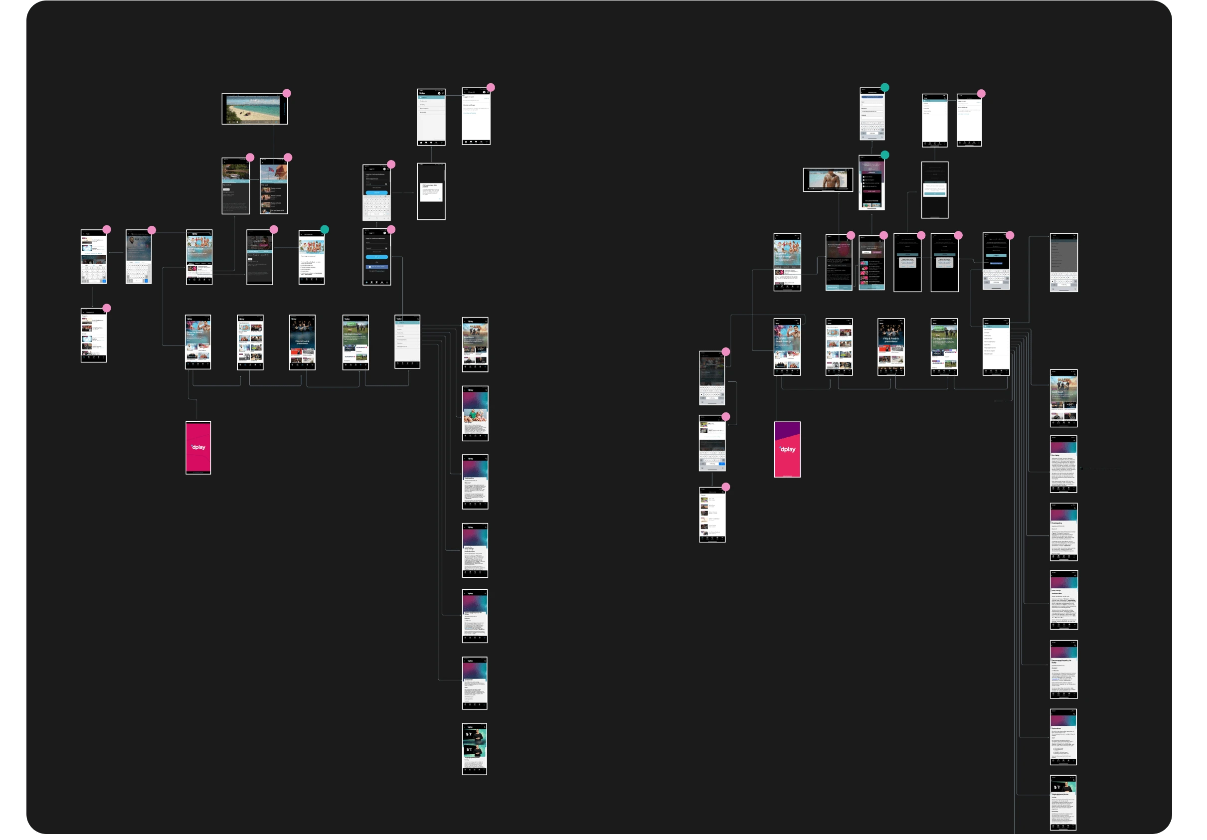
Colour-Coded Grouping - iOS vs Android user flows
To gain a visual overview of our findings, we adopted a colour-coded system to group identified issues. Each colour represented a specific type of inconsistency, helping us categorize and prioritize our focus.
Understanding Every Pattern
Pattern Deconstruction: We delve into a detailed breakdown of each component or pattern, dissecting it into various data points. This process allows us to identify diverse variations existing across the product landscape, accommodating different use cases.
Buttons discrepancies across the product
Atomic and Molecular Components: At the atomic and molecular levels, components such as buttons are scrutinized. We meticulously categorize and group these elements, capturing the nuances of their styles and interactions.
Reusability Opportunities: By understanding the variations and groupings of components, we seek to uncover opportunities for increased reusability, promoting efficiency in design and development processes.
Unifying the User Experience (UX)
Before embarking on the creation of our Design System, a concerted effort was made to ensure a consistent user experience across all platforms. Extensive UX work was undertaken, meticulously addressing and rectifying any inconsistencies in user flows.
The UX efforts contributed to crafting a holistic user journey, eliminating friction points and ensuring a uniform experience, regardless of the platform.
The insights gained from this pre-design consistency phase served as valuable inputs, guiding the subsequent development of our comprehensive Design System.
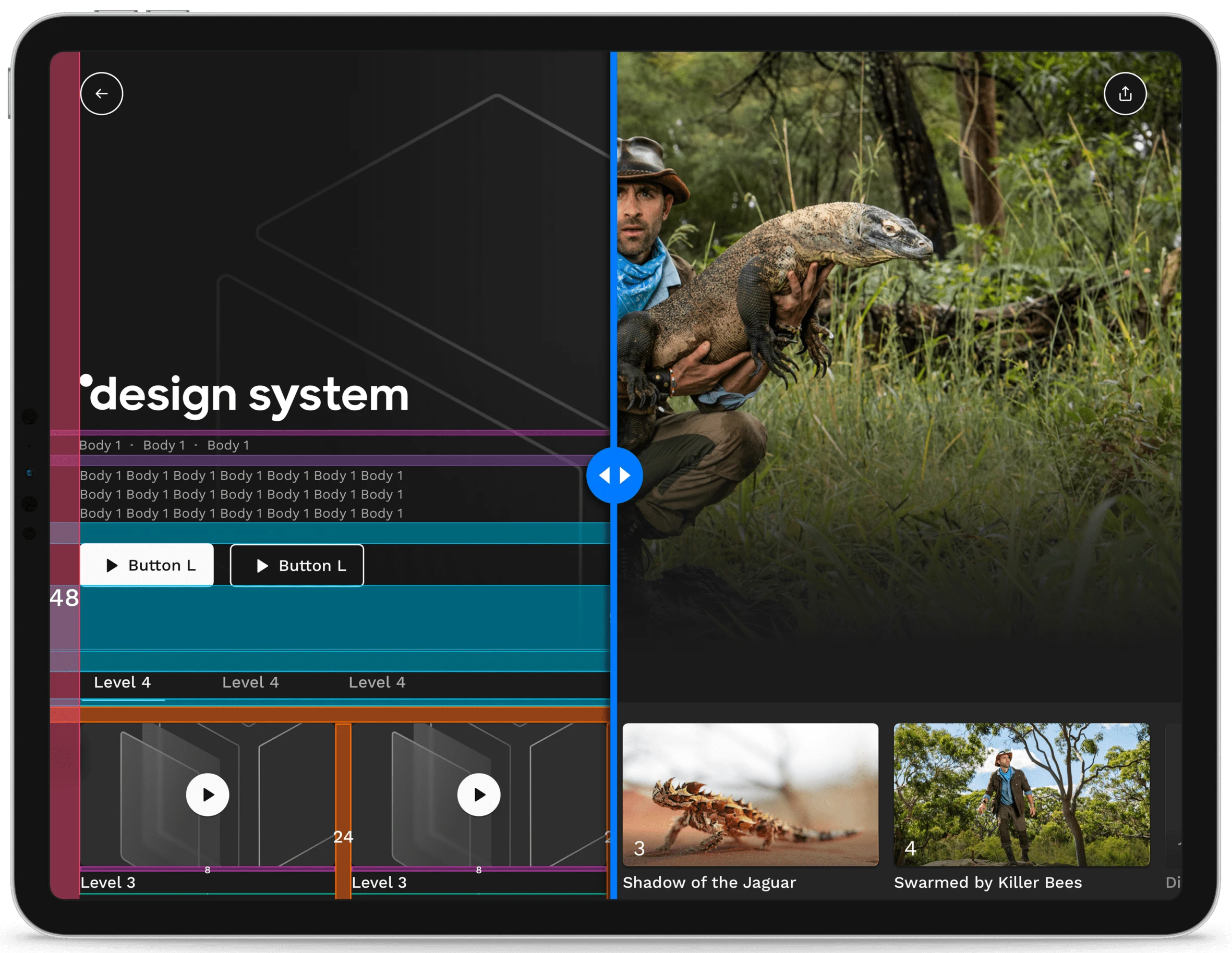
Style Guide
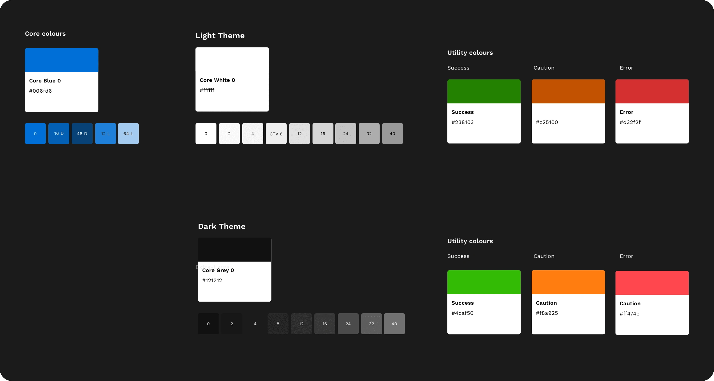
Our style guide defines the unique combinations of Colour, Shadow, Outline, and Elevation that personalise each component based on context and state. The system organises styles into two main themes: Dark Background and Light Background.
Colour Palette
A curated selection of colours, harmoniously blended to enhance visual appeal and convey different states or contexts.
Spacing
Our spacing scale serves as the foundational guide for constructing master components within the Design System. It includes subtle increments tailored to establish precise spatial relationships for detailed-level structures. This scale consistently applies to all components, ensuring uniformity and coherence throughout the Design System.
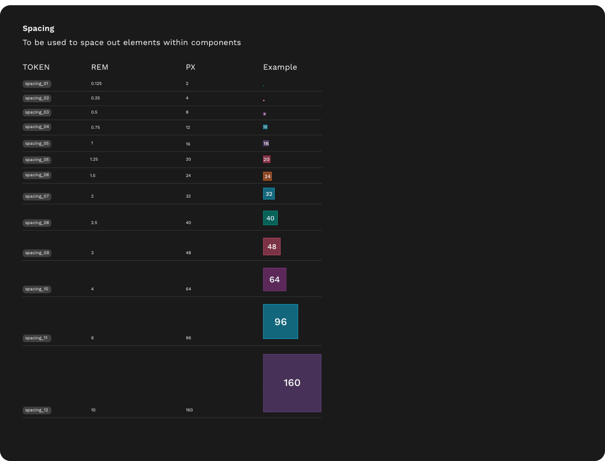
Spacing scale tokens
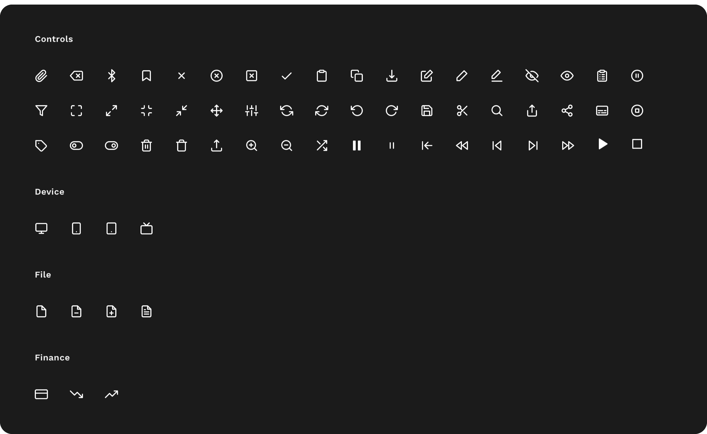
Iconography
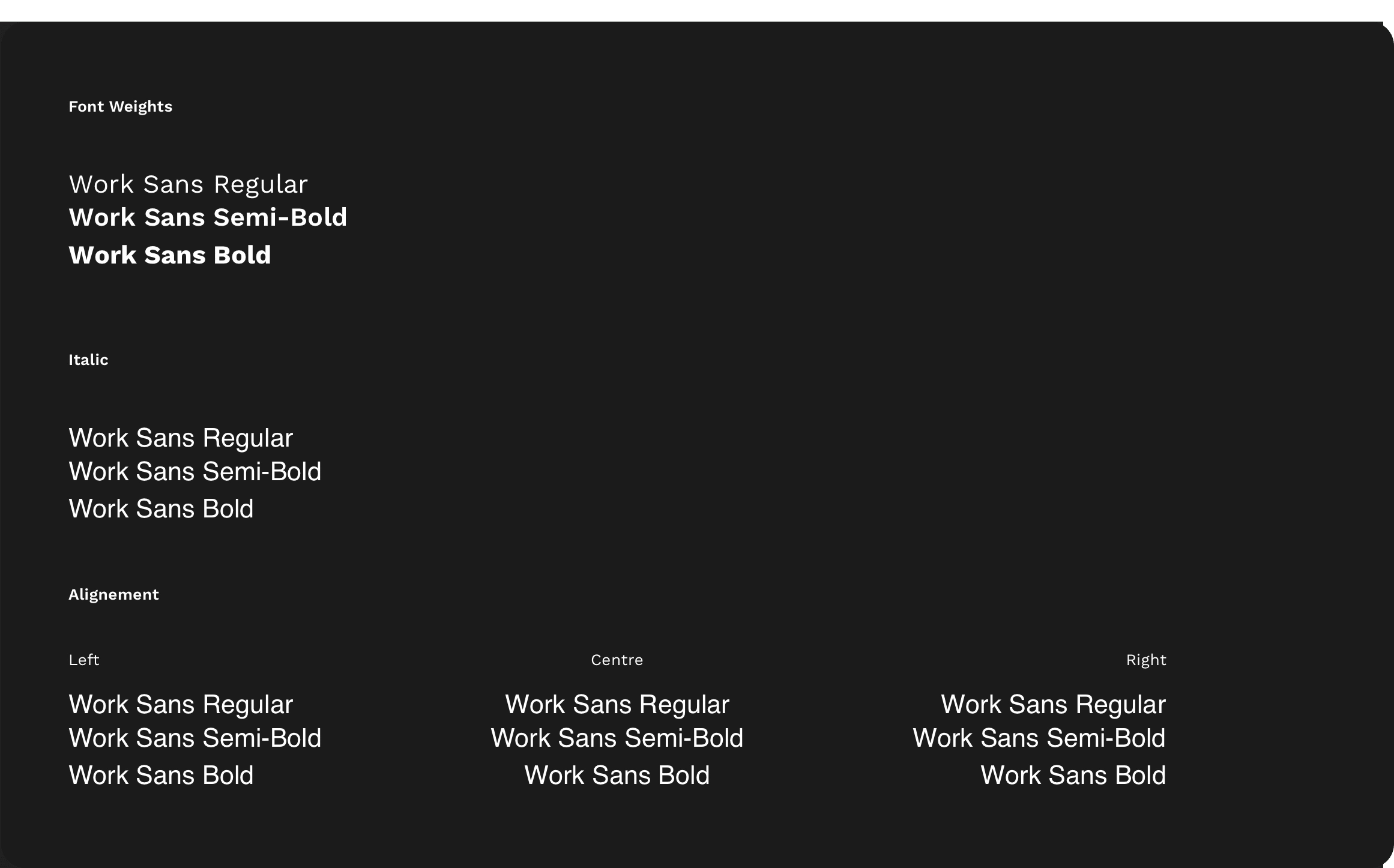
Typography
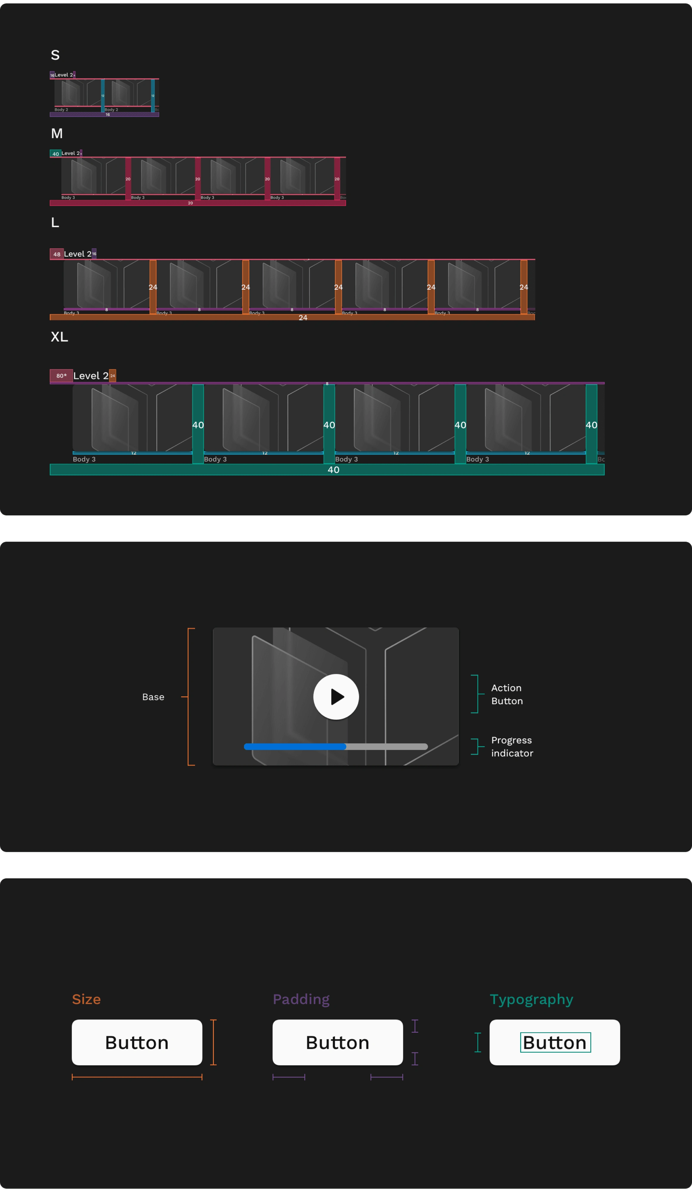
Setting the Base
At the core of every component lies the Base, a pattern of styles meticulously defined in our Style Guide. This foundational element acts as a versatile tool, empowering users to seamlessly combine different UI elements using attributes from our system.
Users can leverage the Base to intuitively combine various UI elements, streamlining the process of creating cohesive and visually appealing user interfaces.
A uniform component sizing model is crucial for maintaining consistency across different product densities. This approach ensures that adopters can efficiently create products that resonate with our design principles.
Breakpoints
Internally embedded within various components, breakpoints serve a pivotal role in ensuring responsiveness and determining the optimal layout size for specific devices and platforms.
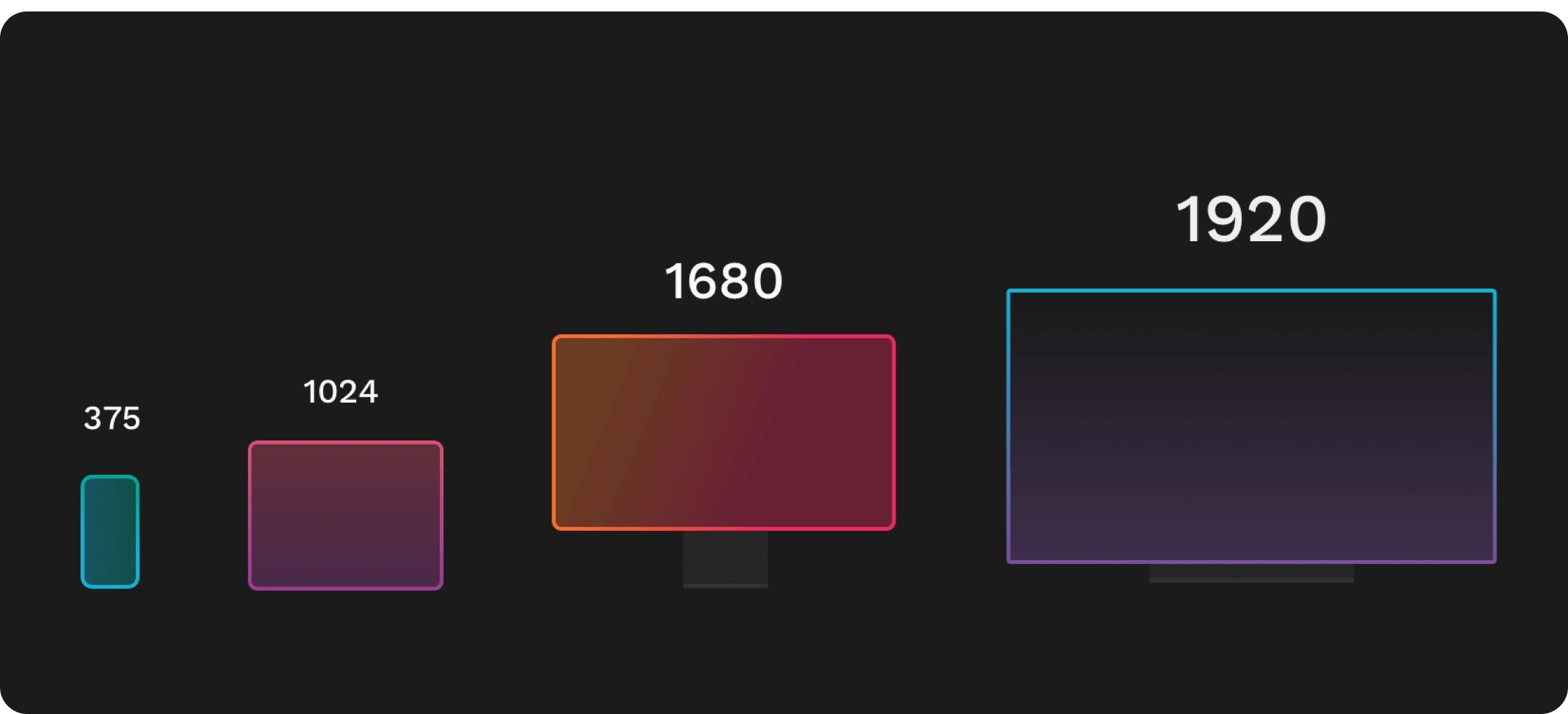
Breakpoints across the product
Key Functions:
Responsiveness: Breakpoints enable components to dynamically adapt to different screen sizes, ensuring a seamless and user-friendly experience across various devices.
Layout Identification: By utilising breakpoints, components can identify and switch to the most appropriate layout size for the specific device and platform in use.
Margins
The Margins, positioned at the edge of the grid, maintain a consistent fixed size within each breakpoint. These intentional margins provide structure and alignment, contributing to a unified and visually balanced layout. By adhering to a fixed size, our design ensures a cohesive and predictable spacing between elements, promoting a harmonious user experience across different screen sizes and platforms.
Margins across different breakpoints
Gutters
Gutters are the spaces between columns, serving as essential separators for content within the grid. These spaces provide clarity and organization, preventing visual clutter. At each breakpoint range, gutter widths are fixed values, ensuring consistency in spacing. To enhance adaptability to varying screen sizes, the gutter width can dynamically change at different breakpoints, optimizing the layout for an improved user experience.
Gutters across different breakpoints
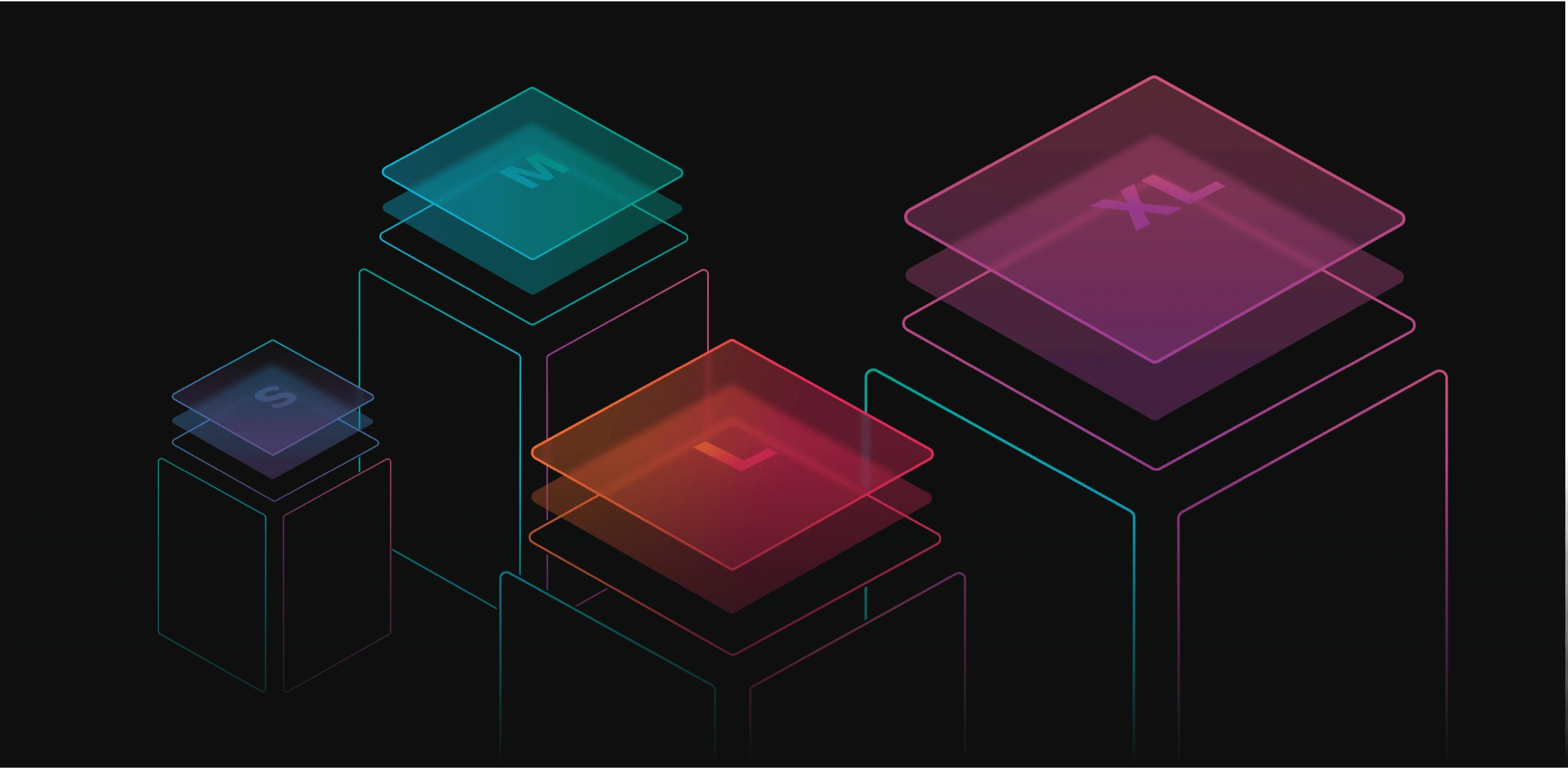
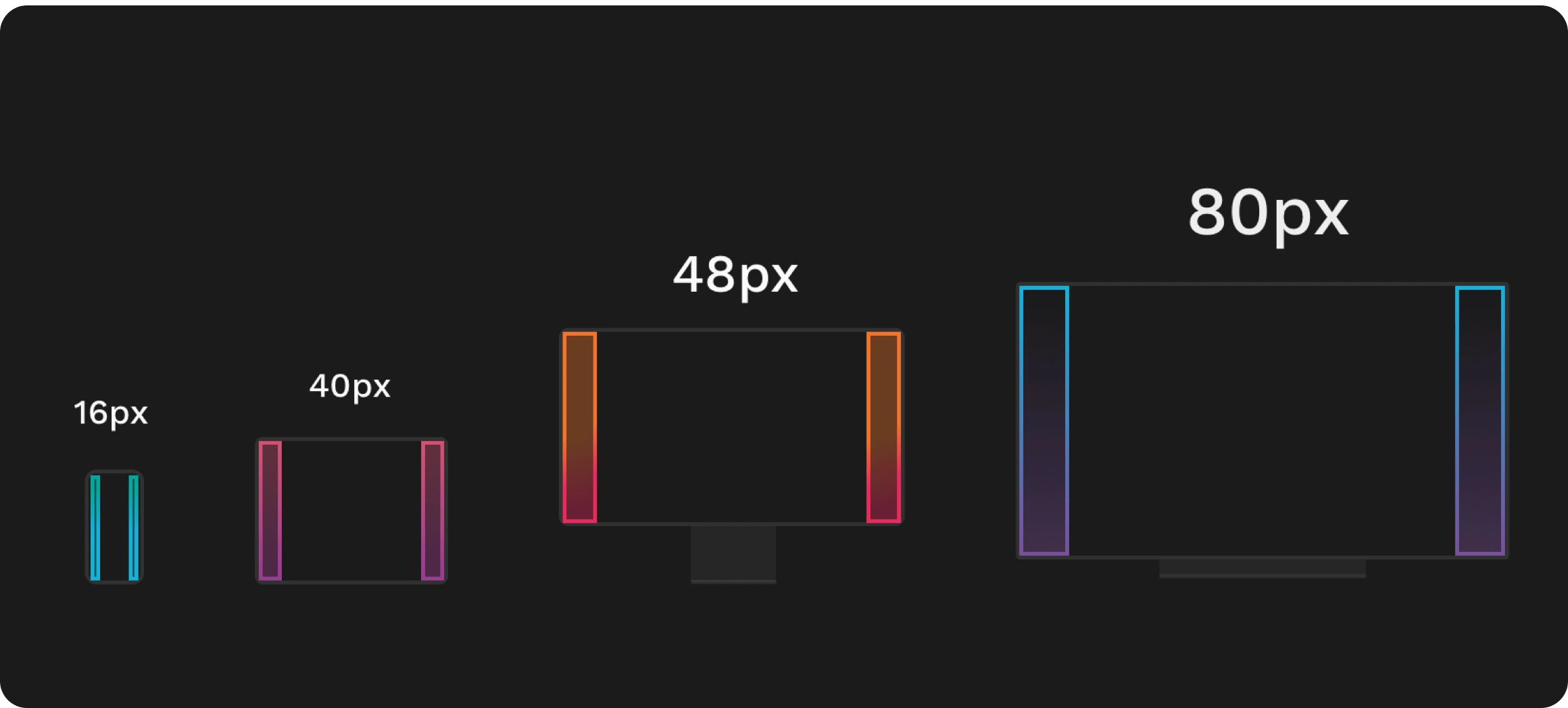
Component Sizing (S, M, L, and XL)
Our component sizing is categorised into four distinct levels - Small (S), Medium (M), Large (L), and Extra Large (XL). This tiered approach allows for flexible and scalable design, accommodating various screen sizes and ensuring a harmonious visual hierarchy. Each size category is thoughtfully calibrated to provide a balanced and optimised user experience, contributing to a seamless and adaptable design system.
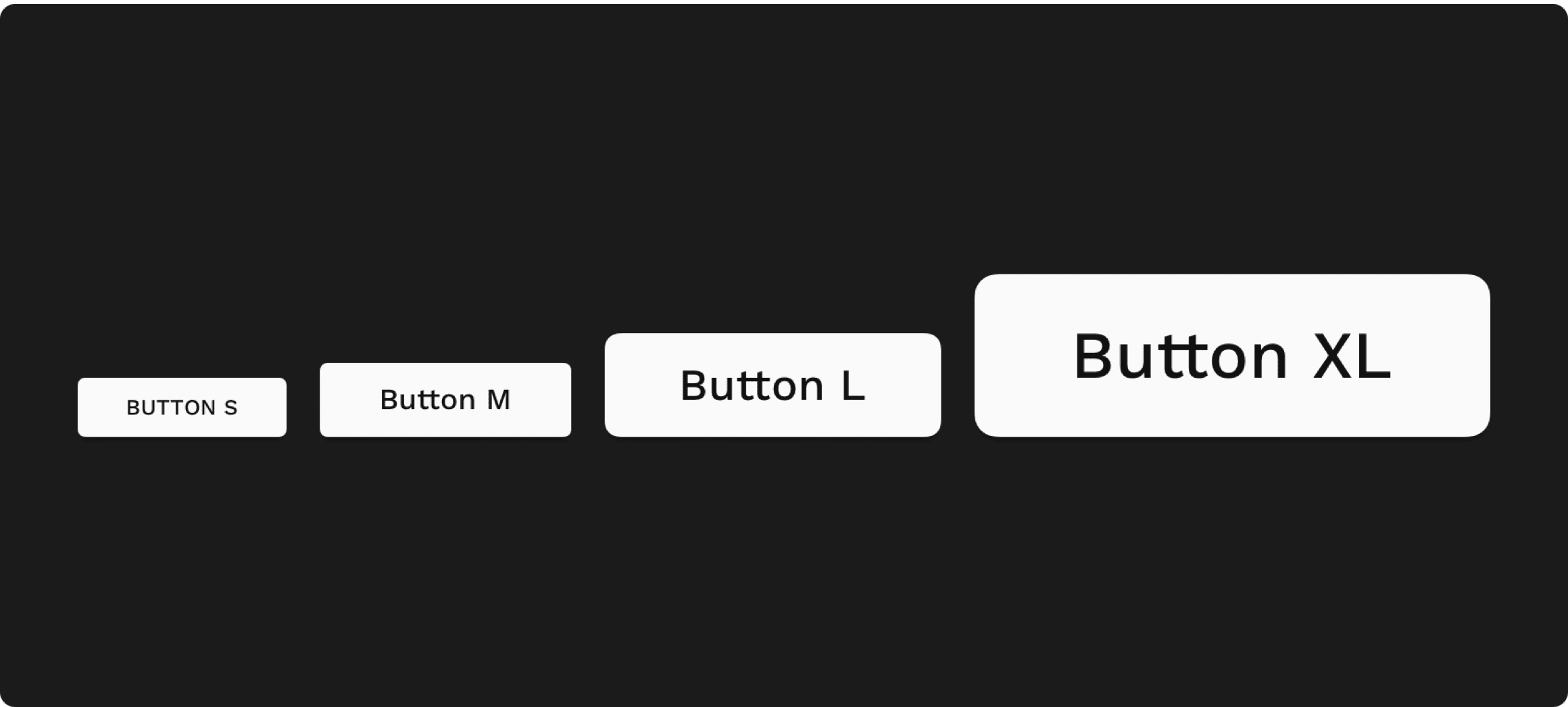
Button sizing across different breakpoints
Component Guidelines
Our component guidelines serve as a comprehensive set of principles and specifications for the design and implementation of each component within our system. These guidelines cover aspects such as layout, spacing, typography, and interactivity, providing a unified framework for consistent and efficient component development. By adhering to these guidelines, we ensure a seamless and cohesive user experience while fostering a streamlined design and development process.
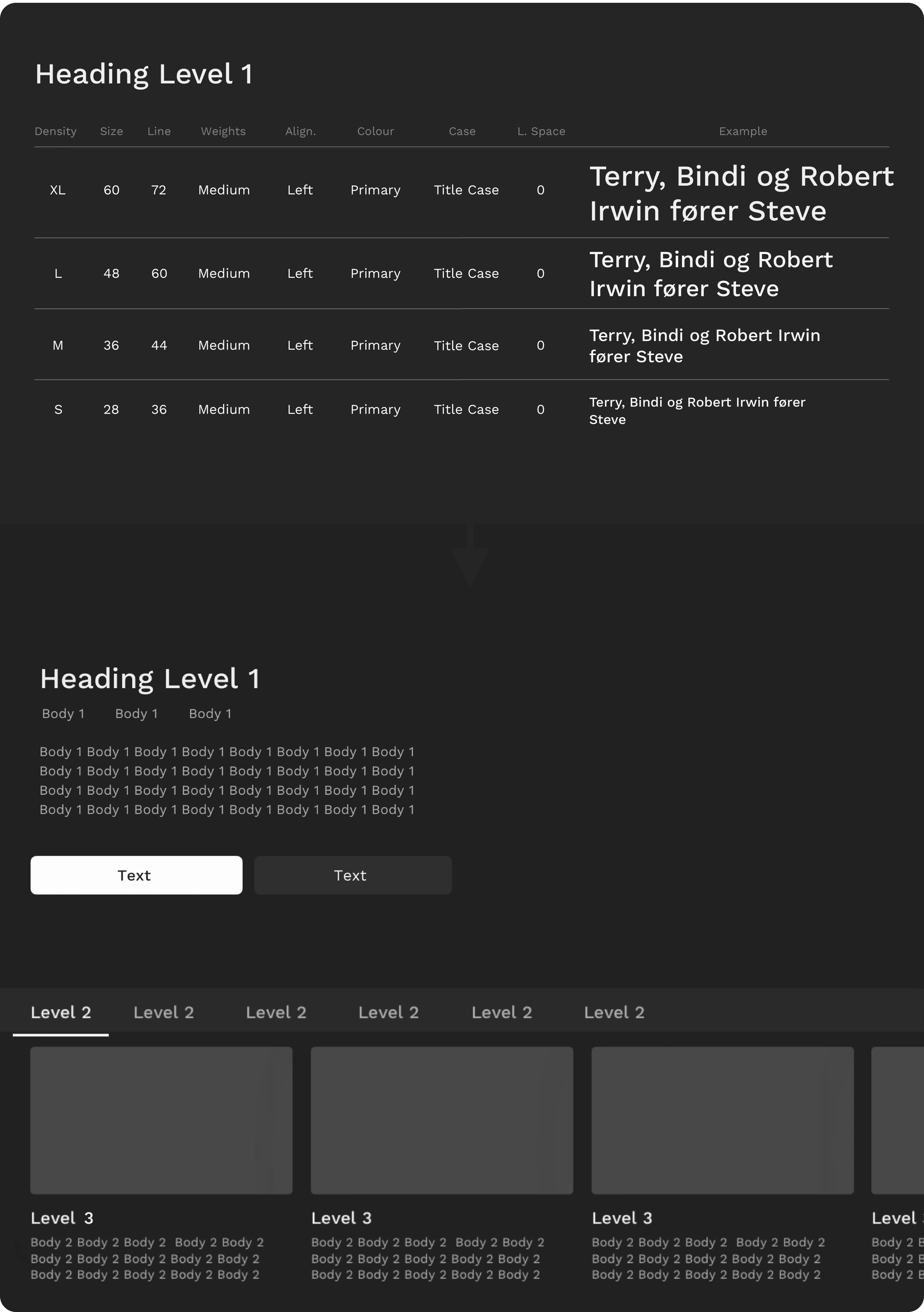
Typography Guidelines by Levels
Our typography guidelines are thoughtfully organized into distinct levels, including Level 1, Level 2, Body 1, Body 2, and more. Each level is meticulously designed to provide a structured typographic hierarchy within our system. From prominent headings to body text, these levels offer a scalable and harmonious approach to font sizes, styles, and spacing. By employing this tiered system, we ensure consistency, readability, and visual coherence across various components and layouts.
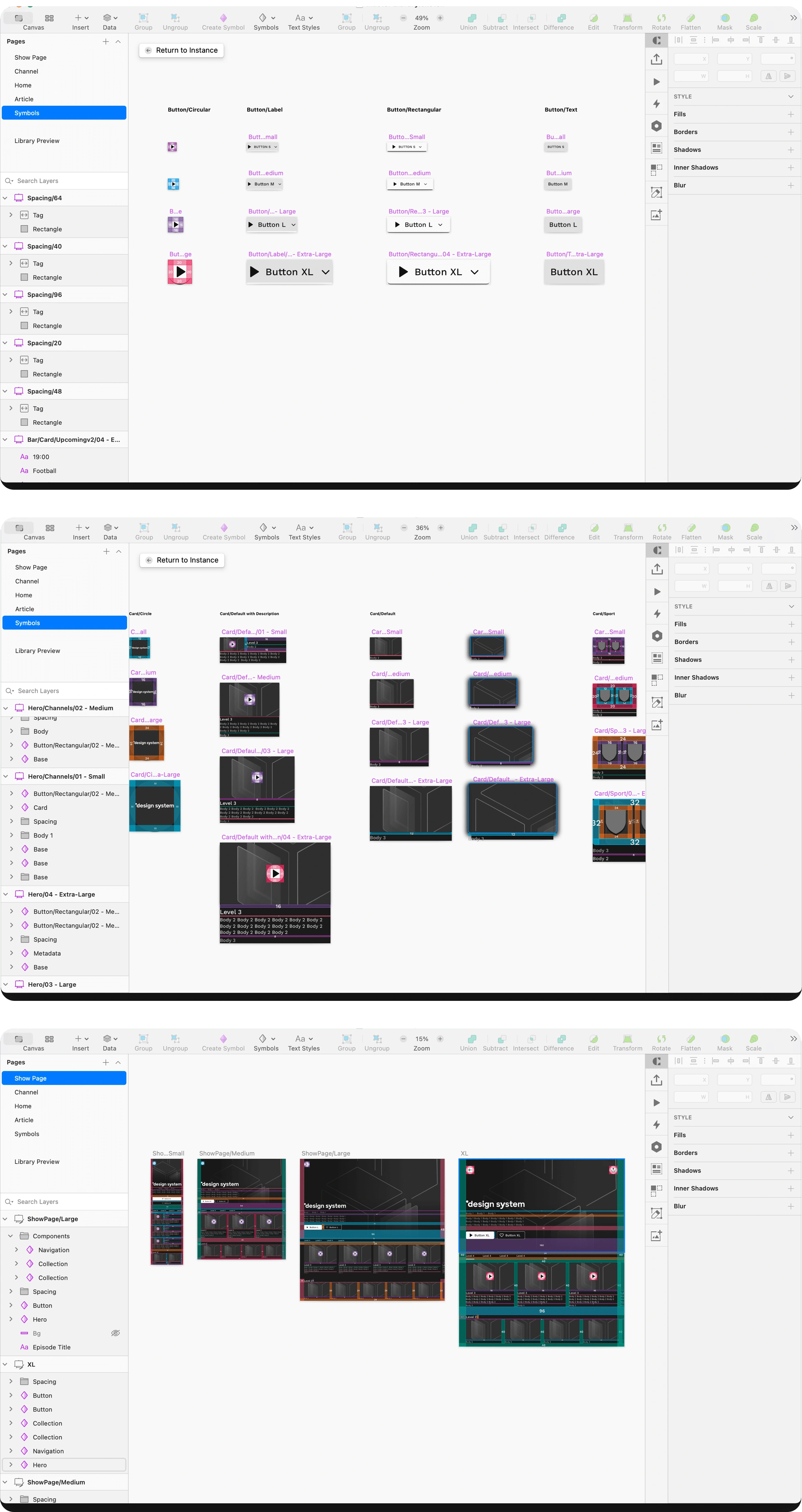
Master Library
Our Master Library is a curated repository of essential design elements, including components, styles, and patterns. It serves as the definitive source of truth for our design system, providing a centralised hub for reusable assets. By maintaining a Master Library, we streamline collaboration, ensure consistency, and expedite the creation of cohesive and visually compelling user interfaces. This central resource embodies our commitment to efficiency, uniformity, and excellence in design.
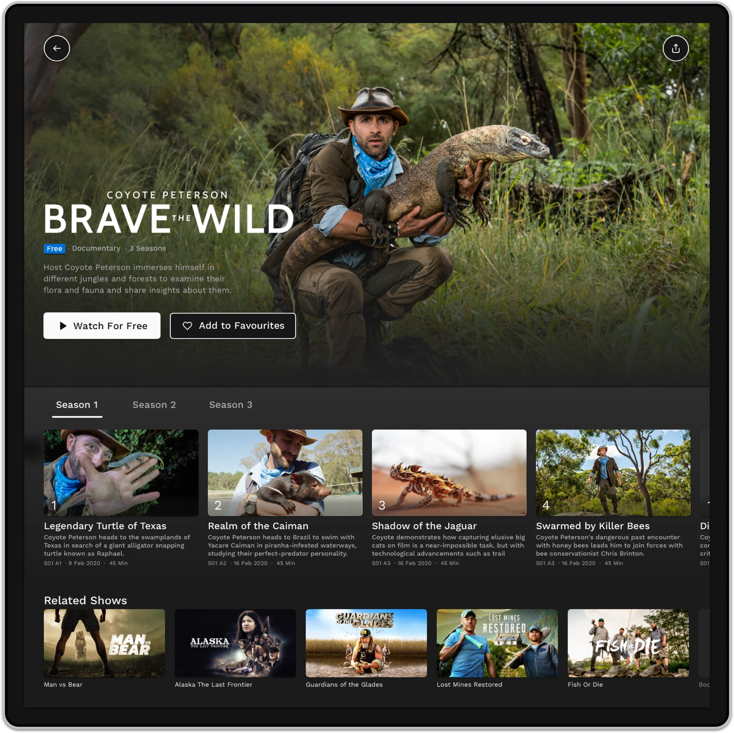
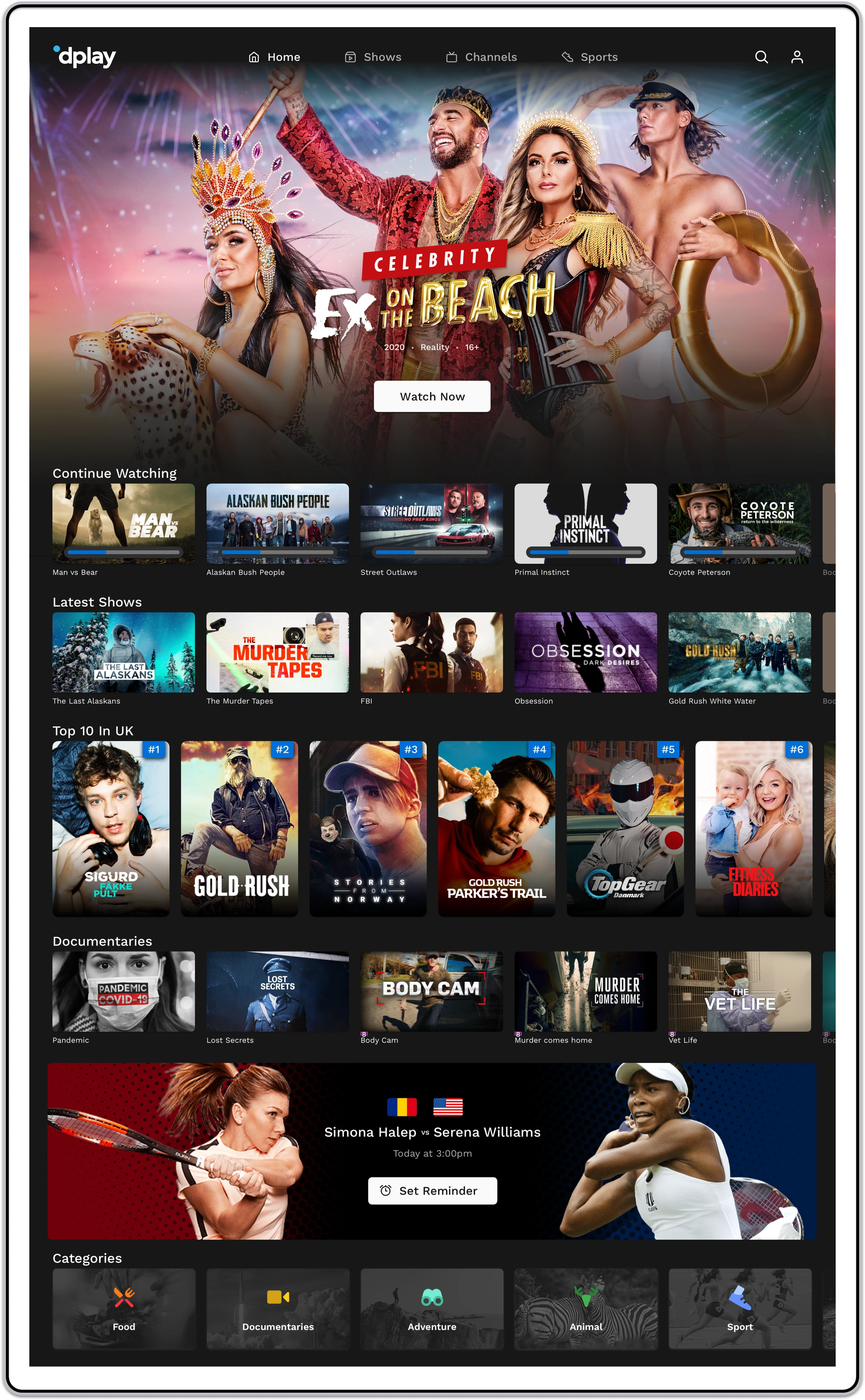
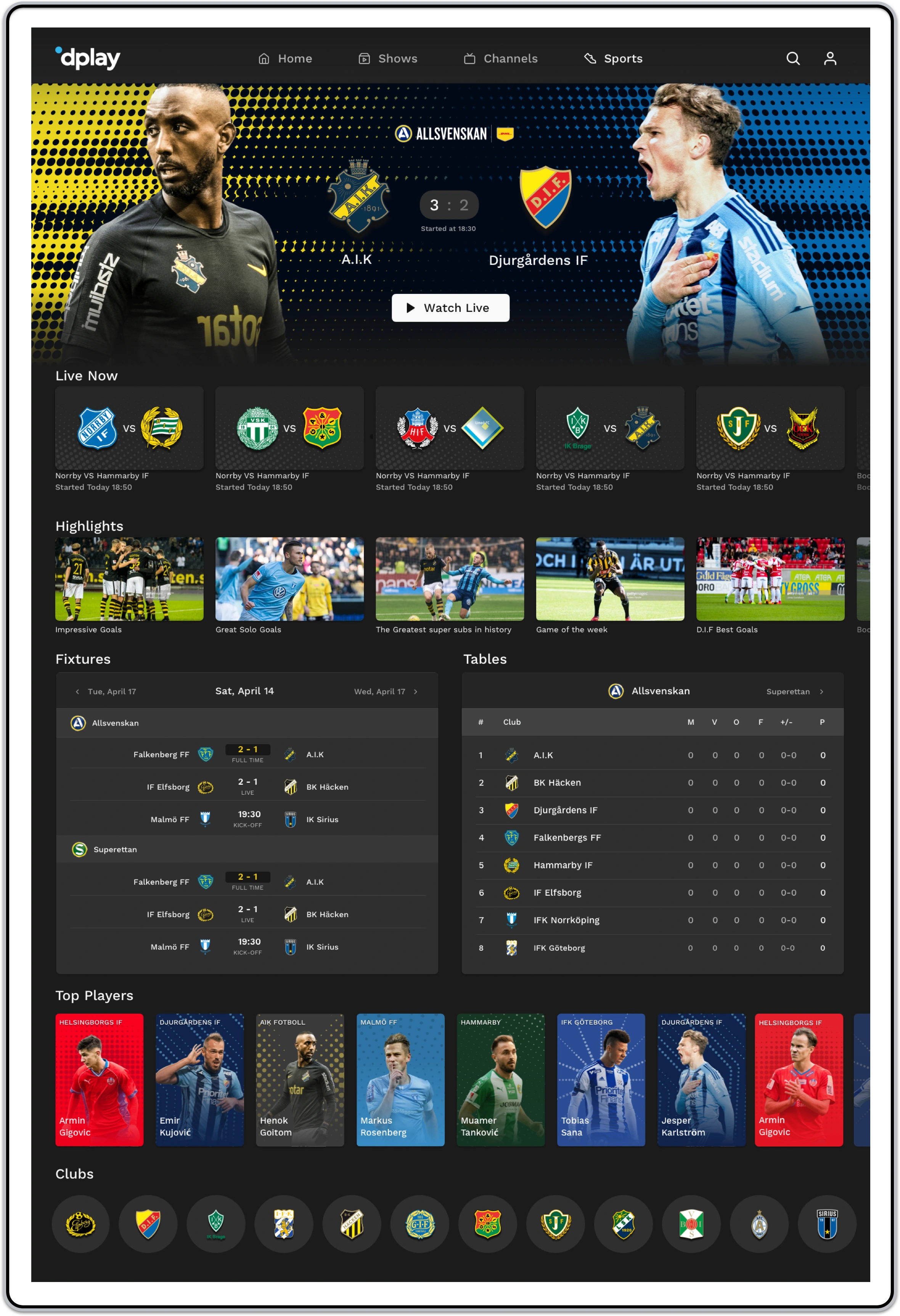
Layouts
Our layouts define the strategic arrangement and positioning of design elements within a user interface. Thoughtfully crafted to enhance user experience, these layouts adhere to a consistent grid system and responsive principles. By providing a structured foundation for content, our layouts ensure visual clarity, hierarchy, and adaptability across various devices and screen sizes. Through systematic design, our layouts contribute to a cohesive and user-friendly interface that aligns with our overall design system.

Thank you for watching.
Like this project
Posted Dec 11, 2023
Create a Design System for the group to unify the experience across all platforms. Delivering design components that save time and align with business goals.
Likes
0
Views
22