Predictive Analytics: Flight Delays at RegionEx
This is the final project for my MBA Operation Management: Predictive Analytics course.
Flight Delays at RegionEx
Case By: Amr Farahat, Susan E. Martonosi
Introduction
The team has applied descriptive analytics and predictive analytics in this project to gain a better understanding of the factors that contribute to flight delays and how they may impact the airline's revenue and relationship with its clients. By analyzing the data, we can identify patterns, trends, and anomalies in the flight delay data and assess the potential impact of these factors on RegionEx's performance.
We chose the case of flight delays at RegionEx because of our curiosity in exploring potential analytical measures to investigate the reasons that led to arrival delays in minutes during the period of September. Also, the case study noted that RegionEx's largest client, Mississippi Delta Airlines, accounted for more than half of its revenue, which posed a risk to the airline's business if on-time performance did not improve. Therefore, it was essential to identify the factors that contributed to delays and assess their potential impact on the relationship with Mississippi Delta Airlines.
We decided to use a storytelling approach to visualize data and present it to the COO, which would help in conveying the complexities of airport circumstances and traffic volume that lead to delays in the operating flight regions. Furthermore, we collected data on two airlines (RegionEx and MDA), arrival delay in minutes, delay indicator, day of the week, and route code.
By providing a description of the data, including what the variables represent and how they were measured, we can communicate the significance of the factors that were analyzed. The arrival delay is defined as the difference between the actual arrival time and the scheduled arrival time, and negative values indicate that the flight arrived earlier than scheduled. The delay indicator is a binary variable that identifies flights with arrival delays of at least 15 minutes. The days of the week are assigned numbers 1 through 7, and the route code corresponds to each flight's origin and destination airports.
Overall, applying descriptive and predictive analysis can help in identifying potential factors that contribute to flight delays and assessing their impact on RegionEx's performance. This information can then be used to develop potential solutions and strategies to improve on-time performance and maintain the relationship with Mississippi Delta Airlines.
Background
In the descriptive analytics part of our team project, we have created three visualizations using the delay flights dataset of RegionEx and MDA. The three visualizations have been coded on the RMarkdown Dashboard, where it has also helped us narrow down each airline’s performance through the use of a dropdown menu option. The problem of the case was that RegionEx had poorer on-time performance in September 2008 compared to MDA, causing RegionEx to be at risk of losing MDA as a client. We have created a density plot, box-plot, and line chart to show the relationship between each airline’s flight arrival delays throughout the month of September. These three visualizations will help the operation’s manager at RegionEx to determine the peak days of the week that has caused the delay and assess whether RegionEx’s on-time performance is worse than MDA.
Descriptive Analytics
Our Dashboard
Our dashboard has four major sections: the sidebar, the density
graph, the boxplot, and the line chart. Each shows the data about
delays in a different and unique way.
Sidebar
The first section is the sidebar. The sidebar will show
the average delay of the selected airline by weekday. Seems to
be that Fridays and Mondays are the worst for our operation. Figure 1. Dashboard Sidebar
Density Plot
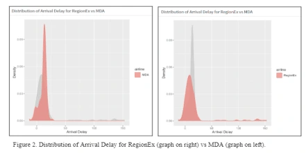
The next chart on our dashboard is the density chart (Figure 2). The density chart shows how many and how bad the delays are, reactive to the selected airline. Overall, RegionEx has worse delays, but MDA has more delays. Which one to choose will be a difficult decision. MDA is more predictable, but RegionEx tends to have better on time performance. Which one to choose will be a difficult decision. MDA is more predictable, but RegionEx tends to have better on time performance.
Box Plot
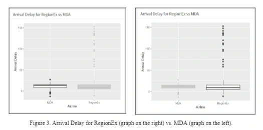
The penultimate chart on our dashboard is the box plot (Figure 3). This diminutive chart shows averages by quartile and outliers. RegionEx has many more outliers, but a lower mean than MDA. This reconfirms that RegionEx has fewer delays, but has worse delays when it has them. This means MDA is more predictable, but will almost always be delayed. Additionally, by looking at the black dots which are the outliers for RegionEx, we can understand that even though RegionEx has most of the delays, they are relatively small delays. It should be concerning to the operation manager if the outliers had the most continuous concentrated outliers over the days of the week in the month of September.
However, one of the primary reasons for using boxplots to display delay data is to mitigate the impact of outliers on inference. While it is true that the RegionEx delay data contains several high-value outliers that increase the mean, it is important to note that outliers do not have as much influence on the median and quartiles, which are more robust measures of central tendency. Upon examining the boxplots, we can see that the typical delay ranges for both airlines are statistically similar, when outliers are excluded. Additionally, it should be noted that the RegionEx dataset has more values than the MDA dataset, indicating that MDA has fewer flights compared to RegionEx. Therefore, while there may be limitations in determining the causes of delays using boxplots, they can provide a useful tool to compare delay data and identify potential outliers. One of the main reasons for displaying the delay data using boxplots is to guard against incorrect inference caused by outliers. In other words, the two box plots show that when outliers are excluded, the typical delay ranges for both airlines are statistically similar.
Line Chart
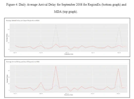
Our final chart is the line chart (Figure 4). This simple chart shows the time series of delays over the month of flight data we were provided. This chart also further reinforces the theme of our dashboard: MDA has more delays, RegionEx has worse delays. Seems twice this month RegionEx had a very bad day. MDA had delays on this day as well, but they were no worse than usual for them. It would be my suggestion to use MDA, as allowing for a little extra time on operation is easier than recovering from unexpected major delays that may halt operation for that day.
Omitted Data
Number of Passengers Data
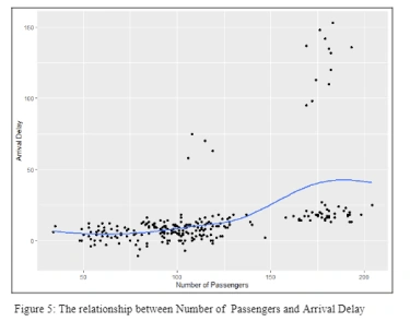
RegionEx includes data on how many passengers it flys on every trip. However, MDA does not. This means we could not include this data on the dashboard, as there was no way to compare them. This is likely the case that RegionEx is employing belly freight, the process of using unused luggage space for cargo, while MDA is likely using dedicated freight planes. The inclusion of passengers likely adds extra variability to the operation. The data provided shows a very slight correlation between passenger number and delay (Figure 5). Passengers however pay for the journey, so RegionEX will likely wish to keep them. But the client will likely see this as a detriment. Dedicated freight haulers will have more control and capacity.
Origin Airport Data
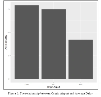
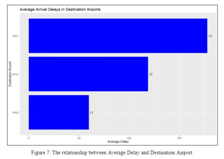
Data about the origin and destination airports was also provided (Figure 6, Figure 7). We elected to not include this data as well as it did not have any truths to discern. PNS had the lowest average delay, and DFW had the most, but the airports cannot be changed, and both airlines go to both airports. This makes the data irrelevant and therefore not included in a decision making dashboard.
Destination Airport Data
The bar chart below was omitted from our dashboard because there is no direct impact and relationship in numerical values to be assessed between destination airport and flight delay. However, it may be good to classify this reasoning between the two variables in a way that there might be some congestion in the destination airport which has caused the delay in arrivals. The bar chart shows that the destination airport MSY had about 13 flight delays in the course of the month with average delays of more than 150 minutes. This shows that out of all three routes, MSY airport had the highest delayed flights in minutes and a waiting time. On the other hand, it can be understood that DFW airport had the most frequent delays happening, meaning they had more flight delays of about 17 flights but they lasted less than 150 minutes, for about 15 to 125 minutes.
Route Code Data
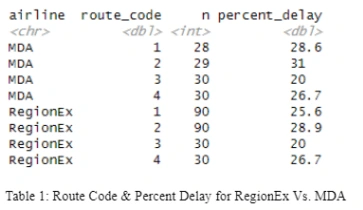
The route code variable was not used for creating visualizations because we did not see a direct relationship that might have caused the delays. However, we were able to create a summary table to visualize internally if the percentage delay was higher for RegionEx than MDA. By looking at the Summary Table 1 below, we understand that RegionEx has a higher percentage of delayed flights. However, as we look individually for each route, RegionEx does not seem to be doing worse than MDA in any route. In fact, in some of the routes, RegionEx appeared to have a lower percentage of delayed flights than MDA, such as in route code 1, which is the route between DFW and MSY. This also shows that for route code 1 (DFW to MSY), MDA had a percentage delay of 28.6% compared to RegionEx of 25.6%. In sum, on individual flight routes, RegionEx does not perform worse than MDA in terms of delays, they operate a higher number of flights with significant delays. This causes their average delay to be greater than MDA's. In essence, RegionEx's weighted delay average is skewed towards the high-delay flights, as they serve them more frequently, resulting in a higher delay average for the entire airline.
Scheduled Arrival Times, Actual Arrival Times, & Flight Times Data
Additionally, we did not include data involving the times around each flight. They were mostly the source for the data we do care about, the delays. Though we might find the best times to depart, this is largely chosen for us by the airports we are bound to use. Since we cannot control this aspect of our operation, we are forced to not consider it for a dashboard for irrelevance.
Conclusion
In sum, based on our descriptive analytics visualizations, we conclude that RegionEx’s on-time performance can be detected and solved as it is not classified to be worse than MDA. Some reasonings behind that is that the number of flights on each route for both airlines were not equal, which can mislead the reporting average delay information. By looking at the boxplot, we understand that since RegionEx operates more flights to the three routes, the airline tends to have more outliers that skew the average arrival delay to be greater than it should be compared to MDA. Our analysis concluded that there are certain external factors like the number of additional flights that make the comparison with MDA a little complicated.
Predictive Analytics
Time Series and Seasonality Model
For the purpose of test trying models to check accuracy of models and MAPE values for all of our variables in our project. We used a time series and seasonality model using different combinations of factors on the “arrival_delay” dependent variable of a dataset called “project_data_v2”. The “project_data_v2” data frame comes from the mutated version of the dataset. The mutate function was used to create a new variable called “Date” in the new data frame. Additionally, the “mdy” function was used to convert the departure date column which was in the form of character into a date format. Then, the “day” function was used to extract the day of the month from the departure date column, all of which used to assign it to the new “Date” variable. Furthermore, the dependent variable, “arrival_delay”, represents the difference between the actual arrival time and the scheduled arrival time of flights. The first model is “seasonality_model1” which includes the two independent variables, “Date” and “airline.” This model provided us with a MAPE of 48.74%.
The second model, “seasonality_model2”, includes two independent variables; “Date” and “day_of_week”. The variable “day_of_week” is an independent variable which captures the effect of different days of the week on the dependent variable. The code then calculates the MAPE using the “mape_function” on the predicted values from the “seasonality_model2.” MAPE is the measure of error used to compare the different models. MAPE stands for mean actual percentage error. In this error detection method, a percentage is produced, and a smaller result is better. We will ultimately choose the model with the smallest MAPE. The MAPE obtained from the “seasonality_model2” is 44.22884%.
The third model, “seasonality_model3”, includes two variables; “Date” and “route_code” as independent variables. The independent variable “route_code” captures the effect of different routes on the dependent variable. The code then calculates the MAPE using the “mape_function” on the predicted values from the “seasonality_model3.” The MAPE obtained from this model is 46.68117%. The fourth model, “seasonality_model4,” includes two variables; “Date” and “origin_airport”. The variable “origin_airport” captures the effect of different origin airports on the dependent variable. The code then calculates the MAPE using the “mape_function” on the predicted values from the “seasonality_model4”. The MAPE obtained from this model is the lowest MAPE among all the models tested, which is 40.08%. It is considered the best model to use for predicting the “arrival_delay” dependent variable based on the dataset. This means that with around 59.92% accuracy, this model will deliver the correct numbers for the prediction model to run.
Overall, the codes are used to compare the MAPE for different seasonality models with varying combinations of variables, in order to identify the best model to predict the “arrival_delay” dependent variable. This model was used for the purpose of finding if the different day of the month has a seasonal effect on arrival flight delays. The lowest MAPE shows that the model can be accurate amongst the rest and therefore we predict that the origin airport has some impact on arrival flight delays. This set of codes are performing regression models that include time-related variables (Date, day of week, and route code) to investigate the effect of these variables on arrival_delay. These are time series and seasonality models that examine the relationship between the predictor variables and the outcome variable, while controlling for the effect of other variables in the model.
Simple Linear Regression Model
The set of codes in this section are performing simple linear regression models to investigate the effect of individual predictor variables (origin airport, route code, and destination airport) on arrival delay. These are simple linear regression models that examine the linear relationship between the predictor variables and the outcome variable.
Within our R-script, we did some test trials to determine which model, whether the time series and seasonality model or the simple linear regression model would be the best model in our case. We ran the simple linear regression model with individual independent variables alone. The “regression_model1” is built with the origin airport as the predictor variable. The “mape_function” is then used to calculate the mean absolute percentage error (MAPE) for the predictions made by the model. The MAPE value obtained is 133.2836%. Similarly, in the second code block, “regression_model2” is built with route code as the predictor variable, and the MAPE value obtained is 132.9869%.
In the third code block, “regression_model3” is built with destination airport as the predictor variable, and the MAPE value obtained is 139.4006%. In the fourth code block, “regression_model4” is built with all three predictor or independent variables (origin airport, route code, and destination airport). The MAPE value obtained is the same as that of regression_model2, which is 132.9869%. Overall, the MAPE value is used as a metric to evaluate the performance of the models. A lower MAPE indicates better model performance. The findings suggest that the model built with route code as the predictor variable performs slightly better than the other models in this simple linear regression model, but the difference in performance is not significant. The simple linear regression model built with all three predictor variables did not perform better than the time series and seasonality model built with just one predictor variable (route code), indicating that including all three variables did not add much predictive power.
In sum, it is difficult to compare these models directly without more information on the data and the specific problem being addressed. However, based on the reported MAPE values, the time series and seasonality model (seasonality_model4) with Date and origin airport as independent variables and arrival delay as dependent variable appears to have the lowest error and therefore, it may be a better model than the simple linear regression model.
RegionEx Estimated Delay
We have three boxes with the range of possible delays for RegionEx (Figure 1). These values will adjust to the imputed values from the drop downs (Figure 1). The lower bound is the lowest possible delay for RegionEx, including negatives for arriving early (Figure 1). The middle Fit box is the most likely delay with the given data, and the upper bound is the worst likely delay to be seen by RegionEx on that given day and origin airport (Figure 1). These three boxes are with a 95% confidence, so further outlier delays are possible, but unlikely.
By changing the day of month manually and checking which days of the month had the highest estimated arrival delay for RegionEx, we found that when the origin airport was DFW, the highest estimated arrival delay was 120 minutes on September 12. Moreover, the second highest estimated arrival delay was on September 29 of about 108 minutes. Similarly, the MSY origin airport had similar patterns as DFW origin airport where both September 12 and 29 appeared to have the highest estimated delays. On the other hand, the PNS origin airport had the highest estimated delays on September 12 of about 115 minutes and September 29 of about 103 minutes.

Figure 1. RegionEx Estimated Arrival Delay Render Value Boxes
MDA Estimated Delay
We also have three boxes with the same delay spread for MDA (Figure 2). It also includes negatives for an early arrival (Figure 2). The values will also adjust with the imputed data to show MDA’s expected delays with the same 95% confidence. The warning about outliers applies here as well. MDA had the highest estimated arrival delays from the DFW origin airport on September 12 of about 36 minutes. Also, the highest estimated arrival delays from the MSY origin airport was on September 12 of about 33 minutes. On the other hand, the highest estimated arrival delays from the PNS origin airport was on September 12 as well of about 27 minutes.

Figure 2. MDA Estimated Arrival Delay Render Value Boxes
As shown in both figure one and two, the colors of the value boxes have a meaning. As the delay worsens, the color gets darker. This is a visual representation of the extremes of the 95% confidence interval, as well as the mean estimated delay.
Two-Sided t-Test
The two-sided t-test is a statistical test used to compare the means of two independent groups. The two-sided t-test was used to compare the average estimated arrival delays of two regions, RegionEX and MDA (Figure 3). This two-sided t-test checks to test if the means of the two airlines are the same (Figure 3). The null hypothesis is that there is no difference between the average estimated arrival delays between RegionEX and MDA (Figure 3). The alternative hypothesis is that there is a difference between the average estimated arrival delays between RegionEX and MDA (Figure 3). The standard confidence level is 95% or an alpha value of 0.05. Since the two-sided t-test p-value is greater than 0.05, we fail to reject the null hypothesis (Figure 3). This means that there is not a statistically significant difference between the average arrival delays of RegionEx and MDA. To further symbolize that there was not a statistically significant difference, we made the value box background color red (Figure 3).
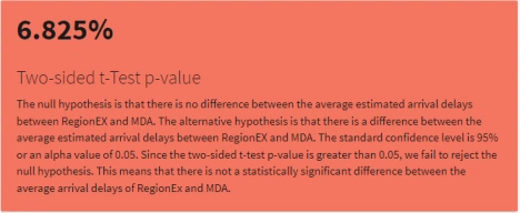
Figure 3. Two-sided t-Test p-value Value Box
Mood’s Median Test
The Mood's Median Test is a statistical test used to determine if there is a significant difference between the median values of two independent samples. In this context, the Mood's Median Test is used to compare the median estimated arrival delays of two regions, RegionEX and MDA, to see if there is a statistically significant difference between them (Figure 4). This test is very similar to the previous test, but checks for the median to tell the two datasets apart. The null hypothesis is that there is no difference between the average estimated arrival delays between RegionEX and MDA (Figure 4). The alternative hypothesis is that there is a difference between the average estimated arrival delays between RegionEX and MDA. The standard confidence level is 95% or an alpha value of 0.05. Since the Mood's Median Test p-value is less than 0.05, we reject the null hypothesis (Figure 4). This means that there is a statistically significant difference between the median arrival delays of RegionEx and MDA. To further symbolize that there was a statistically significant difference, we made the value box background color red (Figure 4).
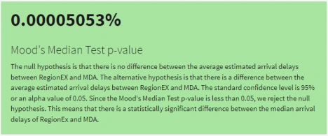
Figure 4. Mood’s Median Test p-value Value Box
Omitted Data
In the descriptive analytics section, we omitted the origin airport, however, in the predictive section, we used the origin airport as one of the main independent variables that appeared to have the lowest MAPE, providing us with a better combination for accuracy of flight delays. Other variables that were omitted include number of passengers, route code, destination airport, departure date, scheduled departure time, scheduled arrival time, delay indicator, and actual arrival time. We omitted those variables because they were not relevant for prediction purposes. If we included all three versions of times like scheduled departure and arrival time, they would create a collinearity. Furthermore, the number of passengers were eliminated because we did not have data or number of passengers for MDA flights, whereas, we only had data for RegionEx, which was not going to be an accurate way for comparison between the both airlines.
Complete Dashboard
Our complete dashboard is enthralling in the predictive section. We have eight different value boxes, and two data selector dropdowns. The selector drop downs will allow the user to predict the delay for a given day and origin airport. The six reactive value boxes will then change to display the range of delay each airline will likely experience with 95% confidence. The MDA delay spread will be listed in the green boxes, the RegionEx delays will be listed in the blue boxes. The last two boxes show the statistical similarity between the two airlines, and an explanation of what the value within means.
Conclusion
We suggest that further research could benefit RegionEx. Identifying additional relevant independent variables could potentially reduce the Mean Absolute Percentage Error (MAPE) in their time series and seasonality model. Additionally, we believe that access to more flight data from previous months could have improved the accuracy of our model. By analyzing more data, we would gain a better understanding of RegionEx's performance over time and be better equipped to make more accurate predictions. We can conclude that September 12 and September 29 had the highest flight delays from the all three of the origin airports for both airlines. This can tell us that the manager needs to further study why those days are causing huge delays in arrival flights.
Prescriptive Analytics
With prescriptive statistics, we can then offer best solutions about the flight delays. This would likely include best scheduling and layover information. We expect we could find with great confidence the periods between landings and departures to ensure connections even with delays, and how tight to schedule to get the most out of the staff and facilities. We will also be able to suggest better support the flights with the most chances for delay. We will likely also give staff directions and training guidelines to correct and prevent known inefficiencies in the layover and cargo transfer processes. We also could carry over the things that are going well from our pest performing flights to our troublesome ones. We will likely find further best decisions as descriptive statistics will find interesting problems that we can prescribe solutions for. Prescriptive is the third in order because it will be derived from the results of the previous steps.
Like this project
Posted Dec 12, 2023
Analyzing flight delays for RegionEx & Mississippi Delta Airlines to improve on-time performance and client retention with descriptive and predictive analytics.
Likes
0
Views
27


