Tableau Project: Super Store Sales
Altaf Safi
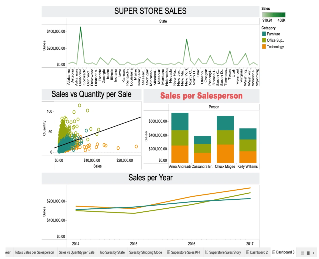
After playing around to see which charts are more informative and fit within a dashboard in an organized order, I discovered some charts like the tree map weren't informative to be used in a storytelling approach. I also learned how to add calculations where it can take an average of a data set variable instead of the sum to allow for a better visualization estimate. I like how I can filter based on year or category to keep it interactive. One of my initial impressions of Tableau was its intuitive and user-friendly interface. The drag-and-drop functionality allowed me to quickly create visualizations without the need for extensive coding or technical expertise. As I progressed in my learning journey, I discovered many chart types and customization options available in Tableau. The software offers an impressive selection of visualizations, from basic bar charts and scatter plots to more complex treemaps and heat maps. The ability to customize colors, labels, and formatting allowed me to tailor the charts to suit my specific needs and enhance their visual appeal.
Like this project
Posted Dec 8, 2023
I created a visually appealing Super Store Sales dashboard by customizing charts, addressing limitations like the treemap, and using average calculations.
Likes
0
Views
20