Tableau: COVID-19 Cases by Location Dashboard
Altaf Safi
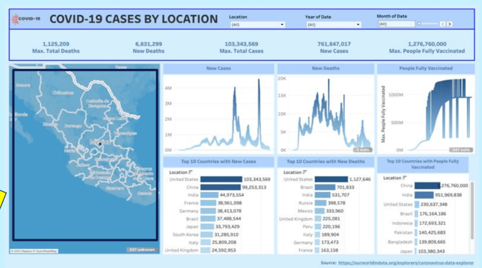
Dashboard created by me, the article starts with an instruction guide on how to use my dashboard.
The COVID-19 data set used was obtained from “Our World in Data” platform and includes information from January 2020 through May 12, 2023. We used seven variables from the dataset to create visualizations and they are location (countries), exact dates (month, day, year), total deaths, new deaths, total cases, new cases, and number of people fully vaccinated. The COVID-19 Global Dashboard provides a comprehensive visualization of the pandemic's impact across the world. The following instruction guide will help you get started with our dashboard:
1. Overview of the Dashboard Features:
a. Line charts for the number of new deaths, new cases, and fully vaccinated people respectively by date.
b. Bar charts of new COVID-19 cases, new deaths, and the number of people vaccinated in the top 10 countries, with the United States being the highest. c. A global map with bigger bubbles indicates a higher number of new cases and deaths for certain countries.
2. Using the Filters:
a. Two filters can be used to adjust the data displayed on the dashboard: Location (Country) and Date (Year, Months).
b. Location Filter: Select the country you are interested in from the dropdown menu. The visualizations will update to reflect data for the chosen country.
c. Date Filter: Choose a specific year and/or month using this filter. The visualizations will update to show data from the selected period.
3. Interacting with the Visualizations:
a. Hover your cursor over different elements of the graphs and maps to view more detailed information. For instance, hover over a specific date on the line chart to see the exact numbers for that day, or hover over a country on the world map to see the number of new cases and deaths there.
4. Making Business Decisions:
The “COVID-19 Cases by Location” dashboard provides valuable insights that can inform business decisions. For example, if you're considering international business operations, you can use the dashboard to assess the COVID-19 situation in potential
target countries. By considering the new cases, death, and vaccination, you can make informed decisions about potential risks and challenges. Remember that this dashboard provides an overview and should be used as part of a more comprehensive decision-making process that includes other data and professional advice.
Data Source: https://ourworldindata.org/explorers/coronavirus-data-explorer
Tableau Dashboard: https://public.tableau.com/app/profile/ikuru.ariji/viz/MKTG612-COVID-19PROJECTFI NAL10/Dashboard?publish=yes
Background
The COVID-19 data set used was obtained from “Our World in Data” platform and includes
information from January 2020 through May 12, 2023.
Use even variables from the dataset to create visualizations:
● Location (countries), exact dates (month, day, year), total deaths, new deaths, total cases, new cases, and number of people fully vaccinated.
● The COVID-19 Global Dashboard provides a comprehensive visualization of the pandemic's impact across the world.
Overview of Dashboard Features
Blue Color Choice: It is a color commonly associated with cleanliness and hygiene, which are essential aspects of combating the spread of diseases like COVID-19 ( CDC Guidelines).
Dashboard
Map with Bubble Visualization:
The main feature of the dashboard is an interactive world map that visually represents the severity of the pandemic in different countries. Each country is represented by a bubble.
Line Graphs:
The dashboard also includes line graphs that track the progression of new cases, new deaths, and the number of people fully vaccinated over time.
Bar Charts:
To gain further insights, the dashboard includes bar charts displaying the top 10 countries with the highest number of new cases, new deaths, and people fully vaccinated. These bar charts provide a comparative analysis of the most affected countries and the countries with the highest vaccination rates.
Conclusion
● The COVID-19 Global Dashboard on Tableau offers an interactive and data-driven visualization of the pandemic's impact worldwide. ● This dashboard empowers users to analyze and understand the global trends associated with COVID-19.
● It serves as a valuable tool for policymakers, public health experts, and the general public in monitoring the ongoing pandemic and making informed decisions to mitigate its effects.
Like this project
Posted Dec 8, 2023
The COVID-19 Global Tableau Dashboard visually summarizes the pandemic's impact worldwide from January 2020 to May 12, 2023.
Likes
0
Views
8