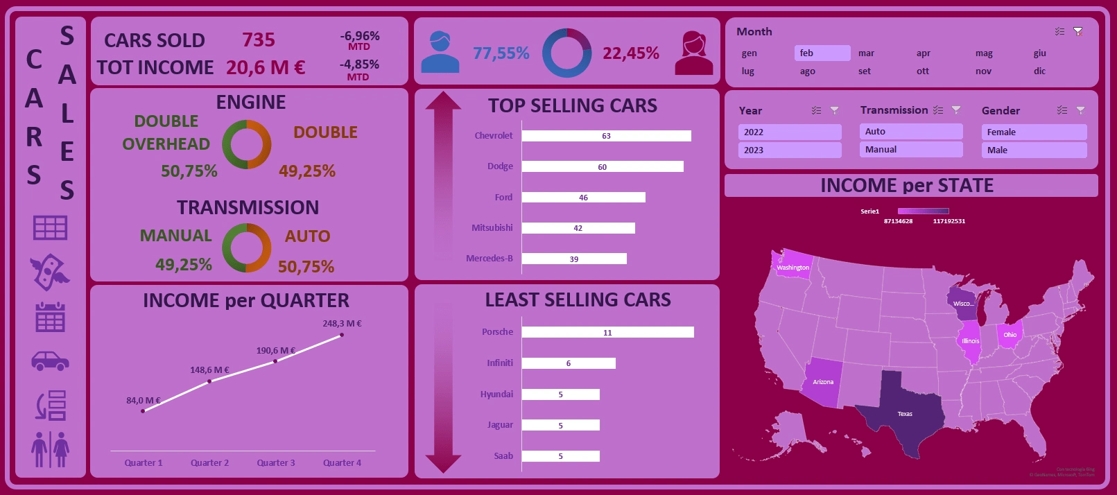
Car Sales Dashboard
Pietro Macorig
Final dashboard
Data analysis
For this dataset, no data-cleaning processes were needed, so I jumped straight into visualizing what the final dashboard could have looked like. I created a custom format for sales numbers and calculated the month-to-date percentage variation.
Data visualization
I created the map (on the right), all the graphs, and the related filters, and then I put them all together.
This dashboard could be used to understand which gender is more likely to buy a specific car (manual/automatic/brand/etc), but even to have a general idea of how the business is going and which state's filiate is doing better than the other. The manager can also rely on the list of top-selling and least-selling cars, to help him make marketing and selling decisions, such as stopping the sale of a brand.
All the icons on the left side are buttons that link to specific sheets, where the pivot tables are located for different graphs.
Like this project
Posted Mar 28, 2024
Dashboard analyzing sales of a car dealership. It's focused on gender, engine type, quarter sale distribution, and a list with more and least sold cars.
Likes
0
Views
10